What is Mamluk Mosque Lamp?
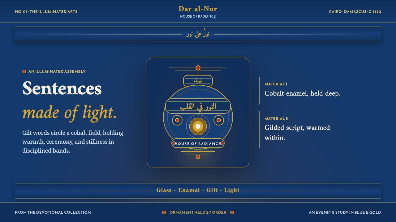
Devotion made luminous: deep enamel blue, gilt inscription bands, and red sparks turn the memory of a Mamluk mosque lamp into a visual language of sacred warmth.
Mamluk Mosque Lamp in brief
The Mamluk Mosque Lamp style takes its ground from mosque lamps blown around 1350 in Cairo and Syria during the Mamluk Sultanate. The source object is a pale-green glass vessel, gilded and enamelled in cobalt, red, and white, designed to glow warmly when hung and lit. Its identity comes from the meeting of vessel, light, inscription, and disciplined ornament rather than from any isolated color or decorative motif.
The visual system is devotional and stately. A deep enamel-blue field carries the atmosphere of the lamp, while gold inscription bands circle the neck and body like sentences made visible. Small red enamel dots act as sparks within the order. The result is richly ornamental without becoming chaotic: the surface feels layered, luminous, and ceremonial, yet every flourish is held by a clear banded structure.
This is not a flat dark theme and not a generic luxury palette. Its darkness is a ground for warmth. Blue establishes depth, gold supplies radiance, red provides controlled vitality, and white can clarify the contrast between script, vessel, and surrounding space. The design should feel as though ornament is being illuminated from within, never as though decoration has simply been placed on top.

Where does Mamluk Mosque Lamp come from?
The source places the lamp around 1350, in Cairo and Syria, within the Mamluk Sultanate. Its associated movements are Mamluk enamelled and gilded glass and Islamic mosque furnishings. These terms establish a specific visual territory: the style belongs to an object made for hanging, illumination, and devotional presence, not to an abstract dark interface detached from material and ritual.
The vessel begins with pale-green blown glass. Gilding and enamel then build a more articulated surface in cobalt, red, and white. This sequence matters to the aesthetic logic. The luminous ground is not replaced by ornament; it is deepened by it. The glass remains present beneath the decoration, allowing the finished object to hold both translucency and authority.
The most distinctive inscriptions are bands of thuluth Quranic and sultanic script circling the neck and body. Their role is structural as well as communicative. They organize the curved vessel into horizontal zones, while the flowing script turns those zones into visual sentences. The band is therefore not a border added at the end. It is the principal device that makes ornament legible, continuous, and ceremonial.
The source names Sultan Hassan, Sultan Barquq, and anonymous master glass enamellers as key figures. The named sultans give the system a connection to patronage and authority, while the anonymous craftspeople represent the hands that made the glass, enamel, gilding, and inscription work tangible. Together, these figures keep the style balanced between public devotion, royal presence, and precise material skill.
What defines the Mamluk Mosque Lamp look?
Enamel Blue Ground
The ground is a deep enamel blue, closer to a luminous night field than to a neutral black. It gives the lamp system its depth and allows the warmer elements to appear as light rather than as ordinary color. Blue should occupy the visual atmosphere, leaving enough surrounding quiet for the gilt bands and red enamel marks to register with dignity.
Gilt Inscription Bands
Gold appears as bands that encircle the vessel, echoing the thuluth Quranic and sultanic script described in the source. These bands create continuity across the curved body and prevent the ornament from dissolving into scattered detail. Their authority comes from repetition and placement: they hold the composition together while also carrying the sense of sacred language.
Red Enamel Sparks
Red is used as a small, vivid interruption within the blue and gold structure. The source describes red enamel sparks, so the accent should feel concentrated and alive rather than broad and dominant. Red marks can punctuate a band, signal a turn in the composition, or provide the visual sensation of warmth passing through the vessel.
Script as Ornament and Structure
The script is not a decorative texture pasted onto a dark background. It behaves as a continuous architectural element, circling the neck and body and dividing the surface into readable zones. Even when the words are not being read, the rhythm of thuluth creates movement, density, and direction. The design should preserve that rhythm instead of replacing it with arbitrary ornament.
Warm Translucency
The lamp is remembered as a pale-green glass vessel that glows warmly when hung and lit. Its visual depth therefore depends on the relationship between surface and illumination. Dark blue should feel capable of holding light, gold should feel reflective, and white should clarify rather than flatten. The overall impression is illuminated material, not a painted imitation of illumination.
Ceremonial Density
The style welcomes ornament, but ornament arrives in ordered fields: bands, rings, marks, and controlled intervals of quiet. This creates a sense of ceremony without visual confusion. Density should gather around meaningful structures, especially inscriptions and the vessel's turning surfaces, while open blue areas provide the pause that lets the ornament feel precious.
Stately Contrast
The palette depends on contrast between a deep cool ground and warm metallic or enamel accents. That contrast should feel ceremonial rather than theatrical. Gold carries radiance, red carries heat, white carries definition, and blue carries depth. When each material keeps its own role, the composition becomes stately and luminous instead of merely luxurious.

Who shaped Mamluk Mosque Lamp?
Sultan Hassan is named in the source as one of the key figures associated with the Mamluk Mosque Lamp reference. Within the design system, his presence belongs to the register of sultanic authority and devotional architecture. The reference does not require a portrait or literal emblem; the name is better understood as part of the historical weight carried by the gilt bands, dark blue ground, and ceremonial furnishing context.
Sultan Barquq is also named as a key figure in the source material. His role in the article is associative rather than biographical: he helps keep the style connected to the Mamluk courtly register identified by the reference. The design should express that register through composure, continuity, and controlled richness rather than through literal historical illustration.
The anonymous master glass enamellers represent the material intelligence behind the reference. The source gives us blown pale-green glass, cobalt, red, white, and gilding, but leaves the makers unnamed. That anonymity is part of the style's dignity: the work is not built around celebrity authorship. It is built around disciplined craft, where surface, inscription, color, and warm illumination operate as one vessel.
How do you use Mamluk Mosque Lamp today?
For presentation slides, use the lamp logic across the whole deck rather than reserving it for a decorative cover. The cover can establish the deep enamel-blue ground, a quiet field of gilt script-like bands, and a restrained red spark that introduces the subject. Content slides should let those bands organize headings, quotations, and transitions. Data slides can treat charts as illuminated vessels: gold carries the primary structure, red marks a meaningful change, and white keeps labels readable without breaking the nocturnal atmosphere.
For web interfaces, the style suits dashboards and pricing pages that need authority, focus, and a sense of considered value. A deep blue surface can carry the main interface, while gilt accents distinguish active navigation, important totals, or selected plans. Red should be reserved for alerts or decisive points, not used as a general action color. Cards should feel layered and material, with clear bands and restrained depth rather than a field of unrelated panels.
For editorial and marketing work, build the page as a sequence of illuminated zones. A headline may sit within a broad blue field, while a narrow gilt rule or inscription-like band marks the beginning of a section. Long-form text benefits from generous quiet around the main column, allowing the decorative language to gather at the margins instead of competing with reading. Marketing pages can use the contrast between deep blue, warm gold, and red enamel to make a product feel ceremonial, enduring, and carefully made.
The most common mistake is reducing the style to dark blue plus gold and calling the result complete. Without the disciplined bands, the warm translucency, and the small red enamel interruptions, the design becomes a generic luxury theme. Another failure is making every surface equally ornate. The lamp reference depends on hierarchy: some areas carry script and radiance, while other areas remain quiet enough for the glow to be felt. Preserve that alternation, and keep the ornament tied to structure rather than scattered across the page.

Mamluk Mosque Lamp — FAQ
Is this style meant to reproduce an actual Mamluk mosque lamp literally?
No. The source uses the lamp as the ground for a design system, not as a demand for archaeological replication. What should carry across are the deep enamel-blue field, gilt inscription bands, red enamel sparks, pale glass luminosity, and disciplined ceremonial density. A successful application preserves the relationships between these elements without pretending to reproduce every physical detail of a historical vessel.
Why is the background deep blue instead of black?
Deep enamel blue retains the darkness required by the reference while keeping a sense of material color and inner light. Black would make the system more severe and could turn the gold into a generic luxury accent. Blue allows the surface to feel like enamelled glass: cool, saturated, and capable of holding warm illumination. It also gives the red marks a more jewel-like presence.
How should the script-like bands be used when the interface does not contain Arabic text?
Treat the bands as a structural reference rather than counterfeit writing. They can organize section changes, frame a heading, or create a continuous visual rhythm around a panel, but they should not be used as meaningless pseudo-text that imitates sacred language. The important qualities are continuity, flowing movement, and disciplined placement. Actual copy should remain clear and readable in its own appropriate typography.
Can the style work without red accents?
It can, but the character changes. The source describes red enamel sparks as small points of warmth within the blue and gold structure. Removing them creates a quieter and more monochromatic interpretation, but it also removes the sense of heat and sudden life that keeps the darkness from becoming cold. If red is omitted, the design must recover that warmth through illumination, material contrast, or carefully protected white space.
What makes the style devotional rather than simply ornate?
Devotional character comes from the relationship between ornament and order. The lamp is not merely covered in decoration; its inscriptions circle the vessel like sentences of light, and the bands give the surface a steady ceremonial rhythm. Warm illumination, disciplined repetition, and the sense of language held within a vessel create the spiritual register. Without that order, gilding and enamel would read as surface richness alone.
Related design styles
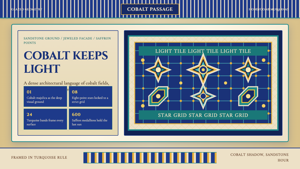 Uzbek Samarkand Shah-i-ZindaOpulent tile memory. Cobalt grids, turquoise bands, and saffron medallions cr…
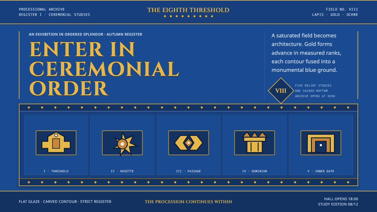 Babylonian Ishtar GateMonumental by procession. Lapis brick, gold registers, and carved capitals ho…
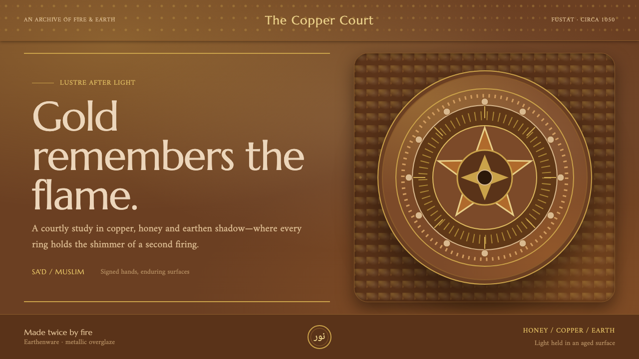 Fatimid LustrewareOpulence fired into earth. Copper-gold lustre glows through dense medallions…
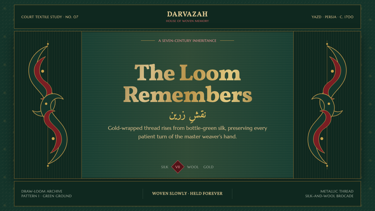 Persian Termeh BotehRoyal brocade, densely alive. Antique-gold boteh climbs across lustrous bottl…
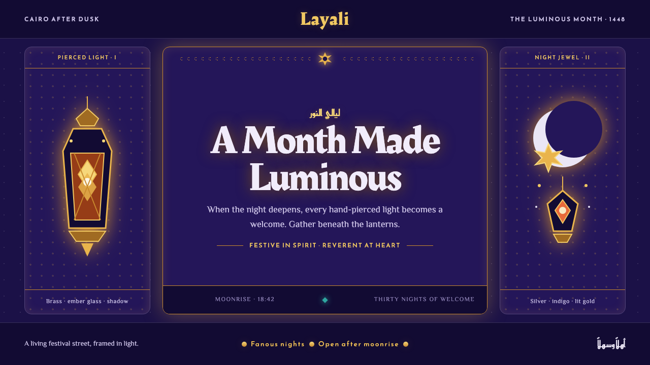 Ramadan Lanterns (Fanous Nights)Night becomes sacred light. Pierced brass and amber glow burn across bottomle…
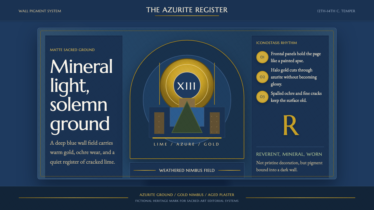 Serbian Medieval FrescoSacred wear becomes structure. Azurite fields, gold halos, and cracked plaste…