What is Maltese Luzzu?
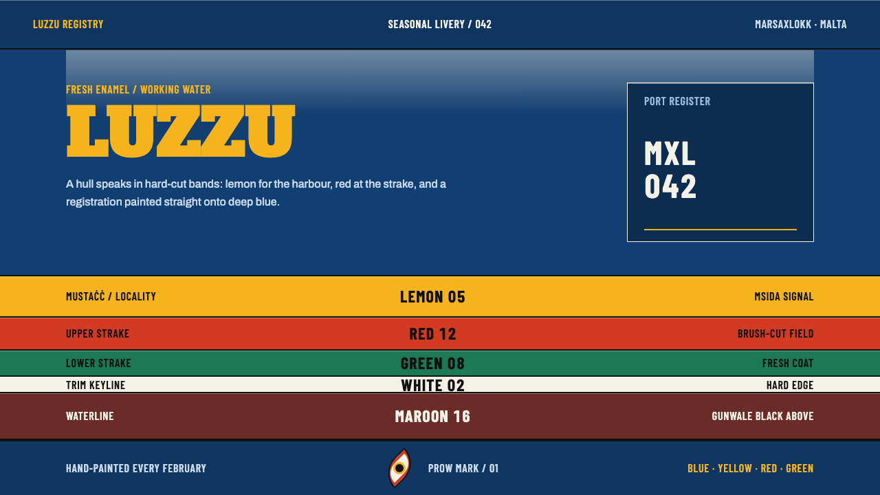
The luzzu paints colour as an address: hard-cut enamel bands, condensed numerals and a watching eye on a deep blue hull.
Maltese Luzzu in brief
Maltese Luzzu is a design style drawn from the paint scheme of the luzzu, the double-ended wooden fishing boat of Malta. Its carvel hull, built with planks laid edge to edge, is finished in glossy marine enamel: a deep blue field of planking carrying stacked bands of yellow, red and green, a black rule along the gunwale, and a reddish-brown strip at the waterline. On the bow sits a painted eye, the għajn ta' Osiris.
The bands are not ornament. They are an address system, and a fishing family's colours say where a boat belongs. The design system paints in that spirit. Colour is information with a fixed meaning, edges are cut hard rather than blended, the surface has the wet sheen of fresh enamel, and numerals are set large and condensed straight onto the field. The style is dark in feeling, bold in graphic weight and strict in how it uses each hue.
It belongs to the family of Mediterranean working-boat liveries, and what distinguishes it is how much the colour has to do. Every yellow has its place and every band has a reason. A designer who borrows the style borrows a rule of discipline as much as a palette: nothing on the hull is there merely because it looks nice.
Where does Maltese Luzzu come from?
The luzzu is a working boat, and the style's reference period is its working livery of 1900 to 1950, repainted every season and still visible on the fleet of the 2020s. The principal references are the harbours of Marsaxlokk and Marsascala on the Maltese coast. Because the paint is renewed each year, the tradition is never a museum survival: every coat is a fresh decision made within old rules, and the design is a living practice rather than a fixed monument.
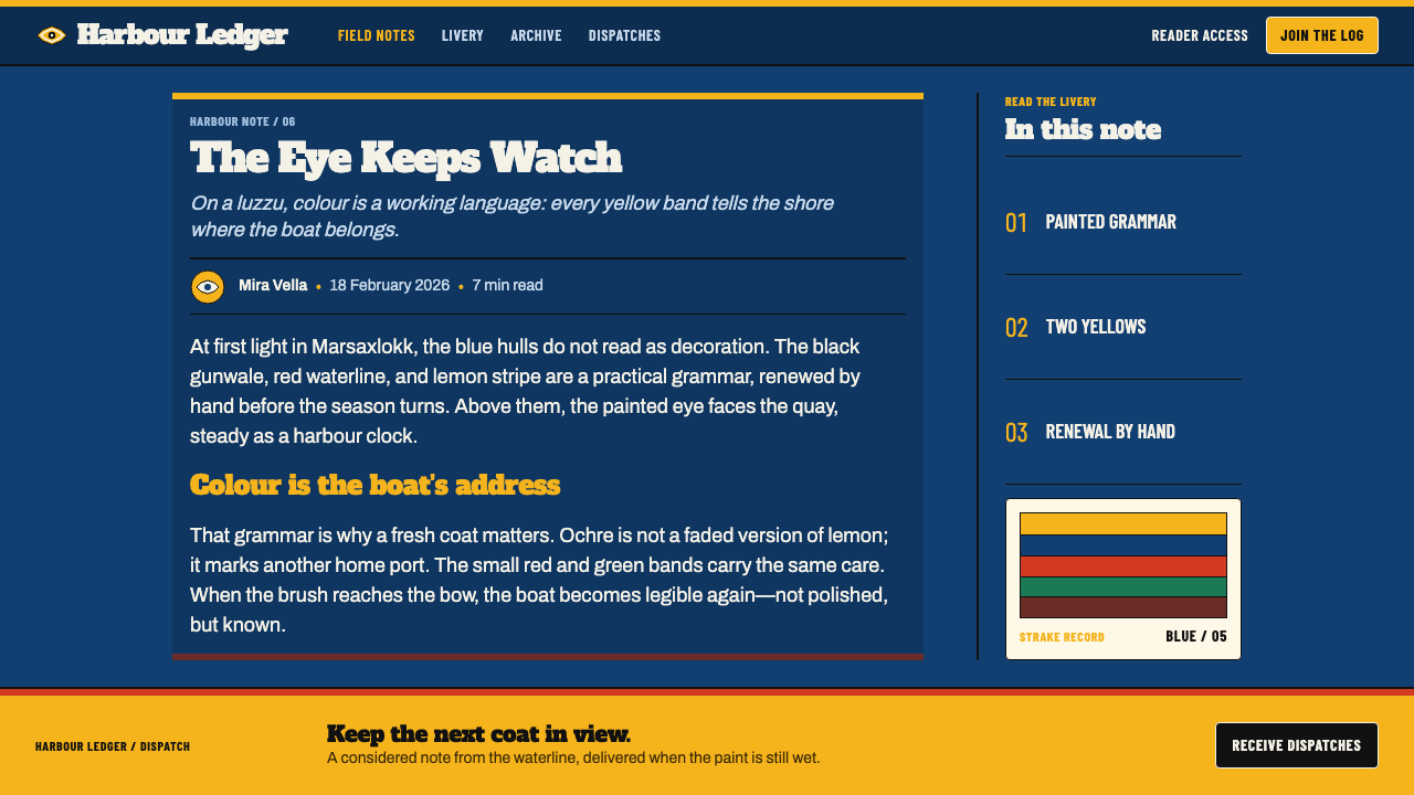
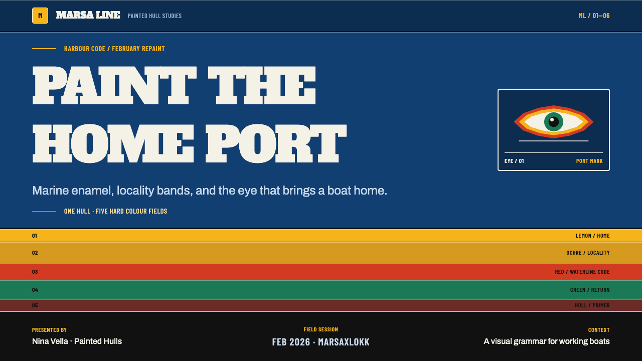
The most famous feature is the eye. Painted on each side of the bow, the għajn ta' Osiris has a white ground, a dark pupil and a coloured ring around it. Its ancestry is traced to the eyes that Phoenician seafarers painted on the prows of their ships, a tradition that crossed the Mediterranean and survives in Malta, where it is traditionally read as a watchful, protective gaze. The eye is repainted each February, as part of the annual renewal of the boat.
The colour bands are a locality code. The moustache-shaped mark known as the mustaċċ, painted above the lower hull, tells you which community the boat belongs to: lemon yellow for Msida and St Julian's, ochre for Marsaxlokk, red for St Paul's Bay, and black while the owning family is in mourning. The style's references name the boatwrights of Marsaxlokk and the fishing families of Msida and St Paul's Bay as keepers of these conventions. This is why two yellows both appear in the style and can never be merged: they are not shades of one colour but two different addresses.
Vernacular enamel signwriting completes the picture. The numbers painted on a hull are not stencilled in a neutral type; they are signwritten, narrow, tall and heavy, filling the height of the band they sit on and applied directly onto the paint. The style carries over this lettering and the Phoenician eye into one graphic system, with a lesson for designers that holds well beyond boats: in a livery, colour is never decorative, because it has to be read from a distance by people who know the code.
What defines the Maltese Luzzu look?
A deep blue hull
The ground is a deep, saturated marine blue, the colour of planking painted for sea and weather. It is not black and not navy as fashion would use it; it is a working blue that every other element sits on. Because it is dark and rich, it makes the bands glow like enamel against hull planks.
Banded enamel colour
Yellow, red and green are laid in stacked horizontal bands, and the bands are the main structure of the page. Each is a flat, opaque stripe with a clear job, like a livery stripe on a hull. Layouts are built by stacking bands rather than by drawing boxes, so sections read as bands of paint.
Hard-cut edges
Every junction between colours is a single clean edge, the line of a loaded brush against masking. There are no gradients and no soft blends, and corners are cut rather than rounded off by effect. The sharpness is what makes the colours legible from far away, and it gives the whole style its decisive character.
Two yellows, two meanings
A lemon yellow and an ochre yellow both live in the palette, and each stands for a different place. They must never be merged into one 'yellow', because in the livery they are different addresses. In a product, this principle becomes a rule: two near-identical colours should mean two different categories, and the difference should be preserved.
Condensed numerals
Numbers are set large, narrow and heavy, directly on the painted field, filling the height of their band with almost no margin. They work as identity: the number is the boat's name in short form. The style gives figures and codes a visual weight that ordinary body text never has.
Wet enamel sheen
The surfaces suggest high-gloss marine enamel, fresh and still wet. The impression is achieved with clean, saturated flats and crisp highlights, not with soft gradients or glassy effects. It should look like paint just brushed on, not like a plastic button.
Gunwale rule and waterline
A black rule runs along the top edge, where the gunwale would be, and a reddish-brown strip closes the bottom, where the hull meets the water. Together they frame the bands like the boat's own outline. In a layout they act as header and footer lines that hold the stacked colour in place.
Who shaped Maltese Luzzu?
The builders and painters of Marsaxlokk, named in the style's references as keepers of the luzzu tradition, and of its ochre-yellow convention in particular. Their harbour is one of the two principal sources for the style, and their yearly repainting is why the livery stays alive as a practice rather than a relic.
The fishing families of Msida, whose boats carry the lemon-yellow mustaċċ. Msida shares that colour with St Julian's, and the family tradition is what turns a shade of yellow into an address. In the design system, these families are the reason a lemon yellow exists apart from the ochre.
The fishing families of St Paul's Bay, whose red mustaċċ marks their boats. They stand for the style's other key idea: red is not a general accent in this livery but a place name. Together with Msida and Marsaxlokk they show how a community vocabulary of colour can be both beautiful and exact.
The ancient seafaring practice of painting an eye on the front of a ship, from which the għajn ta' Osiris is traced. It is the oldest layer in the style and the reason a boat has a face: the vessel looks ahead as it works. The style treats it as a living inheritance and not as a decorative motif.
How do you use Maltese Luzzu today?
Maltese Luzzu suits any product where colour has to mean something and numbers have to be read quickly: logistics, fleets, ports, transport, sports tables, ticketing, maps, operations dashboards, and food and travel brands with a coastal story. Applying it well means treating colour as a code, deciding what each band stands for and sticking to it.
On slides, the cover should be a field of deep blue with a stack of colour bands crossing it and a large condensed title or number cut straight onto the paint. Content slides use bands as section markers, with one colour per topic that returns every time the topic appears. Data slides are the style's best territory: assign each category its own fixed enamel colour, cut the bars with hard edges, and set the key figure large, narrow and flush against the field.
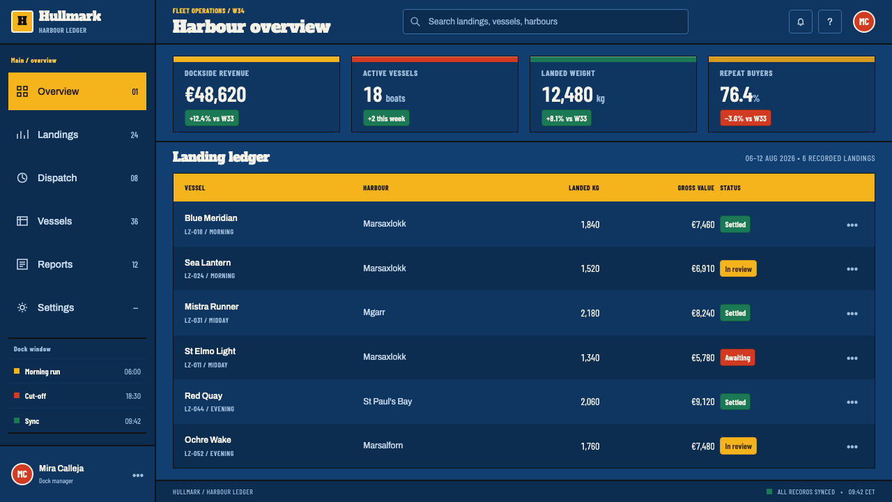
For web interfaces, the style suits dashboards, route and schedule pages, league tables and status screens. Cards are flat blocks with a hard edge and a coloured band along one side, tabs are enamel stripes, and identifiers or order numbers are set in the condensed numeral style. Pricing tiers can be separated by band colour, with each tier keeping its colour wherever it appears.
In editorial and marketing work, use the bands as a storytelling device. A feature page can open on the deep blue field with a bold title, move through coloured chapters that match a map or a timeline, and close on the black rule and the waterline. Photography of boats, ports and workers fits naturally, but the graphic system does not require it; the bands and numerals already carry a sense of place.
The most common mistake is to blend the colours into gradients, which destroys the cut edges that make the livery legible. The second is to merge the two yellows or to use all the colours at equal weight, which turns an address system into stripes. The third is to set the condensed numerals small: their power comes from scale, and at text size they become a cramped, hard-to-read face.
Maltese Luzzu — FAQ
Is this just nautical stripes?
No. Nautical stripes are decoration borrowed from sailing clothes. In the luzzu livery each band is a code that says where a boat belongs, and the colours mean something specific. The design system keeps that rule: bands are structure and meaning, not a pattern, and the palette is tied to a fixed reading rather than chosen freely.
Why is the style dark?
Because the hull is a deep blue and the whole livery is read against it. The bands, numerals and rules are set on the dark field the way enamel is set on planking. A pale page would lose the contrast that makes the cut edges and condensed figures legible from a distance, and the sheen of the paint would turn flat.
Can I use the painted eye in my design?
The style does not require it, and it is best used sparingly. The għajn ta' Osiris is a living emblem of Maltese fishing communities and descends from Phoenician prow eyes. If you include it, treat it as a heritage mark with context, perhaps for a coastal or cultural project, rather than as a generic ornament repeated across a page.
How do I assign colour meanings in a real product?
Start with a short list of categories that really matter, such as regions, teams, services or states, and give each a single band colour. Document the mapping, use it everywhere, and never reuse a colour for a second meaning. Add the two-yellow rule: if two categories are close, give them two distinct but related tones and keep them apart.
Where does it struggle?
It struggles with long, text-heavy reading, quiet wellness brands and any product that wants soft, blended colour. Its energy is graphic and coded, and a dense article on a deep blue field with bright bands around it can feel loud. It is strongest where identity, categories and numbers are the content.
Related design styles
 Balochi Mirror Embroidery (Shisha)Desert light made dense. Indigo grids flash with magenta, saffron, and mirror…
 Basotho Seanamarena BlanketRank made visible. Cobalt wool, gold maize diamonds, and chestnut borders rea…
 Bigouden CoiffeIdentity stands tall. Starched linen rises over matte black, edged in saffron…
 Calçada PortuguesaA city drawn in stone. Stepped limestone courses cut across a basalt grid.
 Scottish Fair Isle Knit ShetlandDense wool confidence. Vermilion, yellow and cobalt bands lock into Shetland…
 Diablada de OruroDensity throws light back. Turquoise scale-work and bullion rings electrify b…