What is Mall Fountain Vaporwave?什么是 Mall Fountain Vaporwave?
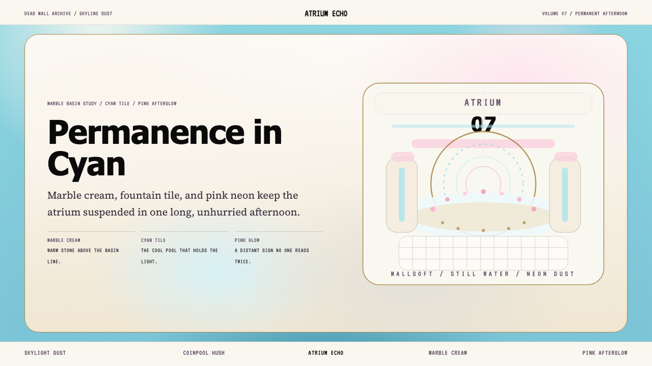
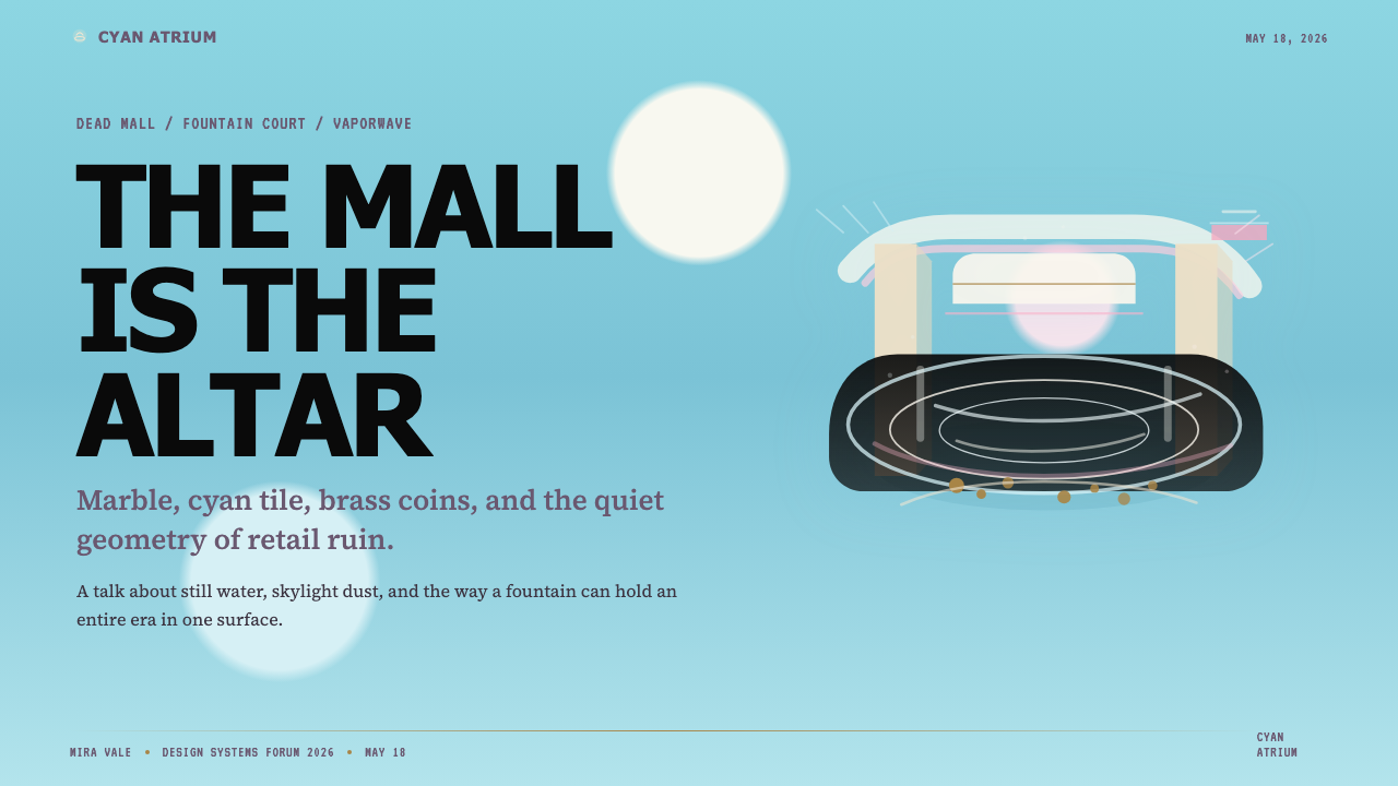
The dead mall's fountain still runs — cyan tile, marble cream, and a pink neon glow nobody reads anymore, suspended in permanent, beautiful stillness.死去的购物中心喷泉依然运转——青瓷砖、奶油大理石,还有无人阅读的粉色霓虹微光,凝固在永恒而美丽的静止之中。
Mall Fountain Vaporwave in briefMall Fountain Vaporwave 速览
Mall Fountain Vaporwave is a design aesthetic rooted in the visual memory of the enclosed American shopping mall at its zenith and its long, melancholy decline. It draws from the specific palette of the atrium fountain — muted cyan tile, warm marble veining, diffuse skylight white, and the distant blush of a perfume-counter neon sign — and merges it with the dreamy, time-collapsed sensibility of vaporwave music culture.Mall Fountain Vaporwave(购物中心喷泉蒸汽波)是一种植根于美国封闭式购物中心全盛期及其漫长衰落过程中视觉记忆的设计美学。它萃取了中庭喷泉的特定色调——柔和的青瓷色瓷砖、温暖的大理石纹理、天窗漫射的白光,以及香水柜台霓虹灯那遥远的玫瑰色微光——并将其与蒸汽波音乐文化梦幻而时间错位的感性融为一体。
Where classic vaporwave leans into digital glitch, bright magenta, and Greco-Roman statuary, Mall Fountain Vaporwave is quieter and more architectural. The mood is closer to standing alone in a two-story atrium at eleven on a Tuesday morning: escalators descending to shuttered anchor stores, pennies glinting on a tile basin floor, the ambient hum of recirculating water as the only sound. Everything is slightly faded, slightly dusty, slightly too still.与经典蒸汽波偏向数字故障、明艳洋红和希罗风格雕像不同,Mall Fountain Vaporwave 更安静,也更具建筑感。它的氛围更接近于某个周二上午十一点独自站在两层中庭里的感受:自动扶梯通向永远关闭的百货公司,硬币在瓷砖水池底部微微闪光,循环水的低鸣是唯一的声音。一切都略显褪色,略积尘埃,略显过于静止。
The visual system that derives from this mood refuses saturated color and sharp contrast. Tones are soft, almost pastel, but not cheerful — they are the pastels of something that has been in fluorescent light too long. Typography mixes the utilitarian legibility of a mall directory with the warmer curves of a 1980s retail brochure. Geometry follows the fountain basin: curved, never angular, never confrontational. The overall effect is a designed melancholy — beautiful because it remembers something, and sad because that something is gone.从这种氛围衍生出的视觉系统拒绝饱和色彩与强烈对比。色调柔和,近乎粉彩,但并不欢快——它们是某种在荧光灯下停留太久的事物所具有的那种粉彩。字体在商场目录的实用易读性与1980年代零售宣传册的温柔曲线之间游走。几何形态追随喷泉盆地:弧形流动,从不尖锐,从不对抗。整体效果是一种经过设计的忧郁——美丽,因为它记得某些东西;悲伤,因为那些东西已然消逝。
See the Mall Fountain Vaporwave design system查看 Mall Fountain Vaporwave 完整设计系统
Where does Mall Fountain Vaporwave come from?Mall Fountain Vaporwave 从何而来?
The enclosed regional shopping mall was invented in its modern form by Austrian-American architect Victor Gruen, whose Southdale Center in Edina, Minnesota (1956) introduced the climate-controlled, inward-facing atrium model that would define American suburban retail for the next four decades. Gruen's original vision was utopian — the mall as a democratic public square, a European piazza transplanted into the American suburb — but what actually emerged was a commercial machine tuned for maximum consumption. The atrium fountain, a fixture of nearly every large regional mall built between the 1960s and 1990s, became the physical and symbolic heart of that machine: decorative, non-functional, permanently running, a reason to linger.现代形式的封闭式区域购物中心由奥地利裔美国建筑师维克多·格鲁恩发明——他于1956年在明尼苏达州伊代纳设计的南谷购物中心,引入了气候可控、向内聚焦的中庭模式,这一模式在此后四十年里定义了美国郊区零售的面貌。格鲁恩最初的构想是乌托邦式的——购物中心作为民主的公共广场,是移植到美国郊区的欧洲广场——但实际诞生的是一台为最大化消费调校的商业机器。中庭喷泉,几乎是1960至1990年代每一座大型区域购物中心的标配,成为这台机器的物理与象征核心:装饰性的、非功能性的、永久运转的,一个让人驻足的理由。
The peak of the enclosed mall — roughly 1975 to 1990 — produced a specific visual culture: the particular cyan of ceramic tile, the warm grain of faux-marble floor, the diffuse glow of skylights supplemented by recessed fluorescent banks, the italic scripts of department store logos in warm gold or coral. These were not designed as an aesthetic system; they were practical choices constrained by 1970s and 1980s material availability and retail convention. But together they constituted a total sensory environment that millions of Americans experienced as the default backdrop of childhood and adolescence.封闭式购物中心的全盛期——大致从1975年到1990年——孕育了一种特定的视觉文化:陶瓷砖特有的青色、仿大理石地板温暖的纹路、天窗漫射光与嵌入式荧光灯组叠加的柔和光晕、百货公司标志以温暖金色或珊瑚色呈现的斜体字迹。这些元素并非作为一套美学系统被刻意设计;它们是受制于1970至80年代材料供给与零售惯例的实用选择。但合在一起,它们构成了一个完整的感官环境,数以百万计的美国人将其体验为童年与青春期的默认背景。
The decline began in the 1990s with the rise of big-box retail, e-commerce, and demographic shifts away from suburban cores. By the 2000s, dead malls — emptied anchor stores, shuttered kiosks, fountains still running in empty atriums — had become a subject of documentary fascination. Photographers like Seph Lawless and Brian Ulrich produced haunting records of these liminal spaces: interiors where time appeared to have stopped, where the commercial infrastructure of optimism persisted long past its context. Their work circulated widely online and intersected with a growing internet subculture attuned to nostalgia, melancholy, and the uncanny beauty of abandoned spaces.衰退始于1990年代,大型连锁折扣店的兴起、电商的扩张以及人口结构向郊区核心以外的迁移共同推动了这一进程。到2000年代,死亡购物中心——空置的主力百货、关闭的摊位、依然在空荡中庭运转的喷泉——成为纪实摄影关注的对象。塞夫·劳利斯和布莱恩·乌尔里希等摄影师留下了这些边界空间令人心悸的影像记录:时间仿佛停止的内部,乐观主义的商业基础设施在其语境消亡后依然顽固延续。他们的作品在网络上广泛流传,与一个日益壮大的网络亚文化相交汇——那个亚文化对怀旧、忧郁以及废弃空间的神秘之美有着特殊的感应。
Vaporwave emerged as a music and visual genre around 2010 to 2012, with Macintosh Plus (the project of producer Vektroid) and its 2011 album Floral Shoppe providing a widely cited landmark. The genre sampled and slowed smooth jazz, elevator music, and corporate background audio from the 1980s and early 1990s, wrapping it in imagery of classical statues, glitched television, Japanese consumer electronics, and early internet graphics. The mall fountain became a natural node where vaporwave aesthetics and dead-mall photography converged: both were about the wreckage of a specific optimism, the eerie persistence of consumer infrastructure, and the strange beauty of a world that kept running after its purpose had departed.蒸汽波作为音乐与视觉流派大约在2010至2012年间涌现,Macintosh Plus(制作人Vektroid的项目)于2011年发布的专辑《Floral Shoppe》是被广泛引用的里程碑。这一流派对1980至90年代初的轻音乐、电梯音乐和企业背景音乐进行采样与降速处理,以古典雕像、故障电视、日本消费电子产品和早期互联网图形作为视觉包装。购物中心喷泉成为蒸汽波美学与死亡购物中心摄影的自然交汇点:两者都关乎某种特定乐观主义的废墟,关乎消费基础设施的诡异持续,关乎一个在目的离去后仍继续运转的世界所拥有的奇异美感。
What defines the Mall Fountain Vaporwave look?Mall Fountain Vaporwave 的视觉特征是什么?
Color色彩
The palette centers on three anchor tones — a muted, slightly grayed cyan recalling ceramic fountain tile; a warm cream or off-white evoking veined marble and aged skylighting; and a soft, distant pink suggesting neon viewed through dusty air or frosted glass. These three tones are never deployed at full saturation. Every hue is pulled back, as though slightly exposed to decades of diffuse fluorescent light. Accent moments — a brighter aqua, a deeper rose — appear sparingly, functioning like the glint of a coin on a pool floor rather than as dominant color events.色板以三种核心色调为轴心:一种柔和的、略带灰调的青色,令人联想到陶瓷喷泉瓷砖;一种温暖的奶油色或灰白色,唤起纹理大理石与老化天窗的质感;以及一种柔和而遥远的粉色,如同透过积尘空气或磨砂玻璃看到的霓虹。这三种色调从不以完全饱和的状态出现,每一种都被拉回,仿佛略微经历了数十年漫射荧光的褪色。点缀性的强调——较明亮的水绿色、较深的玫瑰色——仅偶尔出现,功能上如同水池底部硬币的闪光,而非支配性的色彩事件。
Tone and Mood色调与氛围
Everything in this system is tuned slightly flat and slightly faded, as though photographed through a skylight that has not been cleaned since the early 1990s. Contrast is low to medium — forms read clearly but never snap against their backgrounds. The visual temperature is neither warm nor cool but somewhere between, the way a marble floor holds the ambient temperature of a large interior rather than the heat of direct sunlight. This deliberate flatness is not a lack of craft; it is the primary emotional carrier of the aesthetic.这套系统中的一切都被调校得略显平淡、略显褪色,仿佛透过一扇自1990年代初起就未曾清洁过的天窗所摄。对比度处于低到中等的区间——形体清晰可辨,但绝不从背景中突然弹出。视觉温度不冷不暖,介于两者之间,如同大理石地板承载着宽阔内部空间的环境温度,而非直射日光的热度。这种刻意的平淡并非工艺的缺失,而是这套美学首要的情感载体。
Typography字体排印
The typographic register shifts between two poles that coexisted in the 1980s mall: the clean, slightly condensed sans-serif of wayfinding signage and directory boards, and the warmer, rounder serif or script letterforms of department store branding and promotional materials. Neither is used at extremes. Body text is set with generous tracking to create an airy, unhurried quality. Headline type sits at medium weight — not the bold of an urgent announcement, but the assured weight of a sign that expects to be there for decades. Mixed-case is preferred over all-caps; the mood is ambient, not shouting.字体语域在1980年代购物中心共存的两极之间游走:导视系统与目录牌那种干净、略微紧缩的无衬线字体,以及百货品牌与促销材料中较温暖、较圆润的衬线或手写字体。两者都不被推向极端。正文字距宽松,制造一种通透而从容的品质。标题字体字重居中——不是紧急公告的粗重,而是一块预期将在那里悬挂数十年的指示牌所具有的从容分量。大小写混排优于全大写;氛围是环境性的,而非呼喊性的。
Geometry and Form几何与形态
Shapes follow the logic of the fountain basin: curved, rounded, never sharply cornered. Dividers are soft arcs rather than hard lines. Card and container edges carry a generous radius. Decorative motifs, where they appear, reference tilework patterns — repeated small tessellations, symmetrical arrangements that suggest a floor or wall surface. There is no aggressive diagonal energy, no constructivist tension. The geometry is patient, as though it has been waiting in place for thirty years.形态遵循喷泉盆地的逻辑:弧线流转,边角圆润,从不出现尖锐的转角。分割线是柔和的弧,而非硬直的线。卡片与容器的边缘具有宽裕的圆角半径。装饰性母题(若出现)引用瓷砖拼贴图案——重复的小型镶嵌,对称排列,令人联想到地面或墙面。没有激进的斜向动势,没有构成主义的张力。几何形态是耐心的,仿佛它在原地等待了三十年。
Light and Atmosphere光线与氛围
Lighting in this system is diffuse and non-directional — the way skylight spreads through an atrium without casting a definitive shadow. Glows are soft, wide, and low-intensity: a pale aqua bloom around a fountain element, a faint warm halo above a heading. Shadows, where they exist, are barely-there — very soft, very low contrast, suggesting depth without committing to a light source. This atmospheric softness is the antithesis of the hard shadow used in bolder contemporary styles; it keeps everything suspended in the same ambient luminosity.这套系统中的光线是漫射的、非方向性的——如同天光透过中庭散布,不投下任何明确的阴影。光晕柔和、宽阔、低强度:喷泉元素周围淡淡的水绿色光晕,标题上方隐约的暖色光圈。投影(若存在)若有若无——极柔和,对比度极低,暗示深度而不锁定光源。这种大气性的柔软是更强硬的当代风格所用硬边投影的对立面;它让一切悬浮在同一环境亮度之中。
Texture and Surface质感与表面
Unlike strict flat-design systems, Mall Fountain Vaporwave permits — even invites — subtle surface texture. A faint grain suggesting a slightly dusty photograph, a very light noise layer that softens banding in gradients, a barely visible geometric tile pattern as a background element. These textures are never loud; they operate at the threshold of perception, the way dust on a glass surface is only visible at certain angles. They add tactility and temporal weight without decorating aggressively.与严格的扁平设计系统不同,Mall Fountain Vaporwave 允许——甚至欢迎——微妙的表面质感。一种隐约的颗粒感,暗示一张略带尘埃的照片;一层极轻的噪点,柔化渐变中的色带;一个几乎不可见的几何瓷砖图案作为背景元素。这些质感从不张扬;它们在感知的阈值上运作,如同玻璃表面的尘埃只在特定角度才可见。它们增添触感与时间重量,而不过度装饰。
Negative Space负空间
Space is used generously and purposefully. The atrium model — a large open volume surrounded by retail at the periphery — translates into layouts where content occupies a centered channel and wide margins are left to breathe. There is no fear of emptiness; emptiness is part of the mood. A heading floating in a wide cream field, a single fountain-motif icon centered in a section — these are not failures of content planning but deliberate evocations of the specific quiet of a half-empty mall on a slow afternoon.空间被宽裕而有目的地使用。中庭模式——一个宽阔的开放体量,周边被零售单元包围——转化为内容占据居中通道、两侧留有宽阔呼吸边距的版面布局。对空白毫无恐惧;空白本是氛围的组成部分。一个标题漂浮在宽阔的奶油色区域,一个单独的喷泉母题图标居中于某个版块——这些不是内容规划的失败,而是对某个慵懒下午半空购物中心那种特定静谧的刻意唤起。
See the Mall Fountain Vaporwave design system查看 Mall Fountain Vaporwave 完整设计系统
Who shaped Mall Fountain Vaporwave?谁塑造了 Mall Fountain Vaporwave?
The Austrian-American architect whose 1956 Southdale Center in Minnesota established the enclosed atrium mall as the dominant form of American suburban retail. Gruen intended the mall as a civic space — a pedestrian commons for the car-dependent suburb — but the commercial logic of his clients transformed it into a consumption machine. The atrium fountain was central to his spatial vision: a focal point that gave the interior its identity and invited lingering. Gruen later expressed regret at what his invention had become, but the visual culture he established — the tile, the marble, the diffuse light — persisted for decades and forms the primary aesthetic source material for this design system.这位奥地利裔美国建筑师于1956年在明尼苏达州设计了南谷购物中心,确立了封闭式中庭购物中心作为美国郊区零售主导形态的地位。格鲁恩的初衷是将购物中心打造为公共空间——依赖汽车出行的郊区的步行公共场所——但委托方的商业逻辑将其转化为一台消费机器。中庭喷泉是他空间构想的核心:一个赋予内部空间身份认同、邀请人们驻足的焦点。格鲁恩后来表达了对自己发明所变成之物的遗憾,但他所建立的视觉文化——瓷砖、大理石、漫射光——延续了数十年,构成这套设计系统的首要美学源材料。
An American photographer whose ongoing series documenting abandoned shopping malls — including the widely circulated images of Ohio's Rolling Acres Mall, Columbus's Cloverleaf Mall, and dozens of others across the Rust Belt and Sun Belt — provided the definitive visual vocabulary of dead-mall aesthetics. Lawless's work captures the specific qualities that Mall Fountain Vaporwave translates into design: the aqua of drained fountain tile, the marble-cream of empty atriums, the ghostly pink of dormant neon, and the uncanny stillness of commercial space without commerce. His images circulated through Tumblr, Reddit, and early social media during the 2010s, seeding the liminal-space aesthetic across internet culture.这位美国摄影师记录废弃购物中心的持续系列——包括俄亥俄州滚动草坪购物中心、哥伦布三叶草购物中心以及锈带和阳光地带数十座其他购物中心的广泛流传影像——为死亡购物中心美学提供了决定性的视觉词汇。劳利斯的作品捕捉了Mall Fountain Vaporwave转化为设计的那些特定品质:已排水喷泉瓷砖的水绿色,空旷中庭的大理石奶油色,休眠霓虹灯幽灵般的粉色,以及没有商业活动的商业空间所具有的神秘静止。2010年代,他的影像通过Tumblr、Reddit和早期社交媒体流传,将边界空间美学播撒于网络文化之中。
The recording project of Portland-based producer Vektroid, whose 2011 album Floral Shoppe is widely regarded as the landmark text of vaporwave as a genre. The cover image — a pink-tinted classical bust against a soft aqua ground — and the music itself, which slows and pitch-shifts 1980s smooth jazz and corporate audio into something dreamlike and slightly wrong, defined the emotional register that Mall Fountain Vaporwave inherits. Vektroid's work demonstrated that nostalgia and critique could occupy the same aesthetic space: the album sounds like a department store PA system heard from the bottom of a swimming pool, which is to say, beautiful and lost.波特兰制作人Vektroid的录音项目,其2011年专辑《Floral Shoppe》被广泛视为蒸汽波作为流派的里程碑文本。封面图像——粉色调古典半身像置于柔和水绿色底面——以及专辑音乐本身(将1980年代轻音乐和企业背景音频降速变调为某种梦幻而略显错位的声音)定义了Mall Fountain Vaporwave所继承的情感语域。Vektroid的作品证明了怀旧与批判可以占据同一美学空间:这张专辑听起来像是从游泳池底部传来的百货公司广播,换言之,既美丽又迷失。
A Chicago-based photographer whose long-running projects Copia and Dark Stores document American retail spaces in decline — from liquidation sales to full abandonment. Ulrich's work, exhibited at major museums and published in book form, brought the visual language of dead retail to fine art audiences. His images of empty department stores — the particular quality of light through a skylight over silent escalators, the chromatic relationship between terrazzo floors and fluorescent ceiling panels — are art-historical documents of the same visual environment that defines this aesthetic system.这位芝加哥摄影师长期进行的项目《Copia》和《暗店》记录了美国零售空间的衰退——从清货甩卖到完全废弃。乌尔里希的作品在各大博物馆展出,并以书籍形式出版,将死亡零售的视觉语言带入纯艺术受众视野。他拍摄的空旷百货公司影像——天窗透过寂静自动扶梯上方投下光线的特定质感,水磨石地板与荧光灯天花板之间的色彩关系——是定义这套美学系统的那个视觉环境的艺术史学文献。
The founder of deadmalls.com, an archive established in 2000 that catalogued struggling and closed shopping malls across the United States with visitor photographs, floor plans, and community memories. The site became an early internet memorial for the enclosed mall form, and its aesthetic — amateur photography under fluorescent light, the particular way a security gate looks pulled halfway down in front of a dark storefront — is part of the visual substrate from which Mall Fountain Vaporwave draws. Middleton's project demonstrated that the dead mall was not merely an economic statistic but a felt loss for communities whose social life had organized around these spaces.deadmalls.com的创始人,这个建立于2000年的档案馆通过访客照片、平面图和社群记忆,记录了全美苦苦挣扎和已关闭的购物中心。该网站成为封闭式购物中心形式的早期网络纪念碑,其美学——荧光灯下的业余摄影,半拉下的安全卷帘门在黑暗店面前的特定样貌——是Mall Fountain Vaporwave所汲取的视觉底层的组成部分。米德尔顿的项目证明,死亡购物中心不仅仅是一个经济统计数据,而是那些曾将社交生活组织于这些空间的社群所感受到的真实失落。
How do you use Mall Fountain Vaporwave today?今天怎么用 Mall Fountain Vaporwave?
Mall Fountain Vaporwave suits contexts where you want to evoke a mood of contemplative nostalgia — a gentle melancholy that is beautiful rather than depressing, atmospheric rather than urgent. It is not a rational, authority-signaling style in the manner of Swiss International Style or Bauhaus; it is an emotional style, and its primary function is to make the viewer feel a specific quality of stillness and wistful recognition. Applying it correctly means understanding that everything should feel slightly faded, slightly unhurried, as though the design itself has been there for a while and is entirely comfortable with that.Mall Fountain Vaporwave 适合那些希望唤起沉思性怀旧情绪的场合——一种温柔的忧郁,美丽而非压抑,大气而非紧迫。它不像瑞士国际主义风格或包豪斯那样是一种传递理性与权威感的风格;它是一种情感性风格,其首要功能是让观者感受到一种特定的静谧与追忆共鸣。正确应用它,意味着理解一切都应略显褪色、略显从容,仿佛这套设计本身已在那里存在了一段时间,并对此完全自在。
For presentation slides, the system handles both atmospheric covers and quieter content pages well. A cover slide benefits from a wide, low-contrast field — a soft cyan-to-cream gradient occupying most of the frame, with a heading set in rounded medium-weight type centered or offset slightly downward, and a single small fountain or tile motif as a decorative anchor. Content slides should use generous margins, readable body text at relaxed tracking, and section dividers rendered as soft arcs or thin curves rather than hard rules. Data slides work well when charts are desaturated to match the palette — bar charts in muted aqua, comparison columns in cream and rose — treating data as ambient information rather than urgent metrics.在演示文稿中,这套系统在大气封面页和较安静的内容页上都表现良好。封面幻灯片适合宽阔、低对比度的底面——柔和的青色到奶油色渐变占据大部分画面,居中或略向下偏移的圆润中字重标题,以及一个小型喷泉或瓷砖母题作为装饰锚点。内容页应使用宽裕的边距、宽松字距的易读正文,以及以柔和弧线或细曲线(而非硬直线)呈现的段落分割。数据页在图表被降饱和度以匹配色板时效果最佳——柱状图用柔和的水绿色,对比列用奶油色与玫瑰色——将数据作为环境信息而非紧迫指标呈现。
For web interfaces and digital products, this aesthetic suits landing pages, brand storytelling pages, editorial features, and membership or subscription pages where contemplative tone is an asset. It is less suited to action-heavy dashboards, real-time data tools, or any context where urgency and precision are primary values. On web, the approach involves wide content channels with substantial breathing room, background fields in cream or very pale aqua, body text in a warm near-black rather than pure black, and interactive states signaled through subtle color shifts — a card brightening slightly on hover — rather than hard contrast changes. Avoid bright calls-to-action that snap against the palette; primary buttons should feel like an invitation, not an instruction.对于网页界面与数字产品,这种美学适合落地页、品牌叙事页、编辑特写,以及沉思性基调是资产的会员或订阅页面。它较不适合动作密集的仪表板、实时数据工具,或任何以紧迫感和精确度为首要价值的场景。在网页上,方法是:宽阔的内容通道配以充裕的呼吸空间,背景底面用奶油色或极浅的水绿色,正文用温暖的近黑而非纯黑,交互状态通过微妙的色彩变化来示意——悬停时卡片略微提亮——而非强烈的对比度切换。避免与色板格格不入、跳出画面的高亮行动号召按钮;主要按钮应感觉像邀请,而非指令。
For editorial and marketing work, the style supports mood-driven campaigns and brand narratives that position a product or service around slowness, quality, and considered experience — spa and wellness brands, curated retail, boutique hospitality, cultural institutions. An editorial spread in this system uses wide margins, pull quotes in soft rounded type, and section photography treated with a slight overlay that pulls warm and desaturated. Marketing pages work best when they alternate between cream-ground and very pale aqua-ground sections, with the heading type staying consistent across both and the only bold moment being a single centered image — a fountain, a tile detail, a marble texture — used as the emotional anchor of the page.对于编辑与营销内容,这种风格支持以情绪驱动的品牌叙事和营销活动,适合将产品或服务定位于慢节奏、品质与审慎体验的品牌——水疗与健康品牌、精选零售、精品酒店、文化机构。采用这套系统的编辑跨页使用宽裕边距、以柔和圆润字体呈现的引用段落,以及经过轻微叠层处理使其偏暖、降饱和的配图。营销页面在奶油色底面与极浅水绿色底面版块交替时效果最佳,标题字体在两者之间保持一致,唯一醒目的时刻是一张居中的单幅图像——一座喷泉、一块瓷砖细节、一片大理石纹理——作为页面的情感锚点。
A common mistake when applying Mall Fountain Vaporwave is pushing the palette toward conventional vaporwave — adding bright magenta, increasing contrast, importing digital glitch effects or chrome type. These moves break the specific mood of the system. The correct reference is not a vaporwave playlist cover but the interior of a half-empty Macy's at 10 a.m. in 1988: quiet, slightly overlit, warm in its materials, and almost entirely devoid of urgency. Similarly, using too much pink, or using pink at full saturation, converts the melancholic blush of a distant neon sign into something festive and loses the melancholy entirely. The pink should always feel like something you have to look for.应用 Mall Fountain Vaporwave 时最常见的错误是将色板推向传统蒸汽波风格——加入明亮洋红,提高对比度,引入数字故障效果或镀铬字体。这些操作会破坏这套系统特定的情绪。正确的参照不是一张蒸汽波歌单封面,而是1988年早上十点一家半空梅西百货的内部:安静,略微过于明亮,材料温暖,几乎完全没有紧迫感。同样,使用过多粉色,或以完全饱和的状态使用粉色,会把遥远霓虹灯那种忧郁的玫瑰色晕转化为某种节庆感,从而彻底丧失忧郁。粉色应当始终感觉像是需要你去寻找的东西。
See the Mall Fountain Vaporwave design system查看 Mall Fountain Vaporwave 完整设计系统
Mall Fountain Vaporwave — FAQMall Fountain Vaporwave · 常见问题
How is Mall Fountain Vaporwave different from classic vaporwave?Mall Fountain Vaporwave 与经典蒸汽波有何不同?
Classic vaporwave — as typified by the visual language of the Floral Shoppe era — is high-contrast, often neon-saturated, and draws heavily from digital sources: glitched CRT screens, early 3D rendering artifacts, bright magenta and electric purple. Mall Fountain Vaporwave shares the temporal sensibility (a fixation on the cultural aesthetics of the 1980s and early 1990s) and the melancholic mood, but its visual register is quieter, more architectural, and more material. It draws from the physical world of the mall — ceramic, marble, skylight — rather than from the screen culture of the same era. Contrast is lower, color is less saturated, and the mood is contemplative rather than uncanny.经典蒸汽波——以《Floral Shoppe》时代的视觉语言为代表——对比度高,常常饱含霓虹感,大量汲取数字来源:故障的CRT屏幕、早期三维渲染的伪影,以及明亮的洋红与电气紫。Mall Fountain Vaporwave 共享那种时间感性(对1980至90年代初文化美学的痴迷)与忧郁情绪,但其视觉语域更安静、更具建筑感、更有材料质感。它汲取的是购物中心的物质世界——陶瓷、大理石、天窗——而非同一时代的屏幕文化。对比度更低,色彩饱和度更低,情绪是沉思性的,而非诡异性的。
Can this style work for brands that are not nostalgic or lifestyle-oriented?这种风格能用于非怀旧或非生活方式导向的品牌吗?
It is adaptable but requires honest assessment of fit. The style's emotional core — stillness, wistfulness, beautiful melancholy — is an asset for brands whose value proposition includes slowness, contemplation, and quality over efficiency: boutique hospitality, independent publishing, wellness, curated retail, cultural institutions. It is a poor fit for brands where urgency, precision, innovation, and speed are core values — fintech, SaaS dashboards, medical or legal tools. The risk is not merely aesthetic mismatch; it is that the mood of the system will override the message of the brand, making something feel quietly melancholy when it should feel confidently active.这种风格有适应性,但需要诚实评估契合度。其情感核心——静止、追忆、美丽的忧郁——对于价值主张包含慢节奏、沉思与品质优先于效率的品牌是一种资产:精品酒店、独立出版、健康、精选零售、文化机构。它与紧迫感、精确度、创新和速度是核心价值的品牌匹配度较差——金融科技、SaaS仪表板、医疗或法律工具。风险不仅仅是美学上的不匹配;而是这套系统的情绪会压过品牌的信息,使某些本应充满自信活力的东西显得悄然忧郁。
Is the soft gradient approach in this system acceptable when many design systems forbid gradients?这套系统中的柔和渐变处理方式是否可接受?毕竟许多设计系统禁止渐变。
Yes — but the type of gradient matters enormously. The gradients permitted here are extremely subtle tonal shifts between closely related hues, functioning more like the way a material surface reads under diffuse light than like the decorative gradients associated with dated or overdesigned work. A shift from pale aqua to cream across a wide background field is fundamentally different from a bright multi-stop gradient used to make a button appear three-dimensional. The test is whether the gradient draws attention to itself or simply creates an ambient field. In this system, a gradient that anyone notices is probably a gradient that has gone too far.是的——但渐变的类型至关重要。这里所允许的渐变是相邻色调之间极为微妙的色调偏移,功能上更接近材料表面在漫射光下的呈现方式,而非与过时或过度设计作品相关联的装饰性渐变。宽阔背景底面上从浅水绿到奶油色的偏移,与用于使按钮呈现三维感的多色阶明艳渐变,在本质上截然不同。检验标准是:这个渐变是否会将注意力吸引到自身,还是仅仅制造了一个环境底面。在这套系统中,任何被人注意到的渐变,大概都是走得太远的渐变。
How should photography or imagery be treated within this system?在这套系统中,摄影或图像应如何处理?
Imagery works best when it is treated as atmospheric rather than documentary. A photograph of a marble texture, a close-up of ceramic tile, a long-exposure interior shot of an empty atrium — these integrate naturally because they supply the material qualities the palette references. Portrait or product photography should be treated with a warm, desaturated grade that pulls the image into the palette rather than letting it pop in full color. Avoid high-contrast, sharply lit product shots; they introduce a visual urgency that conflicts with the system's mood. Imagery should feel like something retrieved from a photo archive rather than something shot this morning for a campaign.图像在被当作大气性而非纪实性素材处理时效果最佳。大理石纹理的照片、陶瓷瓷砖的特写、空旷中庭的长曝光内部镜头——这些元素能自然融入,因为它们提供了色板所引用的材料品质。人像或产品摄影应经过温暖、降饱和的调色处理,使图像融入色板,而非以全彩突出弹出。避免高对比度、强打光的产品拍摄;它们引入了一种与系统情绪冲突的视觉紧迫感。图像应感觉像是从照片档案中取出的,而非今晨为某个活动专程拍摄的。
What does getting this style wrong typically look like?这种风格用错了通常是什么样子?
The two most common failure modes are oversaturation and under-restraint. Oversaturation happens when the cyan becomes too bright, the pink too bold, the cream too white — the palette loses its dusty, slightly faded quality and starts reading as generic pastel or retro-pop. Under-restraint happens when too many visual events compete for attention: multiple typefaces, multiple accent colors, textures plus gradient plus motif all in the same composition. The style requires a confident subtlety — each element slightly soft, each decision slightly held back. A good test: if the design would feel completely comfortable in a 1987 Nordstrom brochure, it is probably right. If it looks like a vaporwave playlist cover from 2016, it has gone too far.两种最常见的失败模式是过度饱和与过度堆砌。过度饱和发生在青色变得太亮、粉色太粗犷、奶油色太白的时候——色板失去那种尘旧、略显褪色的品质,开始呈现为普通粉彩或复古流行感。过度堆砌发生在太多视觉事件争夺注意力的时候:多种字体、多种强调色、质感加渐变加装饰母题同时出现在同一构图中。这种风格需要一种自信的微妙——每个元素都略显柔和,每个决定都略有克制。一个好的测试:如果这套设计放在一本1987年的诺德斯特龙宣传册中会感觉完全自然,它大概是对的。如果它看起来像一张2016年的蒸汽波歌单封面,它就走得太远了。
Related design styles相关设计风格
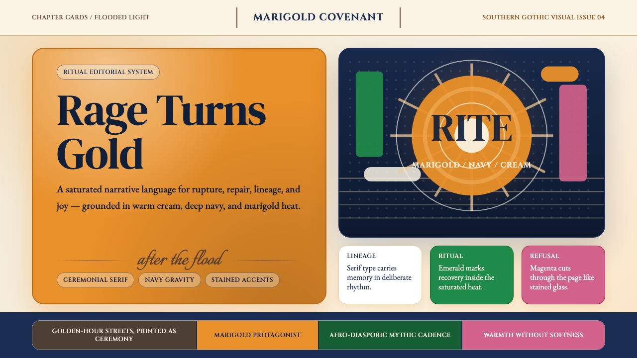 Beyoncé — LemonadeMythic heat refuses restraint. Marigold blocks, navy gravity, serif ceremony.神话般热度拒绝收敛。金盏黄块面、深海军蓝与仪式衬线成形。
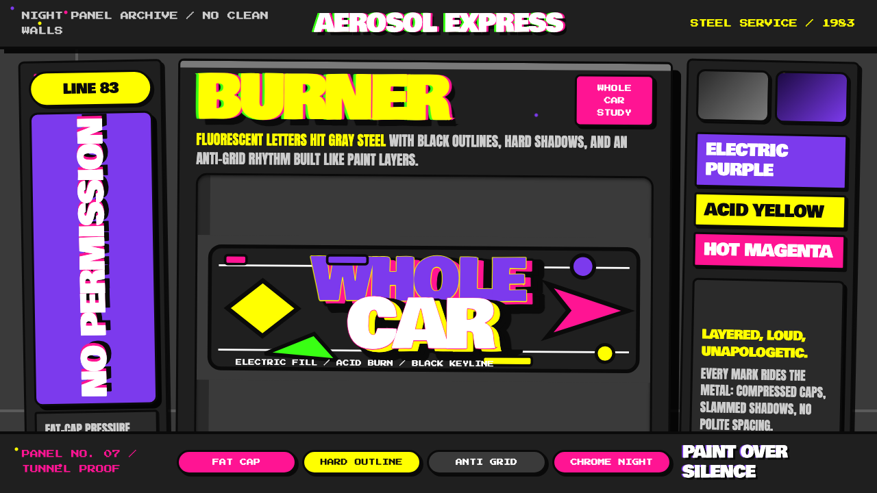 NYC Subway Graffiti (1983)Bombed steel gets loud. Electric purple and acid yellow stack as hard-outline…钢板被炸响:电紫与酸黄层叠,黑线框出狂野字形。
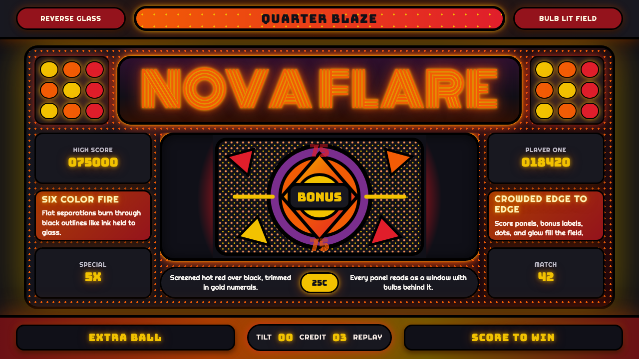 Pinball BackglassGlows like paid light. Monoton type, black outlines, orange-red halftones cro…像投币后的灯光燃起。Monoton 字体、黑描边与橙红半调挤满玻璃。
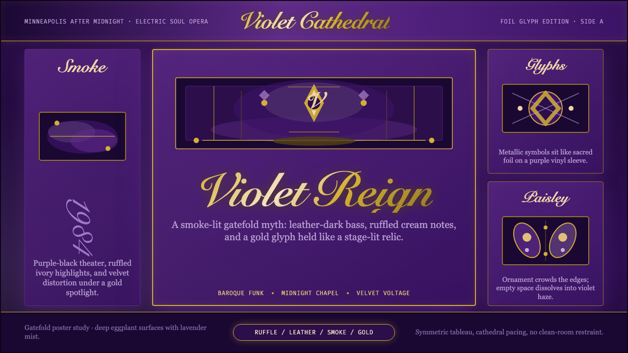 Prince — Purple Rain (1984)Decadence turns electric. Eggplant violet, gold foil glyphs, and smoky symmet…颓艳通电:茄紫、金箔符号与烟雾对称搭起神话舞台。
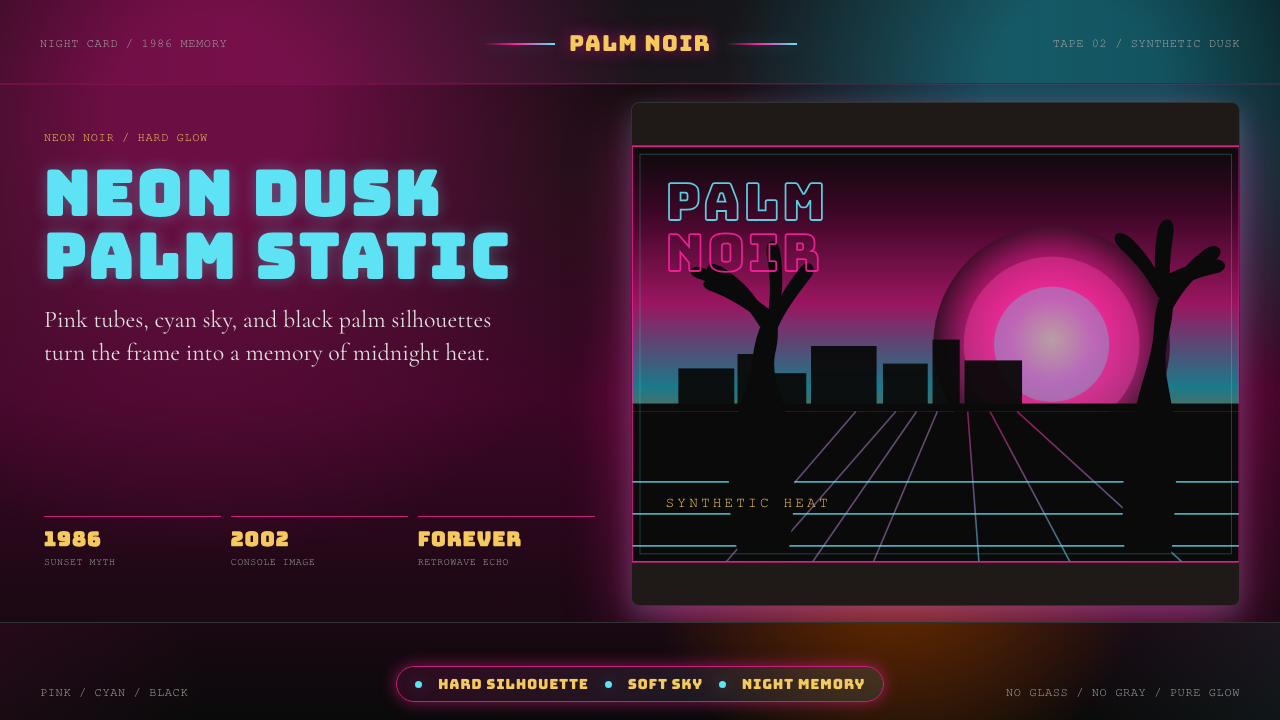 GTA Vice City (2002)Neon-noir nostalgia. Pink-cyan dusk, chunky type, and palm silhouettes.霓虹黑色怀旧。粉青黄昏、粗体字和棕榈剪影。
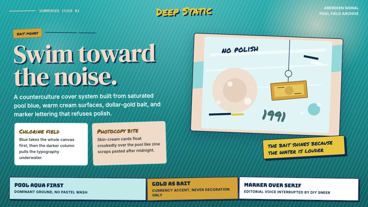 Nirvana — NevermindAnti-pop in pool blue. Cream cards, dollar-gold accents, and marker type roug…泳池蓝里的反主流:乳白卡片、美元金点缀与马克笔字打乱网格。