What is Mafalda?
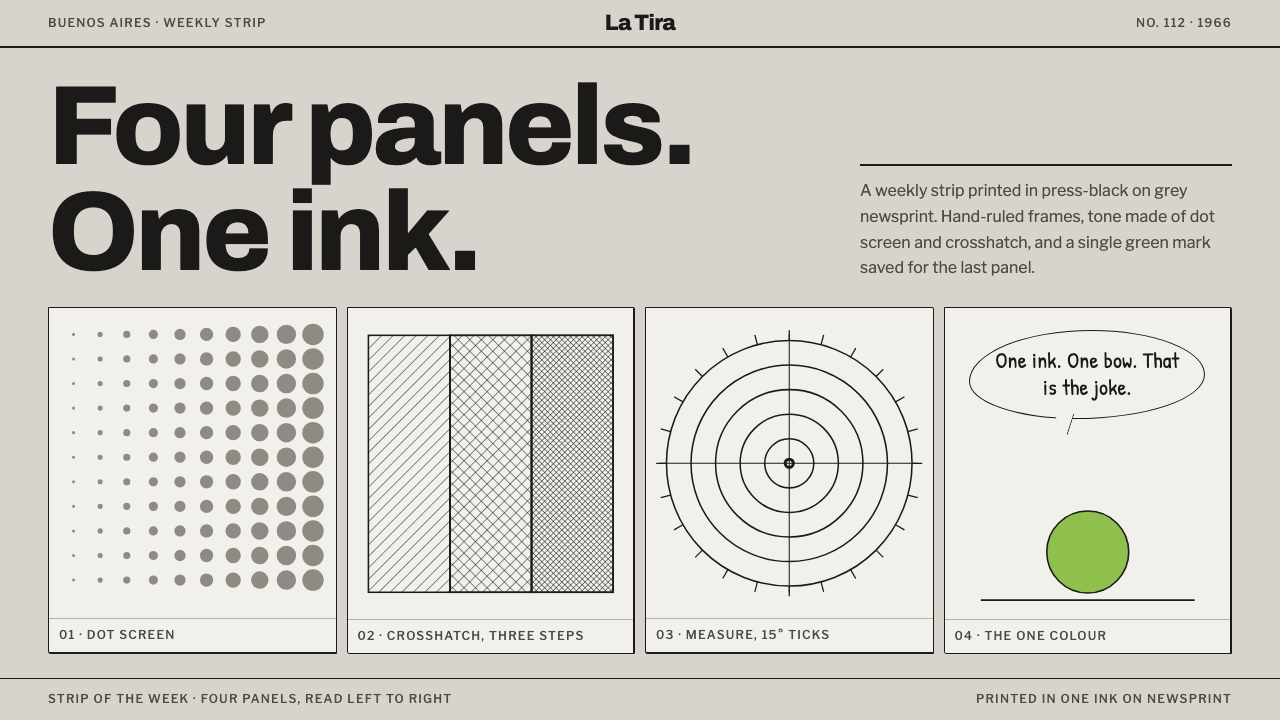
Mafalda is a style of one black ink on grey newsprint: hand-ruled four-panel strips, crosshatched shade and a single green bow used like a punchline.
Mafalda in brief
Mafalda, as a design style, is drawn from the way Quino's comic strip actually reached its readers in Argentina between 1964 and 1973: black ink printed into cheap, warm grey newsprint. A row of four equal panels forms the basic rhythm. Dialogue lives in hand-lettered balloons, each with a single tail. Rules are drawn by hand and are slightly uneven, tone is built from crosshatching and dot screens, and the only colour permitted is the pale green of Mafalda's dress and hair bow, used once, like a punchline.
The governing principle is that everything is printed into the paper rather than floated above it. There are no glowing surfaces, no soft shadows and no gradients that suggest a light source. Ink soaks into a page that is already grey and slightly rough, and the page is allowed to show through. The visual world is small and domestic: a living room, a street corner, a school desk. It works because the drawing is spare enough to leave room for the words.
The tone is humane and sharp. Mafalda is a six-year-old who asks adult questions about soup, about the state of the world and about war, and her creator drew her with a handful of lines. The style carries that mix of tenderness and bite: plain and friendly on the surface, with a short argument waiting in the last panel. It suits interfaces and publications that want to say serious things in a light voice.

Where does Mafalda come from?
Quino was the pen name of Joaquín Salvador Lavado Tejón, a humorist and cartoonist born in Mendoza in 1932. Mafalda began as an idea for an advertising strip, a family of characters meant to promote a brand of household appliances; the campaign never ran, but the characters remained. In September 1964 the girl appeared in the Buenos Aires weekly Primera Plana, and she soon became a regular strip. She moved to the daily newspaper El Mundo and later to the magazine Siete Días, and Quino ended the series himself in 1973, after nine years.
The strip belongs to the Argentine tradition of the historieta, the serial comic, and in particular to the four-panel newspaper strip that builds a small scene, develops it and turns it on the last panel. Its background was the Buenos Aires middle class of the 1960s: a decade of Cold War anxiety, the war in Vietnam, the arrival of the Beatles, and political instability at home that included a military coup in 1966. Mafalda rarely needed to name a politician. Her mother, her father, her friends and her pet turtle, named Bureaucracy, were enough to let a child's question about the world land as social comment. That is the strip's lasting method: satire carried by innocence.
The visual style was a product of printing. Newspaper presses of the day printed in one black ink on cheap grey-brown paper, so Quino drew for that medium: strong outlines, areas of solid black, shading built from lines and dots that could survive being reproduced at speed. Panels were ruled by hand, and balloons were lettered by hand, which gave the pages their uneven human warmth. Collected editions spread the strip quickly through Latin America, Spain and beyond, and the Italian edition was introduced by the writer Umberto Eco. Colour came late, with a television animation in 1979. By then the black-and-white look was already the one people carried in their heads.
As a design system, Mafalda keeps what the press imposed and Quino perfected. The page is newsprint grey rather than white; the text and lines are printing black; the borders are hand-drawn and uneven; the shade is hatching and dots. Four panels in a row are the basic unit, and speech sits in balloons with one tail. The only colour is the light green of Mafalda's dress and bow, and the statue of her that now sits on a street corner in Buenos Aires wears the same green. That green is used once in a composition, the way the last panel of a strip is used, to say the thing everything else has been building toward.
What defines the Mafalda look?
Newsprint Ground
The page is never pure white. It is the warm grey of cheap newsprint, slightly toned and slightly rough, with black ink sitting in it at full strength. Because the ground is already dull, the black reads as crisp and the whole surface as a printed object instead of a lit screen. Large clean areas of paper are part of the composition.
One Ink
A single black does all the work. There are no mid-grey fills and no tints: tone comes from how densely lines and dots are packed, not from changing the colour. Text, outlines, shadows and decoration are all the same ink, which gives every page a unity that a multi-colour palette could not.
Tone by Crosshatch
Shade is built from fine parallel lines, crossed lines and dot screens, laid down in short, slightly irregular strokes. Hatching suggests volume, darkness, and sometimes a mood, such as the heavy lines that gather behind an angry character. Used on interface elements it becomes a texture for secondary or inactive areas, never a flat grey fill.
Hand-Ruled Frames
Panel borders are drawn with a pen and a ruler, and they show it: line weight shifts slightly, corners overshoot or fall short, and gaps between frames are narrow and not perfectly even. This small imperfection is what keeps a rigid grid warm. The frames are tools for pacing a story, not containers for decoration.
Four-Panel Rhythm
Four equal panels in a row are the basic unit. The first sets the scene, the second and third develop it, and the last turns it, often with a line of quiet absurdity. The rhythm is not only for comics: any sequence of four steps, an onboarding flow, a short argument, a before-and-after, can borrow it, with the payoff held for the final frame.
Hand-Lettered Balloons
Speech is hand-lettered in upright capitals that vary in weight for emphasis, set inside irregular ovals with a single tail pointing to the speaker. The lettering is uneven by design, with spacing that tightens and loosens like speech. There is no typographic polish, and none is wanted. The balloon is a place where a voice sits, not an ornament.
The Single Green
One light green, borrowed from Mafalda's dress and bow, is the only colour in the system. It appears once in a composition, on one object or one word, and its force comes from scarcity. Using it a second time dilutes it; using it three times turns the system into an ordinary two-colour design.

Who shaped Mafalda?
Quino, born in Mendoza in 1932, was the Argentine cartoonist who created and drew Mafalda for nine years. His line is economical: a few strokes for a face, a handful of props for a room, and a last panel doing most of the work. He ended the series in 1973 of his own accord, and the strip has been reprinted continuously ever since.
The six-year-old title character is a sceptical, soup-hating child who worries about the state of the world and loves the Beatles. She asks questions that adults have stopped asking, and her pet turtle is named Bureaucracy. Visually she is a round face, a mop of dark hair and a bow, and her light green is the system's single permitted colour.
Mafalda's dreamy, anxious friend, who loves adventure stories and dreads school and the teacher. He is the strip's gentle foil, and a good example of how much emotion Quino could extract from a few lines around the mouth and eyes.
The grocer's son, who dreams of business empires and distrusts talk of social change. He is Mafalda's sparring partner on money and ambition, and a reminder of how the strip lets opposing views argue inside a single frame without anyone being turned into a villain.
A friend whose ambition is to marry well and have many children. She gossips, plans the future in detail and holds conventional views that Mafalda gently pokes at. She stands for the expectations placed on girls of her generation, and the strip uses her to keep its satire humane rather than cruel.
How do you use Mafalda today?
Mafalda is best used when a subject calls for a gentle voice with a spine: civic education, children's and family publishing, essays, opinion newsletters, cultural institutions, community projects and any product whose tone is warm but not naive. Its value is that it makes seriousness approachable. A page in this style says that clever people do not need glossy surfaces.
For presentations, a cover can be one oversized hand-ruled panel on grey newsprint, with the title lettered as a balloon and the single green appearing on one word. Content slides work as a row of four panels in which three set up an argument and the last delivers it. Data slides should draw bars and areas in hatching and dot screens, not in fills, with the green marking the single number the audience should remember.
For web interfaces, a warm grey ground, black type and hand-ruled borders make a calm, readable shell for editorial products, learning platforms and community tools. Onboarding becomes a four-panel sequence; an empty state or an error page can carry a small drawn scene. Use the green for one primary action per view. Avoid gradients and shadows altogether; where depth is needed, add a short run of hatching beside the edge instead.
For editorial and marketing work the style is at its best. Newsletters, explainer pages, annual reports for non-profits, school materials and book covers can lean on panels as units of argument, with captions lettered in the balloon style and short, plain sentences. Photography should be rare; when it appears, convert it to coarse black-and-white halftone so that it sits in the paper like the drawings do.
The most common mistake is to use the colour freely: the style depends on there being one green and nothing else. A second mistake is to make the borders mechanically perfect, which turns a printed, human page into a generic grid. A third is to read the style as simply cute. Mafalda is funny because it is sharp, so the voice must keep an edge, and the layout should keep the last panel for the point.

Mafalda — FAQ
How is this different from American newspaper strips like Peanuts?
They share a lineage. Both are daily strips in which children ask adult questions in a small, spare drawing style. Mafalda is more crosshatched and more explicitly engaged with the politics of its time, and its visual world is that of a Buenos Aires apartment block rather than a suburban lawn. In design terms, Mafalda leans on dense black areas and hand-lettered balloons where the American strip leans on a looser, airier line.
Why is there only one colour?
Because the strip was printed in black ink on newsprint, and colour belonged to later adaptations. The design system turns that historical fact into a rule: a single green, borrowed from the character herself, appears once in a composition. The scarcity is what lets it work as a punchline. A second accent colour would make the page ordinary.
Can the style be used digitally without looking childish?
Yes, if the voice stays dry. The childlike elements are the simple drawing and the plain speech; the content is satirical and adult. Keep the text intelligent and short, let the hand-ruled structure carry the page, and resist the temptation to add cartoon mascots and rounded buttons. The more the layout behaves like a good newspaper page, the less childish it looks.
How should hatching be used in an interface?
Sparingly, and only where a texture says something. A fine diagonal hatch can mark a disabled area, a secondary surface, the shaded side of a card or a bar in a chart, in place of a grey fill. It should be applied in short, slightly irregular runs rather than as a mechanical pattern, and kept away from text so reading stays clean.
Where does the style struggle?
It struggles in contexts that need formality, dense data or glossy polish: financial products, enterprise software with heavy tables, luxury branding. Its warmth and hand-made feel can undermine the seriousness those contexts depend on. It also asks for patience with whitespace and short text, so it fits poorly where screens must show a great deal at once.
Related design styles
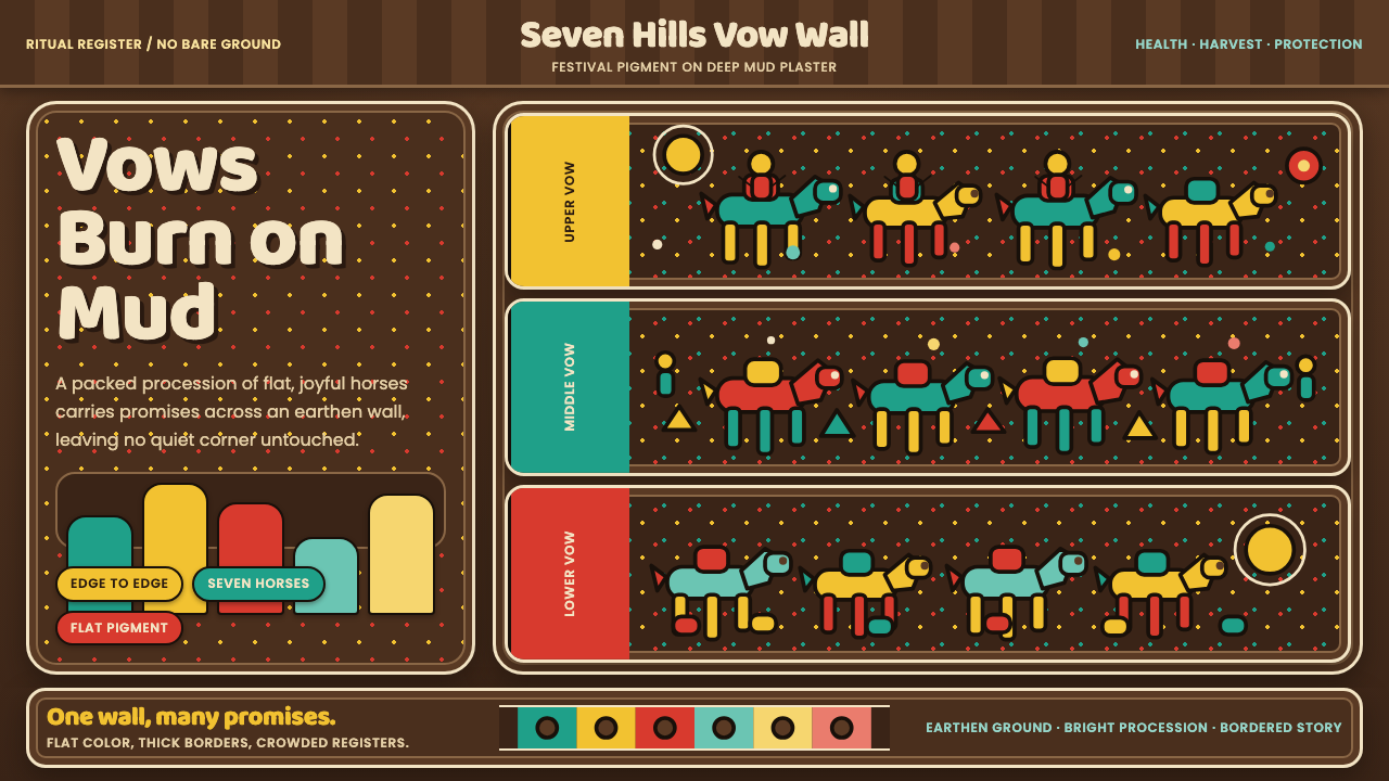 Pithora Rathwa Ritual WallVows fill the wall. Bright horse rows crowd deep mud-brown plaster edge to ed…
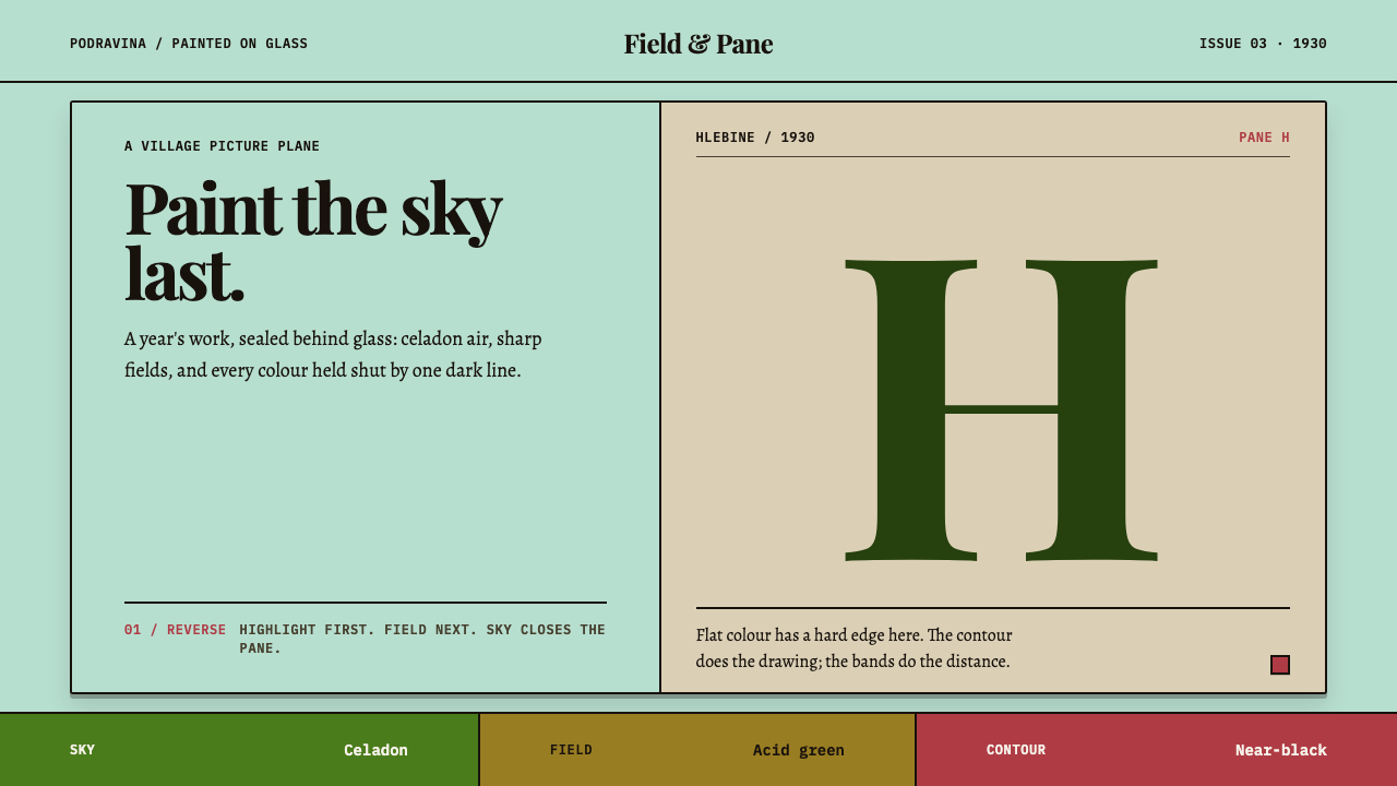 Hlebine Naïve PaintingPainted colour stays fresh. Celadon, field green and dark contours stack the…
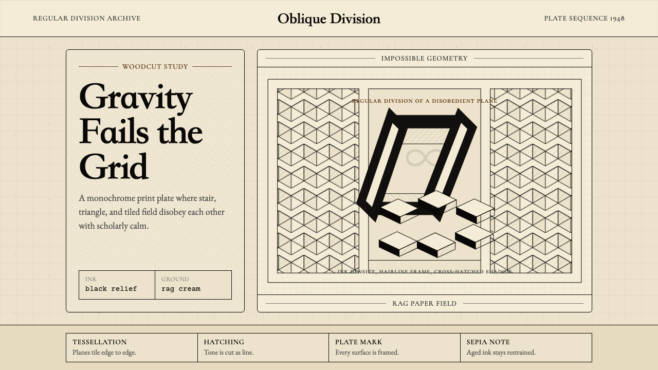 M.C. Escher ImpossibleImpossible calm. Ink-black tessellations and hatching fold cream paper into p…
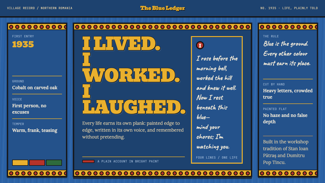 Merry Cemetery SăpânțaDeath speaks with a grin. Cobalt planks frame crowded slab type and hand-lett…
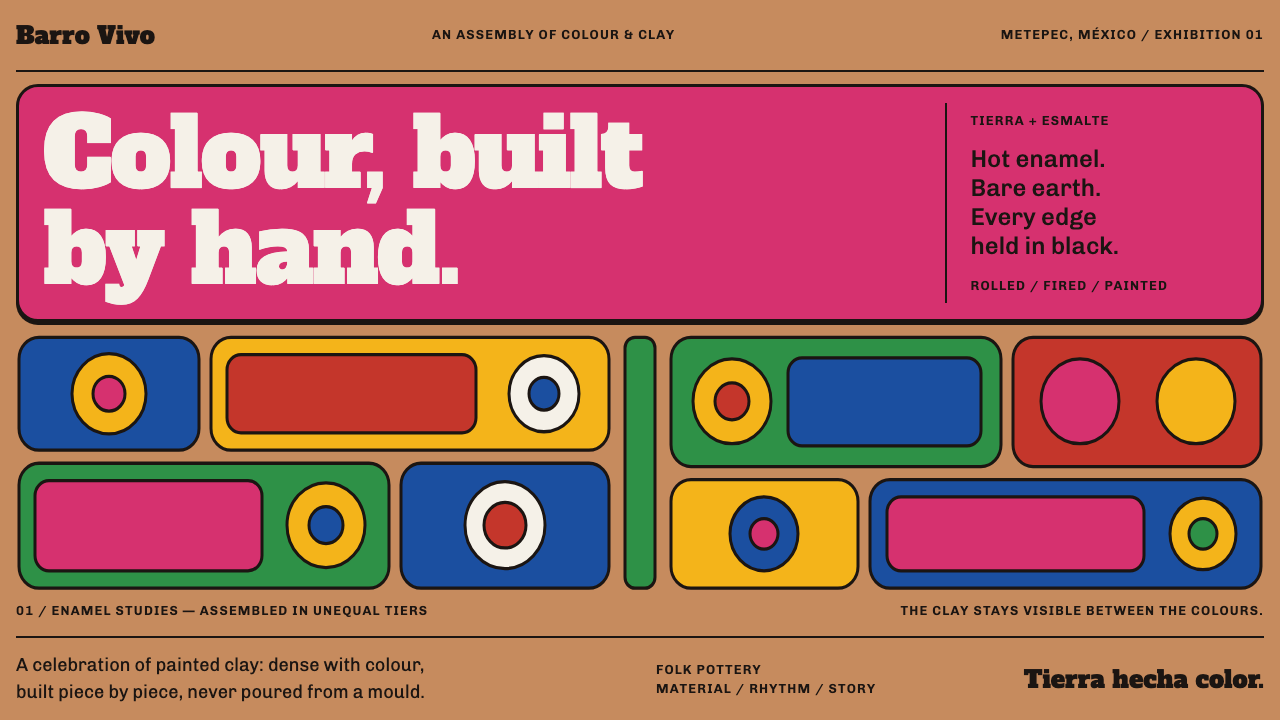 Metepec Tree of LifeDensity is the craft. Hot pink, cobalt and yellow crowd bare clay in black-ou…
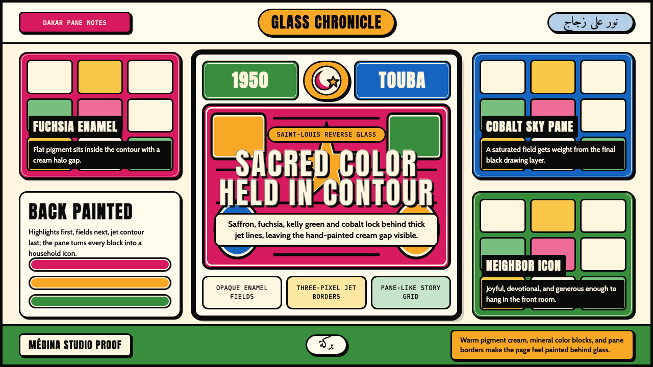 Senegalese Sous-VerreSacred joy in enamel. Fuchsia and saffron panes lock behind thick jet contour…