What is Low Poly?
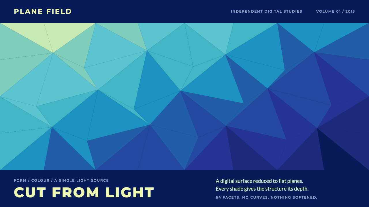
Low Poly rebuilt foxes, mountains and faces out of flat triangles, and its signature full-bleed mesh sliding from deep navy to pale aqua became the default digital header of 2013 and 2014.
Low Poly in brief
Low Poly is a digital look from roughly late 2013 to 2014 in which subjects and backgrounds are rebuilt out of flat triangles, each filled with its own single shade. Seen from a distance, the result looks like cut crystal: a fox head, a mountain range or a portrait made of faceted planes, with brightness changing from one facet to the next rather than smoothly across a surface.
Its signature, and the part this design system keeps, is the full-bleed triangulated mesh. A field of triangles covers the whole background and slides in colour from deep navy through blue and cyan toward pale aqua. Because each triangle is a single flat colour, the gradient is made of steps rather than of a blend, and the picture has a crisp, digital, slightly futuristic feel.
The visual rules are strict. Edges meet edge to edge, with no strokes, no curves and no gloss. A single implied light source decides which facets are lighter and which are darker, so that depth appears without any real shadow. Typography follows the same cool precision: wide-tracked Montserrat titles and pale lime text on navy. The style is hard, clean and geometric, and it feels like light cut into pieces.

Where does Low Poly come from?
Low Poly emerged in late 2013 and peaked through 2014, appearing across Behance, Dribbble, wallpaper sites and design blogs. The source material describes it as part of the flat-design era of web graphics, a period when designers were stepping away from skeuomorphic shine and heavy texture toward simpler shapes and flat colour. Triangulated imagery fitted that mood perfectly: it was flat, digital and obviously made of geometry, yet it still gave subjects some depth.
The look has a second root in three-dimensional computer graphics and indie game art. In 3D modelling, a low-polygon model is one built from relatively few flat faces, which was originally a practical limit of early hardware and became an aesthetic choice later on. Artists took the visible facets that used to be a limitation and turned them into a deliberate style, illustrating animals, landscapes and portraits as if they were sculpted from paper or glass.
The source material names several figures associated with the movement: Timothy J. Reynolds, Breno Bitencourt and Paul Douard, who produced widely seen triangulated artwork, and Quinn Rohlf, who released the Trianglify generator in 2014. Trianglify mattered because it automated the signature background. With a tool that could produce a unique triangle mesh in any palette at the press of a button, the mesh stopped being a hand-made illustration and became the default portfolio header, the stock wallpaper and the standard hero image of countless sites.
That ubiquity is both the style's strength and its cautionary tale. Generative backgrounds, another movement listed in the source, spread the look to every corner of the web within a short time, and the style began to feel overused almost as quickly as it had become popular. Even so, it left a lasting vocabulary: faceted planes, stepped colour fields and the idea that a picture can be assembled from flat pieces. As a design language it now reads as a clear marker of the mid-2010s, a cool, crystalline digital moment.
What defines the Low Poly look?
Triangulated mesh
The basic unit is the flat triangle. Hundreds of them tile the background edge to edge, with no gaps and no overlaps, so the surface reads as a single faceted sheet. Triangles vary in size and angle, which gives the mesh an organic irregularity while every individual piece stays perfectly flat.
Stepped navy-to-aqua colour
Colour travels from deep navy through blue and cyan to pale aqua across the field. Because each facet is a single flat shade, the transition is made of small visible steps rather than a smooth blend. This creates the crystalline, digital feel and means the gradient is built from the same geometry as everything else.
One implied light source
Facets are lighter or darker according to an imagined light direction, applied consistently across the whole surface. There are no drop shadows or glows; depth is read entirely from the difference in brightness between neighbouring planes. A consistent light direction is what makes the mesh feel like a real faceted object rather than random noise.
Hard edges, no strokes
Facets meet directly, with no outlines, no curves and no rounded corners. This lack of strokes keeps the look sharp and graphic. Interface shapes that sit on top of the mesh follow the same rule, using flat fills and crisp edges, and avoiding soft shadows and glass-like gloss.
Wide-tracked Montserrat
Titles are set in Montserrat in capitals with generous letter spacing, a geometric sans whose open, wide forms echo the precision of the mesh. The wide tracking lets short headings breathe against a busy background and gives them a cool, technical rhythm that matches the style's digital identity.
Pale lime on navy
Body text uses a pale lime rather than white, set against the darker navy end of the mesh. The slightly yellow-green tint stands apart from the blues and cyans of the background, so text remains clearly legible and feels part of the same cool palette without disappearing into it.

Who shaped Low Poly?
Timothy J. Reynolds is one of the artists named in the source material in connection with the low-poly wave. His faceted work belongs to the period when Behance and Dribbble filled with triangulated animals and portraits.
Breno Bitencourt is another of the figures listed for the style. His inclusion reflects that low poly was a shared, international design moment, practised by many illustrators rather than owned by a single studio.
Paul Douard is named in the source material among the key figures. Along with the others, he represents the group of artists whose triangulated imagery spread across design blogs and wallpaper sites during 2013 and 2014.
Quinn Rohlf released Trianglify in 2014, a generator that produces triangle meshes in chosen palettes. By automating the signature background, the tool helped turn low poly from a hand-made illustration style into a default header and wallpaper look used across the web.
How do you use Low Poly today?
Low Poly is a cool, digital and geometric style that works best when the product wants to feel technical, modern and a little crystalline. It is strongest as a background and header treatment, where the mesh gives a surface presence without needing imagery. To keep it from feeling dated, treat the mesh as a disciplined ground and let everything above it stay minimal.
For presentation slides, a cover can use the full-bleed mesh from deep navy to pale aqua, with the title in wide-tracked white or pale lime capitals placed on the darkest zone. Content slides can use a narrow strip of mesh as a header or side band while the main area stays a flat navy field for readability. Data slides work well when charts are built from flat shapes, such as bars or area fills made of a few facets in cyan and aqua.
For web interfaces, the mesh suits hero headers, landing pages, portfolio covers and sign-in screens, where a decorative background does not interfere with tasks. Keep content panels flat and sharp-edged, with no rounded gloss, and place text in pale lime or white on the darker part of the mesh. Avoid running the pattern behind dense forms or tables, where the busy facets compete with the information.
For editorial and marketing work, the style suits technology articles, product announcements, event pages and wallpapers. Faceted illustrations of animals, mountains or portraits follow the same rule as the background: flat triangle fills, one implied light, no outlines. Photography can be reinterpreted as a faceted version, or contained in a clean rectangle against the mesh.
The most common mistake is overuse. A faceted mesh behind every section, with every image triangulated too, turns the style into a gimmick, which is why it aged quickly after its peak. Other mistakes include adding gloss or soft shadows to the facets, using many unrelated hues instead of a navy-to-aqua sweep, and making the triangles so tiny that the mesh reads as noise. A few large, deliberate facets look more confident than thousands of small ones.

Low Poly — FAQ
What is the Low Poly style?
It is a late 2013 to 2014 look in which images and backgrounds are rebuilt from flat triangles, each filled with a single shade. Its signature is a full-bleed triangle mesh that shifts in colour from navy to cyan to pale aqua, with hard edges, no outlines and a single implied light source.
Where did Low Poly come from?
It has two roots. One is the flat-design era of web graphics, when designers moved toward simple shapes and flat colour. The other is low-polygon three-dimensional modelling and indie game art, where visible facets were first a technical limit and later an aesthetic choice. Generative backgrounds, such as Trianglify released by Quinn Rohlf in 2014, then spread the look widely.
Why does the style look dated, and can it be used well today?
It became ubiquitous as a default header and wallpaper, so it now marks the mid-2010s. It can still work when used deliberately: one disciplined mesh as a ground, a restrained navy-to-aqua palette, and minimal content above it. Overuse, tiny triangles and added gloss are what make it look stale.
Which fonts and text colours suit it?
Montserrat in capitals with wide letter spacing suits titles, since its open geometric forms echo the mesh. Body text works in a pale lime on the navy end of the mesh, which stays legible and sits comfortably within the cool palette. Keep text on the darker zones and away from the pale aqua areas.
Does Low Poly work for dashboards and data-heavy interfaces?
Only in a limited way. The mesh is best as a header, hero or sign-in background, because its busy facets compete with dense information. For dashboards, use the palette and the flat, hard-edged shapes while keeping the main data areas plain navy, and draw charts from a few flat facet-like fills.
Related design styles
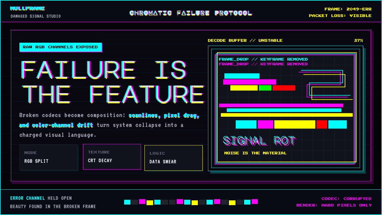 Glitch DatamoshErrors as composition. Corrupted JPEGs, RGB splits, scanlines — failure treat…
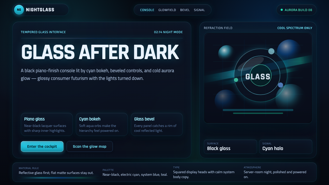 Dark AeroGlass glows after dark. Black lacquer, cyan bokeh, and beveled panels turn Ae…
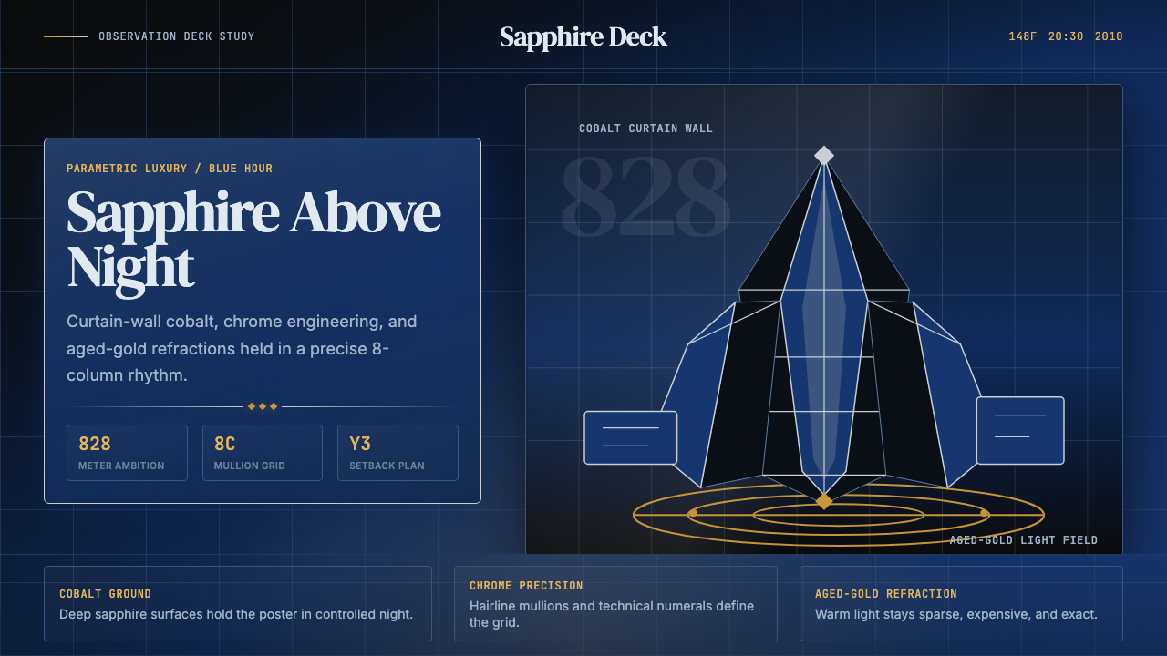 Emirati Burj Khalifa Sapphire (2010)Commanding height, controlled light. Sapphire glass, chrome grid, aged-gold g…
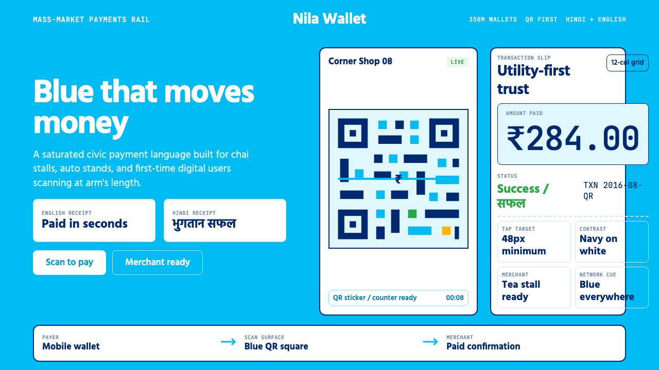 Paytm Indian FintechTrust at street scale. Saturated blue, Hind numerals, and QR grids make payme…
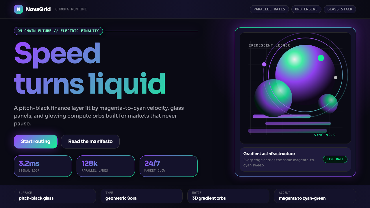 Solana (Magenta Gradient)Fast, black, chromatic. Magenta-to-cyan gradients and 3D orbs make speed glow.
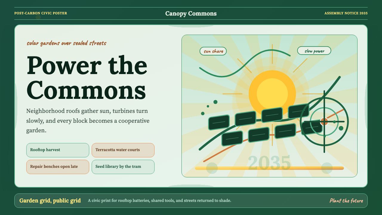 Solarpunk Utopia Poster (2014)Optimism has infrastructure. Emerald ground, saffron sunburst, humanist serif…