What is Love, Death & Robots?
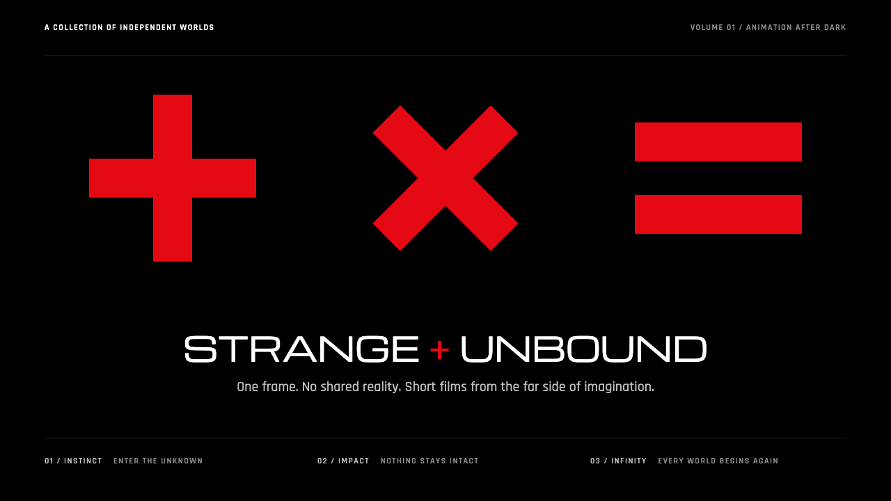
Love, Death & Robots is a design shell built to hold any world: pure black, three hard red glyphs, a lock and a title in wide engineered capitals.
Love, Death & Robots in brief
The Love, Death & Robots style is drawn from the opening sequence of Netflix's adult animated anthology, first released in March 2019. The show is a collection of short films, each made by a different studio in a different technique, from photoreal computer graphics to hand-drawn work to stop-motion. What ties them together is not a house animation style but a shell: a black screen, three glyphs that spin like slot-machine reels, a click as they lock, and then a title.
This design system takes only that shell. The ground is pure black, and a great deal of it is left empty. The glyphs and key marks are a hard, saturated red. Type is set in white, in wide, engineered capitals that look more like machine labelling than like literary typography. Nothing is soft: there are no gradients, no glows and no decorative texture, only red, white and the void.
The point of the shell is that anything can sit inside it. A hyper-real soldier, a painted creature and a comic-strip joke can all follow the same title card because the frame around them stays constant. That is the quality the design system preserves: a confident, minimal container that makes a varied collection of content feel like a single series.

Where does Love, Death & Robots come from?
Love, Death & Robots premiered on Netflix in March 2019 as Volume 1. It was created by Tim Miller, with David Fincher among its key figures, and produced with Blur Studio, based in Culver City, California. The series was conceived as an adult animated anthology, a format that offered creators short running times and very few creative restrictions, and each episode was handed to a different animation team, with contributing studios around the world.
The source material places the show in a lineage as well as a moment. It belongs to the tradition of adult animation anthologies and to the heritage of Heavy Metal magazine and the film of the same name, which mixed science fiction, fantasy, violence and humour for grown-up audiences. It also draws on cyberpunk and pulp science fiction, genres that often imagine technology and mortality colliding in neon-lit or dystopian settings. The title itself, Love, Death & Robots, is a compact summary of the three themes that thread through that tradition.
The series continued after its debut. Volume 2 followed in 2021, Volume 3 in 2022 and Volume 4 in 2025, and the creative team grew and changed over time. Among the people the source material names are Jennifer Yuh Nelson and Doug Delaney alongside Miller and Fincher, which reflects how many hands shaped the show's look across volumes. This design system draws on the identity that remained constant across them: the opening shell, rather than any one episode's style.
That choice is what makes the system unusual. Most media-derived styles copy the look of a single work. Here, the source is a frame designed to be neutral about what it contains. Black space gives the viewer room, a red glyph gives them a mark to anchor on, and white engineered type reads like a technical label on a machine. When a page uses this design language, it borrows that confidence: it signals that the content is varied and serious, and that the container itself does not need to explain anything.
What defines the Love, Death & Robots look?
Pure black void
The ground is pure black, not charcoal or dark grey, and a large part of the page is deliberately left empty. This void is the main material of the style. It gives every other element a stage, makes red and white carry maximum contrast, and communicates the confidence of a container that does not need to fill itself.
Three red glyphs
The signature mark is a group of three hard red symbols that spin like slot-machine reels and then lock into place. In the design system they become the primary accent: a saturated red used for key marks, active states and the single point of focus on a page. Using exactly three, in a row, recalls the original opening and keeps the red from spreading into decoration.
Engineered white capitals
Type is white, set in wide capitals that look engineered, closer to labels stamped on equipment than to book typography. Letter spacing is generous and the letterforms are geometric and rigid. This gives titles authority without ornament, and makes headings read like technical designations.
Hard contrast, no softness
The system has three colours in practice: black, red and white. There are no gradients, glows or soft shadows, and edges are crisp. Hierarchy comes from scale, placement and the red accent rather than from layered effects. This restraint is what lets wildly different imagery sit on top without clashing.
The lock moment
Motion in the original opening has a clear rhythm: spin, click, hold. In interface terms, this suggests transitions that move quickly and then stop decisively, with an exact lock into position rather than a floating ease. Even in still layouts, alignment feels like a lock: elements sit on clear positions with no wobble.
A frame for any content
The style is a container, not a picture. It is designed to host varied imagery, from photoreal renders to illustration, without competing with it. Content sits inside the black frame as if on a screen, and the shell does the work of making disparate pieces look like parts of one series.

Who shaped Love, Death & Robots?
Tim Miller is the creator of Love, Death & Robots, the adult animated anthology that premiered on Netflix in March 2019. His role in conceiving a series of short films, each in a different technique, is what made the unifying shell necessary in the first place.
David Fincher is named alongside Miller as a key figure in the series and is credited as its overseer in the source material. His involvement connects the show to a filmmaker's eye for tone and control, qualities that match the disciplined black-and-red shell.
Jennifer Yuh Nelson is listed among the key figures behind the series. Her inclusion reflects how the show was shaped by multiple directors and teams across volumes, rather than by a single visual author.
Doug Delaney is the fourth key figure named in the source material. As with the others, his place in the list points to the collaborative, multi-studio nature of the anthology, which Blur Studio coordinated in Culver City with contributing studios worldwide.
How do you use Love, Death & Robots today?
Love, Death & Robots is a dark, high-contrast system for content that wants to feel adult, technical and cinematic. It works best when the content itself is varied or visually strong, because the shell is designed to frame things rather than compete with them. Applying it well means respecting the void and the single red accent.
For presentation slides, a cover can be nothing but black, three red glyphs in a row near the centre and a title in wide white capitals underneath. Content slides keep the black ground with white capital headings and short body copy, using red only for the one thing the audience must notice. Data slides suit stark charts: white lines and bars on black, with a single red series highlighting the point of the slide. Imagery, such as a render or still, can sit in the middle of the black like a film frame.
For web interfaces, the style fits media portals, game and film sites, tech launches, developer tools with a cinematic tone and portfolios of visual work. Use pure black as the page ground, set navigation and headings in the white engineered capitals, and reserve red for the primary call to action and active states. Hover and transition effects can follow the spin-click-lock rhythm, moving quickly and stopping precisely. Long reading pages should use a calmer body setting, with generous spacing, so white text on black stays comfortable.
For editorial and marketing work, the shell is ideal for anthology-style content: a series of episodes, a collection of case studies, a portfolio of different projects. The consistent frame makes diverse items feel curated. Poster-style announcements can pair a single strong image with three red glyphs and a wide-capital title. Adult or edgy campaigns benefit from the tone, while anything meant to feel warm or domestic will find it too cold.
A common mistake is to use red everywhere. The impact of the system depends on red being rare and sharp, with the three glyphs as its model. Other mistakes include replacing pure black with a dark grey or a gradient, which removes the void, adding soft glows that contradict the hard edges, and cramming the frame with decorative elements. When a layout feels weak, add more black, not more ornament.

Love, Death & Robots — FAQ
What does this design system actually copy from the show?
It copies the opening shell, not any episode's art style. That shell is a black screen, three spinning red glyphs that lock into place, and a title in wide engineered capitals. The anthology's episodes vary from photoreal CG to stop-motion, so the shell is the only constant, and this system keeps it as a neutral container for any content.
Why only black, red and white?
Because the system's job is to frame varied content without competing with it. Pure black provides a stage, white provides legible type, and a rare hard red supplies a single focal point. Adding more hues would dilute the focus and make the shell compete with the images it is meant to hold.
Is the style only for sci-fi or adult content?
It suits adult, technical and cinematic content best, since the show comes from adult animation, Heavy Metal heritage and cyberpunk and pulp science fiction. It also works for portfolios, media sites, developer tools and launches that want a confident, minimal tone. It is a poor fit for products that need warmth, softness or a domestic feeling.
How should I use the red glyphs on a page?
Treat them as a single focal accent. Use a row of three for a hero mark or loading moment, and use the same red sparingly for the main call to action and active states. If red shows up on every card, label and divider, it stops being a signal and the page loses the tension that the original opening creates.
How does motion fit this style?
The opening has a clear rhythm of spin, click and hold, so transitions should be quick and end exactly, with a decisive stop rather than a floating ease. Avoid glows or soft fades. Even static layouts should feel locked: elements sit on clear positions, aligned precisely, with no ambiguity about where they belong.
Related design styles
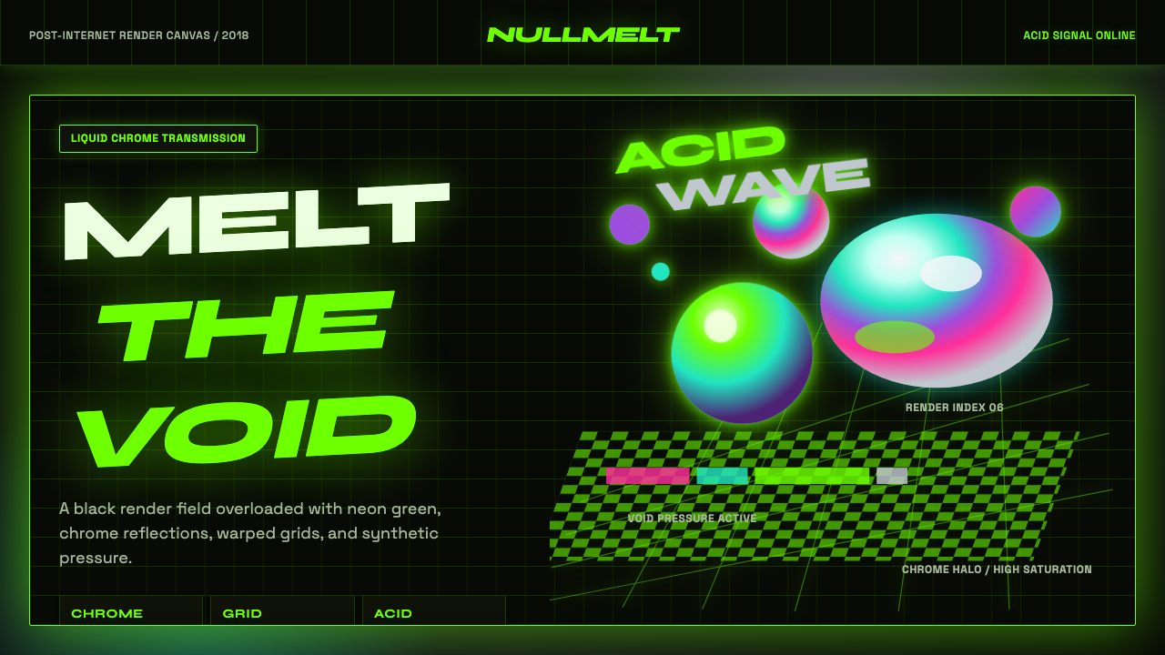 Acidwave 3D RenderPsychedelia hits the render engine. Neon green, chrome orbs, and warped grids…
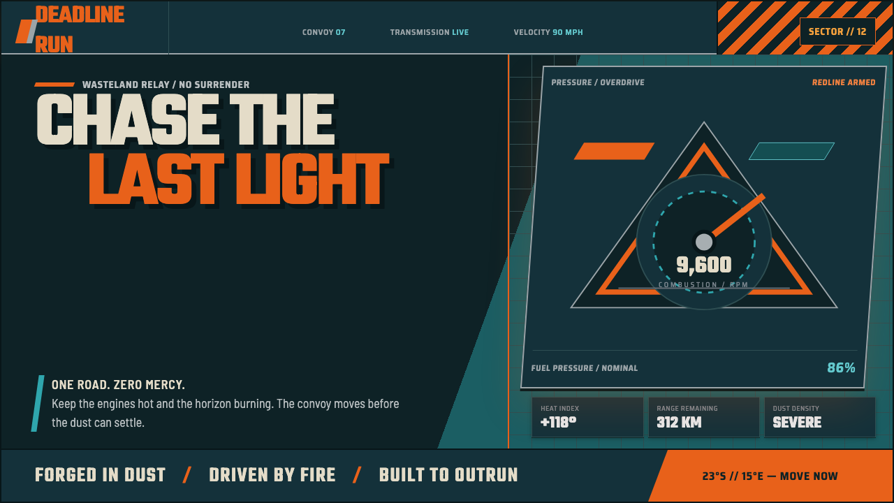 Mad Max Fury Road (2015)Built to roar. Molten saffron cuts through petrol teal, riveted grids, and ha…
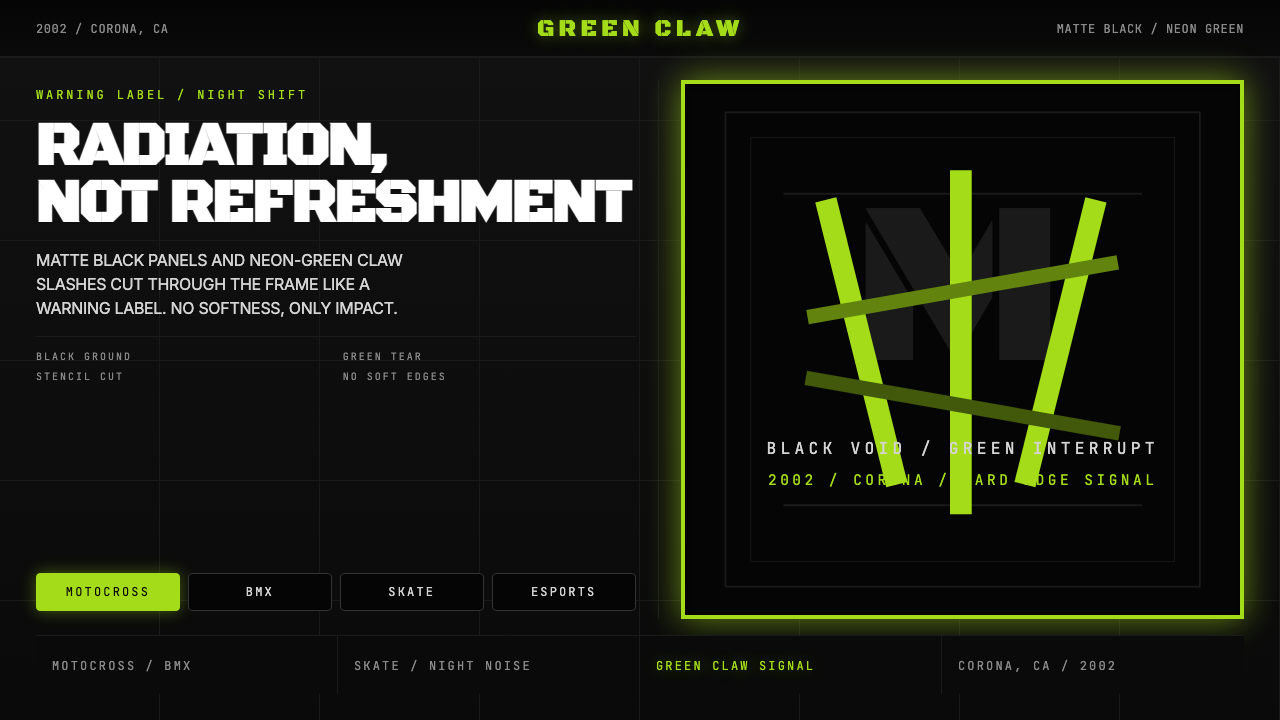 Monster Energy Claw (2002)Aggression, not refreshment. Matte black and neon-green claw slashes cut the…
 ObserverTech, but corrupted. Neon magenta and acid green tear through rain-black conc…
 Promare Triangle FireFire becomes geometry. Cyan and magenta triangles collide on matte near-black.
 Razer Chroma GreenEsports gear at night. Acid Pantone-802 green burns on matte black via RGB gl…