What is Lotus Pond?
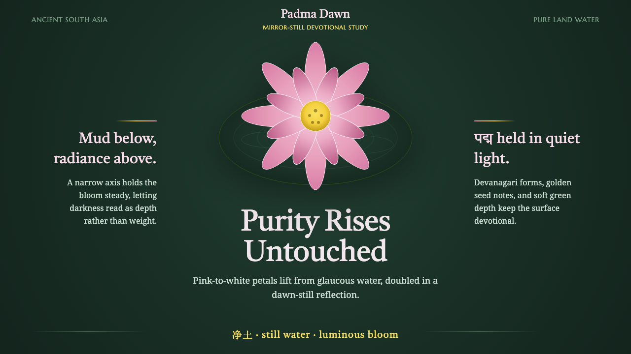
Lotus Pond takes the sacred lotus of South Asian Buddhism — a flower that rises unstained from the mud — and turns its radial petals and mirrored reflection into a design system built for stillness.
Lotus Pond in brief
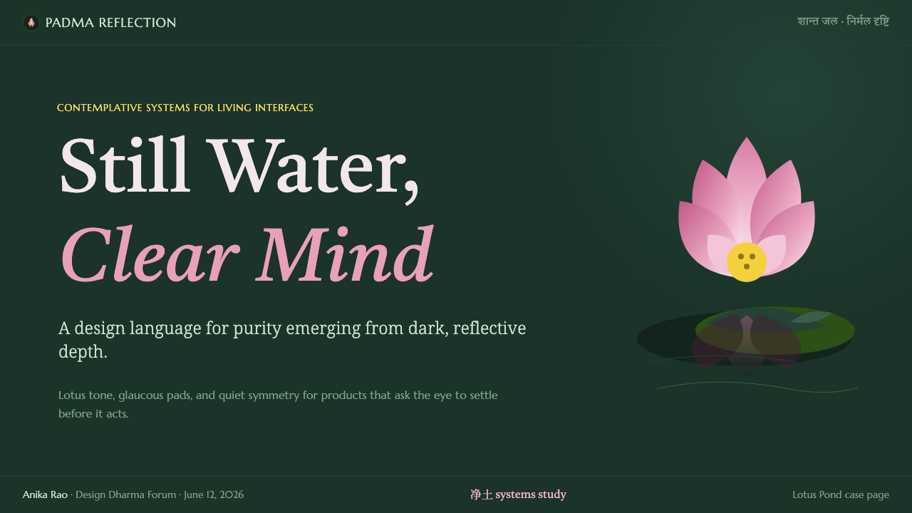
Lotus Pond is a design system built around the sacred lotus (Nelumbo nucifera), the flower that Buddhist iconography across South Asia has used for millennia to represent purity rising untouched from mud and murk. The visual language centers on a single motif — pink-to-white gradient petals opening around a golden central receptacle — set against dark, glaucous-green water, with every form doubled below in a still, mirror-perfect reflection.
The system's governing idea is not decoration but devotion: the lotus is a devotional object before it is a pretty shape, and the design keeps that hierarchy intact. Radial symmetry gives the petal motif its calm, almost meditative repetition; the dark water ground gives that symmetry somewhere quiet to rest. Nothing in the system is loud. Even the brightest petal gradient is answered by acres of near-black stillness around it.
Where Bauhaus proves that a style can be built entirely from structural logic, Lotus Pond proves the opposite case — that a style can be built entirely from a single natural image, treated with enough reverence and repetition that the image becomes a grammar. The pond, the petal, and the reflection are not references. They are the whole vocabulary.
Where does Lotus Pond come from?
The lotus's association with purity predates any single design tradition and belongs to a shared reservoir of South Asian religious symbolism. In Buddhist iconography specifically, the flower's biology supplied its own theology: the plant roots in pond mud, its stem passes through murky water, and yet its bloom opens each morning clean, dry, and unmarked by the mud below it. Buddhist teachers across the region seized on this as a ready-made metaphor for enlightenment — the possibility of a pure mind arising from an impure world — and the image became inseparable from Buddhist visual culture long before any of it was written down as doctrine.
The lotus's most direct personification is Padmapani, literally 'the lotus-bearer,' an epithet and depiction of the bodhisattva Avalokiteśvara shown holding a lotus stem in cave paintings and sculpture across South and Central Asia. Padmapani images place the flower not as background ornament but as an attribute held deliberately in the hand — the bodhisattva's compassion made visible through the flower's own symbolism of unstained arising. This pairing of divine figure and flower recurs across centuries of Buddhist sacred art, cementing the lotus as an emblem carried by, not merely surrounding, sacred beings.
Beyond individual figures, the lotus became structural to an entire cosmology: the Pure Land (净土) traditions describe rebirth itself as occurring inside a lotus flower, the soul unfolding into an already-perfected realm the way a bloom unfolds at dawn. This is the specific conceptual link the design system draws on — not simply 'lotus as a lovely flower' but lotus as the literal architecture of the Pure Land, a place defined by calm water, radiant petals, and total stillness. The reflective, symmetrical water ground of the design system is a direct visual descendant of this cosmology, not an incidental aesthetic choice.
Because this symbolism developed across South Asian Buddhist sacred art broadly rather than through a single named school or workshop, the lotus motif has no founding date or single point of origin in the way a modern movement does — its usage in painting, sculpture, and manuscript illumination stretches back through the pre-modern era of Buddhist civilization and continues, essentially unbroken, into contemporary devotional art and design.
What defines the Lotus Pond look?
Color
The palette pairs a warm gradient family — pink deepening toward white at the petal tips, with a warm golden accent at the flower's center — against a cool, dark, slightly blue-green water tone that reads as glaucous rather than pure black. This warm-against-cool pairing is the system's single most important color decision: the petals must feel luminous precisely because the ground around them is so deep and quiet. Secondary hues are avoided almost entirely; where a third tone is needed, it leans toward the same muted green-black family as the water rather than introducing an unrelated hue.
Symmetry and Composition
Radial symmetry is the system's organizing principle, echoing the way lotus petals fan outward from a central point. Layouts favor compositions that can plausibly emanate from a center — a hero image, a focal card, an icon — rather than the grid-driven asymmetric balance found in more structural design systems. This is compounded by mirroring: the water ground doubles whatever sits above it, so every major visual element is designed with the assumption that it will be seen twice, once upright and once inverted and softened.
Typography
Type in the system draws on scripts and letterforms with roots in Devanagari and Sanskrit — the writing systems historically used to transmit Buddhist sacred texts — lending display type a sense of inscription rather than pure branding. Body text stays legible and restrained so it does not compete with the visual centerpiece of petal and water. The relationship between display and body type mirrors the relationship between flower and pond: one is the reason to look, the other simply holds the surface steady underneath it.
Reflection and Depth
Depth in this system is not created through shadow or elevation but through reflection — a doubled, softened, slightly darker echo of a form appearing below it, as if the surface itself were water rather than a flat plane. This gives the system a signature way of implying depth without ever breaking the calm: nothing casts a hard shadow or lifts sharply off the page, but forms still read as sitting above something, because the pond beneath them says so.
Negative Space
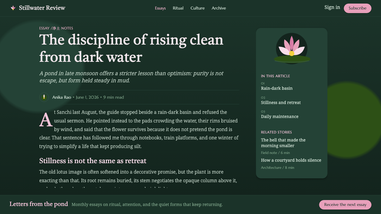
Because the water ground reads as dark and largely undifferentiated, negative space in Lotus Pond does an unusual amount of work: it is not merely the absence of content but the visual equivalent of still water, present and legible as its own element rather than as empty margin. Interfaces built in this system should resist the impulse to fill that darkness with secondary decoration — the quiet is structural, in the same way restraint is structural to a more austere, geometric system.
Motion
Where the system animates at all, motion should behave like water and petals rather than mechanical interface elements: slow blooming expansions rather than snaps, gentle ripple-like easing rather than linear timing, and reflections that lag or soften slightly behind the element they mirror. Fast, sharp, or bouncy motion curves work against the system's entire premise of stillness and should be avoided even where a more energetic system would use them for emphasis.

Who shaped Lotus Pond?
No single named artist created the lotus motif; it was developed and repeated across generations of anonymous and named craftspeople working in Buddhist sacred art across South Asia — cave painters, sculptors, and manuscript illuminators who treated the lotus as a devotional convention to be perfected rather than a personal invention to be signed. This collective, tradition-bound authorship is itself characteristic of sacred iconography, where fidelity to established form matters more than individual innovation.
Padmapani — literally 'the one who holds the lotus' — is a depiction and epithet of the bodhisattva Avalokiteśvara found across cave paintings and sculpture in South and Central Asia. Shown holding a lotus stem with deliberate care, Padmapani fused the flower's purity symbolism directly onto a specific sacred figure, making the lotus not just an ambient motif but an attribute actively carried and presented. This image is among the most influential single depictions in the lotus's visual history, because it demonstrates the flower being held rather than merely surrounding a scene.
The textual traditions describing the Pure Land (净土) — in which souls are reborn inside a lotus flower within a realm of calm water and radiant light — were compiled and transmitted by generations of Buddhist scholars and teachers across South and East Asia. Their descriptions of the Pure Land as a literal lotus-and-water cosmology gave later artists and designers a conceptual blueprint: not simply 'a flower on water' but an entire imagined architecture of stillness, reflection, and purity that the visual system draws on directly.
How do you use Lotus Pond today?
Lotus Pond is a style built for calm, and it succeeds or fails on whether that calm survives contact with a busy interface. Applying it well means resisting the urge to fill every surface with the petal motif; the system's power comes from restraint around a single luminous focal point, not from repeating lotus imagery everywhere.
For presentation slides, the system is strongest on cover pages and quiet section breaks: a single large petal-and-reflection composition, generous dark space around it, and a short line of inscribed-feeling display type. Content and data slides should mute the motif considerably — a small corner accent or a faint watermark-level petal shape is enough — while the water-dark background and warm accent color carry the continuity. Data visualizations should avoid busy multi-color charts; a single warm accent against the dark ground reads as intentional, while a rainbow of chart colors breaks the system's calm immediately.
For web interfaces, Lotus Pond suits dashboards and pricing pages that want to feel considered and unhurried rather than urgent — wellness platforms, meditation and mindfulness products, hospitality and spa booking flows, and premium cultural or editorial products. On a dashboard, the dark water ground works well as the base surface, with cards or panels reading as pale, gently lit shapes floating above it; pricing tiers can use the warm gold-and-pink accent sparingly to mark the recommended plan without shouting. The style struggles on interfaces that need to feel fast, urgent, or data-dense, since its whole premise depends on visual quiet.
For editorial and marketing work, the style rewards long-form, contemplative content — features on craft, wellness, travel, or spirituality — where a large reflected hero image can open a page and the reading experience that follows stays unhurried: generous line spacing, a narrow measure, and section breaks marked by a small petal motif rather than a hard rule. Marketing pages built in this system work best when they let the hero composition breathe across most of the initial view rather than competing with dense copy above the fold.
The most common mistake is treating Lotus Pond as a generic 'nature' or 'floral' skin and scattering lotus imagery decoratively across a layout the way a novelty pattern might be used. The system depends on the motif appearing once, with intention, at a genuine focal point, echoed by its own reflection — not on lotus shapes functioning as wallpaper. A second common error is letting the water ground drift toward true black or toward a generic dark neutral; the glaucous, faintly green-toned darkness is what keeps the ground feeling like water rather than an empty void, and losing that tint flattens the entire system's atmosphere.
Lotus Pond — FAQ
Is Lotus Pond a religious style, or can it be used in secular products?
Lotus Pond draws directly on Buddhist sacred symbolism, and that lineage is worth respecting rather than treating as generic decoration. That said, the visual system itself — radial petal symmetry, reflective dark water, warm-against-cool color logic — translates well into secular contexts that want to evoke calm, purity, or considered stillness, such as wellness, hospitality, or premium editorial products. The key is applying it with the same restraint the sacred tradition itself uses: one focal motif treated with care, not lotus imagery used as a decorative wallpaper pattern.
How does Lotus Pond differ from a generic 'zen' or 'spa' aesthetic?
Generic zen or spa aesthetics tend to rely on pale neutrals, natural wood tones, and soft organic shapes with no single unifying image. Lotus Pond is far more specific: it is built entirely around one motif — the lotus rising from dark water — rendered with a particular warm-against-cool color logic and a mirrored, radial composition. Where a generic spa look might use a vague sense of 'nature,' Lotus Pond commits to a single symbolic flower and lets that commitment do all the work, which makes it more distinctive but also less forgiving of substitution — swap the petal motif for a generic floral pattern and the system's identity collapses.
Can the reflection and dark water concept be applied without the lotus itself?
The reflection mechanic — a softened, darker mirror image beneath a form — is genuinely portable and can be used as a depth cue in other dark, contemplative interfaces even without floral imagery. But doing so borrows only half the system. The lotus itself is what gives the reflection its meaning: purity rising from murk, doubled in still water as a way of dwelling on that rising rather than rushing past it. Strip the lotus out and the reflection becomes a generic dark-mode design trick rather than a motif with any symbolic weight.
What kind of color mistakes most often break this system?
The most damaging mistake is oversaturating the petal gradient until it competes with the water ground instead of glowing against it — the petals need to feel luminous specifically because of the contrast with the deep, quiet background, and pushing the pink too bright or too flat removes that contrast. The second common mistake is letting the dark ground slide toward pure black or a cool blue-grey; the glaucous, slightly green cast is what reads as still pond water rather than empty screen space, and losing it makes the whole system feel like a generic dark theme with a flower stuck on top.
Related design styles
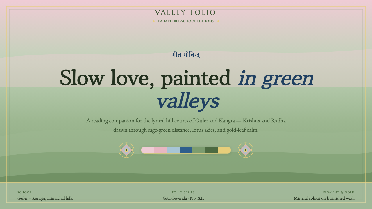 Pahari Kangra PaintingDevotional lyricism, painted slow. Sage-green hill grounds lighten to lotus-p…
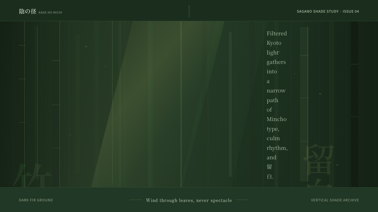 Bamboo GroveQuiet goes vertical. Fir green, Mincho type, and dappled culm rules create de…
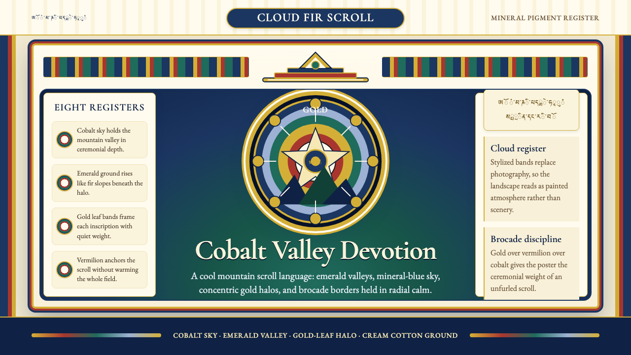 Bhutanese Thangka (Druk Style)Sacred cool-mountain clarity. Cobalt fields, emerald ground, and gold halos f…
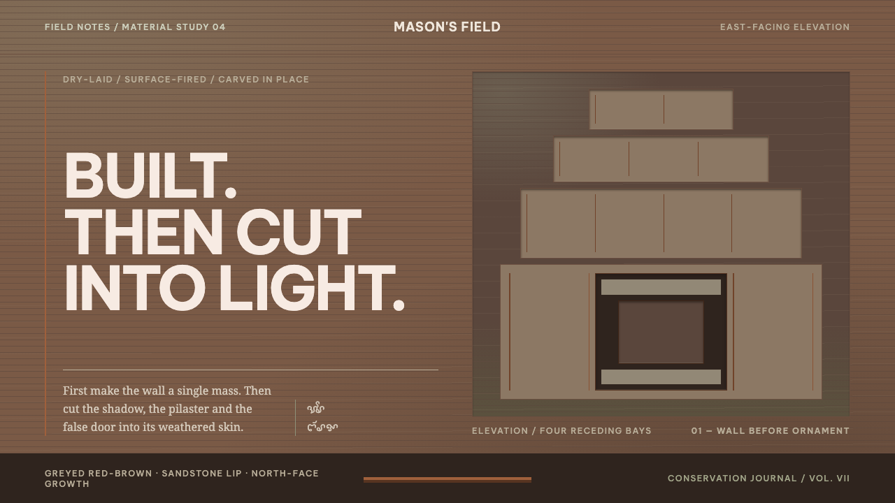 Cham My Son TowersWall before ornament. Greyed brick bays recede around cut shadows and sandsto…
 Hindu Widow White SariRestraint carries the weight. Ash-toned khadi, quiet serif type, and vertical…
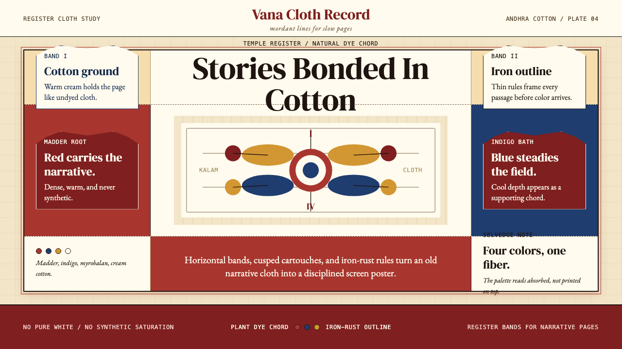 Kalamkari (Andhra Pradesh)Cloth becomes narrative. Madder bands, indigo panels, and iron rules stack li…