What is Loki TVA?
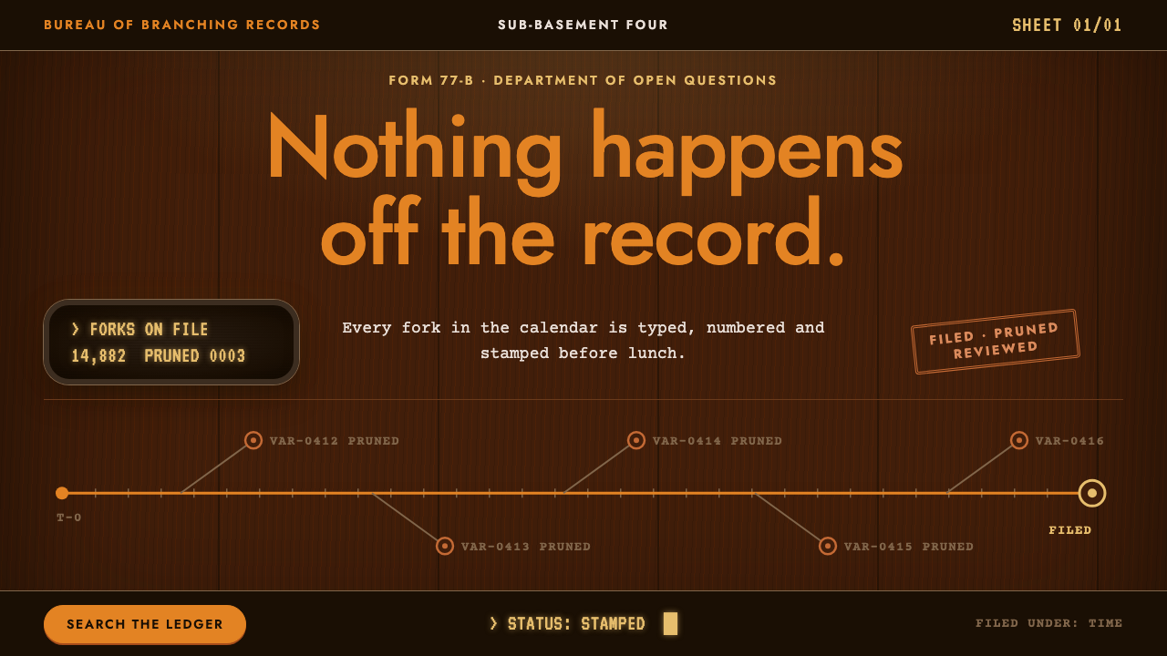
Loki TVA imagines an office that exists outside time yet still runs on paper, rubber stamps and humming amber screens.
Loki TVA in brief
Loki TVA is a design style drawn from the Time Variance Authority, the fictional bureaucracy at the centre of Marvel's series Loki. The organisation sits outside time, polices the order of events, and yet is housed in an environment that looks like a government office from another era. It is a place of filing cabinets, typed case files, orange signage and glowing terminals, all arranged with an almost comic seriousness.
As an interface style it is dark and warm. Surfaces suggest walnut panelling, the light feels like tungsten rather than daylight, and screens are near-black with amber characters that look as if they were drawn by an old cathode-ray tube. Orange is the institutional colour, used for headings, buttons and wayfinding. Typography splits into three voices: a clean sans-serif for signs, a typewriter face for case documents and a chunky terminal face for machine readouts.
The tone of the style is just as important as its look. It takes the idea of bureaucracy seriously enough to make it beautiful, while quietly acknowledging how absurd it is. That dry humour is what lets the style feel fun rather than oppressive, and it is why it works so well for products that want to feel processed, filed and stamped without being dull.

Where does Loki TVA come from?
The style comes directly from the first and second seasons of Loki, the Marvel Studios series made for Disney+. The first season appeared in June and July of 2021, and the second followed in October and November of 2023. At the heart of both is the Time Variance Authority, an organisation that monitors and prunes alternate timelines from a headquarters that sits outside the ordinary flow of time.
The look of that headquarters was built, not drawn. Production designer Kasra Farahani's sets gave the TVA walnut panelling, tungsten lighting, orange fittings and pale terrazzo floors, with amber CRT terminals humming in vast brutalist halls. The combination is deliberately contradictory: warm mid-century office comfort set inside cold, monumental concrete architecture. It is the visual shorthand for an institution that is both homely and terrifying.
Several influences are folded into that single environment. Retro-futurism supplies the idea of a future imagined from an earlier decade, in which computers are bulky and every interface has a physical, mechanical feel. Mid-century modern office design supplies the wood, the furniture and the sense of tidy corporate order. Brutalist civic architecture supplies the scale and the institutional weight. Michael Waldron, Kate Herron and cinematographer Autumn Durald Arkapaw are among the creative collaborators who shaped how this world was written, directed and lit.
Turning that world into a design system required keeping the mood while simplifying the materials. Wood becomes a deep brown background, the orange of the fittings becomes a signal colour, the case files become typewriter text and the terminals become glowing readouts on near-black panels. Because the source is a television set rather than a graphic standard, the design system is an interpretation: it keeps the atmosphere of the office and translates its objects into screen elements.
What defines the Loki TVA look?
Dark wood ground
The base of every page is a dark, warm brown that recalls walnut panelling. It is not black, and it is not a flat fill: the colour suggests grain and depth, and it gives the whole interface the weight of an old institution. Panels and cards sit on this ground like paper on a desk.
TVA orange
Orange is the institutional colour, taken from the fittings and signage of the set. It is used for headings, primary buttons, section markers and wayfinding, and it appears sparingly enough that it always reads as an instruction. Think of it as the colour of an official sign telling you where to go.
Signage sans-serif
Headlines and navigation use Jost, a geometric sans-serif that feels mid-century and orderly. It reads like lettering on a wall in a government corridor: clear, upright and unembellished. Capital letters with open spacing work especially well for section names and department labels.
Typewriter case files
Body text and documents are set in Courier Prime, a typewriter face. This gives any record, form or report the feel of a typed file that has been stamped and passed between desks. Fields, reference numbers and short entries look especially natural in this voice.
Amber CRT readouts
Machine output, counters and status lines appear in VT323, a terminal face, in amber on near-black screens. This is the only place where a glowing, slightly retro digital feel is allowed to take over. A faint glow or scanline suggestion is enough; the effect should read as a terminal in a hall, not a gaming overlay.
Stamped, filed structure
Layouts are organised like paperwork: labelled sections, numbered entries, stamped statuses and tidy columns. Rectangular panels with firm edges feel like trays and folders, and the arrangement favours clear categories over fluid scrolling. The result is an interface that always seems to know exactly where each item belongs.

Who shaped Loki TVA?
Farahani designed the sets of Loki, and his work is the direct origin of this style. His TVA combined walnut panelling, tungsten light, orange fittings and pale terrazzo floors with amber CRT terminals in brutalist halls. That mixture of warm office furniture and monumental concrete is the signature of the whole look.
Waldron is among the key creative figures behind Loki. The series is where the Time Variance Authority became a place with its own rules, jargon and daily routine, and that written bureaucratic comedy is what the interface style tries to preserve in its labels and microcopy.
Herron is another of the creative collaborators associated with the first season of the series. Her involvement is part of the reason the TVA is treated with such deadpan seriousness, which is the tone this design system aims to echo in how it presents records, statuses and instructions.
Arkapaw is credited among the creative team who shaped the way the world was lit and photographed. The warm tungsten glow and the contrast between amber screens and dark surroundings influenced how light and darkness are balanced in the interface.
How do you use Loki TVA today?
On slides, this style is ideal for presentations about process, records or governance: audits, compliance reviews, case studies and internal operations updates. A cover slide can use a dark wood ground, an orange title in the signage face and a small typed reference line. Content slides work best as structured panels, with numbered items and short typewriter-style annotations. Use the amber terminal voice for a single highlighted metric per slide, so it feels like a readout rather than decoration.
On the web, the style suits archives, records search, back-office tools and dashboards that want a sense of humour. A knowledge base can present each entry as a case file with a reference number, a status stamp and a few labelled fields. A monitoring dashboard can set counters and logs in the terminal face on near-black panels. Pricing pages are best kept simple: a few clearly labelled tiers, an orange primary button and plain typed descriptions.
In editorial and marketing work, the style is excellent for playful campaigns about order, paperwork and time. Product announcements can be written as official notices, and newsletters can adopt the format of a memo. Event pages for fan communities, escape-room style experiences and themed launches can all use the wood, the orange and the amber to establish a world quickly.
To get it right, build the hierarchy deliberately. Orange is for instruction, typewriter text is for records, and amber terminal text is for machine output. If every element is orange or every line is glowing, nothing stands out and the sense of institution is lost. Leave generous dark space around panels so the interface feels like a quiet office after hours.
The common mistake is to treat the style as simple dark mode with an orange accent. The atmosphere comes from the combination of materials, namely wood, typed paper and glowing screens, and from the deadpan tone of the copy. A second mistake is overdoing the retro effects with heavy scanlines, flicker or distortion, which turns a refined office into a cheap arcade. Keep effects faint, keep the structure tidy and let the humour live in the wording.

Loki TVA — FAQ
What is the Loki TVA design style?
It is a dark, warm interface style inspired by the Time Variance Authority in Marvel's Loki. It combines dark wood surfaces, orange signage set in Jost, typewriter case files in Courier Prime and amber VT323 readouts on near-black screens. Together they create the feel of a retro bureaucracy that has been processed, filed and stamped.
Where does the visual look come from?
It comes from the sets of Loki, designed by Kasra Farahani. The first season aired in June and July of 2021, and the second in October and November of 2023. The sets used walnut panelling, tungsten light, orange fittings, pale terrazzo floors and amber CRT terminals in brutalist halls, drawing on retro-futurism, mid-century modern office design and brutalist civic architecture.
What products suit it best?
Archives, records search, case management, back-office tools and dashboards with a sense of humour are the strongest fits. It also works for campaigns, newsletters and event pages that play with the idea of paperwork and official procedure. It is less suited to products that need a bright, airy or purely friendly personality.
Do I need to know the show to use it?
No. The style reads on its own as a warm, retro office with glowing terminals. Knowing the series adds a layer of in-joke, but the visual language of wood, orange signage, typed documents and amber screens is understandable without any background.
What is the biggest mistake when using it?
Treating it as a generic dark theme with an orange accent, or piling on retro effects. The style depends on a mix of materials and a deadpan tone. Keep orange for instructions, typewriter text for records and amber terminal text for machine output, and keep any glow or scanline effect faint.
Related design styles
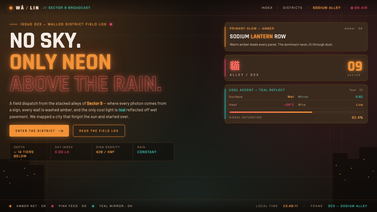 Stray Cyber CityNo sky, only neon. Warm amber and pink signs glowing over wet alleys, with on…
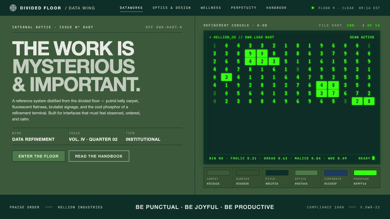 Severance LumonCorporate dread, distilled. Putrid kelly carpet, brutalist signage, CRT phosp…
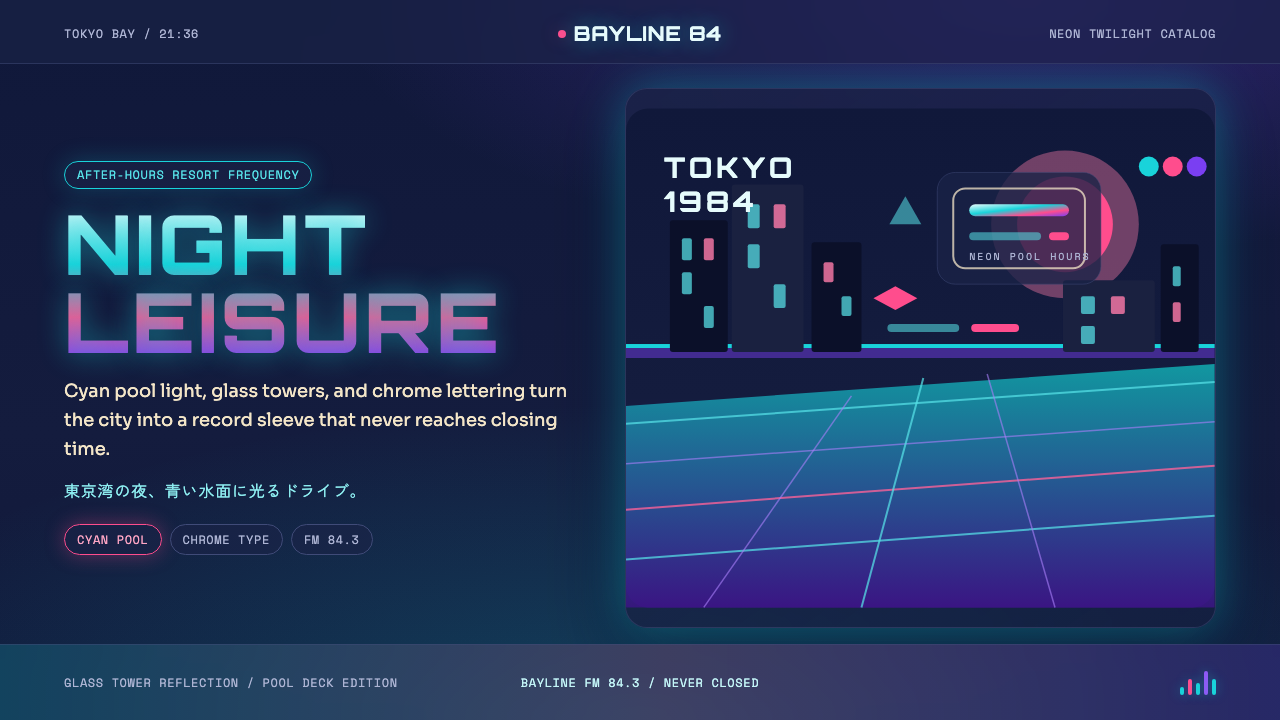 City Pop TokyoNeon leisure after dark. Cyan pool lines, chrome Orbitron, and pink-purple du…
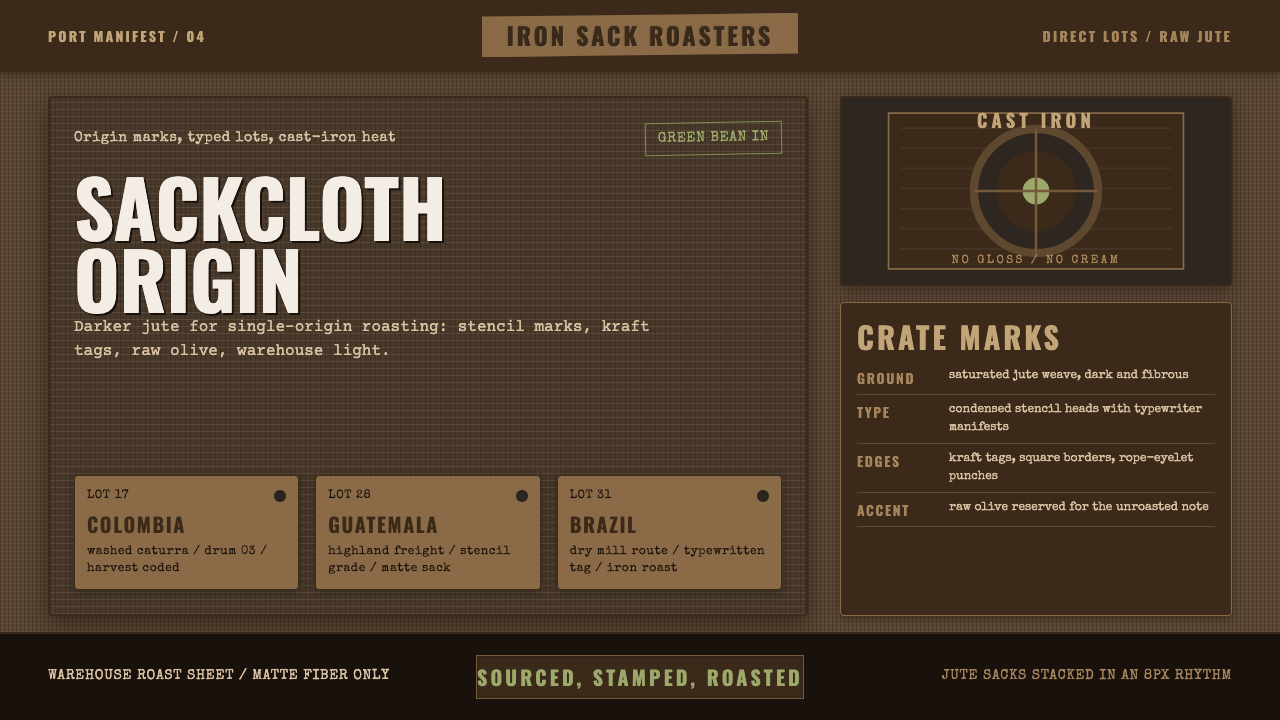 Coffee Roastery BurlapRaw craft, never cream. Dark jute weave, stencil type, and one olive accent.
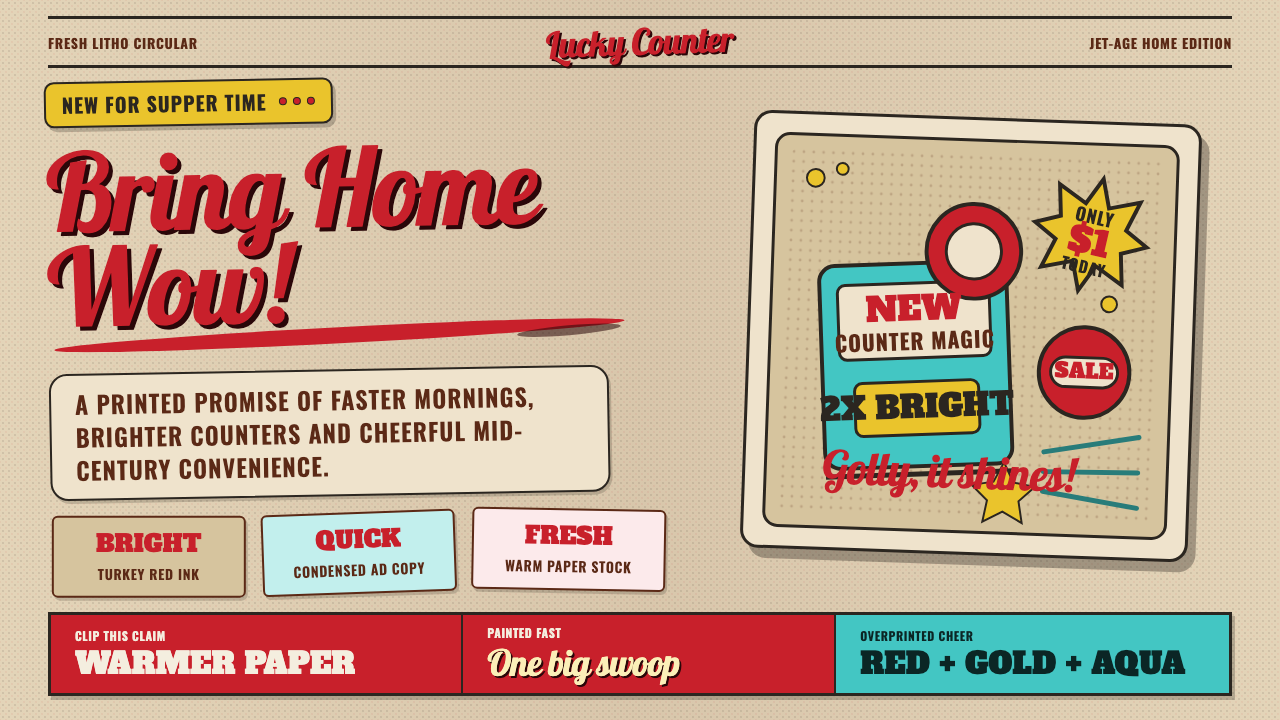 1950s Brush Script AdSells tomorrow in one swoop. Turkey red script, tan paper, starbursts, and ha…
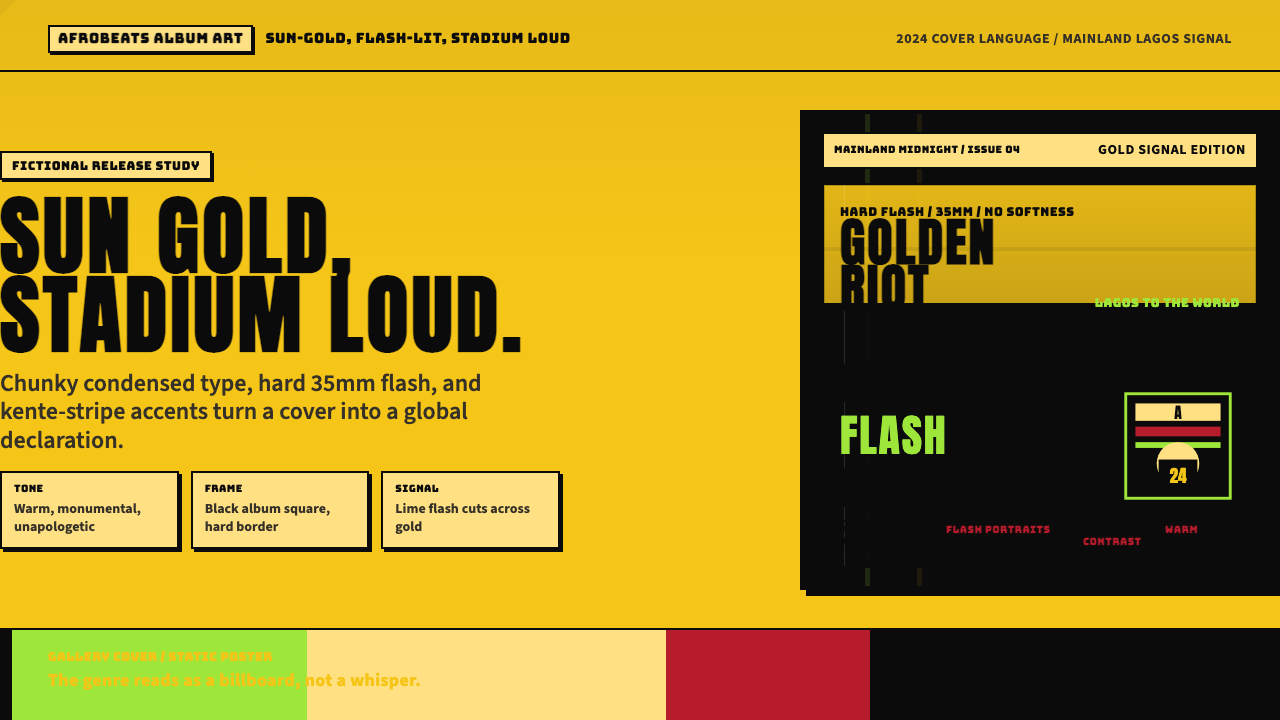 Afrobeats Album Art 2024Sun-gold and stadium loud. Anton type, kente stripes, and hard flash drive th…