What is LocoRoco?
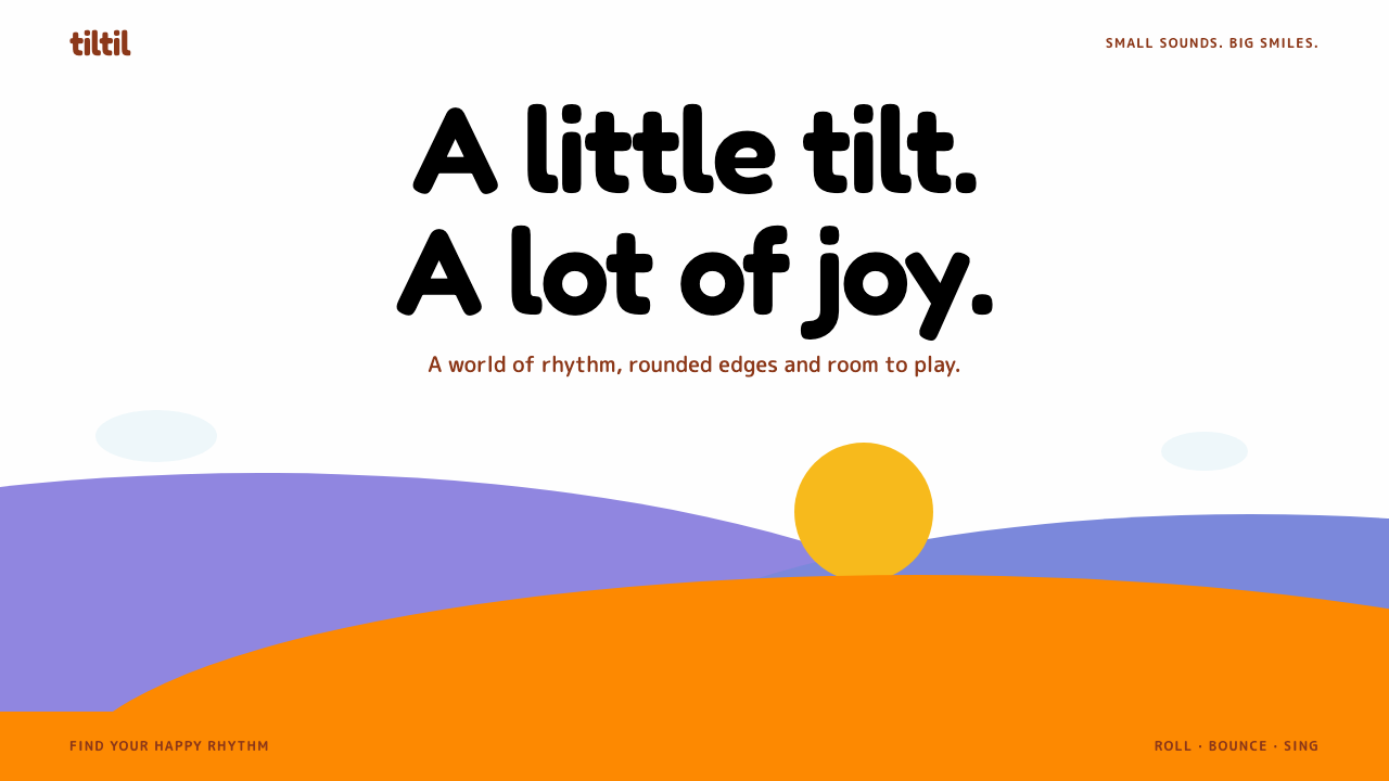
LocoRoco is a joyful design language of solid silhouette hills, smooth curves and a singing yellow blob, where nothing has a straight edge and almost nothing needs words.
LocoRoco in brief
The LocoRoco style comes from the 2006 PSP game LocoRoco, in which the player tilts the entire world to roll a singing yellow blob through bright, curving landscapes. The visual language that grew from it is built entirely out of smooth silhouettes. Terrain is drawn as solid shapes in lavender, periwinkle and orange, stacked like paper cut-outs against a near-white sky, and every edge is a gentle Bezier curve. There is not a single straight line in the picture.
Colour is flat and matte. Surfaces carry no texture, no gloss and no lighting; depth comes only from the overlap of layers. The yellow blob is the star, and it carries the primary actions in a translated interface. Pale blue scalloped clouds act as dividers, a fruit red marks collectables, and black is held back for the small Moja characters and the darkest text.
The overall feeling is joy without noise. The game was designed to be understood without reading, and the visual system inherits that habit: it is spare with words, generous with round shapes and relies on bounce and squash to communicate that something is alive. It is a style that asks the user to smile before it asks them to read.

Where does LocoRoco come from?
LocoRoco was released in 2006 for Sony's PSP handheld and was made by SCE Japan Studio in Tokyo. At that time the PSP was largely associated with powerful console-style games, and LocoRoco was a deliberate departure: a bright, simple, almost text-free game whose entire premise was a single gesture. The player pressed the shoulder buttons to tilt the world, and a round yellow creature rolled, bounced and sang across a landscape built from curves.
The source material names Tsutomu Kouno, Nobuyuki Shimizu and Kemmei Adachi among the key figures behind the work. Together they shaped a game that put play and music at the centre rather than narrative or spectacle. The source also situates the game in two broader movements: the experimental Japanese games of the PSP era, which used the new handheld to try unusual ideas, and text-free, tilt-based play, where understanding comes from watching what moves rather than from reading instructions.
The look of the game is a technical and aesthetic choice at once. It is described as vector and Bezier animation, meaning that the world is made from smooth mathematical curves rather than from textured polygons. That approach gave the team clean, scalable silhouettes, the flat colour fills that define the style, and shapes that could squash and stretch as if made of soft material. It also meant the art could survive being reused later: the 2017 PS4 remaster kept the same vector art, which shows how well the original drawings aged.
As a design reference, LocoRoco matters because it is a clear example of a world described entirely by curves and flat colour. Many digital styles use roundness to feel friendly, but few commit to it so completely, with no straight edges at all. The result is a system that is playful without becoming chaotic, because the palette is limited and the shapes follow one consistent grammar. That discipline is what makes it a useful template for products that want to feel light, musical and approachable.
What defines the LocoRoco look?
Silhouette hills
Sections of a page are drawn as solid silhouette hills in lavender, periwinkle and orange, stacked and overlapped like cut paper. They carry no outline and no interior detail, so the whole composition reads as bold colour shapes. Hills replace the usual rectangular section backgrounds and give the page its landscape rhythm.
No straight edges
Every boundary in the system is a smooth curve. Cards, buttons, dividers and illustrations all avoid hard corners, and even the horizon between sections undulates. The absence of straight lines is not a detail but the main rule, and it is what separates this style from a merely rounded interface.
The yellow blob
A bright yellow is reserved for the primary actions and key numbers, standing in for the game's singing blob. Because it appears nowhere else in quantity, it draws the eye immediately to what the user can do next. Secondary actions use quieter tones so that yellow remains the clear invitation.
Scalloped clouds and fruit red
Pale blue scalloped clouds divide sections, taking the place of rules and lines, while a fruit red marks collectables and counts. These two small accents give the page its secondary language: blue for calm separation, red for things the user gathers or progresses through.
Matte, flat colour
All colour is matte and flat, with no gloss, no texture and no gradients. Depth is achieved only by overlapping silhouettes. This makes the system extremely easy to reproduce across screens and print, and it keeps the look consistent with the vector origin of the artwork.
Rounded, friendly type
Type is set in Fredoka, a rounded sans-serif whose letterforms echo the softness of the shapes around them. It floats above the flat colour hills without needing outlines or shadows. Text is kept short, because the original game is nearly text-free and the style rewards brevity.
Squash and bounce motion
Interaction feels alive. Cards tilt slightly when hovered, like a level leaning under the player's hands, and buttons squash and spring back like the blob itself. Motion is gentle and playful rather than dramatic, and it is the main way the flat, silent shapes communicate that they respond to touch.

Who shaped LocoRoco?
Tsutomu Kouno is named first among the key figures behind LocoRoco. His work on the game helped define its blend of tilt-based play, music and a world drawn entirely in smooth curves, which became the basis for this design system's silhouette-and-blob vocabulary.
Nobuyuki Shimizu is listed among the key figures for the game. His contribution is part of the team effort at SCE Japan Studio that brought an unconventional, text-free PSP title to release in 2006.
Kemmei Adachi is the third key figure named in the source material. His place beside the others reflects how closely the game's sound and music were tied to its visual identity, since the blob literally sings as it rolls.
How do you use LocoRoco today?
LocoRoco is one of the most distinctive playful styles available, and it works best when the product genuinely wants to feel light, musical and friendly. Applying it means committing to curves and flat colour completely. A single straight line or soft shadow will undermine the effect, so plan the whole layout around silhouettes before choosing details.
For presentation slides, a cover can be a near-white sky with two or three layered hills in lavender, periwinkle and orange rising from the bottom, a rounded title set above them and a small yellow blob as the focal point. Content slides can reuse the hills as footers and the scalloped clouds as section dividers. Data slides suit simple, chunky charts whose bars and slices have rounded ends, coloured from the palette with the yellow reserved for the number that matters.
For web interfaces, the style suits children's products, casual games, music and lightweight event pages. Use the hills as section backgrounds, put the primary button in yellow with a squash-and-spring response, and use scalloped clouds instead of horizontal rules. Collectable counters, streaks and progress indicators can use the fruit red. Keep copy short and let shapes and motion do the explaining, since the original game never relied on instructions.
For editorial and marketing work, it fits campaigns that want warmth and a smile: toy and family brands, music festivals, app launches aimed at a general audience and playful educational content. Illustrations should follow the same rule as the interface, using solid shapes with smooth edges and no outlines. Photography is a poor match unless it is cropped inside curved silhouettes and tinted with the palette.
A common mistake is to add detail. Designers tend to introduce gradients, drop shadows or fine outlines to make shapes look more finished, but that removes the matte, cut-paper clarity at the heart of the style. Another mistake is to use straight-edged cards and tables inside an otherwise curved layout, which makes the page feel like two products stitched together. A third is to write long copy, which fights the text-free spirit of the original.

LocoRoco — FAQ
What makes LocoRoco different from other rounded, friendly styles?
It commits to curves completely. Every edge, from hills to clouds to buttons, is a smooth curve, and the colours are flat and matte with no texture or gloss. Many friendly interfaces simply round the corners of rectangles; LocoRoco is built from silhouettes in which no straight edge exists at all, which gives it a cut-paper landscape character.
Which colours does the style use, and what do they mean?
The background is a near-white sky. Hills and sections use lavender, periwinkle and orange. Yellow is reserved for the blob, which means primary actions and key numbers. Pale blue clouds divide sections, fruit red counts collectables, and black is kept for small characters and the darkest text. Using each colour for a single role is what keeps the page cheerful but organised.
Is this style suitable for serious or professional products?
Generally not. The style asks the user to smile before it asks them to read, and its short copy and bouncy motion suit children's products, casual games, music and light events. For finance, legal or dense data tools the tone would feel mismatched, although a toned-down use of the hills and the yellow action colour can add warmth to onboarding screens.
How should motion be handled?
Motion is gentle and playful. Cards tilt slightly on hover, like a level leaning under the player's hands, and buttons squash and spring back like the yellow blob. The aim is to make the flat, silent shapes feel alive and responsive. Keep movement soft and short, and avoid dramatic or fast effects that would break the cheerful calm.
Why is there so little text in this style?
The original game was designed around text-free, tilt-based play, where players understand by watching what moves. The design system inherits that approach: shapes, colour and motion carry most of the meaning, and words are kept short and spare. Rounded type such as Fredoka supports this by feeling like another soft shape on the page.
Related design styles
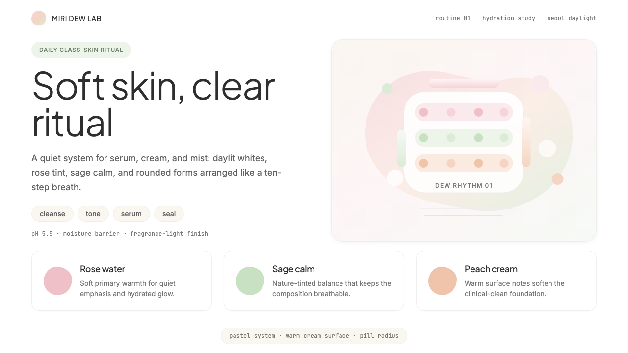 K-Beauty CleanCalm arrives dewy. Rose, sage, and peach pastels float through airy rounded f…
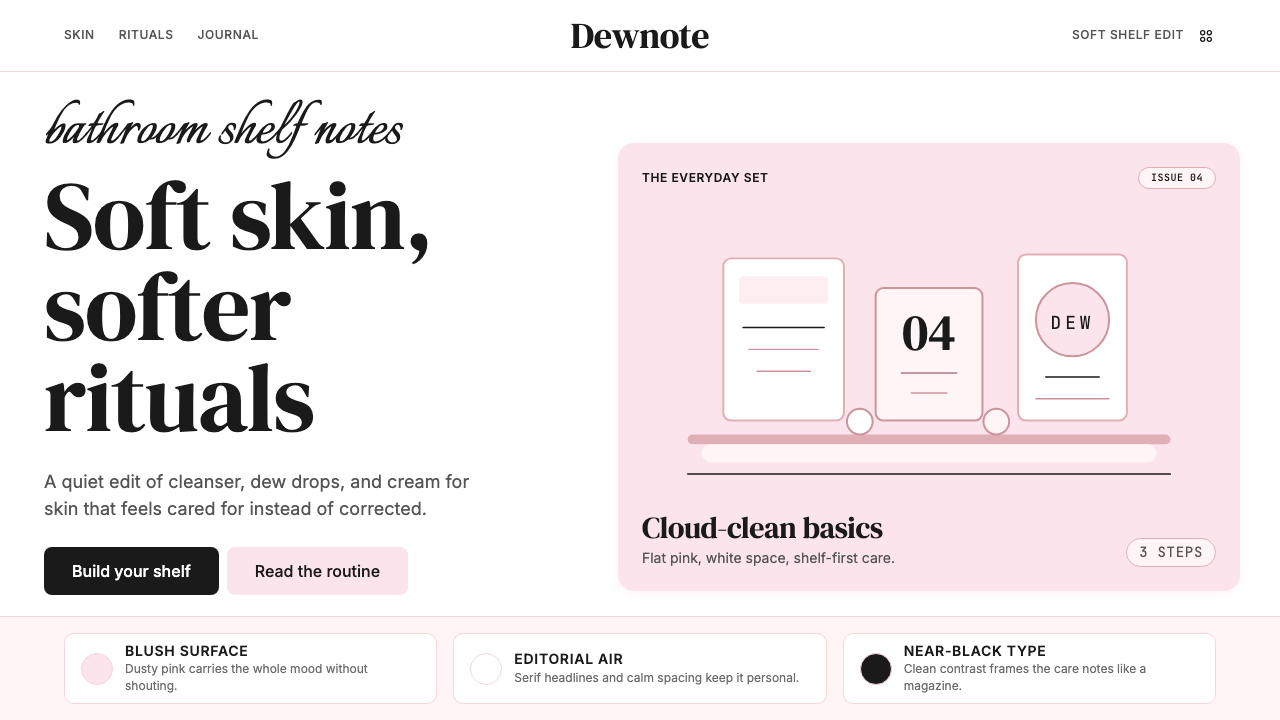 GlossierBeauty as a friend's conversation. Dusty pink (never bubblegum), editorial se…
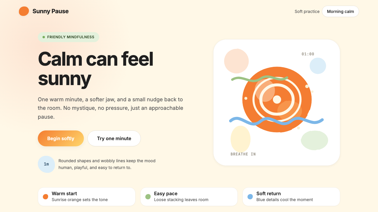 HeadspaceOptimism makes calm approachable. Sunrise orange and wobbly rounded forms bre…
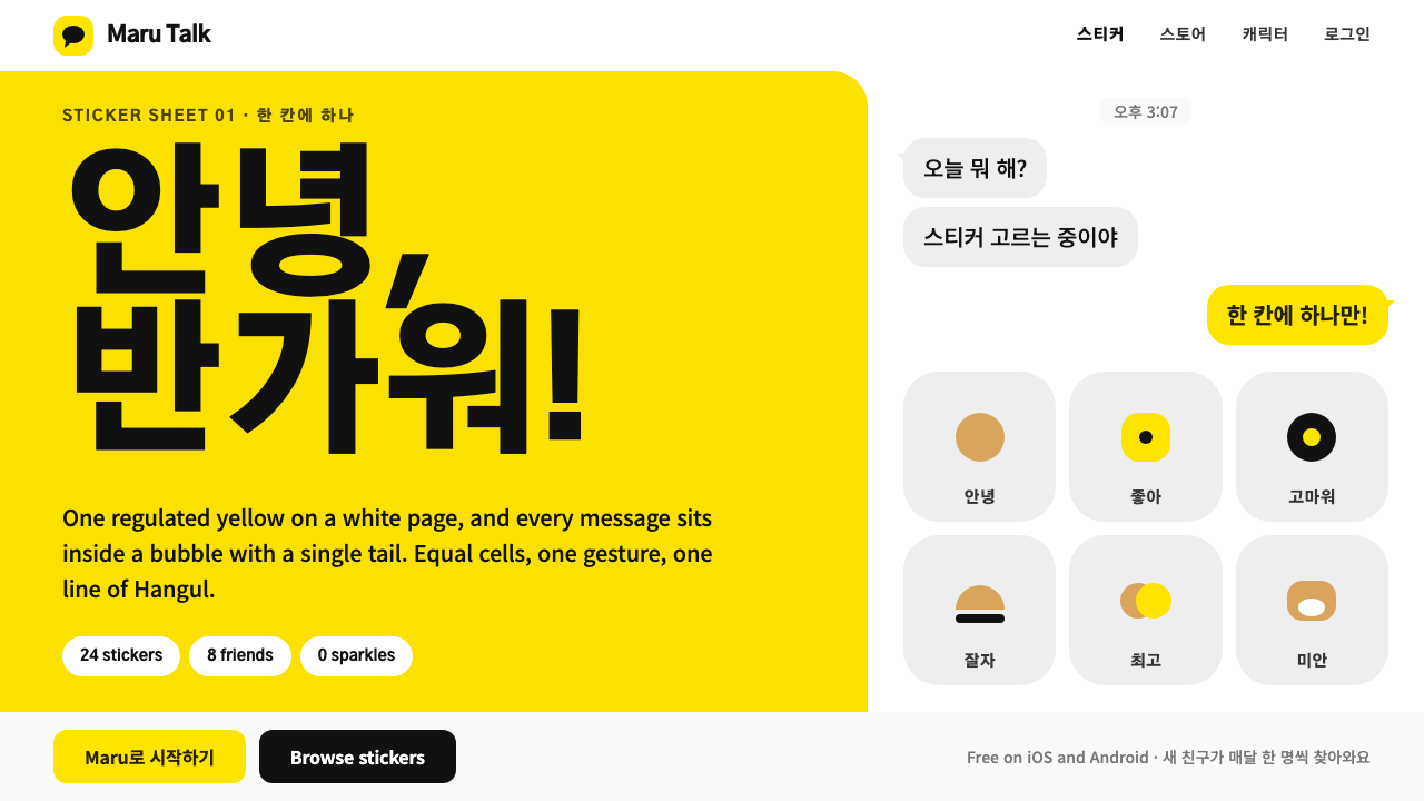 Kakao FriendsOne yellow, one gesture per cell. A white sticker sheet where speech bubbles…
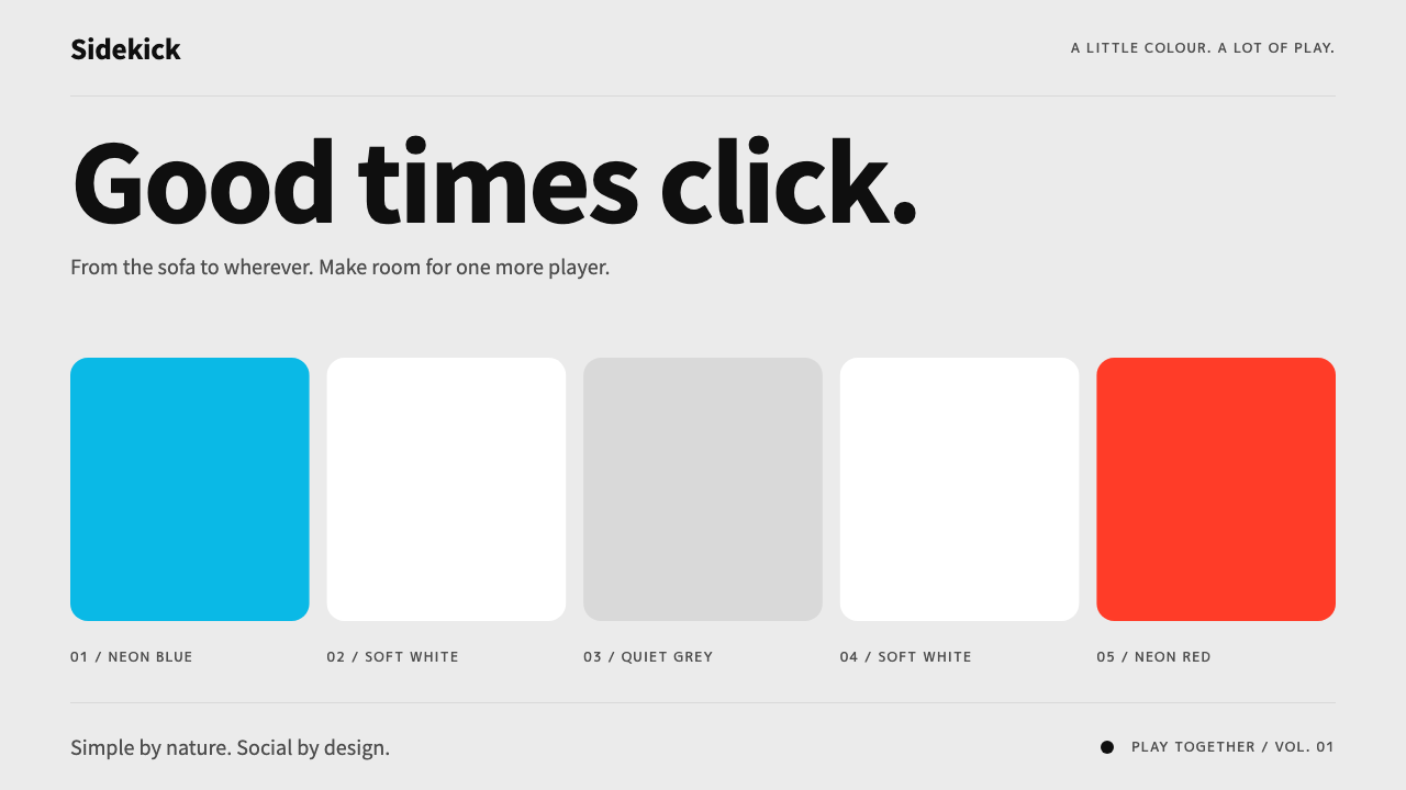 Nintendo SwitchQuiet meets playful. Neon blue and red bookend rounded tiles on a light-grey…
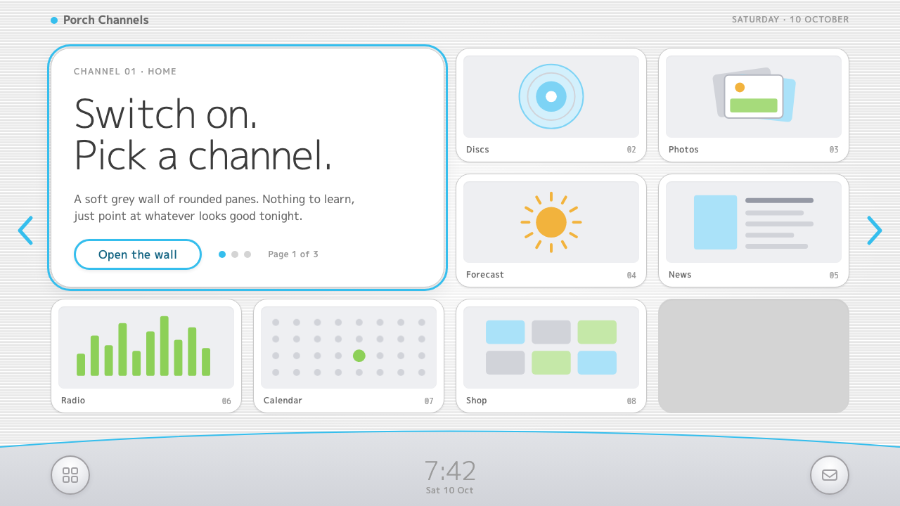 Wii MenuSwitch-on calm. White TV panes on a grey scanline wall, one thin blue line on…