What is Sutartinės Notation?
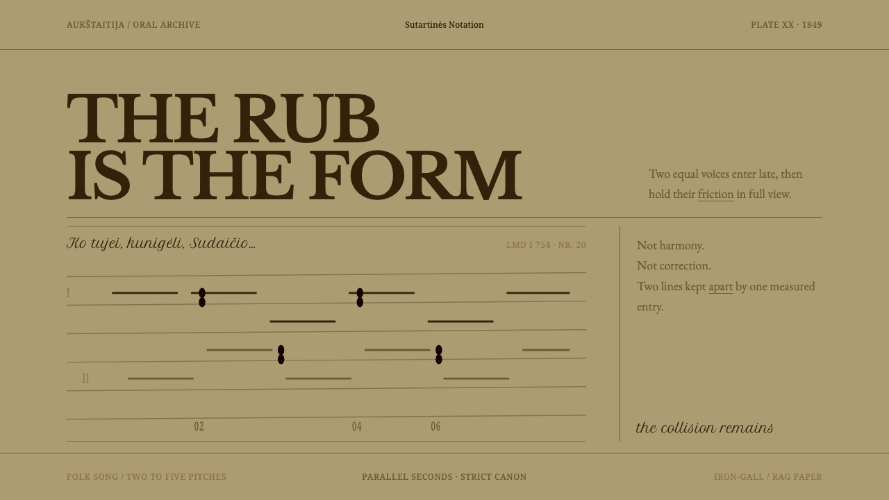
Sutartinės are songs built on friction, two parts staggered in canon and seconds rubbing against each other, and this design lets that friction show in sepia ink on browned paper.
Sutartinės Notation in brief
Sutartinės Notation takes its surface from a single archive sheet: the handwritten manuscript of Mykolas Miežinis, made around 1849 and catalogued as LMD I 754 nr. 20, with LMD standing for the archive of the Lithuanian Literature and Folklore Institute. The system is not a notation standard and not a reconstruction of a printed score. It is a visual language taken from the way one nineteenth-century collector set a song down on paper.
The songs themselves explain the design. Sutartinės are Lithuanian multipart songs built on two to five pitches. They are sung in parallel seconds or in strict canon, with two equal parts staggered against each other and one voice syncopated. The rub of the second, the tight clash between neighbouring notes, is not a flaw to be resolved. It is the song. A design that wants to carry that idea has to let its parts sit slightly out of step with one another and keep the friction visible.
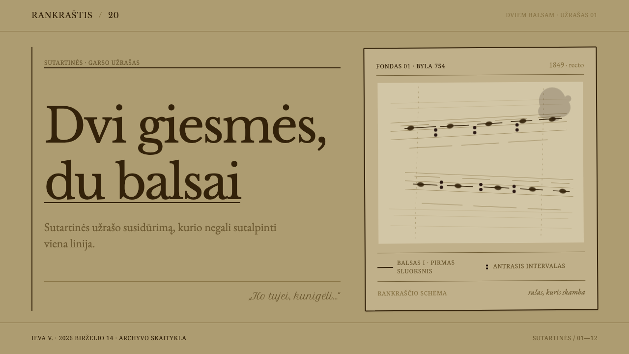
Visually, the sheet is browned rag paper written in iron-gall ink that has faded to sepia. The hand is rounded and leans hard to the right. Words that matter are underscored instead of set in bold, and one large blot has been left exactly where it fell. The layout follows hand-ruled horizontal lines, so it tilts and drifts a little. The result is warm, tactile and unmistakably handwritten, and it looks like something that has been used.
Where does Sutartinės Notation come from?
Sutartinės come from Aukštaitija, in northeast Lithuania, and the tradition is much older than the sheet that the system borrows from. The system dates the manuscript to about 1849 and places the sung tradition far earlier, with textual traces reaching back to the fourteenth century. That gap between a very old practice and a comparatively late written record is the whole situation of the design: what survives on the page is one collector's attempt to catch something that had been sung by ear for a very long time.
The manuscript belongs to the nineteenth-century collecting of Lithuanian folklore, one of the movements the system sits within. Mykolas Miežinis is its named hand. His sheet is held under the shelfmark LMD I 754 nr. 20 in the archive of the Lithuanian Literature and Folklore Institute, the second movement the system names. The choice matters, because it means the style comes from the archive rather than from the concert hall: from a working document written in ink, not from an engraved score prepared for performance.
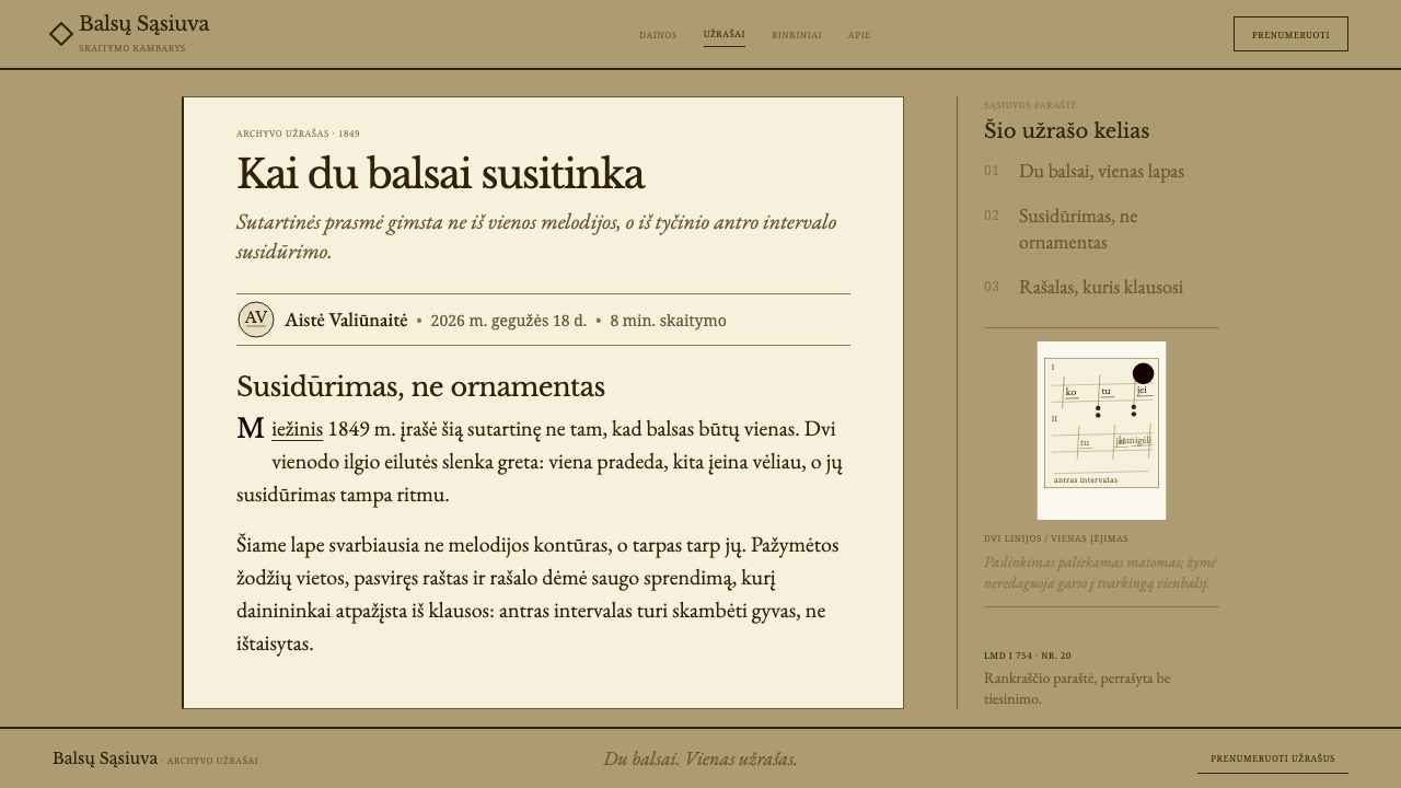
The music is hard to put on paper, and that is part of the point. A song of two to five pitches, with two parts staggered in canon and one syncopated, is not the kind of thing that sits comfortably in standard staff notation. The source says as much, noting that it is almost impossible to record in that form. In a manuscript, the two parts end up written one above or beside the other, staggered across the same sheet, which is the visual counterpart of the way they are sung.
The third movement is the recognition of the tradition as intangible cultural heritage by UNESCO, which listed sutartinės in 2010. Zenonas Slaviūnas stands beside Miežinis among the system's key figures, and together the two names bracket the long documentary history of these songs. The design system takes none of this as a reason to look solemn. It takes it as a reason to be exact about one particular sheet of paper, with its slant, its ink, its underlining and its blot.
What defines the Sutartinės Notation look?
Browned Rag Paper
The ground is not white. It is the warm, browned colour of old rag paper, and every other element is judged against it. The paper is the first thing that tells the viewer this is an archive document, and it sets a low-contrast, earthy tone for the whole composition. Pure white panels or crisp white cards would contradict the system's logic and should be avoided.
Iron-Gall Sepia
The ink is iron-gall that has faded to sepia, so text and lines are a deep, warm brown and not a clean black. Everything on the page lives in one family of browns, which gives the composition a unity that no applied accent could produce. A dark brown for text and a lighter, thinner brown for rules is enough for most hierarchies.
Hand-Ruled Lines
The layout follows horizontal lines that were drawn by hand, which means they are slightly uneven and can drift across the sheet. The structure of the page is therefore a set of lines to write on, not a mathematical grid. In an interface this suggests rows and baselines that are visible and a touch irregular, with content hung from them rather than snapped into boxes.
Staggered Parts
The defining structural idea comes from the music: two equal parts, staggered, written one against the other on the same sheet. In a layout, this becomes paired columns, rows or blocks that start at slightly different points and run in parallel. The stagger should be deliberate and consistent, so that the offset reads as a pattern and not as an error.
Right-Leaning Rounded Hand
The handwriting is rounded and leans hard to the right, and that slant gives the page its movement. It reads as a human hand, with variation from line to line, and it carries a sense of speed and attention. Where a typeface is needed, it should echo this: a rounded, slightly inclined letterform that keeps the warmth of the hand and avoids the cold regularity of a geometric sans.
Underline Instead of Bold
Emphasis is made by drawing a line under a word, not by thickening it. This is a small decision with large consequences: the weight of the text stays even across the page, and the emphasis reads as an act of the pen. In a layout, links, key terms and highlights take an underline in the ink colour, and bold weights are held back for the rare case that really needs them.
The Blot
One large blot is left exactly where it fell. Nobody has cleaned it up or hidden it. The system keeps it as evidence that this is a real sheet that was actually written on, and as a reminder that friction is allowed to show. In design terms it is a single, deliberate imperfection, placed once and not repeated, which gives a composition its character without turning into a texture effect.
Who shaped Sutartinės Notation?
The collector whose handwritten sheet of about 1849, catalogued as LMD I 754 nr. 20, is the visual source of this entire system. His page supplies the browned rag paper, the faded iron-gall ink, the hard right slant, the underlined words and the blot. The system treats him as the author of a surface, and takes its whole look from the way one particular person set a sung tradition down.
His name stands beside Miežinis in the system's reference list, and the pairing is what matters. The songs have a documentary history with more than one hand in it, so the sheet at the centre of the system is one voice in a longer exchange and not a lone relic. It is a fitting echo of the songs themselves, in which two parts answer each other.
The archive that holds the sheet and gives the shelfmark its prefix. Its name appears among the system's movements, which marks the style as one that comes from institutional memory and field collection rather than from performance. For a designer it is a useful anchor: the visual language is that of a catalogued document, with a number, a hand and a history of being kept.
The organisation that recognised sutartinės as intangible cultural heritage in 2010. That recognition places the songs of northeast Lithuania in a wider conversation about living traditions. It does not change the system's visual approach, which stays with the humble archive sheet, but it explains why a design based on a nineteenth-century manuscript can feel current: the tradition it belongs to is still recognised and valued.
How do you use Sutartinės Notation today?
This is a style for work that wants to feel handwritten, archival and warm, and that is comfortable with a little friction. It offers a texture of care and attention rather than polish. Applying it well means respecting the paper, the ink and the stagger, and keeping the imperfections deliberate and few.
On slides, a cover can be a browned sheet with a title in a rounded, slightly inclined hand set along a hand-ruled line, with a single blot placed where it falls naturally, and nothing else. Content slides can use paired columns that start at slightly different points, like two staggered voices, with key terms underlined in the ink colour. Data slides work as ink drawings: sepia lines and bars on the browned ground, with an underline or a small handwritten note to mark the figure that matters.
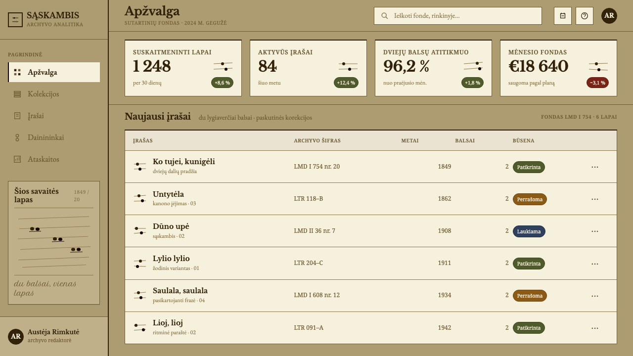
On the web, the style is best suited to reading-led products rather than dense dashboards. Archives, collections, journals, newsletter pages and learning tools fit naturally. Where a dashboard is unavoidable, hand-ruled lines can become row dividers, underlines can mark active items, and the slant can be confined to headings, leaving data cells plain and legible. A pricing page can offer its tiers as staggered columns, with the recommended plan marked by an underline rather than a badge.
For editorial and marketing work, the style belongs with museums, archives, folk and early music, oral history, long reads and album notes: anywhere the subject is a human record. A feature article can use the browned sheet as its page, with a pull quote underlined and a single blot as the only decorative moment. Because the style looks like something written, it asks that the content feel written too: personal, specific and unhurried.
The most common mistake is to treat 'aged paper' as a filter. This system does not use scorched edges, coffee stains or generic vintage textures; it takes one specific sheet, with its brown ground, its sepia ink, its slant, its underlines and a single blot. Cleaning the blot away, setting the text in black, or switching to bold for emphasis removes the very things that make it work. Setting every line at the same slant and spacing is also a mistake, since the hand should drift.
Sutartinės Notation — FAQ
What are sutartinės?
Sutartinės are Lithuanian multipart songs from Aukštaitija in the northeast of the country, built on two to five pitches. They are sung in parallel seconds or in strict canon, with two equal parts staggered and one voice syncopated. The close rub of the seconds is not a flaw but the point of the form. UNESCO listed the tradition as intangible cultural heritage in 2010.
Is this a real notation system I can use to write music?
No. The name refers to the manuscript the system is based on, not to a notation standard. It is a visual language drawn from one handwritten sheet by Mykolas Miežinis from around 1849: its paper, ink, hand and layout. The music is the reason for the design's ideas, particularly the staggered parts, but the system is for interfaces and presentations, not for engraving songs.
Why is the ground browned paper and not white?
Because the source is a nineteenth-century sheet on browned rag paper, and the system treats that paper as part of the message. A white ground would turn it into a generic handwriting style. The brown ground, together with sepia ink, keeps everything inside one warm family of tones and signals at once that this comes from an archive.
Why underline words instead of making them bold?
Because the writer of the source sheet underscored the words that mattered, and a pen cannot thicken a word the way a typeface can. Underlining keeps the weight of the text even and makes emphasis look like an act of the hand. In a layout it also keeps the colour of the page consistent, since no heavy black masses appear among the lines.
Should I keep the blot, or is it a mistake to leave it in?
Keep it, once. The blot is part of the sheet the system comes from, and it is left where it fell. It works as a single, deliberate imperfection that shows the page was really written on. Repeating it as a pattern, or scattering several, would turn the idea into a texture effect and lose the point.
Related design styles
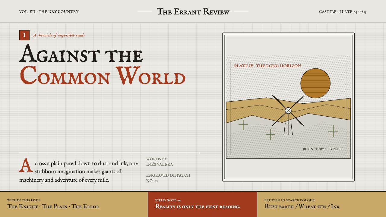 Don Quixote (1605)Imagination defies the plain. Rust capitals and cross-hatched ink score a dry…
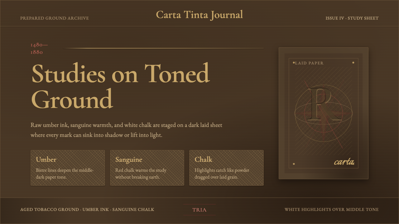 Raw Umber SketchbookMiddle tone becomes drama. Tobacco paper, Garamond type, sanguine marks, chal…
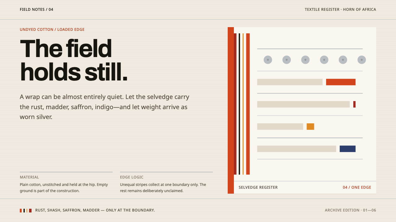 Afar Nomad TextileWeight lives at the edge. Rust and madder selvedges cut across a quiet cotton…
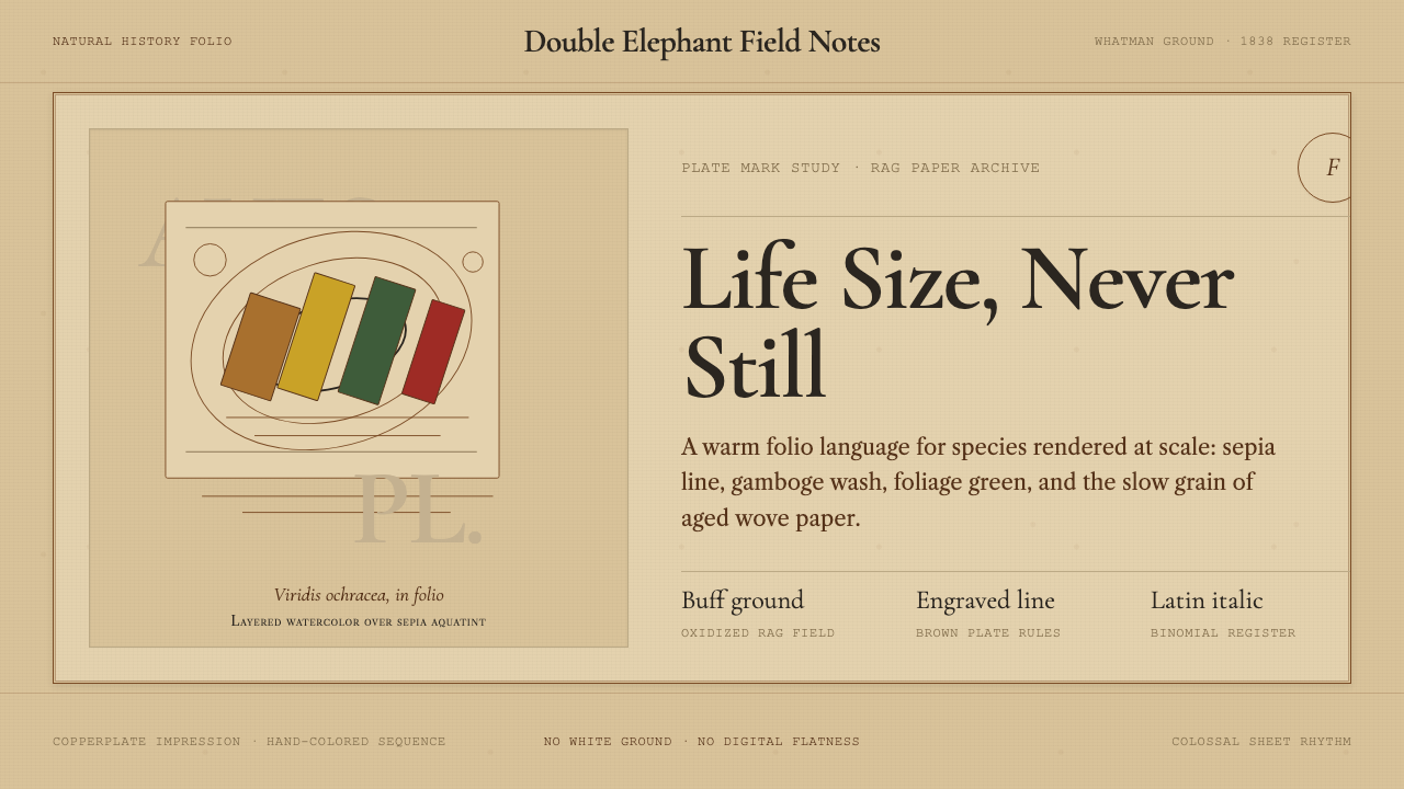 Audubon Birds of AmericaAged natural history breathes. Buff rag paper, sepia rules, and italic binomi…
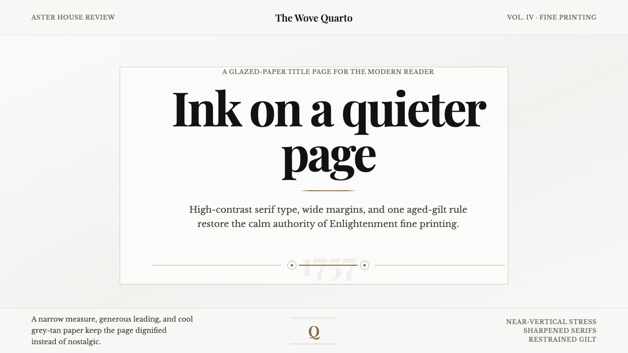 Baskerville Transitional SerifCalm authority in print. Glazed grey-tan paper, sharp serif contrast, one age…
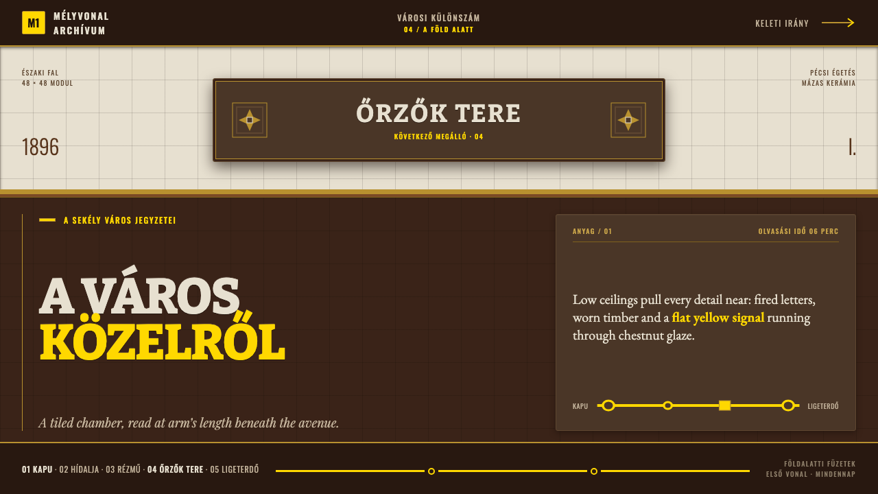 Budapest Millennium LineChestnut glaze turns transit into a room. Fired slab type and flat yellow run…