What is Lipovan Old Believer Icon?
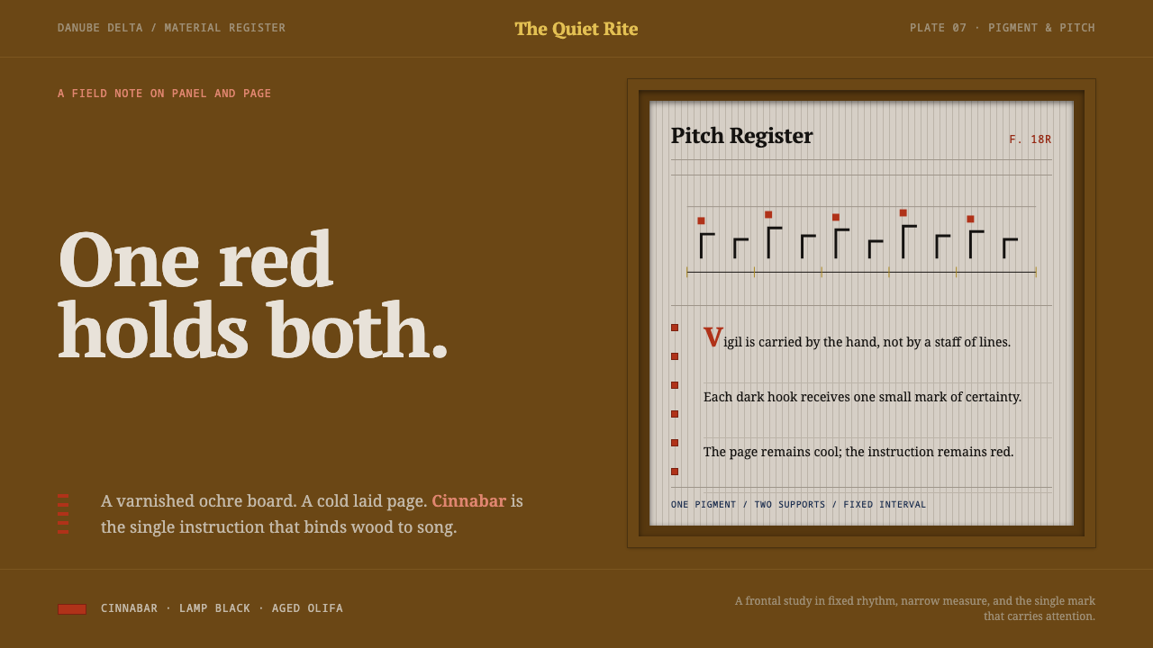
One cinnabar red binds a varnished ochre icon panel to a cool grey chant page, and the whole system is built on that single shared pigment.
Lipovan Old Believer Icon in brief
Lipovan Old Believer Icon is a dark, devotional design language drawn from two objects that sit side by side in the tradition of the Lipovans, the Old Believers of the Danube delta. The first is a small board of lime wood, prepared with gesso and painted in egg tempera, its ochre field gone deep and warm under layer upon layer of olifa varnish. The second is a hand-copied chant book on cool grey laid paper, with black kryuki hooks riding above the text line and red marks above the hooks fixing the pitch.
The central idea is that these two very different objects, one wood and one paper, one warm and one cool, one an image and one a text, share a single red. Pigment analysis of these very panels found cinnabar in the icon and cinnabar in the manuscript. The design therefore uses one saturated red to do all the pointing: marking what matters, fixing a pitch, drawing the eye to the place it should go. A dark varnished ground, a cool page laid into it, and one red. That is the whole grammar.
In practice this gives a design that feels sacral without ever turning sentimental. It is frontal and flat: letters face the viewer, there is no perspective, and nothing casts a shadow. Authority comes from repetition and fixed convention, the way a chant book repeats its markings and an icon repeats its types, rather than from novelty. It is a style for content that deserves reverence and rewards slow reading.
Where does Lipovan Old Believer Icon come from?
The style is rooted in Russian Old Belief, the tradition of Orthodox Christians who kept the old rite and the old books. Its Lipovan branch settled in the Danube delta and in Dobruja, in what is now Romania and Ukraine, and the panels and manuscripts the style draws on date from the eighteenth and nineteenth centuries and, according to the source, are still in community use. That last detail matters. These are not museum relics but objects that belong to a living congregation, which is why the varnish has darkened and the paper carries the softness of repeated handling.
The panel is made in the traditional way. A board of lime wood is coated with gesso, the image is painted in egg tempera, and the surface is sealed under olifa, a drying-oil varnish. Over time the varnish deepens, which is why the ochre field in these panels is darker and warmer than it was when new. The Curio system treats that ageing not as damage but as the intended look: a dark varnished ground is the starting point, not a filter applied afterwards.
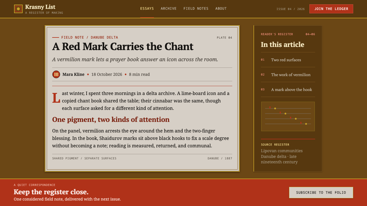
The chant book belongs to the znamenny tradition, the unison church singing of the Russian Orthodox world, notated not on a staff but with hook-shaped signs called kryuki. Above the black hooks, red marks named for Ivan Shaidurov fix the pitch, so the hooks tell the singer the shape of the melody and the red tells the singer where the pitch falls. The text itself is written in poluustav, a manuscript hand, on cool grey laid paper, with the hooks riding above the line like a second layer of writing.
What gives the combination its force is the pigment analysis. Tests on these very panels found cinnabar in the icon and cinnabar in the manuscript: one vermilion binding wood to paper. The system takes that finding as its brief. Rather than choose a red for the interface, it lets the red choose the interface: dark and warm on one side, pale and cool on the other, and a single vermilion standing between them as both ornament and instruction.
What defines the Lipovan Old Believer Icon look?
One Red
A single saturated cinnabar red does all the pointing. Around it sit two grounds: a dark varnished ochre, deep and warm, which belongs to the panel, and a cool grey-cream, which belongs to the page. Black is the colour of the hooks and the text. There are no secondary accents. If a second signal is needed it is solved with weight, position or repetition, not by introducing a new hue.
Two Surfaces
The system is built from two surfaces that never merge: a dark, warm, varnished panel, and a cool pale page laid into it like an inset. The temperature difference carries hierarchy. Warm and dark frames the interface; cool and pale holds the reading. Because the contrast is one of temperature as much as brightness, the page feels placed rather than pasted, in the way a leaf might be bound into a case.
Typography
Letterforms are upright, frontal and unhurried, drawn from the poluustav manuscript hand: the weight of pen-written text rather than the sleekness of display type. Text sits on a clear line, and other marks ride above it, so the line works like a staff that carries the signs. Hierarchy comes from the red marks and from placement, not from large size or decorative display faces. Spacing is steady and even, the way a copyist holds a rhythm over many pages.
Layered Marking
Black kryuki hooks sit above the text line, and red Shaidurov marks sit above the hooks. This layered notation is the style's signature: small, repeated signs above the line that tell the reader how to read it. Interfaces can echo the idea with annotations, status markers and inline cues that sit above or beside a line rather than replacing it. The text stays intact; the marks guide.
Frontal and Flat
Icons face the viewer, and so does this system. There is no perspective, no drop shadow and no illusion of a lit room. Depth is expressed only through overlap of surfaces and a change of tone, the page set against the panel. The refusal is deliberate: a devotional image does not stage a scene, it presents an address, and the interface should do the same.
Surface and Age
Egg tempera under varnish glows from within rather than glittering on top, and laid paper carries a faint ribbed texture. The warmth of the panel is the warmth of age, built up in layers, and the coolness of the page is the coolness of paper that has been turned many times. The surface should feel slightly satin, never glossy. Age here is a quality of depth, not a decorative crack pattern added for effect.

Who shaped Lipovan Old Believer Icon?
The red marks in the chant books are named for him: Shaidurov marks. In the source he is the figure behind the system of red signs that sits above the kryuki hooks and fixes pitch. His marks matter to the design because they form the second layer of meaning on the page, and the layer that shares its pigment with the icon. Where a designer needs a red accent to mean something precise, this is the model.
The community church of the Lipovan Old Believers, named in the source as the institution that holds this tradition. The repeated emphasis on objects still in community use belongs here: these panels and manuscripts belong to a living congregation rather than a closed archive. For a designer, it is a reminder to treat the visual language with respect, without costume, kitsch or spectacle.
Named alongside the Lipovan church as a related community of old-rite believers. Their presence in the source is a reminder that Old Belief is not a single monolithic body but a family of communities that preserved related practices in different institutional arrangements. The style draws on the shared material culture of panels and chant books, not on the doctrine of any one group.
How do you use Lipovan Old Believer Icon today?
As a slide cover, set a single dark varnished-ochre ground across the frame, with a smaller cool pale panel laid into it holding the title in upright, frontal type. Let one red mark carry the emphasis, a short rule or a single word, and leave the rest still. The cover should feel like an object placed on a table, not a poster. Avoid scattering ornaments; the dignity of the style comes from how little it asks you to look at.
Content slides can keep the same two-surface logic: the dark ground as the frame, the pale page as the reading area, and red used only where the eye must land. For data, give charts the pale surface, draw the series in neutral dark tones and make exactly one series or one value red. The red then works as the Shaidurov mark does on the page, quietly fixing the pitch of the whole chart. Avoid three-dimensional effects and shadowed bars; the system reads everything frontally.
In web interfaces the style suits dark-mode products with serious reading at their centre: archives, scripture and liturgy apps, music notation tools, long-form publishing and heritage platforms. Use the dark varnished ground as the application frame and the pale page for content cards. Reserve red for primary actions and key states, so it keeps its meaning. On a pricing page, the recommended plan can carry the single red mark while the others stay neutral, which makes the choice legible without a loud badge.
Editorial and marketing work can lean on the layered marking idea: small notes, glosses or cross-references set above a line in red and black, with the main text left clean. Essays on music, manuscripts, religion, craft and material history are natural fits, as are cultural institutions and publishers of serious editions. Photographs should be frontal and quiet, with no dramatic lighting, and captions should be treated like marks above a text line.
The most common mistake is spending the red. A palette that scatters vermilion across headings, buttons, icons and borders stops pointing at anything, and the system collapses into a generic dark theme. Equally damaging are halos, gold-leaf effects, flickering-candle glows, fake cracks and sepia filters laid over the whole page, which treat a living tradition as a costume. The panel, the page and the one red do all the work; everything else should be quiet.
Lipovan Old Believer Icon — FAQ
What does the red mean in this style?
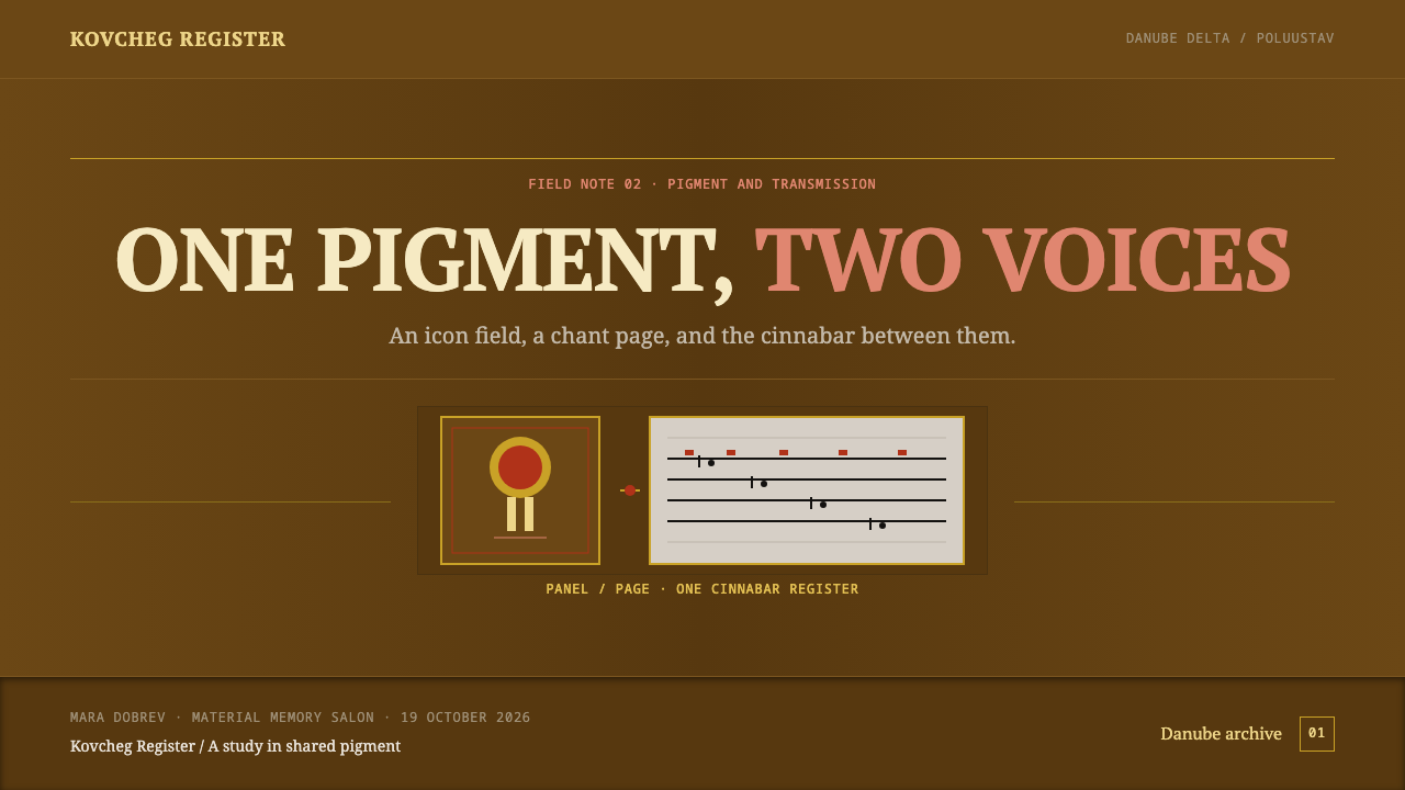
It is a pointing colour. In the source objects, the same cinnabar appears in the icon and in the manuscript, and in the chant book it sits above the hooks to fix the pitch. Translated into design, red marks the place the eye or the hand should go: the key figure, the primary action, the current position. Because it does all the pointing, it must never be used for decoration or for more than a small share of any layout.
Is this a general Russian or Byzantine icon style?
No. The source ties it specifically to Lipovan Old Believer panels and manuscripts from the Danube delta and Dobruja, drawing on a pair of objects and the pigment analysis that connects them. It does not borrow the figurative content of icons or any decorative vocabulary of a wider imperial tradition. What it takes is the physical language of those two objects: varnished ground, cool page, hooks and marks, one red.
Why is the style dark?
Because the panel is dark. Layers of olifa varnish over an ochre field give the icon a deep, warm ground, and the cool grey page is laid into that darkness rather than set on white. The result reads as a lit page inside a shadowed frame. A light version would lose the temperature contrast that holds the system together, so if you need a lighter treatment, keep the page and make the surrounding frame as dark as the content allows.
Do I need to include religious imagery to use it?
No. The style works through structure: two surfaces, one red, frontal type, marks above a line. Figures are not required, and a faithful use usually has none. Because the objects are still in community use, it is better to avoid reproducing sacred imagery as decoration. Take the discipline of the system and leave the devotional content to the community it belongs to.
Which products does it suit?
It suits products where reverence, slow reading and trust are the promise: archives, heritage and cultural platforms, music and notation tools, long-form publishing and serious reference. It is less comfortable with fast, playful or promotional interfaces, because its power comes from restraint and repetition. If a product needs lots of bright states and competing calls to action, this style will fight it.
Related design styles
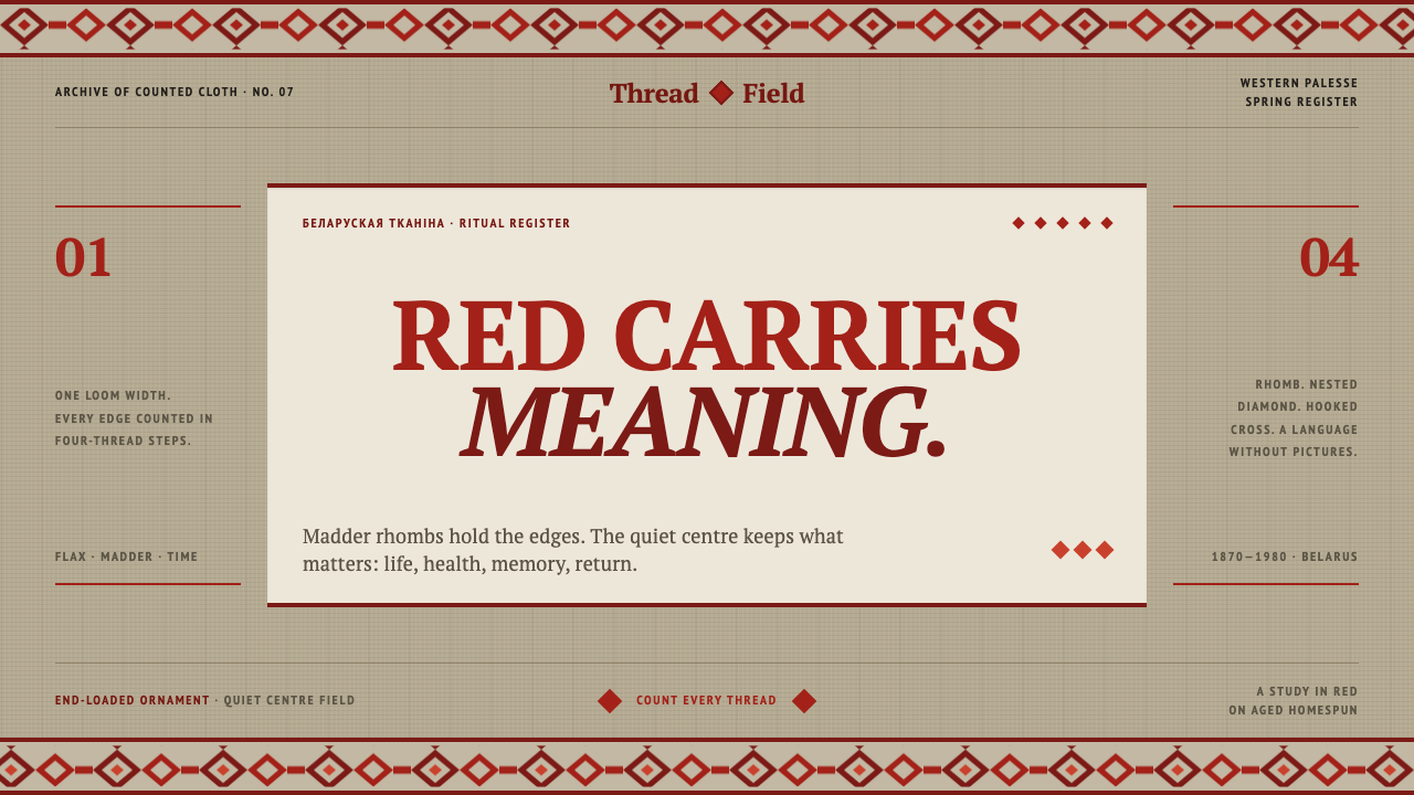 Belarusian RushnykRed carries meaning. Madder rhombs crowd aged flax edges while the woven cent…
 Chuvash SurpanThe ends remember. Madder geometry frames an open hemp field, counted for bot…
 Erzya PangaDensity is the ornament. Madder and black stepped stitches crowd unbleached l…
 Georgian MkhedruliA manuscript breathes slowly. Tanned vellum, round Mkhedruli ink, ochre and u…
 Hutsul KilimGeometry is the craft. Hot red stepped rhombs repeat across raw fleece bands.
 Kashubian Seven ColoursMeaning is stitched into the palette. Seven threads cross undyed linen in a m…