What is The Lion King (Pride Rock, 1994)?
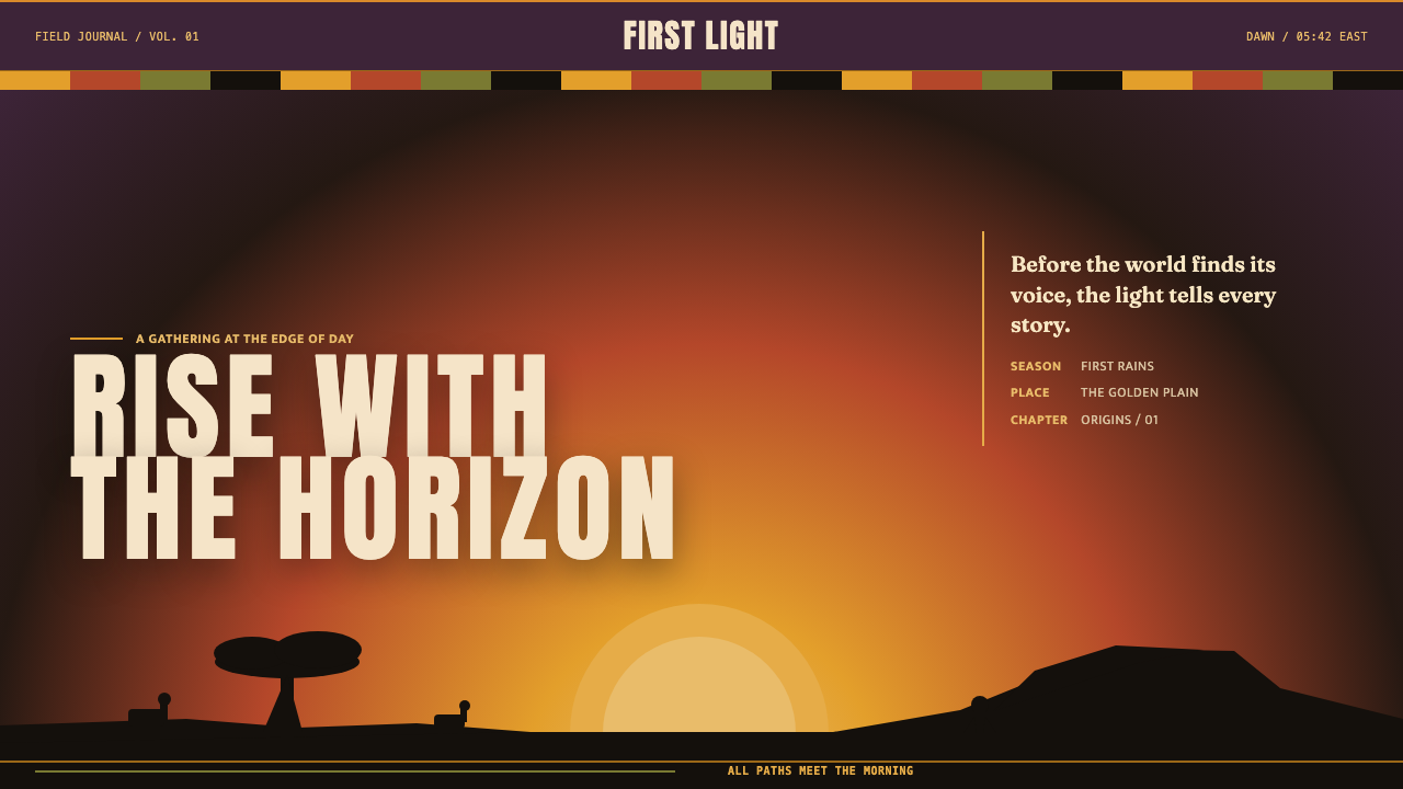
Dawn becomes destiny: monumental black silhouettes rise through plum, terracotta, and molten gold until the screen feels like a horizon.
The Lion King (Pride Rock, 1994) in brief
The Lion King, Pride Rock, 1994 is a cinematic visual language built from the opening iconography of Disney’s 1994 film. Its defining image is immediate: light rises over the savanna, then animals, trees, and rock formations emerge as clean black silhouettes. The effect depends on reduction. Instead of describing every surface, the scene lets contour, scale, and contrast carry the drama.
Its atmosphere moves through deep dusk umber and twilight plum into burnt terracotta and blazing sunset gold. Warmth is essential. Nothing should read glossy, cool, metallic, or neon; light appears to come from the earth and horizon rather than from an interface. The visual field feels painted and elemental, with the sky acting as both background and emotional engine.
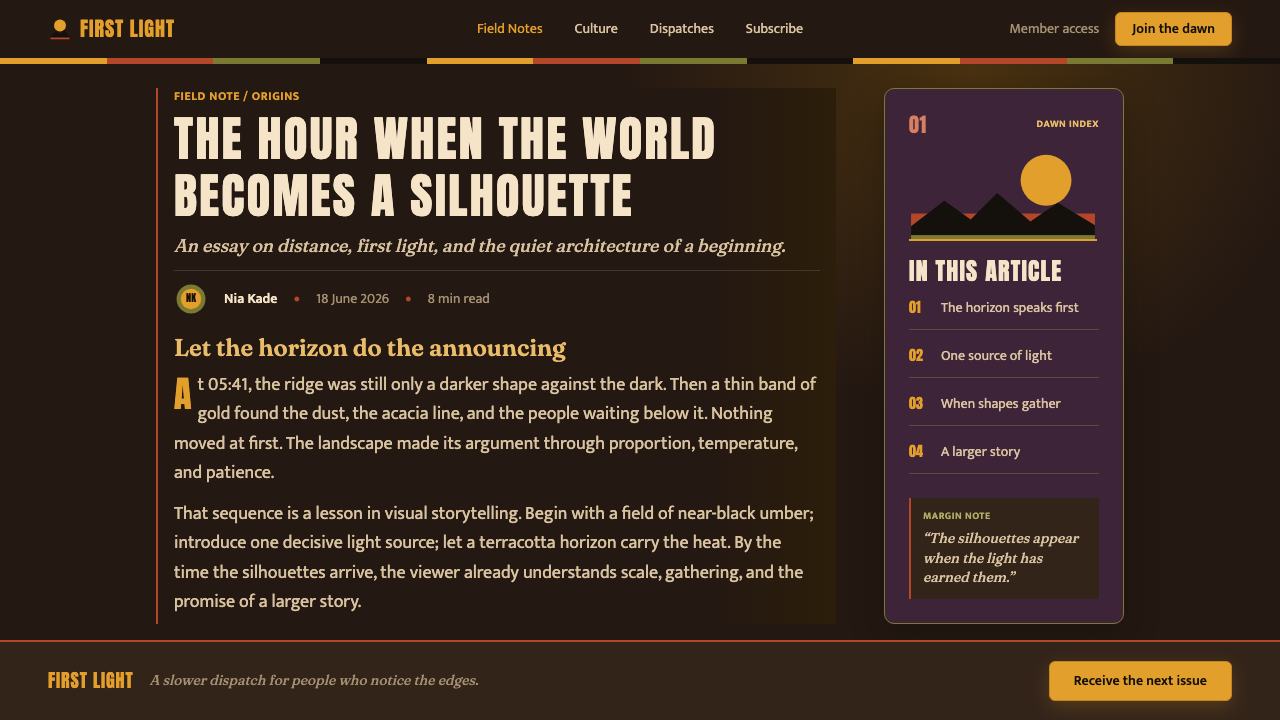
The style also translates African textile logic into screen composition. Bright banded borders associated with Ndebele traditions and stripe-like dividers associated with Kente traditions give edges a ceremonial rhythm. Titles arrive with poster-like gravity, while silhouettes keep the composition legible from a distance. The result is not simply a dark interface with warm accents. It is a scrolling sunrise shaped by silhouette, ritual, and monumental scale.
Where does The Lion King (Pride Rock, 1994) come from?
This visual world belongs to Disney’s 1994 film The Lion King, produced between 1991 and 1994 at Walt Disney Feature Animation. Its source landscape is the East African savanna, specifically the Serengeti and Maasai Mara named in the project’s regional reference. The setting supplies the broad visual conditions: open sky, exposed horizon, isolated trees, animal movement, and rock formations capable of becoming monumental landmarks.
The source material identifies cinematic silhouette staging and Disney Renaissance painted backgrounds as the central visual movements behind the theme. Together, they explain its unusual clarity. A painted sky can carry subtle warmth and dramatic atmosphere, while a silhouette can turn an animal, tree, or ridge into a single decisive shape. The screen therefore reads first as a composition of dark forms against luminous space, then as a narrative environment.
African textile traditions, specifically Ndebele and Kente, provide the organizing logic for borders and dividers. Their influence is not an invitation to fill every surface with pattern. It is a cue to use bands, stripes, and framed edges as deliberate structural moments. A divider can feel ceremonial rather than merely functional; a border can establish cadence without competing with the horizon.
Roger Allers, Rob Minkoff, Andy Gaskill, and Chris Sanders are named as key figures in the approved production context. For this theme, their importance lies in the fact that the visual language is tied to a film-production world rather than a generic safari motif. Pride Rock, the savanna, the rising light, painted atmosphere, and staged silhouettes form one connected cinematic system.
What defines the The Lion King (Pride Rock, 1994) look?
Horizon Light
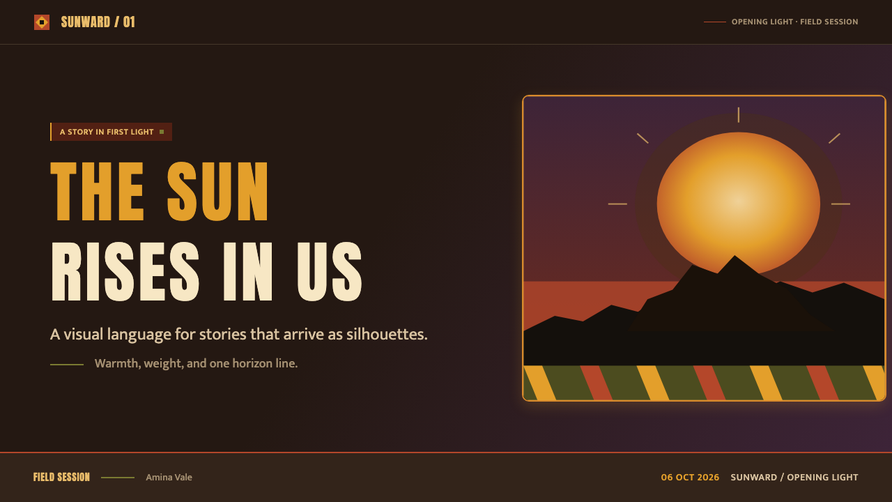
Light rises upward from the savanna and turns the sky into the composition’s main source of energy. The sequence should feel like twilight yielding to sunrise: dark plum and umber hold the upper field, terracotta carries the transition, and molten gold gathers nearest the horizon. The luminous area is not a decorative backdrop. It creates the contrast that makes every silhouette meaningful.
Monumental Silhouette
Animals, acacia-like trees, and rock formations are treated as black cutouts with unmistakable contours. Internal rendering stays restrained because recognition comes from outline, posture, and placement. A large rock can command a page like a landmark; a small animal line can imply distance and procession. The silhouettes should feel staged against light, never pasted over a generic dark background.
Painted Warmth
The palette is governed by dusk umber, plum, burnt terracotta, and sunset gold. Its warmth must remain earthy and atmospheric rather than polished or synthetic. The sky may shift gradually as a painted field, but the focal forms remain crisp and dark. Cool digital shine, neon intensity, and glossy surface treatment break the intended sense of heat, dust, and dawn.
Textile Borders
Ndebele-bright banded borders and Kente-stripe dividers organize the edge of the composition. Their role is architectural: they frame, separate, and establish rhythm. Use them where a section needs a threshold or where a long visual field needs a beat. They should remain legible as bands and stripes, not dissolve into incidental ornament or compete with the central silhouette.
Poster Typography
Titles arrive at monumental scale and carry a poster-like sense of declaration. They work best when allowed generous surrounding sky or darkness, so the text reads as an event rather than a label. Supporting copy should remain quieter and directional. The typographic hierarchy echoes the cinematic staging: one large statement claims the horizon, while smaller information takes its place around it.
Ceremonial Pacing
The style unfolds as a sequence of arrival: darkness, first light, silhouette, proclamation, and open space. It should not feel crowded or mechanically modular. Large quiet regions make the next animal line, title, border, or rock formation feel consequential. The experience is cinematic because each element enters with timing implied by spacing and contrast, even in a static layout.

Who shaped The Lion King (Pride Rock, 1994)?
Roger Allers is named among the key figures in the approved production context for The Lion King. Within this style reference, that connection anchors the visual language in the film’s opening world of savanna light, staged silhouettes, and monumental narrative imagery.
Rob Minkoff is listed as a key figure in the source material. The theme’s visual identity remains tied to a cinematic frame: a horizon, an ascending field of light, and figures whose contours carry narrative force before surface detail appears.
Andy Gaskill appears among the source’s key figures. His inclusion situates the reference within the production world of painted backgrounds, where atmosphere is built through a warm sky field and silhouette staging preserves the clarity of the foreground.
Chris Sanders is also named as a key figure in the approved material. For designers using this reference, the relevant lesson is that the theme comes from a coherent film language, where rock, animal, tree, light, and title all participate in one staged emotional horizon.
How do you use The Lion King (Pride Rock, 1994) today?
For presentation covers, use the style as an act of arrival. Let a broad sky field establish the emotional temperature, then place one monumental title beside or beneath a dominant rock, tree, or animal silhouette. A textile-like border can define the outer edge or introduce a subtitle, but the opening image must remain spacious. The cover should feel like the first frame of a story rather than a crowded summary of its contents.
For presentation content and data pages, preserve the same horizon logic without turning every slide into scenery. Use dark silhouette bands to anchor headings or section changes, and let warm light fields distinguish major ideas. Data should read as a procession of clear forms, with the strongest value or category receiving the visual position of a landmark. Keep explanatory text calm and subordinate so the slide retains its ceremonial visual hierarchy.
For web interfaces, this language is strongest in immersive landing pages, dashboards with major status moments, and pricing pages that need a sense of scale. Establish a dark, warm atmospheric field; reserve luminous gold-like warmth for key actions, featured states, or progress; and use silhouette-like shapes to make navigation or major sections memorable. The interface still needs practical clarity, so borders and dividers should organize interaction rather than become decorative noise.
For editorial and marketing work, treat each long page as a journey from dusk toward dawn. Open with a large statement and a strong horizon image, then use textile-inspired separators to mark chapters, offers, testimonials, or calls to action. Editorial pull quotes can sit in open sky-like areas, while product details belong in calmer framed regions. This preserves the feeling of spectacle while ensuring information has a readable home.
The common mistake is reducing the style to a warm gradient behind black animal icons. That misses the system’s cinematic staging, painted atmosphere, textile rhythm, and monumental hierarchy. Avoid cool highlights, neon energy, glossy panels, and crowded decorative patterns. More importantly, do not make every element equally dramatic. The style works because light, silhouette, border, and title take turns carrying the scene.
The Lion King (Pride Rock, 1994) — FAQ
Is this style simply an African-pattern interface?
No. The approved reference combines three connected sources: cinematic silhouette staging, Disney Renaissance painted backgrounds, and African textile traditions associated with Ndebele and Kente. Textile logic organizes borders and dividers, but the dominant experience comes from the relationship between rising horizon light and monumental dark forms. Pattern is structural support, not the whole visual identity.
Can the visual language work without animal silhouettes?
Yes, provided that silhouette staging remains central. The source material names animals, trees, and rocks as black cutouts, so a rock formation, a solitary tree, or another clearly cut contour can carry the same compositional role. What matters is the contrast between a luminous painted atmosphere and a readable dark form, not the repeated use of one particular animal.
How should titles behave in this style?
Titles should feel monumental and poster-like. Give one main statement enough open space to claim attention, then let smaller copy guide rather than compete. The source describes titles as arriving with poster weight and monumental scale, which means hierarchy should come from dramatic placement and visual breathing room rather than from many competing labels.
Why should cool, glossy, or neon effects be avoided?
They contradict the source image. The theme is explicitly built from a deep dusk-umber sky, molten gold light, clean black cutouts, and an atmosphere with nothing glossy, cool, or neon. Introducing those effects changes the emotional temperature from elemental sunrise to digital spectacle, weakening the relationship between painted light and silhouette.
Where does this style struggle?
It struggles when every task demands dense utility, constant visual parity, or a neutral corporate tone. Its strongest assets are atmosphere, hierarchy, and arrival, so crowded control surfaces can lose clarity if treated as continuous spectacle. Use the language for major moments, sections, and decisions; let routine information remain calm enough to be read.
Related design styles
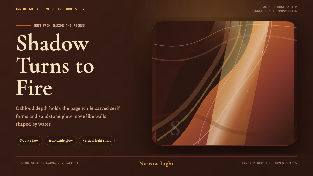 Antelope Slot CanyonGlows from shadow. Oxblood ground, sandstone S-curves, and one warm gold shaf…
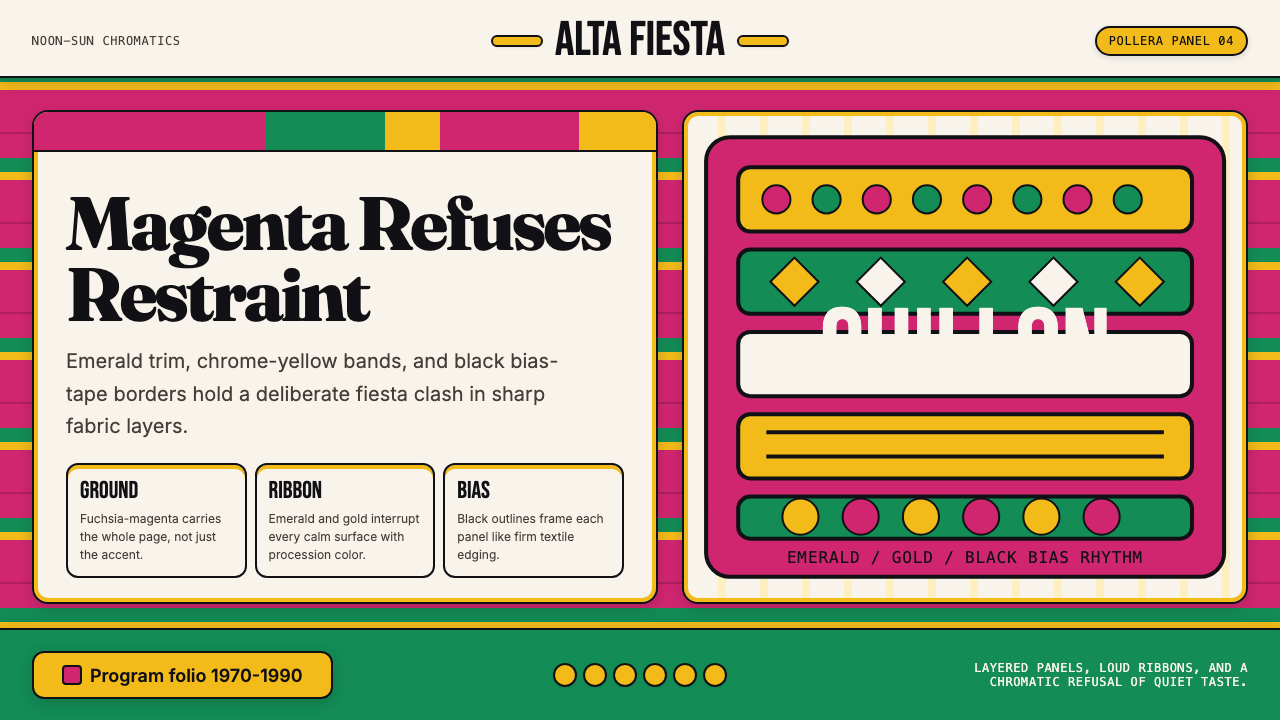 Bolivian Pollera Fiesta MagentaChromatic defiance. Magenta ground, emerald bands and black outlines clash li…
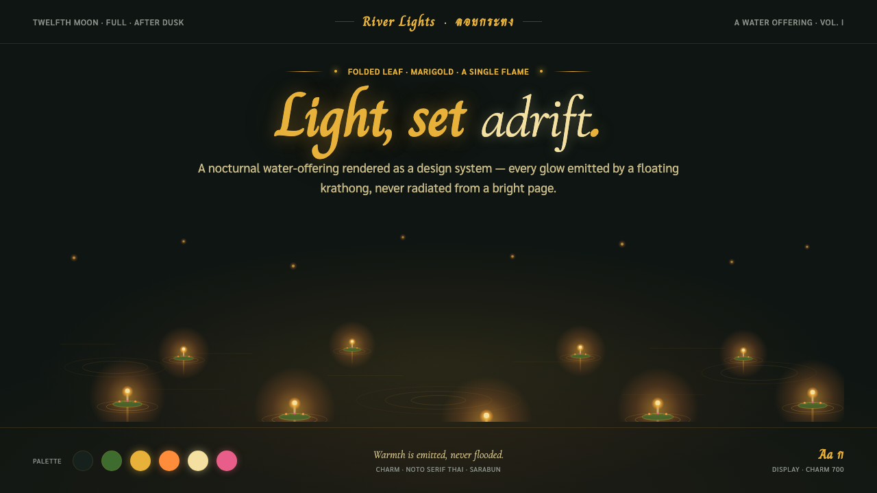 Loy KrathongLight, set adrift. Candle-gold flames on near-black river water — warmth emit…
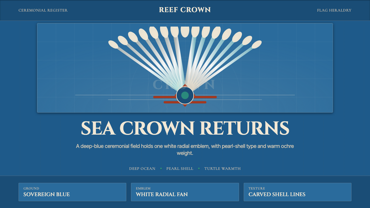 Torres Strait Dhari HeaddressCeremony becomes heraldry. Deep ocean blue centers a white radial fan and pea…
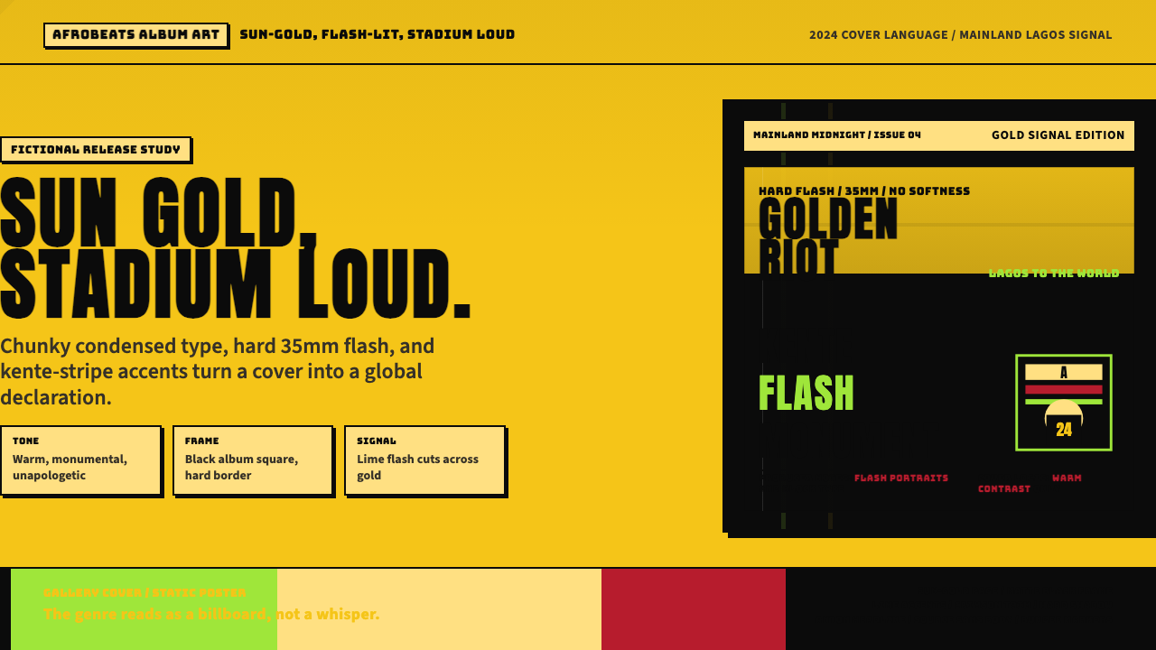 Afrobeats Album Art 2024Sun-gold and stadium loud. Anton type, kente stripes, and hard flash drive th…
 Beyoncé — LemonadeMythic heat refuses restraint. Marigold blocks, navy gravity, serif ceremony.