Design style guide设计风格指南
What is Torres Strait Dhari Headdress?什么是 Torres Strait Dhari Headdress?
A single sacred headdress became the heraldic heart of an entire people — and its visual logic of centered radiance, ocean depth, and shell-bright white still carries that sovereign weight.一顶神圣头饰化为一个民族的纹章核心——其居中放射、海洋深邃与贝壳纯白的视觉逻辑,至今仍承载着那份主权的分量。
Torres Strait Dhari Headdress in briefTorres Strait Dhari Headdress 速览
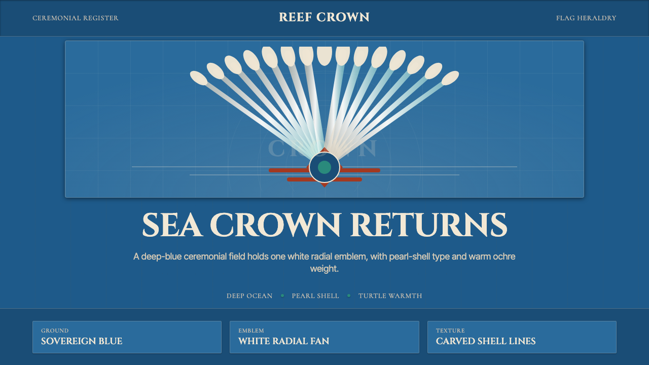
Torres Strait Dhari Headdress is a design language rooted in the ceremonial object that stands at the center of the Torres Strait Islander flag: the dhari, a fan-shaped headdress of white egret feathers mounted on a woven rattan frame. The style translates the visual logic of that singular emblem — bilateral symmetry, radial expansion from a strong center, a palette of deep ocean blue offset by luminous white and the warm amber of turtle shell and pearl — into a complete design system.托雷斯海峡达里头饰是一套扎根于仪式器物的设计语言,而那件器物正是托雷斯海峡岛民旗帜的核心:达里——一顶以白色白鹭羽毛装饰、固定在编织藤架上的扇形头饰。这套风格将那一独特徽章的视觉逻辑——双边对称、从强劲中心向外放射、深海蓝与光亮白及玳瑁珍珠暖琥珀的色彩对话——转化为一套完整的设计体系。
Where most heritage-inspired aesthetics borrow surface textures or regional motifs, the dhari system works differently. Its organizing principle is heraldic: every composition is structured as though it were a flag. The dominant element sits at the center, flanked by symmetrical fields. Negative space is as deliberate as any mark. The result is a visual language that feels ceremonial without being archaic — authoritative and still.许多以文化遗产为灵感的美学倾向于借用表面纹理或地域图案,达里体系的运作方式截然不同。它的组织原则是纹章式的:每一个构图都被架构得如同一面旗帜。主导元素居于中央,两侧对称展开。留白与任何笔触同样经过深思熟虑。结果是一套仪式感十足却不显陈旧的视觉语言——既有权威感,又归于静默。
The palette operates in strong contrasts. A deep, near-indigo blue — the color of open ocean between Cape York and Papua New Guinea — anchors every surface. Against it, white reads with the optical intensity of polished pearl shell. A warm honey-amber drawn from turtle shell provides the only departure from this cool polarity, used sparingly as a bridge between the two. The overall effect is not decoration but declaration.色板以强烈对比为支撑。一种深沉的近靛蓝——开阔海洋在约克角与巴布亚新几内亚之间的颜色——锚定每一个界面。与之相对,白色以抛光珍珠贝母的光学强度显现。从玳瑁中提取的温暖蜂蜜琥珀是唯一偏离这种冷色极性的色调,被克制地用作两者之间的桥梁。整体效果不是装饰,而是宣示。
See the Torres Strait Dhari Headdress design system →查看 Torres Strait Dhari Headdress 完整设计系统 →
Where does Torres Strait Dhari Headdress come from?Torres Strait Dhari Headdress 从何而来?
The Torres Strait Islands form a scattered archipelago of more than two hundred islands between the northernmost tip of Queensland, Australia, and the southern coast of Papua New Guinea. The islands were inhabited for at least three thousand years before European contact, with distinct languages, trade networks, and ceremony traditions binding communities across the water. The dhari headdress was central to the most important ceremonial dances — not a costume detail but the defining marker of ritual status, worn only in contexts of communal significance.托雷斯海峡群岛是散布于澳大利亚昆士兰最北端与巴布亚新几内亚南海岸之间、由两百余座岛屿构成的群岛。在欧洲人接触之前,这些岛屿已有至少三千年的聚居历史,不同的语言、贸易网络与仪式传统将各水域社群紧密相连。达里头饰在最重要的仪式舞蹈中居于核心位置——它不是服装细节,而是仪式地位的决定性标志,只在具有社群意义的场合才得以佩戴。
The featherwork construction of the dhari reflects both ecological knowledge and skilled craft. White egret feathers were selected for their particular luminosity, their capacity to catch and radiate light in the way that pearl shell and polished bone do. The rattan framework — shaped into the characteristic spreading fan — was itself a demonstration of structural ingenuity, supporting the mass of feathers in a shape that remained legible and upright through the movement of dance. The bilateral symmetry of the form was not aesthetic convention but a requirement of the object's ceremonial function: the dancer's body, and by extension the community the dancer represented, appeared balanced and complete.达里的羽饰工艺既体现了生态知识,也凝聚了精湛技艺。白色白鹭羽毛因其特殊的光泽被精心挑选——它们能以珍珠贝母和抛光骨器所特有的方式捕捉并散射光线。藤架——塑造成标志性的展开扇形——本身就是结构智慧的体现,它支撑着大量羽毛,使其在舞蹈动作中始终保持清晰可辨、直立不倒。这一形态的双边对称并非美学惯例,而是器物仪式功能的必然要求:舞者的身体,以及舞者所代表的社群,由此呈现为平衡完整的整体。
In 1992, the Torres Strait Regional Authority held a competition to design a flag for the Torres Strait Islander people. The winning design, created by Bernard Namok of Thursday Island, placed the dhari at the center of a triband field — black for the people, blue for the sea, and green for the land. A white five-pointed star appeared below the dhari, representing the five island groups. The flag transformed a sacred dance object into a political emblem of sovereignty and identity, and in doing so gave the dhari a second life as a heraldic form legible far beyond its ceremonial context.1992年,托雷斯海峡地区管理局举办设计比赛,为托雷斯海峡岛民征集旗帜。星期四岛的伯纳德·纳莫克提交的获奖设计将达里置于三色横幅的中央——黑色代表人民,蓝色代表海洋,绿色代表土地。达里下方出现了一颗白色五角星,代表五个岛屿群。旗帜将一件神圣舞蹈器物转化为主权与身份认同的政治徽章,并由此赋予了达里第二次生命——作为一种远超其仪式语境的纹章形式广为人知。
The broader cultural renaissance that surrounded and followed the 1992 flag design was tied to the Mabo land rights movement. Eddie Mabo, a Torres Strait Islander from Mer Island (Murray Island), had launched a legal challenge to the doctrine of terra nullius — the colonial legal fiction that Australia had been unoccupied before European arrival. The High Court's 1992 Mabo decision overturned that doctrine, recognizing native title for the first time in Australian law. The decision arrived in the same year as the flag. Together, they marked a turning point in the assertion of Torres Strait Islander identity and sovereignty, and the dhari — both on the flag and in contemporary visual culture — became one of the central symbols of that turning.1992年旗帜设计前后出现的更广泛文化复兴,与马博土地权利运动密切相连。来自梅尔岛(默里岛)的托雷斯海峡岛民埃迪·马博对「无主地」原则发起了法律挑战——这一殖民地法律虚构声称澳大利亚在欧洲人到来之前无人居住。澳大利亚高等法院1992年的马博裁决推翻了这一原则,首次在澳大利亚法律中承认了原住民土地所有权。裁决与旗帜诞生于同一年。两者共同标志着托雷斯海峡岛民主权与身份认同主张的历史转折,而达里——无论在旗帜上还是在当代视觉文化中——都成为那一转折的核心象征之一。
What defines the Torres Strait Dhari Headdress look?Torres Strait Dhari Headdress 的视觉特征是什么?
Color: Ocean Depth and Radiant White色彩:海洋深邃与放射纯白
The dominant ground is a deep, saturated blue that reads as open ocean — not the bright turquoise of tropical shallows but the near-indigo of deep water under full sun. Against this field, white carries maximum luminosity, drawn from the specific quality of egret feather and pearl shell: a brightness that seems to generate its own light rather than simply reflecting it. A warm amber — the color of polished turtle shell — appears as a third note, bridging the cold polarity of blue and white with organic warmth. The palette is used at high contrast; there are no muted midtones or dusty neutrals.主导底色是一种深邃、饱和的蓝——不是热带浅滩的明亮青绿,而是烈日下深水区近乎靛蓝的颜色。在这片底色上,白色以最大的光亮度呈现,汲取自白鹭羽毛与珍珠贝母的特质:一种仿佛自行发光而非单纯反射的亮度。温暖的琥珀色——抛光玳瑁的颜色——作为第三个音符出现,以有机温度弥合蓝与白的冷色极性。整个色板以高对比度运作;没有柔和的中间调,也没有哑光的中性色。
Bilateral Symmetry and Centered Composition双边对称与居中构图
The dhari's fan form is perfectly bilateral — a mirror axis runs through the center of every composition. This is not the casual symmetry of decorative borders but the formal symmetry of heraldry and ceremony: both halves are load-bearing. The central element commands the field; flanking elements are subordinate but not incidental. This principle applies across scales, from a full-page layout to a small icon. The effect is authority — the composition does not invite wandering attention but fixes the gaze at the center.达里的扇形是完美双边对称的——镜像轴穿越每一个构图的中心。这不是装饰性边框那种随意的对称,而是纹章与仪式的正式对称:两侧都承担重量。中央元素统领整个画面;两翼元素从属但并非可有可无。这一原则贯穿所有尺度,从整版版面到小型图标。效果是权威感——构图不邀请游移的注意力,而是将目光固定于中心。
Radial Structure放射结构
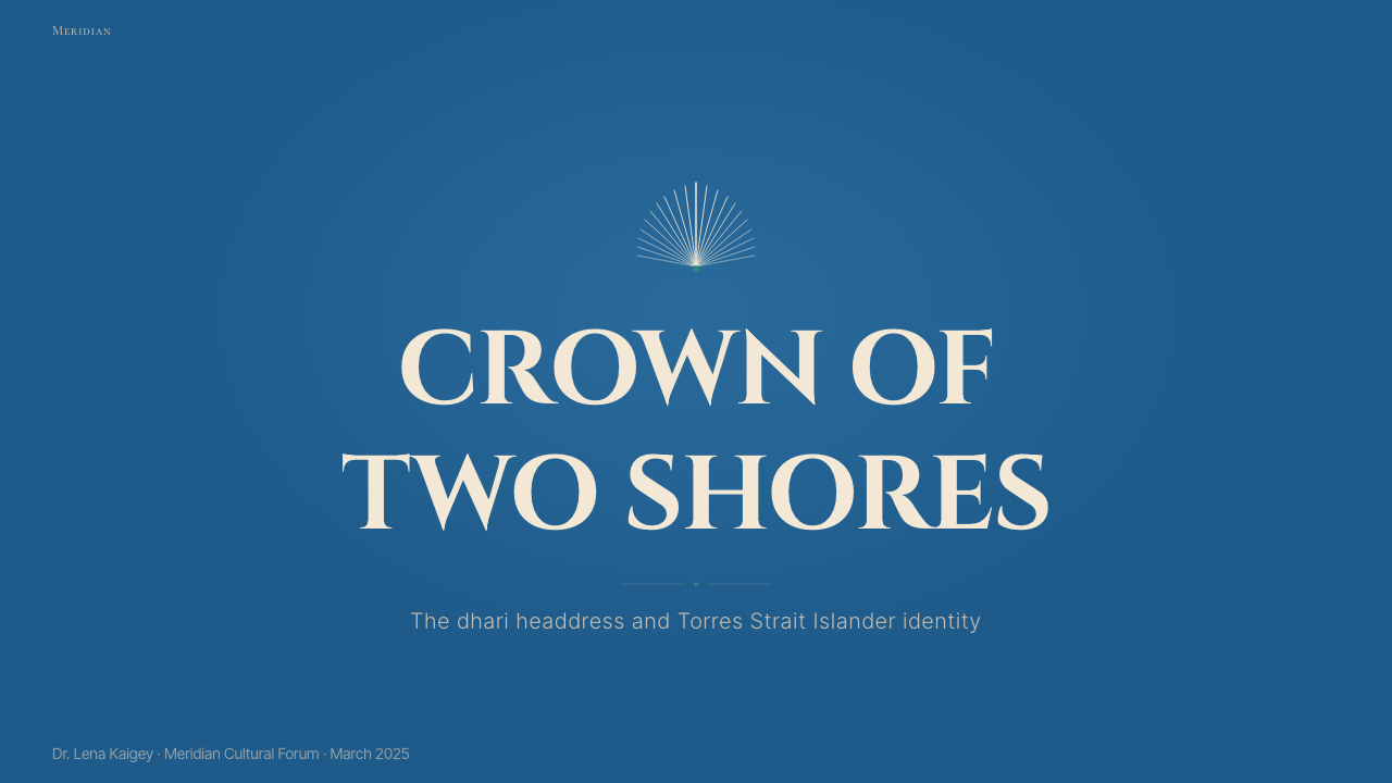
Compositional energy flows outward from the center, following the logic of the headdress's spreading feathers. Lines, shapes, and typographic hierarchies radiate rather than cascade vertically or march horizontally. Data visualizations take on a sunburst or mandala quality; navigational elements orbit a core. This radial logic distinguishes the style sharply from grid-dominant Western design traditions, where information flows top-to-bottom or left-to-right. Here, everything originates at a point and expands — the visual equivalent of a declaration.构图能量从中心向外流动,遵循头饰展开羽毛的逻辑。线条、形状与文字层级呈放射状而非垂直级联或水平排列。数据可视化呈现出旭日或曼陀罗的品质;导航元素围绕核心运行。这种放射逻辑将该风格与以网格为主导的西方设计传统明确区分——在那些传统中,信息从上到下或从左到右流动。在这里,一切从一个点出发并向外扩展——视觉上等同于一次宣告。
Pearl-Shell Luminosity珍珠贝母的光泽
Pearl shell — trochus and pearl oyster — was the most valued trade material in the Torres Strait for centuries, and its optical qualities inform the style's treatment of light. Where other aesthetics might achieve highlight through gradients or glows, this system achieves it through high-contrast edge articulation: a brilliant white element placed directly against deep blue reads as luminous rather than simply light. The iridescent quality of shell is suggested not by gradient fills but by the sharpness of the color boundary — the way a polished shell seems to contain its own interior light.珍珠贝母——马蹄螺与珠母贝——数百年来是托雷斯海峡最珍贵的贸易材料,其光学特质渗透进这套风格对光的处理方式。其他美学风格可能通过渐变或光晕来实现高光,这套体系则通过高对比度的边缘表达来实现:一个明亮的白色元素直接置于深蓝之上,呈现出光亮感而非仅仅是浅色。贝母的彩虹光泽不是通过渐变填充暗示,而是通过色彩边界的锐利来表达——就像抛光贝母仿佛在内部蕴藏着自己的光芒。
Ceremonial Weight and Stillness仪式重量与静默感
The dhari is not a casual object; it is worn in moments of maximum communal gravity. This context of use shapes the visual register of the entire style. Compositions are still — elements do not chase the eye but hold their positions with confidence. Motion, where it exists, is expansive and slow, like the spread of feathers rather than the flutter of leaves. Decorative busyness is structurally excluded. The white space surrounding a central element is not emptiness to be filled but a field of attention, the visual equivalent of the cleared ground before a ceremony.达里不是随意的器物;它只在社群庄严度最高的时刻佩戴。这种使用语境塑造了整套风格的视觉基调。构图是静止的——元素不追逐目光,而是自信地保持各自位置。动态(若存在)是舒展而缓慢的,如羽毛的展开而非叶片的飘动。装饰性的繁复在结构上被排除。中央元素周围的留白不是等待被填满的空洞,而是一片注意力的场域——在视觉上等同于仪式前清扫的地面。
Turtle Shell Warmth as Accent玳瑁温暖作为强调
Turtle shell appears in the flag as a thin border strip and, in the broader material culture of the Torres Strait, as a medium for carving masks and ceremonial objects. In the design system, its warm amber tone functions as the sole deviation from the blue-white axis — a carefully rationed accent that prevents the palette from reading as purely cold or corporate. It is used at small proportion: a single line, a label background, a highlighted data point. Used at large proportion, it would overwhelm the ocean authority of the primary palette.玳瑁在旗帜中以细边框条带的形式出现,在托雷斯海峡更广泛的物质文化中,则是雕刻面具与仪式器物的材料。在设计体系中,其温暖的琥珀色调作为偏离蓝白轴线的唯一元素——一种经过精心配给的强调色,防止整个色板被解读为纯粹冷色调或企业感。它以小比例使用:一条单线、一个标签背景、一个高亮数据点。若大比例使用,它将压倒主色板的海洋权威。
Flat Geometry, No Simulation平面几何,拒绝模拟
The dhari as a visual object is flat when rendered in two dimensions — a silhouette, a flag element, a carved form. The design system follows this same flatness: shapes are filled with solid color, borders are hard, and depth is created through layering and contrast rather than shadow gradients or three-dimensional illusions. This is consistent with the ceremonial function of the original object, which must be legible at a distance, in motion, and across varying light conditions. Flat geometric clarity is not a stylistic choice so much as a functional inheritance.达里作为视觉对象在二维呈现时是平面的——轮廓剪影、旗帜元素、雕刻形态。设计体系遵循同样的平面性:形状以纯色填充,边界是硬边,深度通过叠加与对比而非阴影渐变或三维幻觉来创造。这与原始器物的仪式功能相符——它必须在远处、运动中、不同光照条件下都保持清晰可辨。平面几何的清晰度与其说是风格选择,不如说是功能传承。

See the Torres Strait Dhari Headdress design system →查看 Torres Strait Dhari Headdress 完整设计系统 →
Who shaped Torres Strait Dhari Headdress?谁塑造了 Torres Strait Dhari Headdress?
A Thursday Island artist and the designer of the Torres Strait Islander flag (1992), Namok placed the dhari at the center of the triband composition and in doing so performed the decisive act of visual translation: transforming a ceremonial object into a heraldic device legible far beyond its original context. His design has become one of the most recognizable Indigenous flags in the world. The compositional decisions he made — the bilateral framing, the star below the dhari, the strict triband field — established the visual grammar that the dhari design system extends.星期四岛艺术家,托雷斯海峡岛民旗帜(1992年)的设计者。纳莫克将达里置于三色横幅的中央,由此完成了一次决定性的视觉转译:将仪式器物化为远超其原始语境的纹章装置。他的设计已成为世界上最具辨识度的原住民旗帜之一。他所做出的构图决策——双边框架、达里下方的星形、严格的三色条带——确立了达里设计体系所延伸的视觉语法。
A linguist, cultural educator, and central figure in the documentation and transmission of Torres Strait Islander languages and ceremonial traditions in the latter half of the twentieth century. Bani worked to preserve and explain the dhari and the dances associated with it, placing the headdress within its proper cultural context at a time when that context was under pressure from assimilationist policies. His work is part of the broader cultural foundation that made the 1992 flag and the dhari's entry into visual culture meaningful rather than merely decorative.语言学家、文化教育者,二十世纪下半叶托雷斯海峡岛民语言与仪式传统记录和传承的核心人物。巴尼致力于保存和阐释达里及与之相关的舞蹈,在同化政策对这一文化语境施压之际,将头饰置于其应有的文化背景中。他的工作是1992年旗帜及达里进入视觉文化这一事件获得实质意义而非仅为装饰的更广泛文化基础的组成部分。
A Badu Island artist working in printmaking, sculpture, and performance, Tipoti is among the leading contemporary figures connecting the visual traditions of the Torres Strait to international contemporary art contexts. His linocuts and etchings draw on the formal vocabulary of traditional Torres Strait design — the dhari, the ceremonial mask, the turtle — and submit them to the demands of the fine art print medium. His work demonstrates how the visual logic of the dhari can be extended and elaborated without departing from its ceremonial seriousness.巴杜岛艺术家,从事版画、雕塑与表演创作,是当代将托雷斯海峡视觉传统与国际当代艺术语境相连接的领军人物之一。他的亚麻刻版画与蚀刻版画汲取传统托雷斯海峡设计的形式词汇——达里、仪式面具、玳瑁——并使其服从精细版画媒介的要求。他的作品证明,达里的视觉逻辑可以在不偏离其仪式庄重性的前提下被延伸与丰富。
Though primarily known as a land rights activist and plaintiff rather than a visual artist, Eddie Mabo's historical significance is inseparable from the cultural context of the dhari as a heraldic form. The 1992 High Court decision bearing his name arrived in the same year as the Torres Strait Islander flag, and together these two events marked a turning point in the legal and cultural assertion of Torres Strait Islander sovereignty. The dhari's elevation to a political symbol of identity cannot be understood apart from the Mabo decision's overturning of terra nullius and the assertion of continuous connection to country that the decision recognized.埃迪·马博主要以土地权利活动家和原告而非视觉艺术家的身份为人所知,但他的历史意义与达里作为纹章形式的文化语境密不可分。以他的名字命名的1992年高等法院裁决与托雷斯海峡岛民旗帜诞生于同一年,两者共同标志着托雷斯海峡岛民主权的法律与文化主张的历史转折。达里被提升为身份认同政治象征这一事件,离不开马博裁决对「无主地」原则的推翻,以及该裁决所承认的对土地的持续性联结。
The committee that organized and judged the 1992 flag competition was itself a collective act of cultural self-determination, bringing together community representatives from across the island groups to define a visual identity that could represent the diversity of Torres Strait Islander peoples under a single emblem. The decision to center the dhari rather than any other ceremonial object or geographic marker was a choice about which aspect of shared culture could carry the most sovereign weight — and the choice has proved durable. The flag, and the dhari at its center, have become reference points for Torres Strait Islander visual culture in all its contemporary forms.1992年组织并评审旗帜设计比赛的委员会本身就是一次集体文化自决的行为,汇聚了来自各岛屿群的社区代表,共同界定一种能以单一徽章代表托雷斯海峡岛民多元性的视觉身份。将达里而非任何其他仪式器物或地理标志置于中央的决定,是关于共享文化的哪个面向能承载最重主权分量的选择——而这一选择被证明经久不衰。旗帜及其中心的达里已成为托雷斯海峡岛民视觉文化在所有当代形式中的参照点。
How do you use Torres Strait Dhari Headdress today?今天怎么用 Torres Strait Dhari Headdress?
The dhari design system is among the most compositionally distinctive heritage-derived styles available to contemporary practitioners, because its heraldic logic is structural rather than decorative. Applying it correctly requires understanding what the system is actually doing: fixing attention at a center, radiating energy outward, holding the eye within a bilaterally balanced field. Simply applying the blue-and-white palette to an unrelated layout will produce pastiche; the composition must also obey the system's ceremonial gravity.达里设计体系是当代从业者可用的构图特征最鲜明的遗产衍生风格之一,因为它的纹章逻辑是结构性的而非装饰性的。正确应用它需要理解这套体系实际上在做什么:将注意力固定于中心,向外放射能量,将目光保持在双边平衡的场域之内。仅仅将蓝白色板应用于无关的版面只会产生拼贴;构图也必须遵从这套体系的仪式重力。
For presentation slides, the system excels at cover pages where authority and identity need to be established in a single visual. A centered composition on a deep blue ground — a radial device at the center, the title in luminous white type below it, minimal flanking detail — carries immediate gravitas. Content slides should preserve the bilateral principle: information organized around a vertical center axis, with left and right columns treated as mirror-weighted rather than left-to-right reading sequences. Data slides work well when chart elements radiate from a core rather than stacking in bars; circular or sunburst formats align naturally with the system's compositional DNA.在演示文稿中,这套体系尤其擅长在单一视觉中确立权威感与身份认同的封面页。深蓝底色上的居中构图——中心位置一个放射状元素,下方是光亮白色字体的标题,两翼细节极简——传递出即刻的庄重感。内容页应当保持双边原则:信息围绕垂直中心轴组织,左右两列被视为镜像等重而非从左到右的阅读序列。当图表元素从核心向外放射而非以条状叠加时,数据页效果最佳;圆形或旭日格式与这套体系的构图基因自然契合。
For web interfaces, the style is particularly well-suited to dashboard headers, flagship feature blocks, and pricing page hero sections — contexts where the product is making a claim about its own significance. The approach: commit to a deep blue primary surface, use white for all primary text and interactive elements, and introduce amber only at the level of highlights, active states, or pricing tier indicators. Navigation should be centered rather than left-aligned; card components should be bordered in white on blue rather than cast in soft shadow. The bilateral symmetry principle applies to page-level layout as well — two-column arrangements should feel balanced, not skewed toward a primary reading column.对于网页界面,这套风格尤其适合仪表板标题、旗舰功能区块与定价页英雄区——这些语境中产品正在就其自身的重要性发出主张。方法如下:以深蓝色作为主界面,所有主文字与交互元素使用白色,琥珀色仅出现在高亮、活跃状态或定价层级指示的层面。导航应居中而非左对齐;卡片组件应以白色在蓝色上描边,而非投射柔和阴影。双边对称原则同样适用于页面级版面——双列排布应感觉平衡,而非向主阅读列倾斜。
For editorial and marketing work, the system supports bold single-image compositions with strong typographic integration. A magazine cover or social media image in this style places one dominant centered element — a radial motif, a portrait with dhari-echo framing, a product shot isolated against the ocean blue — with the headline type integrated into the radial structure rather than placed independently at the top or bottom. Marketing pages benefit from the style's poster-like authority: alternating full-width sections in deep blue and white, with the amber accent used consistently for call-to-action elements. The style translates well to print, outdoor, and large-format digital because its high contrast and flat geometry hold at any scale.对于编辑与营销内容,这套体系支持强排版整合的大胆单图构图。这种风格的杂志封面或社交媒体图像将一个主导性居中元素——放射状图案、带达里呼应框架的肖像、在海洋蓝中孤立的产品照——置于核心,标题文字整合进放射结构而非独立置于顶部或底部。营销页面受益于这种风格的海报式权威感:深蓝与白色的全宽区块交替,琥珀强调色一致地用于行动号召元素。这种风格在印刷、户外与大幅数字媒体上有良好的转化效果,因为其高对比度与平面几何在任何尺寸下都保持清晰。
A common mistake when applying this system is using the palette without committing to the compositional logic. Blue and white at high contrast without bilateral centering will read as a generic nautical or corporate theme — visually competent but without the system's distinctive authority. A related error is distributing the three colors at roughly equal proportion across a layout; the dhari palette is hierarchical, with blue dominating, white as the primary figure, and amber as a scarce accent. Overusing amber breaks the oceanic coolness that gives the white its particular luminosity. Finally, avoid asymmetric layouts that would be natural in grid-dominant Western design traditions — the centered, bilaterally balanced structure is not a style detail but the system's fundamental organizing principle.应用这套体系时最常见的错误是使用色板却不遵从构图逻辑。高对比度的蓝白而无双边居中,呈现出的将是通用的航海或企业主题——视觉上称职,但缺乏这套体系独特的权威感。一个相关的错误是将三种颜色以大致相等的比例分配在版面中;达里色板是层级性的,蓝色主导,白色作为主要图形,琥珀色是稀缺强调。过多使用琥珀色会打破赋予白色特殊光泽的海洋冷调。最后,避免在以网格为主导的西方设计传统中自然的非对称版面——居中的双边平衡结构不是风格细节,而是这套体系根本的组织原则。
See the Torres Strait Dhari Headdress design system →查看 Torres Strait Dhari Headdress 完整设计系统 →
Torres Strait Dhari Headdress — FAQTorres Strait Dhari Headdress · 常见问题
Is using the dhari design system culturally appropriate for non-Indigenous designers and brands?非原住民设计师和品牌使用达里设计体系,在文化上是否恰当?
This is a question that deserves honest engagement rather than a formulaic answer. The dhari headdress is a living ceremonial object tied to a specific community's sovereignty and spiritual practice, not a historical artifact available for general appropriation. A design system inspired by its visual logic — the radial structure, the ocean palette, the heraldic centering — can be applied with respect and attribution, but using the dhari itself as a brand mark, or presenting the design as representative of Torres Strait Islander identity without community involvement, crosses into appropriation. The appropriate approach involves genuine consultation with Torres Strait Islander communities, transparent attribution, and an honest assessment of whether the use serves the community's interests or merely extracts their visual culture for commercial benefit.这个问题值得诚实作答,而非给出程式化的回应。达里头饰是一件与特定社群主权和精神实践紧密相连的活态仪式器物,而非供公众随意挪用的历史文物。一套受其视觉逻辑启发的设计体系——放射结构、海洋色板、纹章式居中——可以在尊重与致谢的前提下应用,但将达里本身用作品牌标志,或在未经社群参与的情况下将该设计呈现为托雷斯海峡岛民身份的代表,则跨入了文化挪用的范畴。恰当的方式包括与托雷斯海峡岛民社群进行真诚协商、透明致谢,以及诚实评估该用途是否服务于社群利益,还是仅仅将其视觉文化提取为商业利益。
How does the dhari system differ from other Pacific Island or Oceanic design aesthetics?达里体系与其他太平洋岛屿或大洋洲设计美学有何不同?
The Torres Strait Islands sit geographically between Australia and Papua New Guinea, and the visual culture of the region draws from both directions. However, the dhari system's most distinctive characteristic — the heraldic, bilaterally centered composition — sets it apart from most Pacific Island aesthetics, which tend toward all-over pattern, interlocking geometric tessellation, or asymmetric figurative imagery. Polynesian and Melanesian design traditions (tapa, tā moko, Māori kōwhaiwhai) work with continuous surface coverage; the dhari system works with a single dominant centered emblem and open surrounding field. The closest parallel in Western design is indeed heraldry — which is why the 1992 flag reads with such immediate clarity as a sovereign statement.托雷斯海峡群岛在地理上位于澳大利亚与巴布亚新几内亚之间,该地区的视觉文化从两个方向汲取养分。然而,达里体系最显著的特征——纹章式的双边居中构图——使其有别于大多数太平洋岛屿美学,后者倾向于全面覆盖的图案、互锁几何镶嵌或非对称具象图像。波利尼西亚和美拉尼西亚设计传统(塔帕布、塔莫克、毛利科法伊海)以连续表面覆盖为特征;达里体系则以单一主导居中徽章和开放的周围场域为特征。西方设计中最接近的类比正是纹章学——这也正是1992年旗帜作为主权宣言具有如此即时清晰度的原因。
Can the dhari system work for dark-mode interfaces, or is the deep blue always the background?达里体系能用于深色模式界面吗?深蓝色是否必须始终作为背景?
The deep blue ground is the canonical orientation of the system — it reflects the ocean, which is the environmental context from which the palette is drawn. However, the system can invert: white as the dominant ground with the blue used for structural elements and type, and amber reserved for accents. This inversion is used in the flag itself, where the green and black bands bracket a central blue field — the visual structure includes both light and dark registers. For interface purposes, a white-ground variant reads as formal and documentary, close to the quality of official correspondence; the blue-ground variant reads as immersive and authoritative. What the system resists is mid-value grounds — medium grays or muted backgrounds that rob the palette of its characteristic polarity.深蓝底色是这套体系的标准方向——它呼应海洋,而海洋正是色板所汲取的环境语境。然而,这套体系可以反转:以白色作为主导底面,蓝色用于结构性元素与文字,琥珀色保留为强调色。这种反转在旗帜本身中就有体现——绿色与黑色条带夹着中央蓝色场域,视觉结构同时包含浅色与深色两种基调。对于界面用途,白色底面变体呈现正式、文献性的感觉,接近官方文件的质感;蓝色底面变体则呈现沉浸感与权威感。这套体系所抵制的是中间值底面——中等灰度或哑光背景会剥夺色板其特有的极性对比。
How should the amber accent be used, and what happens when it is overused?琥珀色强调应如何使用?过度使用会产生什么效果?
The amber accent functions as a third voice in a composition that is otherwise conducted between two — blue and white. Its role is to mark the specific: a selected state, a tier label, a highlighted figure in a data set, a call-to-action button. When used at this proportion, it reads as the warm center of the dhari itself — the point from which the feathers spread, the shell at the core of the composition. When overused — applied to multiple elements, used as a fill color for large content areas, or mixed freely with the primary white — it competes with rather than accents the white, and the palette's oceanic character dissolves into something generic. The discipline is proportion: amber at small scale intensifies the blue-and-white polarity; at large scale it destabilizes it.琥珀色强调作为构图中的第三个声部发挥作用,而这个构图在其他方面是蓝色与白色之间的二重奏。它的角色是标记具体事物:选中状态、层级标签、数据集中的高亮数字、行动号召按钮。以这样的比例使用时,它呈现为达里本身的温暖核心——羽毛展开的起点,构图中心的贝壳。当被过度使用——应用于多个元素、用作大面积内容区的填充色,或与主色白色自由混合——它与白色产生竞争而非形成强调,色板的海洋特质消散为某种通用感。关键在于比例:小尺度的琥珀色强化蓝白极性;大尺度则破坏它。
Does the ceremonial origin of the style mean it should only be used for serious or formal contexts?这套风格的仪式起源意味着它只能用于严肃或正式的场合吗?
Not necessarily, but the style does carry a formal register that should be understood and either embraced or consciously subverted. The dhari's visual gravity comes from its ceremonial function: it was worn to mark events of maximum communal significance, and that context of use has shaped the visual system's character. In contemporary application, this manifests as a tendency toward authority and stillness — the style is less at home in playful, chaotic, or sensory-rich environments than in those calling for presence and dignity. This does not limit it to government institutions or cultural organizations; a technology product, a premium consumer brand, or an editorial publication can all carry this register appropriately. The risk is forcing the style into contexts where its gravity works against the user's emotional goals — a children's app, a casual social platform, or an entertainment brand where warmth and spontaneity are the target feeling.不一定,但这套风格确实承载着一种正式基调,理解这一点是选择拥抱还是有意颠覆它的前提。达里的视觉重量来自其仪式功能:它佩戴于标志社群最高庄严度时刻的场合,而这种使用语境塑造了这套视觉体系的性格。在当代应用中,这表现为一种趋向权威感与静默感的倾向——这套风格在嬉戏、混沌或感官丰富的环境中不如在需要存在感与尊严的环境中自在。这并不将其局限于政府机构或文化组织;一个科技产品、一个高端消费品牌或一本编辑出版物都可以适切地承载这种基调。风险在于将这套风格强行置于其重力感与用户情感目标相悖的场合——儿童应用、休闲社交平台,或温暖与自发性是目标感受的娱乐品牌。
Related design styles相关设计风格
 Malian Bogolan over Djenné IndigoCloth reads at night. Djenne indigo, burnt-umber mud marks, and strip seams.夜读之布。杰内靛蓝底、焦赭泥痕与条织缝线。
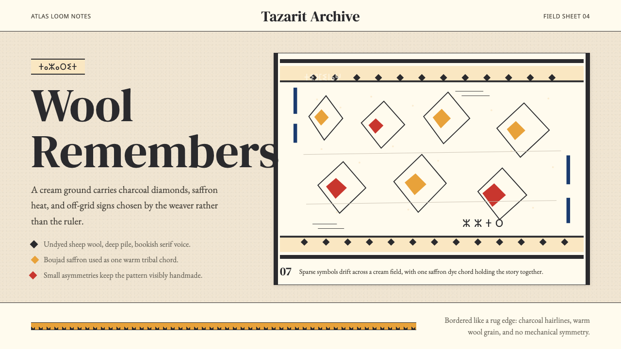 Moroccan Amazigh Berber RugAutobiography in wool. Cream ground, charcoal diamonds, saffron bands drift o…羊毛里的自传:奶油底、炭黑菱形与藏红花色边带轻微偏移。
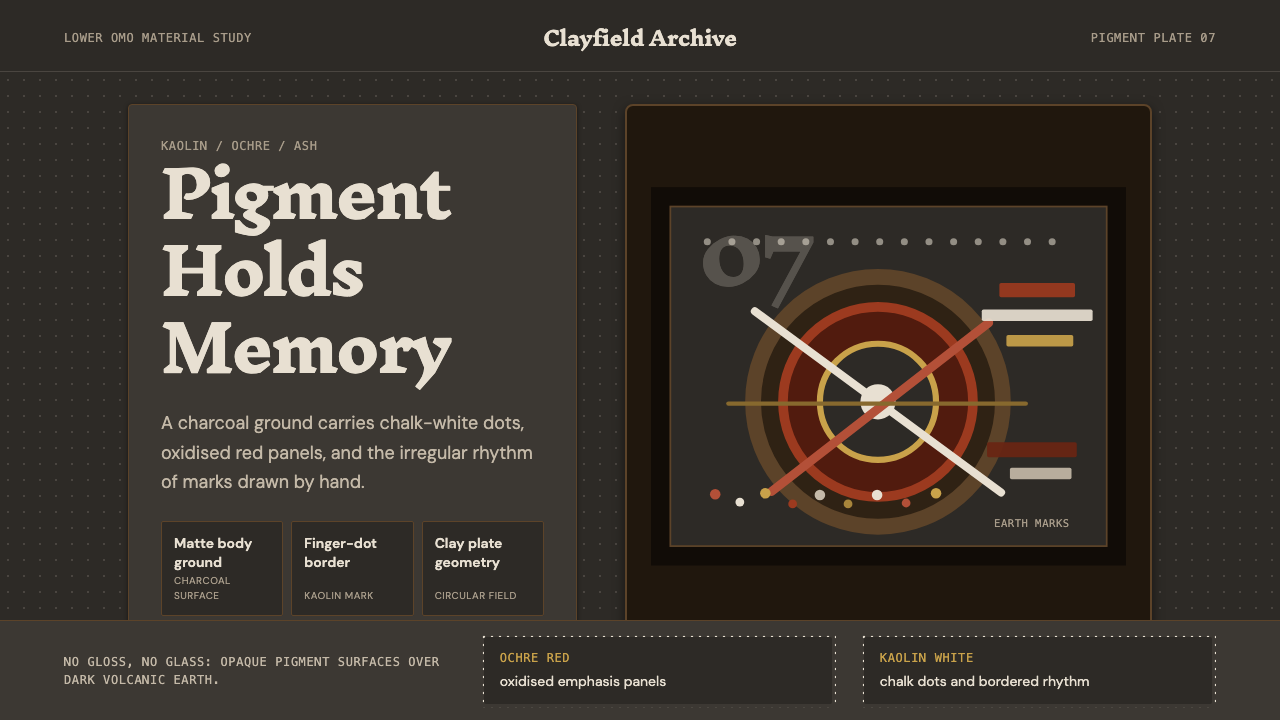 Mursi Omo Valley Lip Plate PaintRaw dignity, matte and proud. Kaolin dots and ochre rings sit on charcoal gro…粗粝而有尊严:炭灰底上,高岭土点阵与赭石圆环。
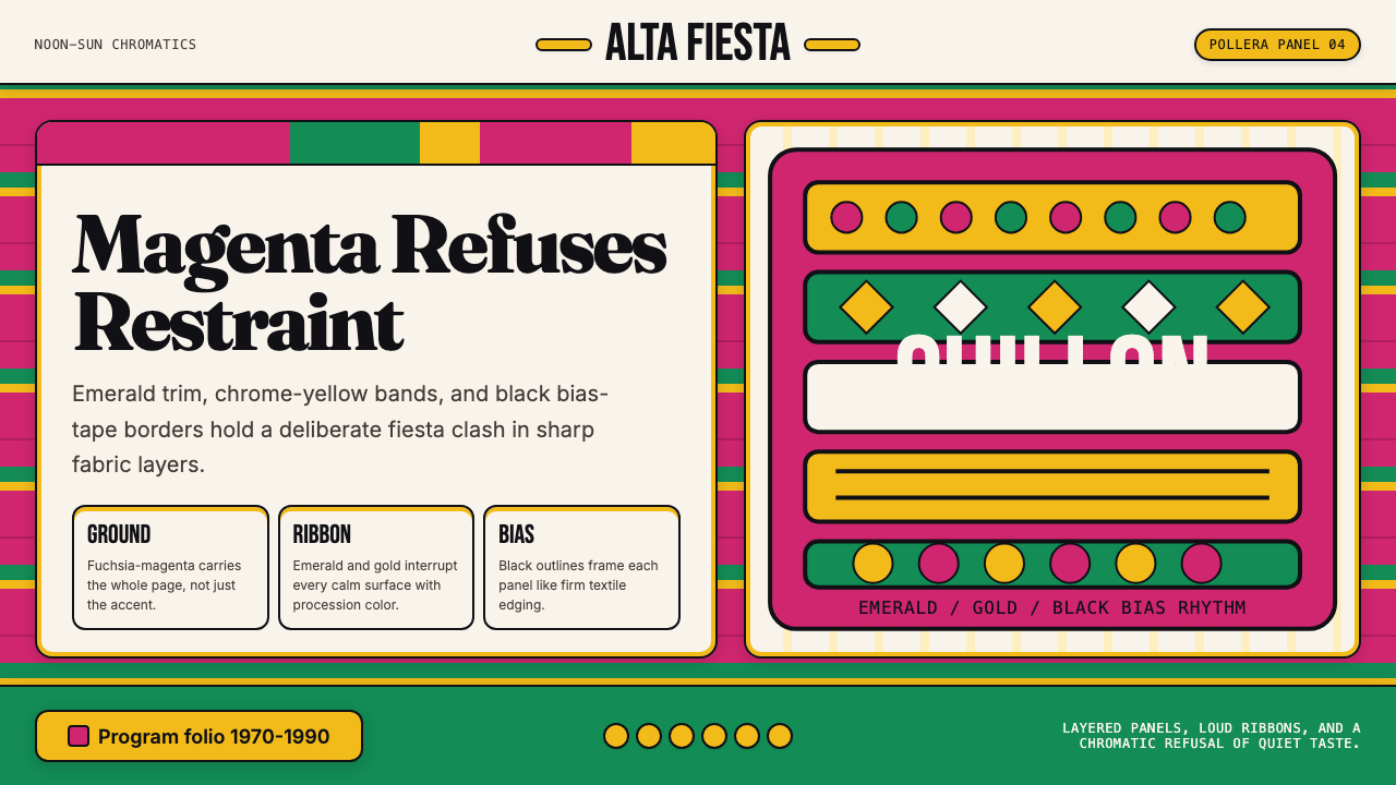 Bolivian Pollera Fiesta MagentaChromatic defiance. Magenta ground, emerald bands and black outlines clash li…色彩拒绝克制:品红底、翡翠带、黑滚边制造节庆撞色。
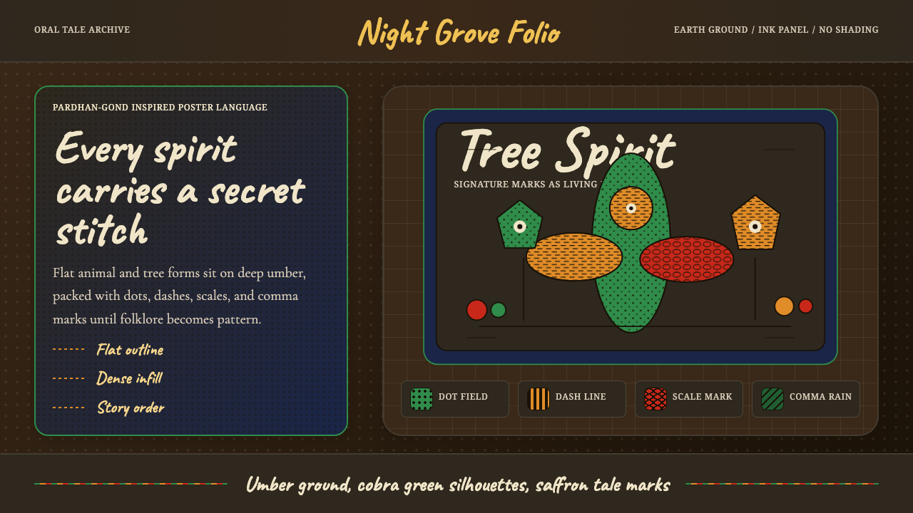 Gond Pardhan (Tree Spirit Painting)Story breathes in pattern. Cobra green forms on umber ground, filled with dot…图案里有故事:赭棕底上的蛇绿轮廓,密填点线纹。
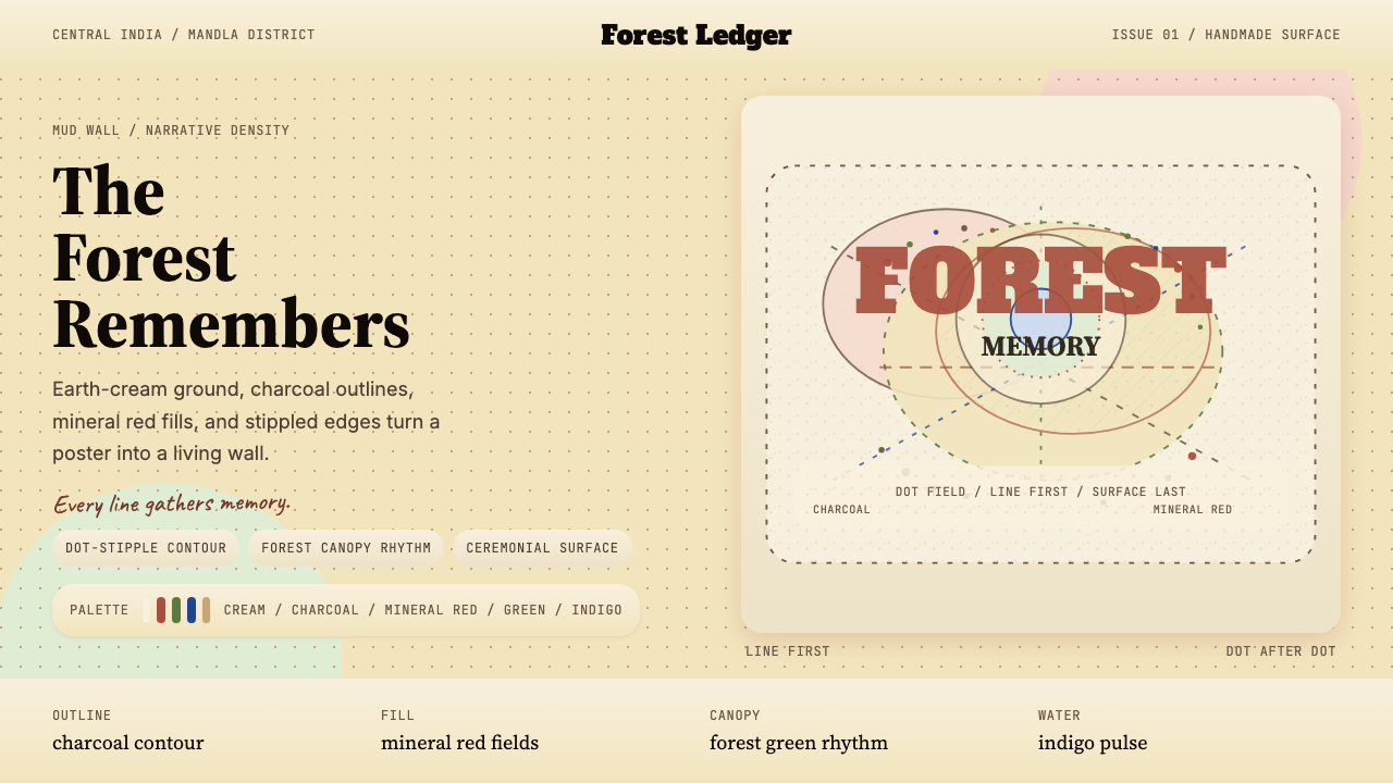 Gond Tribal Art (Madhya Pradesh)The wall becomes a forest. Earth-cream, charcoal, and stippled red make it ce…墙变成森林。土白、炭黑与点刺红让画面像仪式。