What is Lebanese Mezze Tile Tavern?
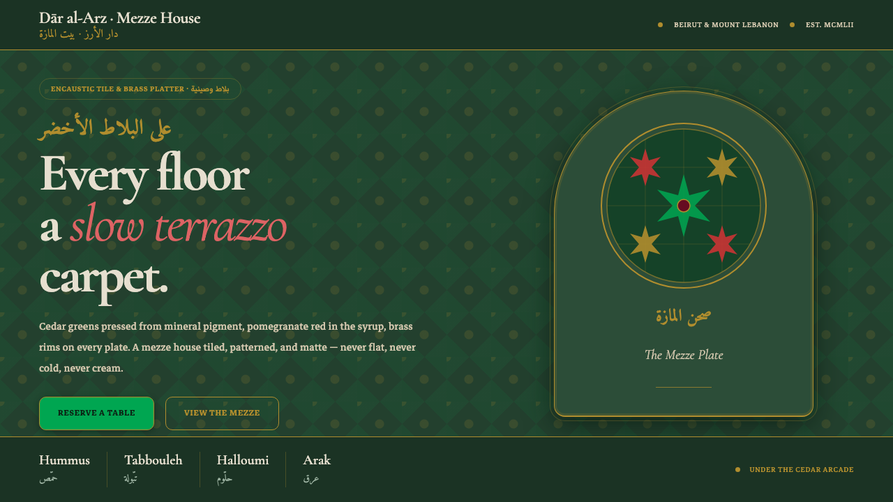
Lebanese Mezze Tile Tavern turns hospitality into a surface: cedar-green tiles, brass warmth, pomegranate red, arched stone, and bilingual Naskh gathered beneath a slow terrazzo rhythm.
Lebanese Mezze Tile Tavern in brief
Lebanese Mezze Tile Tavern distills the visual world of a Levantine mezze house from the mid-century through the late twentieth century, especially the Beiruti and mountain-village atmosphere associated with Lebanon and the wider Levant. Its foundation is a slow terrazzo carpet of encaustic cement floor tiles, with deep cedar greens meeting arak-white plaster, arched stone arcades, brass serving ware, and pomegranate-red accents.
The style feels assembled rather than polished into uniformity. Every surface carries evidence of pattern, material, or craft: tiled floors, matte plaster, stone arches, brass rims, and lettering that moves between Arabic Naskh and Latin forms. The result is dark, warm, and tactile. It does not pursue the emptiness of a modern cream interior or the coldness of a perfectly flat digital surface.
Its visual identity depends on hospitality as much as ornament. Mezze platters, candlelit brass, patterned cement, and bilingual signage create a setting that feels communal, inherited, and carefully maintained. The palette is restrained but not sparse: cedar green establishes depth, arak white gives the eye relief, pomegranate red brings appetite and life, and brass supplies a soft glow against the darker field.
Where does Lebanese Mezze Tile Tavern come from?
The style is rooted in Lebanon and the wider Levant, with Beirut and Mount Lebanon as its principal cultural coordinates. Its time frame is the mezze-house world of 1950–1990: a period expressed here not through a reconstructed historical interior, but through a concentrated atmosphere of tiled floors, arched arcades, stone, plaster, brass, and shared food.
Blatt Chaya and Beiti encaustic cement tiles provide the defining material language. They are treated as more than a floor covering. Their repeated motifs create a visual field that slows the eye, gives the room a patterned foundation, and lets craft remain visible across the entire composition. The terrazzo effect is therefore not a decorative background added after the fact; it is the ground from which the tavern identity grows.
The palette gathers cues named in the source world itself. Deep cedar green recalls Lebanon’s national emblem, while arak-white plaster introduces a pale mineral counterpoint without turning the environment into a cream-colored interior. Pomegranate red and brass mezze platters add appetite, warmth, and ceremony. Together, these elements make the style feel handmade and hospitable rather than merely rustic.
Three related movements complete the setting: Levantine encaustic cement-tile craft, Arabic-Latin bilingual signage, and arched arcade architecture. None is treated as an isolated motif. Tile, script, and arch reinforce one another: the floor establishes rhythm, the lettering establishes cultural voice, and the arcade gives the composition a sense of passage and shelter.
What defines the Lebanese Mezze Tile Tavern look?
Cedar Depth
Deep cedar green is the visual anchor, giving the tavern its dark, grounded character. It should occupy substantial surfaces or recurring structural areas, while remaining matte and mineral rather than glossy. The color feels architectural because it is tied to the national emblem and to the weight of tiled, stone, and plaster surroundings.
Encaustic Rhythm
Patterned cement tiles create a continuous rhythm under every other element. Their motifs should feel repeated, patient, and slightly handmade, like a terrazzo carpet that rewards lingering attention. The pattern is neither a loud wallpaper nor a barely visible texture; it is the room’s persistent visual tempo.
Brass Warmth
Brass appears as a warm reflective counterpoint to the dark green and aged cement. Brass-rimmed plates and mezze platters introduce a sense of serving ritual without becoming luxurious ornament. Its glow should feel candlelit and handled, with enough patina or visual softness to remain part of the tavern rather than a showroom object.
Arched Stone Shelter
Arched stone arcades soften the darkness through repetition and shelter. The arch is not an isolated logo-like shape; it is an architectural frame that organizes entrances, alcoves, or views across the space. Stone supplies irregularity and age, while the repeated curve keeps the environment coherent.
Bilingual Naskh
Arabic Naskh and Latin lettering share the same identity rather than competing for attention. The pairing should feel integrated into signage, menus, and labels, with both scripts treated as active parts of the atmosphere. Letterforms can be expressive and calligraphic, but they must remain legible enough to support the tavern’s welcoming, communal purpose.
Matte Imperfection
The surfaces are patterned and matte, never sterile or overly polished. Cement, plaster, stone, brass, and tile should retain distinct tactile identities. Small shifts in tone, grain, or edge are valuable because they keep the style handmade. The design should feel cared for, not factory-sealed.
Who shaped Lebanese Mezze Tile Tavern?
The Blatt Chaya tile-makers represent the encaustic cement-tile foundation of the style. Their place in the system is material rather than celebrity-driven: repeated floor patterns, handmade variation, and the slow visual rhythm that turns a surface into a carpet.
Levantine mezze restaurateurs embody the hospitality context in which the visual language belongs. Brass platters, shared dishes, bilingual menus, and a room built around gathering all depend on the restaurateur’s work of making craft feel welcoming and lived in.
The Beiti tile workshops stand for the workshop tradition behind the patterned cement ground. In this style, their contribution is felt through durable repetition, matte surfaces, and the conviction that a floor can carry as much identity as a sign or a serving vessel.
How do you use Lebanese Mezze Tile Tavern today?
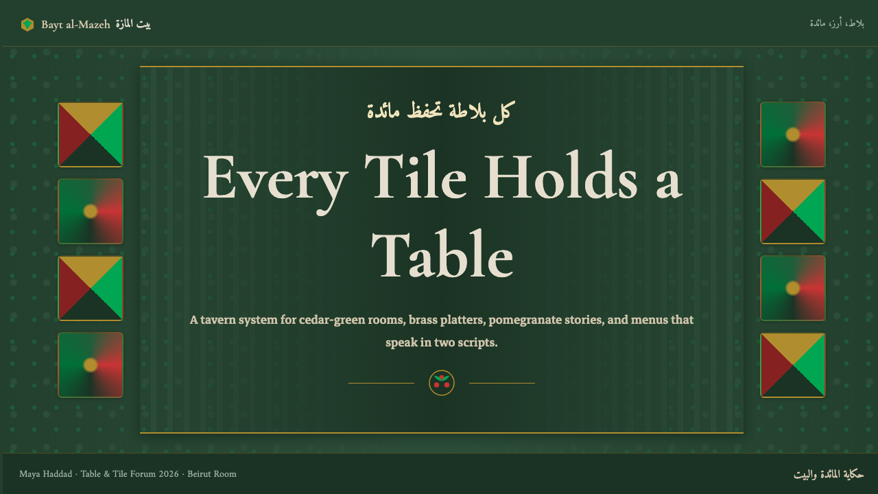
For presentation covers, use the tavern as an enveloping scene rather than a decorative border. Let a deep cedar field establish the mood, then place a strong arched frame, a pomegranate-red focal mark, or a brass-toned serving form against it. The title can appear in bilingual Naskh and Latin, with the scripts arranged as a shared welcome. The cover should feel like entering a room, not viewing a flat title card.
For content and data slides, let the tile pattern provide continuity while the information remains readable above it. Use arched panels or brass-edged containers to group sections, and reserve pomegranate red for emphasis, alerts, or the most important data point. Charts should feel like objects placed on a tavern table: clear, matte, and tactile. Avoid letting the pattern compete with paragraphs, labels, or figures.
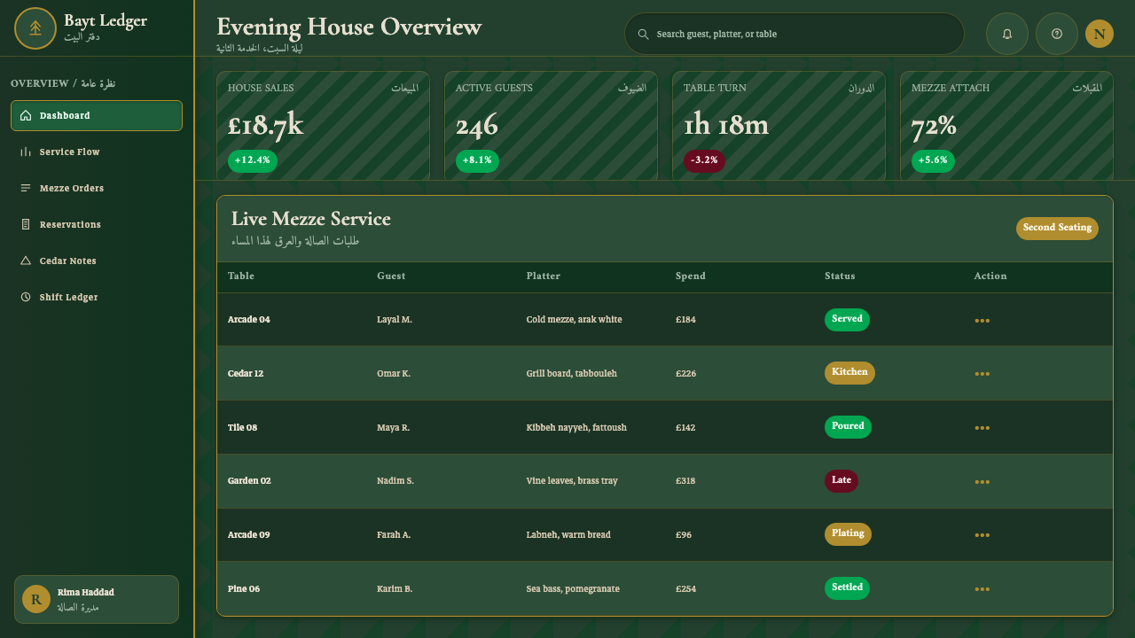
For web interfaces, the style suits restaurant dashboards, hospitality tools, menu systems, cultural archives, and pricing pages that want warmth and a strong sense of place. Deep green can carry navigation or major surfaces, while arak-white panels create relief and brass or pomegranate red identify actions and selected states. Cards should feel like tiled plaques or shallow trays, with visible material character and restrained depth.
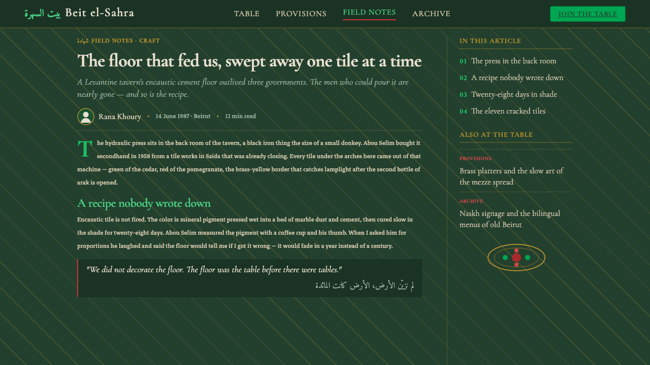
For editorial and marketing work, build a narrow reading field inside a broader patterned environment. Use the outer space for bilingual metadata, tile fragments, arch motifs, or brass rules, while keeping long-form text calm and legible. Campaign pages can alternate dark cedar sections with arak-white plaster fields, introducing pomegranate red where appetite, invitation, or a key message needs emphasis. Photography, when present, should feel integrated with the material world rather than pasted on top of it.
The common mistake is treating the style as a collection of exotic props: an arch here, a red accent there, and Arabic lettering placed as surface decoration. That approach loses the system’s hospitality and craft. The tile rhythm, dark palette, bilingual voice, brass warmth, and architectural framing must support one another. It is also easy to make the result too glossy or too cream-colored; the intended atmosphere depends on matte surfaces, cedar depth, arak-white restraint, and visible handmade character.
Lebanese Mezze Tile Tavern — FAQ
Is Lebanese Mezze Tile Tavern simply a generic Mediterranean restaurant style?
No. Its identity is specifically tied to Lebanon and the wider Levant, especially Beirut, Mount Lebanon, and the mezze-house atmosphere named in the source. The defining combination is not a vague rustic mood but cedar green, encaustic cement tiles, arak-white plaster, pomegranate red, brass mezze platters, arched stone arcades, and Arabic-Latin Naskh lettering working together.
Can the style work on a light background?
Yes, but the light field should read as arak-white plaster rather than generic cream. The style is dark-first, and its warmth depends on the contrast between cedar depth and pale mineral surfaces. If the entire composition becomes light, glossy, and untextured, it loses the tavern’s weight, pattern, and handmade character.
How should Arabic and Latin lettering be combined?
Treat them as a bilingual voice, not as a main language plus an ornamental caption. Arabic Naskh can carry the expressive, calligraphic presence, while Latin lettering provides a parallel reading path. Both should belong to the same sign, menu, or label and should feel deliberately composed within the arch, tile, or brass framework.
Why are tiles so central to the style?
Because the floor is treated as an active carrier of identity. Blatt Chaya and Beiti encaustic cement tiles supply the patterned ground, the slow terrazzo rhythm, and the handmade material evidence that distinguish the style from a dark interior with a few regional props. The floor establishes atmosphere before any sign, dish, or piece of furniture is introduced.
What kinds of products suit this visual language?
It is strongest for hospitality, food, cultural, travel, and editorial products that benefit from warmth, place, and shared experience. It can also give dashboards or pricing pages a memorable sense of welcome. It is less natural for products whose identity depends on clinical neutrality, sterile precision, or an intentionally frictionless absence of cultural reference.
Related design styles
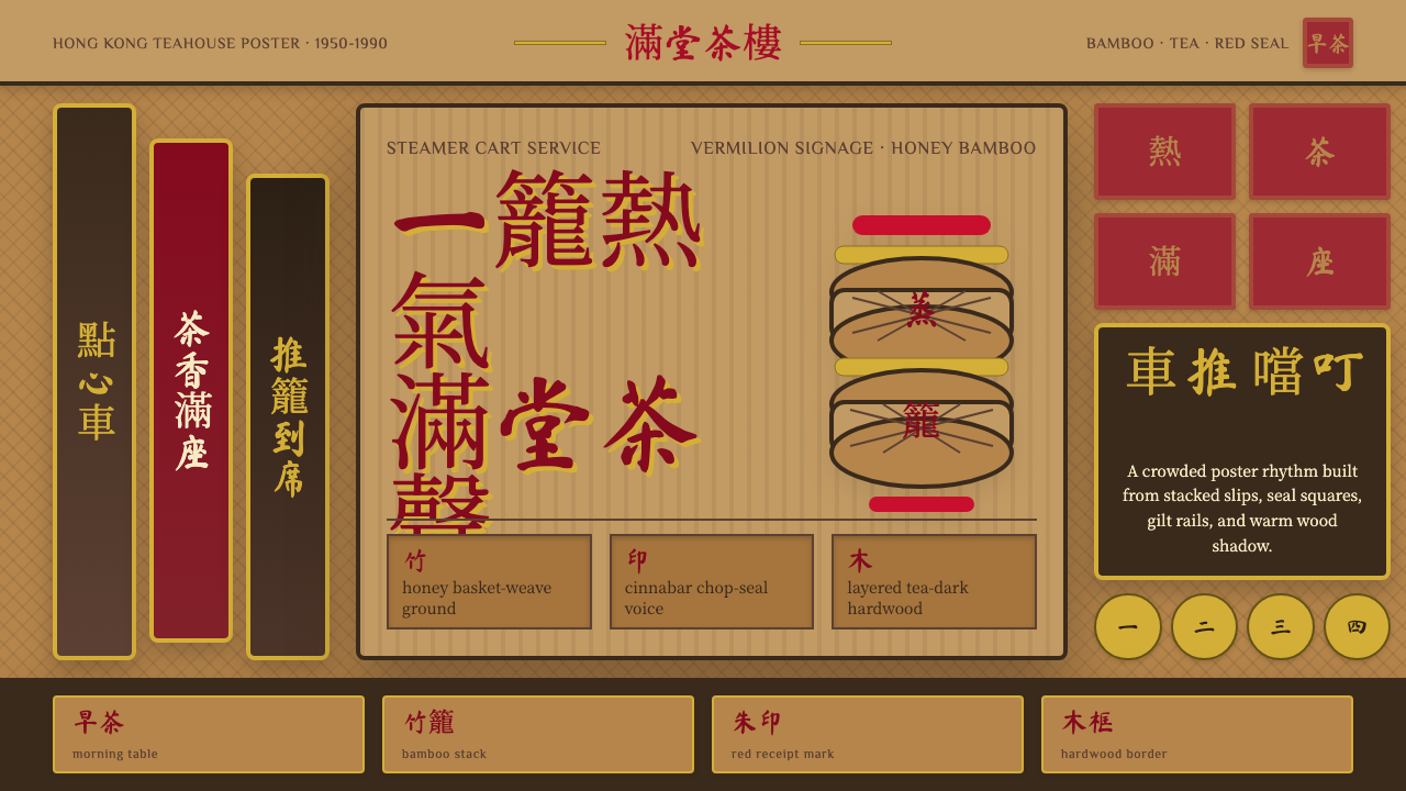 Dim Sum CartWarm clutter sings. Vermilion seals, bamboo weave, and brush type stack like…
 Afghan Baluchi Prayer RugDevotional darkness glows. Plum field, oxblood mihrab, and camel borders surf…
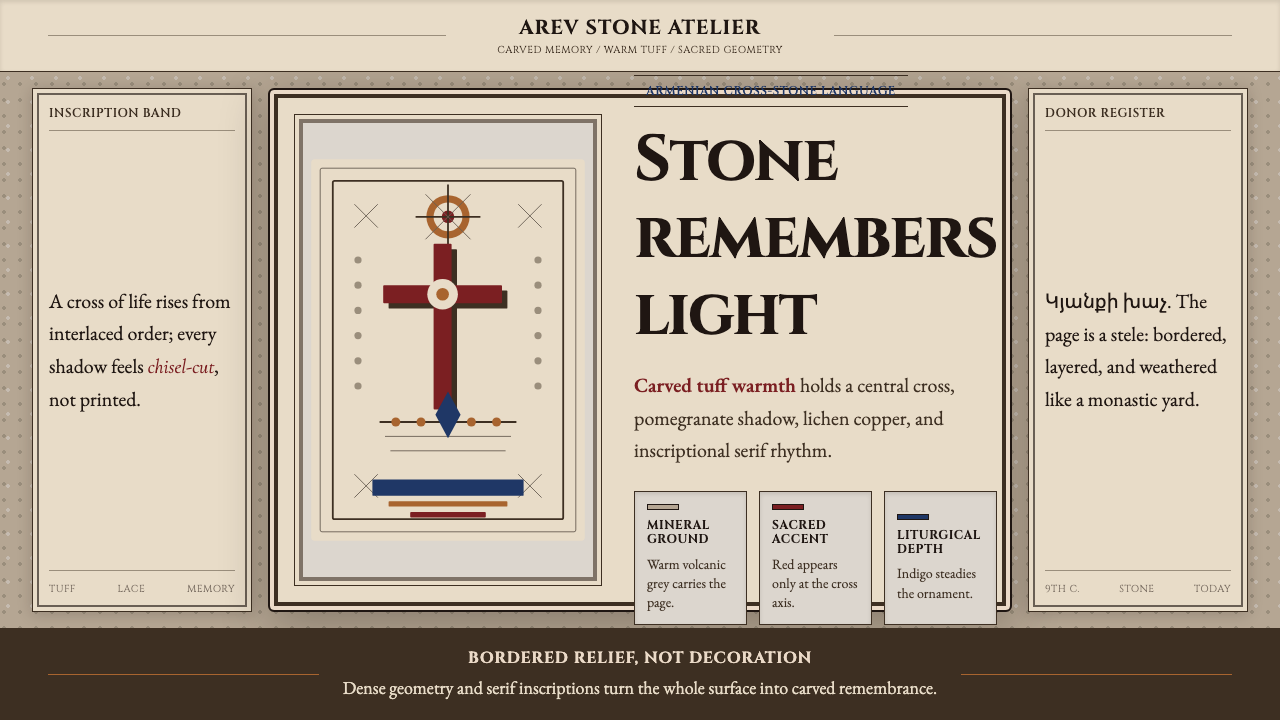 Armenian Khachkar Cross-StoneStone becomes memory. Tuff grey, pomegranate red, and carved borders hold the…
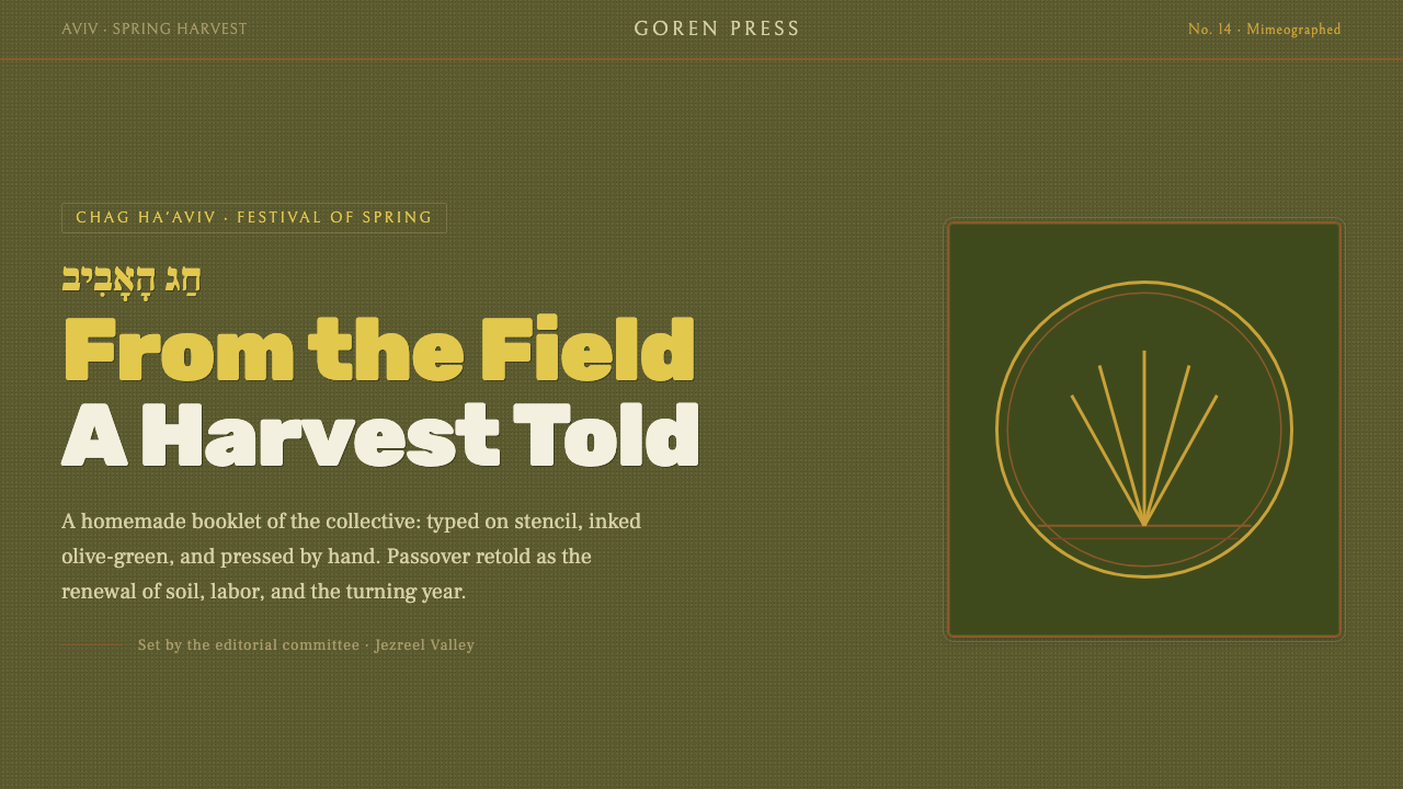 Kibbutz HaggadahHandmade harvest page. Olive stencil stock, wheat serif, deckled linocut geom…
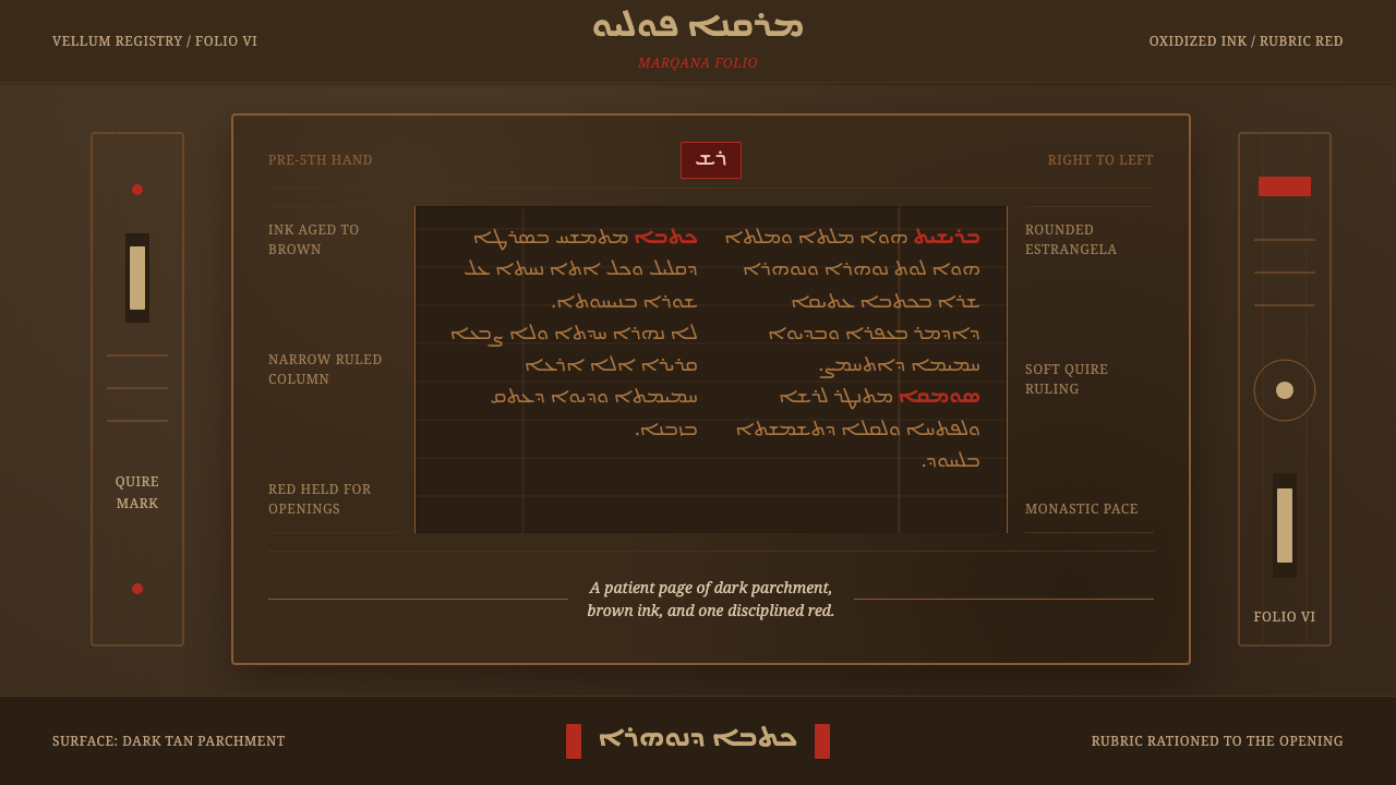 Syriac EstrangelaAncient warmth survives. Brown parchment, right-to-left columns, rationed rub…
 Alchi Monastery MuralDevotional depth. Lapis fields and coffered grids glow on terracotta plaster.