What is Lavender Distillery?
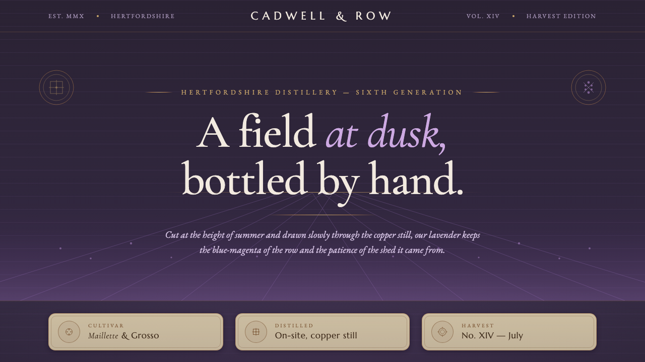
Lavender Distillery turns a working English lavender farm at dusk into a dark pastoral language of blue-magenta rows, copper warmth, and heritage lettering.
Lavender Distillery in brief
Lavender Distillery is a modern pastoral design style drawn from a working English lavender farm and distillery in Hitchin, Hertfordshire. Its central image is a field at dusk: deep purple rows recede toward the horizon while a copper still catches the last warmth of the light. The result is fragrant, rural, and quietly ceremonial rather than rustic in a casual or homespun sense.
The palette is built around the true blue-magenta of cut lavender, not the pale lilac commonly associated with the flower in digital design. That intense dusk-purple sits on dark grounds, while copper appears as a restrained counterpoint in fine rules, accents, and signs of warmth. Kraft-paper surfaces and refined heritage serifs complete the impression of something bottled, labelled, and handled with care.
The style is less about decorating an interface with flowers than about establishing botanical provenance. Every surface should suggest the patient ritual of on-site distillation: a field with a known place, a material with a tactile origin, and a product shaped by craft. Its darkness gives the lavender color depth; its paper and copper details prevent the mood from becoming cold or synthetic.
Where does Lavender Distillery come from?
Lavender Distillery belongs to the period from 2010 to now, and its setting is explicitly contemporary: a working English lavender farm and distillery rather than an imagined historical apothecary. Its regional anchor is Hitchin in Hertfordshire, England. That location gives the style its particular combination of cultivated landscape, English heritage fragrance, and practical botanical production.
The visual language begins with the farm at twilight. Dusk is important because it turns lavender from a bright floral subject into a field of depth and atmosphere. Rows are no longer read as isolated plants; they become repeating bands that lead the eye away from the viewer. The horizon supplies quiet structure, while the fading light makes the copper still feel like a source of human warmth within the landscape.
The system takes its sense of continuity from Hitchin Lavender and the Cadwell family, identified in the source as sixth-generation custodians. That lineage is not used as ornamental nostalgia. It gives the brand a reason to value labels, materials, restrained typography, and the slow repetition of agricultural work. Heritage here means accumulated practice carried into the present, not imitation of an earlier decorative period.
Two related movements shape the style: English heritage fragrance and botanical distilling, alongside pastoral craft branding. Together they produce a design language that treats packaging and interface surfaces as evidence of origin. Deep field color, copper hairlines, kraft-paper labels, and Marcellus lettering all reinforce the same story: a plant is grown in a particular place, transformed on site, and presented through considered craft.
What defines the Lavender Distillery look?
Twilight Ground
The foundation is dark, atmospheric, and closer to evening than to daytime. This ground gives the lavender color visual weight and allows small warm details to register as signs of human presence. Darkness should feel like the field after the light has softened, never like a generic technology interface or a theatrical black backdrop.
True Lavender Color
Lavender is represented as a deep blue-magenta, echoing cut flowers at dusk. It is neither pastel nor sugary, and it should not be diluted until it becomes a vague lilac accent. Used with discipline, the field color carries the identity on its own: botanical, saturated, and unmistakably tied to the crop.
Receding Rows
The repeated rows create the style's sense of depth and direction. They can appear as visual bands, quiet separators, or a compositional rhythm that draws attention toward a horizon. The principle is not literal landscape illustration; it is the use of repetition and recession to make a surface feel cultivated, spacious, and connected to land.
Copper Hairlines
Copper is the warmest element in the system, but it remains precise and restrained. Fine copper rules can frame a label, mark a transition, or suggest the glow of the still without becoming ornamental filigree. Its value lies in contrast: against the dark ground, a narrow warm line feels crafted, metallic, and quietly alive.
Kraft Material
Kraft paper introduces touch into an otherwise dark and atmospheric system. It makes labels feel physical and handled, giving the identity a modest resistance to the smoothness of digital surfaces. The material should read as honest packaging stock: warm, fibrous, and practical, not as a decorative texture layered on for nostalgia.
Heritage Typography
Refined heritage serifs carry the voice of the label, with Marcellus providing a clear reference point. Typography should feel composed and literate, balancing the rural image with a sense of fragrance, provenance, and considered quality. The letters are not antique props; they are the verbal equivalent of a carefully printed bottle label.
Who shaped Lavender Distillery?
Hitchin Lavender is the place-based source of the system. It contributes the working farm, the cultivated rows, and the sense that botanical identity begins in a real landscape. In design terms, it keeps the style grounded: lavender is not an abstract color name but a crop with a field, a horizon, and a seasonally observed atmosphere.
The Cadwell family represents the sixth-generation continuity named in the source. Their role is less a portrait than a principle of stewardship: knowledge and practice carried forward without losing contact with the land. This supports the style's preference for materials, labels, and typography that feel durable rather than fashionable.
The copper still is the system's emblem of transformation. It connects the field to the finished fragrance and gives the palette its human warmth. As a visual figure, it should appear through controlled copper accents and crafted details, suggesting the patient ritual of on-site distillation without requiring literal industrial illustration.
How do you use Lavender Distillery today?
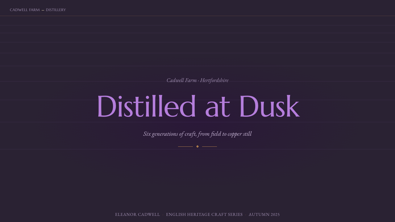
For presentation slides, use the twilight field as the organizing idea across cover, content, and data pages. A cover can place a strong title in heritage serif lettering against a dark ground, with a deep lavender field color and a restrained copper line establishing direction. Content slides should keep the same quiet structure: generous breathing room, clear label-like headings, and repeated horizontal or receding bands that recall planted rows. Data slides can treat charts as cultivated patterns, using lavender for the primary field and copper only for the meaningful comparison or highlight.
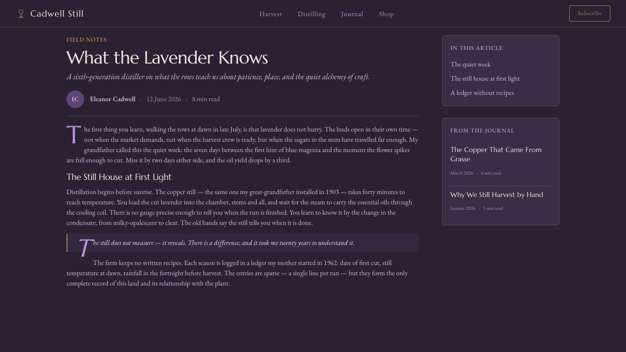
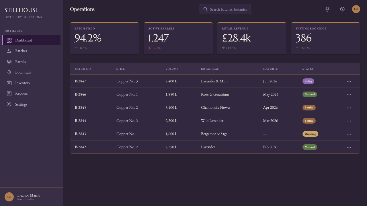
For web interfaces, Lavender Distillery suits dashboards and pricing pages that need to feel crafted, premium, and rooted in a tangible product. A dark surface can carry the main structure, while kraft-like panels create moments of material contrast and copper rules separate information without shouting. Pricing tiers should be distinguished through hierarchy and restrained color roles rather than a collection of bright badges. Buttons and active states can use the lavender field color, while copper is reserved for the clearest action or provenance cue.
For editorial and marketing work, the style supports stories about fragrance, farming, provenance, seasonal goods, and careful production. Article layouts can pair long-form serif headings with compact label treatments, allowing field-like bands or copper rules to mark transitions. Marketing pages can move between dark atmospheric sections and kraft-paper product moments, keeping the same lavender color as the connective thread. Product descriptions should feel like notes from a place and a practice, not generic luxury language.
The common mistake is confusing Lavender Distillery with a soft, pale, floral aesthetic. Washing the lavender color into pastel lilac removes the field's dusk, while adding excessive botanical ornaments turns provenance into decoration. Another frequent error is using copper everywhere; its authority comes from restraint. The style works when dark ground, true blue-magenta, kraft material, heritage serif lettering, and copper detail all support the same story of a working farm and patient on-site distillation.
Lavender Distillery — FAQ
Is Lavender Distillery just a lavender-themed color palette?
No. The color is only the most visible entry point. The style depends on the relationship between a working farm, twilight depth, receding rows, copper warmth, kraft material, and heritage serif lettering. If the purple is removed from that sense of place and craft, the result becomes generic floral branding rather than Lavender Distillery.
Why must the lavender be blue-magenta rather than pale lilac?
The deeper blue-magenta is tied to the source image of cut lavender at dusk. Pale lilac shifts the mood toward sweetness and softness, while the approved style needs botanical depth, cultivated land, and evening atmosphere. The stronger field color also gives the dark system a clear identity without requiring decorative imagery.
What is the purpose of copper in the system?
Copper connects the dark field to the human process of distillation. It recalls the copper still and introduces warmth without breaking the evening mood. Its best use is precise and selective: a fine rule, a small signal, or a carefully chosen action. When spread across every surface, it loses the quiet authority that makes it meaningful.
How should imagery and typography work together?
Imagery should emphasize the field, the horizon, the still, or the tactile label rather than supply generic floral decoration. Typography should provide the composed voice of the bottle label, with Marcellus and related heritage serifs carrying names, headings, and provenance. Neither element should compete with the other: the image supplies atmosphere and place, while the lettering supplies clarity and lineage.
Where does this style work best, and where can it struggle?
It works best for fragrance, botanical goods, farm products, crafted food and drink, and interfaces that need a strong sense of provenance. It can struggle when a product requires playful brightness, fast technological energy, or a highly neutral corporate tone. Its darkness and heritage character are deliberate values, so they should be used where patience, materiality, and place are part of the experience.
Related design styles
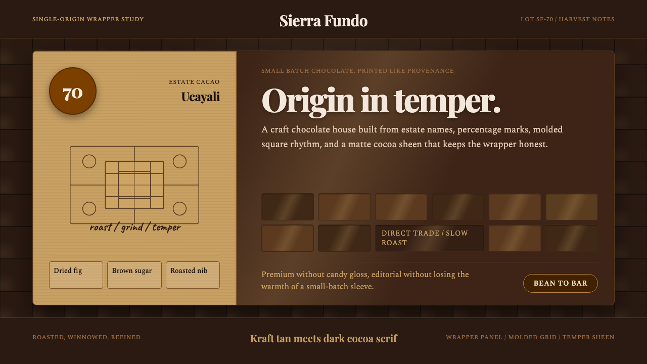 Bean-to-Bar ChocolateOrigin tastes tactile. Cocoa serif, kraft panel, and molded squares carry the…
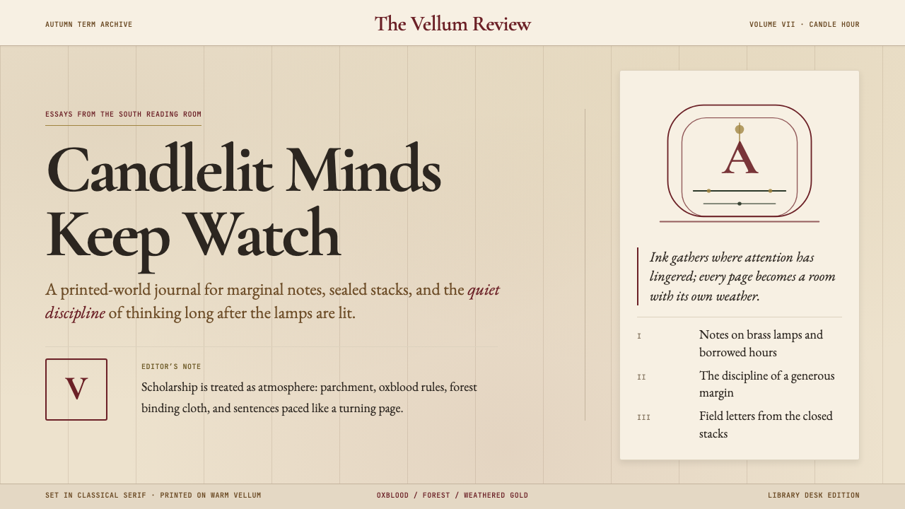 Dark AcademiaCandlelit nostalgia for old books. Parchment grounds, oxblood accents, classi…
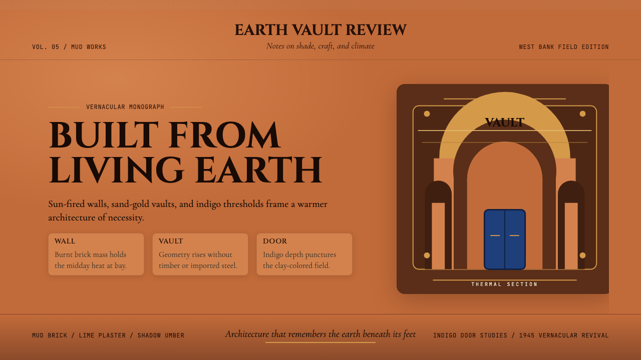 Egyptian Hassan Fathy Vernacular (1945)Earth remembers craft. Burnt brick, sand-gold vaults, and indigo doors carry…
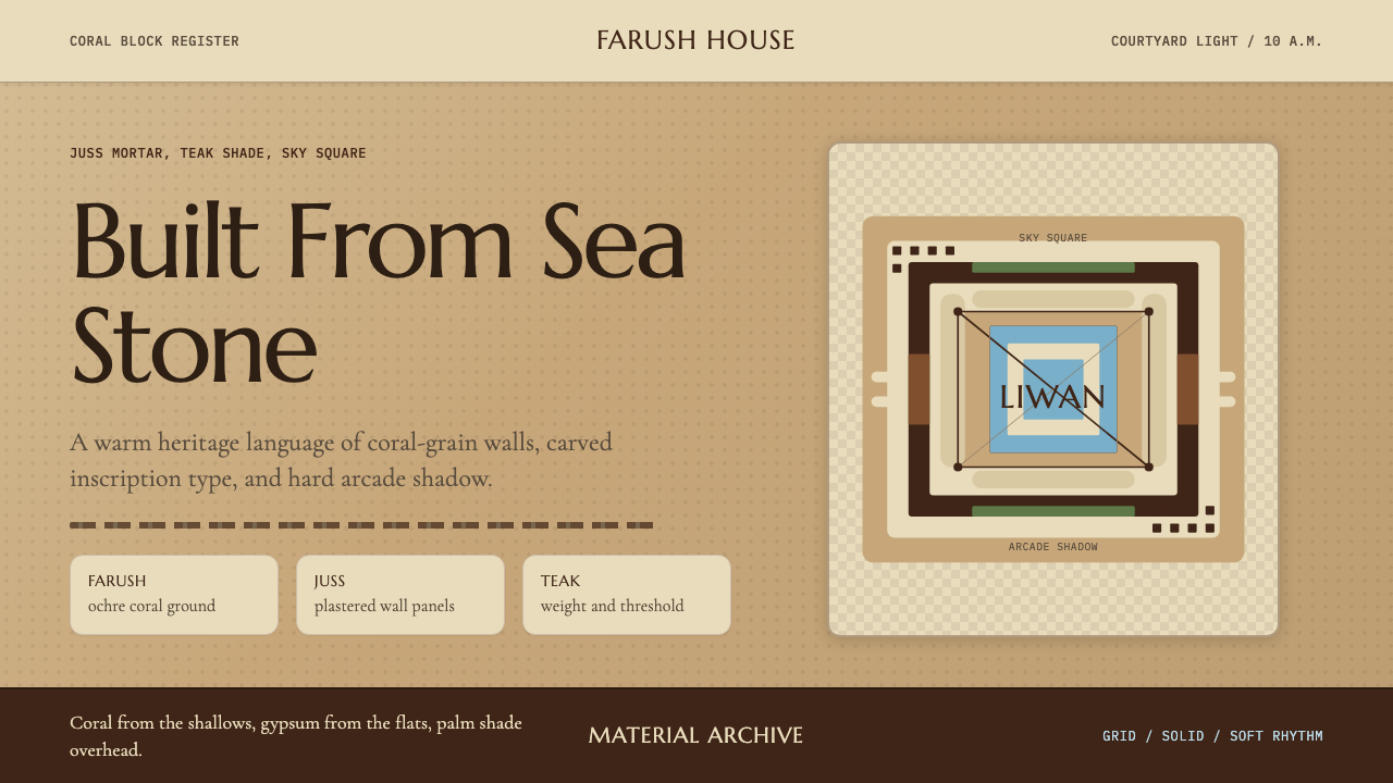 Emirati Bait Al Naboodah Coral HouseFeels built, not styled. Coral ochre, teak brown, and a sky-square courtyard…
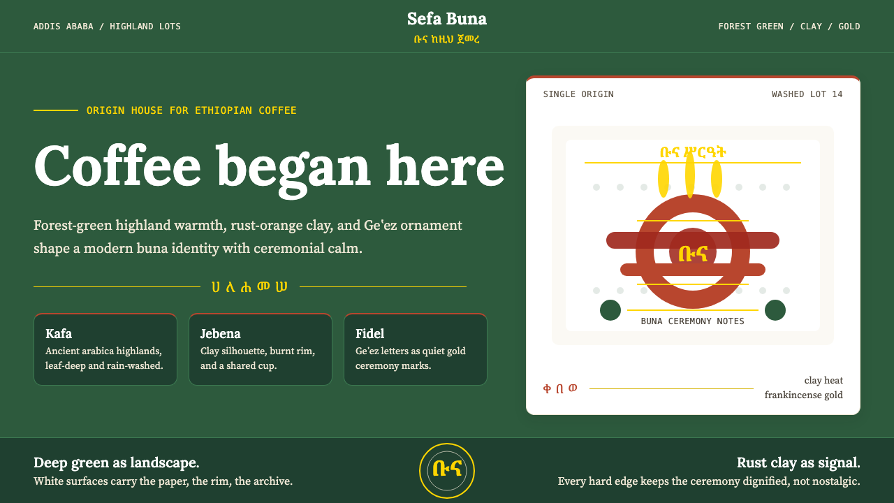 Ethiopian Coffee BunaOrigin feels ceremonial. Forest green, rust clay, Lora serif, and Geʽez gold…
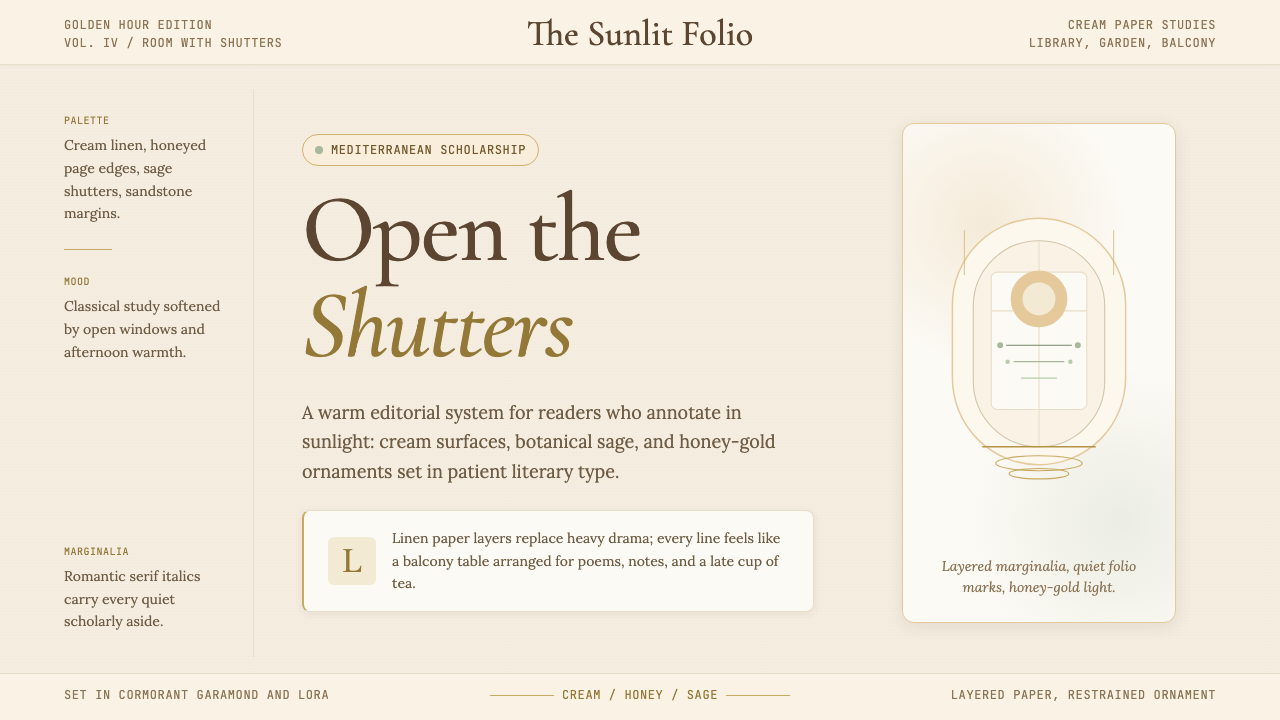 Light AcademiaScholarship turns sunlit. Cream linen, honey gold, sage botanicals, and roman…