What is Wat Xieng Thong Mosaic?
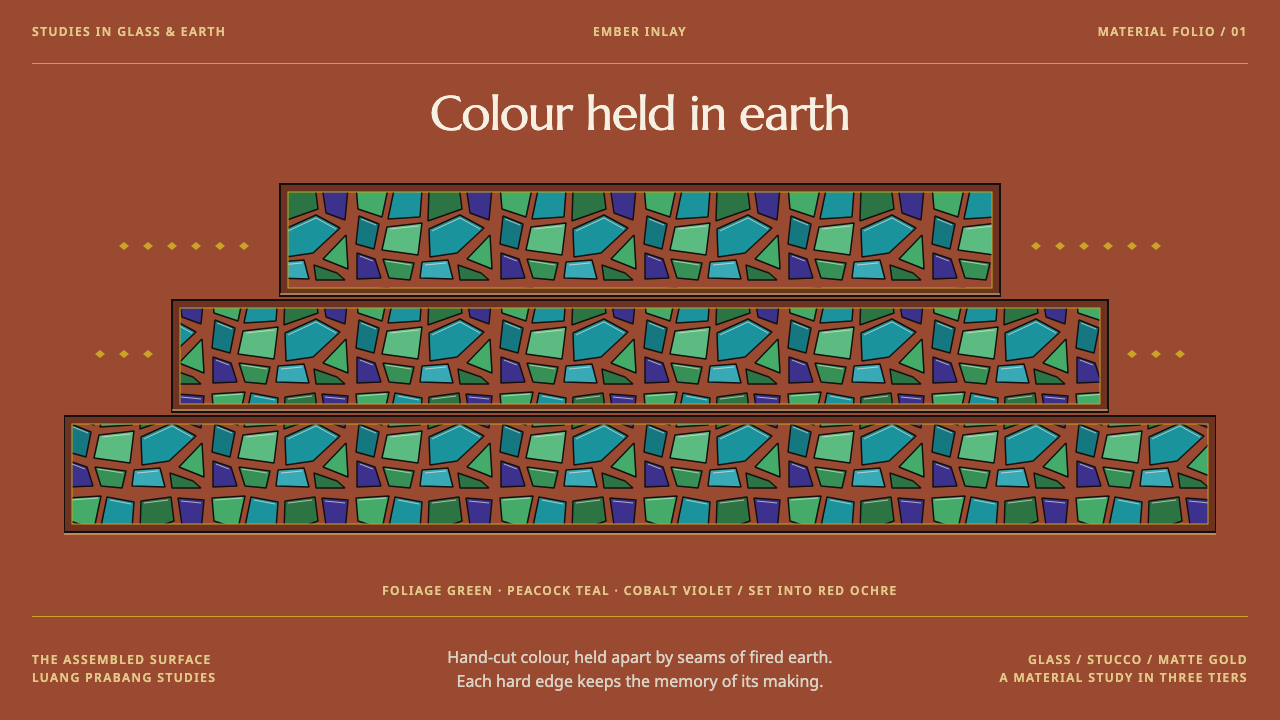
Wat Xieng Thong's rear gable sets colour into earth: opaque green and teal glass chips pressed into red-ochre stucco, edged in matte gold, with a Tree of Life at the centre.
Wat Xieng Thong Mosaic in brief
Wat Xieng Thong is the royal temple of the old Lao kingdom, in Luang Prabang, and its rear gable is the surface everyone comes for. The wall is red-ochre stucco, the colour of fired brick, into which hand-cut glass tesserae were pressed in 1957 to form a Tree of Life. A whole village of small figures is scattered under its branches: houses, animals and monks. Inside the main hall the mood changes: red-and-black lacquer walls stamped all over with gold pattern.
The design system takes that wall literally. The page ground is fired-brick stucco, a warm, earthy red-ochre, and colour arrives as flat opaque chips in foliage green, peacock teal and cobalt violet. Each chip has a seam around it and a single hard highlight, and none ever fades into a gradient. Gold is matte stencil leaf on lacquer, never a metallic gleam.
Structure follows the roof. The temple's roofs drop in three overlapping tiers, the lowest almost reaching the ground, and the layout steps down in the same way, as three overlapping planes. The centre is always kept for the main image rather than pushing the pattern out to the corners. The result is a dark, rich and tactile style that treats colour as something set into a surface, not poured over it.

Where does Wat Xieng Thong Mosaic come from?
The temple was founded in 1559–1560, and the king whose name is tied to its beginning is Setthathirath. Luang Prabang then stood at the centre of a Lao kingdom, and a temple with a royal connection was both a place of worship and a statement of the court's standing. Its age matters to the design: the architecture belongs to the sixteenth century, while the glittering rear wall that made it famous belongs to the twentieth. A reader of the style is looking at old structure wearing a recent skin.
Its form belongs to what the source calls Luang Prabang temple architecture, a regional manner of building in which roofs fall in several tiers over the hall and sweep low. At Wat Xieng Thong the roof drops in three overlapping layers, the lowest almost to the ground. That stepping silhouette is the origin of the style's layout logic: panels do not sit side by side in a flat grid, but overlap and descend, each plane sheltering the one below it.
The interior carries a different tradition, gold stencil lacquerwork. The hall walls are laid in deep red and black lacquer and stamped over their full height with gold pattern. The gold is applied through stencils on the lacquer surface and has a matte finish, which is why the system never uses gold as a mirror-bright metal. It is a patterned, dry gold, closer to ink than to jewelry, and it serves as an edge and a rhythm.
The mosaic is the third tradition: glass-mosaic wall decoration, for which the source uses the Lao term khaem. In 1957 craftsmen pressed hand-cut glass tesserae into the red-ochre stucco of the rear gable, creating the Tree of Life. The year was chosen to mark 2,500 years since the Buddha's passing into nirvana, and the king named in the source in connection with that period of the temple's life is Sisavang Vong. The mosaic therefore reads at once as devotional art, as a royal commission and as a work of village-scale storytelling, with small figures and animals living under the branches.
What defines the Wat Xieng Thong Mosaic look?
Fired-Brick Ground
The ground is red-ochre stucco, the colour of fired brick: warm, earthy and slightly dry. It is a dark style because this ground is deep and saturated, and every other colour has to hold its own against it. The ground is not a neutral backdrop, as the wall itself is the surface the chips are pressed into, so it must feel like a material, with a hint of grain, and not like a flat fill.
Flat Opaque Chips
Colour arrives in small flat pieces of foliage green, peacock teal and cobalt violet. Each is opaque, and each is a single colour rather than a blend. A chip has a visible seam around it and one hard highlight, as cut glass does when it catches light. There is no fade, no glow and no gradient anywhere in the system, because glass tesserae simply cannot do that.
Visible Seams
The gaps between chips are part of the design. They show that the surface is built from separate pieces set by hand, and they give the pattern its grain and rhythm. In an interface this translates to visible dividers and tile edges rather than seamless fills, so a reader can see how the page is assembled.
Matte Stencil Gold
Gold is a dry, matte stencil leaf on lacquer, used to edge shapes and to fill pattern fields. It is not a mirror-bright metal and should never read as a shiny gradient. Think of ink rather than jewelry: gold that outlines, repeats and frames, and never competes with the coloured chips for attention.
Stepped Planes
The temple's three overlapping roof tiers give the system its layout principle. Panels overlap and descend, each one sitting partly over the next, and the lowest plane comes close to the bottom edge of the page. The effect is shelter and depth without any shadow tricks, achieved only through the order in which flat planes are stacked.
A Reserved Centre
The middle of the composition belongs to the main image, as the Tree of Life belongs to the middle of the gable. Pattern supports it but is never banished to the corners as an afterthought. This makes the style strongly centred and symbolic: there is one subject, and everything else arranges itself around it.
Small Lives Under the Branches
Beneath the main motif, tiny figures of villagers, animals and monks are scattered over the stucco. They are narrative detail, small enough to reward a close look and never loud enough to compete with the tree. In a layout they correspond to small illustrations, icons or incidental marks that give the page life at the second reading.

Who shaped Wat Xieng Thong Mosaic?
Setthathirath is the king associated with the founding of Wat Xieng Thong in 1559–1560. His name anchors the temple's royal character: the building is a royal temple because it belongs to the line of kings who ruled from Luang Prabang, and the stepped, sheltering shape of its roofs is the form the whole design echoes.
Sisavang Vong is the Luang Prabang king named in the source in connection with the temple's twentieth-century life. His name ties the 1957 mosaic to the royal institution that the temple served, which helps explain why a modern work of glass could be placed on the most visible wall of a sixteenth-century sanctuary.
The Tree of Life was made by craftsmen who cut glass by hand and pressed each piece into the wet red-ochre stucco, one tessera at a time. Their names are not given in the source, but their method defines the style: every chip has a seam and a single hard highlight because every chip was individually cut and placed.
The hall interior, with its red-and-black lacquer and gold stamped pattern from floor to ceiling, was the work of gilding and lacquer craftsmen working in a regional tradition. They are the source of the matte stencil gold in the system, a gold that edges, repeats and frames rather than shining.
How do you use Wat Xieng Thong Mosaic today?
Wat Xieng Thong Mosaic is a dark, warm and tactile style for subjects that want weight, craft and ceremony. It works best when the content has a clear central subject and a supporting cast of small details, and when the audience is meant to feel that colour has been made rather than printed. Applying it well means keeping its four rules in view: red-ochre ground, flat opaque chips with seams, matte gold, and stepped planes around a reserved centre.
For presentation slides, the cover can mirror the gable: a single central image or title mark framed by chips and edged in gold, on a deep red-ochre ground. Content slides can be built as three stepped bands, each overlapping the one above, so that sections read as tiers. Data slides suit categorical charts in which each category is a flat chip of one colour; keep the bars or blocks opaque, give them visible seams, and avoid any gradient or soft shadow.
For web interfaces, the style fits cultural, hospitality, travel, tea and food, craft and festival products, and any brand that wants to feel rooted. A pricing page can use three overlapping tiers that echo the three roof planes. Navigation and controls should stay plain so that the colour chips carry the identity. Buttons are better as flat opaque tiles with a hairline seam than as glossy pills.
In editorial and marketing work, the style suits long-form travel and heritage features, museum and gallery material, publications about craft, and product storytelling in which place and making matter. A single large central image framed by tessellated colour makes a strong opening, and small incidental illustrations in the margins can play the role of the tiny figures under the branches.
The most common mistake is to treat it as generic Southeast Asian decoration: metallic gold with shine, gem-like gradients on the glass, pattern pushed to the corners, and all three chip colours used in equal measure so that nothing leads. Another is to smooth the seams away, which turns mosaic into a flat fill. A third is to forget that this is a sacred building: the style should be used with care, and not to decorate content that would be out of place on a temple wall.

Wat Xieng Thong Mosaic — FAQ
What is Wat Xieng Thong?
Wat Xieng Thong is the royal temple of the old Lao kingdom, in Luang Prabang, founded in 1559–1560. It is best known for the rear gable of its main hall, a red-ochre stucco wall into which hand-cut glass tesserae were pressed in 1957 to form a Tree of Life. Inside the hall the walls are red-and-black lacquer stamped with gold pattern, and the roof drops in three overlapping tiers, the lowest almost to the ground.
Why is the mosaic dated 1957?
The year 1957 was chosen to mark 2,500 years since the Buddha's passing into nirvana, according to the source material. That is why a twentieth-century work sits on the wall of a temple founded in the sixteenth century. It also explains the layered character of the style: an old building wearing a more recent skin, made with traditional hand methods and meant to commemorate a religious milestone.
Why does the system forbid gradients?
Because the original surface cannot produce them. Each glass chip is a single opaque colour with a seam and one hard highlight, and gold is matte stencil leaf, not a mirror finish. A gradient would suggest a lit, rendered surface and would turn the mosaic into something it is not. Keeping everything flat and opaque is what makes the result read as colour set in earth.
Why is the centre always reserved for the main image?
Because the Tree of Life sits in the middle of the gable and everything else arranges itself around it. The system keeps that logic: one clear central subject, stepped planes around it, and pattern that supports the subject rather than being pushed to the corners. It gives the style a strong sense of focus and ceremony, but it does require the content to have a genuine main subject.
Is it a dark style, and can it be used on a light background?
It is a dark style: the deep red-ochre ground and the saturated glass chips depend on each other. A light version is possible only by turning the ground into a pale stucco, which loses the weight of the original wall and tends to make the colours look like candy. If a lighter page is needed, keep the flat opaque chips, the visible seams and the matte gold, and use a mid-tone earth ground rather than white.
Related design styles
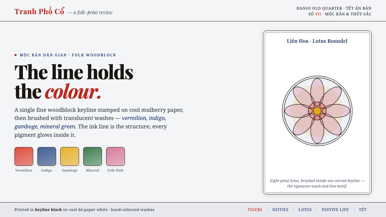 Hàng Trống Folk PrintBright folk colour, never loud. Translucent vermilion-indigo washes held insi…
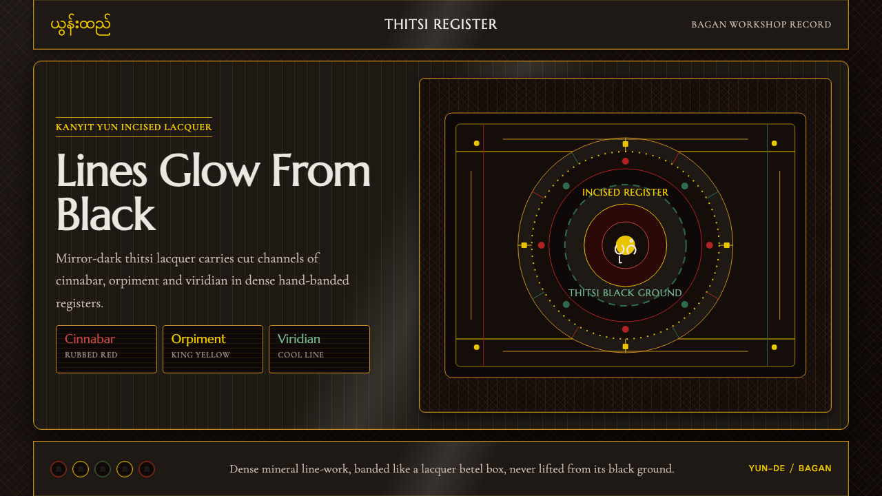 Burmese Yun LacquerwareLacquer glows in cut lines. Cinnabar, orpiment and viridian band a mirror-bla…
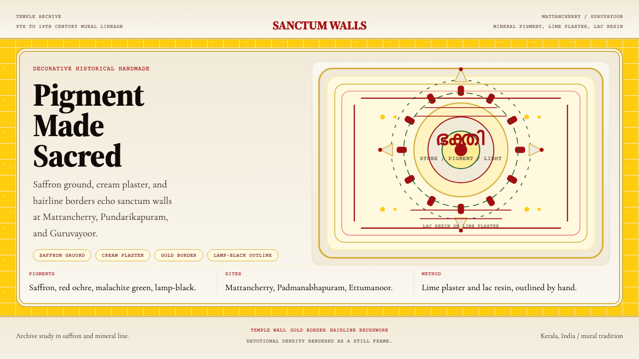 Kerala Mural TempleDevotional density over space. Saffron ground and cream panels, edged in gold.
 Newar Tundal Strut CarvingCenturies-darkened sal-wood. Carved deities and pierced lattice in mid-brown…
 Peruvian Quechua Keros (Andean Cup)Hidden cosmology glows. Crimson lacquer and saffron tocapu grids frame the st…
 PNG Huli WigmanBody as ceremony. Red ochre, cream bone, and feathered geometry hold a fronta…