What is Lao Naga Temple Stencil?
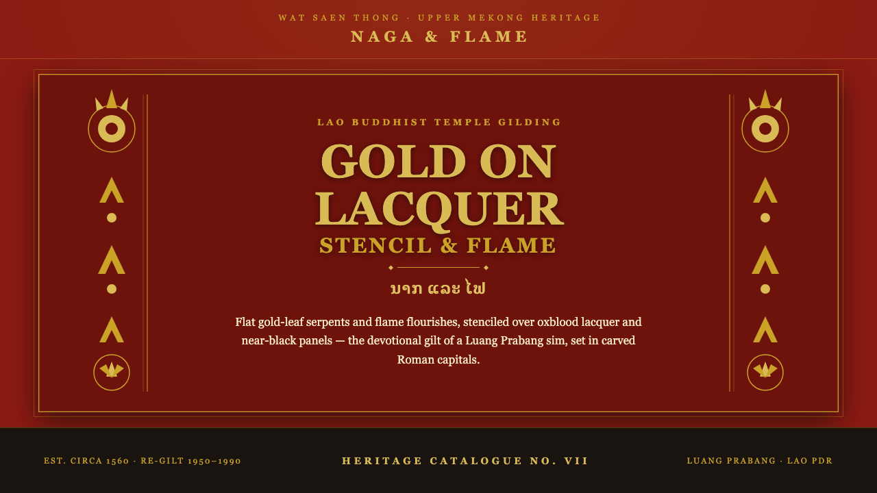
Lao Naga Temple Stencil turns lacquer, gold leaf, and sacred geometry into a dark interface language of devotional weight.
Lao Naga Temple Stencil in brief
Lao Naga Temple Stencil distills the gilded ornament associated with Wat Xieng Thong in Luang Prabang: flat gold-leaf naga serpents and flame or dok flourishes placed over lacquered red-ochre columns and black-lacquer panels. Its mood is formal, devotional, and architectural rather than luxurious in a contemporary hotel sense.
The system is built on contrast between deep oxblood and near-black grounds and a restrained field of gilt ornament. Gold is not treated as chrome, glitter, or a reflective special effect. It behaves as a flat leafed surface, glowing because it is held against darkness and enclosed by symmetrical borders.
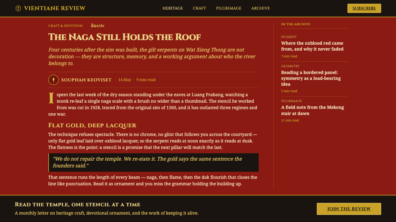
In interface form, this vocabulary becomes lacquer-red page grounds, bordered content panels, monumental headings, and carefully placed ornamental motifs. Typography should feel carved or inscribed, with substantial presence and calm authority. The result is decorative, but every flourish is organized by framing, repetition, and visual devotion.
Where does Lao Naga Temple Stencil come from?
The visual anchor is Wat Xieng Thong in Luang Prabang, Laos, a reference point for the gilded temple vocabulary that this system interprets. Its historical frame is described as Lao Buddhist temple decoration from 1950–1990, with the sim of 1560 providing an older architectural memory. The result is not a reconstruction of one building, but a design reading of its lacquer, stencil, and ornamental discipline.
The material sequence is central. Lacquer establishes the dark, saturated ground; red-ochre appears on columns and structural surfaces; black lacquer creates dense framed fields; gold leaf supplies the devotional emphasis. Because each material has a distinct visual role, the palette feels built rather than selected from a generic luxury moodboard.
Three related practices define the source vocabulary: Lao Buddhist temple decorative arts, gold stencil-on-lacquer ornament, and Naga and dok flourish gilding. The stencil method matters because it produces clear, repeatable silhouettes. Naga serpents and flame-like flourishes can therefore appear as organized motifs, not loose illustrations or ornamental noise.
The interface translation preserves this hierarchy. A page becomes a dark architectural ground, a panel becomes a lacquered shrine-like field, and a heading becomes an inscription with ceremonial weight. Symmetry and borders provide containment, while flat gold marks the places that deserve attention. The system feels handcrafted because it borrows the logic of craft, even when applied to digital components.
What defines the Lao Naga Temple Stencil look?
Color
The palette is dark, saturated, and deliberately narrow: oxblood, lacquer red, red-ochre, near-black, and flat gilt. Red should feel embedded in lacquer rather than printed as a bright interface accent. Gold appears sparingly, gaining authority from the surrounding darkness. Pale neutrals, if needed, should remain secondary and quiet.
Gold Application
Gilt is treated as opaque ornament with a visible, decisive silhouette. It should glow through contrast, not through simulated reflection, sparkle, or metallic gradients. Gold lines and filled motifs work best when they are confident and continuous, like stencil shapes laid onto a prepared surface.
Naga and Flame Motifs
Naga serpents and flame or dok flourishes are the signature forms. They should be simplified into legible silhouettes, repeated with discipline, and placed as framing devices or focal ornaments. Their presence should feel ceremonial rather than illustrative; avoid scattering motifs wherever an empty space appears.
Lacquered Surface
The ground should read as lacquer: dense, deep, and slightly ceremonial, even when rendered as a digital color field. Surface richness comes from color depth and framing, not from glossy reflections, glass effects, or artificial texture overlays. The dark field is an active architectural element.
Symmetry and Framing
Composition is strongest when content is held within balanced, symmetrical bordered panels. Borders are not decorative afterthoughts; they establish the visual order that lets gilt ornament feel intentional. Repetition, centered axes, and paired forms create calm authority, while asymmetry should be used only when the information itself requires it.
Monumental Typography
Headings should be weighty, broad, and inscriptional, with enough presence to hold their place beside gilt ornament. Thin hairline type breaks the system because it reads as contemporary fashion rather than carved authority. Body text should be restrained and highly legible, supporting the title without competing with the ceremonial frame.
Who shaped Lao Naga Temple Stencil?
The gilders of Luang Prabang provide the material intelligence behind the system: lacquer is treated as a ground with depth, while gold leaf is placed as a controlled devotional surface. Their contribution is best understood as a method of restraint. The ornament becomes powerful because the gilt is framed, repeated, and protected by darkness rather than spread across every available surface.
Lao temple stencil artisans define the clarity of the decorative silhouettes. Their stencil vocabulary translates especially well to interface work because it can produce motifs that remain recognizable at different scales without becoming pictorially busy. In a digital system, this means using flat, repeatable shapes as structural accents, dividers, corner pieces, and panel ornaments.
The masters associated with Wat Xieng Thong supply the architectural reference for the system’s balance of ornament and structure. Their influence appears in the relationship between red-ochre structural surfaces, black-lacquer fields, and gilt patterning. The lesson for interface design is that decoration gains dignity when it is integrated with the frame, the panel, and the building-like organization of the page.
How do you use Lao Naga Temple Stencil today?
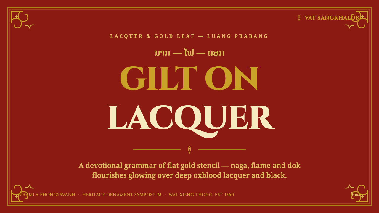
For presentation slides, use the cover as a dark ceremonial field: a monumental title, a restrained gilt naga or flame motif, and a symmetrical border that gives the page the authority of a temple panel. Content slides should keep the same architectural frame while allowing headings and body copy to remain clear. Data slides benefit from flat gold marks against oxblood or black, with ornament used to establish the frame rather than decorate every chart.
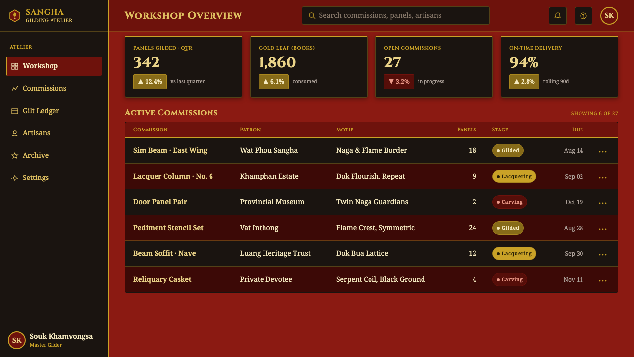
For web interfaces, the system suits dashboards, pricing pages, and other products that need a sense of authority, heritage, or formal trust. Use lacquer-red or near-black grounds to separate major regions, place key information inside bordered panels, and reserve gilt for selected actions, statuses, or focal figures. Cards should feel like inset panels, while navigation can use compact monumental labels and small geometric or stencil-derived indicators.
For editorial and marketing work, Lao Naga Temple Stencil supports a strong cover-to-content rhythm. A feature cover can rely on one large framed composition, while interior pages alternate dense lacquer fields with quieter surfaces that preserve readability. Marketing sections can use gold ornament to mark a promise, product tier, or call to action, provided the surrounding space remains dark and controlled. The result should feel ceremonial and specific, not like a generic black-and-gold luxury campaign.
A common mistake is to reduce the style to black backgrounds, gold text, and expensive-looking effects. Chrome-like highlights, metallic gradients, glitter, excessive ornament, and thin fashionable headings all weaken the source vocabulary. Another mistake is to place naga and flame motifs as isolated decoration without a frame or compositional role. The system works when lacquer, gilt, border, motif, and typography behave as parts of one architectural order.
Lao Naga Temple Stencil — FAQ
Is Lao Naga Temple Stencil meant to reproduce a temple literally?
No. It is an interface interpretation of the gilded vocabulary associated with Wat Xieng Thong and Luang Prabang temple decoration. The goal is to preserve the relationship between lacquered grounds, flat gilt ornament, stencil clarity, symmetrical framing, and monumental text. Literal architectural imitation can become theatrical; the stronger application carries over the underlying order.
Should the gold look reflective and metallic?
It should not. The source describes flat gold leaf glowing on lacquered red and black grounds. Digital applications should therefore rely on contrast, silhouette, and placement rather than polished reflections or metallic effects. A quiet, opaque gilt mark feels more devotional and more faithful to the stencil logic than a highly rendered shine.
Can the style work with a light background?
A light background can be used sparingly, but it weakens the central contrast that makes the system distinctive. The strongest expression comes from gilt held against oxblood, lacquer red, or near-black. If a quieter surface is required for reading, keep it subordinate to the dark architectural fields and retain the same border, typography, and ornament discipline.
How should typography relate to the ornament?
Typography should provide monumental stability rather than compete through delicacy. Headings need substantial forms that can stand beside gilt borders and naga silhouettes, while body text should remain restrained and easy to read. Ornament frames or punctuates the information; it should not interrupt every line of text or force the type into a decorative role.
What is the biggest risk when applying this system?
The biggest risk is confusing devotional ornament with generic luxury. If every surface becomes gold, if borders lose their structure, or if the interface relies on glossy effects, the style loses its Lao temple specificity. Keep the palette narrow, the motifs intentional, the composition balanced, and the gilt flat. Its authority comes from restraint and order.
Related design styles
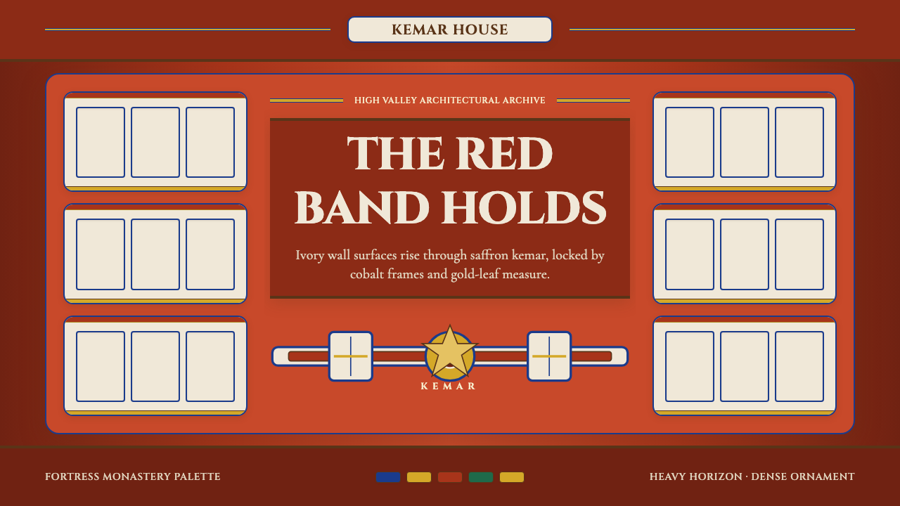 Bhutanese Dzong (Fortress Red)Monumental red holds the page. Cobalt frames and gold bands lock the fortress…
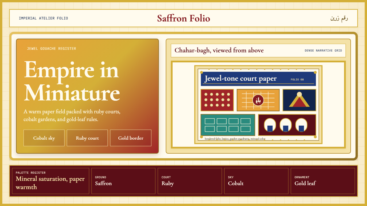 Mughal Miniature (Akbar era)Opulence refuses emptiness. Saffron paper, ruby panels, cobalt lattice, gold…
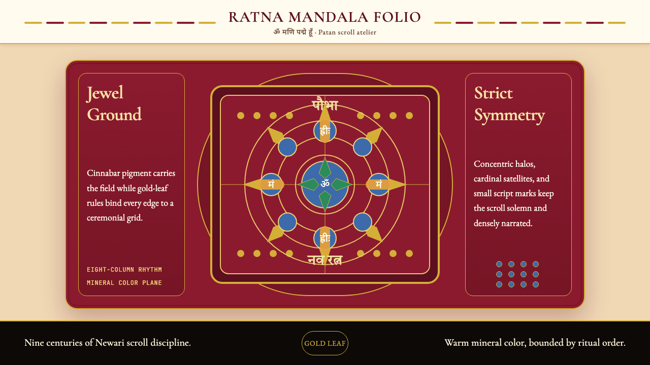 Nepali Paubha (Newari Scroll)Sacred density. Cinnabar ground, gold-leaf frame, lapis rings in strict symme…
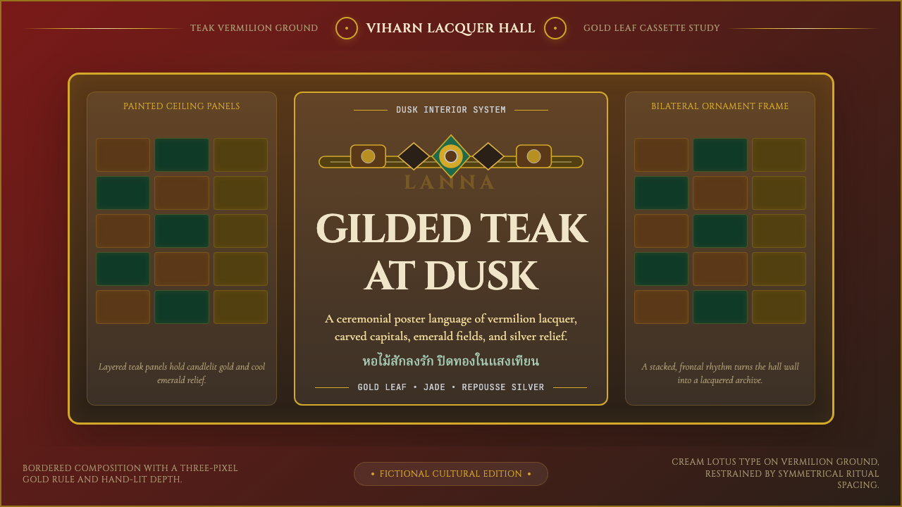 Thai Lanna Tai Yai TempleSacred lacquer glows. Vermilion ground, Cinzel capitals, gold cassette symmet…
 Bhutanese Drukpa Kagyu ThangkaDevotion made cobalt. Gold frames, Cormorant serif, and vermilion marks hold…
 Burmese Shwedagon Gold-LacquerOpulence catches fire. Gold-leaf gradients on cinnabar panels frame a stupa s…