What is Lagrange Servicing Depot?
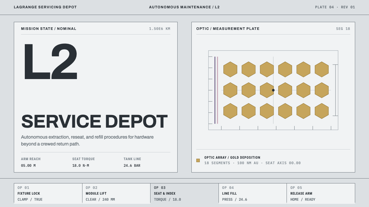
Lagrange Servicing Depot designs like an engineering drawing set in deep space: cleanroom grey, strict rules, numbered parts, and gold permitted only on the optic.
Lagrange Servicing Depot in brief
Lagrange Servicing Depot imagines a robotic workshop parked at the Sun–Earth L2 point, a position far beyond the Moon from which a spacecraft can hold a halo orbit. In the scene the design depicts, sunshield membranes get swapped, instrument modules are pulled and reseated, and tanks are refilled, all by a single five-metre robotic arm. It is a place defined by maintenance rather than discovery, and its look is the look of procedure.
The visual system's ground is the material itself: five layers of Kapton E, a polyimide film aluminized on both sides, laid out flat and folded under cleanroom lights. This is the sunshield of a space telescope read as a surface, with a cold, hard, mirror-like sheen. On top of it, the interface follows the conventions of an engineering drawing: wide margins, squared frames, leader lines running out to numbered parts, and torque values set in monospaced type.
Two details show how strictly the system treats meaning. The purple-pink cast on the outer layers is a by-product of a doped-silicon coating, not a palette choice, so it appears only where that coating would. And gold, the colour everyone expects from a space telescope, is a rationed material: a film about a hundred nanometres thick on eighteen mirror segments, and nowhere else. The tone is that of a working document that reports numbers and never rhapsodizes.

Where does Lagrange Servicing Depot come from?
The style belongs to the 2020s, and its reference point is the James Webb Space Telescope, launched in 2021 to L2. Two real-world objects of that telescope are the ones the system leans on most: the sunshield, a stack of five metallised membranes that keeps the instruments cold, and the primary mirror, made of eighteen gold-coated segments. The source material names the JWST sunshield and optics teams among its key influences, and the settings that give the design its photographic character are the cleanrooms of Goddard Space Flight Center and Maxar.
The second reference is on-orbit servicing, assembly and manufacturing, a field often shortened to OSAM. The system names the Restore-L and OSAM-1 programme, Maxar Space Systems, and the team behind SPIDER, a robotic assembly arm, among its sources. That line of work imagines spacecraft that are repaired, refuelled and even assembled in orbit by robots. The depot at L2 extends that thinking to a place far beyond easy human reach: a service station for a telescope, doing the dull and exacting work of replacing parts.
The graphic half of the heritage is the NASA Graphics Standards Manual of 1975. That document treats an organisation's visual identity as a body of rules, covering logo placement, colour, type and grids, and it turned engineering seriousness into a look. Lagrange Servicing Depot takes its attitude from the manual's habit of specifying instead of persuading: the interface does not try to convince anyone that the mission is exciting, it simply sets out the parts and states the values.
Joined together, those threads produce a look that is not space in the cinematic sense. There are no nebulae, no glows and no heroic silhouettes. It is the space programme as seen by the technicians who prepare it: tidy, grey, labelled and cold. Whatever depth the design has is found in the procedure, not in the scenery.
What defines the Lagrange Servicing Depot look?
Cleanroom Grey
The ground is a family of cool, hard, pale metallic greys, the colour of film and fixtures under cleanroom light. It is a light style: bright, even and shadowless, with none of the warmth that would suggest comfort or atmosphere. The grey is not a neutral absence of colour but the material's own colour, and everything else on the page is measured against it.
The Purple-Pink Artefact
A faint purple-pink cast belongs to the outermost layers, where a doped-silicon coating produces it. In the system it is a by-product, not a brand colour. It should appear only on surfaces that represent those outer membranes, and never be promoted to buttons, links or headings. Its value lies in being honest about where it comes from.
Gold, Rationed
Gold is reserved for the optic: eighteen mirror segments carrying a film of gold roughly a hundred nanometres thick, and nothing else. The rule is simple and absolute: the most precious thing on the page gets gold, and no other element does. Headings, dividers and calls to action are never gold. Because it is so scarce, a single gold element draws the eye more strongly than a whole page of bright colour could.
Drawing Conventions
Layouts follow the habits of an engineering drawing. Margins are wide, frames are squared, and thin leader lines run from a callout to a numbered part. The reader is meant to trace a line from a label to a thing, not to absorb a mood. White space is generous because every item needs room to be identified without ambiguity.
Monospaced Data
Values such as torque settings and tank pressures are set in monospaced type, so digits line up in columns and can be compared at a glance. Mono is not used for decoration or for a hacker mood. It marks the places where the document is quoting a measurement, and everywhere else the type stays plain and sober.
Squared Geometry and Flat Light
Frames are square and corners are crisp. Rules are thin and consistent. There are no soft shadows, no glows and no gradients standing in for depth; the lighting is flat and even, as in a cleanroom. Hierarchy is made with weight, spacing and numbering rather than with effects.
A Voice That Reports
The copy is as disciplined as the layout. Labels state what a part is and what was done to it. Sentences are short, verbs are plain, and nothing is described as stunning or revolutionary. The system persuades by being exact, which is why a numbered diagram carries more authority here than a headline.

Who shaped Lagrange Servicing Depot?
These are the engineering groups behind the telescope's layered sunshield and its eighteen-segment primary mirror. Their hardware supplies both the ground of the design (stacked metallised film) and its single exception (the gold on the optic), which is why the two materials carry so much of the system's logic.
Maxar is named in the source alongside Goddard as a cleanroom setting, and as part of the servicing line of work. Its facilities are part of the photographic world the design draws on: bright, clean rooms where large flat membranes are folded and handled by technicians.
This is the programme name under which robotic servicing, assembly and manufacturing in orbit was being developed. It supplies the idea at the heart of the depot: that refuelling, module replacement and repair are routine jobs for a robot arm, not feats.
The team behind the SPIDER robotic assembly arm is credited among the system's sources. The depot's long arm, which swaps membranes and reseats modules, is the same kind of device, and its presence explains why the interface shows parts and tolerances rather than people.
How do you use Lagrange Servicing Depot today?
Lagrange Servicing Depot is a light, rule-bound, document-like style, and it suits any subject where the audience wants to see exactly what is being claimed. Applying it well means obeying the rules the system sets itself: grey ground, squared frames, leader lines to numbered parts, measurements in mono, and gold only where something is truly precious.
For presentation slides, the cover can be treated as a drawing sheet: a wide margin, a squared frame, a plain title block, and perhaps one gold element that stands for the single thing the deck is about. Content slides work as annotated figures, with a diagram in the centre and numbered callouts pointing in from the edge. Data slides are the natural home of monospaced columns and thin rules, where a table of values is more convincing than a decorative chart.
For web interfaces, the style fits operations dashboards, status pages, infrastructure and developer tools, laboratory and hardware products, and technical documentation. Pricing and specification pages work well as spec sheets: each plan is a numbered part with a short list of exact values. Keep controls flat and square, avoid shadows, and let the single gold accent mark the one action or object that matters most.
In editorial and marketing work, the style suits whitepapers, engineering blogs, technical manuals, reports to regulators or partners, and brand material for companies that want to sound precise rather than inspiring. Long documents benefit from numbered sections and margin notes. Photography, when used, should look like documentation: evenly lit, square-on, and uncropped.
The most common mistake is to treat the style as generic science fiction, with glows, nebula gradients and gold splashed over headings because space feels luxurious. The depot rejects all of this. Another is to promote the purple-pink cast to a brand colour, or to round the corners and soften the shadows so the interface feels friendlier. A third is lyrical copy: the moment the text starts to sound excited, the document stops sounding like one.

Lagrange Servicing Depot — FAQ
Is the Lagrange Servicing Depot a real place?
No. The depot is an imagined scenario: a robotic workshop at the Sun–Earth L2 point where sunshield membranes, instrument modules and propellant tanks are serviced by a long arm. It is grounded in real objects and real programmes, including the James Webb Space Telescope's sunshield and mirror and the robotic servicing work behind Restore-L and OSAM-1, but the depot itself is a design concept, not a facility that exists.
Why is gold so strictly limited?
Because the real telescope uses gold in one place only: a very thin film on the mirror segments. The system turns that fact into a rule, so gold marks the optic and nothing else. The restriction gives the colour its meaning, since a gold element tells the viewer that this is the most precious thing on the page. Spreading it across headings or buttons would destroy that signal.
Why does the design include a purple-pink cast if it is not a palette choice?
Because it is part of the material's honest appearance. The outer layers pick up that cast from a doped-silicon coating, so a faithful rendering of the film includes it. The system keeps it as a by-product: allowed where the coating would produce it, forbidden as a decorative accent. That distinction between artefact and choice is part of what makes the style feel documentary.
Can the style work for products that have nothing to do with space?
Yes, and it often works better than a literal space treatment. The underlying ideas are precision, labelled parts, exact values and restraint, which suit infrastructure software, developer tools, laboratory and hardware products, technical documentation and back-office systems. What matters is that the product genuinely wants to sound exact. For a product that wants to sound warm or playful, the style will feel cold.
Does it work on a dark background?
It is built as a light style, because the cleanroom is bright and evenly lit and the grey ground is the colour of material under that light. A dark version loses that logic and tends to slide toward the glowing, cinematic space look the system avoids. If a dark page is unavoidable, keep the flat light, the square frames, the mono values and the gold rule, and resist adding glows to make it feel more like space.
Related design styles
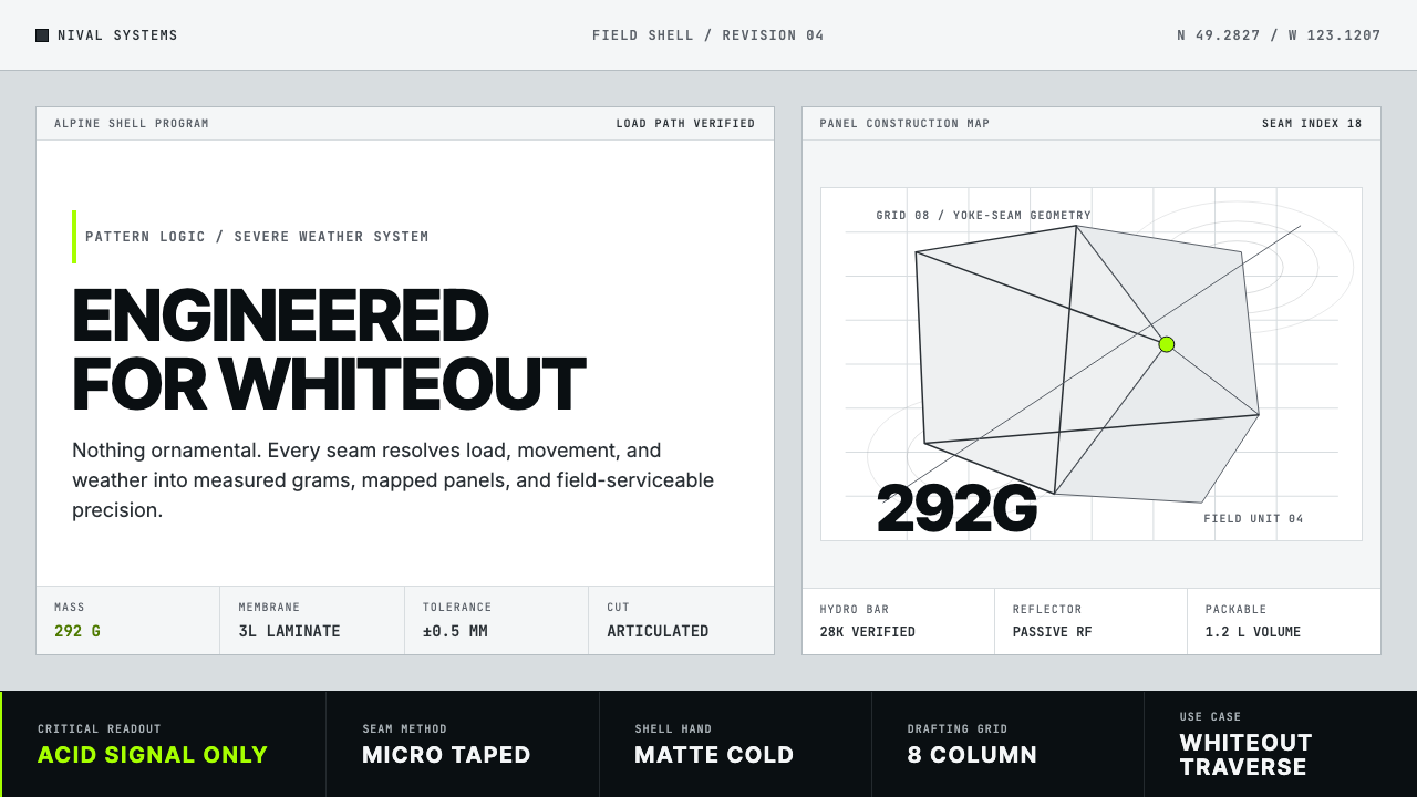 Arc'teryx Technical OutdoorEngineered, never ornamental. Glacier silver grid, mono specs, one acid-green…
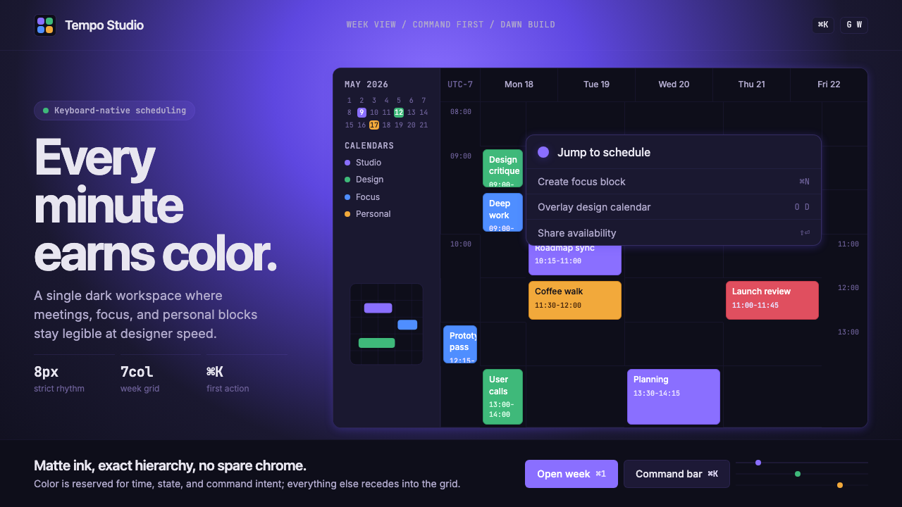 Cron CalendarDesigner-tech restraint. Purple wash, ink grid, mono shortcuts, surgical even…
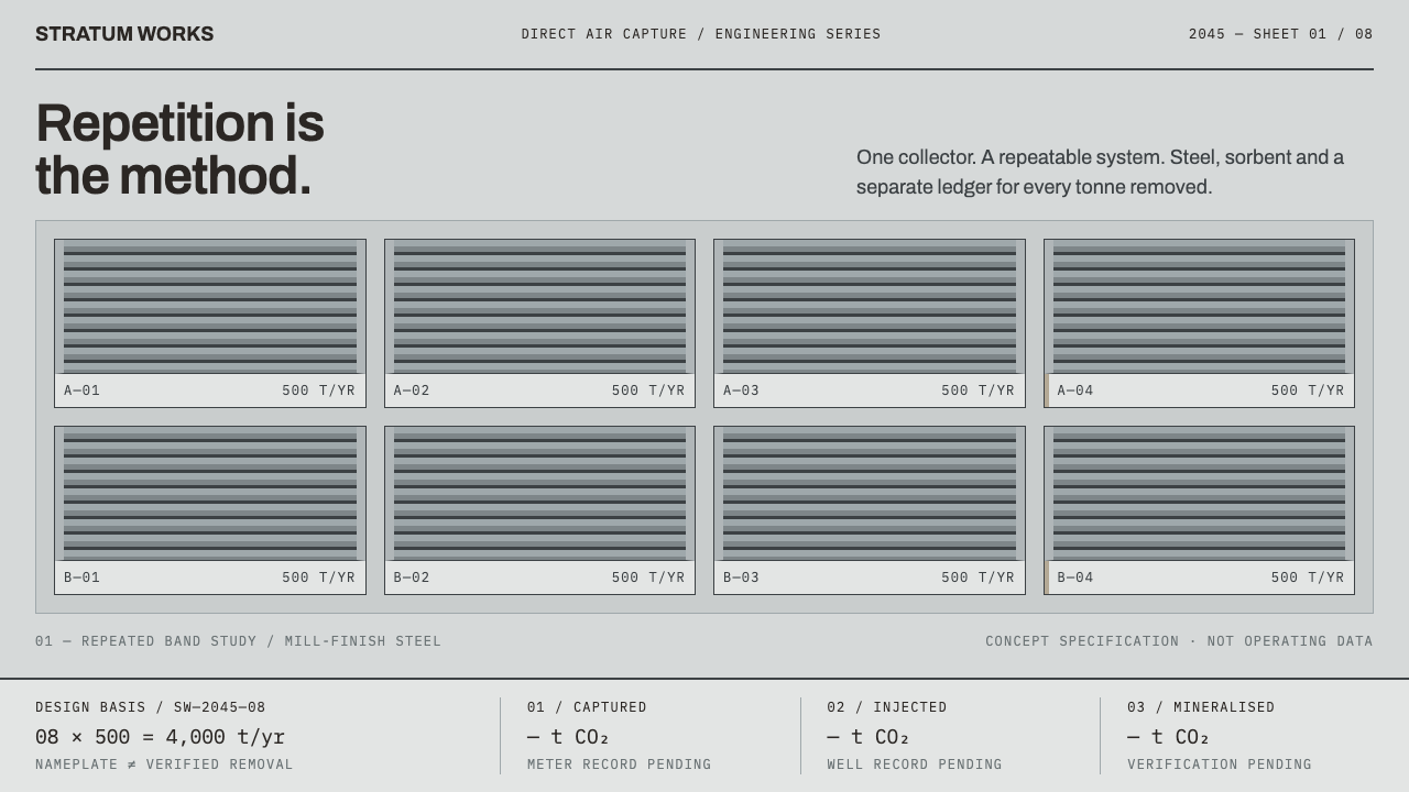 Direct Air Capture PlantRepetition, not rhetoric. Steel-grey louvre bands and monospaced ledgers make…
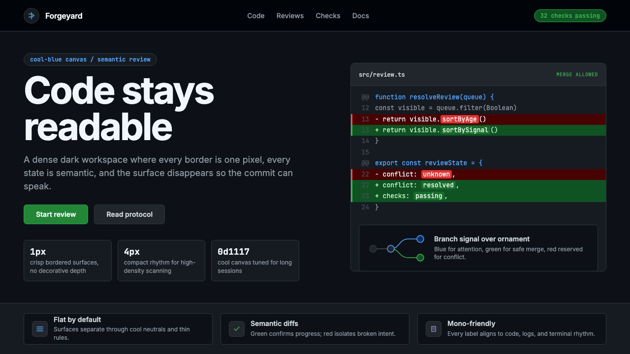 GitHub DarkCode-first darkness. Cool-blue canvas, 1px borders, green/red diff lines.
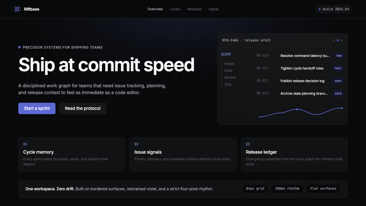 Linear 2024Precision down to the millisecond. Near-black, indigo-violet accents, Inter D…
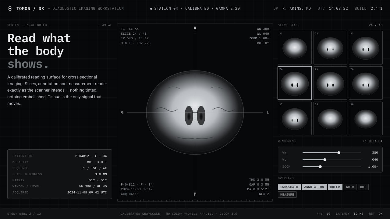 MRI ScanReads like a radiology viewport. Tissue-gray tomograms on pure black, IBM Ple…