What is Kondapalli Toys?
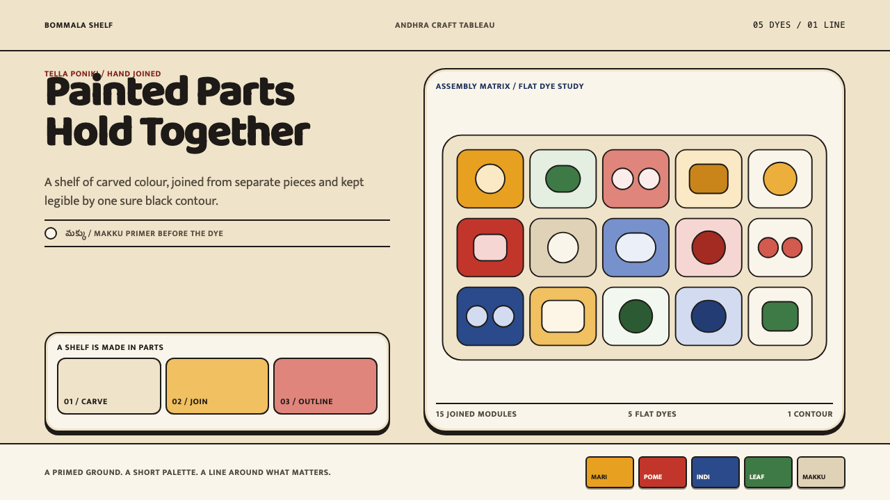
Kondapalli Toys is a style where colour holds together: flat blocks of marigold, pomegranate red and indigo, each fenced by a single black contour on a warm bone-white ground.
Kondapalli Toys in brief
Kondapalli Toys is a light, warm, flat-colour design style drawn from the wooden toys of Kondapalli, a village near Vijayawada in Andhra Pradesh, South India. The toys are carved from tella poniki, a soft pale wood, with limbs, torsos and cart wheels shaped separately, joined, and then sealed with makku, a paste of tamarind-seed powder and sawdust. The craft has been practised from the sixteenth century to the present and has carried a Geographical Indication tag since 2006.
The visual language that follows is plain in its rules and very particular in its look. A bone-white primed surface comes first. Colour arrives afterwards in flat fields: marigold yellow, pomegranate red, indigo, green and a palm-leaf peach, each applied as a solid block. Nothing blends and nothing shades. Every field that matters is fenced by a black contour of even weight, and it is that line, more than any particular hue, that makes the whole composition cohere.
In the design system, those three decisions become a discipline: a primed ground, a small dyer's palette, and an outline around everything that matters. It is a cheerful style, but not a careless one. The colours are bold and the shapes are simple, yet the system is held together by firm structural rules, which is exactly what makes it dependable for interfaces, slides and printed pages that must feel friendly and still be legible.

Where does Kondapalli Toys come from?
Kondapalli is a village in the NTR district, near Vijayawada in Andhra Pradesh. The toys take their material from the hills above the city, where tella poniki, a soft and pale wood, is cut for carving. The source dates the craft from the sixteenth century to the present, which makes it a long-running tradition, and its place of origin is so specific that the toys are known by the village's name.
The record credits the work to the Aryakshatriya artisan families of Kondapalli. Their method is modular. Limbs, torsos and the wheels of toy carts are shaped as separate pieces, then joined. The assembled figure is sealed with makku, a mixture of tamarind-seed powder and sawdust that dries to a warm bone surface. This stage is easy to underrate: before a single drop of colour touches the toy, the makers have created a smooth, uniform, pale ground, which is why the colour that follows is so clear.
Colour is then applied in a deliberately limited way. The palette named in the source is marigold yellow, pomegranate red, indigo, green and palm-leaf peach, laid on as flat fields. The craft does not shade, blend or model volume with light and dark. Instead, a black contour of even weight surrounds each field, separating adjacent colours and defining the shape. The effect is closer to the logic of a printed outline drawing filled with solid colour than to the logic of painting, which is why the style translates so naturally to flat digital surfaces.
The craft sits within three connected frames in the record: Indian folk toy traditions, the GI-protected handicrafts of Andhra Pradesh, and the display culture of Sankranti Bommala Koluvu. The first places the toys in a long lineage of handmade play objects. The second reflects the Geographical Indication status, awarded in 2006, which formally ties the craft to its place. The third connects the toys to a festival practice of arranging figures for viewing, which helps explain why they are made to look good side by side. The design system keeps the discipline and drops the object: a primed ground, a small dyer's palette and an outline around everything that matters.
What defines the Kondapalli Toys look?
Primed Bone Ground
Everything sits on a warm, pale, bone-coloured surface, the visual equivalent of the makku coat that seals the toy before painting. It is not pure white and not cream; it is a soft, slightly warm off-white that makes colours look clean without making the page clinical. The ground is also an active element. Because it is smooth and uniform, the saturated blocks laid on it read with great clarity, and large areas of it can be left empty without feeling unfinished.
Small Dyer's Palette
The palette is short and fixed: marigold yellow, pomegranate red, indigo, green and a palm-leaf peach, plus black for the line. These are saturated, earthy and warm, the colours of a dyer's workshop rather than of screens. The restraint matters. Using only these hues, and using each as a solid field, keeps even a busy composition legible, and prevents the cheerfulness from turning into noise.
Black Contour of Even Weight
Every important shape is fenced by a black line, and the line keeps the same weight throughout. It does not taper, vary with pressure or fade at the edges. This even outline is the single most recognisable feature of the style and the thing that distinguishes it from imitations. It separates neighbouring colours, defines silhouettes and makes buttons, cards, icons and illustrations look as if they were cut out and painted rather than rendered.
Flat Fields, No Shading
Nothing blends and nothing shades. There are no gradients, no soft shadows, no highlights and no simulated depth. Volume is implied by the shape and by the arrangement of parts, not by lighting. This makes the style honest and cheap to reproduce, and it works in print, on screens and in single-colour applications alike. The discipline is strict: adding a single gradient to a block undermines the logic of the surrounding system.
Blocks Meeting at the Line
Adjacent colours do not touch directly; they meet at the black contour. This is what gives the style its sense that colour holds together: a yellow field next to a red one does not vibrate or bleed, because the line sits between them. In layout terms, the rule is to separate neighbouring colour areas with a line, not with a gap or a gradient, and to give the line the same weight everywhere so that the composition reads as a single drawing.
Parts Joined, Then Sealed
The toys are built from separate parts, such as limbs, torsos and cart wheels, that are joined and then sealed with a single coat. In a design system, this suggests a component logic. Interfaces and illustrations are assembled from discrete, simple pieces that are each drawn with the same line, then unified by a shared ground. A card, a badge or a figure can be understood as a part joined to others, instead of a single organic shape.
Festive, Display-Ready Warmth
The record connects the craft with the display culture of Sankranti Bommala Koluvu, in which figures are arranged for viewing. That context shapes the mood of the style: it is friendly, celebratory and made to be looked at together. Compositions work well as sets, rows and collections, where many small coloured shapes share the same outline and the same ground. The warmth is communicative, not sentimental, because the rules stay firm.

Who shaped Kondapalli Toys?
The source credits the toys to the Aryakshatriya artisan families of Kondapalli, who carve, join, seal and paint them. The craft survives through these households and the techniques they hold: choosing tella poniki, shaping parts separately, preparing the makku and applying flat colour with an even black outline. The design system draws directly on their working order, ground first, palette second, line last.
The record lists Sankranti Bommala Koluvu among the movements around the craft. It is a display practice, a tradition of arranging figures for viewing at festival time, and it gives the toys a social purpose beyond play. For the design system, it supplies the idea that individual pieces are meant to be seen together, which is why sets, rows and collections are a natural way to use the style.
Kondapalli toys have been GI-tagged since 2006, a formal recognition that the craft belongs to its place and to the people who make it there. It is not a person, but it is a decisive moment in the record, because it turned a local tradition into a protected one. For designers, it is a reminder to name the village and the craft when using the style and to avoid presenting it as an anonymous folk look.
How do you use Kondapalli Toys today?
Kondapalli Toys is one of the most approachable styles in the library, and it rewards being used as a system rather than as a decoration. Its rules are simple enough to follow consistently: a primed ground, a short palette of flat colour fields, and an even black outline around everything that matters. The result is lively and warm without relying on effects.
For presentation slides, a cover works well with a warm bone-white ground, one or two large flat colour blocks in marigold, red or indigo, and a title set plainly in dark ink, with outlines around the main shapes. Content slides can be built as simple outlined panels, each filled with a single flat colour, arranged in rows. Data slides are a strong match: bars and pie segments become solid colour fields with a black contour, and a chart stays clear because adjacent colours never touch directly.
For web interfaces, the style suits products with a friendly, handmade or educational character, such as marketplaces for crafts, learning tools, family and children's products, food and festival platforms. Buttons, cards and tags should be flat colour fields with a consistent black outline. Avoid drop shadows altogether and signal depth with offset or stacking instead. Pricing pages can present each tier as a differently coloured block with the same outline, so that the tiers feel like pieces of one set. Keep body text in a dark ink on the bone ground for comfortable reading.
For editorial and marketing work, the style gives posters, packaging, campaign pages and illustrated articles a recognisable personality. Use flat illustrations with a single contour weight, keep photography simple or convert it to flat colour treatments, and let the bone ground carry the white space. When the subject is the toys themselves, name Kondapalli and the artisan families who make them, since the style is tied to a specific place and a protected craft.
The most common mistake is adding polish the style does not allow: gradients, glows, soft shadows or glassy highlights. They destroy the flatness that holds the system together. A second mistake is varying the outline, using thin lines in some places and thick lines in others, or leaving some shapes without an outline at all. A third is widening the palette until the colours compete; the strength of the style is that a short palette is repeated with discipline. Finally, do not treat it as a children's style by default. The warmth is friendly, not infantile.

Kondapalli Toys — FAQ
Why does every important shape need a black outline?
Because the outline is what holds the colour together. In the original craft, flat fields of yellow, red, indigo and green are never blended, so the black contour does the work of separating them and defining each shape. In a layout, leaving the outline out makes flat colours bleed into one another visually and removes the cut-out, painted quality that identifies the style. The outline should also keep the same weight everywhere.
Can I add gradients or soft shadows for extra polish?
No. The style depends on nothing blending and nothing shading. Gradients and soft shadows imply a light source and a rendered object, while Kondapalli toys are painted in flat fields. If you need depth, suggest it with overlap, offset shapes or stacking, and keep every surface a single solid colour.
Is this only suitable for children's products?
No, although toys are its source. The style is warm, bold and clear, and it suits any product that wants to feel friendly and handmade: craft marketplaces, learning tools, food and festival brands, community platforms and illustrated editorial. What it does not suit are contexts that depend on severity or luxury, where its cheerfulness would feel out of place. Used with discipline, it reads as confident rather than childish.
How many colours can I use?
Keep to the short palette named in the source: marigold yellow, pomegranate red, indigo, green and palm-leaf peach, with black for the contour and the bone ground beneath. You do not need to use all of them on every page. A composition that leads with one or two and uses the rest sparingly will usually look stronger than one that spreads five colours evenly. Do not add new hues to the set.
What does the Geographical Indication tag mean for designers?
It means the craft is formally recognised as belonging to Kondapalli and its makers, and has been since 2006. The tag does not restrict colour or line in a design system, but it is a good reason to credit the place and the artisan families when the style is used publicly, and to describe the style as drawn from Kondapalli toys rather than as a generic Indian folk look.
Related design styles
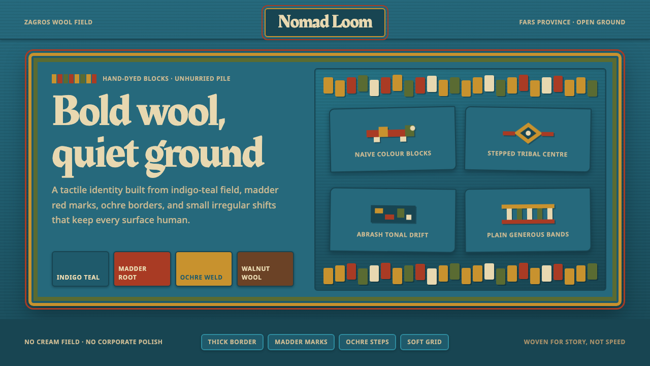 Persian Gabbeh RugBold wool, quiet ground. Indigo-teal field, ochre borders, madder block motif…
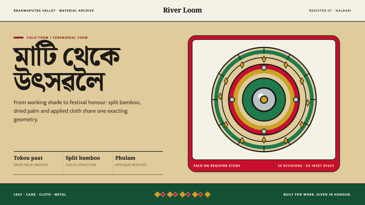 Assamese JapiWork becomes ceremony. Straw-gold rings carry green appliqué, festival red an…
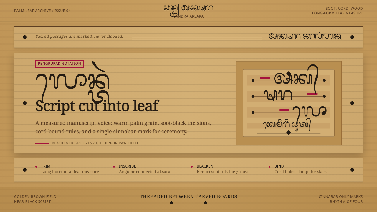 Balinese LontarHandmade memory, incised. Golden leaf strips carry soot script and spare cinn…
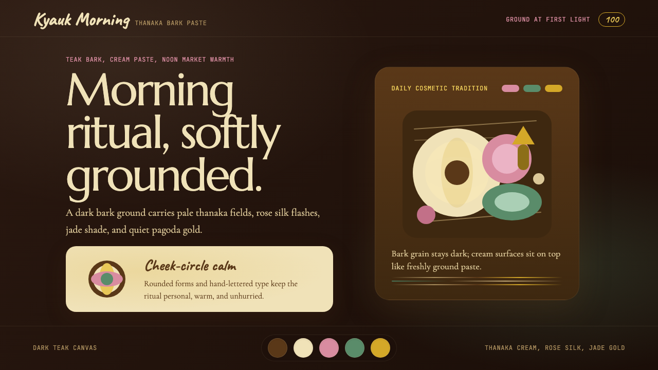 Burmese Shan Thanaka (Bark Paste)Handmade warmth on dark bark. Thanaka cream roundels soften rose, jade, and g…
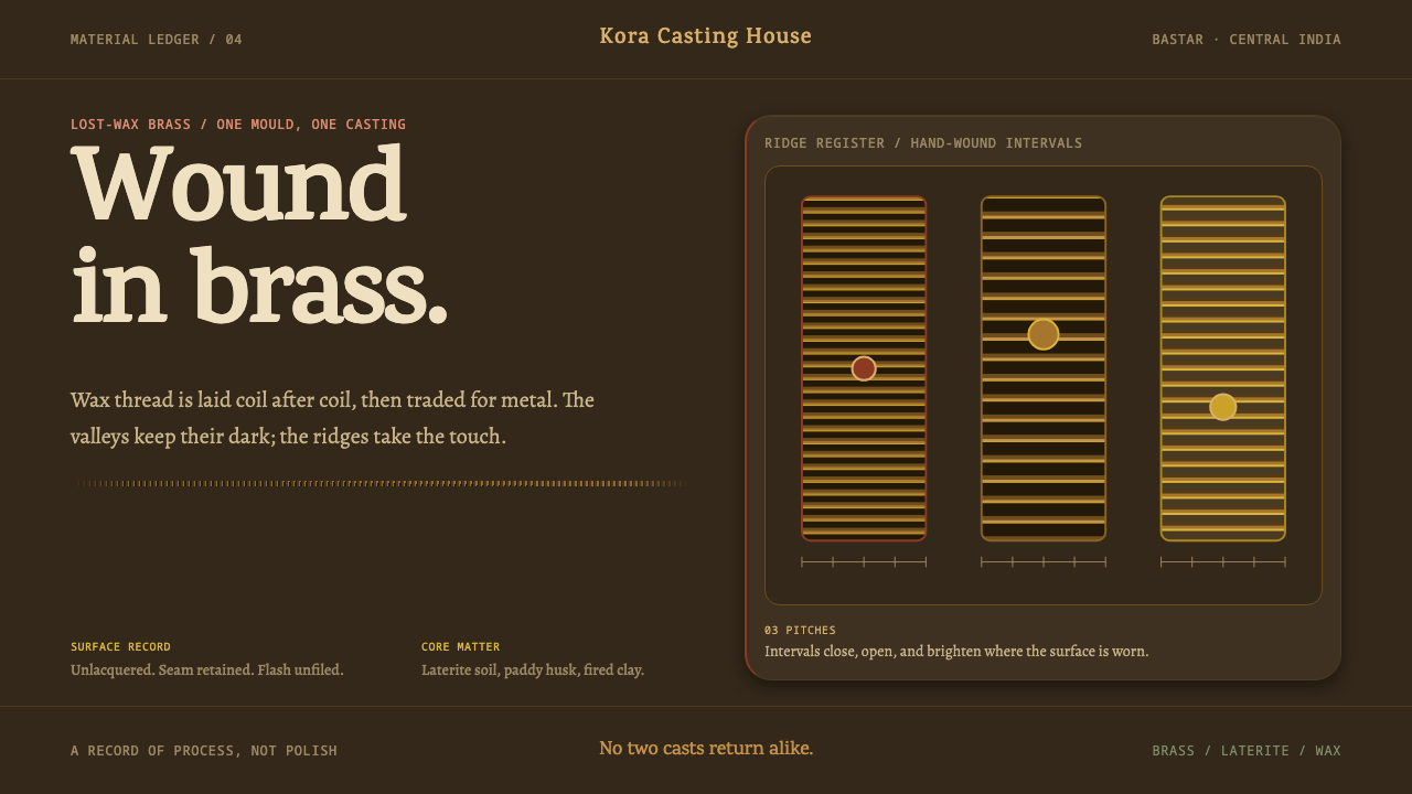 Dhokra Bastar BronzeProcess stays visible. Dark coil valleys and rubbed brass ridges make every c…
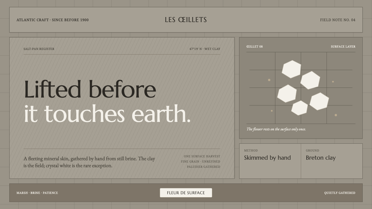 Guérande Fleur de SelCrystal white is the exception. Mineral serif and hairline grids rise from we…