What is KOKUYO Campus Notebook?
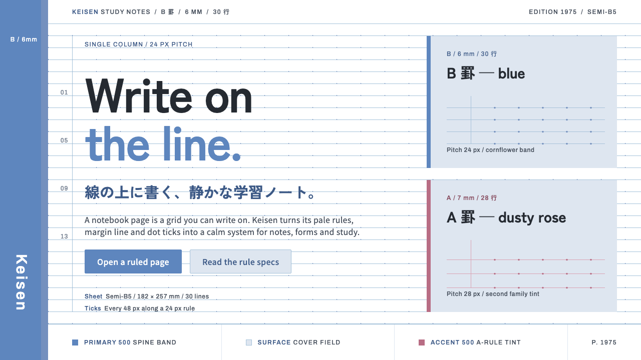
The KOKUYO Campus notebook turned everyday school paper into a quiet system — pale-blue rules on white, one cornflower band down the spine, and labels that read like a spec sheet.
KOKUYO Campus Notebook in brief
The KOKUYO Campus notebook style takes its look from a single humble object: the ruled notebook that Japanese students have carried since 1975. Its visual language is plain by intention. The page is pure white paper, ruled in pale blue at a strict, even pitch; the cover is a pale card with one cornflower band running down the spine and carrying the Campus wordmark. Nothing else is asked to be decorative.
As a design style it belongs to postwar Japanese stationery standardisation and to functional student-goods design, a tradition in which paper sizes, ruling types and page counts were settled into dependable standards so that a notebook could be bought without thinking and trusted without checking. JIS paper sizing and the Semi-B5 format are part of this background. The notebook's appeal comes from that reliability rather than from any gesture of style.
The visual rules that follow from it are simple to state. The ruled line is the baseline grid, and text sits on the line instead of floating between two. Fields are drawn as ruled lines with no boxes around them. Labels read like a printed specification, naming a ruling type, a pitch and a line count, rather than like marketing copy. Tints are functional: each pale colour stands for a real rule width, not for mood. Small dotted ticks set into each line mark column positions. The overall feeling is calm, structured and useful, a surface that wants to be written on rather than looked at.

Where does KOKUYO Campus Notebook come from?
The company behind the notebook, KOKUYO, traces its beginnings to 1905 and to its founder Zentaro Kuroda, and it grew up in Osaka alongside the Japanese office and the Japanese school. The Campus notebook arrived in 1975, and its place in student life became so ordinary that it is now hard to separate the object from the experience of studying in Japan. The credit for the design is institutional: the source record names KOKUYO's in-house design rather than an individual designer, which fits a product whose chief virtue is a kind of dependable anonymity.
The wider context is postwar standardisation. Japanese stationery makers worked within a framework of national standards in which paper sizes were defined through the Japanese Industrial Standards, and the Semi-B5 format became the conventional size for notebooks. Standardisation meant that a notebook, a binder, a desk and a satchel could all be made to fit one another. In that sense a Campus notebook is less a one-off design than the best-known product of a long, collaborative effort to make everyday paper dependable.
The notebook's look has evolved in a few well-marked steps. In 1983 the A and B rule marks were introduced, giving the buyer a clear label for the ruling they were choosing, and this is the origin of the spec-sheet labelling that still defines the notebook's visual voice. In 1991 a vertical logo and more vivid covers arrived, which gave the series a brighter presence on the shop shelf without touching the discipline of the interior. Since 2011 the rules themselves have been dotted: small ticks set into each line help the writer keep columns and indents aligned. Each change was incremental and functional, and each one added a layer of information rather than decoration.
That pattern of slow improvement driven by use explains why the design system derived from the notebook is so coherent. It treats the page as a working surface: rules as grid, tint as meaning, label as spec. The same logic carries easily to digital products, where a student's note app or a dense form faces exactly the same demand, which is to be calm, legible and quickly learned. The Campus look is anti-spectacle. It earns trust through consistency, and its authority comes from being a standard that people have used for decades.
What defines the KOKUYO Campus Notebook look?
Paper and Cover
The interior is pure white paper, the lightest and most neutral ground in the style. The cover is a pale card, close to white with a faint blue cast, which keeps the object looking clean and unclaimed. There are no textures, no photographs and no illustration. The white is not a blank to be filled with personality but a working surface whose job is to make the ruled lines and the writing on them easy to read.
Pale-Blue Ruling
The ruled lines are a pale, cool blue, light enough to recede behind handwriting yet visible enough to give every line its place. They sit at a strict and even pitch, and that pitch is the whole layout's baseline. In an interface the rules do the work that borders, cards and dividers usually do, structuring the page with a single repeated, low-contrast line.
The Cornflower Spine Band
Down the spine runs one cornflower-blue band carrying the Campus wordmark. It is the only strong colour in the system and the single place where the brand speaks. Because it is a band and not a flood, it works as an anchor: a vertical stripe at the edge of the layout that identifies the product and frames everything beside it. In a digital layout it maps to a side rail, a header strip or an active-state marker.
Writing on the Line
The governing discipline is that text sits on the line. The rules are a baseline grid in the literal sense: type and handwriting alike rest on them, and nothing hangs in the gap between. Headings, labels and values align to the same underlying rhythm, so vertical spacing is always a whole number of rules. This gives the style its quiet orderliness, because everything on the page agrees about where a line begins and ends.
Open Fields Without Boxes
Fields are drawn as ruled lines, not as boxes. A name, a date or a subject is written on a line exactly as it would be in a notebook, with no border, no fill and no rounded corners around it. The result is a form that feels lighter than a conventional one while remaining unambiguous about where to type. It also means a form-heavy screen stays calm, since the page is made of lines rather than of containers.
Spec-Sheet Labels
Labels are written like a printed specification: a ruling type, a pitch and a line count, stated plainly in small type. The language is direct and descriptive, never promotional. This is the voice of the style, and it extends from the notebook's cover to interface copy: buttons, headings and field labels say what they are, in the fewest words that are still exact.
Functional Tints and Column Ticks
Any additional tints in the system are functional pale colours, and each one corresponds to a real rule width rather than to decoration. Colour here is information, not mood. The small dotted ticks set into each line, introduced with the dot-ruled pages, mark column positions and indents and give the grid a second, finer level of alignment. Together, tints and ticks keep the style from ever becoming merely pretty.

Who shaped KOKUYO Campus Notebook?
The Campus notebook is credited to the company's own design staff rather than to a single named designer. That institutional authorship is part of the product's character: the design improves through accumulated, careful revisions such as the rule marks of 1983, the new covers of 1991 and the dotted rules since 2011, rather than through a signature gesture.
Zentaro Kuroda is recorded as the founder of KOKUYO in 1905. The company he started in Osaka grew into one of Japan's best-known stationery and office-goods makers, and the Campus notebook of 1975 is the most visible product of that long tradition of making ordinary paper goods well.
Not a person but an institution that belongs in any account of the style. The national standards framework for paper sizing, including the Semi-B5 notebook format, is what allowed stationery to be made to fit together. The Campus look is in large part the visual expression of that standardising culture: regular, dependable and quietly unremarkable by design.
How do you use KOKUYO Campus Notebook today?
The Campus notebook style is one of the most useful models for interfaces whose job is to hold a person's own work. It suits study tools, note-taking apps, planners, form-heavy productivity software and anything else that wants to feel calm, structured and trustworthy. Its principles are structural: put the line first, let text rest on it, keep colour functional, and write labels as plainly as a spec.
For presentation slides, build the grid out of rules. A cover can be a white field with a single cornflower band down one edge and the title set on a ruled line, with a small spec-style label beneath it. Content slides use a few pale rules to organise text into lines and columns, with headings sitting on a rule rather than in a box. Data slides work well as ruled tables, where the pale lines carry the structure and the numbers do the talking. Avoid filled panels and large image backgrounds, which would undermine the writing-surface feel.
For web interfaces, treat the page as a sheet of ruled paper. Use a white background, pale blue rules for dividers and table rows, and the one cornflower accent for the active navigation item, primary action or side rail. Draw inputs as underlined lines rather than bordered boxes, and keep controls quiet. Notes, flashcards, to-do lists, timetables and gradebooks are all natural fits. Tabular data feels especially at home, since the rule-and-column logic of the style is the logic of a table.
For editorial and marketing work, the style supports plain, informative communication: study guides, product sheets, onboarding material and school-facing pages. Copy should read like a clear specification, naming what the thing is and what it does in short, exact phrases. Photography, if used, should be restrained and kept away from the ruled areas, so that the page continues to look like something you could write on. The brand speaks through the single blue band and nothing louder.
A common mistake is to treat the pale blue as a theme colour and spread it across headers, buttons, backgrounds and icons, which erases the contrast between a quiet rule and a meaningful accent. Another is to draw the ruled lines for decoration, at spacing that does not match the text, so that characters sit between lines instead of on them; the rules are only credible if the baseline discipline is real. A third is to add shadows, rounded cards or gradients, none of which exist on a notebook page.

KOKUYO Campus Notebook — FAQ
Why pale blue rules instead of black or grey?
Pale blue is a practical choice. It is visible enough to guide the eye along a line, but light and cool enough to step back behind whatever is written on it, so the writing is always the dominant element. Black rules would compete with the text, and neutral grey would feel more clinical and less like paper. In a digital interface the same reasoning applies: a low-contrast cool line structures a page without drawing attention to itself.
Is this a skeuomorphic notebook look?
No. The style borrows the logic of the notebook, not its surface effects. There is no paper texture, no spiral binding, no page curl and no simulated shadow. What it takes from the object is the ruled baseline grid, the functional tints, the spec-style labels and the single spine band. This is why it translates so cleanly to screens: it describes how a notebook organises a page, not how it looks in a photograph.
How should the cornflower band be used in a digital layout?
Think of it as a single anchoring stripe rather than a general accent. A vertical rail at the edge of the layout, a thin band at the top of a card, or the marker for the current item in a menu all echo the spine. Use it where the product needs to say 'this is the thing you are in' and keep the rest of the page in white and pale rules. If the blue starts appearing in many places at once, it stops behaving like a spine and starts behaving like a theme.
Does the style work in a dark mode?
It is a light-ground style at heart, and its logic depends on pale rules sitting quietly on white. A dark version is possible, but it needs more than an inversion: the rules must stay low in contrast, the single blue accent should remain the only strong colour, and the labels must keep their plain, spec-like tone. Many teams simply keep study and note surfaces light, since the paper metaphor is where the style is strongest.
Where does the style struggle?
It struggles where a product needs drama, persuasion or a strong emotional register. A launch page for a luxury brand, an entertainment platform or a campaign built on imagery will find the style too modest, because its virtue is calm usefulness rather than spectacle. It is strongest when the user is the author and the interface is the sheet they are writing on, and weakest when the interface itself is supposed to be the show.
Related design styles
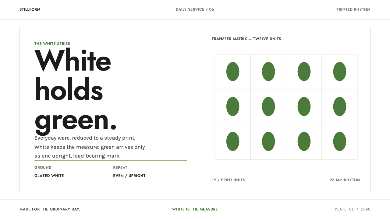 Gustavsberg BersåCalm lives in the interval. Porcelain white, Jost type, and upright green rep…
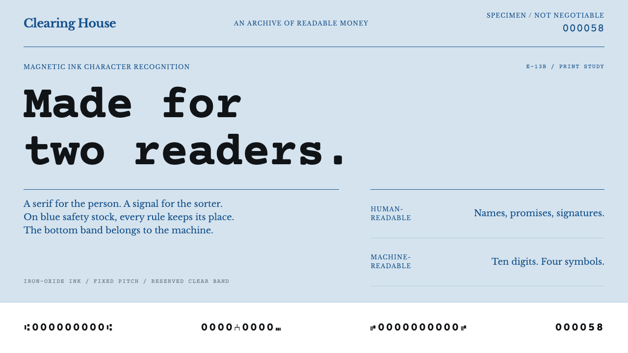 MICR Cheque FontTwo readers, one document. Engraved blue serif above an uncompromising magnet…
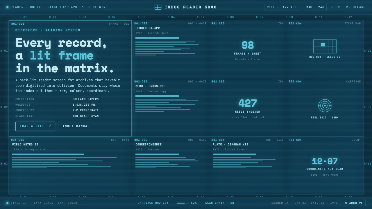 Microfiche ArchiveRecords as lit frames in a matrix. Cyan-blue back-lit panel, glowing mono typ…
 Tin Toy RobotWind-up optimism. Gunmetal blue tin panels carry red lamps, amber gauges, and…
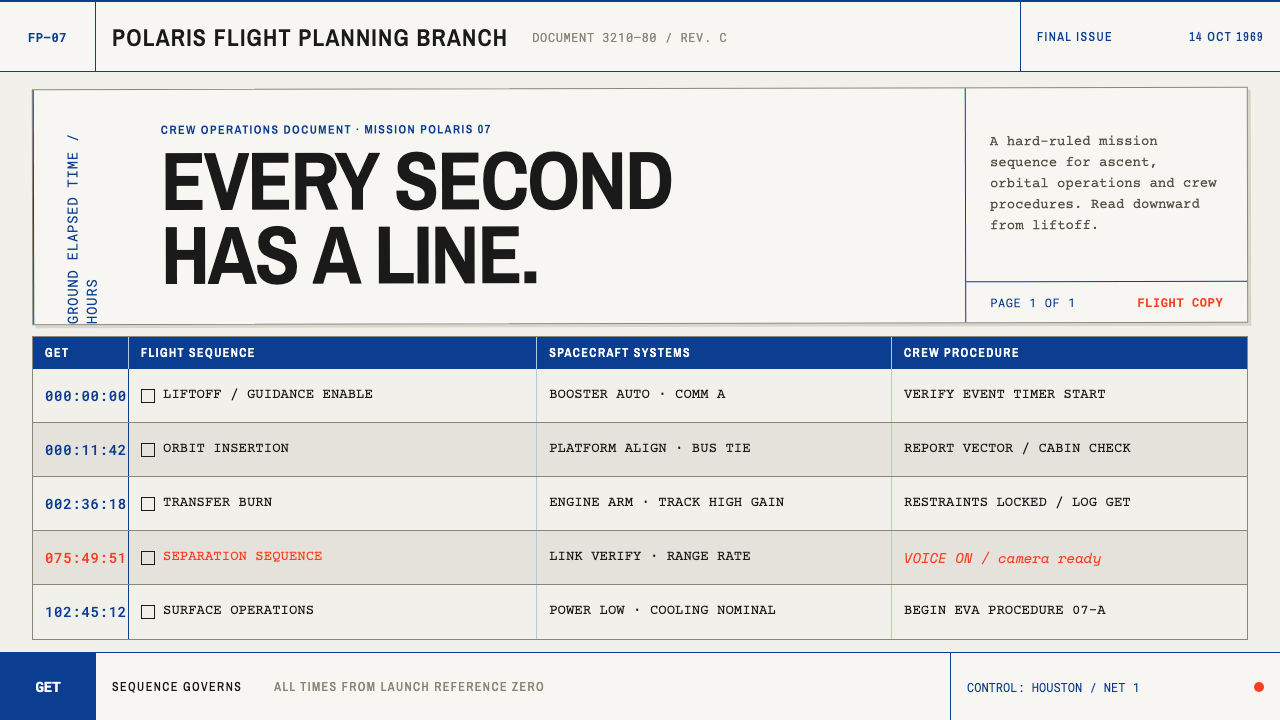 Apollo Flight PlanEvery second has a line. NASA blue rules and monospaced GET stamps discipline…
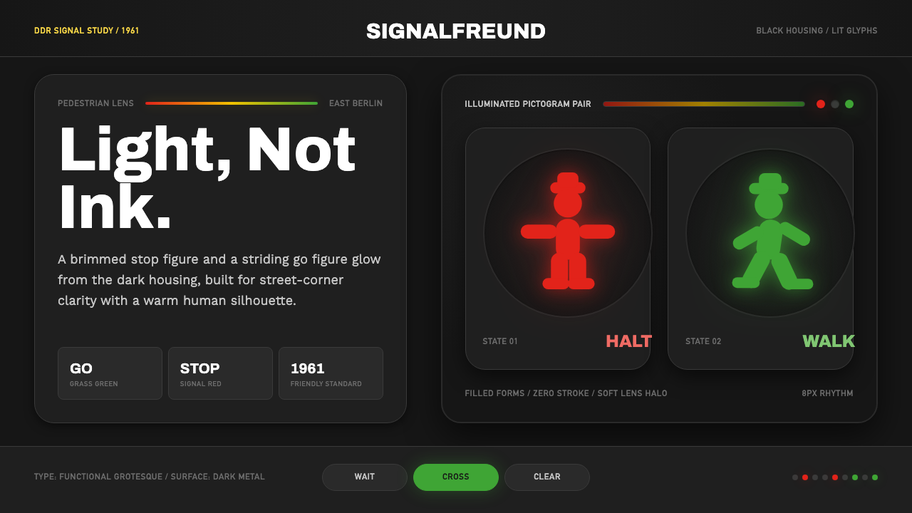 East German AmpelmännchenLight, not ink. Grass-green and signal-red silhouettes glow inside black lens…