What is Kingdom Hearts?
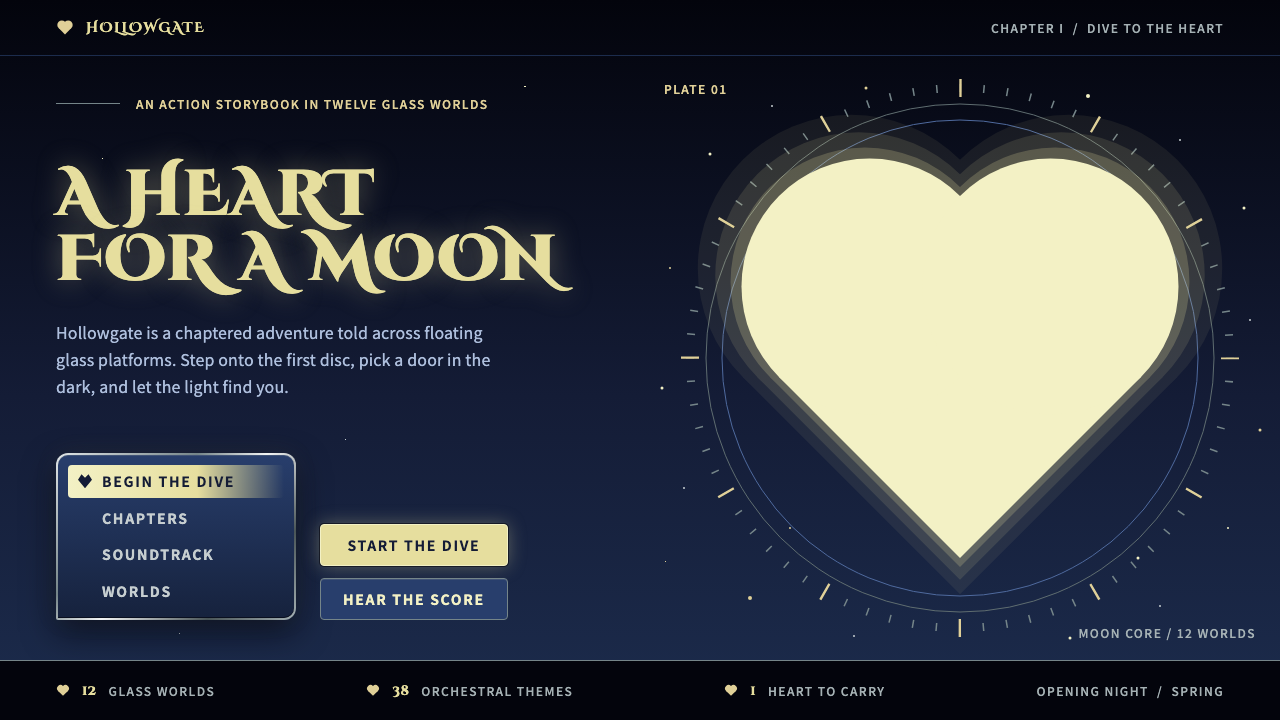
Kingdom Hearts is a navy night with a heart-shaped gold moon, where a Disney storybook meets a Final Fantasy command menu.
Kingdom Hearts in brief
The Kingdom Hearts style comes from the 2002 PlayStation 2 action RPG that Square built together with Disney Interactive, directed and character-designed by Tetsuya Nomura. Its look sits between two worlds: a Disney storybook on one side and a Final Fantasy menu screen on the other. The result is a dark interface that still feels warm, theatrical and a little devotional.
The system takes the navy night of the North American cover, the gold of the heart-shaped moon, the steel-silver wordmark and the leaded panes of the Station of Awakening, and puts them into hearts, crowns and circles rather than plain boxes. Cards become round glass platforms, navigation becomes a vertical command menu and badges are drawn as hearts and crowns.
Light is soft and gold is bright. Stained glass is used sparingly, placed only at the points that matter, so that the page keeps its midnight calm while still feeling ceremonial.

Where does Kingdom Hearts come from?
Kingdom Hearts was released in 2002, in Japan in March and in North America in September. It was a collaboration between Square of Tokyo and Disney Interactive in the United States, a pairing that was unusual at the time. Tetsuya Nomura served as director and character designer, and Shinji Hashimoto appears among the key figures of the production. The music is associated with Yoko Shimomura, and the theme song with Hikaru Utada. A Final Mix edition followed in late 2002, and high-definition remasters began to appear from 2013.
The game's visual premise was a collision of design traditions. On one side stood Disney feature animation, with its familiar characters and fairy-tale worlds. On the other stood the character design of the Final Fantasy tradition of Japanese role-playing games, where heroes are drawn with elaborate straps, zips, belts and silver chains, a combination that was fashionable in Tokyo streetwear in those years. Putting a boy in that costume beside Donald and Goofy created the distinctive tension of the series.
The third influence recorded for this system is the Gothic cathedral stained glass. The Station of Awakening, a circular platform of leaded coloured panes suspended in black, is among the most recognised images of the game. It brings a sacred, almost chapel-like quality to a story about hearts and light, and gives the interface a vocabulary of circles, panes and rims.
The North American cover supplies much of the palette: a deep midnight navy sky with a heart-shaped moon glowing in soft gold, and a steel-silver title whose sharp points hold a crown and a key-shaped blade. This design system takes those images and turns them into reusable interface parts, so that a modern page can feel like opening the game's menu.
What defines the Kingdom Hearts look?
Color
Deep midnight navy is the ground, taken from the sky of the North American cover. Gold, soft and glowing, is reserved for the heart-shaped moon, halos and key emphasis. Steel silver frames titles and menus. Stained-glass colour is a sparing accent, dotted only where it matters, so the overall impression stays dark, calm and luminous.
Typography
Headlines use decorative capitals with a classical, inscriptional feel, set with generous spacing so they read like carved titles. The steel-silver wordmark with sharp points is the model for display type. Body text stays plain and legible, so the ornament is concentrated in headings and labels.
Round Glass Platforms
Cards are drawn as circular or rounded glass platforms rather than plain boxes, echoing the Station of Awakening. A thin leaded rim and a soft inner light give each card the sense of a small stage on which one idea sits.
Command Menu Navigation
Navigation is a vertical command menu in the manner of a console role-playing game, with silver-framed entries and a clear highlighted selection. It inherits the Final Fantasy menu-screen tradition, which is why the interface feels playable rather than merely browsable.
Hearts and Crowns
Badges, bullets and icons are drawn as hearts and crowns, the series' two central emblems. They replace generic dots and stars. Used with restraint, they turn small interface details into part of the story.
Light and Halo
Light is soft. Gold halos gather around the focus of attention instead of hard drop shadows, and glows fade gently into the navy ground. The aim is a ceremonial, nocturnal warmth, not a harsh neon effect.

Who shaped Kingdom Hearts?
Director and character designer of the 2002 game. His blend of Final Fantasy character design, with its straps, zips and chains, and Disney's friendly worlds defines the series' look, and the system here follows that fusion.
A key figure on the production side at Square, associated with bringing the Square and Disney Interactive collaboration to the screen in 2002.
The composer associated with the game's music, whose score contributes to the ceremonial, nocturnal mood that this interface system tries to reproduce visually.
The singer associated with the game's theme song, a reminder that the series spoke to Japanese and international audiences at once.
How do you use Kingdom Hearts today?
Kingdom Hearts is a theatrical style, and it rewards designers who commit to the night and use ornament only where it earns its place. The core recipe is a dark navy ground, gold light and silver framing, with hearts, crowns and circles in place of ordinary shapes.
For presentation slides, a cover works best as a night sky with a large gold circle or heart acting as a moon, a silver-framed title in decorative capitals and plenty of dark space. Content slides can be built as circular platforms with a single idea in each. Data slides should keep charts simple, with gold as the highlight and silver for structure, and avoid overloading the navy ground with colour.
For web interfaces, the style suits game-related pages, fan sites, story-led products and playful creative portfolios. Navigation can become a vertical command menu on the left or in a drawer. Cards can be rounded glass platforms. Buttons can take silver frames with a gold glow on hover or focus. It is less suitable for long dense reading, because ornamental capitals and dark grounds tire the eye.
For editorial and marketing work, the look supports launches, trailers and event pages that want a sense of ceremony. A hero area can use a nocturnal gradient-free navy field, a golden emblem and a short title. Stained-glass colour can mark one or two key moments rather than appearing everywhere.
The common mistake is to turn every surface into stained glass or to flood the page with gold. When everything glows, nothing is special. Keep the navy calm, use gold for the focal point, keep silver for frames and let the hearts and crowns serve as small punctuation marks.

Kingdom Hearts — FAQ
Which design traditions does this style combine?
Three are recorded: Disney feature animation, Final Fantasy-style Japanese role-playing game character design and Gothic cathedral stained glass. Together they give the interface its storybook warmth, its command-menu structure and its glowing circular platforms.
Is it a dark or light style?
It is a dark style. The deep midnight navy ground is what lets the gold glow and the silver frames read clearly. Moving it onto a white page would remove the night-sky logic that the whole system depends on.
Why hearts, crowns and circles instead of plain boxes?
Because the shapes are the series' emblems. A heart-shaped moon, a crown on the wordmark and the circular Station of Awakening all appear in the source imagery. Turning cards, badges and navigation into those forms keeps the interface in the same visual world as the game.
How much gold is too much?
As soon as gold appears on every element, the halo effect disappears. Reserve it for the moon-like focal point, key emphasis and the glow around the active item, and let navy and silver carry everything else.
What projects suit this style best?
Game-related pages, story-led products, fan communities, event or launch pages and creative portfolios that want a ceremonial, nocturnal tone. It is less well suited to dense, text-heavy documentation.
Related design styles
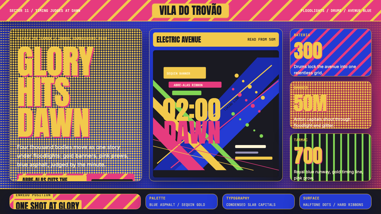 Brazilian Samba School (2000s Carnaval)Parade at floodlight volume. Royal blue asphalt, sequin gold type, pink ribbo…
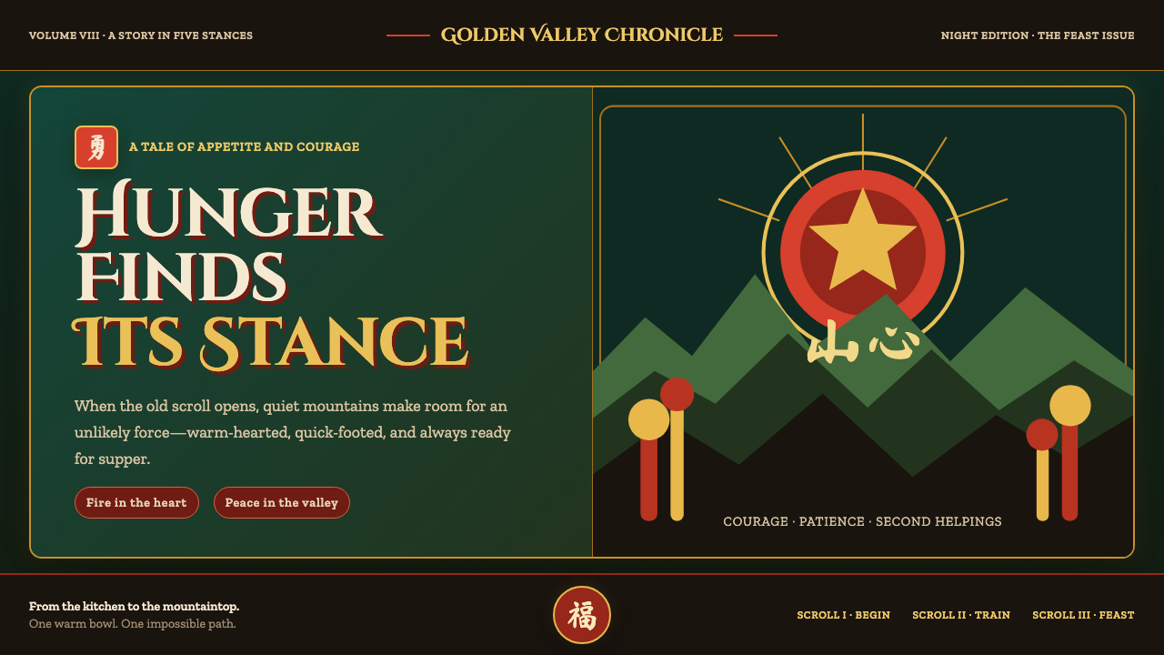 Kung Fu Panda (2008)Ancient calm meets comic momentum. Vermilion, gold and paper-cut peaks glow i…
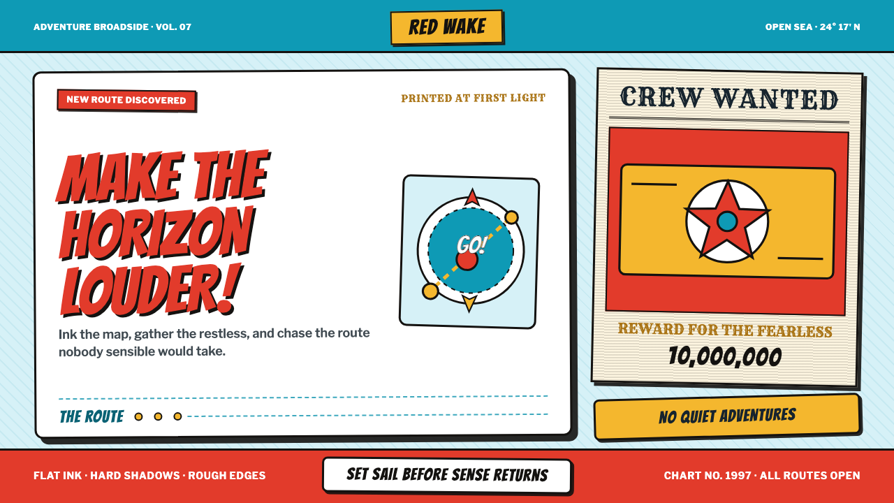 One Piece (Grand Line Adventure)Adventure shouts first. Vermilion splash type and cyan charts collide in hard…
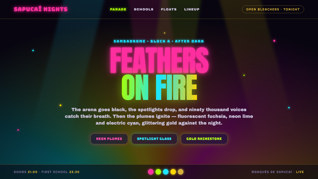 Rio Carnival Neon FeathersThe Sambadrome after dark. Fluorescent fuchsia, lime and cyan plumes glowing…
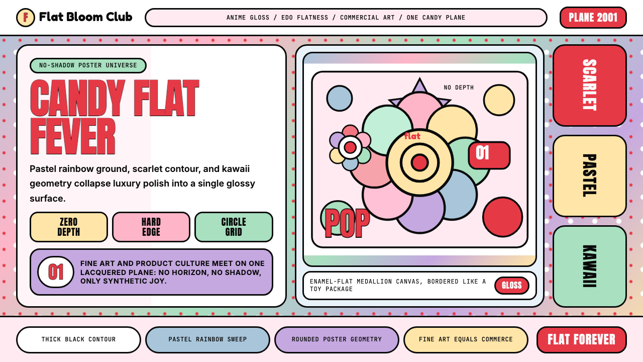 Takashi Murakami SuperflatJoy has no depth. Pastel rainbow, scarlet accents, and black contours flatten…
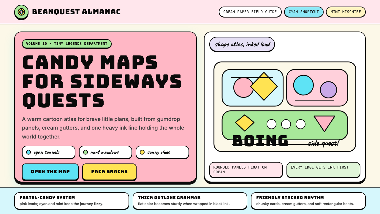 Adventure TimeCartoon warmth, inked loud. Cream gutters, candy pink, cyan and mint lock int…