What is Kéré Architecture?
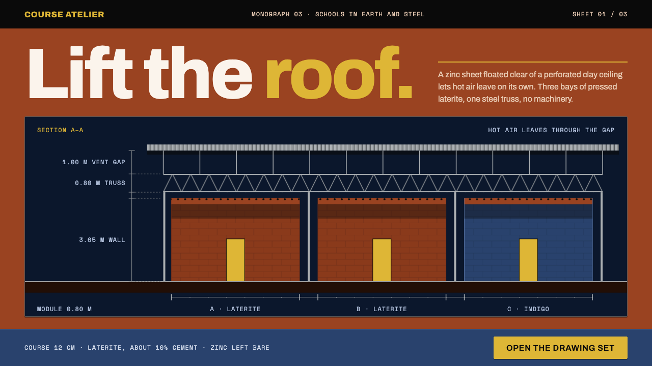
The Kéré Architecture style is built the way Gando Primary School was: a roof that floats, walls that stay earth, and colour taken straight from the site.
Kéré Architecture in brief
Gando Primary School, in the village of Gando in Burkina Faso's Boulgou Province, is a school of three classroom bars built from hand-pressed laterite brick under a corrugated zinc roof that never touches the walls. A slender steel truss carries the metal clear of the building, and hot savannah air leaves through a perforated clay ceiling. Diébédo Francis Kéré designed it for his own village, and this design system takes its logic from that building and from the practice he later founded.
The style's colours come straight from the site. Red laterite earth in full sun is the ground. Ochre, taken from the steel doors, is the principal accent and also the colour of fine rules. Galvanised zinc supplies a cool metallic grey. And the deep indigo of Kéré's 2017 Serpentine Pavilion is used as a whole mass: indigo here is the entire wall, never a thin outline. The type is a clean grotesque, with no attempt at hand-made flourishes.
Layouts are long, low and modular. They are organised like an architectural section, built around the repetition of the brick joint and around the hard shade of midday, which becomes a layout component in its own right. The overall mood is dark and earthy, a design that feels built rather than drawn.

Where does Kéré Architecture come from?
The story begins between 1999 and 2001 in Gando, in Boulgou Province, Burkina Faso, where a school was built by the people it was for. The walls are laterite brick, pressed by hand on site by the villagers from local clay mixed with a modest share of cement. The roof is corrugated zinc, lifted off the walls on a slender steel truss. Hot air escapes beneath it, through a perforated clay ceiling, so the building cools itself without machinery. Francis Kéré built it for his own village.
Recognition followed. The school won the Aga Khan Award in 2004, and the architect's practice was founded in Berlin in 2005, so that the design work now has a studio in Germany as well as its roots in Gando. In 2017 Kéré's Serpentine Pavilion in London brought a deep indigo to a wider public, and in 2022 he was awarded the Pritzker Prize. The design system gathers these points into a single palette and a single way of organising a page.
The movements named in the source brief explain the method: contemporary African architecture, passive cooling and low-tech climate design, and participatory community construction. Passive cooling means that the building's form, not an installed machine, solves the climate problem, which is why the roof floats. Participatory construction means that the people who will use the building help to make it, which is why the walls remain visibly earth, pressed and joined by hand. Both ideas carry directly into a visual language: honest materials, visible structure, no disguise.
Translated into an interface, the building offers a set of clear analogies. The floating roof becomes a layer that is visibly separate from the content beneath it, with a gap that lets the page breathe. The laterite wall becomes a base surface that is allowed to look like material and not like a flat digital fill. The brick joint becomes a modular rhythm. The midday shade, hard and unblurred, becomes a deliberate block of darkness on the page. None of this is decoration. It is how the building works, rendered in colour and layout.
What defines the Kéré Architecture look?
Laterite ground
The base of the palette is red earth as seen in full sun, a warm brick-like tone that belongs to the walls of the school and the soil around it. It is used for large surfaces, not for accents, so the page feels grounded in a material. Because this base is strong, the other colours are chosen to sit on it rather than to fight with it.
Ochre accent and rules
Ochre, taken from the steel doors, is the principal accent and the colour of fine rules. It marks doors, thresholds and edges: the places where a user crosses from one area to another. Used on thin lines, it divides the page the way a metal frame divides a wall, with precision and without a drop of ornament.
Whole-wall indigo
The deep indigo of the 2017 Serpentine Pavilion is used as a mass, a full panel or a whole section, and never as a thin outline. This is the style's one great gesture. A single block of dark blue against the earth tones gives the page a point of gravity, in the same way that one painted wall can change the character of a whole room.
Galvanised zinc grey
Galvanised zinc supplies a cool, slightly metallic grey that stands for the roof. It is the only truly cool neutral in the palette, and it is used for top layers, headers and overlays: the elements that float above the earth. The contrast between warm earth and cool metal is the palette's main structural idea.
Clean grotesque type
Type is a clean grotesque, plain and neutral, with no decorative or faux-handmade fonts. The reasoning is the same as for the materials: the building is honest about how it is made, so the typography does not pretend to a craft feeling it does not need. Information is set clearly, with strong contrast against the earth and indigo grounds.
Section-based modular layout
Layouts are long, low and repetitive, organised like an architectural section and built on a module that echoes the brick joint. Content is arranged in horizontal bands and repeated units, so that a page reads like a wall of well-laid bricks. The rhythm is regular, but the regularity is functional, not merely decorative.
Hard shade and the floating layer
Midday shade is hard and unblurred, and it is treated as a layout component: a dark band under an overhang, a crisp shadow cast by a floating layer. The floating roof appears as a visible gap between the top layer and the content, so the page seems to be sheltered rather than sealed. Shadow here is a structural fact, not an effect.

Who shaped Kéré Architecture?
The architect behind the school and the practice that took its name from him. Kéré designed Gando Primary School for his own village, won the Aga Khan Award in 2004, founded his practice in Berlin in 2005, designed the Serpentine Pavilion in 2017 and received the Pritzker Prize in 2022. His thinking, that climate, community and material should drive form, is what this style is built on.
The people who pressed the laterite bricks on site and built the school with their own hands. They are part of the style because participatory construction is part of its meaning: the walls remain visibly earth because they were made by the community that uses them. In design terms, they stand for materials that look like what they are and structure that can be read.
The building from which the style takes its structure: three classroom bars of hand-pressed laterite brick, a corrugated zinc roof held clear on a slender steel truss, and a perforated clay ceiling that lets hot air escape. Nearly every rule of the design system, from the earth base to the floating top layer, can be traced to a decision in this building.
Kéré's pavilion in London, whose deep indigo gives the style its most striking colour. The pavilion matters because it moved the school's logic of honest material and shaded space to a different continent and context, and because it shows how a whole mass of colour can do the work that an outline would do elsewhere.
How do you use Kéré Architecture today?
The Kéré Architecture style suits work that wants to feel built, grounded and honest about its materials. It is a poor match for anything that wants to feel weightless or glossy. Applying it well means respecting the structural ideas, the floating layer, the earthen base and the whole-wall colour, rather than simply picking a red and a blue.
For presentation slides, a cover can be a laterite-toned field with a single block of indigo as a whole panel, a thin ochre rule and a plain title in grotesque type. Content slides work as horizontal bands, each carrying one idea, with a zinc-grey header floating above them. Data slides take on the quality of a section drawing: charts placed on modular grids, with ochre rules as axes and indigo as the one emphasised series.
For web interfaces, the style fits architecture and design studios, cultural institutions, non-profits, education and community projects, and products whose story is about place and material. Use a floating header that is visibly separate from the content below it, keep the base surface earthy rather than flat, and reserve indigo for a major panel such as a hero or a call-to-action section. For dashboards, use the modular grid and ochre rules for structure, and let the indigo mass mark the area that matters most.
For editorial and marketing work, the style suits long-form features, project stories, annual reports, exhibition pages and fundraising campaigns. Compose in long, low bands with strong horizontal rhythm, let one section turn indigo as a whole, and treat shadow as a layout element rather than an effect. Photography of materials, hands and buildings sits naturally here. Keep headlines plain and let the colours carry the place.
The most common mistake is to use indigo as a border or a thin accent, which discards the style's central idea that colour is a mass. Another is to polish the earth tones into smooth gradients or add soft drop shadows, which turns a built surface into a digital one. A third is to use a decorative or faux-handmade typeface to signal craft, when the style's honesty depends on plain type. A last, subtler error is to ignore the gap: if the top layer touches the content with no space between them, the floating roof, which is the whole logic of the building, has been lost.

Kéré Architecture — FAQ
Who is Diébédo Francis Kéré?
He is the architect who designed Gando Primary School for his own village in Burkina Faso, finished in 2001. He won the Aga Khan Award in 2004, founded his practice in Berlin in 2005, designed the Serpentine Pavilion in London in 2017 and received the Pritzker Prize in 2022. His work is associated with contemporary African architecture, passive cooling and participatory construction.
Why is indigo used as a whole wall instead of as an outline?
Because the colour belongs to a mass, as it does in the pavilion that inspired it. A thin line of indigo reads as a decoration, while a whole panel reads as a place. Using it as a full surface gives the page a point of gravity, and it keeps the palette honest: colour is a material, not an accessory.
What does 'roof floats, walls stay earth' mean in interface terms?
It means the top layer of the page, such as a header or an overlay, should be visibly separate from the content beneath it, with a gap that lets air through, while the base surface should look like a material, warm and earthy, rather than a flat digital fill. The two layers have different jobs, and the space between them is what makes the page feel sheltered and ventilated.
Is this style only suitable for architecture-related projects?
No. It suits any project whose story is about place, material and community, including education, non-profit, cultural and craft-oriented work, and any brand that wants to feel grounded and honest. It is less suitable for products that rely on glossy, weightless or highly playful visuals, where the earthy base and hard shadows would feel out of place.
Why use a plain grotesque instead of a handmade-looking typeface?
Because the building is honest about how it is made, and the typography should be too. A faux-handmade face would add a craft feeling the layout does not need and would compete with the colour masses. A clean grotesque keeps information clear against earth and indigo grounds, and leaves the materials to carry the character.
Related design styles
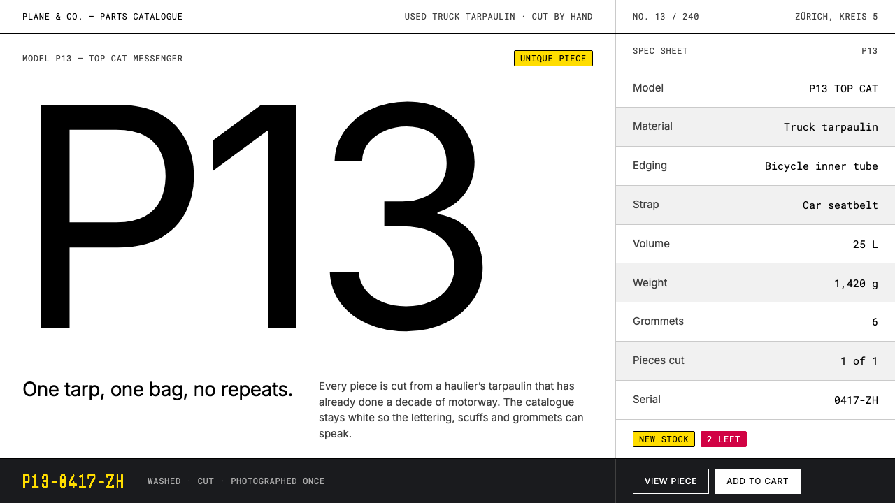 FREITAGColour-zero on purpose. White sweep, hairline grid, one type weight — the tar…
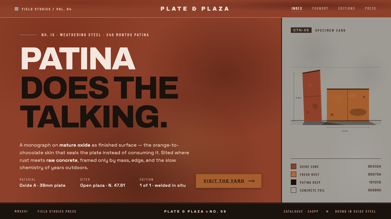 Corten Rust SculpturePatina does the talking. Saturated rust-oxide planes hard against raw concret…
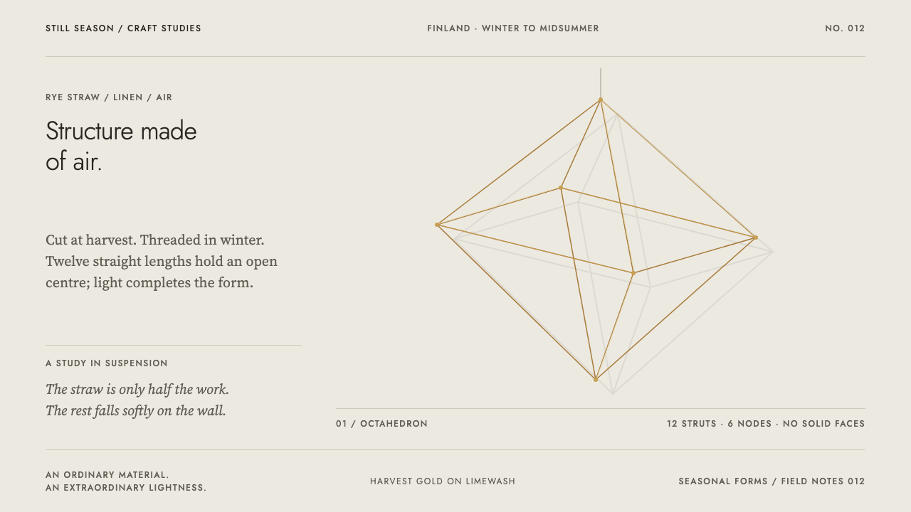 Finnish HimmeliAlmost entirely air. Straw-gold struts and a faint offset shadow on cool lime…
 Kelabit Bead CapEvery bead carries a record. Burnt-orange grids and yellow units turn a cap i…
 Mexican Concrete BrutalismThe surface does the talking. Board-formed warm-grey concrete, plank seams an…
 Prairie SchoolThe horizon, built. Ochre plaster, oak trim and straight-line art glass drawn…