What is Keep?
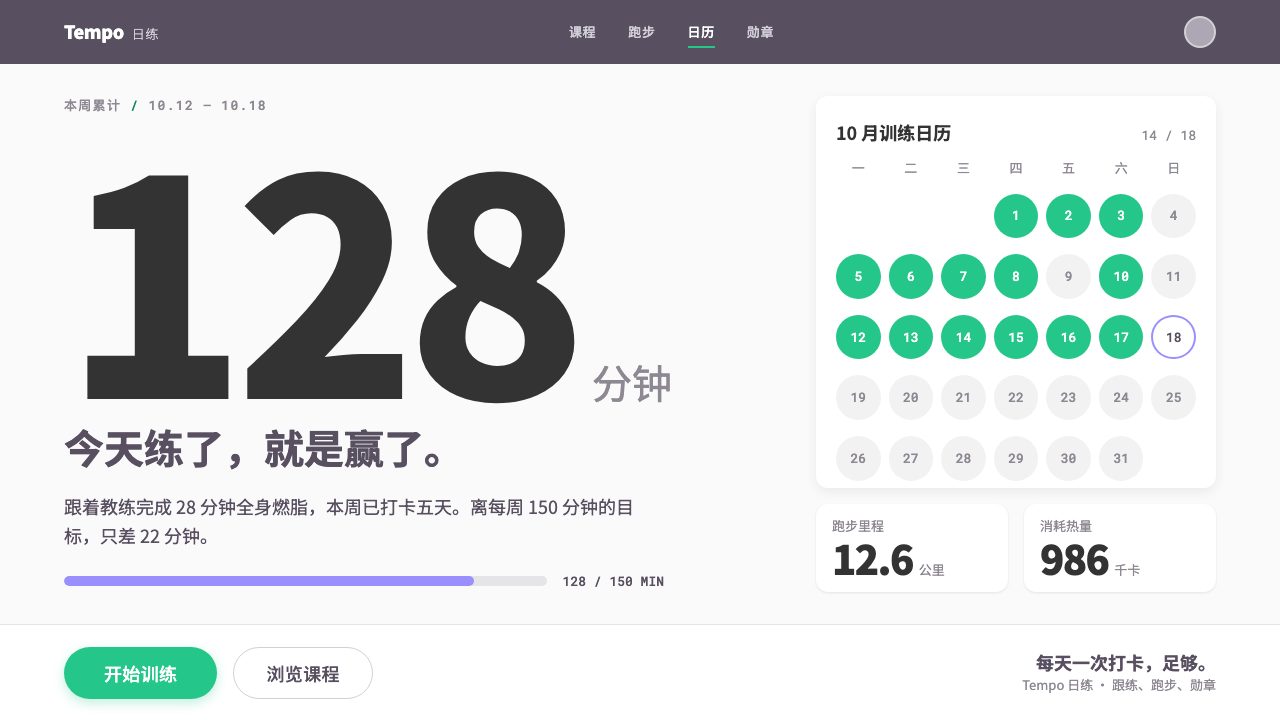
Keep turned self-discipline into a visible number: a dusky purple bar, a single green start pill and heavy numerals on a near-white page.
Keep in brief
The Keep style is the interface language of the Beijing fitness app that brought follow-along coaching into millions of living rooms in 2015. Its structure is simple and instantly recognizable: a solid dusky-purple header over a near-white page, course cards led by a coach's video frame, a training calendar of checked-off days, and green pills marked with the words for 'start training'.
The system is flat and photographic. There are no ornamental gradients or heavy textures; colour does the work of hierarchy, and real photographs and video frames of coaches provide the human warmth. The emotional centre of the screen is numeric. Minutes trained, kilometres run, calories burned and medals earned are enlarged to the heaviest weight and placed in the middle of the screen.
Underneath it all sits a slogan, which in Chinese reads as 'self-discipline gives me freedom'. The interface is built to express that sentence: restrained, clean and made for a daily check-in rather than a one-off impression.

Where does Keep come from?
Keep was founded in Beijing in 2014 around Wang Ning and his team, and the app was released in February 2015. The product arrived at a very specific moment: the mid-2010s mobile home-workout boom in China, when smartphones were everywhere, gym access was uneven and many young urban people wanted to exercise without a membership or a trainer standing next to them.
Its central idea was follow-along coaching, known in Chinese as genlian. Instead of leaving users to design a routine, the app set a coach's video in front of them and let them move in sync. Course cards therefore lead with a coach's frame, carry a difficulty rating running from the easiest level to the hardest, show a duration and display how many people are taking part. That social proof and graded structure turned exercise into something that looked like a course catalogue.
Two other currents shaped the interface. One was the quantified-self culture of running apps: a route drawn as a line on a map, distance and pace stated plainly, and medals collected for milestones. The other was the habit loop of check-in. The training calendar, with its dots for completed days, makes a streak visible at a glance, so that missing a day feels like breaking a chain.
The current visual identity is dated by this system to roughly 2015 through 2023. Across those years the look stayed remarkably stable, because the core promise did not change: a calm, flat, photographic surface that pushes the number and the next action forward. That consistency is part of why the style is easy to recognise today.
What defines the Keep look?
Color
A dusky, restrained purple sits in the header and navigation, over a near-white page. A single bright green is reserved for the main action, the start-training pill, so that it is always the loudest object on the screen. Colour does the work of hierarchy: there are very few other accents, and nothing competes with the primary button.
Typography
The numbers are the heroes. Minutes, kilometres and calories are set at the heaviest weight and enlarged to the centre of the screen, with small light labels beneath them. Body text stays simple and legible, while the numeric display carries the emotion, a deliberate choice that makes progress feel like something you can read from across the room.
Course Cards
Each course card opens with a coach's video frame, followed by a title, a difficulty level, a duration and a participant count. The card is a compact promise: who will lead you, how hard it is, how long it takes and how many others are doing it. Cards stack into clean, scannable lists.
Training Calendar
A calendar of checked-off days turns a habit into a visible streak. Completed days are marked with a simple dot or tick, and gaps are as visible as successes. It is the quietest part of the interface and one of the most motivating.
Flat and Photographic
Surfaces are flat, without decorative gradients or heavy shadows, and imagery is photographic rather than illustrated. The humanity comes from real coaches and real movement. This keeps the look clean enough for daily use while avoiding the sterility of a purely graphic interface.
Medals and Maps
Achievement is made tangible through medals for milestones and through a route traced as a single line on a map. These small devices turn effort into a collection, which supports the slogan's idea that discipline can be earned, counted and displayed.

Who shaped Keep?
The founder around whom the company was built in Beijing in 2014. The product he and his team shipped in February 2015 made follow-along coaching a daily habit for a generation, and its interface remains the reference for this system's calm, flat, number-led look.
How do you use Keep today?
The Keep style is a good choice whenever the goal is to turn effort into a number and a number into a habit. Its strengths are clarity of the next action, visible progress and a calm surface that can be opened every day without fatigue.
For presentation slides, a cover can follow the app's rhythm: a solid dusky-purple band across the top, a near-white field and one very large number carrying the message. Content slides work as stacked cards, each opening with a photograph, with a short title and a few supporting facts. Data slides are the style's natural home: a single heavy figure in the centre with a small light label, and a simple calendar or streak graphic to show consistency over time.
For web and mobile interfaces, the style suits fitness, wellness, learning and habit-tracking products, as well as any dashboard where one primary action should be unmistakable. The rule is simple: keep the header in the single purple, reserve the green for the main action, let photography lead the cards and give the key figures the heaviest weight on the screen. A check-in calendar and a medal shelf are natural additions.
For editorial and marketing work, the look supports campaigns built around progress and discipline. A landing page can open with a coach's image, a bold numerical claim and one green action button. The slogan about self-discipline giving freedom can be used as a headline, with proof expressed through counts, streaks and achievements rather than adjectives.
The common mistake is to dilute the single accent. If green begins to appear on decorative elements, or if several bright colours are added to the cards, the start button loses its power and the screen loses its calm. Another is to make the numbers timid: the whole system relies on them being the heaviest, largest objects on the page.

Keep — FAQ
What does 'follow-along coaching' mean?
It is the practice of exercising in sync with a coach's video instead of designing your own routine. In Chinese it is called genlian. Keep built its interface around this idea, which is why every course card opens with a coach's video frame.
Why is the page almost white while the header is purple?
The near-white page keeps the surface quiet and lets photographs and numbers stand out, while the single dusky purple in the header gives the interface a stable identity. The effect is calm rather than flashy, which suits something people open every day.
Why are the numbers so large and heavy?
Because the numbers carry the emotion. Minutes trained, kilometres run and calories burned are the evidence of effort, so the interface gives them the heaviest weight and the centre of the screen. The slogan about self-discipline giving freedom depends on progress being readable at a glance.
Is this a light or dark style?
It is a light style. A near-white page is central to its calm and to the way a single green button can dominate. Moving it onto a dark ground would change the character of the system.
What kinds of products suit it best?
Fitness, wellness, learning and habit-tracking products, plus any tool built around a daily check-in and a single obvious next action. It is especially good where progress can be shown as a number, a calendar or a medal.
Related design styles
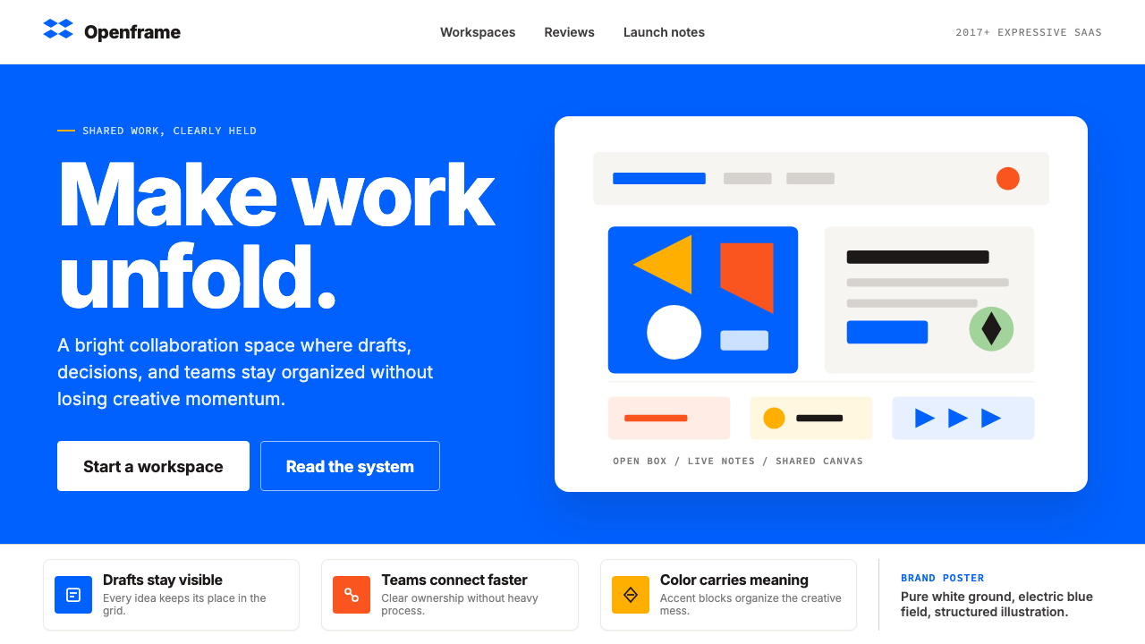 Dropbox ModernFriendly SaaS gets loud. Electric blue and Sharp Sans drive a structured geom…
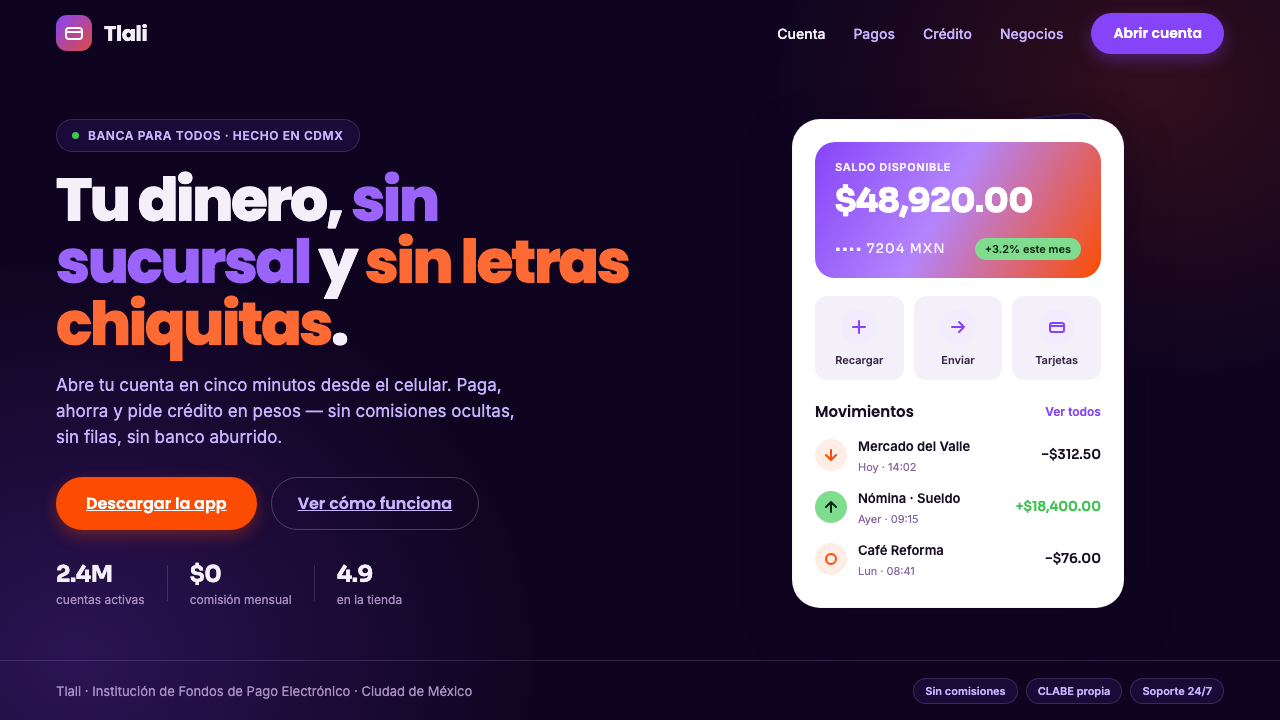 Mexican Fintech StartupNeobank, not legacy bank. White rounded cards float on near-black plum, lit b…
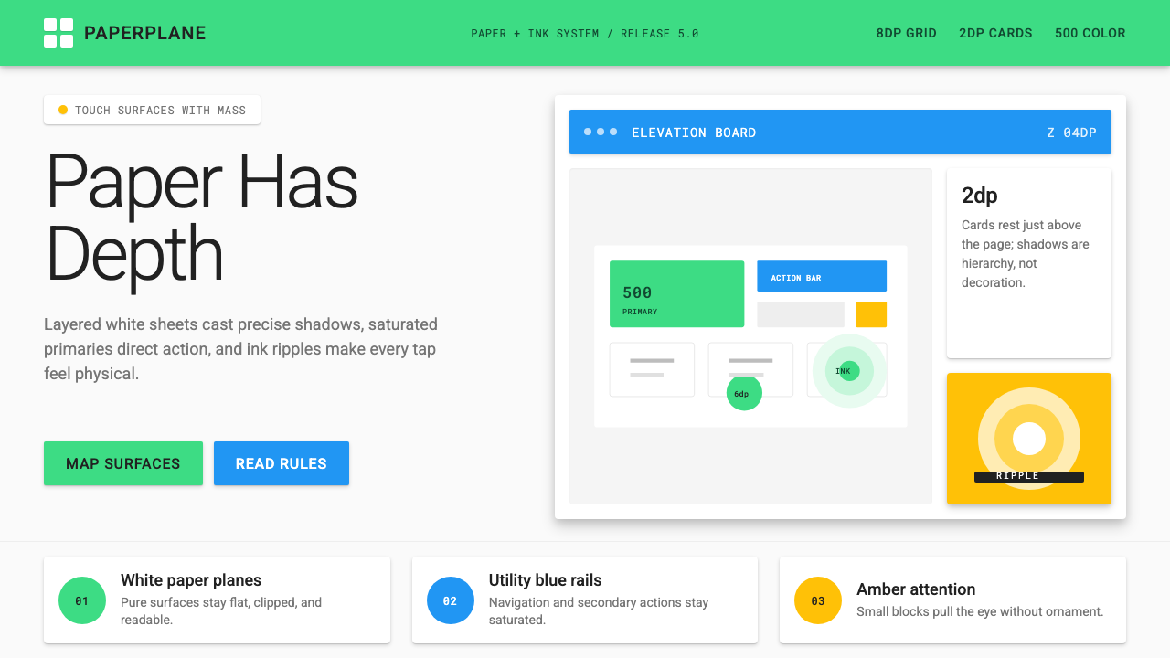 Android Lollipop (Material 1.0)Paper becomes physical. Roboto, green FABs and sharp shadows give white cards…
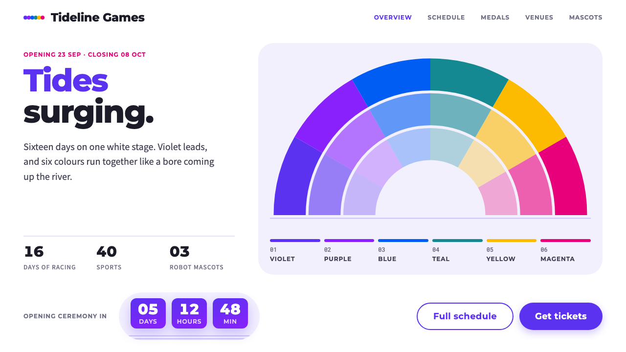 Hangzhou Asian GamesViolet tides on white. Six colours fan out in tiered arcs, with pill buttons…
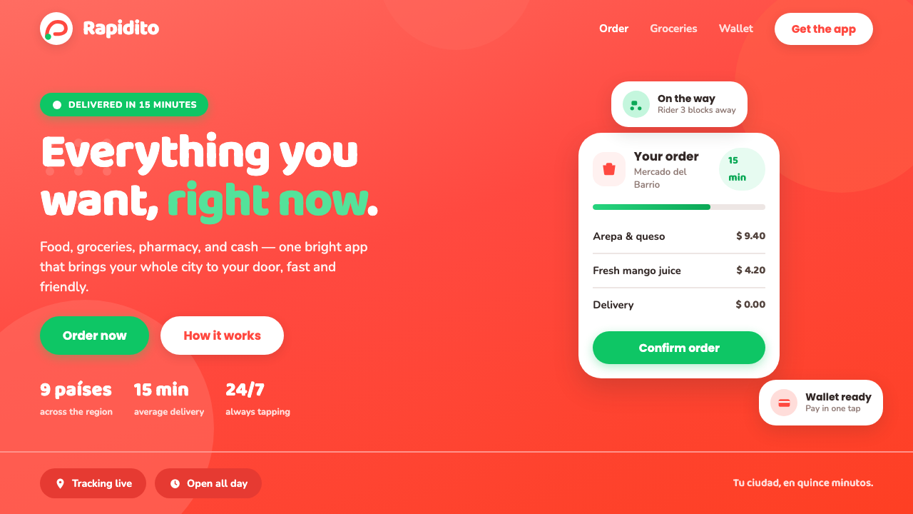 Rappi DeliveryOrdering, made joyful. A hot red-orange wash floods the page; white pill card…
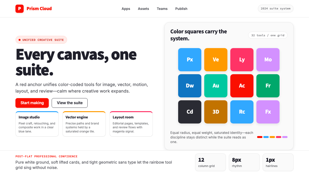 Adobe Creative CloudUnified, not uniform. Red anchor, white space, and saturated app tiles organi…