What is Hangzhou Asian Games?
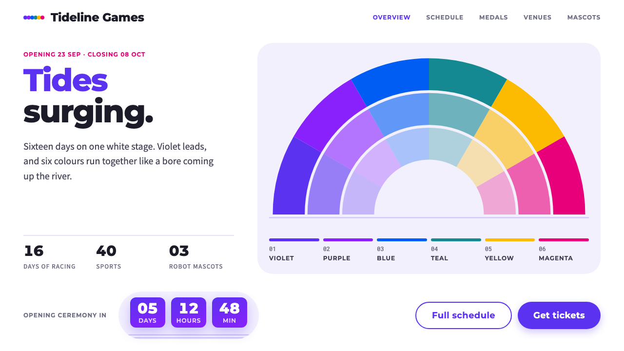
The Hangzhou Asian Games identity is violet tides on a white ground: six colours fan out in tiered arcs, with pill buttons and large rounded cards.
Hangzhou Asian Games in brief
The Hangzhou Asian Games style comes from the visual identity of the 19th Asian Games, held in Hangzhou in autumn 2023. Its emblem, called 潮涌 (Tides Surging), folds a fan, the tidal bore of the Qiantang River, a running track and the sun of the Olympic Council of Asia into a single rounded mark.
The system takes that official identity at face value. Colour sits on a white ground, with violet in front and six supporting hues running as tide bands and fan segments. Numbers are set in Montserrat and count down toward the event, and three robot mascots keep the whole thing friendly rather than formal.
The overall feel is bright, energetic and forward-moving, with a note of warmth drawn from the Jiangnan region. Everything is rounded: pill-shaped buttons, large-radius cards, arcs layered like folding fan ribs. It is a sports identity that looks celebratory and open rather than aggressive.

Where does Hangzhou Asian Games come from?
The 19th Asian Games was awarded to Hangzhou in 2015. It was planned for 2022, but it was postponed and finally held from 23 September to 8 October 2023. Because the postponement came late, the event kept its original name, Hangzhou 2022, even though it took place a year later. That small mismatch is part of the story of this identity.
The emblem 潮涌 (Tides Surging) was designed by Yuan Youmin. It merges four ideas into one rounded shape: a folding fan, which stands for Jiangnan craft and culture; the Qiantang River's tidal bore, a famous natural spectacle near Hangzhou; a running track, which brings in the sport; and the sun of the Olympic Council of Asia, which ties the mark to the continental organisation behind the Games. Layering these ideas into a single arc-based mark is what gives the identity its characteristic tiered, wave-like form.
The three robot mascots, named 琮琮, 宸宸 and 莲莲, express the region's heritage in a friendly digital form. In the original identity they refer to three of Hangzhou's celebrated sites, the Liangzhu archaeological ruins, the Grand Canal and West Lake, which are all World Heritage places. Turning heritage sites into approachable robots reflects the Games' double nature: ancient culture and cutting-edge technology presented together.
That technological side was central to the opening ceremony, which used Smart Games digital ceremony technology. Online participants formed a digital torchbearer that waded across the Qiantang River with the athlete Wang Shun to light the main cauldron. The identity belongs to the tradition of Asian and Olympic Games identity systems, but it adds Jiangnan heritage motifs and a distinctly digital sensibility, and this design system distils the visual side of that mix.
What defines the Hangzhou Asian Games look?
White ground
Colour sits on a clean white ground rather than on a tinted or dark field. The white gives the palette room to breathe, makes each hue read at its truest, and keeps the identity feeling open and public, like a stadium in daylight.
Violet in front
Violet is the lead colour, used for the main emblem, primary actions and headline emphasis. Because it appears first and most often, it acts as the identity's anchor, and every other hue is read in relation to it.
Six supporting hues
Six further colours run as tide bands and fan segments alongside the violet. They are deployed as a spectrum, in ordered sequence, so the page feels like a rainbow of participating nations and events rather than a random collection of accents.
Tiered arcs
The signature shape is an arc repeated in tiers, like the ribs of a folding fan or the successive lines of an incoming tide. These arcs run across backgrounds, frame content and create a sense of forward surge without any hard angles.
Pill buttons, rounded cards
Buttons are pill-shaped and cards use large rounded corners. Everything echoes the roundness of the emblem, so the interface feels friendly and cohesive. Hard rectangles would break the language, so corners are always generously softened.
Montserrat numerals
Numbers are set in Montserrat and treated as a feature: countdowns, medal counts and schedules get generous scale. The geometric, open letterforms suit the rounded graphics and give figures a confident, athletic presence.
Friendly robots
Three robot mascots appear as a trio, softening the technology theme. They keep the identity approachable and signal the Smart Games character of the event, balancing futuristic digital imagery with a warm, human tone.

Who shaped Hangzhou Asian Games?
The designer of the emblem 潮涌 (Tides Surging), which merges a folding fan, the Qiantang River's tidal bore, a running track and the sun of the Olympic Council of Asia into one rounded mark that became the foundation of the whole visual identity.
The athlete who lit the main cauldron at the opening ceremony together with the digital torchbearer. His moment on the Qiantang River symbolised the Games' pairing of human sport and digital technology.
The continental organisation behind the Asian Games, whose sun symbol is folded into the emblem. Its presence in the mark ties the Hangzhou identity to the broader tradition of Asian and Olympic Games identity systems.
How do you use Hangzhou Asian Games today?
The Hangzhou Asian Games style suits subjects that want to feel public, celebratory and forward-moving: sports, events, civic campaigns, education and any product that wants a warm, energetic digital face. It is a colourful style, but its white ground and ordered palette keep it disciplined.
For presentation slides, a cover can sit on white with a large violet arc rising from one corner, the title in bold geometric type and a short series of coloured tide bands as a footer. Content slides can use large rounded cards to group information, each with a single supporting hue. Data slides suit arc-based charts and big Montserrat numbers, with the six supporting colours used in order to separate categories.
For web interfaces, use white as the page ground, violet for primary buttons and active states, and pill-shaped controls throughout. Cards should have generous rounded corners and soft internal spacing. Supporting hues belong in categories, tags and charts, not in body text. Countdown or progress modules, with large numerals, are a natural fit for this identity.
For editorial and marketing work, the tiered arcs make strong dividers and backgrounds for event pages, schedules and announcements. The three robot mascots can serve as a friendly guide figure in onboarding or explainer sequences. Imagery should lean toward bright, open scenes with plenty of white space so that the palette keeps its clarity.
A common mistake is to use all seven colours at equal weight. The identity depends on violet leading, with the other hues in supporting roles; otherwise it turns into a random rainbow. Another mistake is introducing sharp corners or heavy dark panels, which break the roundness the identity depends on. Keep corners soft, keep the ground white and let the arcs do the moving.

Hangzhou Asian Games — FAQ
What is the Hangzhou Asian Games design style?
It is a bright identity built on a white ground with violet in front, six supporting hues running as tide bands and fan segments, pill buttons, large rounded cards, Montserrat numerals and three friendly robot mascots.
What does the emblem 潮涌 represent?
Designed by Yuan Youmin, 潮涌 (Tides Surging) combines a folding fan, the Qiantang River's tidal bore, a running track and the sun of the Olympic Council of Asia into a single rounded mark.
Why is it called Hangzhou 2022 if it was held in 2023?
The Games were planned for 2022 but postponed, and were finally held from 23 September to 8 October 2023. The event kept its original name, so the identity still carries Hangzhou 2022.
Who are the three mascots?
They are the robots 琮琮, 宸宸 and 莲莲. In the original identity they refer to Liangzhu, the Grand Canal and West Lake, three of Hangzhou's celebrated heritage sites, presented in a friendly digital form.
How should I balance the colours?
Let violet lead and use the six supporting hues in order as bands, segments, tags and chart categories. Keep the ground white. If every colour has equal weight, the identity loses its anchor and starts to look random.
Related design styles
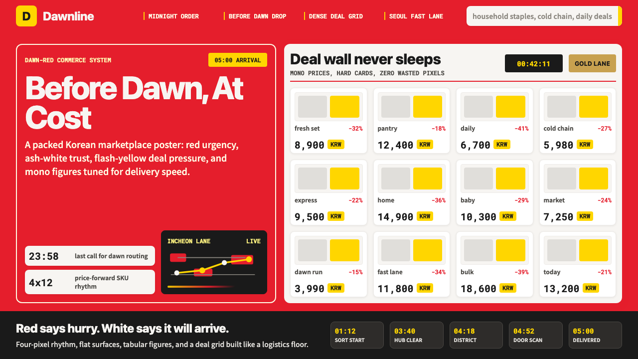 Coupang Rocket DeliveryUrgency made trustworthy. Rocket red, flash yellow, mono prices and packed gr…
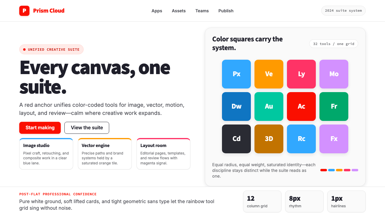 Adobe Creative CloudUnified, not uniform. Red anchor, white space, and saturated app tiles organi…
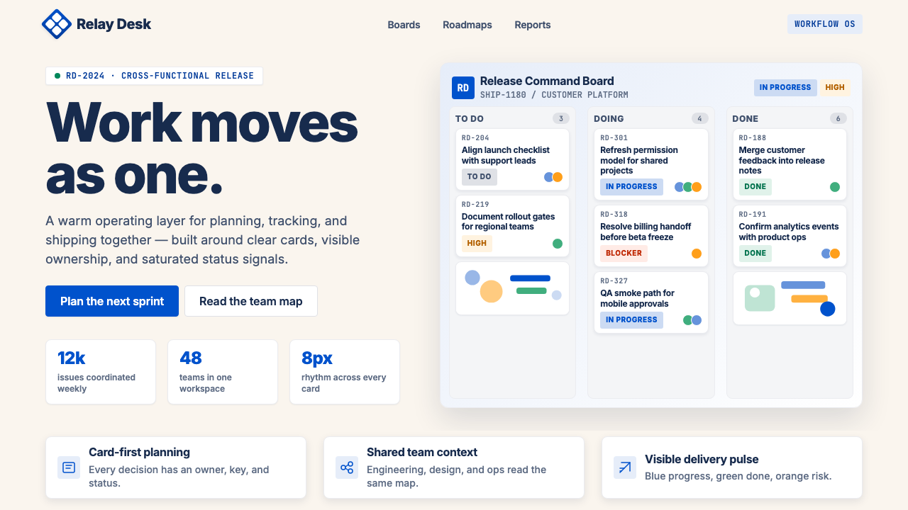 Atlassian Jira BlueWarm enterprise teamwork. Saturated blue cards on cream make status feel huma…
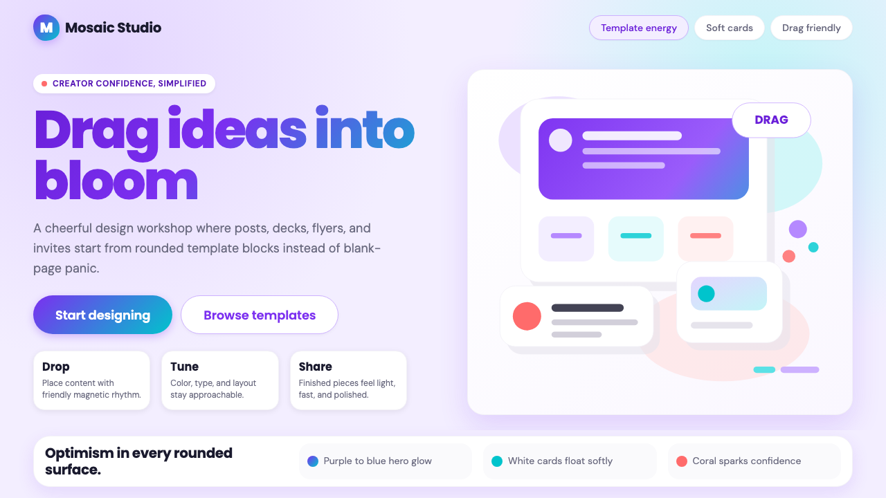 Canva 2024Confidence feels draggable. Purple-blue gradients and floating white template…
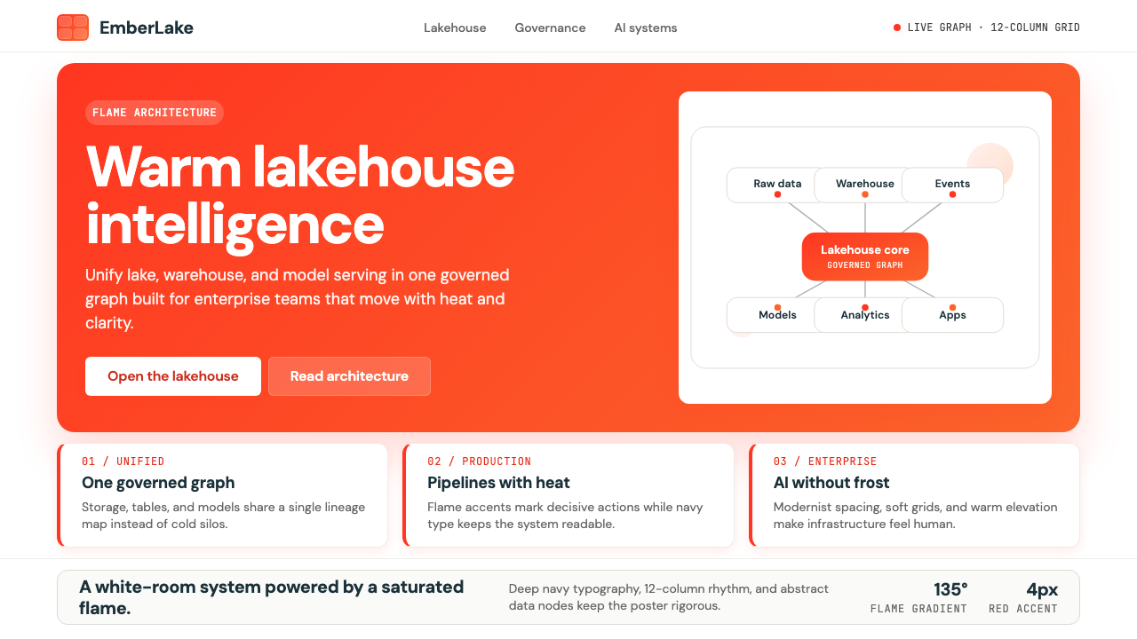 Databricks LakehouseWarm enterprise confidence. Flame red-orange gradients meet DM Sans and clean…
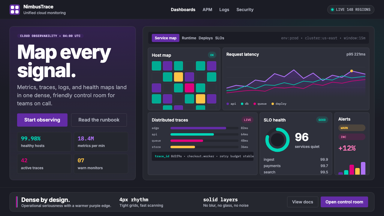 DatadogSerious telemetry, friendly pulse. Purple dark grids pack charts, badges, and…