What is Kashmiri Crocus Purple?
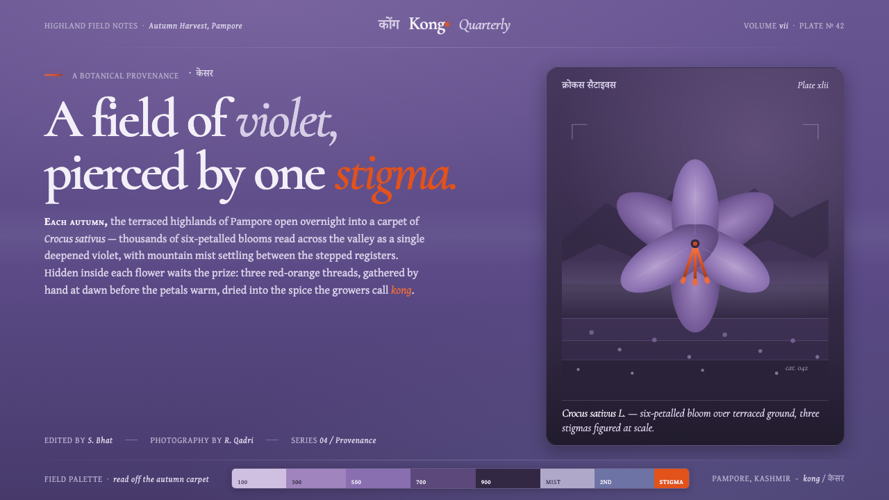
Kashmiri Crocus Purple turns a Pampore autumn into a hierarchy of abundance: violet petals everywhere, highland mist in the middle, and one saffron-orange spark that commands the eye.
Kashmiri Crocus Purple in brief
Kashmiri Crocus Purple is a landscape-derived design system rooted in the saffron terraces of Pampore, Kashmir. Its visual field is dominated by a deepened violet drawn from massed Crocus sativus petals, softened by highland lavender-greys and punctuated by a rare saffron-orange accent. The system is defined less by a complete palette than by an unequal distribution of color: abundance belongs to violet, while its warm counterpoint remains scarce.
The style translates a botanical scene into visual hierarchy. Violet establishes the atmosphere and carries most of the surface; lavender-grey provides the haze of mountain mist and the quiet presence of terraced earth; saffron-orange functions as the hidden stigma revealed inside the flower. The result is dark, atmospheric, and concentrated rather than uniformly dramatic. Its strongest moments come from restraint, especially when the accent appears only where attention must settle.
Typography gives the system a cultural and editorial voice. Devanagari acknowledges the South Asian referent, while high-contrast serif forms introduce a cultivated, literary quality against the dense violet ground. Type should feel considered and legible, not rustic or folkloric. The overall impression is botanical without becoming floral decoration: a regional landscape distilled into color, atmosphere, contrast, and a carefully controlled spark.
Where does Kashmiri Crocus Purple come from?
The system is located in the Kashmir highlands, specifically the Pampore saffron terraces of South Asia. Its historical frame is the period from 1900 to 1950, understood through highland saffron cultivation and the botanical landscape of Crocus sativus. This is not a style built from an abstract color association. It begins with a place, a crop, and the recurring visual condition of violet flowers opening beneath mountain mist.
Each autumn, Pampore is described as a carpet of Crocus sativus laid over grey terraced earth. The flowers move visually from violet toward lavender, while the landscape around them remains muted and atmospheric. This relationship between vivid bloom and subdued ground supplies the system with its central compositional tension. Purple is not isolated as a jewel-like accent; it is a mass, a field, and an environment.
The flower provides the system's decisive contrast. Hidden inside each six-petalled bloom is a prized red-orange stigma, a small saffron spark set against the dominant purple. In design terms, this creates a model of abundance interrupted by rarity. The accent is meaningful because it is outnumbered. If it were distributed evenly, the visual relationship would lose the character of the flower and become a generic complementary palette.
The final design language distils this landscape rather than reproducing it literally. A deepened massed-petal violet becomes the ground, highland lavender-greys carry mist and earth, and saffron-orange marks the concealed botanical detail. Devanagari and high-contrast serifs extend the reference from color into typography, allowing the system to acknowledge its South Asian setting without relying on ornamental motifs or pictorial imitation.
What defines the Kashmiri Crocus Purple look?
Dominant Violet
Violet is the system's environmental color: deep, abundant, and visually continuous. It should occupy the largest areas and establish the emotional temperature before any accent is introduced. The hue is closer to a mass of petals under reduced light than to a bright ornamental purple. Its depth gives the system its dark character while allowing lavender-grey and saffron-orange to register as distinct events.
Misty Highland Neutrals
Lavender-greys soften the dominant violet without neutralizing it. They represent mountain mist and grey terraced earth, supplying breathing room, secondary surfaces, and quiet transitions. These tones should remain atmospheric rather than metallic or clinical. Their role is to make the purple field feel situated in a highland landscape, not suspended as an isolated color exercise.
Saffron Scarcity
Saffron-orange is the system's rarest and most directional color. It should behave like the stigma inside the flower: small, warm, valuable, and immediately legible against violet. Use it to mark a decision, a focal detail, or a moment of emphasis. Its force depends on surrounding restraint; frequent use turns the botanical spark into ordinary decoration.
Cultural Typography
Devanagari gives the system a direct South Asian reference, while high-contrast serifs contribute refinement and editorial authority. The pairing should feel intentional and balanced, with neither script treated as a novelty. Typography carries place through rhythm and presence rather than through ornamental display. Clear hierarchy and generous breathing room keep the cultural reference dignified.
Botanical Landscape
The visual language should suggest a field under mist rather than depict a flower as an isolated icon. Broad violet masses, softened grey transitions, and a concentrated warm detail recreate the relationship between crop, terrain, and atmosphere. This makes the style useful across layouts: it can operate as a full visual environment or as a restrained hierarchy within a single composition.
Who shaped Kashmiri Crocus Purple?
The source identifies Kashmiri saffron-farming families and their kong cultivation as the human foundation of the style. They anchor the palette in lived agricultural practice rather than in a purely aesthetic purple. The system therefore carries an implied respect for cultivation, place, and the recurring seasonal landscape of Pampore.
Crocus sativus is the botanical source of the entire visual structure. Its violet-to-lavender petals create abundance, while the hidden red-orange stigma supplies the rare contrast that gives the palette its identity. The flower is not merely an image reference; it is the system's model for organizing attention.
Pampore provides the spatial frame: violet flowers spread across grey terraces beneath mountain mist. Its importance lies in the relationship between color and ground, bloom and atmosphere. The design system inherits that layered setting, making the palette feel geographic and seasonal rather than generic.
How do you use Kashmiri Crocus Purple today?
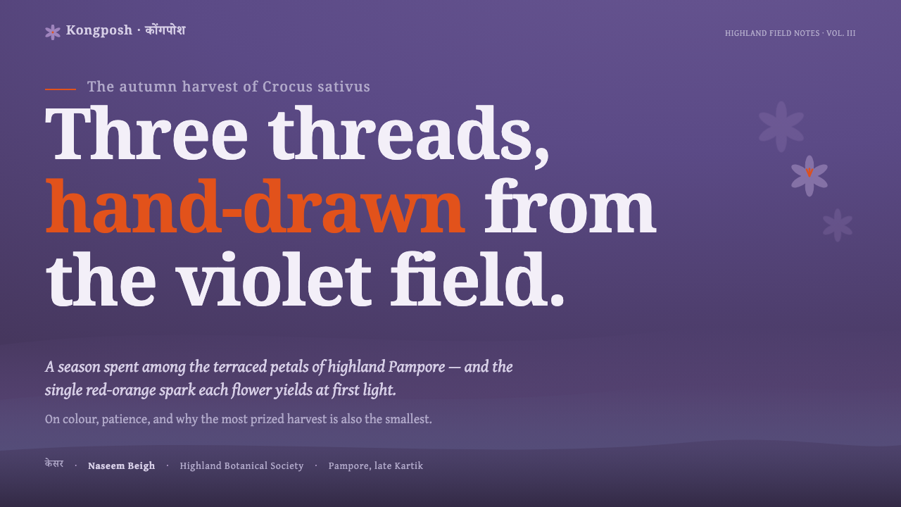
For presentation slides, use the deep violet as the primary cover field and let the title sit with confident contrast, supported by high-contrast serif type or Devanagari where appropriate. Content slides should move toward misty lavender-greys so the deck can breathe without abandoning its atmosphere. On data slides, saffron-orange should identify the key finding, selected value, or decisive comparison, while the rest of the information remains subordinate and calm.
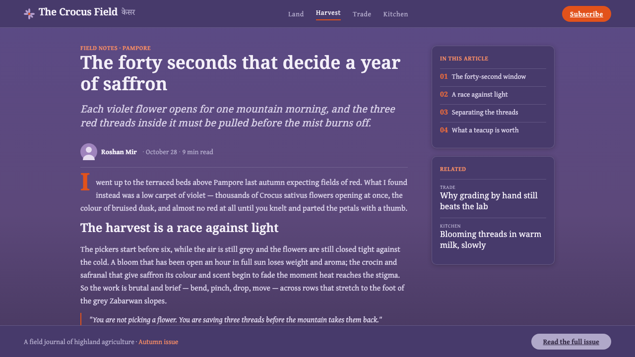
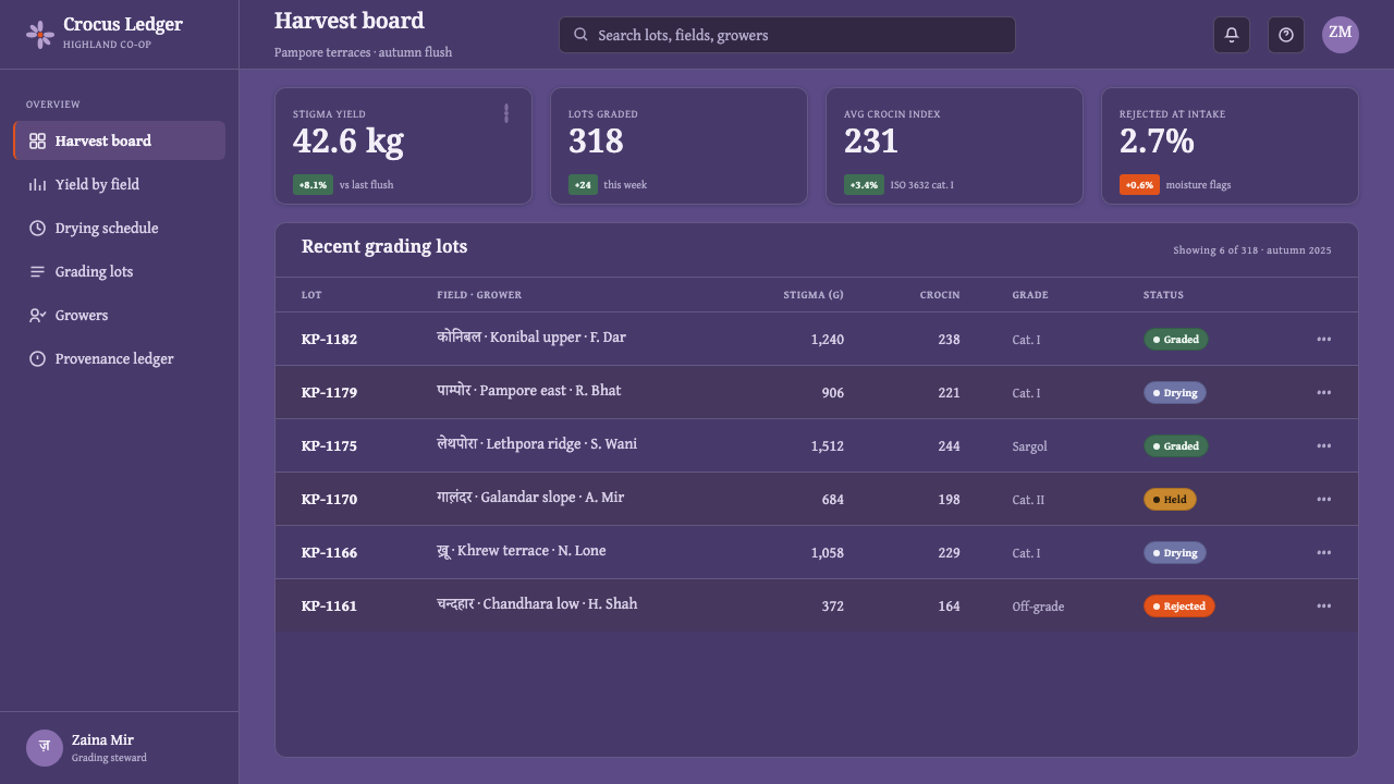
For web interfaces, the style suits dashboards and pricing pages that need a dark, distinctive environment with a clear focal accent. Violet can carry the main shell and major surfaces; lavender-grey can separate panels, secondary information, and quieter states; saffron-orange can signal action, selection, or priority. The interface should preserve the system's unequal hierarchy. If every control is orange, the accent no longer feels like the rare stigma inside the flower.
For editorial and marketing work, the system supports atmospheric storytelling with strong cultural presence. Articles can pair dense violet opening fields with restrained grey reading surfaces, using serif typography for authority and Devanagari for regional emphasis. Marketing compositions can treat the violet field as a recognizable brand environment, then reserve saffron-orange for the central promise or call to action. The strongest layouts will suggest the Pampore landscape without turning every page into literal floral imagery.
A common mistake is to treat the style as a three-color palette and distribute violet, lavender-grey, and saffron-orange evenly. That removes the essential relationship between abundance and scarcity. Another mistake is choosing a bright decorative purple, adding generic orange everywhere, or using Devanagari as surface ornament without typographic care. The system works when color, type, and atmosphere all point back to the same source landscape.
Kashmiri Crocus Purple — FAQ
What distinguishes Kashmiri Crocus Purple from a generic purple palette?
Its identity comes from hierarchy and origin, not from purple alone. The violet is a massed-petal ground associated with Pampore, the lavender-greys bring in mountain mist and terraced earth, and the saffron-orange accent echoes the hidden stigma of Crocus sativus. Remove that unequal relationship and the system becomes merely purple, rather than a landscape-derived language.
Can saffron-orange be used as a large background color?
It can appear in a larger block when the composition specifically calls for a dramatic inversion, but it should remain the rarer voice of the system. Its meaning depends on contrast with abundant violet and quieter lavender-grey. In most applications, keeping it concentrated preserves its association with the flower's prized stigma and gives it directional force.
Why does the system pair Devanagari with high-contrast serifs?
The pairing connects the visual system to its South Asian referent while giving the typography an editorial and cultivated character. Devanagari supplies cultural specificity; high-contrast serifs provide a contrasting literary voice. Neither should be used as decoration. The relationship works when both scripts are treated as serious carriers of language, rhythm, and hierarchy.
Does the style require literal flower imagery?
No. The essential reference is the relationship between massed violet petals, misty grey ground, and a rare saffron detail. That relationship can be carried by surfaces, typography, spacing, and selective emphasis without depicting a flower. Literal botanical imagery may support the system, but it should not replace the underlying hierarchy.
Related design styles
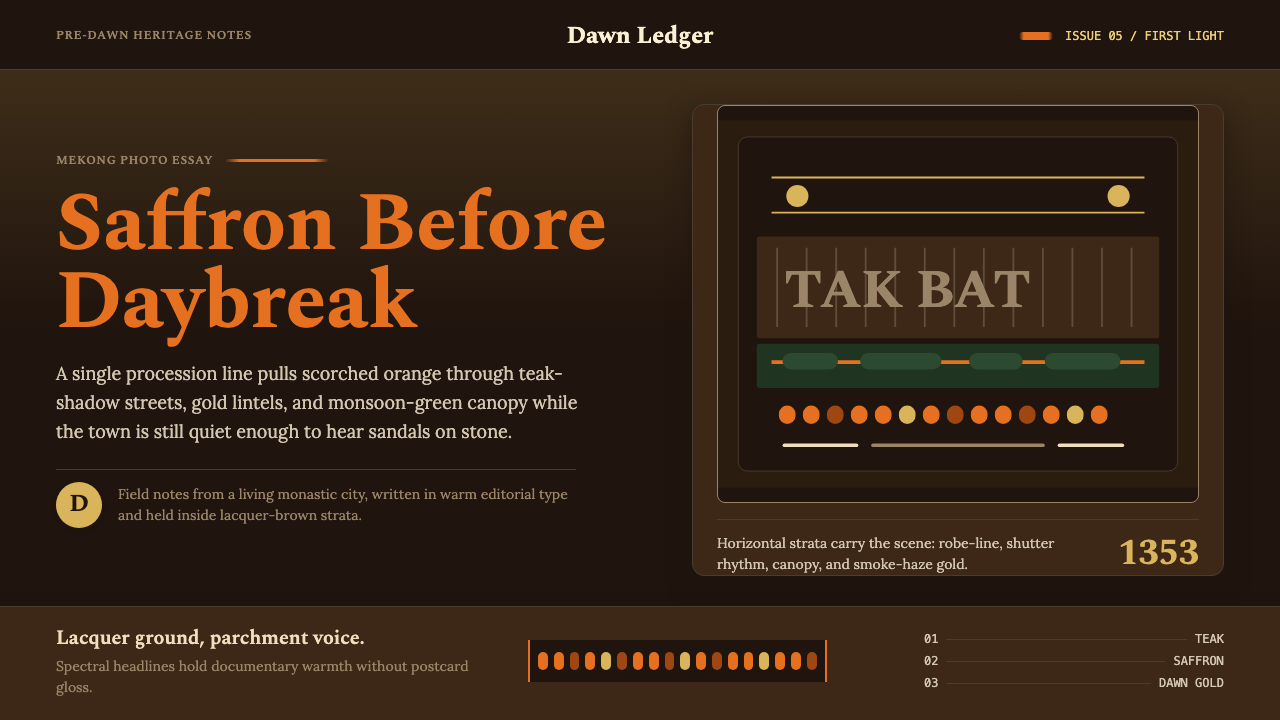 Luang Prabang Saffron AlmsDawn has weight. Saffron bands cut through teak brown and smoke-gold editoria…
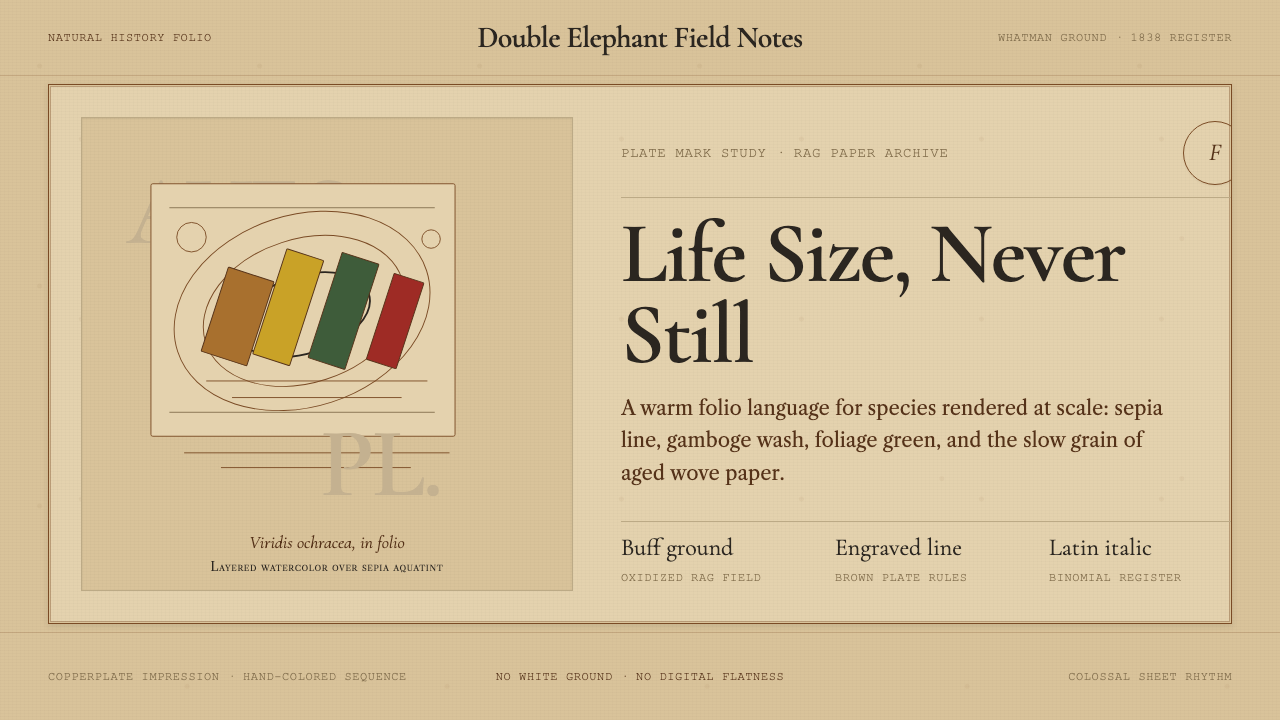 Audubon Birds of AmericaAged natural history breathes. Buff rag paper, sepia rules, and italic binomi…
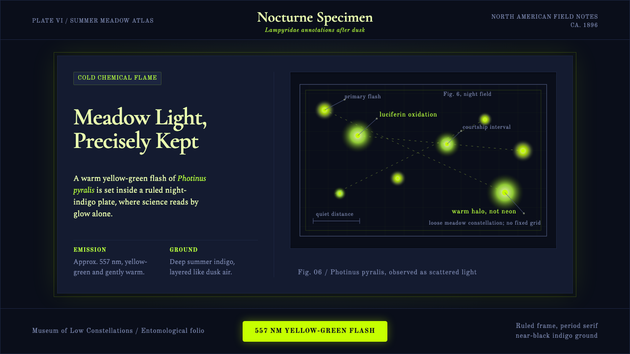 Firefly BioluminescenceQuietly luminous. Yellow-green 557 nm sparks drift through ruled indigo plate…
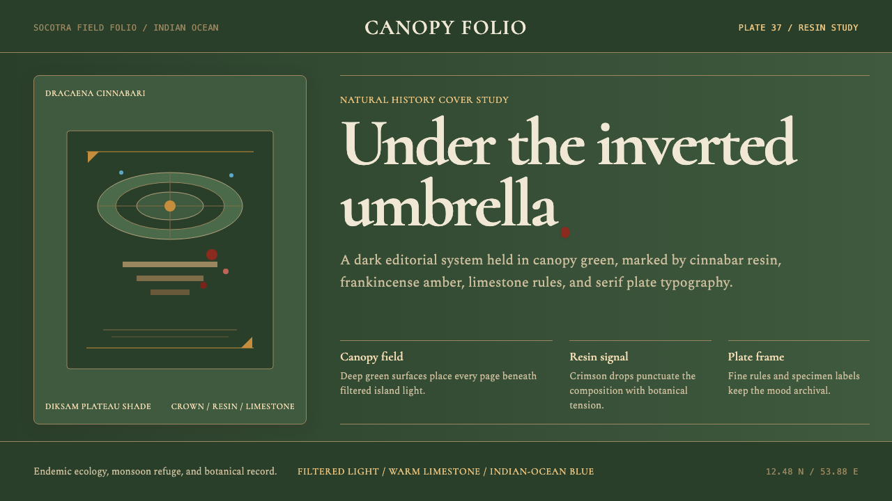 Yemeni Socotra Dragon's Blood TreeCanopy shade holds the page. Resin red, amber rules, and serif specimen frami…
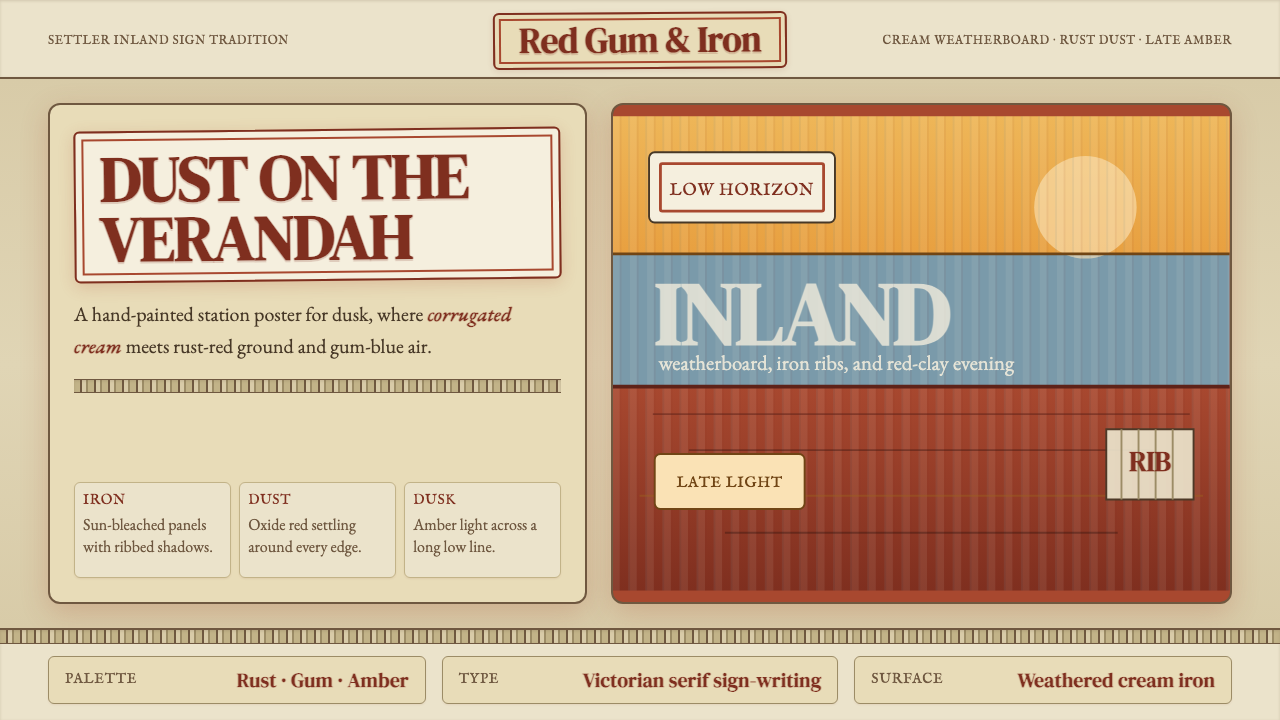 Australian Outback VernacularWeather is the voice. Rust dust, gum-blue bands, and serif sign-writing age t…
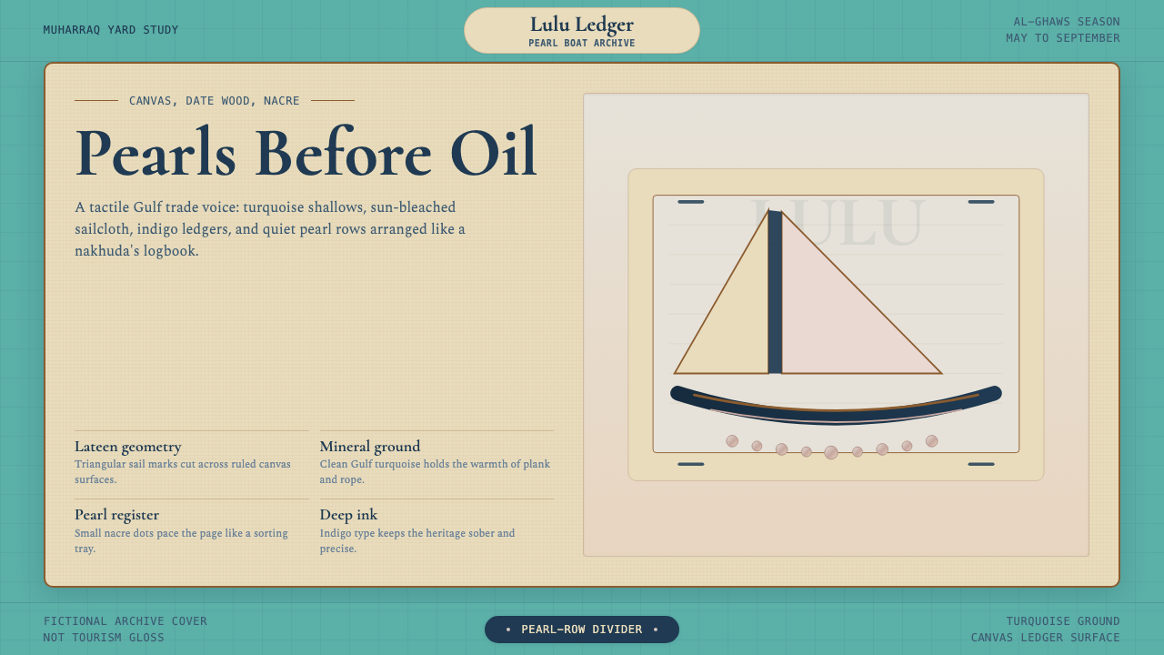 Bahraini Dhow Pearl-Diving BoatMineral and sun-bleached. Gulf turquoise, canvas cream, and pearl rows frame…