What is Jumia?
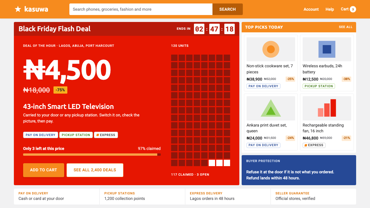
Jumia's storefront shouts the promise, not the photograph: pay on delivery, collect near you, and a deal-red price set enormous on a flat grey page under an orange header.
Jumia in brief
The Jumia style is the visual language of an emerging-market online marketplace: a flat pale-grey canvas, tightly packed white product cards, a sticky orange header and prices written in an unapologetic deal red. It comes from Jumia, the e-commerce company founded in Lagos, Nigeria, in 2012, and it carries the logic of a shop built for conditions in which almost nothing could be taken for granted.
Those conditions explain the design. The storefront was made for a market in which nobody could assume a credit card, a findable street address or a reliable courier. So the loudest thing on the page is never the photography. It is the promise: pay on delivery, collect at a pickup station, a percentage off, only a few items left. Trust, logistics and urgency do the selling, and the picture of the product is there to confirm what the promise has already said.
The type system is equally direct. A single sans-serif family does everything, set bold and tight where the price is, and small, uppercase and generously spaced where the logistics are, so the eye can pick out the number and then the terms of delivery without hunting. During Black Friday the whole page turns into stacked promotional strips and deal reds, which is the version most people remember. The overall impression is dense, bright and utilitarian, a bazaar translated into a screen, and it is meant to be.

Where does Jumia come from?
Jumia was founded in 2012 in Lagos, Nigeria, at a moment when online shopping in much of Africa faced problems that are largely invisible to shoppers elsewhere. Few people held credit cards. A delivery address might not be findable by a courier. A delivery date was hard to promise with confidence. A marketplace that ignored those facts would have looked professional and sold very little, so the design started from them instead, and what resulted is a style built out of reassurance.
The movements the source brief connects it to are practical rather than artistic: emerging-market marketplace interface design, cash-on-delivery commerce and the design of pickup-station logistics. Each leaves a visible mark on the screen. Cash on delivery turns payment from a form field into a headline claim. Pickup stations turn the address field into a choice between home delivery and a place that can actually be found. The interface is therefore full of small logistical statements that a marketplace in a card-and-courier economy would tuck away in a footer.
The company grew outward from Lagos to storefronts in Egypt, Morocco, Kenya, Ghana and Côte d'Ivoire, which is why the system has to be flexible and repeatable rather than precious. It listed on the New York Stock Exchange in 2019, a milestone that put the brand in front of an international audience. The campaign calendar shaped the look as well: a Black Friday campaign has run annually since 2014, and its stacked strips and heavy red price tags became the most recognisable image of the brand. The storefront captured in this style reflects the period of roughly 2020 to 2024.
Four people are named as key figures: Tunde Kehinde, Raphael Kofi Afaedor, Sacha Poignonnec and Jérémy Hodara. They are the founders associated with the company's start and growth, and the design is best read as the visual consequence of the commercial problem they set out to solve rather than as anyone's personal signature. The source brief credits no individual designer. The style belongs to the marketplace, and its signature is its flatness.
What defines the Jumia look?
Grey canvas, white cards
The page is a flat pale grey, and every product sits on a white card laid directly on it. Because grey and white separate cleanly on their own, cards need no borders and no shadows to feel distinct, which leaves the space between them tight. The effect is a dense shelf of goods in which each item has its own clear boundary and nothing is dressed up.
The orange header
A sticky orange header carries the search and the brand and stays with the shopper as the page scrolls. It is the single strong anchor of the layout and the page's one dependable landmark. Everything else is grey, white or deal red, so the orange is never competing with anything of its own kind.
Price as headline
The price is set as a headline, enormous, bold and tight, in deal red. It is not a detail attached to the product but the main event of the card. A shopper deciding between two similar items is meant to see the number before they see anything else, and the number is drawn at a scale that makes that unavoidable.
Small, uppercase logistics
Delivery, payment and pickup terms are set small, in capital letters with generous letter-spacing. They are quiet in size but easy to find, because the shape of spaced capitals stands out against the bold, tight numbers beside them. This is where the trust lives: the page tells you how and when you will receive the goods in a voice that never shouts.
Promise-first badges
Short claims such as pay on delivery, pickup station available, a percentage off and a count of items left act as badges around the product. They answer the shopper's doubts in the order doubts arise: can I pay safely, can I collect it, is it a deal, will it run out. Photography supports these claims and does not lead them.
One family, two registers
Everything is set in one sans-serif family, and difference is made by weight, size and case alone. Bold and tight signals money; small and uppercase signals logistics. With only one family on the page, the interface stays coherent however crowded it becomes, and the hierarchy is legible even to someone scanning in a hurry on a small screen.
Black Friday mode
For campaign periods the page converts to stacked promotional strips and heavier deal reds, layered one on top of another until the whole screen is an offer. It is the same system turned up, not a different one: the grey, the white cards and the orange header remain, and the strips simply claim more of the vertical space.

Who shaped Jumia?
Named first among the key figures and one of the co-founders of Jumia in Lagos in 2012. What matters for design is the problem the company was founded to solve: how to sell online where payment cards, street addresses and couriers could not be taken for granted. The interface's insistence on cash on delivery and pickup stations is that problem made visible.
Another of the co-founders named in the source brief. His name ties the style to the company's earliest years in Lagos, when the storefront's job was to make an unfamiliar habit feel safe. The visible legacy is a page that explains itself: the terms of delivery and payment are printed small, but they are never hidden.
A co-founder named in the source brief and associated with the company's later growth, its spread across several countries and its listing on the New York Stock Exchange in 2019. A storefront that has to run in many markets favours a flat, modular, repeatable system, which is exactly what the grey canvas and the white card provide.
The fourth co-founder named in the source brief, commonly mentioned alongside Poignonnec in accounts of the company's expansion. His inclusion reminds us that this is a corporate design language built for scale: its rules have to survive many product categories, many countries and an annual Black Friday surge without needing a designer's attention each time.
How do you use Jumia today?
The Jumia style is for commerce that has to earn trust quickly and sell on clarity rather than glamour. Borrowing it well means putting the promise before the picture and giving every piece of logistics a visible place on the page, not just adding an orange bar to a layout.
For presentation slides, a cover can be a pale-grey field with a bold orange band across the top and a single enormous claim or number in deal red. Content slides work as tightly packed white cards on grey, each with a bold headline figure and one or two small uppercase lines of conditions. Data slides suit price tables, comparisons of delivery and payment options and discount tiers, which makes the style a natural fit for retail planning decks, promotion reviews and sales results.
For web interfaces, the obvious territory is the storefront, the product catalogue, the flash-sale page, the delivery-option picker and the order-tracking screen, along with merchant dashboards for small sellers. Keep a sticky orange header with search, pack the cards tightly on the grey canvas, and give each card a short row of promise badges. Let the price be the largest thing on every card. On a pricing or plan-comparison page, apply the same principle: the figure leads, the conditions follow in small capitals, and a single red accent marks the offer.
For editorial and marketing work, the style suits promotional landing pages, seasonal sale events and newsletters that need to carry many offers in one view. Stack the strips in a strict order, lead each with a concrete promise instead of an adjective, and use photography as supporting evidence. Copy that states a plain fact, such as pay when it arrives or collect it from a station near you, will do more work here than any amount of atmosphere.
The most common mistake is to spend deal red everywhere. When every element is red, nothing is a deal, and the one colour that is meant to mark the price becomes noise. A second mistake is to soften the page with generous whitespace, large photography and soft shadows, which removes the density that makes the system feel like a marketplace and turns it into a boutique. A third is to drop the small uppercase logistics lines as clutter: they are the part that carries trust. And the style is a poor match for brands that need quiet luxury or an air of scarcity, because everything about it says abundance and speed.

Jumia — FAQ
Is the Jumia style only suitable for e-commerce?
It is at its best in commerce, but the underlying idea travels: lead with the promise, give logistics a visible and honest place, and let one number dominate each unit of content. Ticketing, food delivery, classifieds, travel deals and any service that sells on price and reliability can use the same grammar. It is less suitable where the brand depends on mystery, craft or luxury.
Why is the page grey instead of white?
A pale-grey canvas lets white product cards separate from the background without borders or shadows. That keeps every card flat, keeps the gaps between cards narrow and lets many products fit on a screen. White on white would need outlines to hold the layout together, and outlines add the visual noise this style is trying to avoid.
Why are the prices set so large?
Because the price is the decision. In a marketplace where trust has to be built quickly, the first question is whether the item is worth the money, and the second is whether it will arrive. The design answers the first with an enormous deal-red figure and the second with small, clear logistics lines. Photography is secondary since the shopper has usually already formed a picture of what they want.
How is this different from marketplaces designed for card payments and reliable delivery?
Those marketplaces can treat payment and delivery as background plumbing and spend their visual effort on browsing and discovery. Here the plumbing is the product. Cash on delivery, pickup stations and delivery windows are promoted to the front of the page, because they are what makes a shopper willing to order at all. The result trades some elegance for a great deal of reassurance.
How can I run a Black Friday style promotion without the page turning chaotic?
Keep the structure and turn up only the strips. Stack the promotional bands in a fixed order, reserve deal red strictly for prices and discount claims, and leave the grey canvas, white cards and orange header untouched so the page still reads as the same shop. Density is welcome, but disorder is not: every strip should say one thing, and no two strips should compete for the same message.
Related design styles
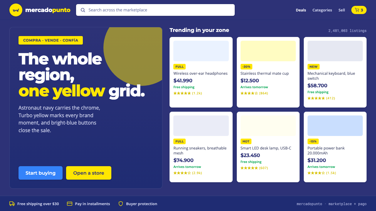 Mercado Libre YellowLatin America's marketplace energy. Turbo yellow brand moments, blue CTAs on…
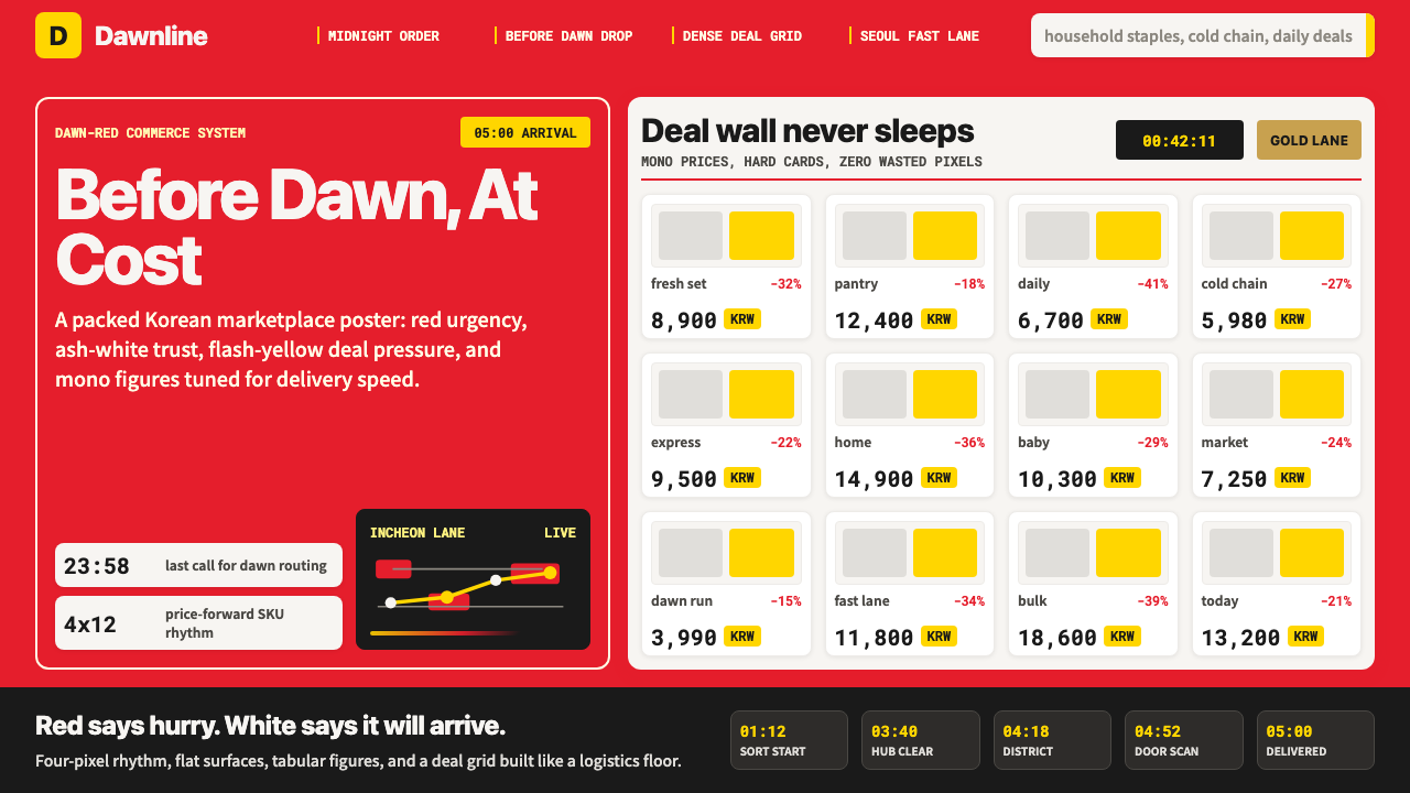 Coupang Rocket DeliveryUrgency made trustworthy. Rocket red, flash yellow, mono prices and packed gr…
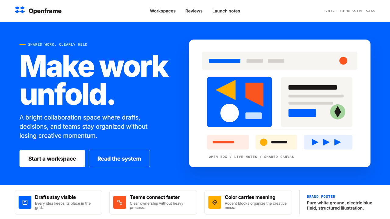 Dropbox ModernFriendly SaaS gets loud. Electric blue and Sharp Sans drive a structured geom…
 JD.com (京东)Urgency earns trust. Deep red prices pack a white 12-column grid with gold fe…
 Paytm Indian FintechTrust at street scale. Saturated blue, Hind numerals, and QR grids make payme…
 Shake Shack (Green-Chartreuse)Friendly premium, never loud. Chartreuse on warm cream with tight modernist t…