What is Judo Gi Kodokan?
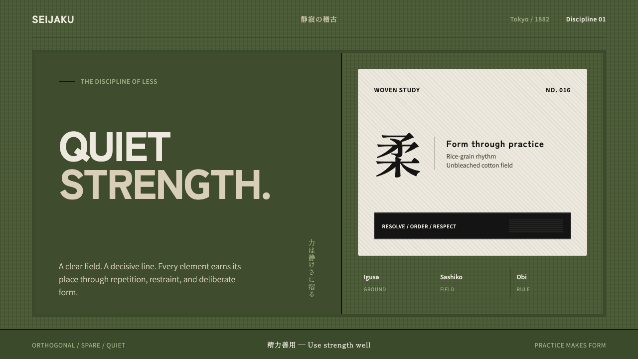
Judo Gi Kodokan turns discipline into atmosphere: off-white sashiko, decisive black belt lines, and an igusa-green ground held in quiet alignment.
Judo Gi Kodokan in brief
Judo Gi Kodokan draws its visual language from the dojo floor: woven igusa-rush green tatami beneath a heavy off-white judogi, with the official Kodokan black belt cutting across it as a firm horizontal rule. The result is dark, grounded, and restrained without becoming bleak.
The system treats every element as having a position and a duty. Off-white is the field, black is the decisive boundary, and igusa green is the supporting ground. Texture comes from the rice-grain weave rather than from ornament. Lines are orthogonal, surfaces are quiet, and contrast is used to establish order rather than drama.
Its atmosphere is one of controlled strength. Judo Gi Kodokan suits interfaces, documents, and presentations that need gravity, focus, and trust without theatrical polish. The style is not rustic decoration and not martial spectacle; it is a disciplined arrangement of material, line, and space.

Where does Judo Gi Kodokan come from?
The style belongs to the visual world of Japan, specifically the Kodokan in Tokyo, and its historical frame is the period from 1900 to 1950. Its reference point is not a single decorative motif but the complete physical setting of practice: the mat underfoot, the woven garment, and the belt that marks the body's center.
The Kodokan was founded in 1882, giving the style a named institutional ground rather than an abstract martial theme. Judo Gi Kodokan draws from Kodokan judo and from a bushido-derived idea of martial purity: a visual language in which discipline is demonstrated through composure, repetition, and exact placement rather than display.
The judogi became standardized in the early twentieth century, and its material character is central to the style. The rice-grain weave gives the off-white garment a dense, tactile surface while preserving a broad, quiet field. It is substantial without being ornate, and its visual authority comes from construction rather than applied decoration.
The black belt completes the system. The official Kodokan obi is treated as a structural line, with sixteen rows of top-stitching giving the dark band a measured internal rhythm. Against the green tatami and off-white gi, it creates the style's essential composition: ground, field, and boundary held in disciplined relationship.
What defines the Judo Gi Kodokan look?
Color
The palette is built from off-white, near-black, and igusa green. Off-white carries the largest fields and keeps the composition breathable; black defines rules, seams, labels, and decisive boundaries; green establishes the grounded atmosphere of the tatami. The colors should remain muted and material rather than glossy or neon.
Texture
Texture comes from the sashiko rice-grain weave: a repeated, tactile surface that is felt before it is noticed. It should support the composition quietly, giving large fields of off-white or green a physical presence without turning them into illustration. Texture is evidence of making, not surface decoration.
Orthogonal Structure
The visual system is governed by straight, meeting lines. Panels, dividers, text blocks, and image crops should align like sections of a mat or folds of a garment. Curves may appear only when they belong to the subject itself; the surrounding structure remains square, calm, and exact.
The Belt Line
The black obi functions as more than a dark accent. It is a visual command: a line that separates, anchors, and gives the eye a place to stop. Use it for major rules, navigation bands, title bars, or strong horizontal transitions. Its power comes from restraint; repeated heavy lines quickly become noise.
Hierarchy
Hierarchy is expressed through placement, contrast, and weight rather than ornament. A title can occupy a clean off-white field, while a black label or green marker identifies its position in the system. Body text stays composed and legible. The page should feel arranged before it feels styled.
Quiet Depth
Depth should come from overlap, material contrast, and the relationship between ground and field. Avoid theatrical lighting or decorative effects. A dark band across a pale surface, or a green plane supporting an off-white card, creates enough spatial separation. The mood is weighty because the elements are grounded, not because they are made dramatic.

Who shaped Judo Gi Kodokan?
Kanō Jigorō is the key historical figure named by the style. His association with the Kodokan gives the system its institutional center and explains why the visual language feels disciplined rather than generically athletic. In this design vocabulary, authority is expressed through measured structure, composure, and a refusal of unnecessary display.
The Kodokan is the named ground of the style, founded in Tokyo in 1882. It represents an environment in which practice, order, and repetition matter more than spectacle. As a design reference, it keeps the palette and composition connected to a place of disciplined activity rather than allowing martial imagery to become theatrical.
The judogi is the system's principal field: heavy, off-white, and marked by the dense character of sashiko rice-grain weave. It brings material honesty to the visual language. Large pale surfaces should therefore feel constructed and substantial, not empty or luxurious. The garment is calm because its authority comes from making.
The official Kodokan black belt supplies the clearest structural motif. Its dark band and sixteen rows of top-stitching turn a functional object into a model of visual order. In applications, it suggests using one strong dark rule with deliberate internal rhythm rather than scattering many unrelated accents.
How do you use Judo Gi Kodokan today?
For presentation slides, use the opening slide as a composed dojo floor: a broad off-white field, one grounded igusa-green plane, and a decisive black line carrying the title or section identity. Content slides should preserve that same discipline through aligned text blocks, calm labels, and clear horizontal divisions. Data slides should treat charts as structural objects, using green for the grounded series, black for the decisive comparison, and off-white for the field around them.
For web interfaces, Judo Gi Kodokan suits dashboards, operational tools, and pricing pages that need seriousness without corporate gloss. Let the dark structure establish navigation and hierarchy, while off-white content areas keep reading comfortable. Use igusa green for active states, selected categories, or the primary path through a task. Cards should feel like placed surfaces on a mat, with edges and alignment doing more work than decorative effects.
For pricing pages, the black belt idea can organize tiers or plan transitions. A strong horizontal rule may separate plan identity from included features, while a restrained green marker identifies the recommended or active path. Keep the table-like structure visible and avoid turning the page into a sales spectacle. The style works best when confidence comes from clarity and construction.
For editorial and marketing work, use the judogi as the page field and the obi as the recurring editorial device. Long-form articles can place metadata, pull quotes, or section labels along disciplined horizontal rules. Campaigns can pair close material imagery with quiet copy, allowing the sashiko weave or tatami ground to carry atmosphere. The result should feel considered and durable rather than trendy.
The common mistake is to make the style loudly martial: adding aggressive symbols, dramatic action imagery, excessive black, or too many heavy rules. Judo Gi Kodokan is powerful because it remains composed. If every element insists on strength, the system loses its calm center. Keep one dominant ground, one clear structural line, and enough off-white space for discipline to become visible.

Judo Gi Kodokan — FAQ
Is Judo Gi Kodokan a literal martial-arts theme?
Not primarily. It borrows the physical vocabulary of the dojo, but its design principle is discipline rather than action. The mat, gi, and belt become a system of field, texture, and boundary. Martial references should remain quiet and structural; the style loses its character when it depends on combat imagery or theatrical aggression.
Why is the palette so restrained?
The restraint preserves the relationship between ground, garment, and belt. Igusa green gives the composition a place to stand, off-white provides the broad field, and black establishes decisive order. Additional colors would compete with those roles unless they are introduced for a clear communicative reason.
Can the style use photography or imagery?
Yes, provided imagery is treated as material and structure rather than spectacle. Close views of sashiko weave, tatami, folded fabric, or a belt line support the system naturally. Images should be composed with calm crops and strong alignment, allowing texture and placement to carry the mood instead of dramatic effects.
Does Judo Gi Kodokan require a dark interface?
No. The reference is dark because of the black belt and grounded dojo atmosphere, but the system depends on contrast between off-white, black, and green rather than on darkness alone. A light field with strong black structure can be equally faithful, especially for reading-heavy pages. What matters is the hierarchy of ground, field, and boundary.
What makes the style feel authentic rather than themed?
Authenticity comes from letting the source material govern the composition. Use the sashiko weave as quiet texture, the black obi as a deliberate rule, and igusa green as the grounding field. Keep alignment exact, keep ornament sparse, and let authority emerge from repetition and restraint. If the design would still work after removing martial symbols, its underlying system is probably strong.
Related design styles
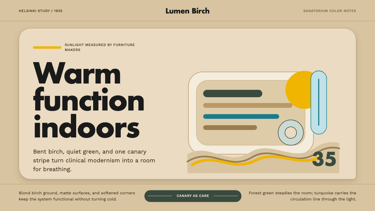 Aalto Finnish ModernModernism made humane. Birch fields, canary yellow, and soft plywood curves b…
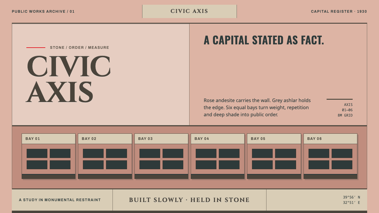 Ankara Republican ArchitectureAuthority moves slowly. Rose andesite, grey ashlar and six equal bays enforce…
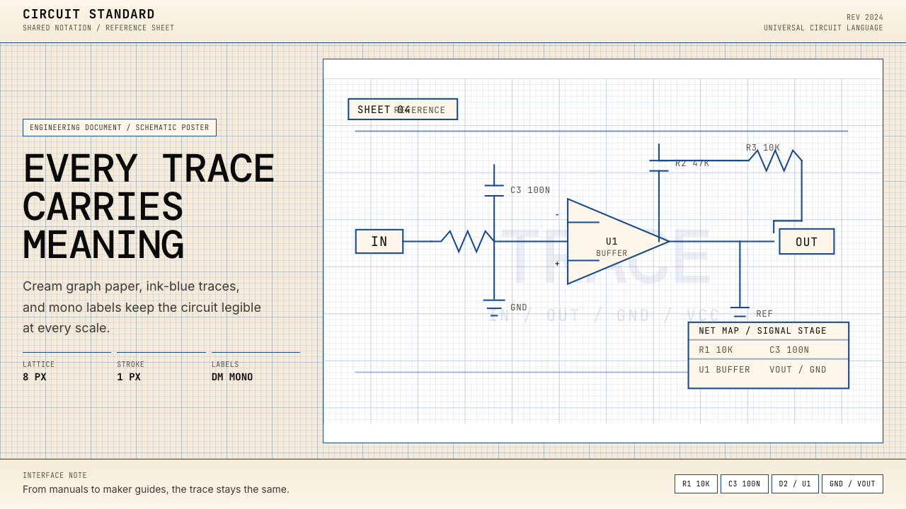 Electrical Schematic WiringAustere and exact. Cream graph paper, ink-blue traces, and mono labels make e…
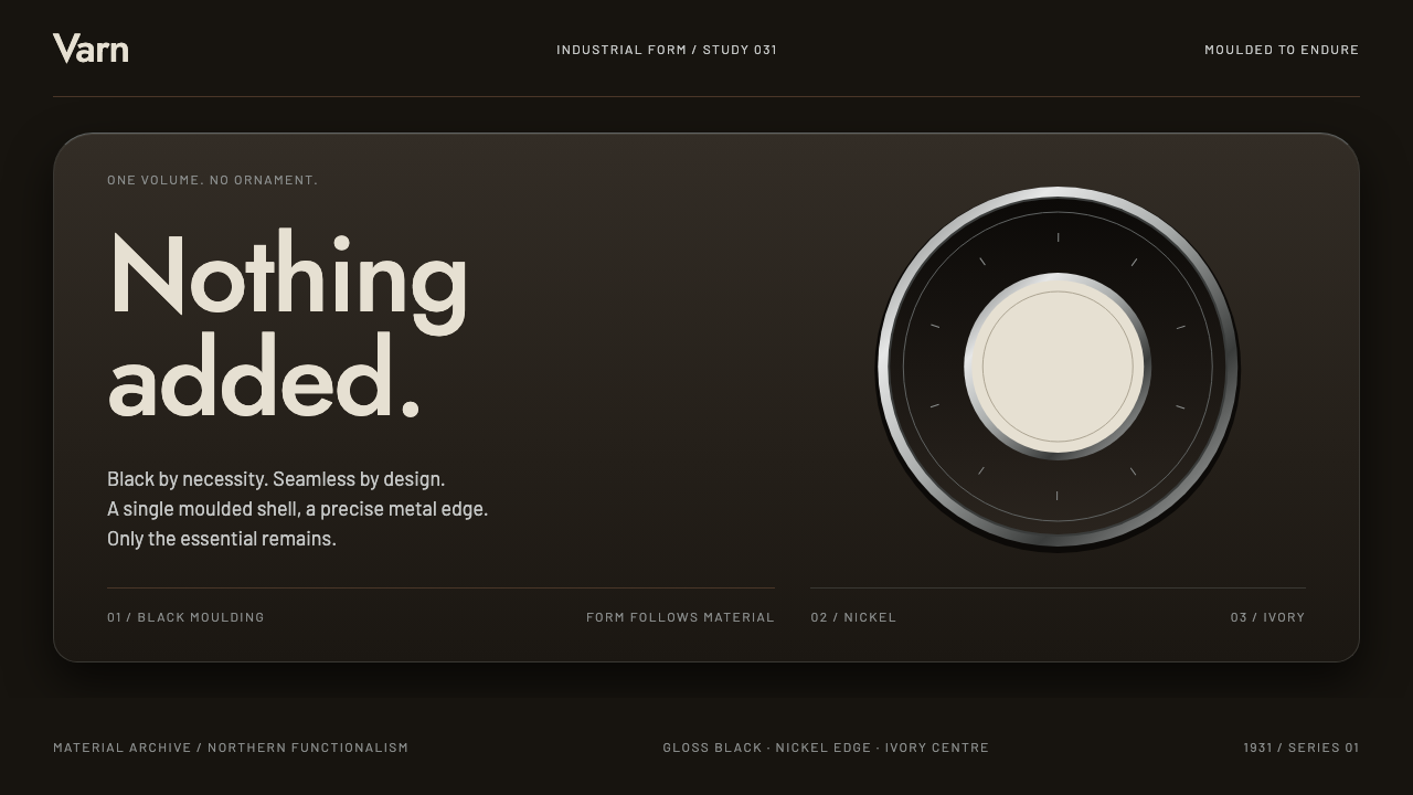 Ericsson Bakelite TelephoneNothing added. Gloss-black shells, nickel rings and ivory type give functiona…
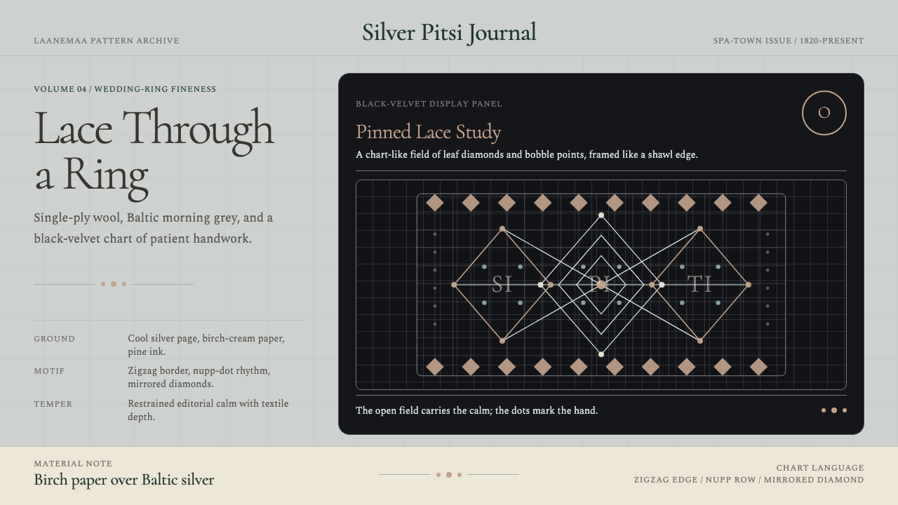 Estonian Haapsalu Lace ShawlQuiet craft, held in silver light. Cormorant type meets nupp dots and velvet…
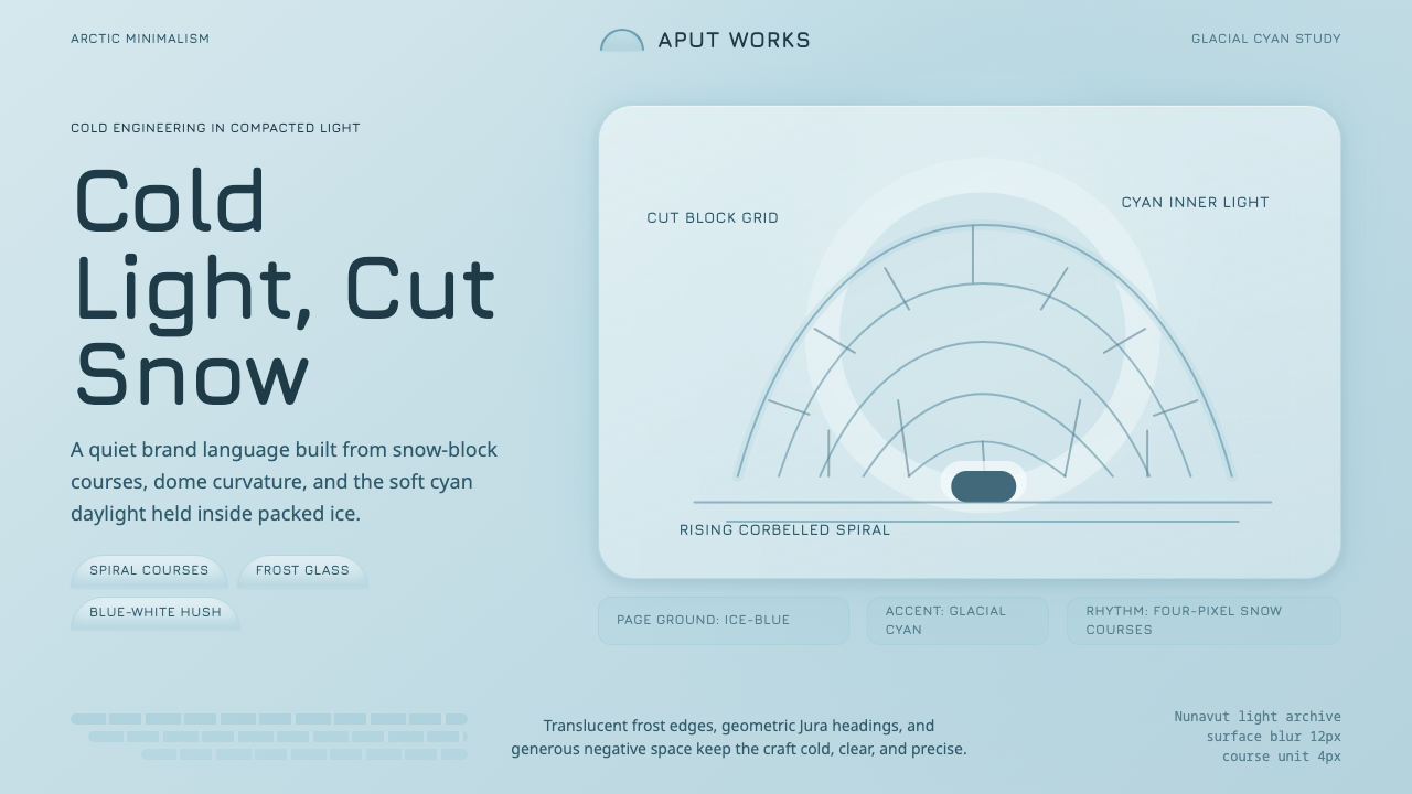 Inuit IglooCold craft, clear light. Glacial cyan and Jura type trace a spiral-block dome…