What is Infinity Nikki?
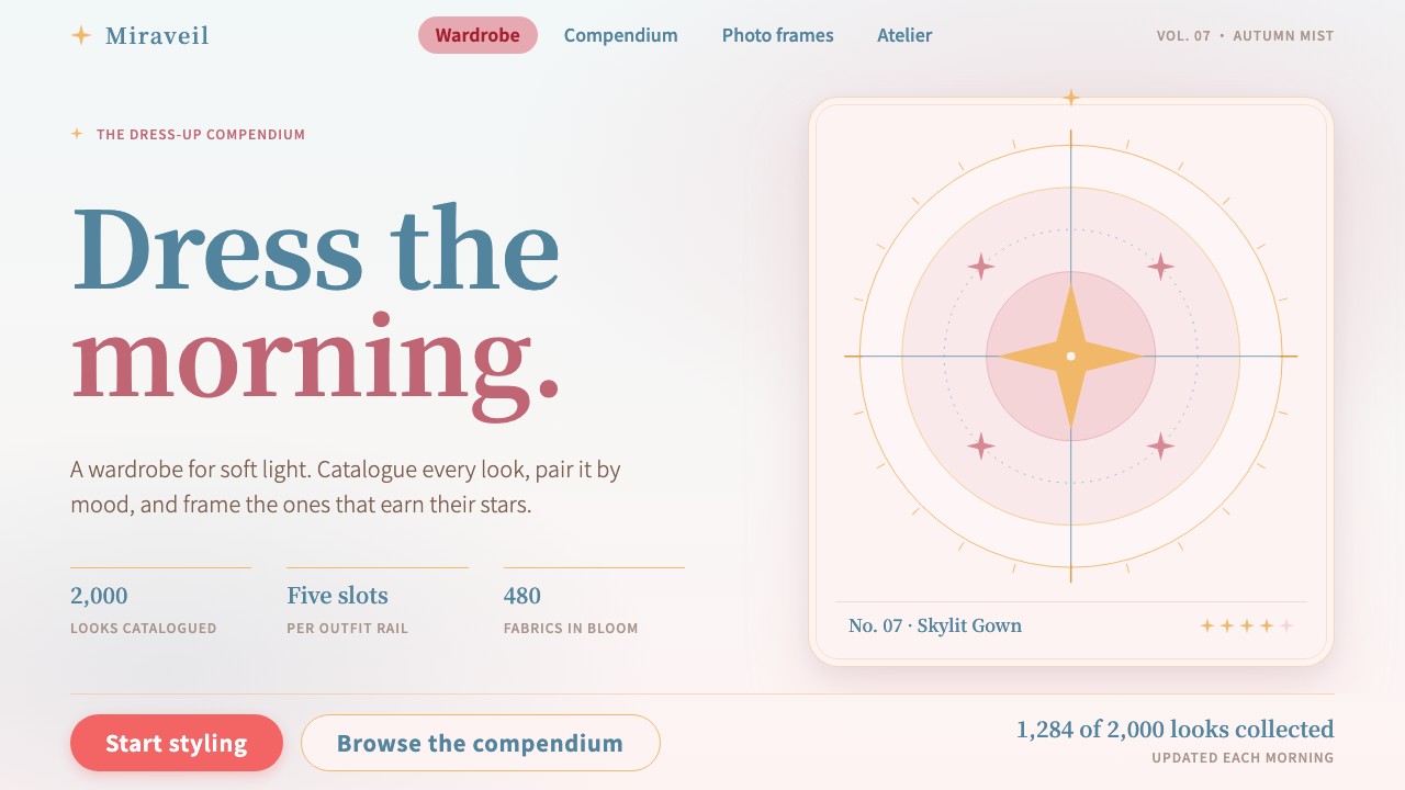
Infinity Nikki’s visual language is morning mist turned into an interface: sky-white ground, sakura-pink accents, a steel-blue serif, and thin gold lines that trim every card like the hem of a gown.
Infinity Nikki in brief
This system is drawn from Infinity Nikki, the fifth game in the Nikki series and the first in the series built as an open world. The series is about dressing up: a girl called Nikki, a wardrobe that grows with every adventure, and a world in which putting together an outfit is the central act of play. The interface language that grew around it is soft, airy and deliberately uncrowded.
The ground is the misty sky-white of Miraland, the game’s setting, closer to a bright morning haze than to flat paper white. Nikki’s sakura-pink hair supplies the primary colour, headings are set in a steel-blue serif taken from the game’s logo, and thin gold lines frame the cards the way trim finishes a dress. The result is feminine without being sugary, and decorative without being loud.
It is a style for interfaces about collecting and dressing up: compendium cards, wardrobe rails, photo frames, scoring panels. Pages should stay gentle, with plenty of white space, and the small ornaments, butterflies and starlight, act as accents rather than as wallpaper. This is a game interface that deliberately avoids looking like a lottery advertisement.

Where does Infinity Nikki come from?
The Nikki series began in 2012 in China and became one of the country’s best-known dress-up and styling game families. Over successive entries it built a loyal audience around a simple promise: that assembling an outfit is a creative act worth a whole game. Infinity Nikki, released on 5 December 2024, is the series’ first open-world adventure, developed in Suzhou, China.
The move to an open world changed the visual question. Earlier entries could present clothes inside menus and stage sets; an open world needed a landscape in which the clothes could live. The team turned to a stylised rendering approach on Unreal Engine 5, with soft light and painterly colour, and the interface language followed: airy backgrounds, thin ornamental lines and a restrained use of pink so that the clothes and scenery could carry the colour.
The origin notes for this system name Yao Runhao and Kentaro Tominaga among the figures connected to the project. The visual period it captures runs from 2024 into 2026, the years of the game’s launch and early seasons, when its identity settled into the pink, sky-white and gold combination described here.
Three currents meet in the result. The first is the Chinese tradition of dress-up and styling games, a genre that treats fashion as play. The second is the open-world adventure, which brings exploration, photography and collecting into the same loop. The third is Unreal Engine 5 stylised rendering, whose lit, hazy, storybook look gives the interface its sense of daylight.
What defines the Infinity Nikki look?
Color
The ground is a very pale, slightly blue-tinted white, like sky seen through haze. Sakura pink is the principal accent and is used for selected states, highlights and the most important buttons. Steel blue is reserved for headings and titles. Gold appears almost only as fine lines and small ornaments. The palette is light throughout, and no dark surface interrupts it.
Typography
Headings use a steel-blue serif with the poise of the game’s logo, often set with generous space around it so it feels like a title on a dress shop card. Body text is a clean, light sans that stays out of the way. The contrast between an elegant serif and a quiet sans gives the pages a feeling of boutique stationery rather than software.
Frames and borders
Cards are outlined in a thin gold line, sometimes with a small corner ornament, so that each one looks like a framed swatch or a tag sewn onto a garment. Borders never thicken or double into heavy frames. The gold is a finish, not a structure: take it away and the layout still works, but it loses its sense of being tailored.
Space and layout
White space is part of the style. Compendium grids leave wide gutters, wardrobe rails show only a few items at a time, and photo frames sit in lots of empty ground. Corners are softly rounded and elements feel like they float lightly rather than lock into a tight grid. The goal is that the player always sees a few beautiful things, never a hundred.
Ornament and motifs
Butterflies, sparkles and small points of starlight are the recurring motifs. They are placed sparingly, usually at the edge of a card or beside a heading, and often drift slightly. They suggest magic and lightness without cluttering the page, and they never cover content.
Tone and motion
The tone is calm, gentle and quietly celebratory. Transitions are soft fades and slow glides, and collecting an item feels like unwrapping something rather than winning a prize. The system deliberately turns down the volume that many mobile game interfaces turn up.

Who shaped Infinity Nikki?
Yao Runhao is named in this system’s origin notes among the key figures behind the project. His association is with the studio in Suzhou that carries the Nikki series, whose steady growth since 2012 made an open-world entry possible.
Kentaro Tominaga is the second figure named in the origin notes. He is connected to the Infinity Nikki project in the period it captures, between its 2024 release and the seasons that followed, when its colour and typographic identity settled.
Nikki is not a designer but the series’ central character, and the system’s palette is built around her. Her sakura-pink hair becomes the primary colour, and the dress-up premise defines every interface type the style is meant for: wardrobes, albums and compendiums.
How do you use Infinity Nikki today?
On slides, use this style for covers and section dividers that want to feel like a boutique lookbook: a sky-white ground, a steel-blue serif title with plenty of air around it, a single pink accent and a fine gold rule. Content slides should show only a few items each, in framed cards, with generous margins. It is a good choice for fashion, beauty, gift and lifestyle presentations.
For web interfaces, it fits collection-based products best: wardrobe or closet apps, sticker and card collection pages, photo albums with frames, and rating or scoring panels. Cards get a thin gold outline and soft corners, selected states turn pink, and headings use the serif. Keep screens uncrowded; show a handful of items per row and let the ground breathe.
On pricing and sign-up pages, apply the style with restraint. A pale ground, one pink primary button and a framed plan card can feel inviting and premium without hard-sell tactics. Because the style deliberately avoids the loud look of lottery and gacha advertising, it works well when you want users to feel looked after rather than rushed.
In editorial and marketing work, it suits campaign pages for seasonal collections, creator showcases and community photo galleries. Pair a large serif headline with a single image in a gold-trimmed frame, and use butterflies or starlight only at the corners. A long article can use pink for pull quotes and steel blue for subheads.
The most common mistake is overdoing the sparkle. Filling every margin with butterflies, adding heavy gold gradients, or using saturated pink on large areas turns the delicate mist into a candy-shop poster. A second mistake is crowding: the style loses its identity as soon as the white space shrinks. Keep pink small, gold thin, and the ground pale.

Infinity Nikki — FAQ
What is the Infinity Nikki style?
It is a light, airy interface style taken from Infinity Nikki, the fifth Nikki game and the first built as an open world, released on 5 December 2024. It combines a misty sky-white ground, sakura-pink accents, a steel-blue serif for headings and thin gold lines framing cards.
Where do the colours come from?
Each one has a source in the game. The sky-white ground comes from the misty daylight of Miraland, the pink from Nikki’s sakura-pink hair, the steel blue from the serif logo, and the gold from the trim on her outfits. That is why the palette feels like one world rather than a set of unrelated swatches.
Is it a good fit for a dashboard?
Not really. The style is built around collecting, dressing up and browsing a few beautiful items, so it works best for galleries, albums, profile pages and soft consumer products. Dense tables and long data views would fight its generous white space.
Why does it avoid looking like a gacha game?
The system keeps pages soft, uncrowded and quiet on purpose. Rather than flashing banners and heavy glow, it uses white space, thin lines and a restrained pink, so that browsing a wardrobe feels like looking through a lookbook, not standing in front of a prize wheel.
Related design styles
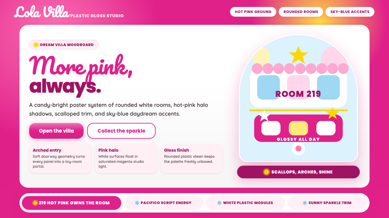 Barbie DreamhousePink is the whole world. Hot magenta ground, Pacifico script, scallops and gl…
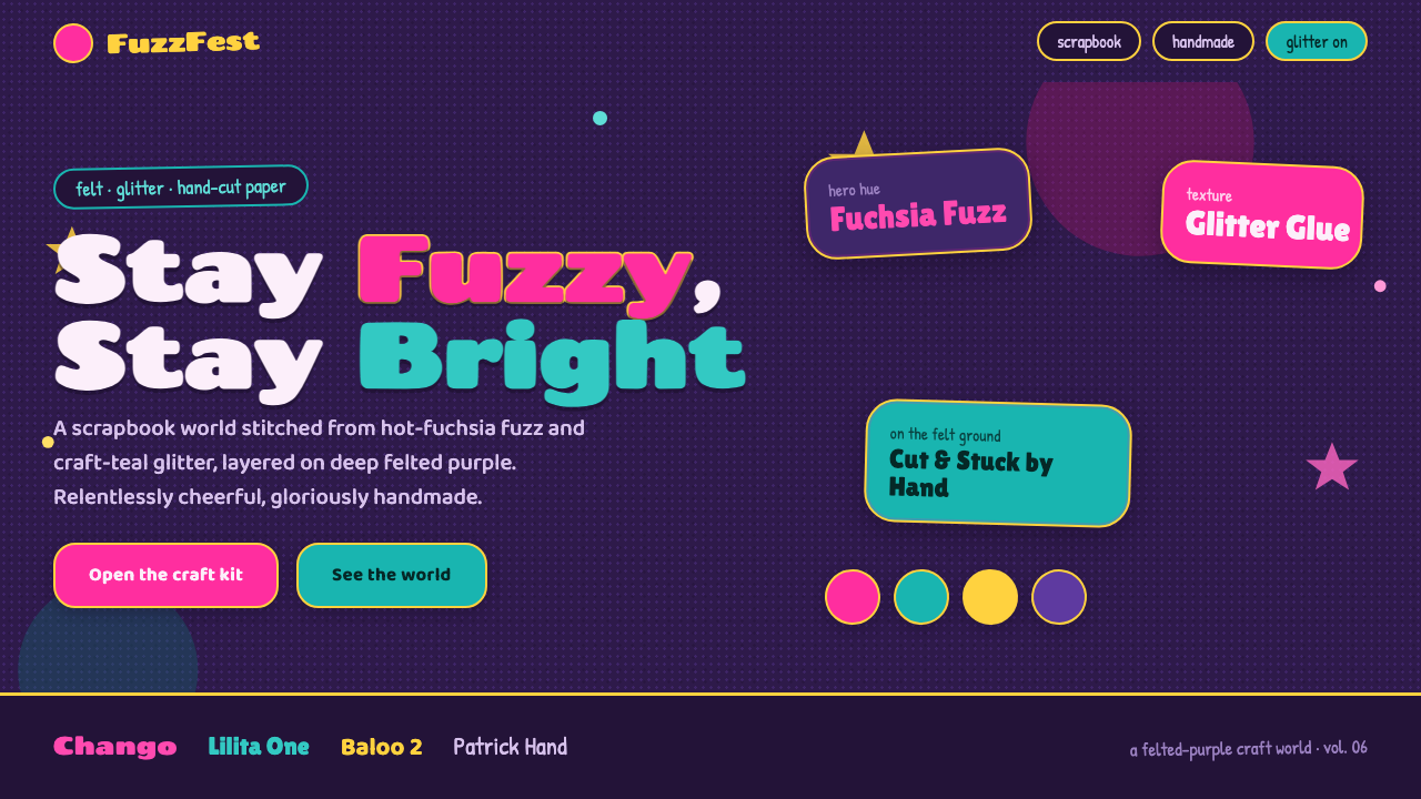 Trolls Poppy Magenta 2016Relentlessly cheerful, gloriously handmade. Fuchsia fuzz and craft-teal glitt…
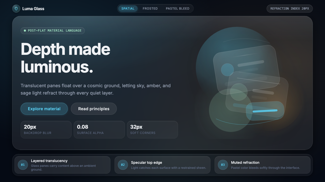 Apple Liquid Glass 2024Skeuomorphism, reborn for spatial. Frosted panels, specular highlights, depth…
 Bing Dwen DwenHuggable ice-gloss. One concentric halo in cyan and stripes, over capsule-rou…
 Bolivian Cholita (Bowler-Hat Fiesta)Loud pride, fully reclaimed. Magenta pollera bands, emerald borders, bowler c…
 Coquette Aesthetic Pink Bow (2023)Softness is deliberate. Dusty pink, cream silk, and strawberry red frame ever…