What is Indie Sleaze?
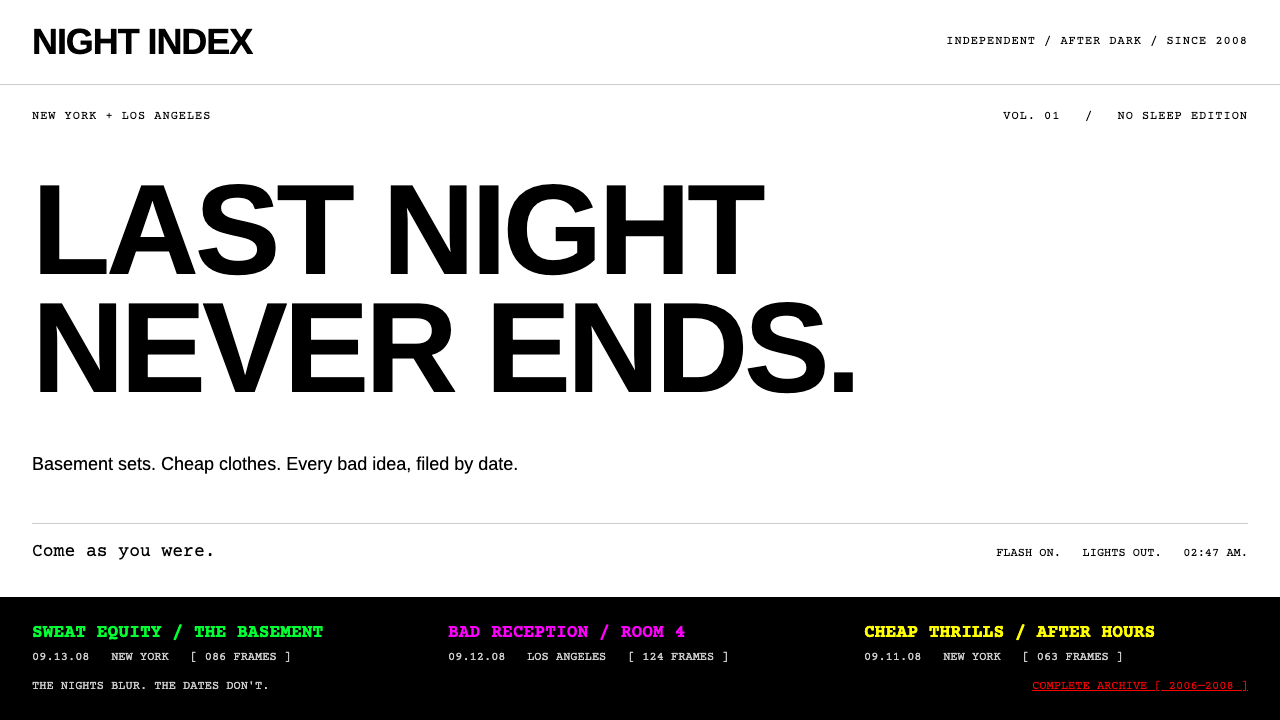
Indie Sleaze is the late-2000s party web: a white wall blown out by an on-camera flash, one tight black headline, and a pitch-black archive of last night's faces.
Indie Sleaze in brief
Indie Sleaze is a visual style that grew out of blog-era nightlife between roughly 2006 and 2012, centred on the party scenes of New York's Lower East Side and Los Angeles. It is less a formal movement than a mood that photographers, bloggers and clothing brands produced without ever agreeing on a name; the label 'indie sleaze' was attached to it years later, once people started to miss it.
The look has two halves that belong together. The day side is an advertisement: a single photograph shot with a flash straight on the subject, a white background so overexposed that it reads as a wall of light, and one line of copy set in a heavy, tightly spaced, all-capitals grotesque. The night side is an archive: a black page, red links, event titles in a monospaced typewriter face glowing in neon green and magenta, and dense grids of small, sweaty snapshots, each one stamped with a date.
What unites the two sides is a refusal to look polished. The flash is harsh, the faces are shiny, the shadow behind the subject is hard and slightly too close, and the layout never apologises for being crowded or blunt. In digital design the style survives as a way of saying that something is current, unguarded and a little dangerous, a deliberate counterweight to soft gradients and friendly rounded interfaces.

Where does Indie Sleaze come from?
The roots of the style lie in the years when nightlife photography moved online. Around 2006, party photographers began posting thousands of unedited snapshots to blogs and social networks within hours of an event. Mark Hunter's archive, The Cobrasnake, became the model: a black page, a long scroll of thumbnails, event names and dates, and a sense that anyone who had been out last night might find themselves in the grid by morning. Nothing was retouched, because speed and candour were the point.
The second source is advertising. American Apparel, led by Dov Charney, ran stripped-down advertisements through the late 2000s, many of them on the back cover of Vice magazine. The formula was almost absurdly plain: one snapshot-style photograph, usually lit with direct flash against a white ground, and a short line of text in a bold Helvetica-style capital face. Terry Richardson's photographic manner, with its on-camera flash, unposed subjects and pale walls, made the same visual language feel like a signature of the moment.
Music culture supplied the soundtrack and the attitude. MySpace pages for small bands, blog-driven discovery of electronic and guitar acts, and the French electronic duo Justice, whose stark black-and-white branding sat comfortably beside the party snapshots, all fed the same atmosphere. The aesthetic was a way of belonging: if your photo, your page or your band looked like this, you were part of a scene that took itself seriously by pretending not to.
The look faded in the early 2010s as smartphones, filters and brand-managed social feeds replaced the raw flash snapshot with something more controlled. It returned as nostalgia in later years, when a younger audience went looking for an era that seemed messier and less performed. The design system here picks up exactly that double life, keeping the white ad page and the black gallery as two modes of one visual identity, so that a site can move from announcement to archive without changing character.
What defines the Indie Sleaze look?
Flash-white ground
The day side is built on an overexposed white that feels lit from the front rather than designed. It is not a calm, neutral page colour; it is the blank wall behind a flash photograph, and the subject sits against it with a short, hard shadow. Because the ground is so bright, everything placed on it, a photo, a headline, a thin rule, looks sharp and slightly confrontational.
Tight black capitals
Headlines are set in a heavy grotesque, all capitals, with letters pulled close together and very little space between lines. The result reads like a slogan printed on a magazine back cover. There is usually one headline and one short line of supporting copy, never a paragraph of explanation, and the size contrast between the two is generous.
Black archive pages
The night side flips the page to black. Links turn red, and the interface behaves like a database of evenings rather than a brand site. This is where the style feels most distinctive: a dark ground that makes small, flash-lit photographs glow, and a sense that the page is a record kept by someone who was actually there.
Neon monospaced titles
Event titles are set in a typewriter-style monospaced face and coloured in acidic neon green, magenta and sometimes a bright yellow. The colours rotate rather than follow a strict hierarchy, so a page of listings looks like a flyer wall. The monospaced letterforms add a utilitarian, log-file feeling that keeps the neon from turning decorative.
Dense thumbnail grids
Photographs are shown small, edge to edge or with minimal gaps, in grids that run for many rows. Quantity is part of the message: the page proves that a night was crowded and that someone documented all of it. Each cluster is labelled with a date, so the layout doubles as a timeline of evenings.
Hard, close shadow
Where shadows appear they are the direct-flash kind: small, dark and offset just behind the subject, with a crisp edge rather than a soft blur. They give photographs and cards a flat, snapshot-like depth and keep the interface from drifting toward the soft elevation common in modern product design.

Who shaped Indie Sleaze?
Hunter is the photographer behind The Cobrasnake, the party archive that defined how nightlife looked online between 2006 and 2008. His format, a black page, a long run of date-stamped thumbnails and a casual, always-present camera, is the template for the dark half of this style. His pictures made it feel normal for a night out to be documented in public within hours.
Richardson's photographic manner, direct on-camera flash, unposed subjects and plain pale backgrounds, helped turn the snapshot into a fashion language. It is a major reference for the white half of the style. His career is also associated with serious public controversy, so designers borrowing his visual shorthand should remember that the look and the person are not the same thing.
As the leader of American Apparel, Charney presided over the advertising that put a single snapshot and a line of bold capitals on the back page of Vice and elsewhere. The formula was so spare that it became instantly recognisable, and it taught a generation of designers that an advertisement could be one image, one line and a lot of white space.
The French electronic duo Justice stands for the music side of the era. Their stark black-and-white branding and club-facing energy sit naturally beside the party photography, and they illustrate how the visual style travelled with the sound: if a band's page looked like this, it signalled belonging to the same scene.
How do you use Indie Sleaze today?
Indie Sleaze rewards restraint in structure and abandon in attitude. Its strength is contrast between a bright, stripped-down announcement mode and a dark, dense archive mode, so the first design question is which of the two a given page should be. Treat them as a pair, not a blend: white pages that announce, black pages that document.
For presentation slides, the white mode makes striking covers and section openers. Use a single flash-lit photograph or a plain bright field, set one line of heavy capitals tightly, and leave everything else empty. Content slides work best as short statements rather than bullet lists. For data slides, switch to the black mode: set labels in the monospaced face, use neon sparingly to flag the one figure that matters, and let the rest recede into the dark.
For web interfaces, the style suits event listings, music and nightlife pages, band sites, photo archives and any product that wants to feel like a scene rather than a service. A dashboard in this mode should behave like a log: dated rows, monospaced titles, red links and restrained neon highlights. Pricing and sign-up pages usually work better in the white mode, with one headline, one price line and a single dark button.
For editorial and marketing work, the format is magazine-back-cover simple: one photograph, one headline, one small line of credit. It is well suited to launch announcements, lookbooks, tour posters and campaign pages for products aimed at people who like a slightly unruly, authentic image. Keep photographs candid, lit from the front and left unretouched, since a polished photograph quickly breaks the illusion.
The most common mistake is treating the style as a costume. Overdoing neon colours, mixing them with soft gradients, adding rounded friendly buttons or using polished stock photography will make it feel like a parody. A second mistake is losing the dark archive half and keeping only the white ads; the pairing is what makes the system feel like a place and not just a poster. Finally, always make sure body text remains readable on black, because the attitude is allowed to be rough but the information is not.

Indie Sleaze — FAQ
What exactly is indie sleaze?
It is the name later given to the look and attitude of blog-era party culture from about 2006 to 2012: direct-flash photography, messy nights in New York and Los Angeles, skinny black clothes, indie and electronic music, and websites that were more archive than brand. As a design style it means flash-white ad pages paired with black, thumbnail-heavy archive pages.
Why does it use both a white mode and a black mode?
Because the original culture had both. The American Apparel advertisements on a Vice back cover were white, bare and slogan-driven, while party archives such as The Cobrasnake were black, crowded and full of dates. Keeping both lets one identity move from announcing something to documenting it without changing character.
Is it the same as Y2K or vaporwave?
No. Y2K is glossy, futuristic and optimistic, and vaporwave is a nostalgic, dreamy remix of consumer imagery. Indie Sleaze is raw and documentary: its visual signature is the harsh flash photograph, not a gradient or a retro-computer motif. It is closer to a nightlife zine than to a futuristic fantasy.
What kind of products suit this style?
It fits event listings, music and nightlife sites, band pages, photo archives, fashion lookbooks, magazines and launch pages for products that want a candid, slightly rebellious tone. It is a poor fit for medical, financial or children's products, where the deliberate roughness would undermine trust.
How do I keep it from looking like a parody?
Limit yourself to one idea per page, keep photographs candid and unretouched, use neon colour only as an accent, and avoid soft gradients and rounded friendly components. Most importantly, keep the structure honest: a plain white announcement or a dense, dated black archive. When the layout is disciplined, the rough attitude reads as intent rather than costume.
Related design styles
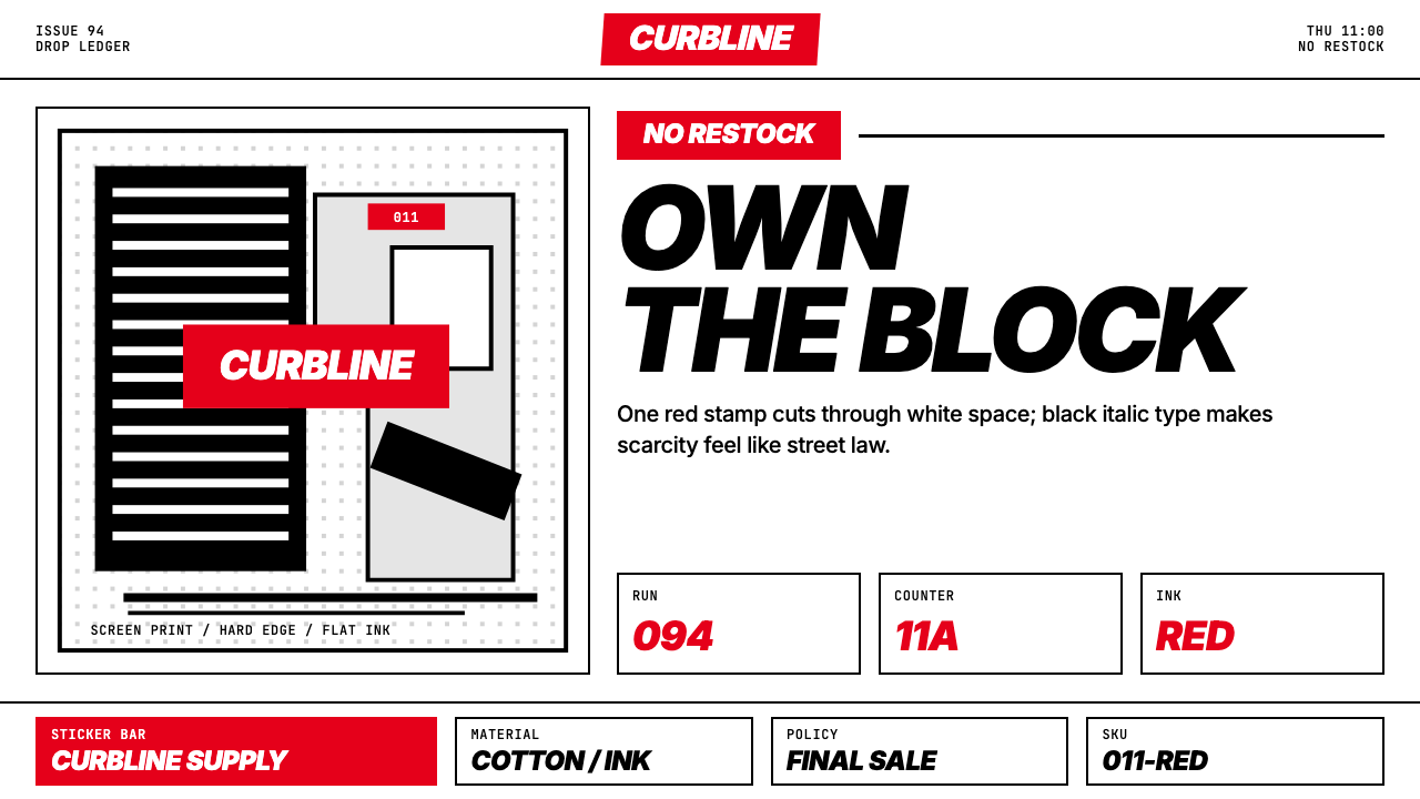 Streetwear (Supreme red)Militant minimalism. A single red box, white field, and black italic grid do…
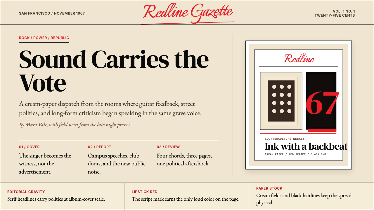 Rolling Stone MagazineCounterculture gets editorial weight. Cream paper, lipstick red script, serif…
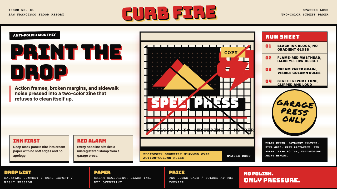 Thrasher Skate Zine (1981)Loud without polish. Flame red type, black ink blocks, and cream zine grids h…
 Wu-Tang Clan — 36 ChambersMythology, not minimalism. Gold-leaf glyph on matte black, cream-yellow rule,…
 Kendrick — To Pimp a ButterflyPolitical weight, printed cold. Cream paper, hard serif type, monochrome crow…
 Muhammad Ali Fight Poster (1965)Type does the fighting. Blood red and dead black collide in a stacked letterp…