What is Indian Railways Timetable?
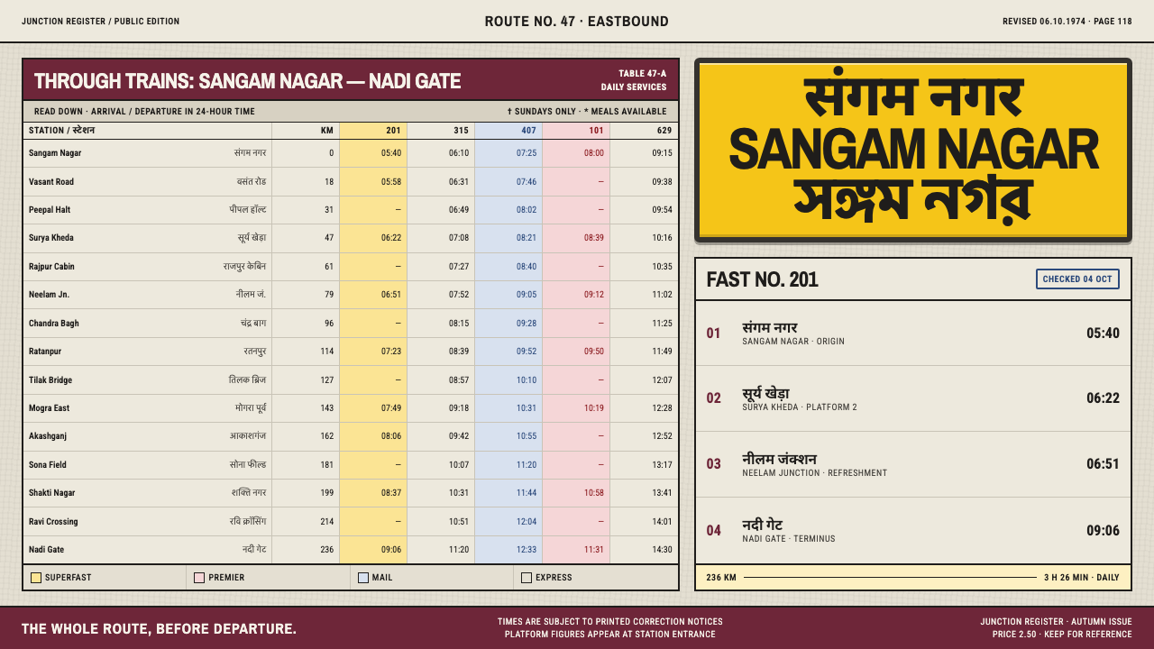
Two halves of one information system: hairline tables on grey pulp that you search rather than read, and black-on-yellow enamel boards you can read through fog.
Indian Railways Timetable in brief
Indian Railways Timetable is the visual language of India's railway information as it appeared in the printed timetables of the 1960s and 1970s and in the station signage that went with them. A national timetable is not a book you read; it is a surface you search. The design that grew around that fact is dense, tabular and utterly unsentimental, and it comes in two halves that never meet in the middle.
The first half is paper. Thousands of departures are pressed into hairline-ruled columns on grey mechanical pulp, with station names set in three scripts and every tint in the table standing for a class of train. The second half is steel. Vitreous enamel plates carry black type on a yellow chosen to survive fog, dust and lantern light. One half is ink soaked into cheap grey stock; the other is loud, glossy and impossible to miss.
What the system refuses is just as defining. There is no soft middle register: no pastel cards, no gradients, no gentle shadows, no decorative flourish between the dense page and the shouting board. Everything is either information packed to the limit or information shouted at a distance. Both are in the service of a passenger who needs one fact, quickly, and does not care how it looks.
Where does Indian Railways Timetable come from?
The roots are in colonial transport publishing, carried into the Indian state. The railway timetable as a genre came from Britain, where the name of George Bradshaw became shorthand for the printed guide to trains. In India that tradition lived on in commercial form as Newman's Indian Bradshaw, issued by W. Newman and Co. of Calcutta, which appeared across the second half of the twentieth century, and in official form as the All-India Timetable, which ran through the 1960s and into the late 1980s. The issues of the 1970s are the reference point for this system.
These books were products of an industrial printing culture. Letterpress tabular composition at industrial scale meant that every figure and rule was set, locked up and printed on a rhythm dictated by the railway's own calendar. The Railway Board and the zonal railways commissioned and controlled the content, and the printing was done at government and commercial presses. Cheap grey paper, small type and narrow columns were not stylistic choices but economies: the point was to fit a whole country's trains into a volume a person could carry and afford.
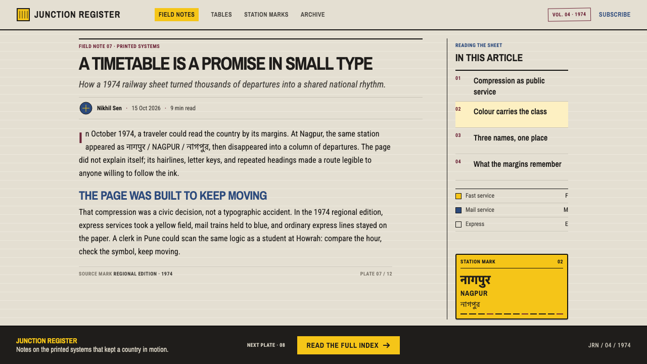
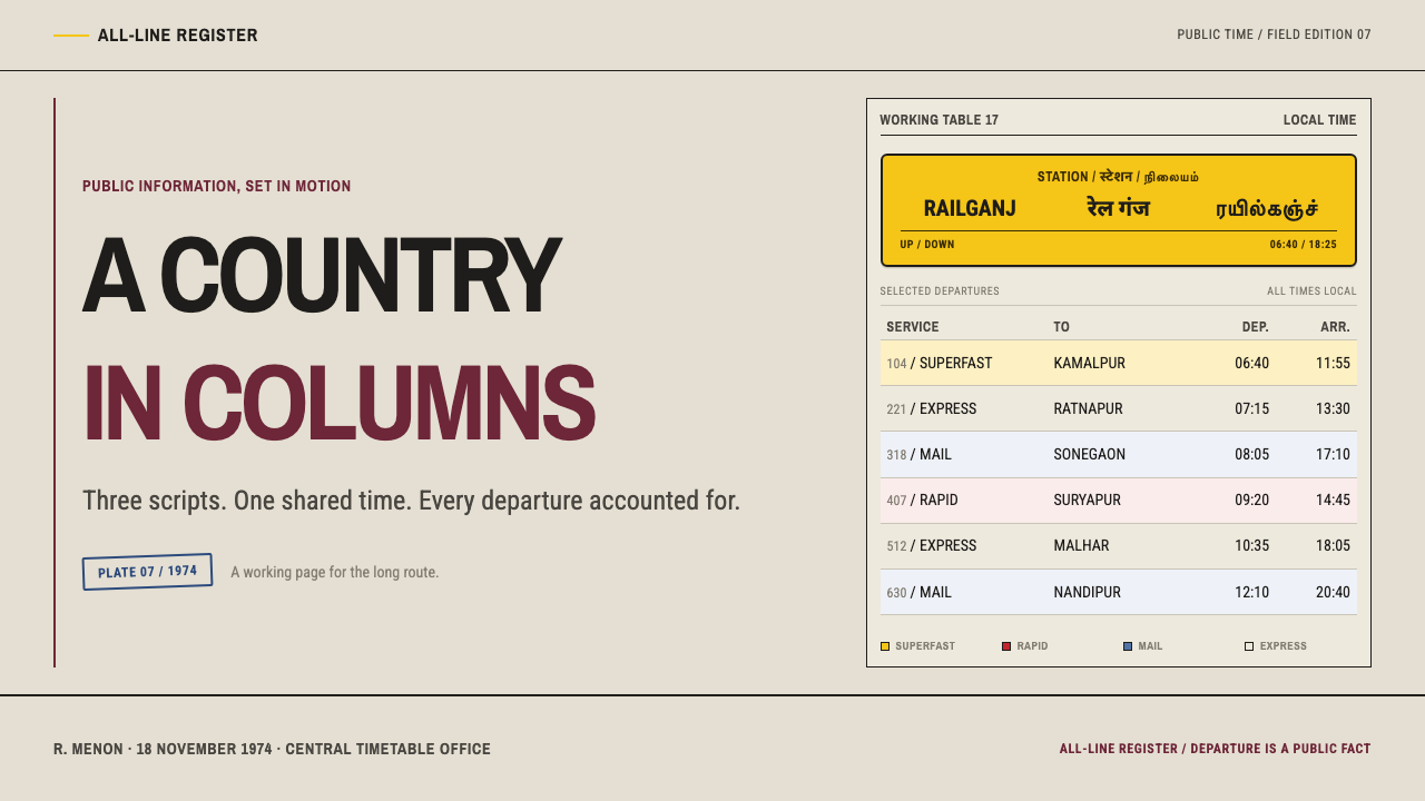
The multilingual dimension is what makes the Indian version distinct from its British ancestors. A station name appears in three scripts: Devanagari, Latin, and a regional script, so that a traveller in any part of the country can find the place they are looking for. Multilingual public information design here was not a gesture toward inclusion but a practical response to a railway that crossed language boundaries every few hours. Setting three scripts of different proportions into the same narrow column forced a typographic discipline that no single-script timetable ever needed.
The other half of the system, the station board, comes from the same institution doing the same job in a different material. The Railway Board's timetable and signage offices were responsible for telling people where the train was going, and the answer outdoors was vitreous enamel: glass fused onto steel, immune to weather, with black lettering on yellow. The yellow was chosen to remain visible in fog, in dust and under a lantern. These are not two designs but one, an information system that speaks quietly on paper and loudly on the platform, with nothing in between.
What defines the Indian Railways Timetable look?
Hairline-ruled density
The timetable page is a grid of hairline rules in near-black ink, with columns narrow and rows tight. The lines are as fine as the press allows, which keeps the ruling from competing with the figures. Density is not a fault to be fixed but the whole point: the reader needs the entire network on one page, so the page is packed to the edge of legibility.
Grey pulp ground
The page is cheap mechanical pulp, a dull newsprint grey that soaks up ink and never shines. It is a neutral, slightly dim ground that suits tiny black type and keeps the dense columns from glaring. The grey is not an aesthetic choice but a consequence of economy, and the design makes a virtue of it by never pretending to be anything finer.
Tint-coded train classes
Tints in the table are not decoration; each stands for a class of train. In the reference issues yellow marks the superfast services, red the premium Rajdhani and Shatabdi trains, blue the mail trains, and the ordinary express is left white. The reader learns the code once and then scans by colour. This is colour as a lookup key, never as mood.
Three scripts to a station
Station names are set in three scripts side by side: Devanagari, Latin and a regional script. The three have different proportions and different densities, and the typesetting has to keep them in step inside a column that was designed to be narrow. The result is a rhythm of mixed letterforms that is unmistakable and has become part of the look of Indian public information.
Vitreous enamel boards
Outdoors the information becomes steel: plates of vitreous enamel, glass fused onto metal, with black lettering on yellow. The surface is hard, glossy and permanent, and the lettering is heavy, simple and large. It is designed to be read at a distance and from an angle, in weather, and to survive decades of dust and rain without losing a letter.
Signal yellow, chosen for survival
The yellow of the boards is not a brand colour. It was chosen because it remains visible in fog, in dust and under a lantern, where paler or cooler colours disappear. Against it, black type reaches the highest contrast the system can offer. The yellow is flat, saturated and loud, and it is meant to feel like a warning because, functionally, it is one.
No middle register
The system lives at two extremes, dense grey ink and loud enamel yellow, and has no gentle register in between. There are no soft cards, no gradients, no pastel tints, no ornamental frames. Anything that sits in the middle, neither as compact as the table nor as loud as the board, is treated as unnecessary, because the two poles already cover every need a traveller has.
Who shaped Indian Railways Timetable?
The Calcutta publisher of Newman's Indian Bradshaw, the commercial railway guide that ran across the second half of the twentieth century. Its volumes carried the Bradshaw tradition into Indian conditions, setting stations in several scripts and cramming a continent's trains into columns of tiny, rigorously ruled figures. It is the clearest example of colonial transport publishing handed down intact to the independent state.
The English printer whose name became shorthand for the printed railway guide. His tradition of compressing complete timetables into small, dense volumes is the genre the Indian timetables inherited. Bradshaw's contribution is less a particular look than a method: treat the timetable as a reference object, build it from tables and rules, and give it the authority of something you consult rather than read.
The institution behind both halves of the system. The Railway Board and the zonal railways commissioned the All-India Timetable, controlled its content and had it printed at government and commercial presses; the same offices lay behind the enamel station boards. That one body was responsible for both paper and steel explains why the two feel like parts of a single design, with the same priorities of clarity, durability and economy.
How do you use Indian Railways Timetable today?
Indian Railways Timetable is the right reference when information density is the product: schedules, logistics boards, comparison tables, directories, reference sheets. It rewards a designer who trusts the reader to scan, and it punishes decoration. The central skill is to be comfortable with two extremes at once and to refuse everything in between.
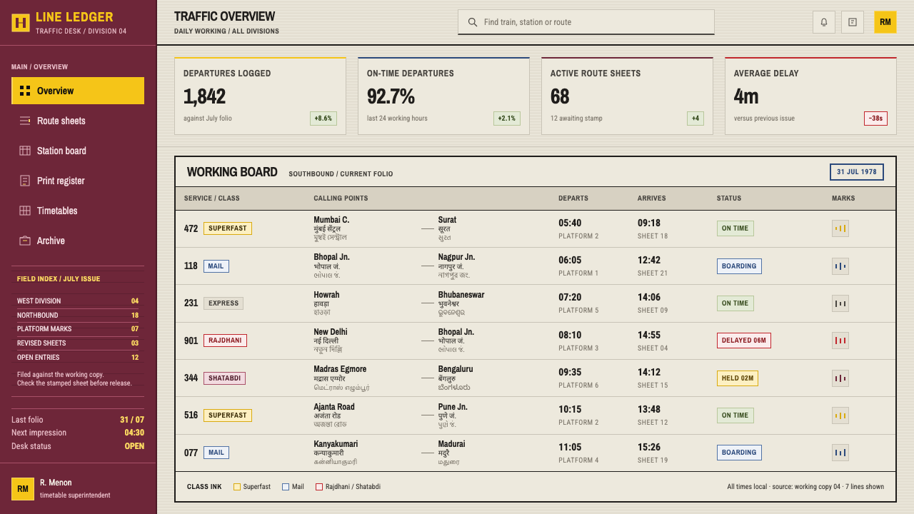
For slides, use the system for cover pages and data pages. A cover works as a flat signal-yellow field with a single line of heavy black type, as direct as a station board. Content slides can be tables: thin ruled lines in near-black, small type, restrained grey ground, with tints reserved to mark categories. Data slides are strongest when they behave like a timetable, with rows of values, aligned columns and colour used as a code rather than for emphasis.
For web interfaces, the style suits schedules, status boards, operations dashboards, admin tables and pricing comparisons. Keep the page grey or neutral, rule rows with hairlines, and let colour flag a class or a state. Put a loud yellow-and-black block where the user must not miss something, such as a delay notice or a platform change. Resist the temptation to soften it into a card with a shadow. On screens, keep the density but make sure type remains readable at normal viewing distances; compactness should never mean strain.
For editorial and marketing work, the dense half supports reference-style publications, directories, annual statistics and travel guides, while the loud half works for posters, banners and wayfinding. Marketing pages can alternate a quiet, tabular section with a single enamel-yellow call-to-action block. The strength of the design is its contrast of registers, so keep each section unmistakably in one mode or the other.
The common mistake is to soften the poles: turning signal yellow into a pastel, adding gradients to the grey, or placing rounded cards between the dense table and the loud board. Another is using tints decoratively instead of as codes, so that the colour no longer tells the reader anything. A third is to multiply the number of classes until nobody can remember the key. Each tint should mean one thing, be explained once, and be used consistently.
Indian Railways Timetable — FAQ
Is a dense table really acceptable on a modern screen?
Yes, if you separate density from illegibility. The timetable is dense because readers must find one fact in a very large set, and a compact table with firm alignment serves that better than a scattering of airy cards. On screen, keep the compactness, hold row rules to fine lines and use real table alignment, but never shrink text below comfortable reading size. The goal is to inform at a glance, not to recreate the print limits of cheap pulp.
Why is the board yellow, and can I use another bright colour?
The yellow was chosen for survival: it stays visible in fog, in dust and under lantern light, and black lettering on it gives the strongest contrast available. Another bright colour might look similar in a mockup but lose that function in poor conditions. In design terms, keep the yellow if your use case also needs a warning-grade attention signal; if it does not, this is probably not the right style.
How many tints can I use for categories?
As few as the reader can learn at a glance. The original code works because a handful of tints each map to one class of train and the plain white row means the ordinary case. Add a new tint only if it carries a distinct meaning, and put the key where it can be found. If a tint is only there to make the table look lively, remove it.
Can this style work on a dark background?
The paper half depends on ink on grey stock, so its natural form is light. The enamel half can invert, since a bright yellow plate has its own ground, but it should still behave as a flat block with solid black type. Dark interfaces can borrow the signal-yellow-on-black logic for alerts. Avoid translating the whole system to dark, because the dense grey page loses the very quality that made it readable.
Is this a retro or nostalgic style?
It can be used that way, but its origin is functional rather than nostalgic. The pulp grey, the narrow columns and the enamel yellow were the result of economy, durability and the need to be read in poor conditions. Used with that logic, the style feels current wherever dense information meets urgent signage. Used only for atmosphere, it becomes a costume, and it works less well.
Related design styles
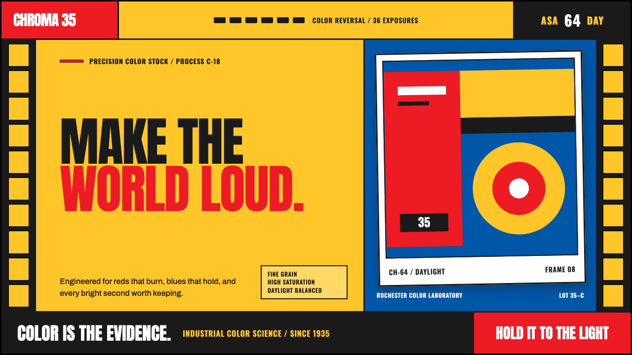 Kodak Film (1935)Color arrives at full volume. Chrome yellow, signal red and filmstrip geometr…
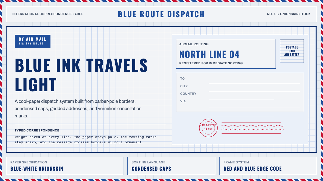 Par Avion Air MailPostal lightness made strict. Onionskin blue, Oswald caps, and red-blue edge…
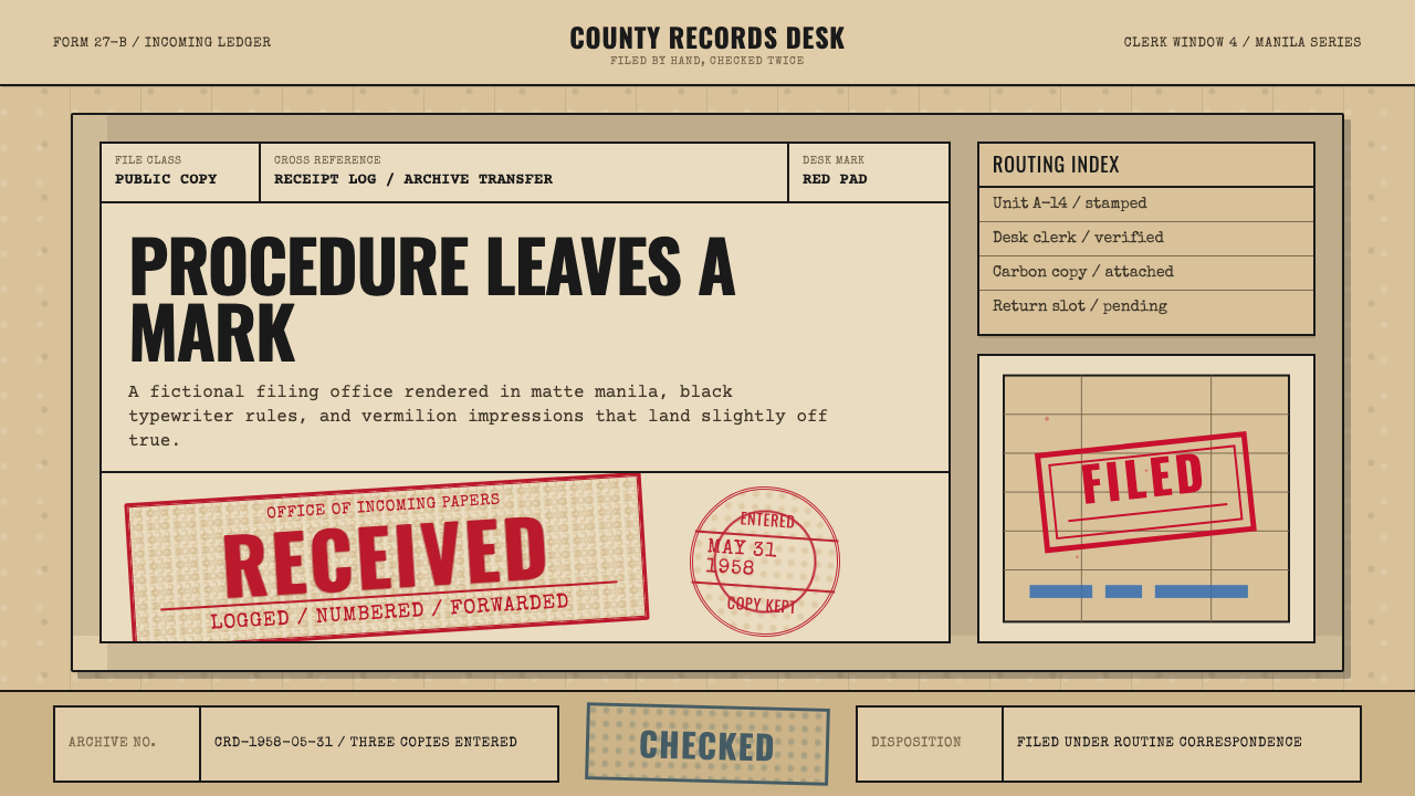 Office Rubber StampsProcedure made visible. Vermilion Oswald stamps strike a manila logbook grid.
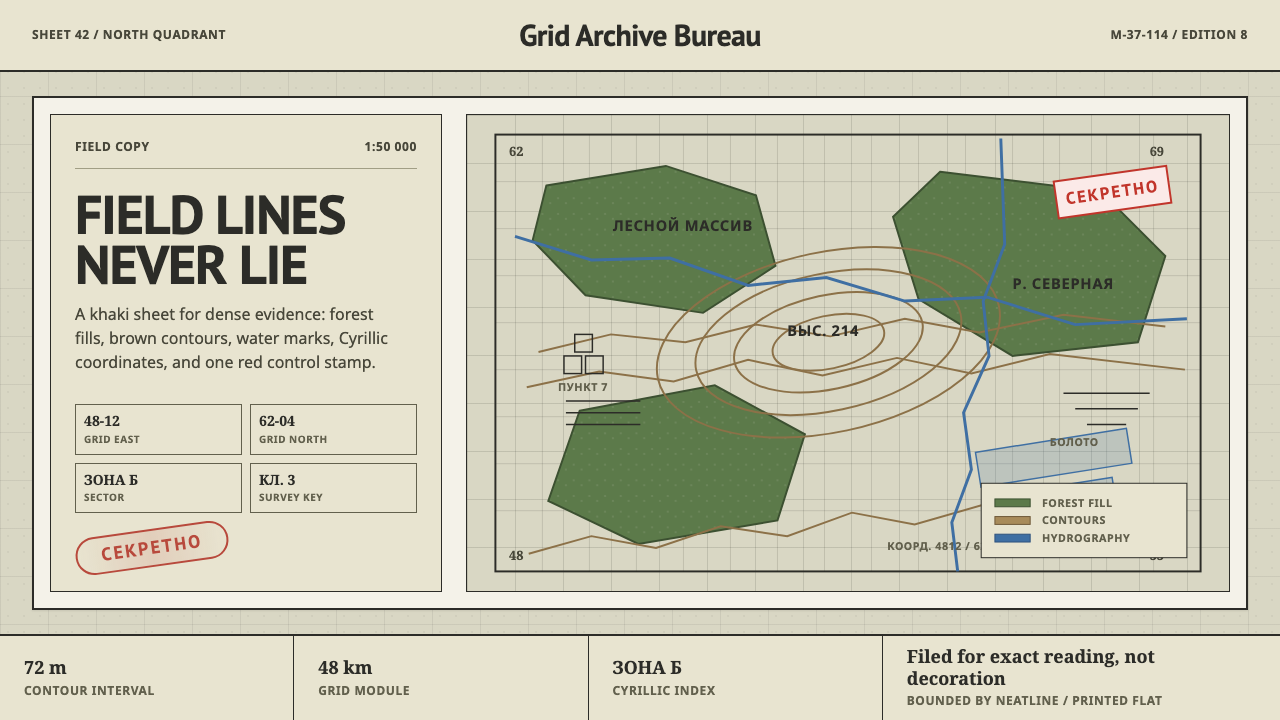 Soviet Classified MapAustere field intelligence. Khaki grid, forest green fills, brown contours, r…
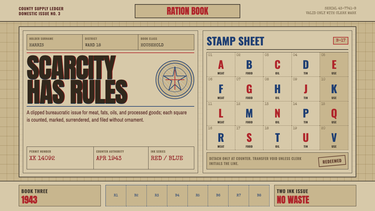 Wartime Ration CouponScarcity made visible. Buff card, red-blue overprint, and perforated grids do…
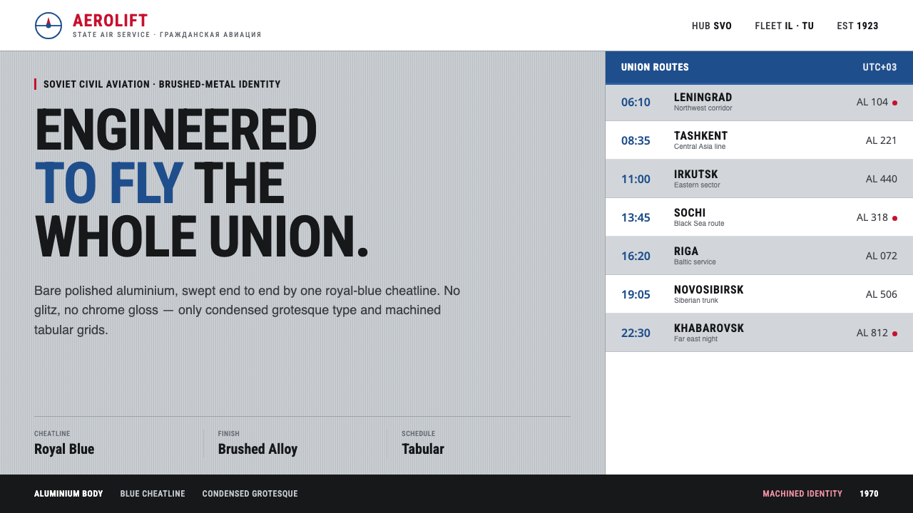 Aeroflot Soviet AirlineEngineered restraint rules. Silver ground, royal-blue cheatlines, and flat gr…