What is Indian Dhaba Truck-Art Menu?
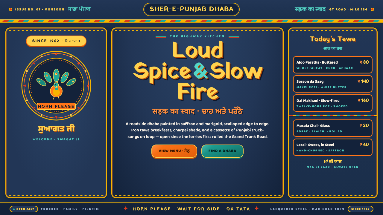
Indian Dhaba Truck-Art turns a steel truck panel into a traveling feast — lacquered color, hand-lettered language, scalloped borders, and enough ornament to make the highway itself feel celebratory.
Indian Dhaba Truck-Art Menu in brief
Indian Dhaba Truck-Art is a living vernacular style rooted in the decorated lorries of Punjab and the Grand Trunk Road highway corridor in North India. It treats every steel panel as a public-facing canvas, covering deep indigo fields with saturated saffron, marigold yellow, turquoise, and chili red. The result is not quiet decoration but highway maximalism: warm, loud, lacquered, and designed to be noticed in motion.
The visual system brings together several working traditions rather than a single formal school. Indian truck art supplies the painted vehicle surface and exuberant color; Phulkari and folk ornament traditions contribute floral rhythm and patterned density; highway vernacular signage contributes bold lettering, outlined forms, and immediate readability. Roadside dhaba culture gives the system its emotional temperature: generous, social, theatrical, and unapologetically abundant.
Its darkness is structural rather than moody. Deep indigo-blue panel fields provide the night-like ground from which the warmer colors glow, while chrome trim and reflective tape catch passing light. Scalloped borders, floral edging, painted separators, and hand-lettered signage occupy the surface edge to edge. Nothing is treated as leftover space. The charm comes from the way every mark appears to belong to a larger moving object, a roadside meal, or a message meant for travelers.
Where does Indian Dhaba Truck-Art Menu come from?
The style belongs to the post-Partition rise of long-haul trucking, with its strongest identity formed between 1950 and 1990 along Punjab and the Grand Trunk Road highway corridor. As trucks became visible carriers of goods, people, and regional identity, their steel bodies offered a moving public surface. Painting the vehicle was therefore both practical decoration and a declaration of presence: the truck announced itself before it arrived, and its painted panels traveled far beyond the place where they were made.
The word dhaba names the roadside setting that gives this design system its atmosphere. A dhaba is understood here through its cooks, its highway location, and its role as a generous stop along a long journey. The visual language mirrors that setting through abundance rather than restraint. Warm color, dense ornament, reflective trim, and assertive lettering make the vehicle feel connected to food, hospitality, traffic, and the shared theater of the road.
The makers were not presented as a named artistic movement with a single author. Anonymous truck-painting karigars, or sign-painters, developed the surfaces through practiced handwork; roadside dhaba cooks belonged to the cultural world the imagery served; highway sign-letterers shaped the language of public communication. Their work sits alongside Indian truck art, Phulkari and folk ornament traditions, and highway vernacular signage as a living continuum rather than a closed historical style.
That continuity is central to understanding the system. It does not reproduce a museum artifact or freeze a regional vocabulary into a decorative theme. It carries forward the logic of the decorated lorry: saturated marks against a dark panel, borders that frame rather than disappear, lettering that functions as both message and ornament, and a surface designed to meet the eye from a distance. Its historical force comes from remaining useful, visible, and socially embedded.
What defines the Indian Dhaba Truck-Art Menu look?
Indigo Ground
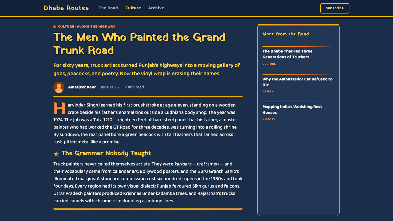
Deep indigo-blue is the system's foundational field, recalling painted steel and giving the warmer colors room to glow. It creates a dark, continuous body across which lettering, flowers, borders, and reflective details can travel. The ground is not empty background; it is the visual mass that makes every saturated mark feel luminous.
Lacquered Saturation
Saffron, marigold yellow, turquoise, and chili red are used with unapologetic intensity. Their purpose is not subtle tonal modulation but visual heat and immediate recognition. Against indigo, the palette behaves like painted enamel or fresh roadside signage: strong, glossy in spirit, and alive under changing light.
Scalloped Framing
Scalloped borders frame panels from edge to edge, turning the perimeter into an active ornamental band. The repeated curves soften the hard steel surface without making it delicate. They announce that the whole panel has been composed, including its boundary, and that no transition between one area and the next should be visually careless.
Hand-Lettered Authority
Bold Gurmukhi and Devanagari lettering anchors the composition through mass, outline, and rhythm. The letters are not neutral captions placed after the image; they are painted forms with their own decorative force. Their hand-made presence keeps the system warm and local, while their strong silhouettes preserve readability amid dense ornament.
Floral and Folk Density
Floral edging and folk ornament fill the surface with rhythm rather than random noise. Motifs can repeat, gather, and press against lettering or borders, producing the sense of a panel that has accumulated care over time. The density is generous but organized: recurring shapes and color families keep maximalism legible.
Chrome and Reflection
Chrome trim and reflective tape introduce flashes of hard brightness into the painted field. These details connect the style to actual road conditions, where a vehicle is seen through movement, distance, glare, and changing daylight. Reflection is therefore part of the identity, not a finishing effect added for polish.
Who shaped Indian Dhaba Truck-Art Menu?
The anonymous truck-painting karigars, or sign-painters, are the hands behind the decorated steel surface. Their contribution is not a signature style attributed to one celebrated individual but a shared craft of saturated color, ornamental framing, outlined lettering, and confident placement across moving vehicles. They turn functional transport into a recognizable public image while preserving the directness of hand-painted work.
Roadside dhaba cooks represent the social world that gives the system its warmth and appetite. Their presence in the source tradition links ornament to hospitality, travel, and the promise of a generous stop on the highway. In the design language, this becomes abundance: color that feels served rather than rationed, lettering that calls attention, and surfaces that welcome the passerby through sheer visual energy.
Highway sign-letterers shape the system's public voice. Their work makes Gurmukhi and Devanagari lettering simultaneously communicative and ornamental, using bold silhouettes and painted outlines to hold attention from a distance. They demonstrate that typography in this tradition is not a separate layer of information but one of the main painted structures of the vehicle.
How do you use Indian Dhaba Truck-Art Menu today?
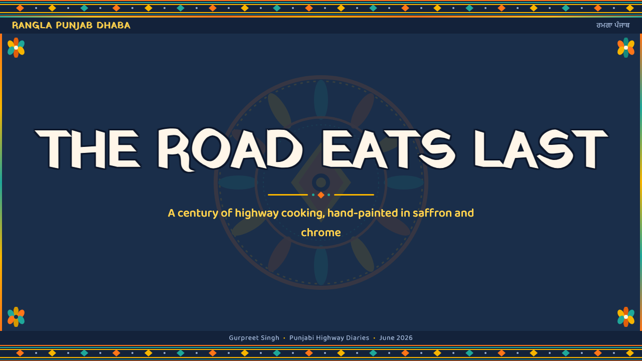
For presentation slides, use the style as a complete atmosphere rather than a decorative cover treatment. A cover can establish the deep indigo field, a broad saffron or marigold gesture, and a prominent hand-lettered title framed by scalloped edging. Content slides should preserve that visual voice while giving text a clear resting place inside the ornament. Data slides can treat charts, labels, and callouts as painted sign elements: highly visible, outlined, and arranged with enough contrast to remain legible through the surrounding richness.
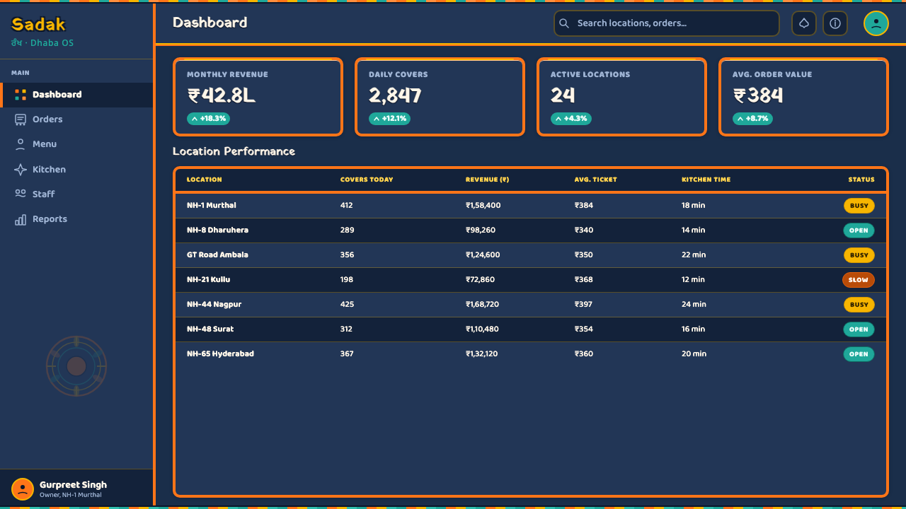
For web interfaces, the system suits dashboards, logistics tools, travel products, and pricing pages that want to feel energetic, regional, and immediately recognizable. Use indigo as the continuous structural ground, reserve the warm saturated colors for actions and states, and let borders carry some of the personality. Cards can feel like painted panels, while navigation can borrow the authority of highway signage. The key is to keep functional labels bold and readable even when floral edging, reflective accents, and ornamental framing are present.
For editorial and marketing work, Indian Dhaba Truck-Art supports a strong poster and menu sensibility. Articles can use indigo section fields, colorful side notes, hand-lettered display moments, and floral or scalloped rules to distinguish passages without becoming sterile. Marketing pages can present offers, menus, or travel stories as generous painted panels, with chrome-like separators or reflective accents suggesting the movement of the road. The style is especially effective when the message itself should feel hospitable, abundant, and difficult to ignore.
The most common mistake is confusing maximalism with indiscriminate accumulation. Adding every color, border, flower, letterform, and reflective detail at once can flatten the hierarchy and make the page feel noisy rather than alive. The system needs a dominant indigo ground, a clear lettering anchor, and recurring ornamental logic. Saturation should create emphasis, not erase it; borders should frame the message, not compete with it; and the hand-painted character should remain legible rather than being imitated through random distress.
A second mistake is polishing away the vernacular character. Perfectly uniform geometry, restrained corporate spacing, or generic digital lettering can make the result look like a themed interface instead of truck art. The goal is not to reproduce physical imperfection mechanically, but to preserve the sense of human placement, regional language, dense care, and roadside visibility that makes the style distinctive.
Indian Dhaba Truck-Art Menu — FAQ
Is Indian Dhaba Truck-Art the same as generic Indian truck art?
They overlap but are not identical. Indian truck art is the broader vernacular tradition of decorating lorries, while this Curio system focuses on the highway-dhaba atmosphere within that tradition. Its defining emphasis is the combination of deep indigo panel fields, saffron and marigold color, turquoise and chili red, scalloped framing, chrome trim, reflective tape, and bold Gurmukhi or Devanagari signage. The result is a particular mood of roadside abundance rather than a complete account of every truck-art variation.
Why is the background so dark?
The deep indigo ground connects the visual system to painted steel panels and gives the saturated warm colors their glow. It also supports the highway setting, where chrome and reflective tape can catch changing light. A light background would be possible in an adaptation, but it would shift the style away from its lacquered vehicle presence and reduce the contrast between the dark body and the bright painted marks.
How should the lettering be handled if Gurmukhi or Devanagari is not available?
The essential quality is not merely the script name but the role of lettering as a painted structural element. Use bold display lettering with a strong silhouette, visible outline, and enough presence to anchor the panel. It should feel hand-placed and public-facing rather than like a quiet caption. However, an adaptation should not invent pseudo-Gurmukhi or pseudo-Devanagari characters; when the actual scripts are unavailable, preserve the visual logic without pretending to reproduce the language.
Can this style be used for a restrained or luxury brand?
It can work when the brand wants expressive regional character, hospitality, and memorable abundance, but it will resist a conventional quiet-luxury position. Reducing the palette, removing the borders, and replacing hand-lettered authority with delicate typography may make the result more refined, but it also removes the system's central identity. The strongest use accepts its warmth and theatricality, then controls hierarchy so the richness feels intentional rather than uncontrolled.
What makes the style feel authentic rather than themed?
Authenticity comes from preserving the relationships among surface, language, border, and road visibility. The dark field should support bright painted marks; the lettering should function as both message and ornament; scalloped or floral framing should organize the perimeter; chrome and reflective details should suggest a vehicle encountered in motion. If these relationships disappear and only bright colors remain, the result becomes generic decoration. The style is convincing when every flourish seems connected to a working public surface.
Related design styles
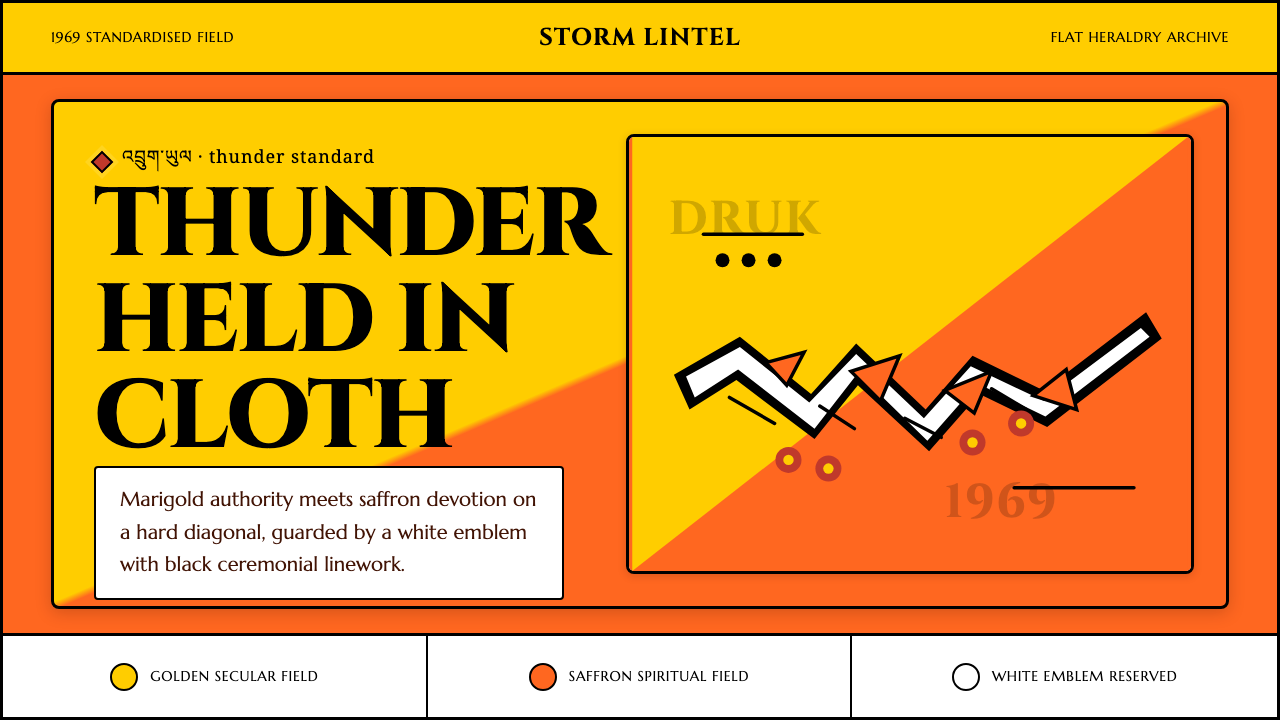 Bhutan Thunder Dragon FlagHeraldry hits like thunder. Marigold and saffron split hard around a white em…
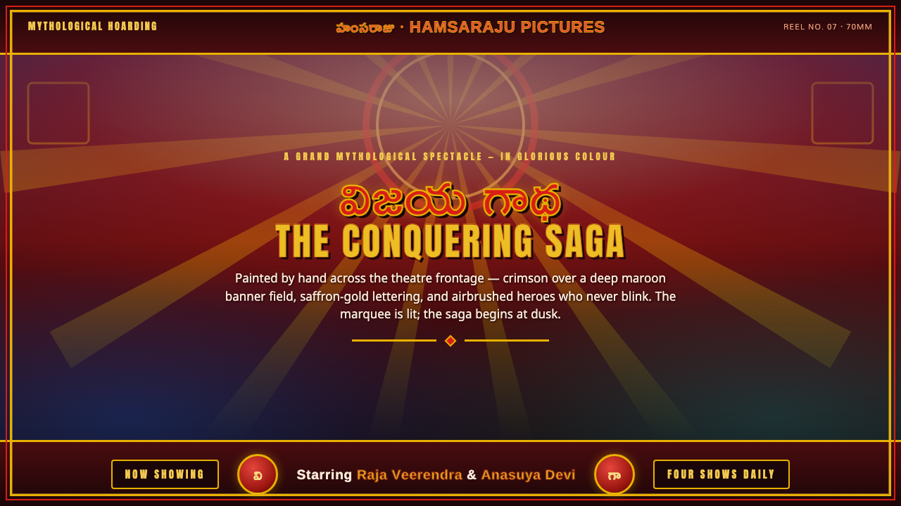 Telugu Tollywood PosterMythological marquee maximalism. Crimson over maroon, gold-outlined Telugu di…
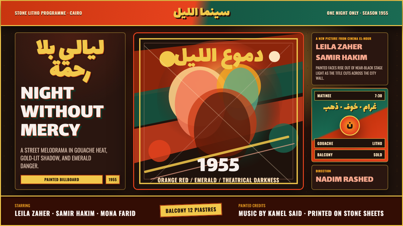 Egyptian Film Poster (Cairo)Melodrama at billboard scale. Near-black ground, ruq'ah titles, orange-red ag…
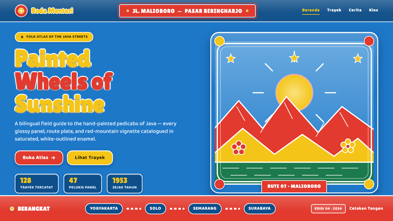 Javanese Becak Folk ArtFolk painting at full volume. Sky-blue enamel, red mountains, white-outlined…
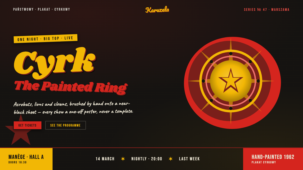 Polish Cyrk Circus PosterPainterly state-circus maximalism. Vermilion and circus yellow blaze from nea…
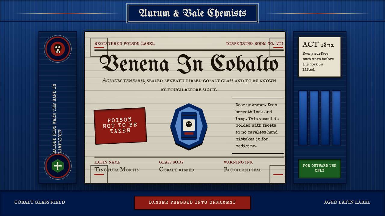 Apothecary Poison LabelDanger made ornate. Cobalt ribs, aged paper, and red POISON rules make fear t…