What is The Incredibles?
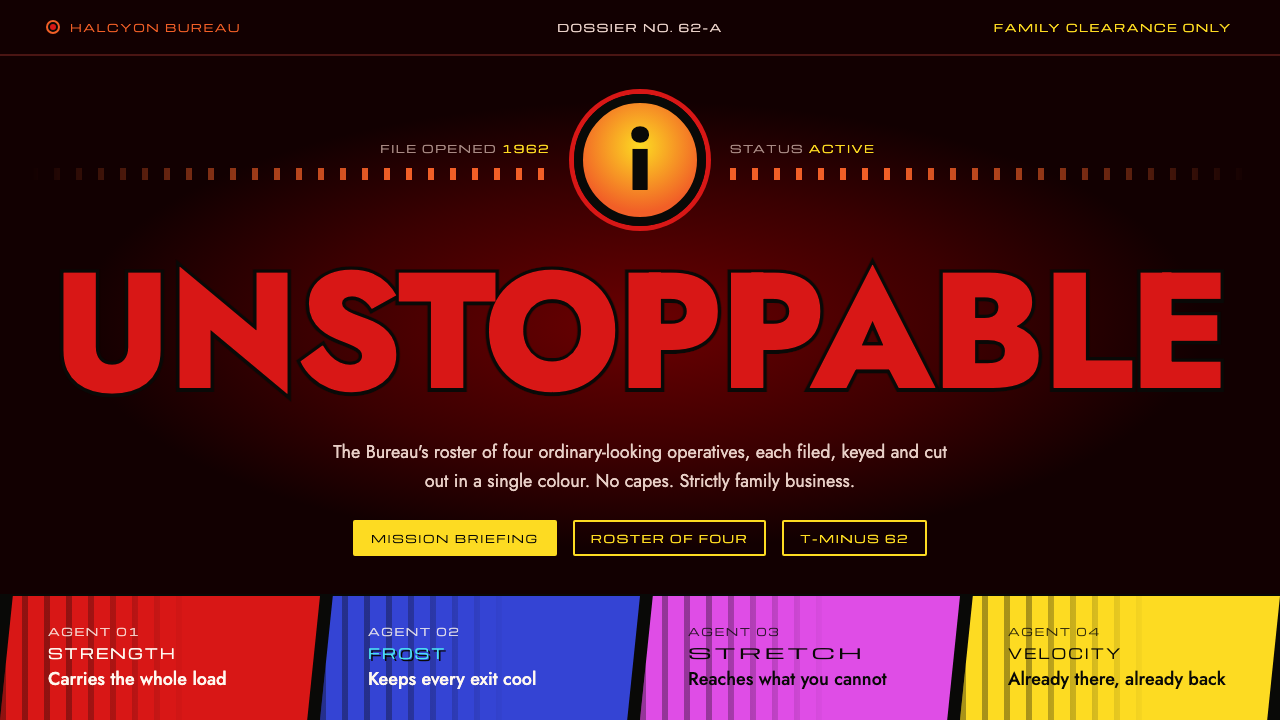
The Incredibles style is a 1962 spy dossier lit by suit red: flat cut-out shapes, slanted credit cells and heavy geometric capitals on a near-black, crimson-warmed void.
The Incredibles in brief
The Incredibles style is a design language drawn from Pixar's 2004 film: the lit red of the family's suit, the orange-and-yellow 'i' emblem inside a black ring, and a near-black background warmed by a single crimson glow. It is graphic rather than rendered. There is no metallic sheen and no lens flare; instead, the look depends on flat colour and hard-edged, cut-out shapes.
Its second source is the film's end-credit sequence, which borrows from early 1960s spy-film title design. Layouts are built from slanted parallelogram cells, with one colour assigned to each character, so a page reads like a dossier opened in a smoky office. Headings use heavy geometric capitals, while names and labels use a wide credit-roll grotesque.
The effect is confident, energetic and a little retro-futuristic. It tells stories about people and missions, which is why it suits character files, briefings, event pages and anything that should grab attention at a glance while still carrying a sense of narrative.

Where does The Incredibles come from?
The Incredibles was released by Pixar in November 2004, and the studio that made it was based in Emeryville, California. The film was written and directed by Brad Bird, who proposed a family of superheroes living in a world shaped by the optimism and anxiety of the early 1960s. That period setting is the root of the visual language: the story's technology, architecture, furniture and graphic design were all imagined as if the Space Age had arrived and never ended.
The look draws on three connected traditions. The first is 1960s spy-film title design, in which studios used flat, abstract, cut-out shapes in motion to introduce a story. The second is mid-century modern design, with its clean geometry, confident colour and love of simple forms. The third is Space Age retro-futurism, the idea of an optimistic tomorrow drawn with rockets, curves and angular lines. Together they give the film a world that feels sleek and stylised rather than realistic.
Among the people usually associated with the film's design and sound are director Brad Bird, producer John Walker, composer Michael Giacchino and designer Teddy Newton, who is known for the end-credit sequence. The credits are a showcase for the film's graphic thinking. Characters are reduced to bold silhouettes and colour blocks, and typography moves with the same angular energy as the shapes around it. This is the part of the film that translated most directly into a standalone design system.
That is why the style holds together so well outside the movie. It is not a copy of a poster, but an extraction of the principles behind the title design: flat colour, one hue per character, slanted cells, strong capitals and a dark ground with a single warm light behind it. The result belongs to a particular moment, 2004, looking back at a particular era, the early 1960s, and it carries the charm of both.
What defines the The Incredibles look?
Suit Red on a Crimson Void
The ground is a near-black that is warmed by a soft crimson glow, as if a single red light sat behind the page. Against it, the lit red of the family suit becomes the primary accent for headings and key actions. The contrast is dramatic and warm rather than cold, giving the whole system the feel of a stage with one spotlight.
The Emblem Ring
The orange-and-yellow 'i' sits inside a black ring, and that circle becomes the system's signature mark. It works as a logo, a bullet, a button shape and a decorative anchor. Because it is a simple circle with a bold glyph, it stays legible at any size and gives the otherwise angular layout a single curved counterpoint.
Flat Cut-Out Shapes
Everything is built from flat fills with hard edges, like shapes cut from coloured paper and laid on a dark table. There are no metallic gradients, soft shadows or glossy highlights. Depth comes from overlap and scale alone, which is exactly how 1960s title sequences created movement and drama with limited means.
Parallelogram Credit Cells
Content is arranged in slanted cells with angled cuts at the corners, echoing the end-credit sequence. Each character or section gets one colour, such as a cool blue for the ice-wielding hero and magenta for the stretching heroine, so that identity is carried by colour before any label is read. The slant gives the page a forward-leaning motion.
Heavy Geometric Capitals
Headings are set in thick, geometric capital letters with round bowls and strong stems, sometimes outlined in black to separate them from the dark ground. The letterforms feel confident and a little theatrical, closer to a film title than to a document. They work best short, as punchy statements of two or three words.
Wide Credit-Roll Grotesque
Names, labels and captions use a wide, even-weight grotesque in the manner of a credit roll. It provides a calm, legible counterweight to the loud capitals above it. Set in small upright lines against the dark field, it reads as official and archival, like entries in a file that someone has just opened.

Who shaped The Incredibles?
The director of The Incredibles, who set the story in a world imagined from the early 1960s and shaped its stylised, mid-century look.
A producer on the film, part of the Pixar team that brought the director's period vision to the screen in 2004.
The composer whose score gave the film its spy-jazz energy, matching the sound of the era the visuals evoke.
A designer associated with the film's end-credit sequence, the part of the production that most clearly defined its graphic title language.
How do you use The Incredibles today?
On slides, the style is a strong fit for team introductions, project kickoffs, product launches and any deck that benefits from a sense of mission. A cover slide can use the dark crimson-warmed ground, a heavy capital title in suit red and the emblem ring in a corner. Content slides can use slanted cells, one colour per person or workstream, so an audience can recognise who owns what before reading a word. Data slides work well when each metric gets its own coloured cell.
In web interfaces and dashboards, it suits character profiles, game or entertainment hubs, event pages, team directories and mission-style onboarding flows. Cards with slanted corners and one accent colour per category give navigation a clear identity. Keep the background dark, buttons in suit red and secondary text in the wide grotesque. For dashboards, assign colours to departments or metrics and let flat fills, not gradients, carry the weight.
For editorial and marketing work, the style gives posters, trailers' key art, social cards and campaign pages the feel of a vintage spy film. Pair a flat silhouette with a large capital headline and a slanted strip of credits at the bottom. It works for anything that tells a story about a group of capable people, and it handles playful topics as well as it handles dramatic ones.
The most common mistake is adding realism. Glossy gradients, soft drop shadows, metallic bevels or photographic textures break the cut-out logic and make the look generic. The style is flat on purpose, and depth must come from overlap, scale and colour contrast alone.
A second mistake is using too many accent colours without a rule. The system works because each colour belongs to one character or category. If colours are assigned at random, the dossier logic disappears. Decide the mapping first, keep it consistent, and use suit red for the main call to action only.

The Incredibles — FAQ
What is the Incredibles design style?
It is a flat, graphic style drawn from Pixar's 2004 film: suit red on a near-black ground warmed by a crimson glow, an orange-and-yellow emblem in a black ring, heavy geometric capitals and slanted credit cells, inspired by 1960s spy-film titles.
Which design traditions does it draw on?
Three main ones: 1960s spy-film title design with flat cut-out shapes, mid-century modern design with clean geometry and confident colour, and Space Age retro-futurism, which pictures an optimistic tomorrow with angular lines and curves.
Why does each character have a different colour?
The end-credit sequence assigns one colour to each character, such as blue for the ice hero and magenta for the stretching heroine. The design system keeps that logic so that colour identifies a person, team or category before any label is read.
Where does the Incredibles style work best?
It suits character profiles, mission briefings, team introductions, event pages, entertainment hubs and posters: interfaces with a sense of story that still need to grab attention instantly. It is less suited to calm, text-heavy or luxury designs.
What is the most common mistake with this style?
Adding realism, such as glossy gradients, soft shadows or metallic bevels. The style depends on flat colour and hard-edged cut-out shapes, so depth should come from overlap and scale only, with suit red kept for the main action.
Related design styles
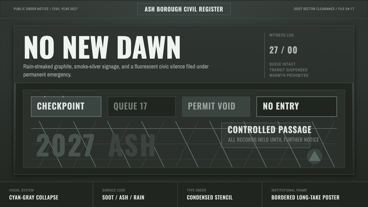 Children of MenHope drains out. Soot-green fields, smoke-silver type, and checkpoint rules h…
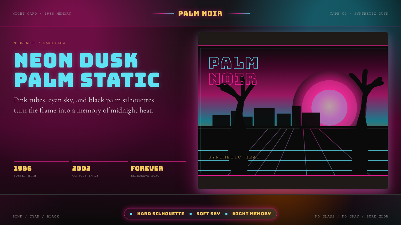 GTA Vice City (2002)Neon-noir nostalgia. Pink-cyan dusk, chunky type, and palm silhouettes.
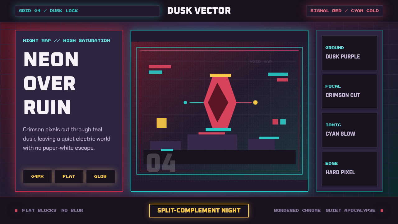 Hyper Light DrifterBeautiful ruin glows. Dusk purple holds crimson pixels and cyan grid light.
 PlayStation (1994 Original)Quiet power, engineered. Grey plastic and four saturated symbols punctuate ti…
 Ace AttorneyQuiet testimony. One red shout breaks the navy calm, with bitmap dialogue bel…
 CelesteA quiet night climb. Plum sky, navy cards, one dash-pink signal, hard 8px off…