What is Ikarus Bus?
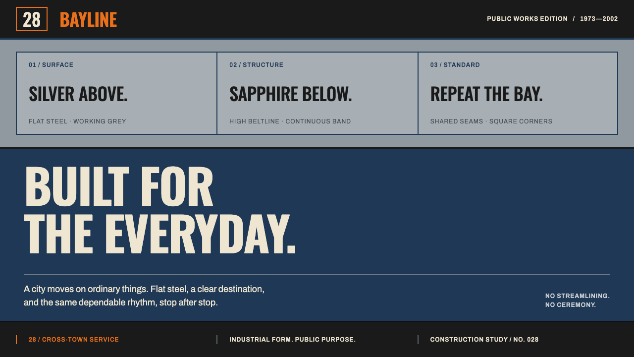
The Ikarus articulated bus was built without ceremony: two flat-sided boxes, a high beltline, and a surface split between silver grey and sapphire blue.
Ikarus Bus in brief
The Ikarus 280 was the articulated bus of the Eastern Bloc. Built in Budapest from 1973, it consists of two flat-sided steel bodies joined by a rubber accordion, and it was shipped by the tens of thousands to Hungary, the German Democratic Republic and the Soviet Union. Its windows are so large that the whole flank reads as a long strip of glass sitting on a painted band. It is a vehicle that looks the way it does because that is what a high-capacity city bus needed to be, not because anyone was styling it.
The design system takes its structure straight from that body. A high beltline splits every surface into two unequal parts: silver grey above and sapphire blue below. Panels repeat at the rhythm of the window bays. Headers behave like destination boards, with compact, condensed lettering. Corners stay square, with only a trace of rounding at the edges. Nothing in the system is streamlined, for the simple reason that the bus never was.
The result is a utilitarian, civic style: rational, repeatable, legible from a distance and indifferent to fashion. It trades on the beauty of things that were designed to work thousands of times a day, in all weather, for all passengers. For a designer today, it offers a distinctive alternative to both slick tech minimalism and ornamental retro: a way of making ordinary information feel dependable and slightly nostalgic without ever feeling decorated.

Where does Ikarus Bus come from?
The Ikarus Body and Vehicle Works was a Hungarian bus manufacturer, with production centred on Budapest and Székesfehérvár. The record gives the 280's production window as 1973 to 2002, and notes that the 200-series family it belongs to shaped Budapest's streetscape for roughly fifty years. That is a very long time for a single vehicle design to remain visible in a major city. Generations of residents grew up with this shape as the default image of public transport, and the design system draws part of its emotional force from that familiarity.
The context is socialist industrial mass production. Within a planned economy that shared transport equipment across allied states, a large, standardised, easy-to-service bus was a priority, and Ikarus supplied cities in Hungary, the German Democratic Republic and the Soviet Union in very large numbers. Operators named in the record include BKV Budapest, the capital's public transport company, and the Berlin transport operator BVB, and the record also lists FOK-Gyem among the organisations tied to the buses. The vehicle was therefore a shared object across multiple countries, seen daily by millions of people who never thought of it as designed.
Its body was an exercise in modular engineering. The 200-series approach built buses from repeatable sections and panels, so that variants of different length and capacity could be produced from common parts. The articulated 280 puts two such rigid bodies together and links them with a flexible accordion joint that lets the vehicle bend through a turn while the passengers walk through from one section to the other. The visual grammar of equal bays, flat sides and a continuous horizontal line follows from this method. It is what structural honesty looks like on a production line.
The graphics were equally functional. State transport authorities of the period relied on a system of route numbers, destination boards and livery bands that had to be understood at a glance, from across a street, by every passer-by. The record describes these as state transport-authority graphics: condensed lettering that fits long place names into narrow boards, simple colour fields that identify a service, and strictly repeated placement. This is public information design in its working form, optimised for legibility and consistency rather than for brand expression, and it is the third source, with the body and the industrial context, of the design system's language.
What defines the Ikarus Bus look?
The high beltline
A single horizontal line, set high on the body, divides every surface into two unequal parts. Above it is silver grey; below it, sapphire blue. The inequality matters: a half-and-half split would look like a flag, while the unequal division reads as a vehicle, with the glazed upper area lighter and the painted lower band weightier. Every panel, card and header repeats this proportion.
Silver grey and sapphire blue
The palette is two colours doing structural work. Silver grey is a cool, slightly metallic neutral that behaves like glazing and bare panel. Sapphire blue is a deep, saturated blue that behaves like a painted livery band. Other colours appear only as small functional signals. Paint is flat and enamel-like, with no gradients, so the colour reads as surface rather than light.
Panels at window-bay pitch
Content repeats at the rhythm of the window bays, in equal, adjacent panels separated by narrow seams. This produces a strong horizontal cadence and a clear, modular grid. When layouts are built in this way, any number of items can be added or removed without breaking the pattern, in the same way a bus can be built longer by adding bays.
Headers as destination boards
Headings are treated like the boards in the windscreen: a narrow, high-contrast strip with condensed capitals, a route number at one end and a destination at the other. They are about information, not display. This gives titles a very specific, dependable personality, and it lets a long name fit in a short space without shrinking into illegibility.
Square corners
Panels, buttons and cards have square corners, with only a slight softening at the edge so they feel like pressed steel rather than cut paper. Pill shapes, circles and organic blobs do not belong here. The geometry is rectangular because the body is rectangular, and it holds together as a system because every element agrees on that.
A flexible joint between rigid blocks
The articulation is the vehicle's signature: two rigid boxes linked by a pleated, flexible connector. Read as a layout principle, it suggests strong, flat blocks of content connected by narrow, differently textured joints, such as a ribbed or pleated divider. The idea is that flexibility is concentrated at the connection, and the blocks themselves stay firm.
Nothing streamlined
There are no swooshes, no tapering, no aerodynamic curves and no suggestion of speed. Surfaces are flat, shadows minimal, and wear is accepted as part of working life. The style is built on durability and clarity, and it asks to be judged by whether it can be read and used by anyone, not by whether it looks fast.

Who shaped Ikarus Bus?
The Hungarian manufacturer that built the 200-series buses, with production in Budapest and Székesfehérvár from 1973 to 2002 in the case of the 280. Its modular approach to bus bodies, assembled from repeatable panels and sections, is the engineering origin of the design system's grid. Its shipping of the type by the tens of thousands made one body shape a shared sight across an entire bloc.
The public transport operator of the Hungarian capital, named in the record. Its fleets are why the 200-series is remembered as shaping Budapest's streetscape for roughly fifty years. For the design system, BKV represents the civic setting: a vehicle meant to carry ordinary people through ordinary days, whose graphics had to be functional first.
The Berlin transport operator named in the record, representing the type's use in the German Democratic Republic. It is a reminder that the style was not local to Hungary but part of a shared transport culture across several countries, where a standard vehicle looked the same in different cities.
How do you use Ikarus Bus today?
The Ikarus system suits subjects where reliability, order and public service are the values: transport and logistics, municipal and civic tools, infrastructure and utilities, timetables, industrial and engineering brands, archives of twentieth-century industrial life, and software where clarity matters more than charm. It also has a quiet nostalgic pull, but its strength is function, not sentiment.
For presentation slides, build the cover on the two-band split: a silver grey upper zone and a sapphire blue lower band separated by the high beltline, with the title set like a destination board in condensed capitals. Content slides repeat the structure, with items arranged in equal bays and a thin blue band at the foot. Data slides are a natural fit, particularly timetables, route maps, tables and bar charts aligned to the bay grid. Keep the unequal proportion on every slide so the deck feels like one fleet.
For web interfaces, use the beltline as the structure of the page: a grey upper area for content and a blue lower band for navigation or status. Section headers look like destination strips, buttons are square and flat, and cards sit in equal-width bays with narrow gaps between them. The style is excellent for dashboards, ticketing, schedules, status pages and admin tools, because it makes dense information orderly. Check contrast carefully on the silver grey, and use the blue for strong labels and states rather than for long passages of text.
For editorial and marketing work, think of signage and timetable typography. Narrow condensed headlines, route-number style numerals and strictly aligned columns suit documentary photography of streets, vehicles and workers. Layouts can borrow the bay rhythm so that captions, images and text blocks line up in the same cadence. Copy should be plain, factual and direct, in the manner of public notices, with humour used dryly and sparingly.
The most common mistake is to turn the style into costume. Adding hammers, stars or propaganda-poster conventions confuses state transport-authority graphics with political imagery, and the record points to the former. Another mistake is to smooth it: rounding every corner, adding gradients or a streamlined swoosh betrays the logic of a bus that was never streamlined. A third is to split the surface evenly. The unequal division is the identity, and a half-and-half layout loses it.

Ikarus Bus — FAQ
What was the Ikarus 280?
It was an articulated city bus built in Budapest from 1973, made of two flat-sided steel bodies joined by a rubber accordion. It was produced by the Hungarian Ikarus works and delivered in very large numbers to Hungary, the German Democratic Republic and the Soviet Union. The record gives 1973 to 2002 as its production window and credits the 200-series family with shaping Budapest's streets for roughly fifty years.
Why is the surface split into silver grey above and sapphire blue below?
Because the bus is. Its windows are so large that the whole flank reads as a long strip of glass sitting on a painted band, divided by a high beltline. The design system translates that division into a repeated proportion: a lighter silver grey upper area and a heavier sapphire blue lower band, in unequal parts. It is the system's signature and should be kept on every surface.
Is this a political or propaganda style?
No. The record lists its sources as socialist industrial mass production, modular bus body engineering and state transport-authority graphics, which means vehicle design and public signage rather than posters or slogans. The style is about legibility, repeatability and durability. A faithful use avoids symbols and slogans and lets the proportions, the bays and the destination-board headers carry the character.
Why use condensed lettering for headings?
Because destination boards have to fit long place names into narrow strips and still be read from across a street. Condensed capitals do this efficiently and give titles a strong, dependable voice. In a layout, they let headings sit on a single line in a modest height, and they pair naturally with large, simple route-number numerals.
Can this style work for a modern app or dashboard?
Yes, particularly for information-dense products such as schedules, ticketing, logistics, admin tools and status pages. The equal-bay grid, destination-strip headers and square flat components make dense content orderly. The one caution is contrast: check the silver grey carefully against text, keep long paragraphs out of the blue band, and treat the nostalgic character as a light flavour rather than the point.
Related design styles
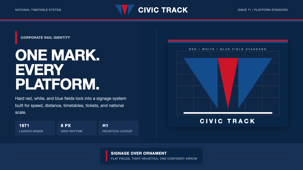 Amtrak Arrow (1971)Civic authority at speed. Deep navy, Helvetica lockups, and red-blue arrows.
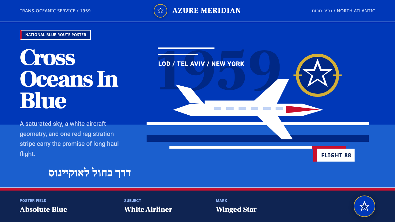 El Al Israel AirlinesNational blue takes command. White aircraft geometry cuts a flat jet-age post…
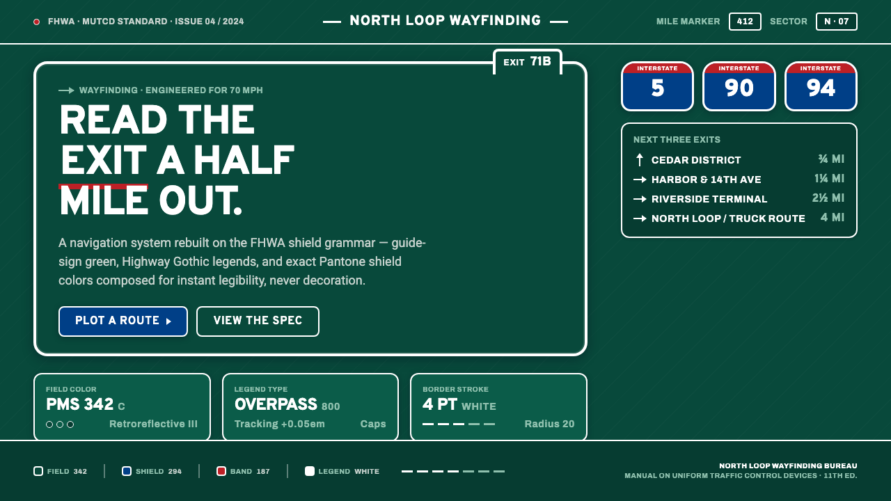 Interstate Highway ShieldEngineered for 70 mph. Guide-sign green, Pantone shield blue and red, Highway…
 Mod Vespa London (1964)Precision rides hard. Royal blue, target red, Bebas caps, and roundel geometr…
 Nikon F Professional BlackMechanical precision as brand. Black-enamel ground, chrome rims, white-filled…
 Saul Bass CorporateAuthority distilled. Deep blue geometry, tight Inter lockups, and white space…