What is Ultima Thule Glass?
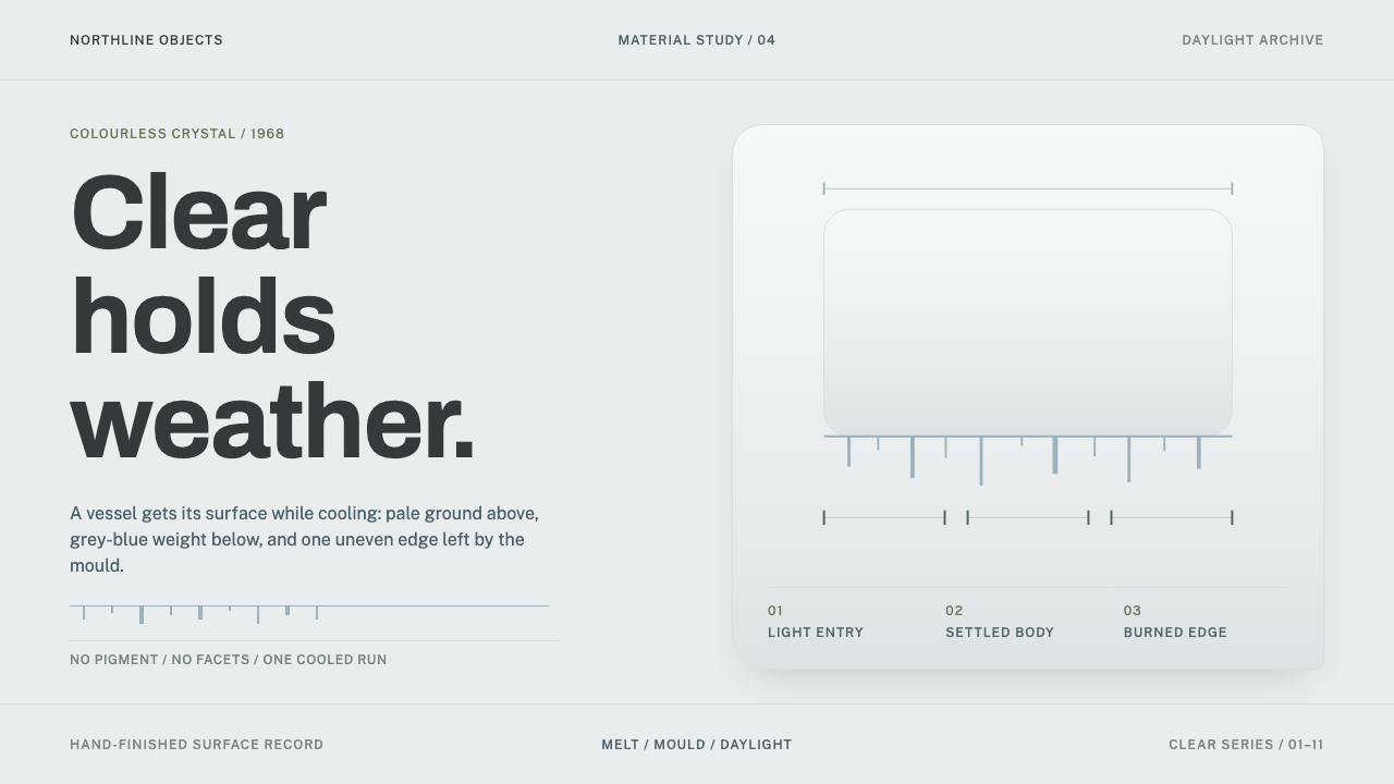
Ultima Thule makes clear glass hold weather: a pale cool ground, grey-blue where light falls into shadow, and vertical runs that hang like melting ice.
Ultima Thule Glass in brief
Ultima Thule is a range of hand-blown glass designed by the Finnish designer Tapio Wirkkala in 1968 and produced by Iittala in Finland. Its surface looks like ice that has melted and refrozen in mid-run: long, uneven vertical drips of clear glass hang from a horizontal edge, catching daylight and bending it into soft grey-blue shadows. There is no colouring pigment, no cut facet and no applied decoration. The glass is clear, and everything the eye reads comes from thickness, texture and light.
As a design system, Ultima Thule translates this into a visual language of extreme economy. The ground is a pale, cool, colourless grey-white, the colour of clear crystal in northern daylight. The main hue is a soft grey-blue, the colour the glass takes where it falls into shadow. Margins are wide. The only recurring motif is a set of vertical runs of uneven length, hanging from a horizontal edge. Everything else is space.
It is a quiet style, but not an empty one. The drips never repeat exactly, the shadows have a depth that comes from real thickness, and the large blank areas are not leftover room but the principal content: they are the light. The style rewards designers who can resist adding things, and who understand that in clear glass the absence of colour is itself a deliberate colour decision.

Where does Ultima Thule Glass come from?
The object behind the system was designed in 1968 at the Iittala glassworks in Finland, and its subject was drawn from Lapland. The name borrows a classical phrase for the farthest north, and the form takes its cue from the way ice and meltwater behave in the far north of Finland: running, hanging and freezing in uneven lines. This is typical of Wirkkala's wider practice, which treated natural forms as processes to be translated rather than shapes to be copied.
What makes the story unusual is how the glass was made. Wirkkala carved the mould from wood, and then spent over a thousand hours at the Iittala works with the blowers, getting the process right. When hot glass is blown into a wooden mould, it burns the wood as it cools. The char that results is what gives the glass its dripping, icicle-like surface, and because the wood goes darker with each use, pattern and tone change as the mould ages. The blower has to judge exactly when to stop. Every piece is therefore a result of collaboration between a designer, a material that degrades, and a craftsperson's judgement.
The glass entered a wider public life through aviation. From 1969 it appeared on the tables of Finnair, and later in its first-class service, so that thousands of people first met Finnish design through a glass in their hand. The record notes that it remains hand-blown and has been in continuous production from 1968 to the present, with coloured editions added from 2018. That longevity is itself part of the design's identity: it is a mid-century object that has not needed to be redesigned.
Ultima Thule belongs to the Finnish mid-century modernism that treated craft and industry as partners, to the Nordic organic design that sought forms from nature without literal imitation, and to the broader studio-glass attitude that the maker's hand, and even the material's imperfection, can be the point. The design system inherits all three: it is modern in its restraint, organic in its irregularity and handmade in its attention to variation.
What defines the Ultima Thule Glass look?
A colourless, cool ground
The base is not white but the pale, slightly cool grey-white of clear crystal in Finnish daylight. It should feel like light that has passed through glass, with a very gentle tonal shift from one area to another rather than a hard flat white. This ground makes everything else on the page feel as though it is lit from within.
Grey-blue as shadow
The only real hue is a soft grey-blue, the colour clear glass takes where it thickens or turns from the light. It is used for shadows, primary type, rules and active states, in a range of values from very pale to a deep, slate-like tone. It is a colour of weather and distance, and it should never become saturated or electric.
Vertical runs of uneven length
The single motif is a set of vertical lines of different lengths hanging from a horizontal edge, like icicles or drips frozen mid-fall. Their unevenness is essential. Equal lengths would turn them into a comb or a bar chart, while the irregular rhythm is what makes them read as melting, flowing material. Used at the top of a page, a card or a divider, they carry the entire identity.
A surface made by char
The texture comes from hot glass burning a wooden mould. It is organic and unrepeatable, with no two drips alike. In a design this means avoiding mechanical tiling, and letting the pattern vary subtly from instance to instance, in the way a hand-blown piece would. Variation is a feature, not an error to be corrected.
Wide margins and silence
Space is the primary material. Margins are wide, line lengths short, and the number of elements on any surface small. Content is placed with room to breathe so that the pale ground can do its work. The quietness is deliberate: the design wants to be looked through, not looked at.
No facets, no staging
The glass is not cut, tinted or dressed up. Nothing is staged with props or dramatic lighting, and in imagery the object is shown plainly in daylight. Likewise the design avoids glossy highlights, drop shadows meant to simulate glass, or decorative flourishes. If an effect could not be produced by clear glass and a window, it does not belong here.

Who shaped Ultima Thule Glass?
The Finnish designer who carved the Ultima Thule mould from wood in 1968 and then worked with the Iittala blowers for over a thousand hours to refine it. He is a central figure of Finnish mid-century modernism and Nordic organic design, known for translating natural forms into objects without literal imitation. In this design system, his influence is the patience: a single motif refined until it feels inevitable.
The glassblowers at the Iittala works who made the design work in practice. They judge, piece by piece, when to stop blowing, because pattern and tone shift as the charred wooden mould darkens. Their skill is what keeps the object hand-blown today, and it is the reason variation is built into the system rather than being treated as imperfection.
The Finnish airline on whose tables Ultima Thule appeared from 1969, and later in its first-class service. By placing a hand-blown glass in front of thousands of travellers, Finnair turned a studio-quality object into a public memory. The association gives the design system a built-in context of travel, hospitality and northern light.
How do you use Ultima Thule Glass today?
The Ultima Thule style suits products and stories that want to feel calm, precise and natural without becoming rustic: premium home and tableware, hospitality and travel, wellness and skincare, architecture and lighting, design studios, and software with a deliberately quiet voice. Its power depends on discipline. Each added element reduces the effect, so the first design decision is always what to leave out.
For presentation slides, the cover is a pale field with a horizontal edge at the top, a handful of vertical runs of uneven length descending from it, and the title set in a deep grey-blue with generous margin. Content slides keep the same pale ground, a single column of text and a very thin horizontal rule, with the vertical runs reduced to a small echo or removed entirely. Data slides work best with fine lines and subtle tonal areas rather than heavy bars, using values of grey-blue to separate series and leaving most of the canvas open.
For web interfaces, treat the page as a sheet of clear glass. Use the pale cool ground for the whole page, grey-blue for type and controls, and let the vertical-run motif appear at the top of the hero or as a divider between major sections. Cards should be defined by tone or hairline edges rather than strong shadows. Because the palette is low in contrast, check text carefully: use the deeper grey-blue for body copy and reserve the palest tones for ornament and backgrounds so legibility is never sacrificed. Dense dashboards need extra care, but product pages, booking flows, portfolios and reading experiences suit it very well.
For editorial and marketing work, build around photography taken in plain daylight on neutral grounds: glass, water, snow, window light. Keep captions short, headlines calm, and spacing generous. A single image of the object, with the vertical runs as the only graphic element, is stronger than a collage. Calls to action should be understated, in deep grey-blue on a pale ground, with no glow or gradient to compete with the page's quiet.
The most common mistake is to over-glass it. Heavy frosted-glass blur, translucent overlays stacked on every card and glossy highlights are a different aesthetic, built on simulated effects, whereas this system reads as real clear glass in real light. Other errors are adding bright accent colours, drawing the vertical runs as cartoonish icicles with symmetrical spacing, and filling the margins because they look empty. The empty space is the point, and the unevenness of the runs is what keeps them alive.

Ultima Thule Glass — FAQ
What is Ultima Thule glass?
It is a range of hand-blown glass designed by Tapio Wirkkala in 1968 and made by Iittala in Finland. Its surface, which looks like melting and refreezing ice, comes from blowing hot glass into a wooden mould that chars as the glass cools. The subject was drawn from Lapland, and the range has been in continuous production since 1968.
How does the mould create the pattern?
Wirkkala carved the mould from wood. Hot glass burns the wood as it cools, and the resulting char gives the glass its dripping, icicle-like surface. Since the wood darkens further with use, the pattern and tone shift over time, and the blower has to judge when to stop. This is why each piece differs slightly and why variation is part of the design system.
Why is the palette so pale, with only grey-blue?
Because the object is clear glass. The pale cool ground is the colour of colourless crystal in Finnish daylight, and the grey-blue is the colour the glass takes where it falls into shadow. No pigment is used, so the system adds none. Restricting the palette this way makes the few tonal differences meaningful and keeps the whole page feeling lit by natural light.
Is this the same as glassmorphism?
No. Glassmorphism simulates frosted glass with blur, translucency and glowing edges layered over colourful backgrounds. The Ultima Thule system works the other way round: it has no blur or glow, a nearly colourless ground, and a single motif of vertical runs. It aims for the quiet look of real clear glass in daylight, not for a screen effect. If you borrow its rules, keep the restraint and leave the layered translucency behind.
Can I add colour, given that coloured editions exist?
The record notes coloured editions of the object from 2018, but the core identity of the design system is the colourless original from 1968. If you introduce colour, do it as a tint within the glass: one hue at a time, soft and translucent in character, used for a single accent area rather than throughout. Never let colour replace the pale ground and grey-blue shadows as the foundation.
Related design styles
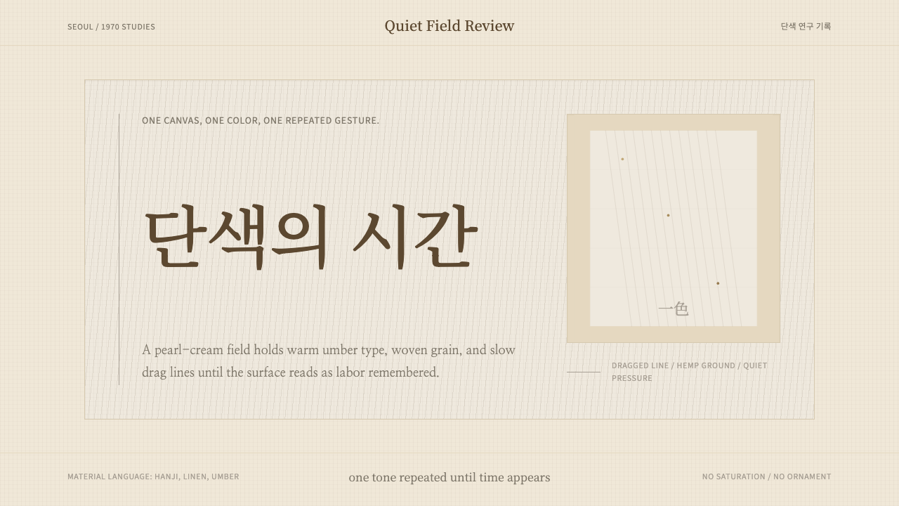 Korean Dansaekhwa MonochromeLabor becomes stillness. Umber serif type and drag lines on pearl cream.
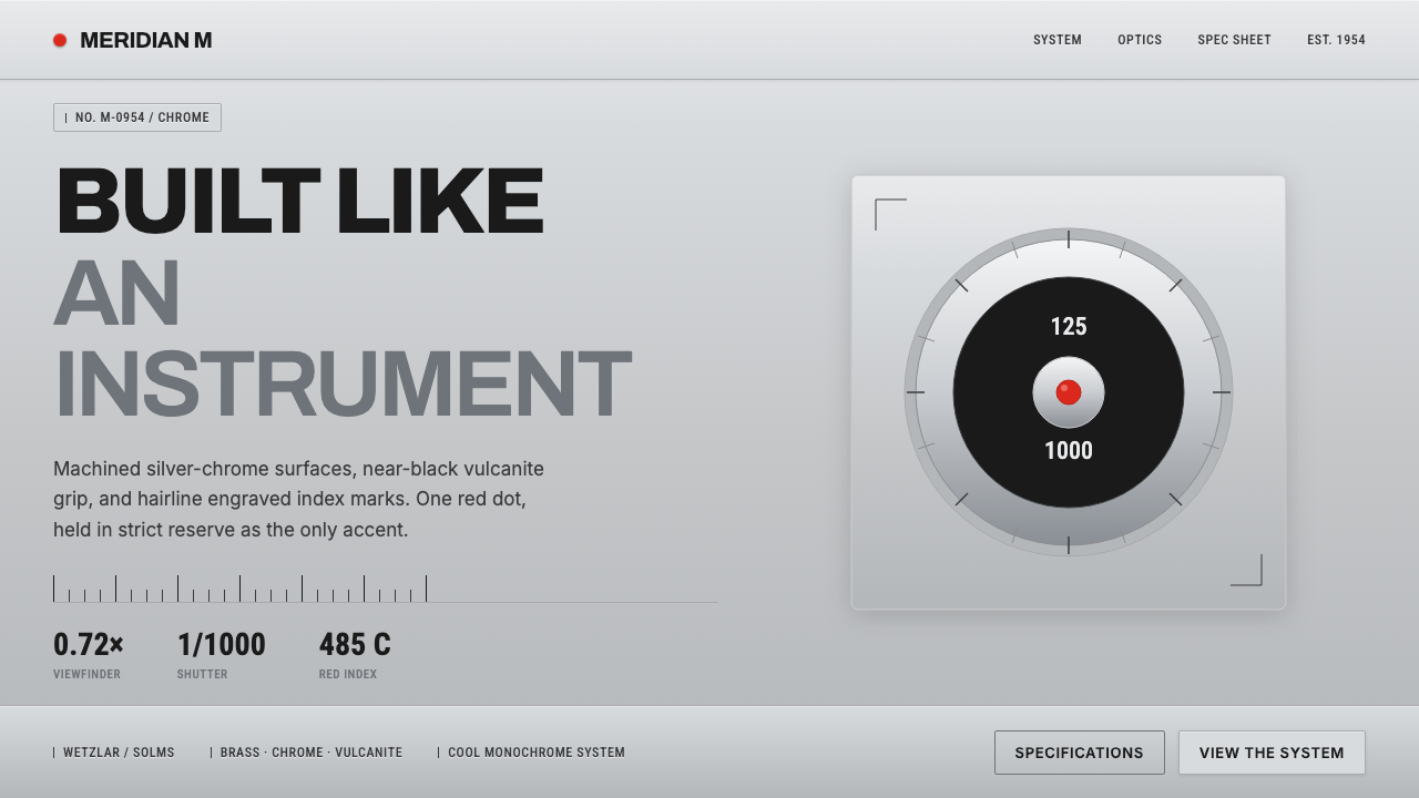 Leica M Silver ChromeBuilt like an instrument. Brushed silver-chrome on near-black vulcanite, one…
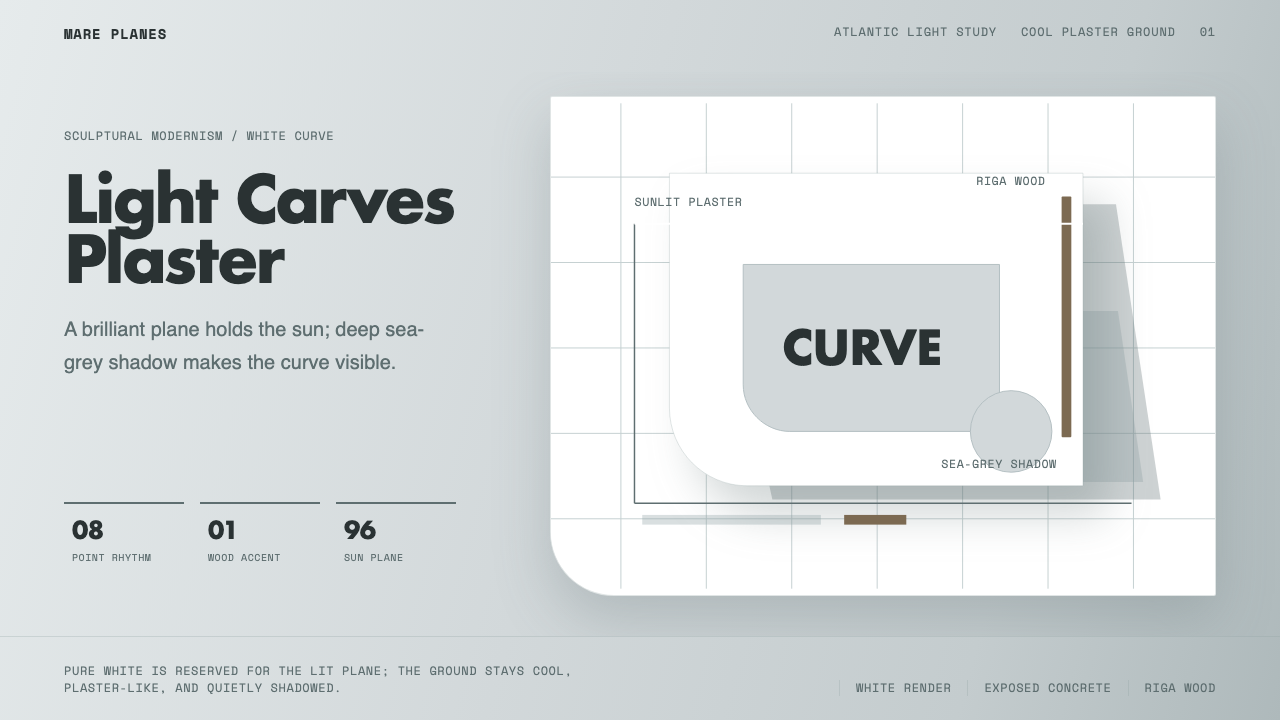 Alvaro Siza WhiteLight makes the form. White planes on cool plaster throw sea-grey shadow and…
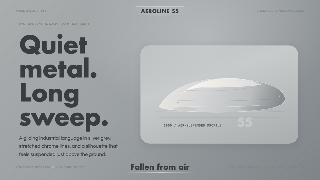 Citroën DSSilence made aerodynamic. Silver-grey ground, chrome hairlines, one long glid…
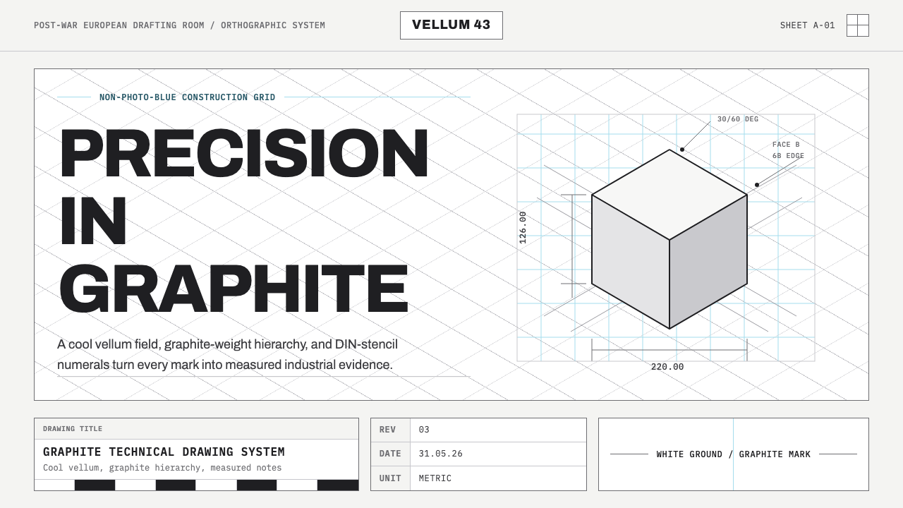 Graphite Technical DrawingDrafting-room precision. Non-photo-blue grid and graphite DIN lettering do th…
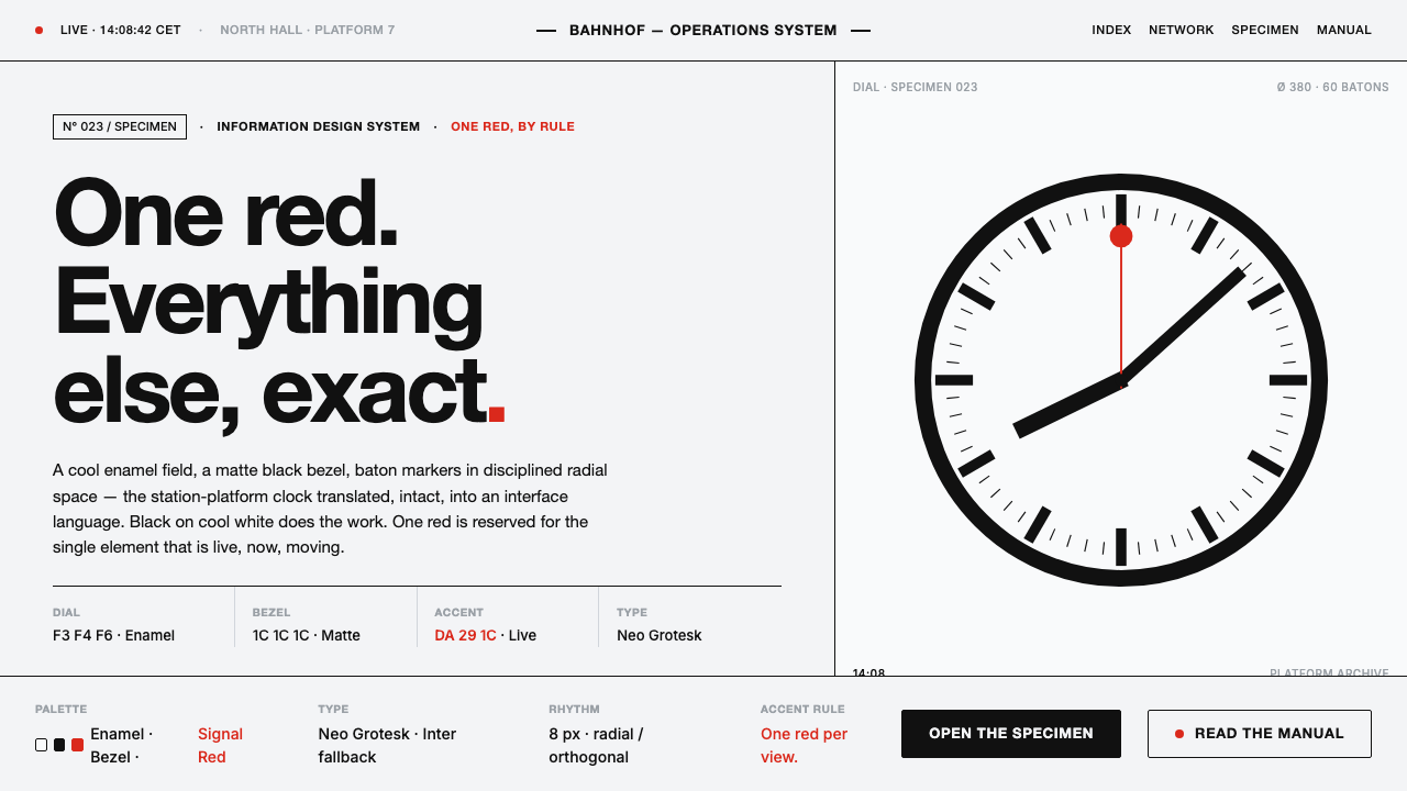 Hilfiker Railway ClockEverything exact, one thing live. Black hands on cool enamel white — one red…