What is Identity V?
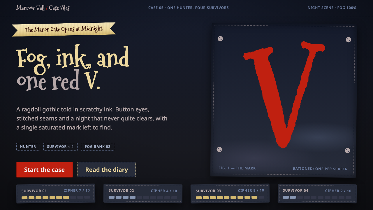
Identity V is gothic cartoon horror stitched from ragdolls and fog: a charcoal night, parchment ribbons, wobbling bone-white lettering and one blood-red V.
Identity V in brief
The Identity V style is the visual language of NetEase's 2018 asymmetric horror game: a world of ragdolls and puppets with button eyes, stitched seams and spindly limbs, drawn in scratchy ink over desaturated night scenes. It is gothic but not grim. The mood is closer to a storybook told in the dark than to realistic horror, and that mix of dread and playfulness is its defining trait.
The game's premise explains the look. One player takes the role of a Hunter, four others play Survivors, and the contest takes place on the fog-bound grounds of Oletus Manor. The art has to carry tension, so the palette is held almost entirely in dark neutrals, with a single saturated colour reserved for moments of danger. Everything else recedes into charcoal and haze.
As a design system, it translates that mood into interface terms. A midnight charcoal ground holds the page, parchment-toned ribbons carry titles, hand-lettered bone-white text wobbles across the top, and the blood-red V is used with discipline: the brand mark, Hunter alerts and the single action someone most needs to take. It suits gloomy, narrative interfaces that want a wink inside the shadows.

Where does Identity V come from?
Identity V was developed and published by NetEase Games and launched in 2018, first in mainland China in April and then worldwide in July. It arrived in a mobile market crowded with bright, friendly games, and its decision to build an entire product around fog, ink and gothic mood was a distinct bet. The format it chose, one Hunter against four Survivors, is a form of asymmetric multiplayer horror, and the visual identity was designed to make that imbalance legible at a glance.
The style's most obvious ancestor is the Burtonesque gothic cartoon, the tradition associated with director Tim Burton and the stop-motion puppetry that grew around his films. Its hallmarks are thin, elongated bodies, large dark eyes, stitched or patched surfaces and a sweet-macabre sense of humour. Identity V takes those cues and pushes them toward a ragdoll look, a style Chinese players know as ragdoll cartoon style, in which characters appear to be sewn together from fabric and stuffing.
That ragdoll idea explains many of the interface's details. Stitched seams become dashed borders, button eyes become small round accents, and cloth textures turn into flat, slightly worn surfaces. The art is also scratchy by design: line work has a visible hand, as if drawn with a dip pen, rather than the clean vector edges of a typical mobile game. This gives a handmade, storybook quality that softens the fear and invites the player in.
The visual language has been refined across the years from launch onward, and it continues to change with seasonal updates, which means the style is a living one rather than a frozen period piece. The core pillars remain steady: a dark, desaturated environment, paper-like surfaces for text, and one carefully rationed warning colour. That consistency is why the look is so recognisable even when events and characters change.
What defines the Identity V look?
Midnight Charcoal Ground
The base is a deep, slightly warm charcoal rather than pure black, so the page feels like a foggy night and not a void. Subtle tonal shifts and haze suggest distance and weather. This dark ground carries the entire mood, and it also gives the lighter parchment and bone tones room to glow without needing outlines or glare.
Parchment Ribbons
Titles sit on ribbon shapes in an aged parchment gold, with soft folds and swallowtail ends. They work like the banners of a Victorian storybook, giving headings a physical, ceremonial presence. Because the ribbon is the main warm light on the page, it guides the eye to what is most important before any text is read.
Wobbling Hand Lettering
Display text is drawn in a bone-white, hand-lettered style whose baseline wanders and whose letters tilt slightly. This unsteadiness is intentional: it suggests a nervous hand and an uneasy narrator. Body text stays more legible and restrained so that the lettering reads as atmosphere on top, not as an obstacle to information.
Stitched Seams and Dashed Borders
Panels and cards are outlined with dashed lines that imitate thread running through fabric. The motif ties every container back to the ragdoll idea, so even a plain settings box feels sewn together. It also gives edges a softness that solid rules would not, keeping the overall impression handmade and slightly vulnerable.
Scratchy Ink Line Work
Illustrations and icons are drawn with visible, uneven pen strokes rather than perfect vectors. Characters have long limbs, small bodies and big dark eyes, and lines cross and overlap as if sketched quickly. The roughness gives the style a storybook warmth and keeps the horror in a theatrical, rather than a graphic, register.
One Blood-Red V
The single saturated colour in the system is a blood red, shown in the V of the logo and reused sparingly for Hunter alerts and the primary action. Because nothing else competes, it lands with real force. The rule is strict: if red appears everywhere, the warning loses its meaning, so it must be rationed like a scarce resource.

Who shaped Identity V?
The developer and publisher behind Identity V, which launched in mainland China in April 2018 and worldwide in July of that year.
The film director whose gothic cartoon and stop-motion puppet aesthetic is the clearest ancestor of the game's ragdoll look.
The single antagonist role in each match, whose arrival is signalled by the system's blood-red alert colour.
The four player-controlled ragdoll characters who try to escape Oletus Manor, rendered with button eyes and stitched limbs.
How do you use Identity V today?
On slides, the style is ideal for storytelling decks, game pitches, horror or mystery themed talks and creative portfolios. A cover slide can use the charcoal ground with a parchment ribbon holding the title and a hand-lettered subtitle above it. Content slides should keep body text clean and bone-white, and use the dashed border for callout boxes. For data slides, let charts sit in muted tones and use the red V colour only for the single number that matters.
In web interfaces, it fits game landing pages, community hubs, character galleries and event pages. A hero can pair a foggy dark image with a ribbon title and one red call-to-action button. Cards for characters or news items work well with stitched borders. Dashboards are possible but should stay quiet: use charcoal panels, parchment labels and reserve red for alerts, so that a warning looks like an actual warning.
For editorial and marketing use, the style gives posters, social cards and seasonal campaigns a theatrical, storybook mood. Pair illustrations of puppet-like figures with wobbling hand-lettered headlines, and let the text sit on paper-toned shapes. It is especially well suited to Halloween promotions, mystery releases and anything that wants to be creepy and charming at once.
The most common mistake is flooding the layout with red. The system works because one saturated colour exists against a field of dark neutrals; adding red backgrounds, red headings and red decorations destroys that contrast and turns the mood from eerie to aggressive. Keep the V, the alert and the main button as the only warm-red moments.
A second mistake is making the hand lettering too hard to read. The wobble is atmosphere, not a licence for illegible text. Use the hand-drawn style for short titles and let body copy stay in a clean, readable face. Also avoid clean glossy gradients and sharp vector icons, which would clash with the scratchy, sewn-together world.

Identity V — FAQ
What is the Identity V design style?
It is a ragdoll gothic style drawn from NetEase's 2018 horror game: a midnight charcoal ground, parchment-gold ribbons for titles, wobbling bone-white hand lettering, stitched dashed borders and a single blood-red V reserved for key moments.
What inspired the look of Identity V?
Its main influence is the Burtonesque gothic cartoon tradition, associated with Tim Burton and stop-motion puppetry, pushed toward a ragdoll cartoon look in which characters seem sewn from fabric, with button eyes and stitched seams.
Why is red used so sparingly in this style?
The system is built from dark neutrals, so one saturated colour has real impact. The blood-red V is kept for the brand mark, Hunter alerts and the main action. If red were used everywhere, warnings would lose their meaning and the mood would turn aggressive.
Where does the Identity V style work best?
It suits game pages, storytelling decks, mystery and horror themed content, Halloween campaigns and character galleries: gloomy, narrative interfaces that also want a touch of playfulness. It is a poor fit for bright, corporate or minimalist work.
Is this style only for the game Identity V?
No. It originates in the game's visual identity, but the underlying pattern of a dark ground, paper-toned ribbons, hand lettering and one rationed warning colour can be applied to any dark, narrative project, as long as the red stays scarce.
Related design styles
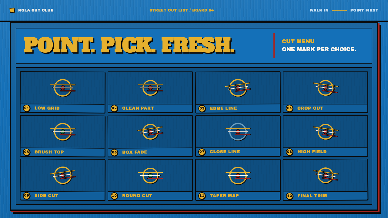 Ghana Barber Shop SignsChoice becomes a painted language. Chrome-yellow codes cut across an enamel-b…
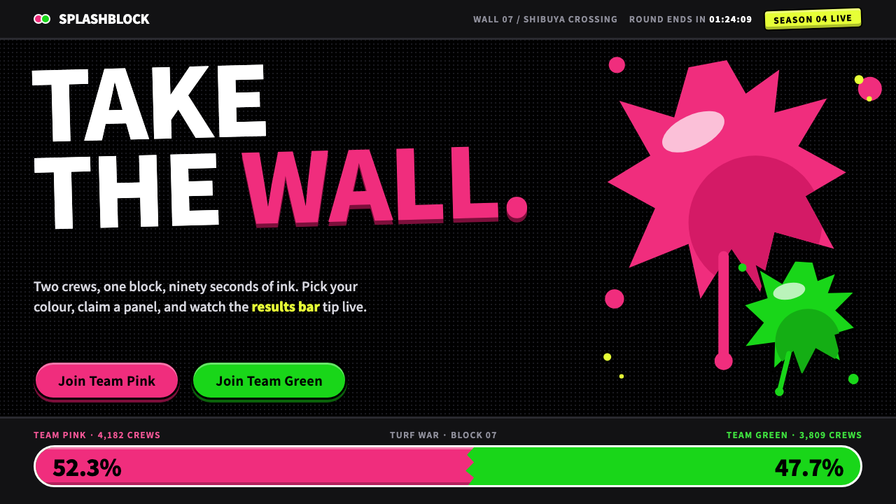 SplatoonTwo inks, one black wall. Fat 900-weight type, glossy ragged splats and tilte…
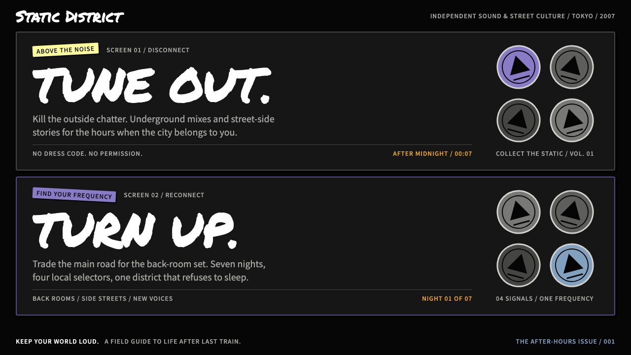 The World Ends with YouStreet noise, split in two. White marker type on ink black, with violet pins…
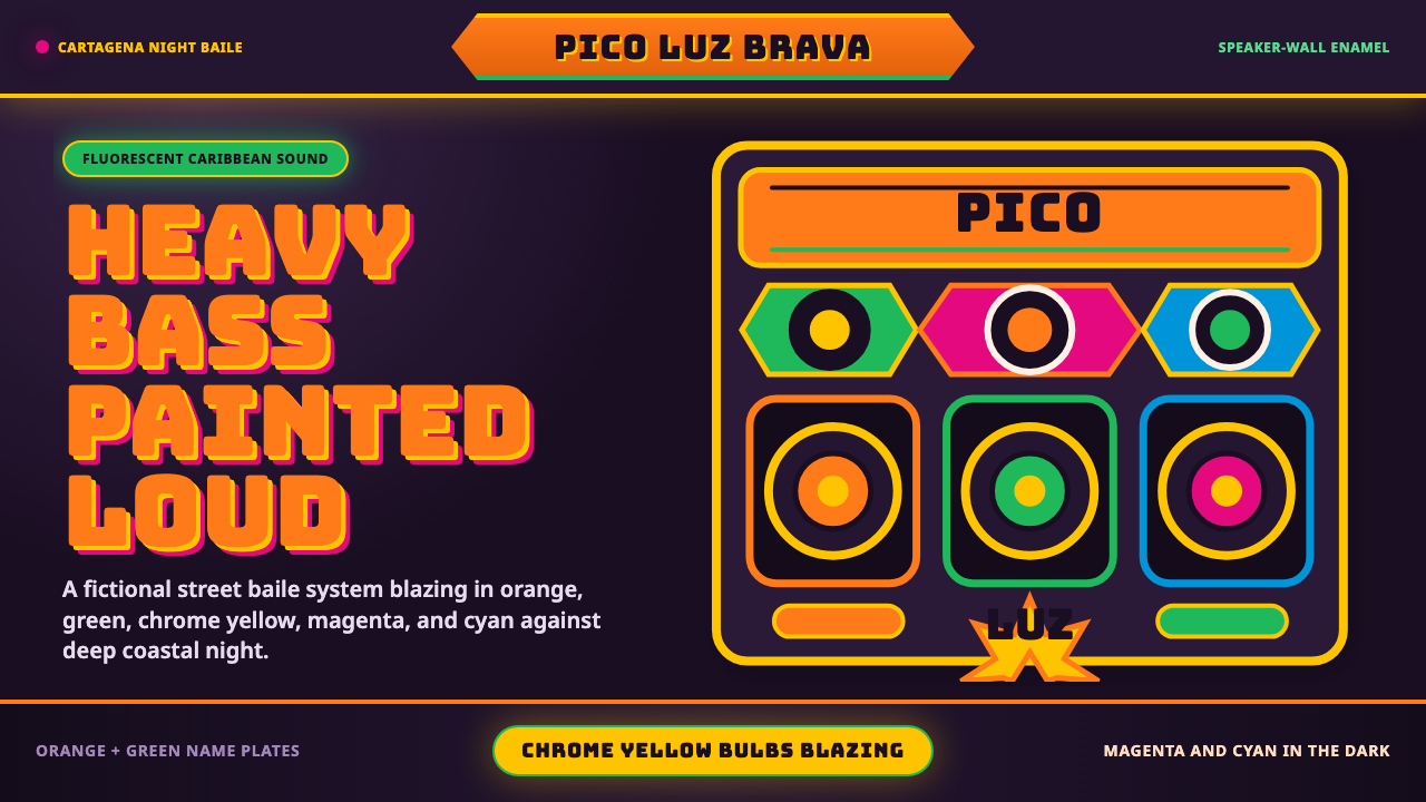 Champeta Picó SoundLoud after dark. Orange-green banners and fat Bungee type glow like a speaker…
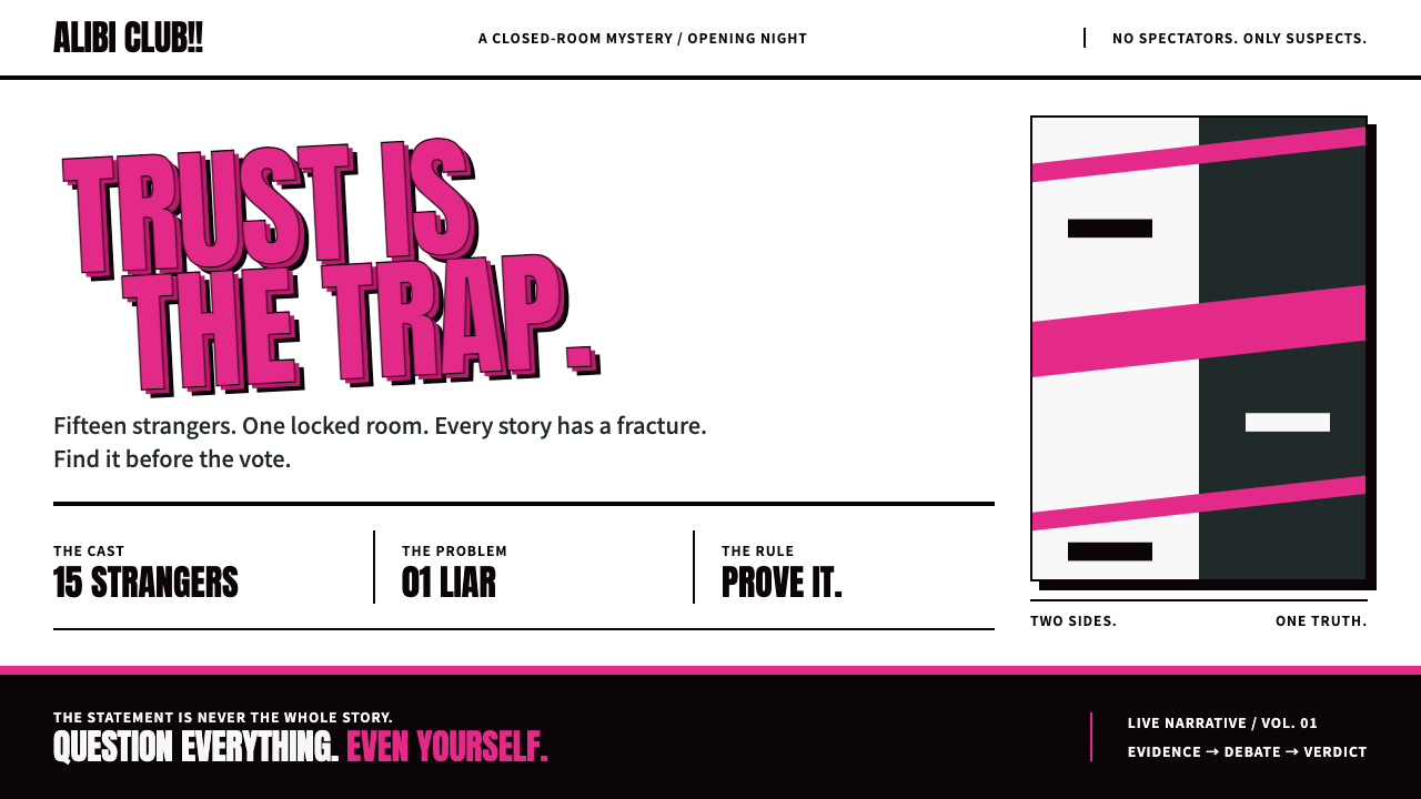 DanganronpaSweet ink, vicious tension. Hot-pink Anton capitals collide on white with har…
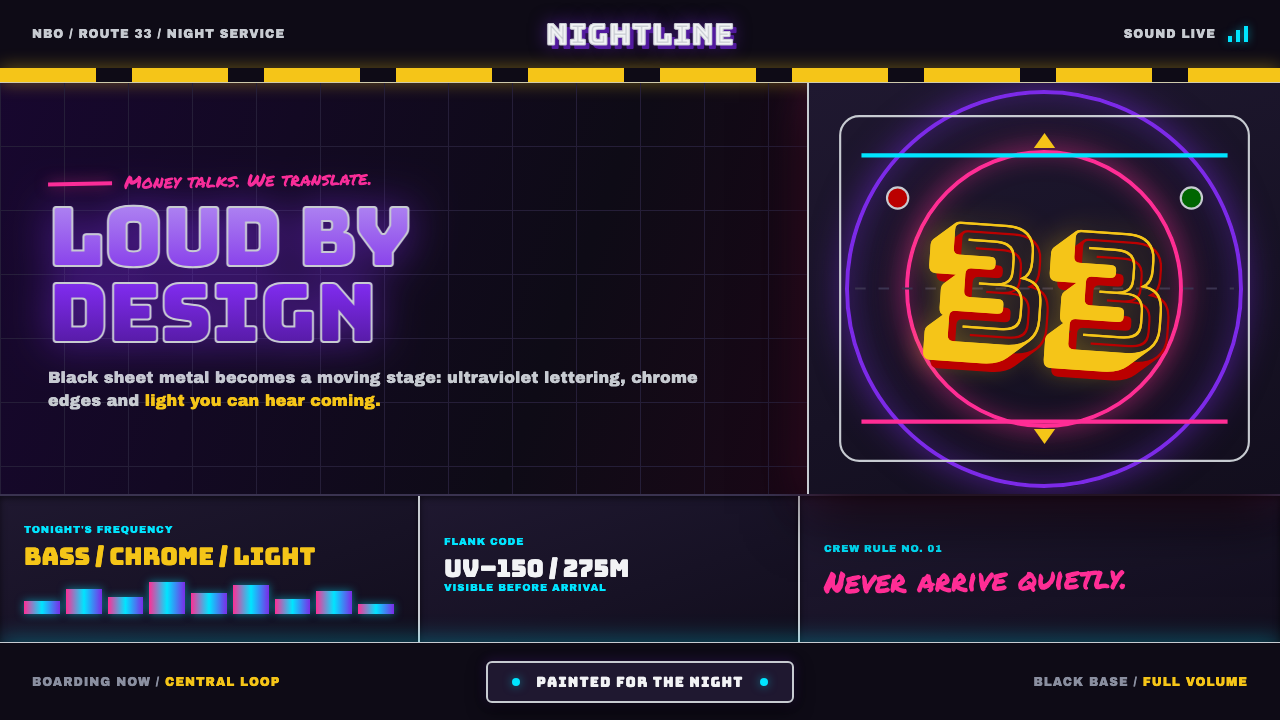 Nairobi Matatu ArtBuilt to be unmissable. Neon airbrush and chrome blaze across night-black hor…