What is ICQ?
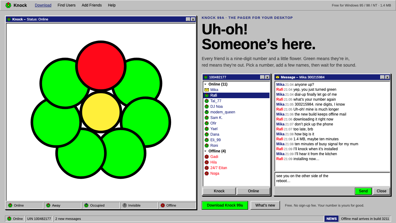
ICQ turned being online into a small green flower in a narrow grey window — the first mass-market face of presence on the internet, preserved in bevels and pixels.
ICQ in brief
The ICQ style is the visual language of a late-1990s desktop messenger: system-grey Windows chrome, three-tone bevelled windows that look pressed out of plastic, small black-outlined pixel flowers in flat green, red and yellow, and densely packed small text. It is not a marketing aesthetic. It is the look of software that lived in a corner of the screen all day, a tool you glanced at rather than a page you read.
The name comes from the pronunciation of the letters I-C-Q, 'I seek you', and the product made that promise literal. Each person was a number, each friend a name in a list, and each name carried a tiny flower that said whether they were there. A message arriving was announced not with a banner but with a sound, the cartoonish 'Uh-oh!' that millions of users still recognise instantly. The interface was built around that single glance: who is here, who is away, who just spoke.
Visually the style rests on a handful of unmistakable decisions. Surfaces are flat grey, edges are lit from the upper left and shadowed to the lower right so that every button reads as a physical key, and ornament is limited to the flower, the only organic shape in a world of rectangles. It is nostalgic for anyone who grew up with dial-up, and it is increasingly attractive to designers who want a tactile, honest, slightly comic alternative to today's frosted-glass interfaces.

Where does ICQ come from?
ICQ shipped in November 1996 from Mirabilis, a small start-up in Tel Aviv. The company was a team of four, and the product they released was free to download, which in the mid-1990s was how new software travelled across the early web. There was no advertising campaign to speak of. People installed it because a friend had it, and they asked friends to install it so that they could be found. That chain of invitations is why ICQ became the first messenger the whole internet used, and why its interface was designed for strangers who had never used a chat program before.
The people behind it are usually named as Yair Goldfinger, Arik Vardi, Sefi Vigiser and Amnon Amir, with Yossi Vardi often credited as a supporter of the venture. Their design problem was unusual. Email already existed, and so did chat rooms, but neither answered the simple question of whether a particular person was at their computer right now. ICQ's answer was the contact list with presence indicators, an idea so successful that nearly every messenger since has copied it. The flower, the number, the list and the alert sound are all solutions to that one question.
Visually, ICQ belonged to the Windows 95 and 98 desktop. It inherited the operating system's grey surfaces, bevelled buttons and small bitmap icons rather than inventing its own world, which meant users already knew how to read it. The clients most often remembered are ICQ 98 and ICQ 99a, released during the years when instant messaging moved from curiosity to daily habit. The accompanying website, icq.com, spoke the same late-1990s web language: free-download buttons, plain grey panels and small, practical type.
In June 1998 AOL acquired Mirabilis, a deal that signalled how seriously the industry now took instant messaging. The style that this system recreates, however, comes from the period just before and around that moment, when ICQ was still a clean, tightly drawn desktop tool and not yet a crowded portal of features. It belongs to a specific slice of internet history: the late-1990s free-download web, Windows desktop software, and the first generation of people who made friends on a screen.
What defines the ICQ look?
System Grey Chrome
The base is a flat, medium-light grey borrowed directly from the Windows desktop. It reads as neutral hardware rather than as a brand colour, and everything else sits on it: the contact list, the message window, the option dialogs. The effect is utilitarian and slightly institutional, and that restraint is exactly what makes the small spots of colour matter.
Three-Tone Bevels
Every window, button and panel is built from a lit upper-left edge, a shadowed lower-right edge and a flat face between them. Raised elements look pressed out of plastic; inset fields look sunk into it. This is how the interface communicates what can be clicked and what is merely displayed, and it replaces later conventions such as soft shadows or colour fills.
Pixel Flowers
The flower is the brand's only organic form. It is drawn in a small bitmap with a black outline and filled with flat green, red or yellow, and its colour is the status: green for online, red for offline, with other tints for states in between. Because it is so small and so plainly drawn, it feels friendly rather than corporate, and it carries meaning at a glance.
Dense Small Type
Text is set small and tight in a plain sans-serif, with little leading and almost no decorative scale contrast. Names, numbers and timestamps are packed so that a long contact list fits in a narrow window. This is a design for scanning, not for reading, and the density is part of the character: it signals a tool that expects to be used all day.
Narrow Vertical Layout
The signature composition is a tall, narrow list window that docks to the side of the screen, with a menu button at the bottom and a few small controls at the top. It is built to coexist with other programs rather than to dominate the display. Dialogs and chat windows open as separate small boxes, so the whole product feels like a set of modest tools rather than a single large page.
Sound as Interface
The alert is part of the visual identity even though it is not visual. A new message is announced with a cartoonish 'Uh-oh!', and the sound is as recognisable as any logo. Designers who recreate the style on screen often add small motion or text cues that echo that moment of interruption, because the experience of ICQ was always about being gently summoned.

Who shaped ICQ?
One of the four people usually credited with creating ICQ at Mirabilis in Tel Aviv, and a leading public voice for the product in its early years.
A co-founder of Mirabilis and one of the original team behind the messenger's release in November 1996.
A co-founder of Mirabilis, part of the small group that built and launched ICQ before the AOL acquisition.
The fourth member of the founding team at Mirabilis, credited alongside the others for the original ICQ.
How do you use ICQ today?
On slides, the ICQ style works best as a deliberate retro frame. A cover slide can show a single grey window with a bevelled title bar and one small flower beside the presentation's name, and content slides can use narrow list panels for agendas or participants. It suits talks about internet history, early online communities, nostalgia marketing and product origin stories. Data slides should use plain tables inside bevelled panels, with colour reserved for the single status that matters, so the flower logic carries over: green for good, red for problem.
In web interfaces and dashboards, the style fits chat tools, community panels, retro-themed apps and anything that benefits from visible presence. A contact list with small coloured status flowers, a pricing page laid out as a column of bevelled boxes, or a settings screen made of simple dialog windows will feel immediately coherent. Because the layout is dense and narrow, it works well for sidebars and compact utilities. It is a poor match for large image-led layouts, so keep photography minimal and let the chrome do the talking.
For editorial and marketing work, the style gives a memorable voice to anything that plays with the early internet. Newsletters, landing pages for indie software, event posters for a throwback party and social cards can all borrow the grey window frame. Use the flower as a single repeated motif, and keep copy short and conversational, in the spirit of a message popping up on screen. The tone is friendly and slightly cheeky rather than polished.
The most common mistake is treating the bevel as a decorative effect. In the original, every raised or sunken edge meant something: it told you what was clickable. Applying a bevel to every element, or mixing it with soft shadows and gradients, breaks the logic and makes the result look like a costume. Keep the three-tone rule consistent, use flat fills, and resist adding glow or blur.
A second pitfall is overusing colour. The grey environment is the point; the flower and a handful of status colours are the only accents. If every heading and button is bright, the one small green flower loses its power. Treat colour as information, not decoration, and the style will read as authentic rather than as a pastiche.

ICQ — FAQ
What is the ICQ design style?
It is the look of the ICQ desktop messenger from the late 1990s: system-grey Windows chrome, three-tone bevelled windows, small black-outlined pixel flowers that show online status, and tightly packed small type. It recreates the ICQ 98 and 99a era rather than a marketing site.
When and where was ICQ created?
ICQ was released in November 1996 by Mirabilis, a small company based in Tel Aviv, Israel. AOL acquired Mirabilis in June 1998, and the late-1990s clients such as ICQ 98 and ICQ 99a are the ones this style draws on.
Why are there flowers in the ICQ interface?
The flower is a presence indicator. It sits beside each contact's name and changes colour to show whether that person is online, so you can tell at a glance who is available. Its small, plainly drawn form is the interface's only organic shape.
Where does the ICQ style work best today?
It suits retro-themed apps, chat and community tools, nostalgia campaigns, indie software pages and talks about internet history. It works best in narrow, dense layouts and as a deliberate throwback, and it is a poor fit for image-heavy or luxury designs.
What is the biggest mistake when using the ICQ style?
Treating the bevel as pure decoration. In the original, raised and sunken edges told users what could be clicked. Mixing bevels with soft shadows or gradients, or spreading bright colour everywhere, breaks that logic and makes the design look like a costume.
Related design styles
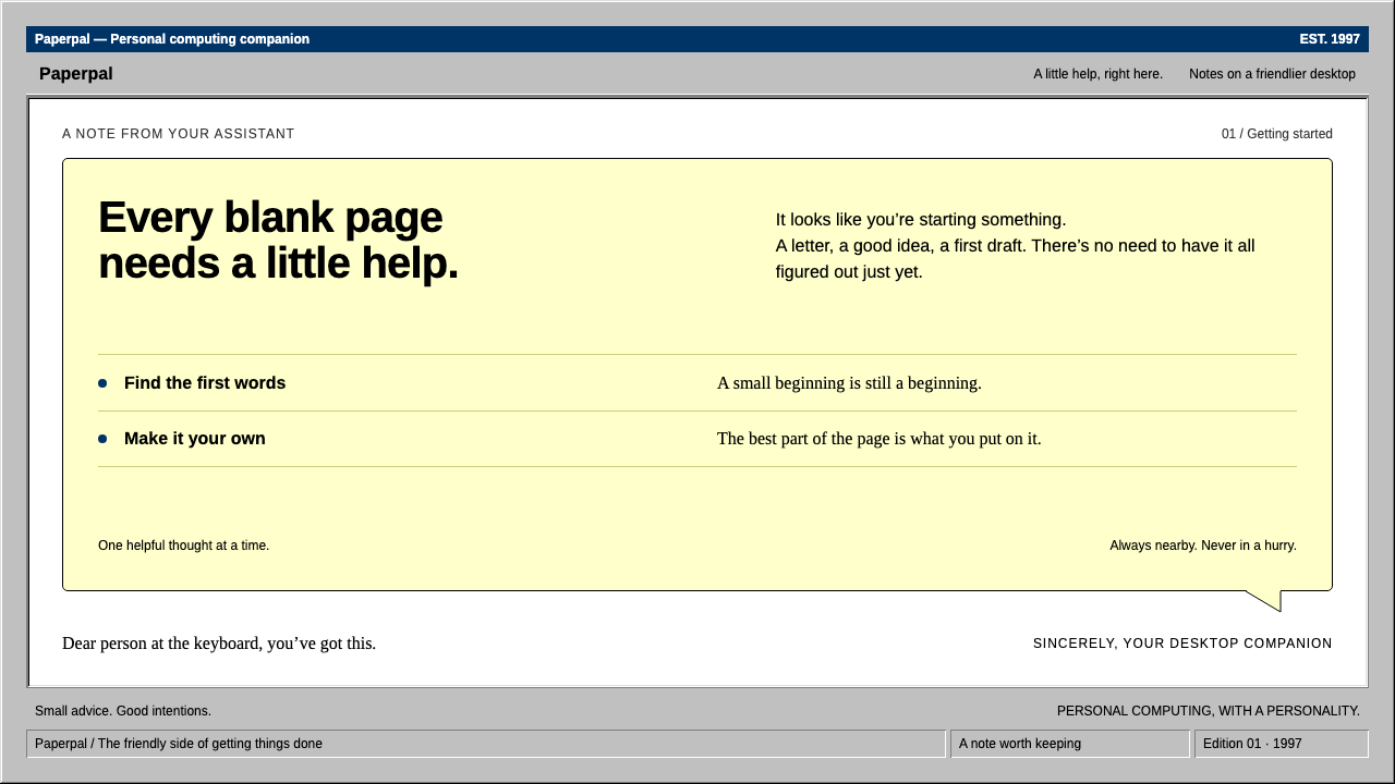 ClippyHelp with a human touch. Pale-yellow balloons, navy trim and hard grey bevels.
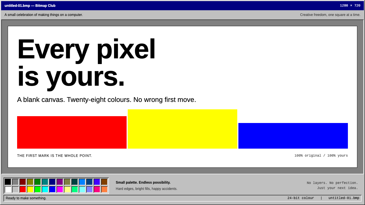 MS PaintFirst-computer freedom. Navy captions, grey bevels and 28 fixed colours frame…
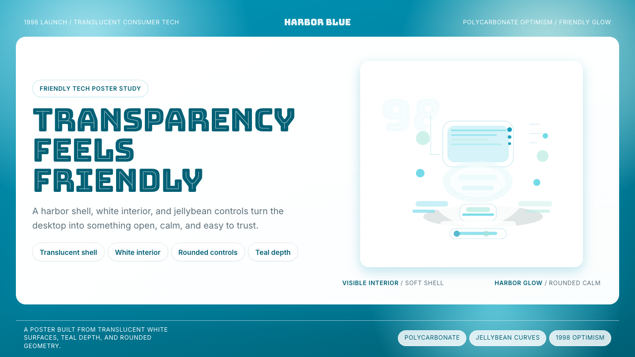 iMac G3 Bondi Blue (1998)Transparency feels friendly. Bondi blue, white glass, and pill curves set the…
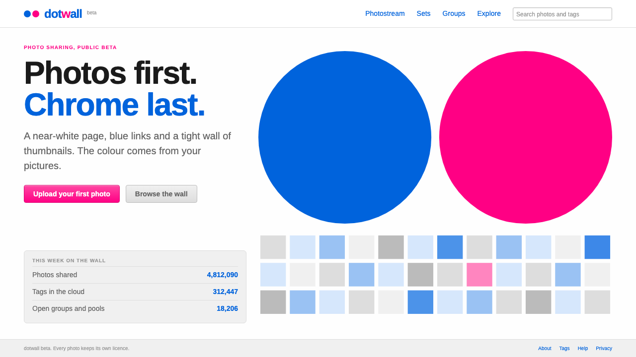 FlickrPhotos first, chrome last. Near-white page, blue Arial links and a blue dot b…
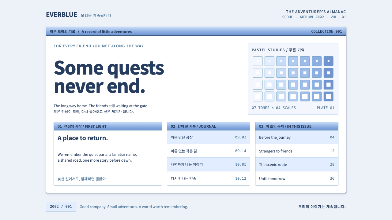 Ragnarok OnlineSmall adventures, lasting warmth. Periwinkle chrome, navy hairlines and dense…
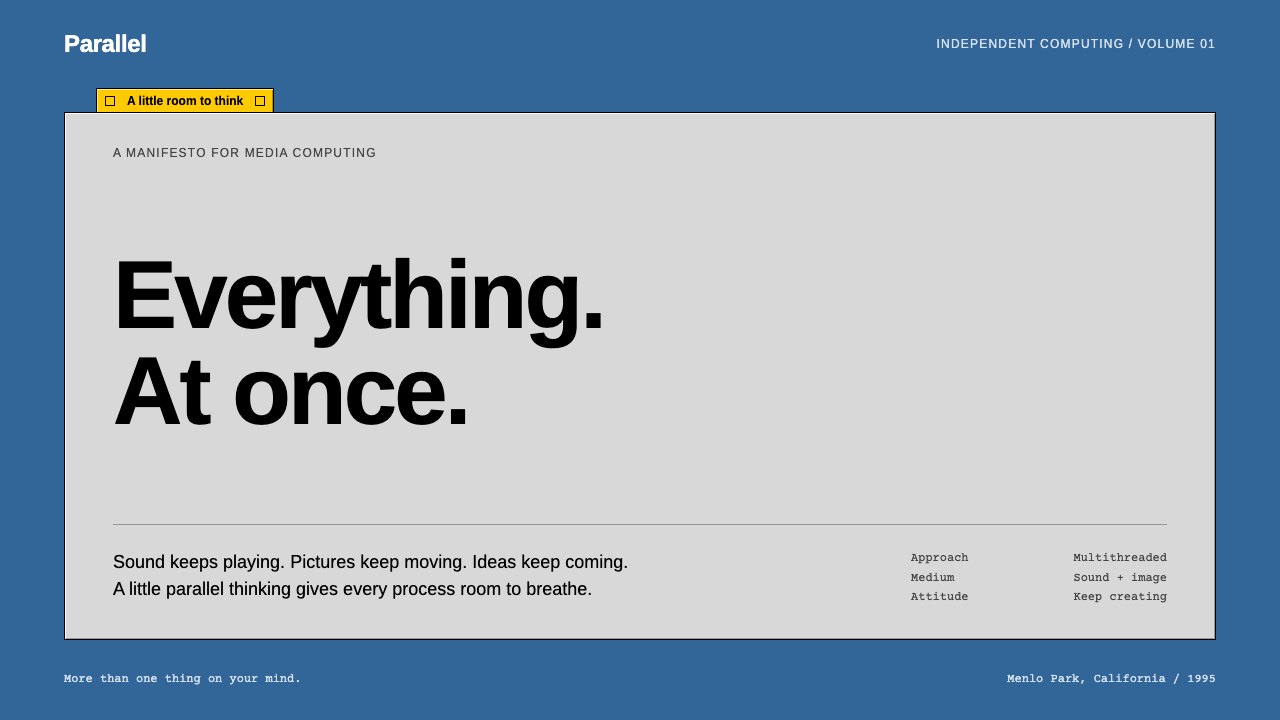 BeOSQuiet chrome, restless spirit. Blue desktop, grey bevels, one short yellow ta…