What is Hyperloop?
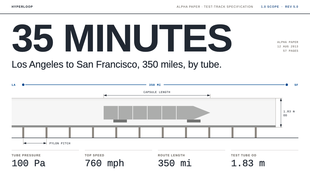
Hyperloop's look is a white spec sheet, not a render: navy capitals, hairline dimension arrows and one flat grey capsule drawn in elevation.
Hyperloop in brief
The Hyperloop style is drawn from a document rather than a product shot. Hyperloop began as a 57-page PDF: the Hyperloop Alpha paper of August 2013, which proposed aluminium capsules riding on air-caster skis through low-pressure steel tubes on pylons, travelling from Los Angeles to San Francisco in 35 minutes.
The design system takes its look from that paper and from the white test tube that followed. Pages are white, headings are navy capitals, dimension arrows are drawn as hairlines, a grey capsule is shown in elevation, and spec tables list the numbers and leave it there.
The overall impression is that of engineers writing for engineers. Nothing is glossy and nothing is persuasive in a marketing sense. The credibility comes from restraint: flat fills, thin lines, careful labels and the confidence of a document that lets its figures speak.

Where does Hyperloop come from?
Hyperloop was first set out in August 2013 in the Hyperloop Alpha paper, a 57-page open document published by Elon Musk. It proposed a new mode of ground transport: aluminium capsules floating on air-caster skis inside low-pressure steel tubes carried on pylons, running between Los Angeles and San Francisco in 35 minutes. Crucially, it was published as an open paper rather than a product, an invitation to engineers to build on it.
That openness gave the visual language its character. The paper is a technical document, with cross-sections, dimensions and tables, and its look is that of an engineering report rather than an advertisement. It belongs to the tradition of open-source transport white papers: a sketch of an idea, offered in the plain visual language of the people who would have to make it work.
The idea then moved from paper to hardware. SpaceX built a mile-long test tube beside its Hawthorne, California headquarters, painted white, and invited university engineering teams around the world to design and race pods through it. The competition was announced in 2015 and ran from 2017 to 2019. The team WARR Hyperloop from the Technical University of Munich won repeatedly and reached 463.5 km/h in 2019.
These student projects are part of the same visual story. University engineering design competitions produce drawings, build reports and spec sheets, and the white tube became the iconic setting. This design system takes its identity from the paper and the tube together: white document pages, navy capitals, cross-section drawings and a flat grey capsule, presented as engineers would present it.
What defines the Hyperloop look?
White document pages
The ground is plain white, like a printed report or a PDF page. There is no tinted backdrop, no photograph and no atmosphere. White is chosen because it is neutral and technical, and because it echoes the white of the test tube itself.
Navy capitals
Headings and labels are set in navy capitals in a DIN-like engineering style. The letters are even, geometric and blunt, the kind of lettering you would expect on a technical drawing or a standards document. Navy gives them authority without the drama of pure black.
Tube cross-sections
The tube is shown in cross-section and elevation rather than in a dramatic perspective view. Showing the structure from the side or in slice makes the diagram explanatory: you see how things fit and where the air and the capsule sit, rather than being sold an image.
Hairline dimension arrows
Dimensions are drawn with very thin lines and small arrowheads, with labels set beside them. They are the visible signature of an engineering drawing. Because the lines are so light, they annotate without competing with the object they measure.
Flat grey capsule
The aluminium capsule is drawn in elevation and filled with a flat grey, with no reflections, gradients or glossy highlights. It is a diagram of an object, not a render of one. Its flatness is the point: it keeps the image honest and consistent with the rest of the page.
Plain spec tables
Numbers go into tables with clear row labels and no decoration. The table lists values and stops there, with no persuasive copy wrapped around it. This is the clearest expression of the style's attitude: specifications are presented, not sold.

Who shaped Hyperloop?
The author of the Hyperloop Alpha paper of August 2013 and the figure most closely associated with the concept. His decision to publish it as an open document, rather than a product, invited engineers and students to take it further.
The student team from the Technical University of Munich that won the SpaceX pod competition repeatedly and, in 2019, reached 463.5 km/h in the Hawthorne test tube. Its pods stand for the university engineering design competition side of the story.
How do you use Hyperloop today?
The Hyperloop style is ideal for subjects that need to feel technical, credible and unadorned: engineering, infrastructure, research, deep technology and any context where claims must be backed by numbers. It trusts the content and gets out of its way.
For presentation slides, a cover can be a white page with a navy capital title, a thin horizontal rule and a small grey capsule in elevation below it. Content slides work like pages of a report: a clear heading, a short paragraph and a spec table. Data slides suit simple diagrams with hairline dimension lines and labelled axes, with every figure shown plainly and no decorative three-dimensional effects.
For web interfaces, the style suits documentation, technical product pages, investor or research dashboards and anything resembling a datasheet. Use white for the ground, navy for headings and key actions, and keep tables prominent. Cards can be separated by thin lines rather than shadows. Interaction should be quiet, so that the information is always the loudest thing on screen.
For editorial and marketing work, the style gives white papers, technical explainers and case studies a serious, open-source character. Use cross-section illustrations and annotated diagrams instead of stock photography. When a claim is made, show the number next to it in a table or callout. The restraint itself becomes a message that the content can stand on its own.
A common mistake is to add polish: glossy renders, dramatic gradients, glowing effects or futuristic backgrounds. That undermines the entire premise, which is that this is a document by engineers. Another is overusing navy so that everything looks like a heading. Keep the capsule flat, the lines thin and the tables plain, and let the numbers carry the page.

Hyperloop — FAQ
What is the Hyperloop design style?
It is a technical-document look: white pages, navy capital headings, hairline dimension arrows, a flat grey capsule drawn in elevation, tube cross-sections and plain spec tables, taken from the Hyperloop Alpha paper and the white test tube.
Where does it come from?
It comes from the Hyperloop Alpha paper of August 2013, a 57-page PDF by Elon Musk, and from SpaceX's white mile-long test tube in Hawthorne, California, where university teams raced pods from 2017 to 2019.
Why is the capsule flat grey rather than rendered?
Because the style imitates an engineering document. A flat grey elevation is a diagram that explains structure, while a glossy render would be an advertisement. The flatness keeps the image honest and consistent with the rest of the page.
What kind of products suit this style?
Documentation, research, infrastructure, deep-tech and data-heavy products where credibility comes from numbers. It is a poor fit for playful consumer brands, because its restraint can read as cold when warmth is expected.
How do I avoid over-designing it?
Keep the ground white, headings in navy capitals, lines thin and tables plain. Resist adding gradients, glows or dramatic backgrounds. If a decorative element does not explain something, it probably does not belong in this system.
Related design styles
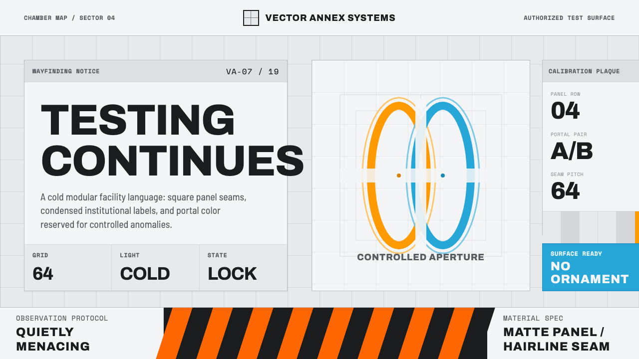 Aperture ScienceSterile authority. Cool panel seams, Archivo signage, and sparse orange-blue…
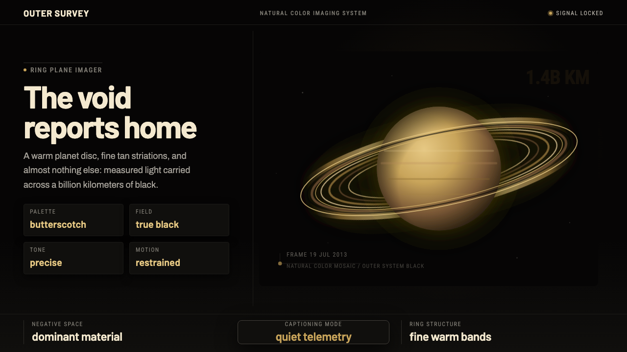 Cassini Saturn ImagingDeep space feels exact. Butterscotch Saturn floats in black with fine tan rin…
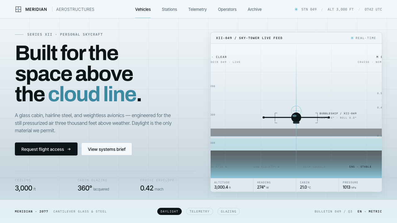 Oblivion Sky TowerSterile daylight futurism. Cool sky-grey glass, hairline steel mullions, a si…
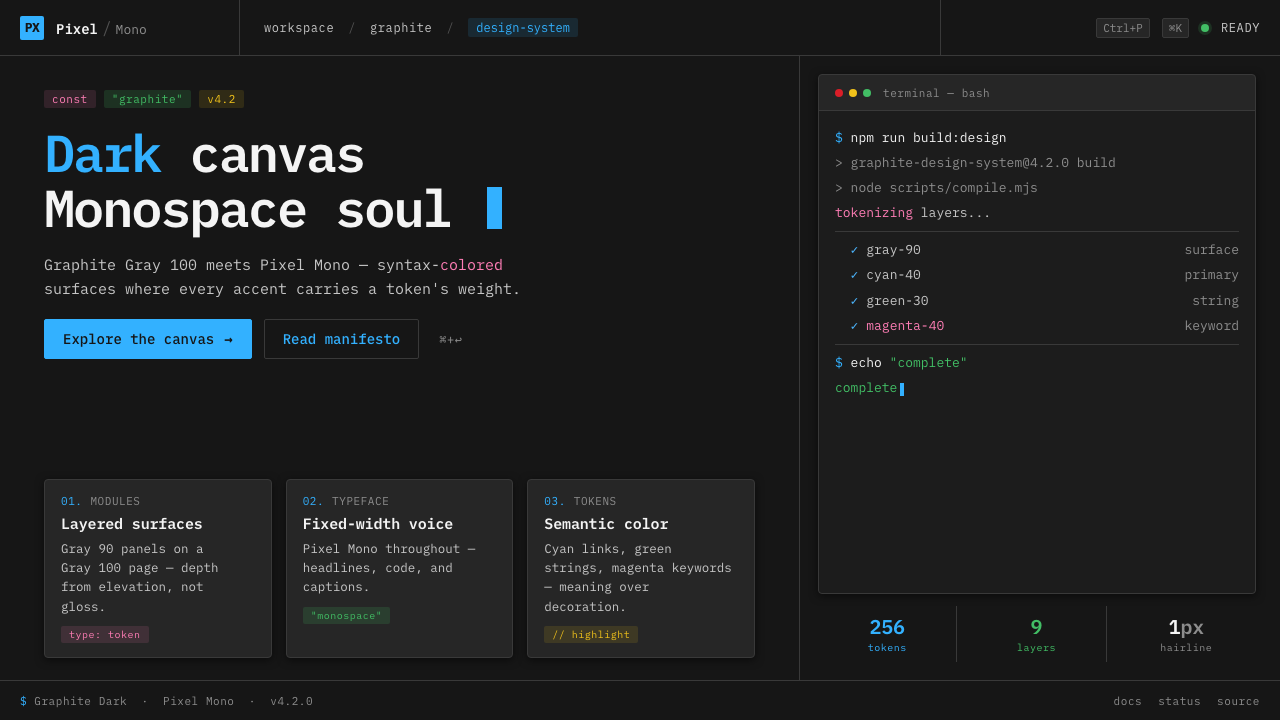 IBM Plex Mono DevColor used like syntax highlighting. Carbon Gray 100 canvas, IBM Plex Mono th…
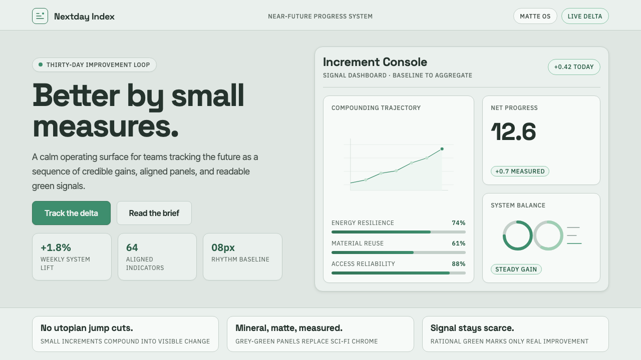 ProtopiaCalm progress, not sci-fi hype. Mineral grey-green grids make every small gai…
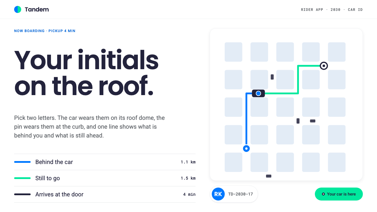 Robotaxi Rider AppYour initials, on the roof. One 6px route line flips blue to green at the car…