What is Home Robot Manual?
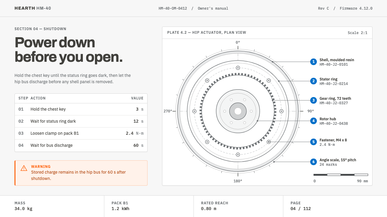
A household humanoid needs a manual, and this style is that manual: graphite line-art, blue callout numbers, and exactly one orange warning on the page.
Home Robot Manual in brief
Home Robot Manual is a documentation-first design style, imagined as the printed and on-screen manual that ships with a household humanoid robot around 2040. Its visual language is the language of instruction: a neutral paper-toned page, a white-shelled machine drawn as an exploded view in graphite line-art, thin leader lines running from each part to a numbered key, and procedures set out as tables in which every row is one action with a unit attached.
The premise is simple. The more capable and autonomous a machine becomes inside a home, the less its explanatory page should sound like an advertisement. A launch event persuades; a manual accounts for itself. It says where the parts are, how they are joined, what to check before switching on, and how to stop the machine. This style takes that accountability as its aesthetic, so the page feels calm, exact and slightly dry — the register of a document you trust precisely because it is not trying to sell you anything.
Visually, the restraint is deliberate and rule-governed. Orange appears once on the whole page, reserved for the emergency stop. Blue appears only as the numerals that label callouts. Everything else is rule, margin and measurement. The style is intentionally not pretty in the way a product keynote is pretty; a manual exists to be consulted, not admired, and its beauty is the beauty of a well-labelled diagram.

Where does Home Robot Manual come from?
The idea of a home robot with a manual sits at the end of a timeline the theme itself marks out: from 2000, when Honda's ASIMO programme first showed the public a walking humanoid, to 2026, when the first consumer deliveries of 1X Technologies' NEO began, and onward to a projected 2040. ASIMO, developed in Tokyo, was a demonstration machine. It belonged to stages, exhibitions and press events, and the paperwork around it was written for engineers and hosts, not for householders. For two decades the humanoid was a spectacle, and spectacles do not need manuals.
The 2026 milestone changes the genre. When a humanoid is delivered to an ordinary household, it becomes a product with obligations: set-up steps, safety notices, maintenance routines, and a clear answer to what a person should do when something goes wrong. 1X Technologies, founded by Bernt Børnich with roots in Moss, Norway and a base in Palo Alto, represents the first wave of consumer-facing humanoids, while Figure AI stands for the wider race to build general-purpose machines. The geography of the theme's timeline moves accordingly, from Tokyo to Palo Alto and Moss to Sunnyvale: from a showpiece, to a start-up delivering to living rooms, to an industry.
By choosing 2040 as its setting, the theme assumes that household humanoids have matured into ordinary appliances, and that their documentation has settled into a stable genre, the way vacuum-cleaner and washing-machine manuals did. It borrows from three traditions named in its lineage. Consumer-hardware technical documentation supplies the structure: quick-start spreads, parts lists, safety sheets, service tables. Swiss-grotesque instructional typography supplies the voice: neutral sans-serif letterforms, flush alignment, strict hierarchy, the plain authority found on timetables and signage. Exploded-view industrial illustration supplies the picture, a draughtsman's technique that pulls an assembly apart along its axis so that every component can be seen, named and numbered.
The combination answers a trust problem that no marketing page can solve. A machine that moves through a kitchen, lifts objects and shares floor space with children and pets earns acceptance by being legible, and legibility is what a manual provides: it promises that a person can locate every part, understand every step and override every function. The decision to spend the single orange on the emergency stop states the design's priorities better than any slogan could. Safety is the one thing the page is allowed to shout about.
What defines the Home Robot Manual look?
Neutral Paper Ground
The page is a quiet, neutral off-white closer to paper stock than to a glowing screen. It is a colour chosen for being unnoticeable, so that line-work and numerals carry all the information. Warm creams and cold pure whites are both avoided: the first reads as nostalgic, the second as promotional, and a manual should feel like neither.
Graphite Line-Art
The robot is drawn, not rendered. A white-shelled body is described by fine graphite-grey outlines, with no gradients, glossy highlights or cinematic lighting. The effect is closer to a patent drawing or an engineer's service diagram than to a product shot, and it signals that the machine is being explained rather than sold.
Exploded Views and Leader Lines
Assemblies are separated along their axes and floated apart, each part tethered to the numbered key by a thin leader line. The lines never cross decoratively; they run straight or turn at disciplined angles, and the white space between parts is itself information, because it shows how the pieces fit together.
Blue Callout Numerals
Blue has exactly one job: numbering. It labels callouts on diagrams and links them to entries in the key, so the colour itself becomes a reading cue. Wherever blue appears, there is a number to look up. Using it for links, headings or decoration would dilute that signal, so the style does not.
The Single Orange
Orange occurs once per page, attached to the emergency stop. It is the only warm, saturated note in an otherwise cool and neutral composition, which means the eye finds it instantly. The rule works as a kind of design interlock: because orange is never spent elsewhere, it always means the same thing.
A Three-Part Type System
Typography divides the labour among three families. IBM Plex Sans sets procedure steps and labels in a calm, grotesque voice. IBM Plex Mono holds part numbers, firmware versions and torque values, so anything a technician might copy or compare sits in fixed-width characters. Archivo is kept for the cover and large headings, where a slightly more assertive grotesque announces the document without becoming a logo.
Rows, Rules and Measurement
Procedures are tables, and each row carries a single action followed by its unit, whether a duration, a force or a count. Hairline rules separate the rows, generous outer margins leave room for notes, and spacing follows a measured rhythm rather than a decorative one. Nothing in the layout asks to be admired; everything asks to be checked.

Who shaped Home Robot Manual?
Founder of 1X Technologies and the person most closely tied to the theme's Norwegian and Palo Alto thread. His company's path from research prototypes toward a humanoid delivered to households is the reason a home-robot manual is a plausible object at all. For this style he stands for the moment a humanoid stops being a laboratory demonstration and becomes something a family must be taught to live with.
Honda's long-running humanoid programme, whose public debut in 2000 anchors the start of the timeline. ASIMO established, in the public mind, that a machine with arms and legs could walk among people. It was shown rather than sold, which makes it the useful contrast: the manual style begins where the demonstration ends and the household begins.
A humanoid-robotics company with roots in Moss, Norway, and a base in Palo Alto, whose NEO robot marks 2026 as the year of first consumer deliveries. The company represents the shift from showpiece to product, and with it the need for set-up guides, safety notices and service documentation written for non-specialists.
Another builder of general-purpose humanoids, included in the theme's lineage as a sign that home robots are an industry rather than a single product. A shared industry implies shared conventions, such as standard warning placement and standard callout numbering, and that is exactly the territory the manual style explores.
How do you use Home Robot Manual today?
Home Robot Manual is a strong choice when a topic must feel trustworthy, explained and a little technical, and it transfers well beyond robotics. Hardware, safety, onboarding and any product with physical or operational consequences can borrow its logic: describe, label, measure, and keep the single warning loud.
On slides, a cover can follow the manual cover: a single line-art object, perhaps exploded, set against the paper ground with a heavy grotesque title and a part-number-style subtitle in the monospaced face. Content slides work as numbered figures, with the diagram on one side and a keyed list on the other, and a procedure table replacing bullet points. Data slides should be spare: hairline-ruled tables with units, charts drawn in graphite lines, blue reserved for numbering, and orange used once for the single metric that signals risk.
In web interfaces the style suits documentation sites, onboarding flows, device dashboards, admin consoles and pricing pages that list specifications. Build pages as stacked sections with ruled dividers, keep body text on the neutral paper tone, use the monospaced face for identifiers and values, and present step lists as numbered tables. Interactive affordances can stay quiet; the one orange element should be the destructive or emergency control, such as a stop, disable or revoke action.
For editorial and marketing work, the manual voice offers an unusual kind of credibility. Launch pages for hardware, white papers on safety, product teardown articles and onboarding emails can all use exploded diagrams, keyed captions and procedure-style copy. Marketing succeeds here by being specific: a measured weight or a count of steps persuades more than adjectives, and the plain format makes every claim look checkable.
The most common mistake is making the style look futuristic. Glowing outlines, dark gradients, chrome and cinematic robot photography all contradict the premise that this is a document, not a teaser. A second mistake is spending the orange more than once; as soon as it decorates a button, a heading and a chart, it stops meaning stop. A third is setting body paragraphs in the monospaced face, which turns a manual into a terminal printout. Keep the discipline: line-art, numbers, one warning.

Home Robot Manual — FAQ
Is Home Robot Manual a sci-fi style?
No. Although it imagines a household robot in 2040, its visual language is deliberately documentary rather than futuristic. It draws on existing manual conventions, namely exploded drawings, keyed parts lists and procedure tables. The sci-fi feeling comes only from the subject matter, never from glows or chrome, which is why the style can sit comfortably on a serious engineering page.
Why does the style use orange only once?
Because meaning depends on scarcity. Orange is reserved for the emergency stop, so a reader scanning the page learns that the only warm accent is the one that matters in an emergency. If orange also appeared on links, badges or illustrations, the signal would blur and the page would lose its safety logic.
How does it differ from Swiss International Style?
They share neutral grotesque type, grids and restraint, and this theme openly borrows from Swiss instructional typography. The difference is purpose and picture language. Swiss Style is a general graphic philosophy applied to posters, identities and publications; Home Robot Manual is a narrower genre, built around technical illustration, part numbers, callouts and procedures, with its own colour discipline of blue numerals and a single orange warning.
Can it work for products that are not robots?
Yes. Any product that has parts, steps and risks can borrow it: appliances, medical devices, software installers, API reference pages, safety training and enterprise admin tools. The robot is the scenario, not the limit. The style is weakest for emotional or playful products such as entertainment, food or children's brands, where an instruction-sheet voice would feel cold.
Does it work on a dark background?
The style is written for a light, paper-toned page, and that matters: graphite line-art and blue numerals depend on reading as ink on paper. A dark version is possible for screens used in dim environments, but it needs care, because orange against black becomes far louder than orange on paper and can turn a calm document into an alarm. If you invert it, keep the lines fine, keep the blue muted and keep the orange to the same single use.
Related design styles
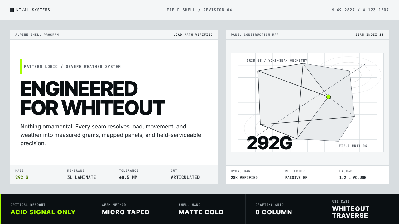 Arc'teryx Technical OutdoorEngineered, never ornamental. Glacier silver grid, mono specs, one acid-green…
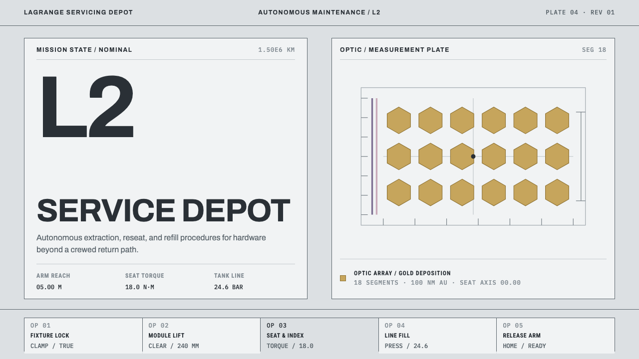 Lagrange Servicing DepotEngineering without theatre. Cleanroom grey, strict rules, and gold reserved…
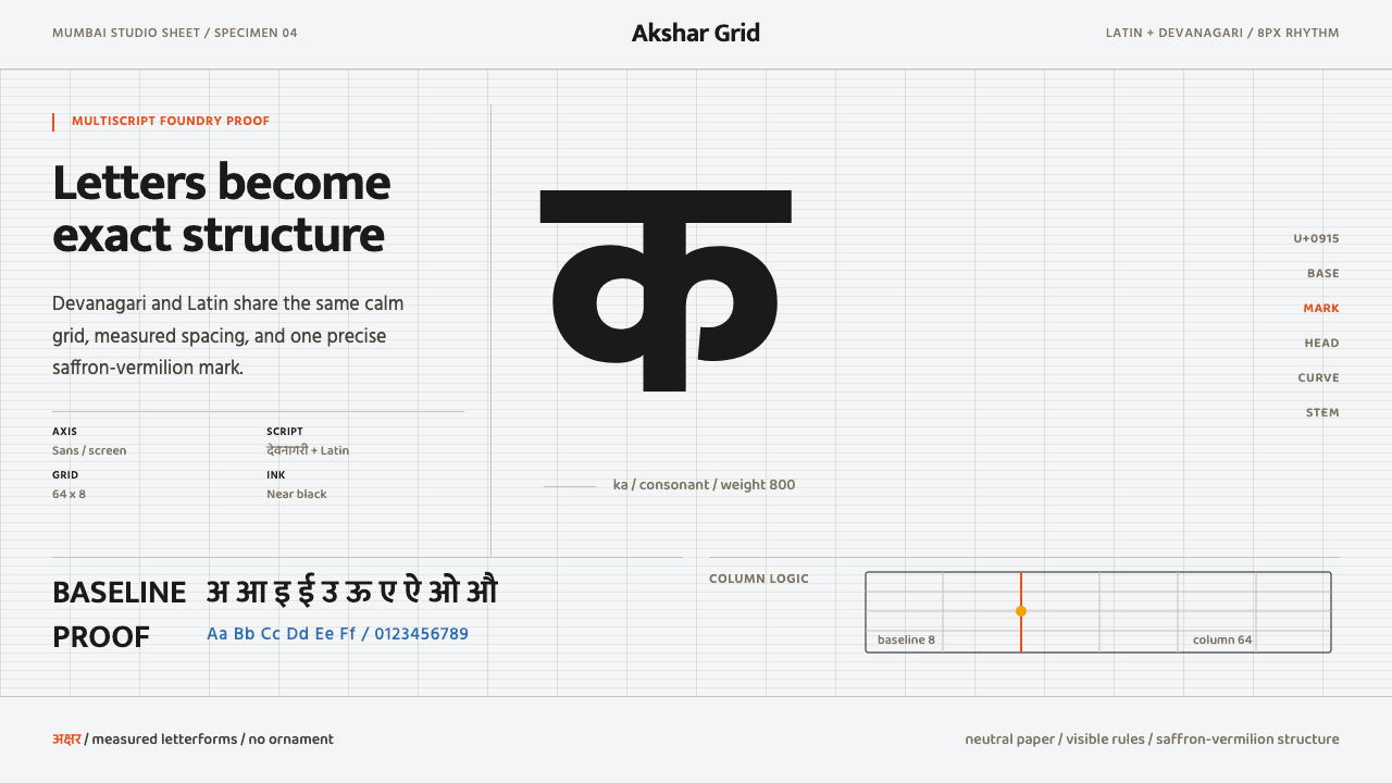 Modern Devanagari TypeType is the subject. Warm off-white grid, giant glyphs, one saffron-vermilion…
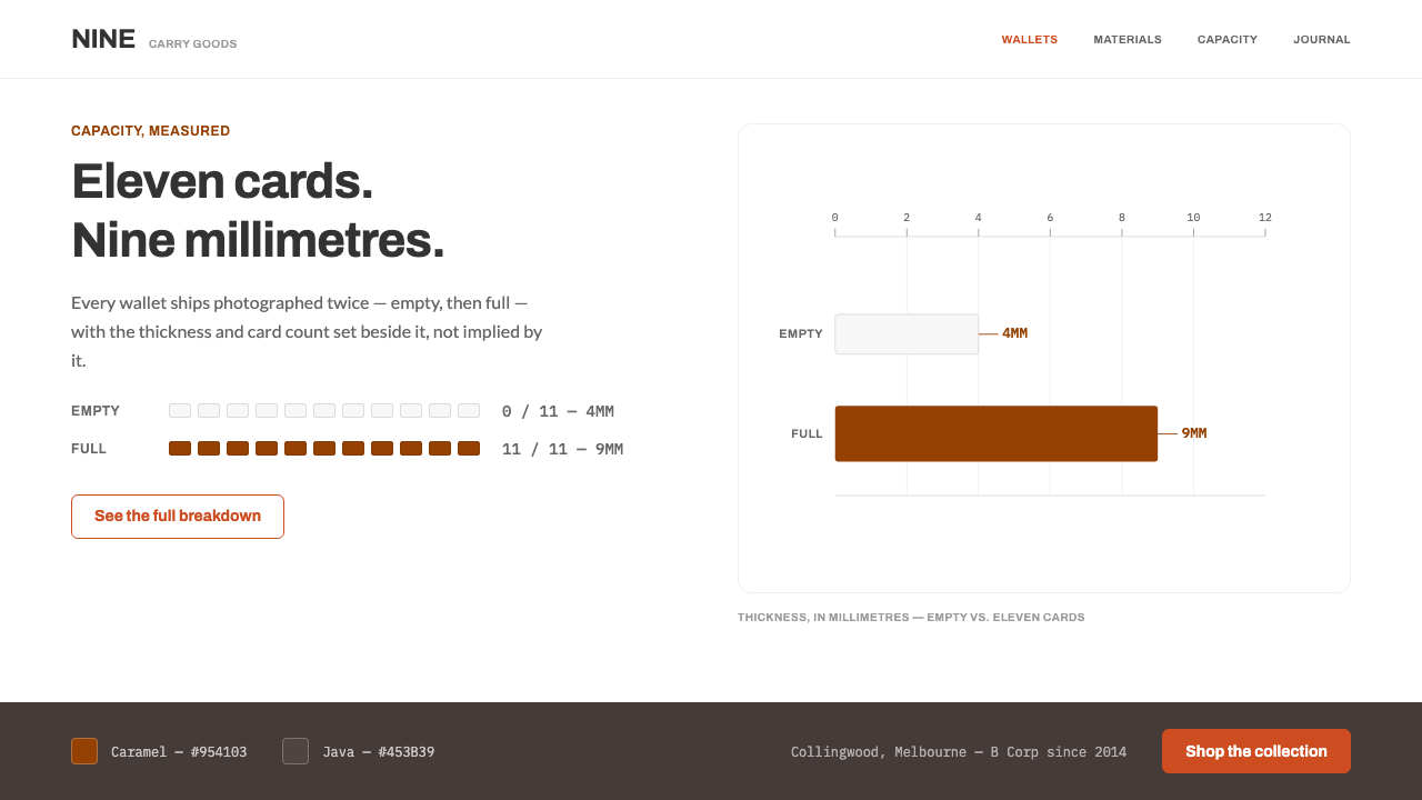 BellroyThinness gets measured, not claimed. Caramel bars plot millimetres against ca…
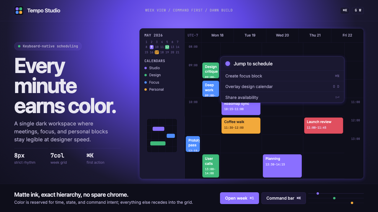 Cron CalendarDesigner-tech restraint. Purple wash, ink grid, mono shortcuts, surgical even…
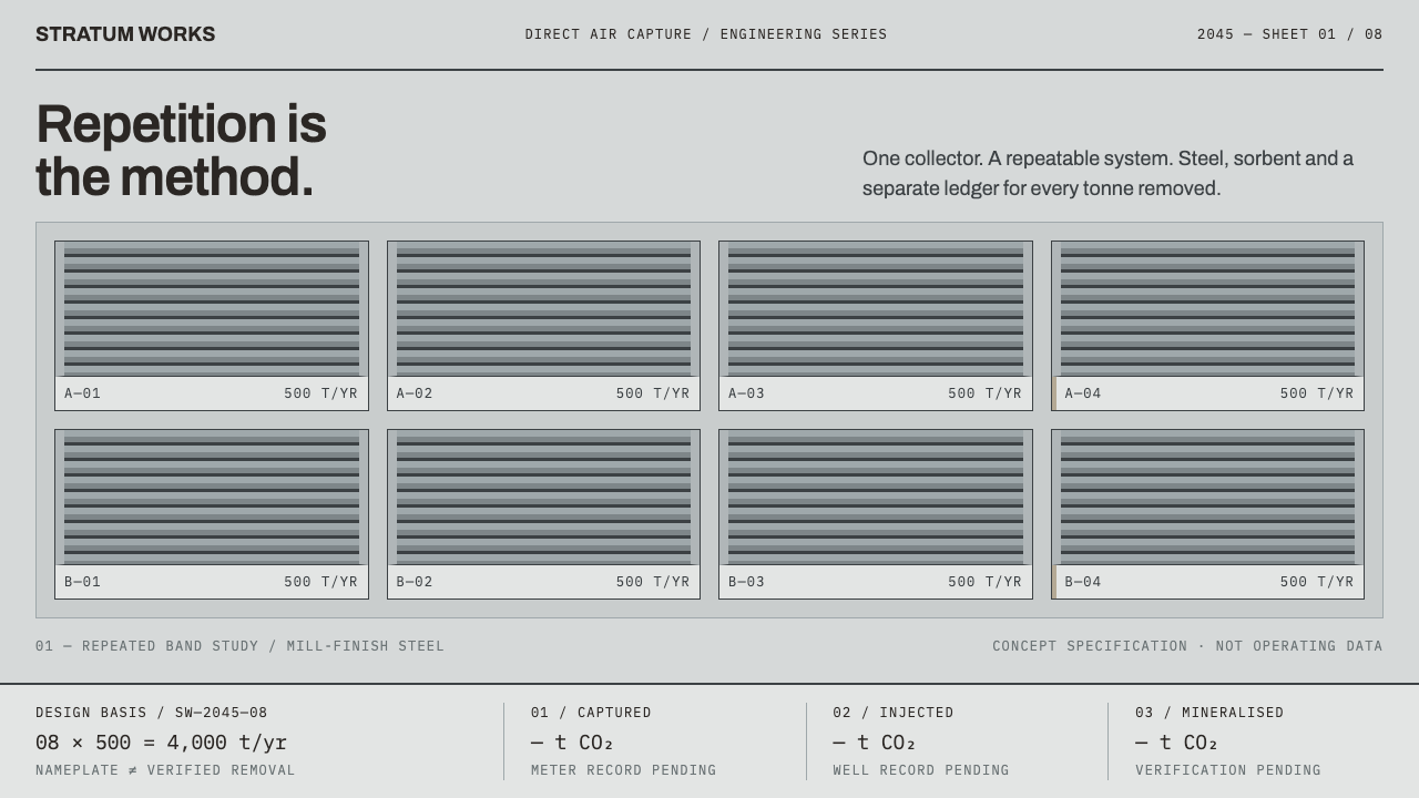 Direct Air Capture PlantRepetition, not rhetoric. Steel-grey louvre bands and monospaced ledgers make…