What is Bellroy?
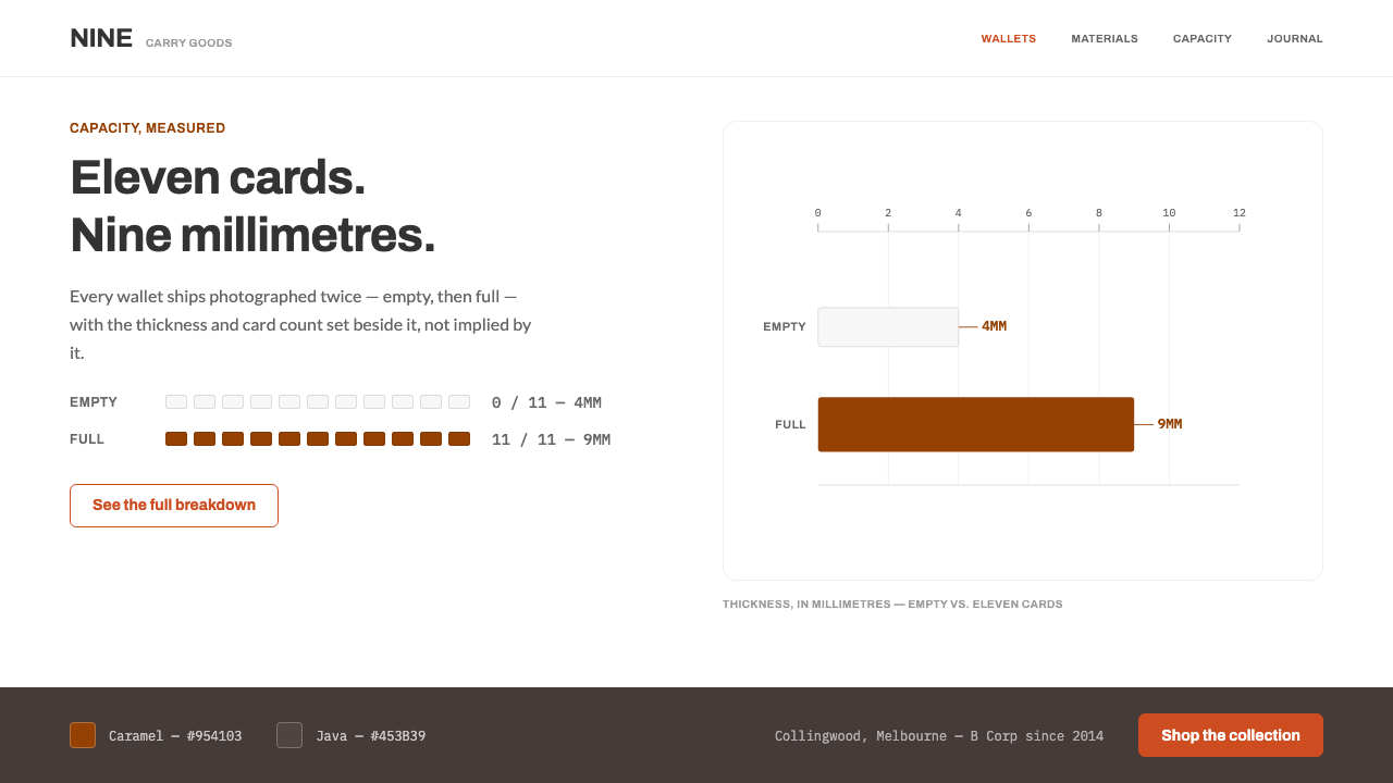
Bellroy argues for thinness with numbers: an empty wallet beside a full one, annotated in cards, millimetres and grams, on a white ground where the leather speaks in its own colour.
Bellroy in brief
Bellroy is a design style built on comparative product photography and measured claims. The company, founded in 2010 in Collingwood, Melbourne, sells slim wallets and other carry goods, and its pages never simply say that a wallet is thin; they show it. Each product band pairs an empty wallet with a stuffed one against the same white sweep, then annotates both with the facts a shopper actually needs: how many cards it holds, how thick it is and how much it weighs.
Around that evidence the system is deliberately plain. The ground is white, the type is a humanist sans, and there is a single orange reserved for links and calls to action. One warm panel is held back for the section on materials and sustainability, so that the leather and the company's openness about its materials get a setting of their own. Nothing is styled that could instead be measured, and the effect is closer to a well-made product manual than to a fashion editorial.
The signature device is the bar. Caramel-coloured bars plot millimetres against card counts, turning a purchasing doubt, will this get bulky, into a small chart that can be read at a glance. Numerals are set larger and more visibly than the headings around them, which inverts the usual hierarchy of retail pages: here the number is the headline and the adjective is the footnote.

Where does Bellroy come from?
Bellroy began in 2010 in Collingwood, Melbourne, Australia. The background material names four people as key figures, Andy Fallshaw, Hadrien Monloup, Lina Calabria and Graeme Barty, and the current visual system on which this style is based dates from roughly 2022 to 2024. The two dates are worth setting side by side: the style records the company as it looked in the early 2020s, about a dozen years after its founding, with its habits of presentation already well settled.
The style sits inside four overlapping traditions listed in its background notes. Carry, or everyday-carry, design is the culture of the pocket and the bag: the objects people take with them every day and judge by how well they disappear. Functional leather goods is the craft tradition from which wallets come, approached here as an engineering problem, namely how little leather and stitching can hold a given number of cards. B Corp material transparency brings a habit of disclosure, a willingness to name materials and say where they come from. Comparative product photography is the visual technique that ties the others together.
What distinguishes the Bellroy treatment is that these traditions reinforce one another. A carry-design audience cares about size and weight, so the page measures them. A transparency ethos favours showing over claiming, so the leather appears in its real, named colours, Caramel and Java, rather than being tinted to match a layout. Comparative photography needs a neutral stage, so the ground is white and the same sweep is used before and after. The visual system is less a look imposed on the product than a consequence of how the product is argued for.
That logic explains the restraint. Because the page depends on evidence, it cannot afford visual noise that competes with the evidence. Orange is rationed to actions, warm grey is rationed to materials, and everything else yields to the object and its dimensions. The tone that results is practical, slightly dry and confident that a good measurement is persuasive enough.
What defines the Bellroy look?
White Sweep
Every product scene sits on pure white, and the same sweep is used for the empty and the stuffed version of a wallet so that the comparison is fair. White here works like a laboratory control rather than an aesthetic gesture: it removes every variable except the one being compared, and it keeps the leather's colour honest.
Measured Leather Colour
Leather appears in its own measured colours, Caramel, a warm orange-brown, and Java, a deep coffee brown, and is never tinted to harmonise with a layout. The page adapts to the product; the product is never adapted to the page. This gives the palette an unusual property: its strongest colours are samples of real material, not brand decoration.
A Single Orange
One orange is reserved for links and calls to action. It is the only colour that exists for the interface rather than for the product, and so it reads unambiguously as something you can press. Using it nowhere else is what keeps the signal intact.
The Warm Materials Panel
A single warm grey panel is held back for the materials and sustainability section. Because it appears only once, it works as a change of room: the reader leaves the white product stage and enters a quieter space where sourcing is explained. Reusing the panel elsewhere would drain that effect.
Humanist Sans Type
The typeface is a humanist sans, with the open, slightly calligraphic proportions of handwriting rather than the mechanical regularity of a geometric face. It reads as friendly and workmanlike, which suits a product about daily use. Headings are modest in scale; they exist to label the evidence rather than to compete with it.
Numerals as Headlines
Numbers are set larger and more visibly than headings. Card counts, thickness and weight are the real content of a product band, so they take the display position that a slogan would take elsewhere. Pairing a big numeral with a plain unit label makes the claim scannable from a distance.
Bars Instead of Adjectives
Thinness is plotted as bars. Caramel-coloured bars compare millimetres against card counts, turning a qualitative promise into a proportion that can be seen. The bars are flat, unshadowed and labelled, in the manner of a technical diagram, and they borrow their colour from the leather itself.

Who shaped Bellroy?
Andy Fallshaw is the first of four names listed as key figures in the background material for Bellroy. His name anchors the style to the company's 2010 origin in Collingwood. The material gives no titles, so this article does not either; what matters for the style is the starting point it implies, a Melbourne business built around a single narrow idea, the slimmer wallet.
Hadrien Monloup is named second among the key figures. Having several names rather than one is itself informative: the style's voice is collective and impersonal, built around evidence rather than a personality. A system whose rule is that nothing is styled that could be measured is a natural product of a group that agreed to let the numbers speak.
Lina Calabria is the third name in the list. Together with the others she ties the look to a specific team and place rather than to an abstract trend. The visual system discussed here belongs to the early 2020s, so her name is best read as part of the context in which the company's comparative, measurement-first way of presenting products took its present form.
Graeme Barty completes the group of four. All four names are tied in the material to the company's origin in 2010, while the current visual system is dated roughly 2022 to 2024. The distance between those two dates is a reminder that this style is a snapshot of a mature brand's way of showing things, not a record of its first sketches.
How do you use Bellroy today?
Bellroy's style suits any product that can be argued for with measurement. It rewards designers who have real numbers to show and punishes those who do not: a layout with no data in it looks unfinished rather than minimal.
In presentations, build the cover from the product stage: a single object on white, the name in a modest sans, and one orange element if there is an action. Content slides should pair two states, before and after, empty and full, old and new, on the same white ground with a number under each. Data slides use flat, single-colour bars labelled with units. Take the bar colour from a real material or brand sample rather than inventing a chart palette.
For web interfaces, the style works for product detail pages, comparison tables, specification sheets and configurators. Keep the ground white, use orange only on links and primary buttons, and let a warm grey panel mark one distinct section such as materials, sustainability or care. Dashboards in this idiom favour a few large numerals with unit labels over many small widgets. Pricing pages can borrow the paired-state device, showing what each tier adds as a before-and-after with figures instead of adjectives.
In editorial and marketing work, replace superlatives with measurements. A caption that says how many cards, how thick and how heavy outperforms a paragraph of praise, and a comparative photograph does more than a lifestyle shot. Sustainability and sourcing copy belongs on the warm panel, written in the same plain, factual register as the specifications.
The common mistakes are to tint the product to match the layout, to spread the orange across headings and decorations, and to use the warm panel as a general background. Each weakens the system's central claim, which is that what you see is what was measured. Another is to use the style without numbers: stripped of its figures, the plain white layout loses its reason for existing.

Bellroy — FAQ
Is the style only useful for leather goods?
No. The method of comparing two states, annotating them with numbers and keeping the ground neutral works for any product whose value can be measured: bags, devices, furniture, tools. What the style cannot do is work without real figures. If there is nothing to measure, the layout has no reason for its hierarchy, and a different style will serve better.
Why does the style refuse to adjust the colour of the product?
Because the page's credibility depends on it. If Caramel were tinted to harmonise with a banner, the reader could no longer trust that the photograph shows the real leather. Keeping material colours as they are, and letting the layout adapt to them, is the visual equivalent of the style's wider habit of stating measurements instead of making claims.
What does comparative product photography mean in practice?
It means showing the same product in two states on the same background and under the same conditions, so the viewer can compare for themselves. In Bellroy's case that is an empty wallet next to a stuffed one. The technique works because everything except the variable is held constant, which is why the white ground and the framing must not change between the two images.
Can I add more accent colours?
The system has one interface accent, an orange used for links and calls to action. The leather colours belong to the product, and a warm grey panel belongs to one section. Introducing further accents blurs these roles. If you need to distinguish more states, use weight, size or position within the grey-and-white scheme first.
How is it different from an ordinary minimalist e-commerce look?
Typical minimalist retail pages use white space to create a mood: calm, premium, uncluttered. Bellroy's use of white is evidential. It is the neutral stage for a comparison, and the numerals are the headline. Remove the numbers and the paired photographs and the style loses its argument, becoming only a generic white page.
Related design styles
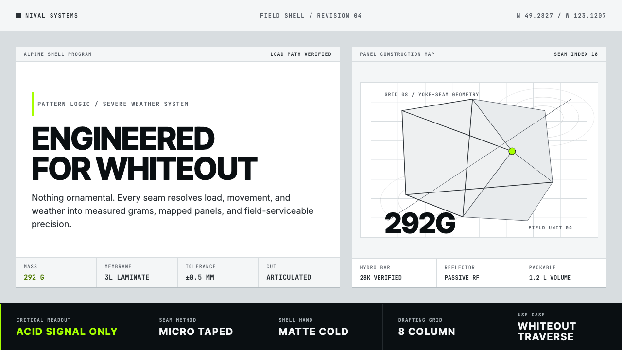 Arc'teryx Technical OutdoorEngineered, never ornamental. Glacier silver grid, mono specs, one acid-green…
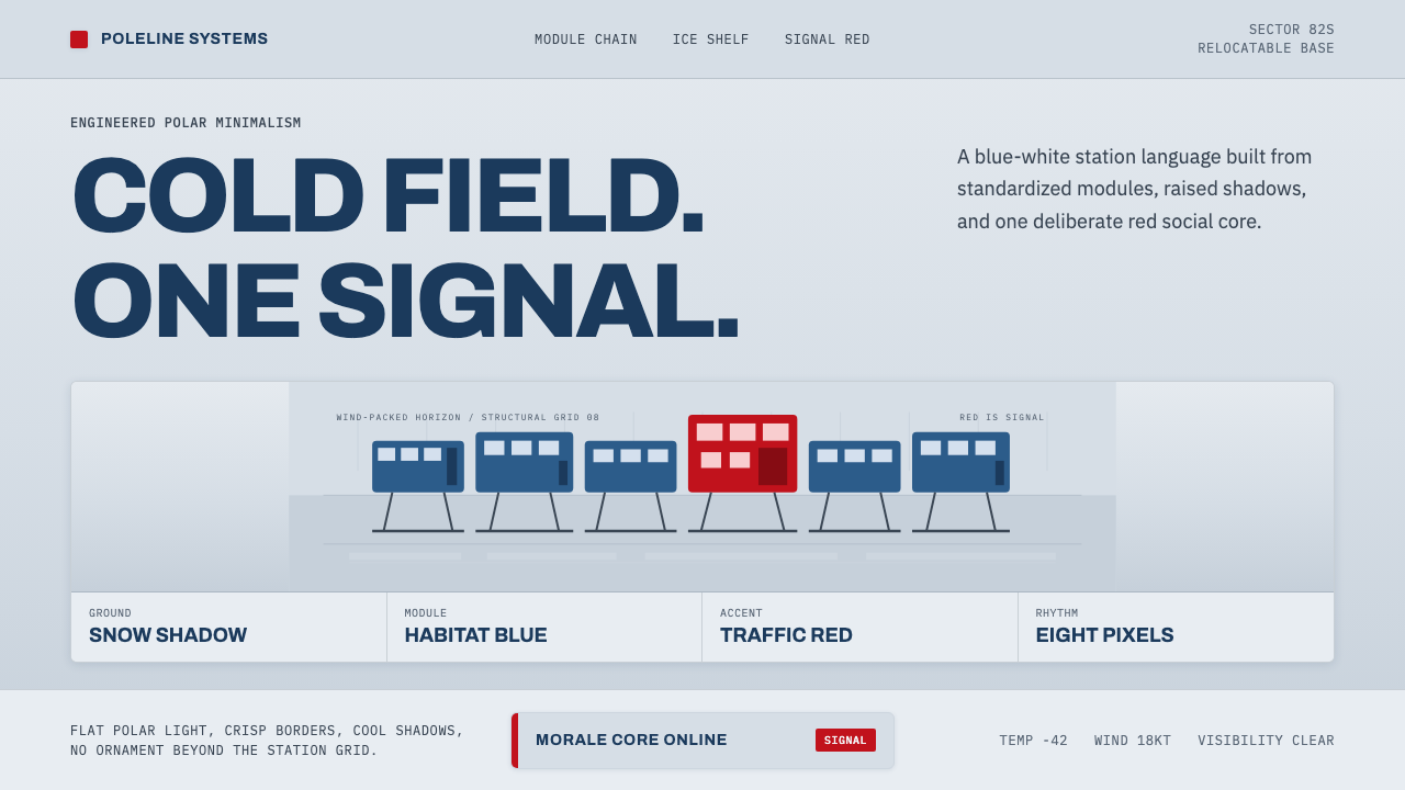 Antarctic StationCold precision, one red signal. Archivo modules ride a blue-white horizon gri…
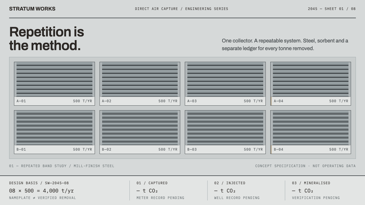 Direct Air Capture PlantRepetition, not rhetoric. Steel-grey louvre bands and monospaced ledgers make…
 Home Robot ManualDocumentation, not a launch. Graphite line-art, blue callout numerals, one or…
 Lagrange Servicing DepotEngineering without theatre. Cleanroom grey, strict rules, and gold reserved…
 Modern Devanagari TypeType is the subject. Warm off-white grid, giant glyphs, one saffron-vermilion…