What is Hotline Miami?
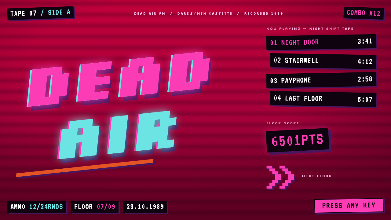
Hotline Miami's look is a crimson void where nothing sits level: black bitmap HUD boxes, combo counters in the corners and pink-and-cyan split titles on a tilt.
Hotline Miami in brief
The Hotline Miami style is the look of a top-down pixel massacre suspended in a void that breathes hot pink, crimson and magenta, then sinks into a dark vignette toward the bottom of the frame. The game's 2012 release, set in Miami in 1989, gave it a neon-soaked, slightly feverish identity that has been widely imitated.
Titles lean on slanted baselines and split into pink and cyan ghosts, offset by half a body width, like a videotape that has been copied too many times. Around them sit hard black HUD boxes set in bitmap capitals, combo counters pinned to the corners and score pop-ups that flash in magenta and vanish.
Nothing sits level and nothing stays still for long. The overall effect is pressure, rhythm and a faint smell of danger. It suits pages that want tension and beat rather than calm: music, games, nightlife, action and anything with a deliberately abrasive edge.

Where does Hotline Miami come from?
Hotline Miami was released on 23 October 2012 for PC, created by Dennaton Games in Sweden and published by Devolver Digital. The creators are Jonatan Söderström and Dennis Wedin, working with artist Niklas Åkerblad, known as El Huervo, and with musician Nigel Lowrie among the contributors tied to the game's identity. It belongs to the wave of indie pixel-art games that flourished in the early 2010s.
The setting is Miami in 1989, and the visual world draws on 1980s VHS box art and on the sound and colour of synthwave and darksynth. Hot pink, crimson, magenta and cyan, glowing against black, are the colours of neon signage and rental-store cover art. The effect is nostalgic for an era the game recreates less as history than as a half-remembered, overheated dream.
The game was made with Game Maker, a modest tool that encouraged flat, blocky, top-down graphics. Those limits shaped the look: sprites seen from above, hard pixel edges, interface elements drawn as plain black rectangles with bitmap type. The roughness is part of the charm, because it makes the violence and the colour feel immediate and unrefined rather than polished.
A sequel, Wrong Number, followed in 2015, carrying the same visual language forward. Together the games helped define how an indie pixel game could look aggressive and stylish at once, and this design system distils that language: the crimson void, the split titles, the black HUD boxes and the flashing score numbers.
What defines the Hotline Miami look?
Breathing crimson void
The background is not a flat colour but a void that pulses between hot pink, crimson and magenta, then darkens into a vignette toward the bottom edge. It is the atmosphere of the whole system: heat at the top, shadow at the bottom, and no still, neutral ground anywhere.
Slanted baselines
Titles are set on tilted baselines and never sit level. The tilt gives every heading a sense of falling forward or being thrown into the frame, so that even a static page feels like it is mid-motion.
Pink and cyan ghosts
Headlines split into a pink layer and a cyan layer, offset against each other by about half a body width. The misregistration reads like a worn videotape or a badly aligned print, and gives the type a vibrating, glitchy edge.
Black HUD boxes
Interface elements are hard black rectangles holding bitmap capitals. They are plain, opaque and square, and they sit on top of the vivid void like a utilitarian overlay. Their sheer blackness makes the text inside instantly legible.
Corner combo counters
Combo counters and scores are pinned to the corners of the frame, outside the central action. This keeps the main field uncluttered while giving the interface a constant sense of accumulation and consequence.
Flashing score pop-ups
Score numbers flash in magenta and then vanish. They are ephemeral by design: a reward that appears for a beat and disappears, pushing the viewer onward. Nothing in the system stays still for long.

Who shaped Hotline Miami?
One of the two creators behind Dennaton Games in Sweden, and a central figure in the making of Hotline Miami, released on 23 October 2012.
The other half of the Dennaton Games duo, working with Jonatan Söderström to build the game in Game Maker and to shape its overall look and feel.
The artist known as El Huervo, associated with the game's pixel imagery and its distinctive visual identity.
A musician associated with the project. The synthwave and darksynth sound world is inseparable from the visuals, because the colour and the rhythm of the screen were built to move with the music.
How do you use Hotline Miami today?
Hotline Miami's style is not neutral and is not meant to be. It works when the subject wants pressure, rhythm and a little danger: a music release, a game, an event, an action film campaign or a product that wants a deliberately abrasive identity. The system is strongest when it is allowed to be loud.
For presentation slides, a cover can be a full crimson void with the title on a tilt, split into pink and cyan ghosts. Content slides can use black bitmap boxes laid over the void to hold short lists or key numbers, with a combo-counter style number tucked into one corner. Data slides work well as big flashing figures with a short label, rather than dense tables.
For web interfaces, the style fits landing pages, game portals, music and nightlife products and creative tools with an edgy character. Keep copy short, set it in bitmap capitals inside black boxes, and use the pink-and-cyan split for headlines only. Let the background shift between hot colours, and use short flash effects for confirmation messages rather than long smooth transitions.
For editorial and marketing work, the style gives posters and social images an instant, retro-neon identity. Pair it with grainy video textures and big, blunt typography. Counters and score-style numbers can express statistics as a game, turning an ordinary result into a flashing reward. The tilt itself can act as a layout principle, with every block rotated slightly off the horizontal.
A common mistake is to tone the system down: levelling the type, evening out the gradient, or letting body text sit on the vivid background without a black box. That removes the tension and hurts legibility. The opposite mistake is to apply every effect to every element at once; the split ghosts belong on titles, the flash belongs on scores, and the black boxes carry everything that must be read.

Hotline Miami — FAQ
What is the Hotline Miami design style?
It is the look of a top-down pixel game in a breathing hot-pink, crimson and magenta void: tilted titles split into pink and cyan ghosts, black bitmap HUD boxes, corner combo counters and flashing score pop-ups.
Where does it come from?
It comes from Hotline Miami, released on 23 October 2012 for PC by Dennaton Games of Sweden and published by Devolver Digital. It is set in Miami in 1989, and borrows from 1980s VHS box art and synthwave culture.
Why are the titles tilted and split?
The tilt keeps every heading off level so the page never feels still, and the pink-and-cyan split imitates a videotape copied too many times. Together they give type a feverish, vibrating character that matches the game's pacing.
How do I keep text readable on such a loud background?
Put everything that must be read inside hard black boxes set in bitmap capitals. The vivid void is for atmosphere, the split ghosts are for titles, and the flashing colour is for scores. Do not let body text sit directly on the void.
Is this suitable for professional products?
Usually not. The system is abrasive by design and favours entertainment, music, games and nightlife. For calm, trust-driven products such as healthcare or finance, its tension and flashing effects would work against the message.
Related design styles
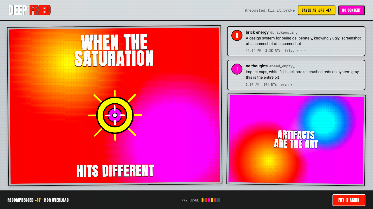 Weird Twitter / ShitpostGloriously ugly on purpose. Blown-out HDR reds and white-stroke Impact caps o…
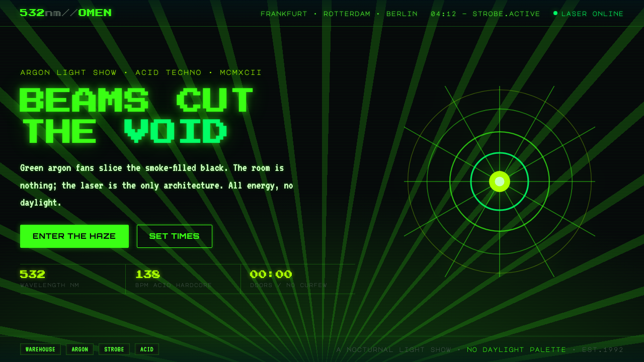 Acid Rave Laser Show 1992Beams cut the void. Argon green on pitch-black smoke, pixel marquee type, add…
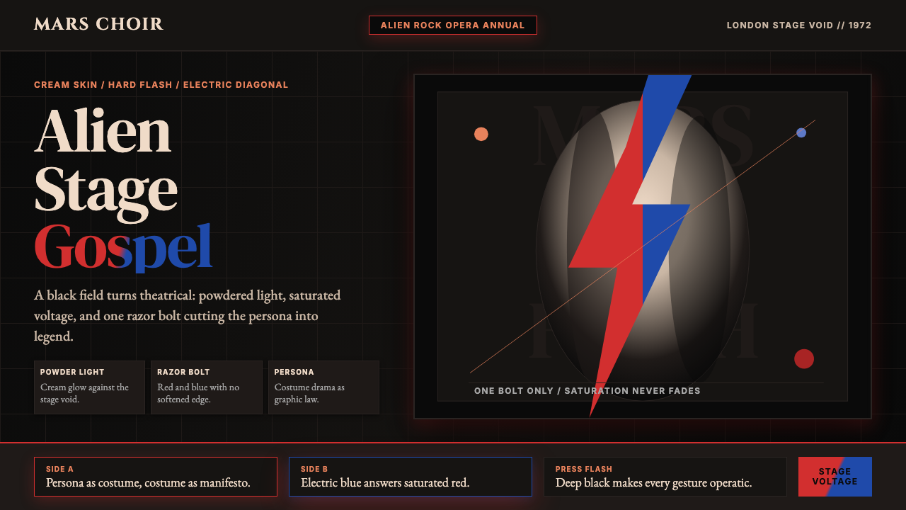 Bowie — Ziggy StardustTheater at full voltage. Cream-on-black portrait cut by one red and electric-…
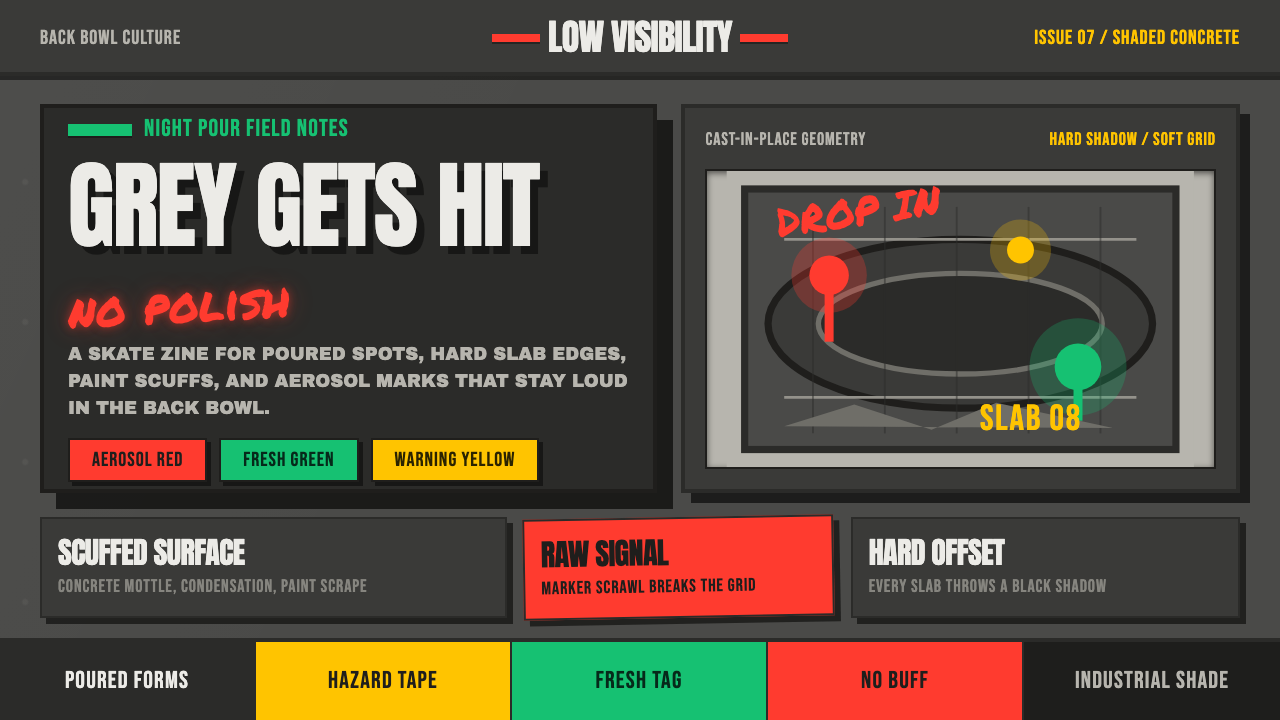 Concrete SkateparkRaw concrete detonates. Grey slab blocks carry red, green, and warning-yellow…
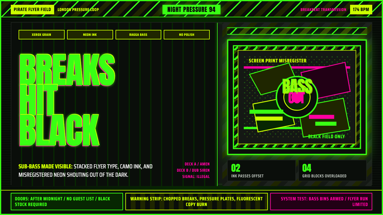 Jungle / Drum & BassRaw rave voltage. Neon green Anton, camo strips, and xerox grain hit black.
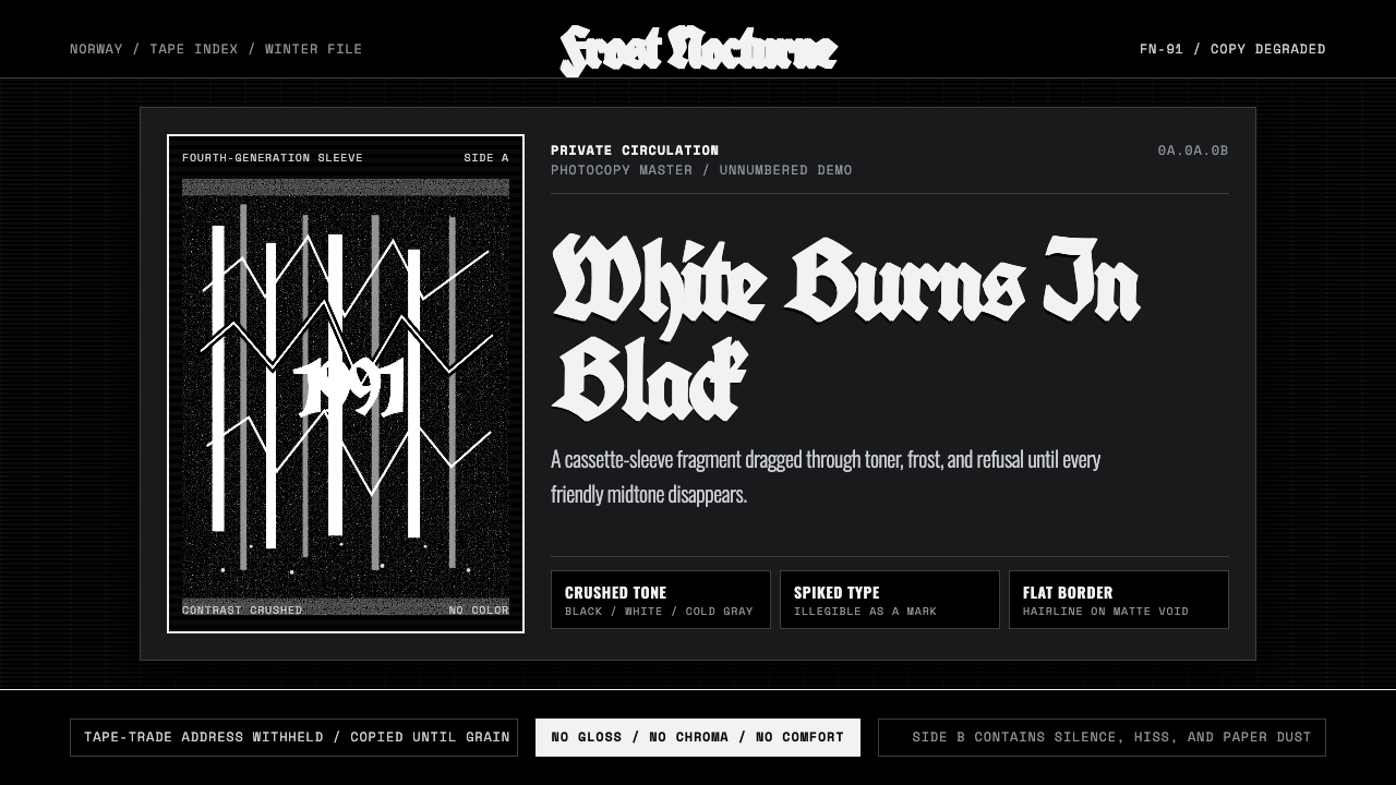 Nordic Black MetalUncompromising monochrome. Blackletter, hairline frames, and xerox grain crus…