What is Honor of Kings?
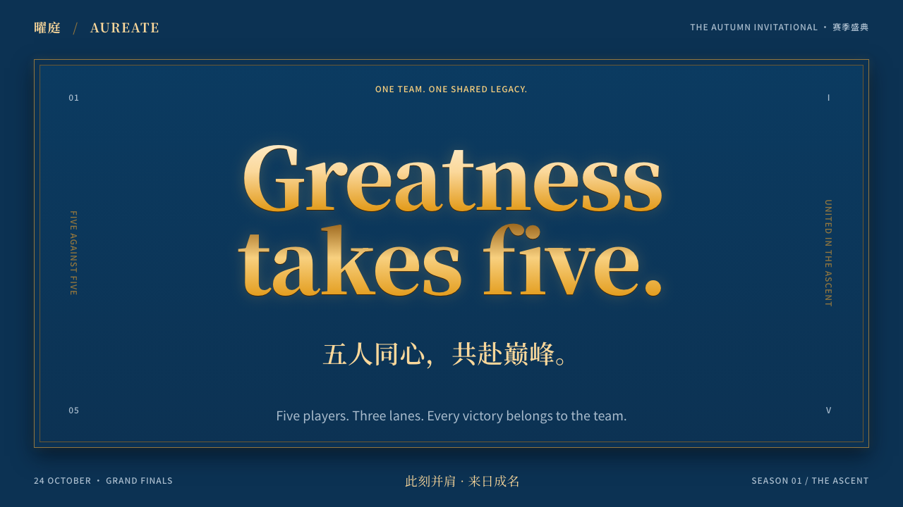
Honor of Kings turns victory into ceremony: metallic gold titles and double gold rules on deep navy, with heroes from Chinese history and myth looking out of every panel.
Honor of Kings in brief
The Honor of Kings style is the interface language of Tencent's five-versus-five mobile MOBA, released by TiMi Studio Group on 26 November 2015 in mainland China. Its screens are built from deep navy panels framed by thin double gold rules, metallic gold titles with a polished sheen, and large painted splash art of heroes drawn from Chinese history, myth and classical novels.
The mood is ceremonial. A match is a small campaign, and the interface frames it like an investiture: chamfered panels with gold corner brackets, avatars circled by gold rings, tabs with a gold underline and rank emblems shaped like crests. Dark ground and warm metal give the screens weight without making them heavy.
Translated into product design, it is a dark, gold-trimmed system for moments that deserve a sense of occasion: openings, rankings, rewards, rosters and achievements. It rewards a confident hand; used with restraint, it feels dignified rather than loud.

Where does Honor of Kings come from?
Honor of Kings launched on 26 November 2015 in mainland China, developed by Tencent's TiMi Studio Group. It was designed for phones from the start: short matches, touch controls and a five-versus-five format that retained the strategy of the PC MOBA genre while fitting into a commute or a lunch break. It quickly became a social currency for a generation of players, and it later grew into a major mobile esports scene through the King Pro League, known as the KPL. A global edition followed in 2024.
The sources list Li Min and Huang Lanxiao among its key figures. The game's visual identity grew out of three ideas: mobile MOBA conventions, such as compact hero cards and clear role icons; a mobile esports presentation in which broadcasts, ranks and tournament screens needed to look prestigious; and a distinctive approach to hero design that draws on Chinese history, myth and classical novels. Characters take their names and stories from those sources, then reappear as skins with fresh painted splash art.
That last idea shaped the interface more than any other. Because the art on screen is traditional in subject, the framing around it adopts the metal-and-lacquer logic of imperial ceremony, rendered in deep navy and gold. Double rules recall the thin gilt borders of scrolls and certificates. Chamfered corners and corner brackets recall armour plates and seal frames. Crest-shaped rank emblems recall heraldic shields, even though the game is Chinese in theme.
The result is a look that feels both modern and rooted. It carries the energy of a competitive game, with sharp contrasts and dramatic lighting, while giving every menu the polish of a formal programme. In the design-system era, it stands as one of the clearest examples of a game interface that is also a brand, recognisable at a glance in a screenshot even when the logo is cropped out.
What defines the Honor of Kings look?
Deep navy ground
Panels and backgrounds are a deep, slightly cool navy that reads as night sky or lacquer. It gives gold maximum contrast without the harshness of pure black, and it lets painted art glow when placed on top. Layers are built by small steps of lightness rather than by borders alone.
Thin double gold rules
Panels are framed by two thin gold lines, with a narrow gap between them, like the gilt border of a certificate. The lines are fine, so they decorate without crowding the content. This double rule is the most recognisable single device in the whole look.
Metallic gold titles
Headings are set in a serif with a polished gold sheen, a gradient from lighter to deeper gold that suggests beaten metal. It is used for titles, hero names and key numbers only. Body text stays in a clean, legible face in light neutral, so the gold remains special.
Chamfered panels with corner brackets
Panel corners are cut at an angle rather than rounded, and small gold brackets mark them. This echoes armour plates and seal frames, and gives cards a crisp, engineered silhouette. Rounded corners are avoided because they would soften the ceremonial tone.
Gold-ringed avatars
Hero and player avatars are circles with a gold ring around them, set against the navy panel. The ring turns a small portrait into a medal. Ring thickness and detail can grow with importance, so a champion's portrait looks grander than an ordinary list entry.
Tabs with a gold underline
Navigation uses tabs in which the active one carries a gold underline and brighter text, while the rest recede into the navy. The cue is minimal but unmistakable, and it keeps the system consistent with the gold-on-navy palette without adding more boxes.
Crest-shaped rank emblems
Rank and status are shown by emblems shaped like shields and crests, with metal tiers from bronze to higher honours. They turn progress into collectable insignia. Because they are drawn as objects, they hold their own next to the painted hero art.

Who shaped Honor of Kings?
Named in the sources among the key figures behind Honor of Kings at Tencent's TiMi Studio Group.
Also credited among the key figures of the game's creation and its visual identity.
The Tencent studio that developed and released Honor of Kings on 26 November 2015.
The professional league that made the game a central part of Chinese mobile esports and demanded broadcast-grade interface design.
How do you use Honor of Kings today?
On slides, the Honor of Kings style is made for ceremonies and rankings: awards presentations, team introductions, esports events, annual reviews with a sense of occasion. A cover can be a navy slide with a double gold frame and a large metallic title. Use one painted figure or key image per slide. Keep body copy light on navy and short; the frame already supplies the grandeur, so the text can be modest.
For data slides, treat charts as scoreboards. Bars and lines are drawn in gold and a lighter neutral over the navy, with direct labels, and the most important result is set in the metallic title face. Avoid more than two accent hues. Rankings work especially well as vertical lists with ringed avatars and crest emblems, which makes leaderboards feel earned.
On the web and in apps, the system fits game portals, esports sites, fan communities, battle-pass pages, reward screens and loyalty programmes. Chamfered cards hold the content, gold underlines mark the active tab, and ringed avatars identify people. Buttons should be solid gold with dark text for the main action and outlined gold for the secondary one. Use motion sparingly: a gentle shine across a title is enough.
In editorial and marketing work, the look suits launch campaigns, tournament posters, character reveals and event pages. Painted splash art does most of the persuading; the gold frame and type make it feel official. Copy can be bold and declarative, in the voice of a proclamation, but it should still be short. Titles may use traditional names and epithets when the subject matter calls for them.
The common mistake is to overuse gold. If every element is gold, nothing is special, and the page turns into costume jewellery. Another mistake is using the system for quiet or utilitarian products such as accounting tools or documentation, where the ceremony becomes noise. Lastly, avoid mixing in rounded, friendly components, which clash with the chamfered silhouette.

Honor of Kings — FAQ
What is the Honor of Kings design style?
It is the interface language of Tencent's mobile MOBA Honor of Kings: deep navy panels, thin double gold rules, metallic gold serif titles, chamfered corners with gold brackets, ringed avatars and crest-shaped rank emblems, all supporting painted hero art.
When and by whom was the game released?
It was released on 26 November 2015 in mainland China by Tencent's TiMi Studio Group. A global edition followed in 2024. Its competitive scene runs through the King Pro League, the KPL.
Where do the heroes come from?
Hero design draws on Chinese history, myth and classical novels. Characters keep names and stories from those sources and appear in new painted skins, which is why the interface frames them like heirlooms.
Is it suitable for ordinary business software?
Rarely. It is built for occasions, rankings and rewards. In a dense, utilitarian product the ceremony becomes noise. Use it for celebratory moments or gaming and esports surfaces rather than for everyday tools.
How should gold be used?
As a trim and a signal: rules, titles, rings, underlines and key numbers. The ground stays navy and body text stays neutral, so gold keeps its meaning of importance and honour.
Related design styles
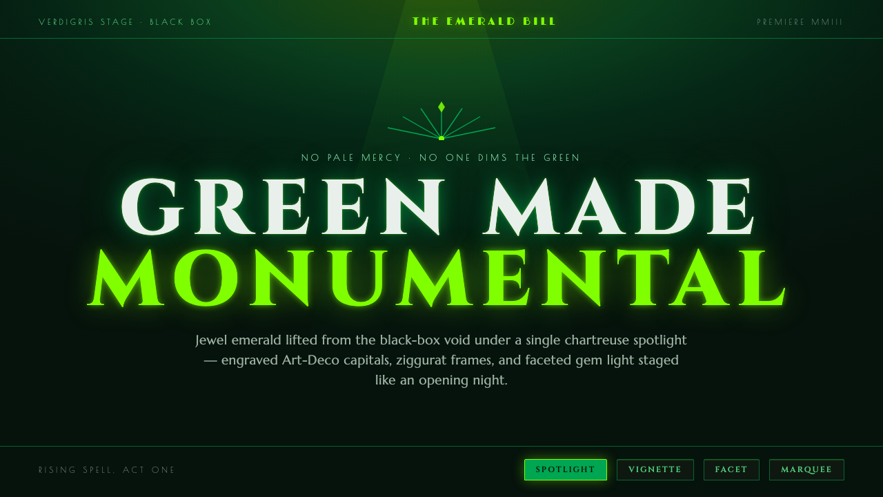 Wicked Elphaba EmeraldGreen made monumental. Jewel emerald spotlit on a black-box void, in engraved…
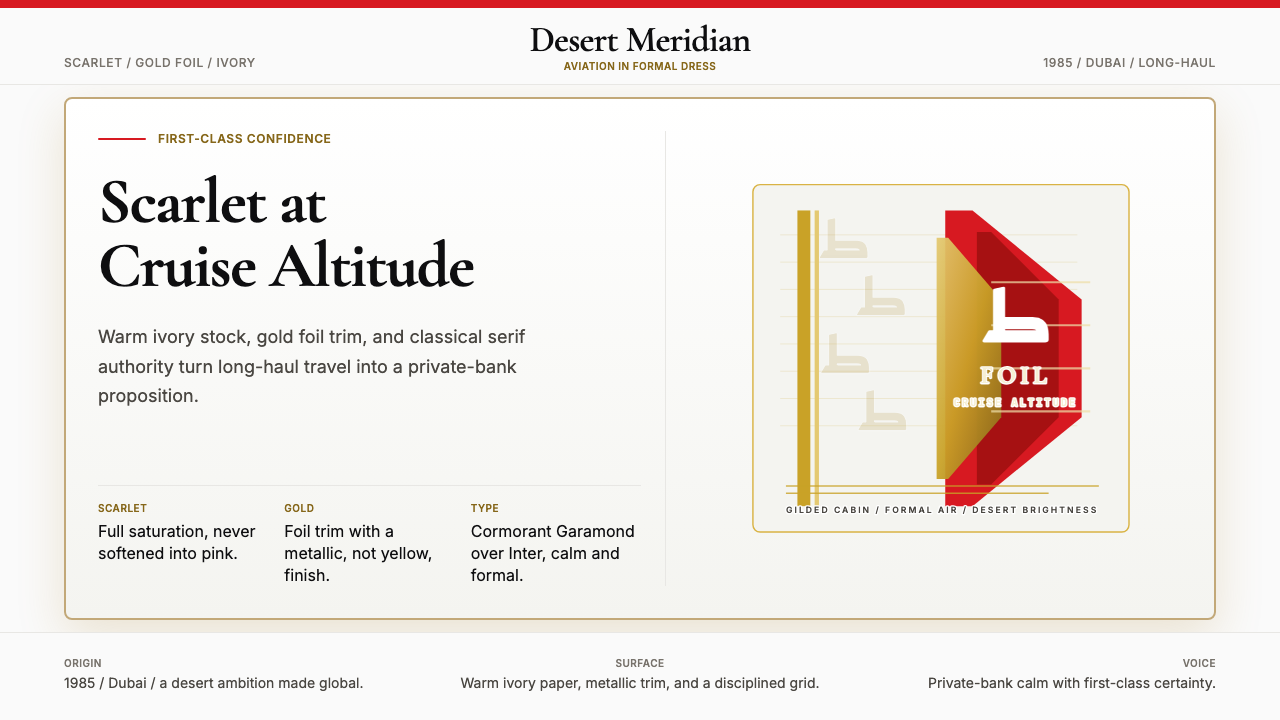 Emirates Airline (Red-Gold)Scarlet confidence, never casual. Ivory stock, gold foil, and serif restraint.
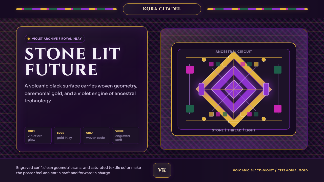 Africanfuturism VibraniumCeremony goes electric. Violet glow and gold inlay thread a volcanic textile…
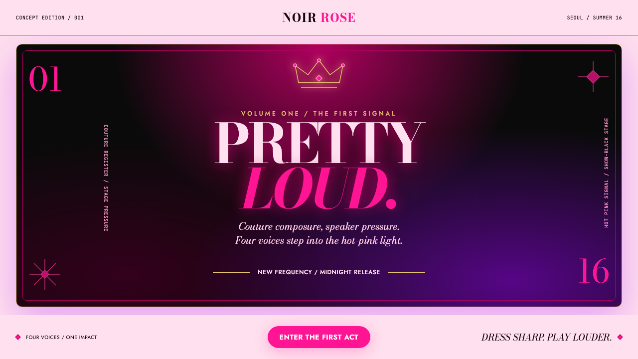 BLACKPINK (2016 Debut Era)Couture hits at full volume. Hot pink, show-black and Bodoni lock onto a spot…
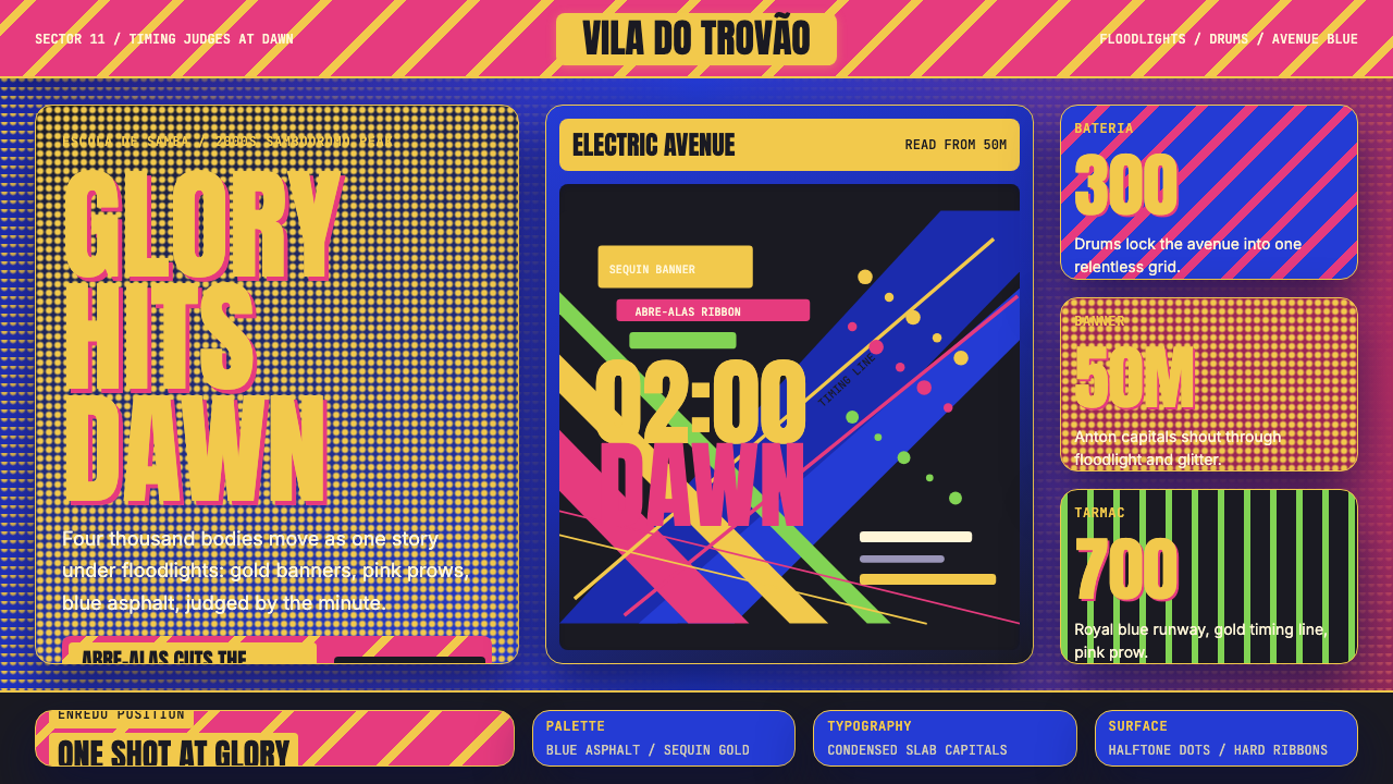 Brazilian Samba School (2000s Carnaval)Parade at floodlight volume. Royal blue asphalt, sequin gold type, pink ribbo…
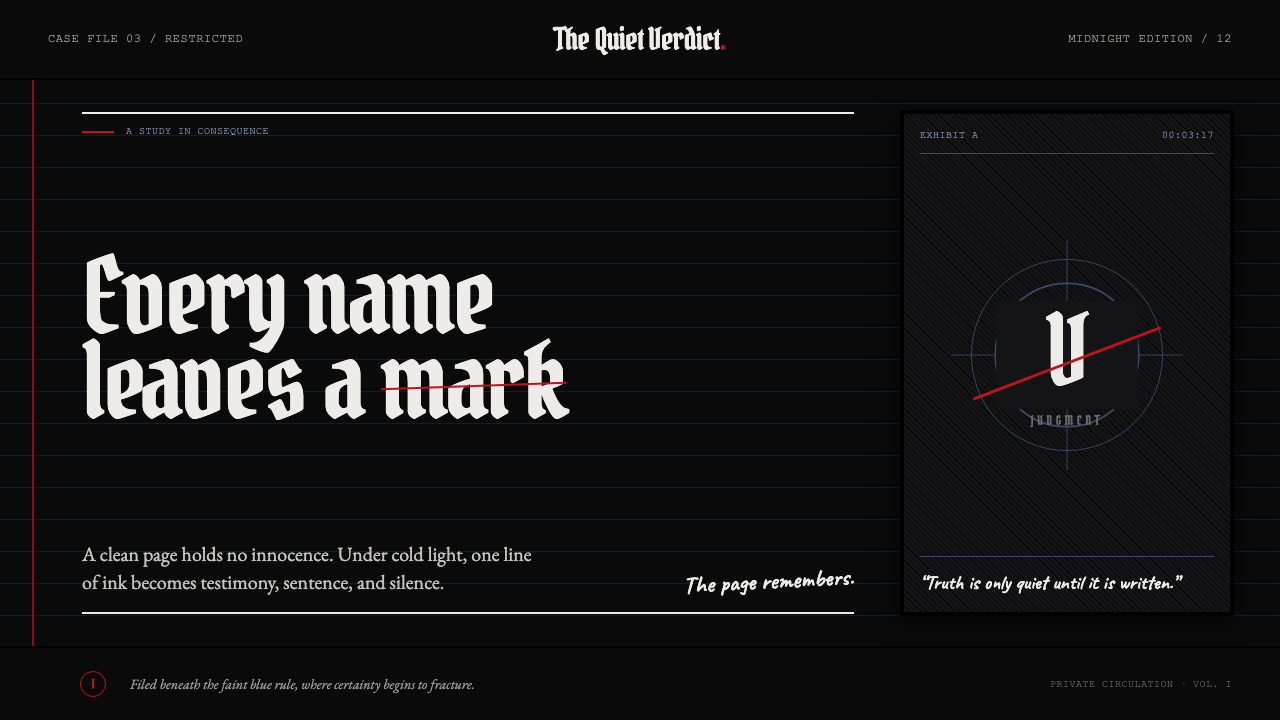 Death Note (2003)Silence becomes judgment. Bone-white blackletter and blue rules break under o…