What is HK Typhoon Signals?
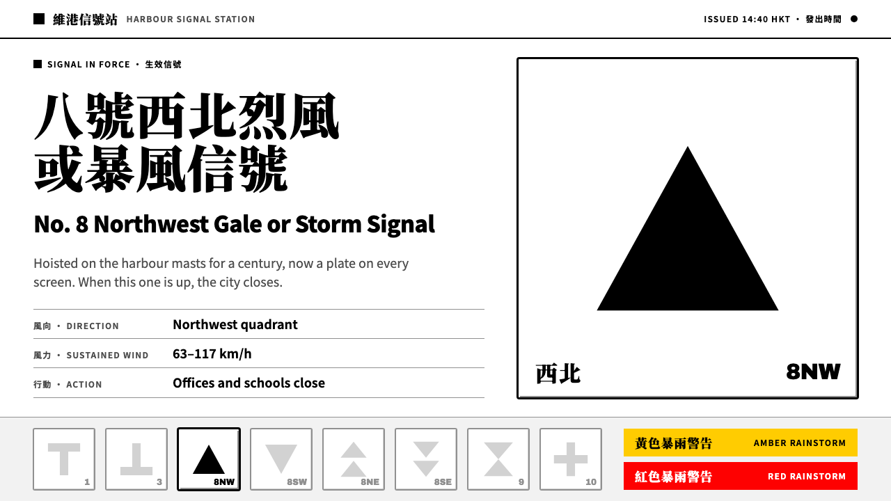
Hong Kong's typhoon signals are one of the clearest verdict systems in public design: eight black shapes on white plates, where the signal in force goes solid black and every other rung of the ladder falls back to grey.
HK Typhoon Signals in brief
Hong Kong's tropical cyclone warning signals are eight black shapes on a white plate: an upright T, an inverted T, four triangle arrangements for the four quadrants of the No. 8 signal, an hourglass and a cross. For more than a century they decided whether ships ran, schools opened and offices emptied. Residents refer to the levels by number, and hearing that the No. 8 signal has been hoisted is enough to stop a working day. Few graphic systems have carried so much consequence with so little form.
As a design style, it takes the plate as its entire material. Fields are pure white; the geometry is flat, solid black; three bevel greys give the plate its edge and mark the signals that are not in force; and a strict escalation ladder of 1, 3, 8, 9 and 10 sets the order. A signal that is in effect is rendered fully black while the others recede to grey, so a viewer can read the state of the whole system at a single glance. There is no gradient, no illustration and no flourish.
The language is bilingual and heavy. Chinese is set in a Ming face, the traditional high-contrast serif form of Chinese print, with English beneath in a plain grotesque. Both are set bold so that a label can be read at a distance on a signal mast, a television corner mark or a leaflet. The result is a style of rigorous public clarity, with the authority of an official notice and the visual economy of a pictogram set.

Where does HK Typhoon Signals come from?
The system begins in the nineteenth century with the first storm signals of 1884, when the Hong Kong Observatory started warning those who used the harbour of approaching storms by means of hoisted signals. William Doberck is the name tied to the Observatory's early years, and Robert FitzRoy, remembered for pioneering public storm warnings in Britain, stands behind the very idea that a storm could be announced to sailors by shapes visible from the shore. Signals of this kind belong to a long tradition of maritime storm signalling shared by ports around the world.
Over the following decades the early signals were consolidated into a numbered system. The numbering settled in the middle of the twentieth century, and with it the ladder that Hong Kong still uses, a deliberately sparse ladder of five rungs numbered 1, 3, 8, 9 and 10. This marked a movement from notices aimed at ships toward public-safety symbol standardisation: shapes that could be learned once, by anyone, and understood without a translator. The sparseness is part of the design, since a short ladder is easy to remember.
The system's greatest cultural weight came between 1950 and 1990, when the signals were part of the ordinary rhythm of the city. A hoist at Tsim Sha Tsui or at the harbour signal stations was a fact that everyone could see, and the schools, ferries and offices of an entire city responded to it. For people who grew up in Hong Kong, the No. 8 signal produces a conditioned response: it means that work stops. The shapes became part of collective memory, which is why a design built on them can be recognised without explanation.
The physical life of the hoisted signals ended on 1 January 2002, when raising them on masts was discontinued. What had been canvas on timber frames, flying from signal-station masts, moved to web pages, television corner marks and single-sheet leaflets, with the geometry unchanged. That shift, from hoisted signals to broadcast pictograms, is the story this style tells. It keeps what mattered in the originals, their flatness, their high contrast and their order, and sets aside the constraints that the mast once imposed.
What defines the HK Typhoon Signals look?
The White Plate
Everything sits on a plate: a pure white field with a modest bevelled edge, like a sign board seen against the sky. The plate is the unit of the system, equivalent to a card or tile in an interface, and it carries exactly one signal. White is used without tint or texture, because its job is to give black the cleanest possible background and to make the whole system read as a notice rather than an illustration.
Solid Black Glyphs
Signals are drawn as flat, solid black geometry, with no outline, no inner detail, no shading and no gradient. A glyph is either present as a clean dark mass or absent. This is the logic of an object hoisted on a mast and read from far away: only silhouette matters. In a screen context, the discipline is to resist adding highlights, rounded softening or decorative line work to what must be a pure silhouette.
A Vocabulary of Eight Shapes
The vocabulary is minimal and highly distinct: an upright T, an inverted T, four arrangements of triangles for the quadrants of the No. 8 signal, an hourglass and a cross. Each can be told apart from the others at a glance and at a distance, and each was designed to survive poor visibility. Together they show how much meaning can be carried by a handful of simple, unambiguous forms.
The Escalation Ladder
Signals are ordered on a ladder of 1, 3, 8, 9 and 10, and the layout shows that order explicitly, usually as a row or column of plates from lowest to highest. The sequence is the system's grammar: the viewer always knows where a given signal sits in relation to the others, what has already passed and what could come next. In design terms, the ladder is a ready-made way to present any sequence of escalating states.
One Signal, One Verdict
Only the signal in force is rendered in full black. All the others fall back to grey, still present for orientation but visibly inactive. This single rule turns the whole ladder into a state indicator: it is read in an instant, with no legend and no colour coding. The difference is carried by value alone, from solid black to a pale or middle grey, so that the verdict is unmistakable.
Three Bevel Greys
The plate's edge is modelled with three greys, a light one, a middle one and a dark one, which give it a gentle bevel. This is the only depth in the system, and it is a physical depth, the thickness of a painted board, not a simulated light effect. The same greys, applied to inactive glyphs and secondary text, form the whole supporting palette. Nothing else is needed.
Heavy Bilingual Labels
Each plate is labelled in both languages. The Chinese sits above in a Ming face, a serif with strong contrast between thick and thin strokes that is the traditional voice of official Chinese print, and English follows beneath in a plain grotesque. Both are set heavy so that the labels hold their own beside solid black shapes. The pairing is formal, public and unambiguous, and it treats both languages as equals.

Who shaped HK Typhoon Signals?
The Hong Kong Observatory's first director, whose name is tied to the earliest storm signals of 1884. His importance to the style is as the figure behind a public service that treated visual clarity as a matter of safety. The idea that a handful of shapes could carry a warning to everyone in a harbour is the founding premise on which this entire design language rests.
The British naval officer and meteorologist remembered for pioneering public storm warnings in Britain. He is the model behind the broader tradition of announcing storms to mariners by visible signals, a tradition that Hong Kong's system belongs to and adapts. Seeing the plates as part of this lineage explains why they are built for distance and weather rather than for decoration.
The places where the signals were physically raised, on masts at Tsim Sha Tsui and at the stations around the harbour, until the practice ended on 1 January 2002. They matter to the style as the original medium: canvas and timber frames read against sky and water. Remembering that origin helps designers keep the system's flatness, scale and high contrast when it is brought onto screens.
How do you use HK Typhoon Signals today?
The typhoon-signal style is the right choice whenever a product needs to communicate state, order or severity with absolute clarity: status pages, incident dashboards, public notices, transport and safety information, school and civic communications, weather and risk products, or anything built on a short ladder of ordered levels. The governing principle is one signal, one verdict, and it should be applied with the same rigour wherever it appears.
On presentation slides, a cover can be a single white plate carrying one black glyph, with the title set heavy in bilingual form beneath it. Content slides can use the ladder directly: a row of plates, one black and the rest grey, to show where a project, risk or maturity level currently stands. Data slides should use the same logic for emphasis: keep every series grey and give only the series under discussion solid black, avoiding legends that depend on colour.
In web interfaces, treat each plate as a card with a gentle bevel. A status or severity indicator becomes a row of plates in order, with the active one solid black and the others grey. The same pattern suits plan selectors, step trackers and tier comparisons, where one option is chosen and the others remain visible for orientation. Labels are set bilingual and heavy, buttons are solid black, and secondary actions are grey. Do not add colour to signal severity; the value difference between black and grey already does the work, and it remains legible for colour-blind users.
For editorial and marketing work, the style gives explainers, posters, leaflets and infographics an official, trustworthy voice. A single plate can serve as an emblem for a feature or a campaign, and the ladder can be used as a recurring device for walking readers through stages. Copy should be short and declarative, in the manner of a notice, and bilingual pairing should be consistent: the same order, the same weight, on every plate.
The most common mistake is to add traffic-light colours to show severity, which dissolves the black-versus-grey logic that makes the system quick to read. Another is to render every signal black, leaving nothing visibly in force. Others include outlining or shading the glyphs, setting the labels in light weights, inventing new shapes that break the established vocabulary, and using the plate as a decorative badge rather than as a statement of fact. If more than one thing seems urgent, the ladder is being asked to do too much.

HK Typhoon Signals — FAQ
Does the style use red, amber and green for severity?
No. The system relies on value, not hue. The signal in force is solid black and every other rung is grey, which is both quicker to read and more robust than colour: it survives monochrome printing, poor screens and colour-blindness. Adding a traffic-light palette would not strengthen the message and would blur what makes the original distinctive.
Can the system be used for things other than weather?
Yes. Its underlying structure, an ordered ladder of states with exactly one active at a time, fits many contexts: incident severity, service status, subscription tiers, onboarding stages, project phases and access levels. What must be kept is the discipline: a short ladder, one active state, and a clear visible order. The shapes themselves can be replaced, but they should stay simple, flat and distinct.
Why pair a Ming face with a grotesque?
The Ming face is the traditional voice of Chinese official print, with a contrast and gravity that suit a public warning, while the grotesque is the plainest, most neutral way to set Latin letters. Together they say that the message is authoritative and international at once. Both are set heavy so they can stand beside solid black shapes without being overpowered.
How should the system behave on a dark page?
The plate is white by design, so the easiest approach is to keep the white plates and place them on a darker surround, letting the ladder remain intact. Inverting the glyphs to white on black removes the bevel logic and changes the meaning of active and inactive, which is risky for a system whose whole purpose is unambiguous reading. If inversion is unavoidable, test that the active state still stands out unmistakably.
Why are there only five rungs on the ladder?
Because a short ladder is a memorable one. The numbering of 1, 3, 8, 9 and 10 reflects a system settled over decades and designed to be learned by an entire population, not consulted from a manual. Fewer rungs mean fewer distinctions to get wrong. For designers, the lesson is to resist filling out a scale with intermediate steps that nobody will remember.
Related design styles
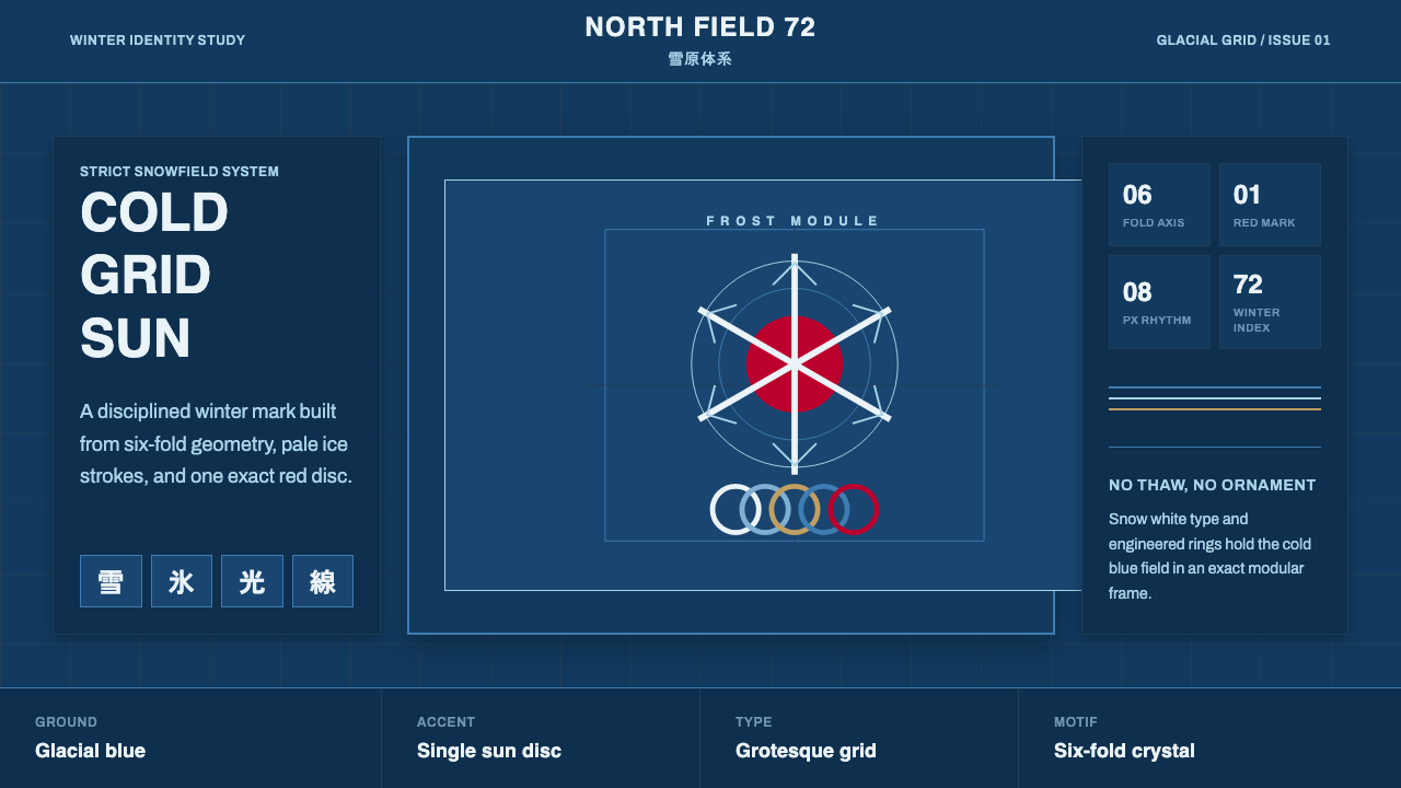 Sapporo Winter 1972Icy order, exact and calm. Glacial blue grid, snow-white type, one red sun di…
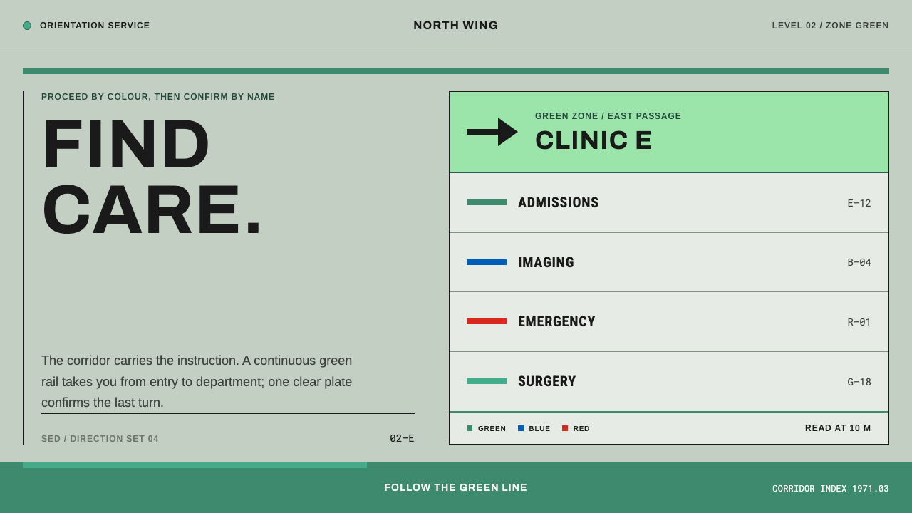 Hospital Wayfinding 1970Colour removes hesitation. Enamel green rails and open grotesque plates lead…
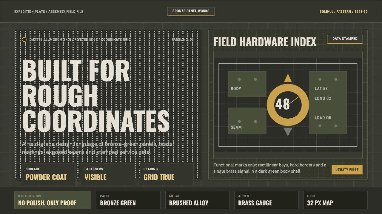 Land Rover DefenderUtility refuses polish. Bronze green panels, rivets and brass grid data do th…
 Tokyo 1964 (Kamekura)Ceremony reduced to a mark. Crimson disc and gold rings lock to a black axial…
 Cartier-Bresson Decisive MomentNever cropped. Silver-gray tonality is locked by a dead-black film rebate.
 Gdynia Port ModernismAuthority without ornament. Naval blue rules cross lime plaster above a black…