What is Hilma af Klint?
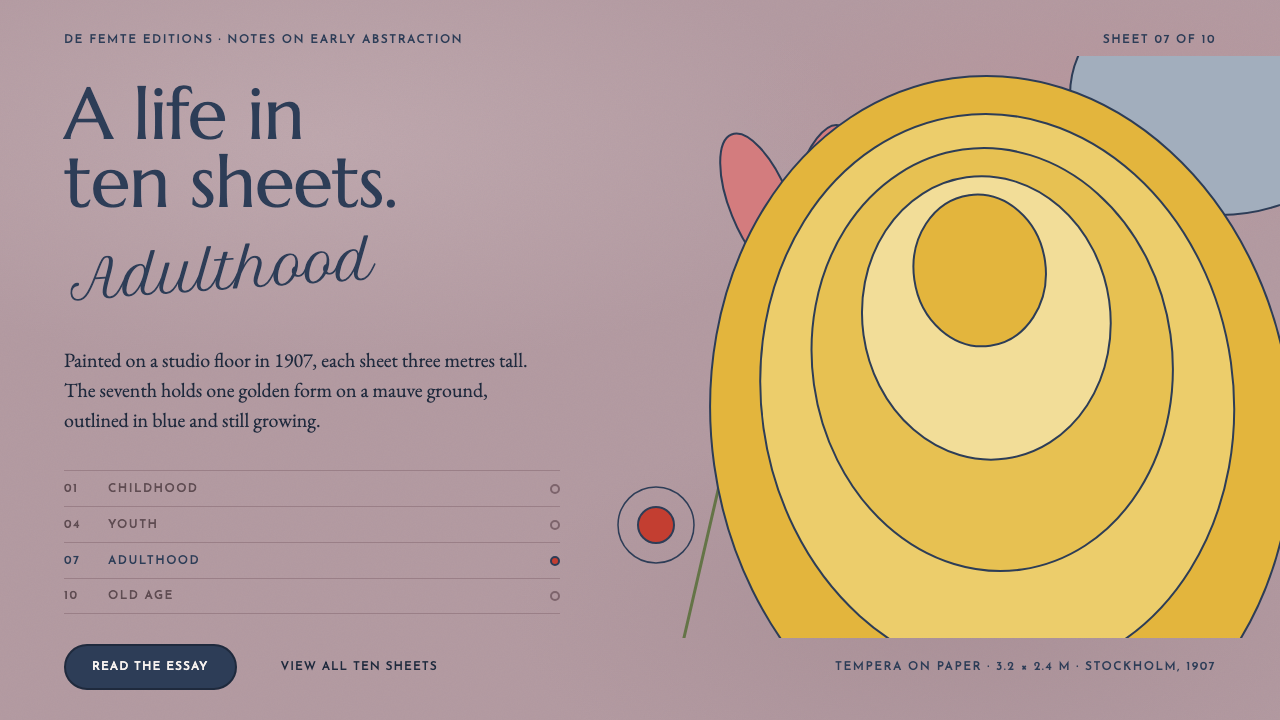
Hilma af Klint's The Ten Largest paints a whole human life as wall-sized abstraction: one golden form on a dusty mauve ground, outlined in deep blue and surrounded by spirals, petals and handwriting.
Hilma af Klint in brief
This style takes its ground from a single painting: The Ten Largest, No. 7, Adulthood (1907), by the Swedish artist Hilma af Klint. The surface is a dusty mauve tempera sheet on which one enormous golden form floats, outlined in af Klint's structural dark blue. Spirals, petals and egg shapes grow upward across the sheet, and single cursive words sit wherever she wanted them. As a design language it is organic and spiritual rather than geometric, and it is conceived at the scale of a wall rather than of a label.
The Ten Largest is a group of ten very large sheets of paper, each more than three metres tall, that depict the stages of a human life: childhood, youth, adulthood and old age. Af Klint painted them in tempera in her Stockholm studio in 1907, with the sheets laid out on the floor. The design system translates that physical condition into layout: large forms, wide fields of colour, no frame, and the sense that the viewer is standing in front of something much bigger than the screen.
Visually the style rests on a handful of decisions. The ground is matt and unframed. Colour is soft and chalky, with the gold form as the single bright event. Outlines are deep blue rather than black, which gives the drawing a structural, almost botanical clarity. Type pairs Roman capitals with a classical text serif and a looping script for section marks, so that words feel less like labels and more like handwriting left on a wall. Nothing glosses, nothing glows and nothing is boxed in.

Where does Hilma af Klint come from?
Hilma af Klint worked in Stockholm, Sweden, and belongs to the first generation of artists to make abstract paintings. The era this style draws on runs from 1906 to 1915, the years of her cycle Paintings for the Temple, of which The Ten Largest, painted in 1907, is a part. She worked at a time when European art was beginning to turn away from representation, but she worked largely in private, and her paintings were first widely exhibited only in 1986. The design language therefore inherits an unusual double character: it feels radical, yet it was never made to be fashionable.
The spiritual background matters. The currents this style draws on are early abstraction, theosophy and anthroposophy, and Swedish symbolism. Af Klint's work grew from a conviction that visible forms could depict invisible realities, such as the structure of life, growth and spirit. Rudolf Steiner, the founder of anthroposophy, belongs to the intellectual world around her spiritual interests, and Anna Cassel, a fellow artist in her close circle, stands for the shared and collaborative setting from which the temple cycle grew. The paintings are therefore not abstractions of nothing. They are closer to diagrams of experience.
The Ten Largest was painted in 1907 as a unified cycle of ten sheets. Af Klint laid the paper on the floor of her Stockholm studio and painted in tempera, which accounts for the matt, dry surface and the chalky softness of the colour. The sequence follows the four ages of life, and the seventh sheet, Adulthood, is the one this style takes as its ground: a mauve field with a great golden form floating above its centre, outlined in deep blue, with spirals, petals and egg shapes growing upward around it. It marks the point in the cycle at which the human life is at its fullest, and the painting is correspondingly bold and expansive.
The paintings were not made for the galleries of their time. They were made for a temple, a building that existed only as an idea, and that is why they are sized for walls and have no frames. Their public life began late. Since the 1986 exhibition af Klint has been absorbed into the standard story of early abstraction, and the design language derived from The Ten Largest reflects both halves of that history: the intensity of a private spiritual project, and the clarity with which it reads when it is shown on a very large surface.
What defines the Hilma af Klint look?
Mauve Wall Ground
The ground is a dusty mauve, soft, chalky and slightly grey, like tempera drying on paper. It fills the whole field with no border or frame, so that the page behaves like a wall rather than a window. Because it is low in contrast with itself, it works as a calm, atmospheric field against which a few strong forms can be placed, and it asks for dark, deeply coloured text rather than pale text.
One Golden Form
A single enormous golden shape floats above the centre of the field and is the one bright event. It is a rounded, organic mass rather than a geometric figure, and it is large enough to dominate the composition. Everything else is subordinate. The discipline of the style lies in resisting the urge to add a second gold form: the power of the first comes from being alone.
Structural Blue Outline
Forms are drawn in a deep, dark blue rather than black. The blue contour separates shapes from the ground and from each other, and it gives the drawing a firm structural quality that feels botanical, like a plant diagram, rather than graphic. Lines are confident and fairly even, and they are allowed to be hand-made, with slight swelling and wobble, rather than machine-straight.
Upward Growth
Spirals, petals and egg shapes grow upward across the sheet. They do not circle the centre or arrange themselves symmetrically; they climb, branch and drift as plants do. This gives compositions a natural vertical movement and a feeling of continuous unfolding. In layout terms it argues for asymmetry, for elements that rise from the lower area, and for leaving the upper field open for the golden form.
Cursive Marks
Single cursive words sit wherever the painter wanted them, in the open spaces between forms. They are not captions or headings but marks, closer to notes written on a wall. In a design context this becomes a looping script used sparingly for section marks, annotations and single-word interjections, always set so that it feels placed by hand rather than aligned to a grid.
Layered Type Voices
Three typographic voices work together. Roman capitals, classical in proportion, carry titles and labels with dignity. A traditional text serif carries the reading. The looping script plays the part of the artist's handwriting. The three never compete: each has a distinct job, and the contrast between formal capitals and informal script mirrors the contrast between structure and gesture in the painting.
Matt, Unframed, Mural Scale
Surfaces are matt and dry, with no gloss, no glow and no soft cast shadows. Nothing is boxed in by borders, cards or frames; forms are allowed to extend toward the edges of the field. Everything is sized for a wall and not for a label, so type is generous, forms are large and each screen holds fewer things than a typical interface would. Scale itself is the main ornament.

Who shaped Hilma af Klint?
The Swedish artist who painted The Ten Largest in 1907 and the wider Paintings for the Temple cycle from 1906 to 1915. She worked largely in private, and her paintings were first widely exhibited in 1986. For designers, she offers a rare model of abstraction that is spiritual and botanical rather than rational and geometric, built from curves, growth and handwriting rather than grids.
A fellow artist in af Klint's close circle, named here because the temple paintings grew out of shared work and companionship rather than solitary invention. She is a reminder that the style belongs to a studio culture of exchange. In design terms, that translates into a preference for warmth and intimacy of touch over polish, even at very large scale.
The founder of anthroposophy, whose ideas form part of the spiritual and intellectual background to af Klint's interests. His presence in this story explains the style's seriousness of purpose: the forms are meant to say something about growth, life stages and invisible order, not merely to decorate a surface. Any use of the style benefits from keeping that sense of purpose in mind.
How do you use Hilma af Klint today?
Hilma af Klint is the style to reach for when the subject is contemplative, humane and large in scale: cultural institutions and exhibitions, wellness and mindfulness products, education and learning platforms, journals and long-form publishing. It asks for patience and space. It is poorly suited to anything that needs tight, dense, transactional layout, and it works best when each screen has a single idea to deliver.
On presentation slides, a cover can be built from one large golden form set above the centre of a mauve field, with the title in Roman capitals and a short line of script as a marginal note. Content slides should hold a single statement each, with wide margins and one organic motif rising from the lower edge. Data slides work with very few values: let one value take the gold, outline the others in deep blue, and use script for annotations, keeping the chart itself flat, matt and unframed.
In web interfaces, use the style for landing pages, campaign sites and reading experiences rather than for dashboards. A hero section should consist of the mauve field, one large golden form and a headline in capitals. Navigation is set in small capitals; buttons are flat, outlined in deep blue and free of shadows; forms use matt fields with blue contours. Let motifs such as spirals and petals appear as section dividers or background marks, rising from the lower area of the page, and let the upper space remain open.
For editorial and marketing work, the style supports slow, immersive storytelling. Long essays are best set in the classical text serif with generous line spacing, while the looping script handles pull-quotes and marginal notes. Exhibition pages and event announcements can use the golden form as a recurring emblem, enlarged to bleed past the edge of the page. Copy should be unhurried, descriptive and warm, in keeping with the ambition of the original paintings.
The most common mistake is to treat the style as generic pastel mysticism and add glitter, glow, gradients or star-like decoration. The original is matt, structural and confident. A second mistake is shrinking the forms until they become decoration rather than architecture: if the golden form is not dominant, the system loses its point. A third is overusing the script so that the page reads as a greeting card. Finally, avoid centring everything symmetrically, because the growth of the forms is upward and asymmetric.

Hilma af Klint — FAQ
Is this style the same as Art Nouveau or Symbolism?
No, though they overlap in their love of organic curves. Swedish symbolism is one of the currents this style draws on, and early abstraction and spiritual movements are others. The difference lies in intention and finish: Art Nouveau typically decorates objects and surfaces with elegant line work, while this style uses the same organic vocabulary at mural scale to depict stages of life, with a matt tempera finish and no ornamental border.
How do I keep text legible on a mauve ground?
Use deep, dark colour for text: the structural blue or a very dark neutral, not pale or pastel tones. The mauve ground is mid-light and chalky, so low-contrast text will disappear into it. Set body text in the classical serif at a generous size with ample line spacing, and reserve the script for short marks that do not need to be read at length.
Is the style suitable for dense dashboards or data tools?
Generally not. It is built around scale, space and a single dominant form, so it works against the density that analytical tools need. If you must use it in a product with data, restrict it to the framing: an overview page, a welcome state, a report cover. Keep the working screens plainer and borrow only the ground colour, the blue outline and the type pairing.
What does mural scale mean on a screen?
It means treating the screen as a wall. Forms are large enough to dominate the viewport and may bleed off its edges, type is bigger than usual, and each screen carries fewer elements than a typical interface. Whitespace is part of the composition rather than a gap between components. On small devices the same principle holds: keep one large form and one headline instead of shrinking many things to fit.
Do I have to use spirals and petals?
No. They are the original motifs, but the essential principles are more general: one dominant organic form, a deep outline, upward and asymmetric growth, and sparing handwriting in the empty spaces. One or two motifs, drawn with consistent contours, are enough to carry the language. Using many different motifs at once usually dilutes it.
Related design styles
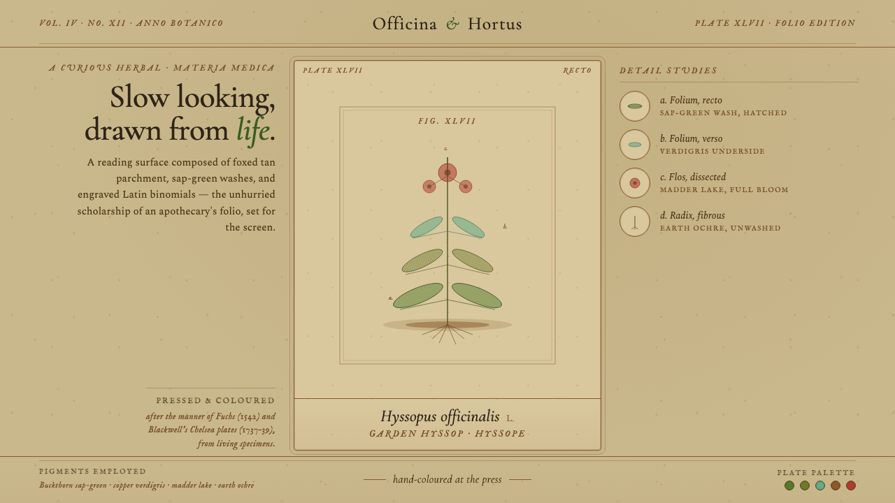 Herbal PharmacopoeiaSlow scholarship of the apothecary folio. Foxed tan parchment, sap-green wash…
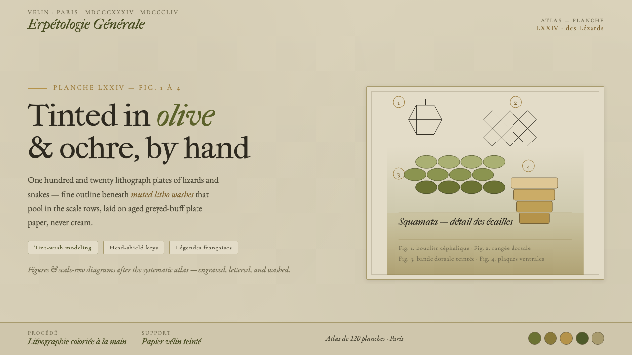 Herpetology Scale PlateA 19th-century herpetology atlas, digitized. Olive-and-ochre litho washes on…
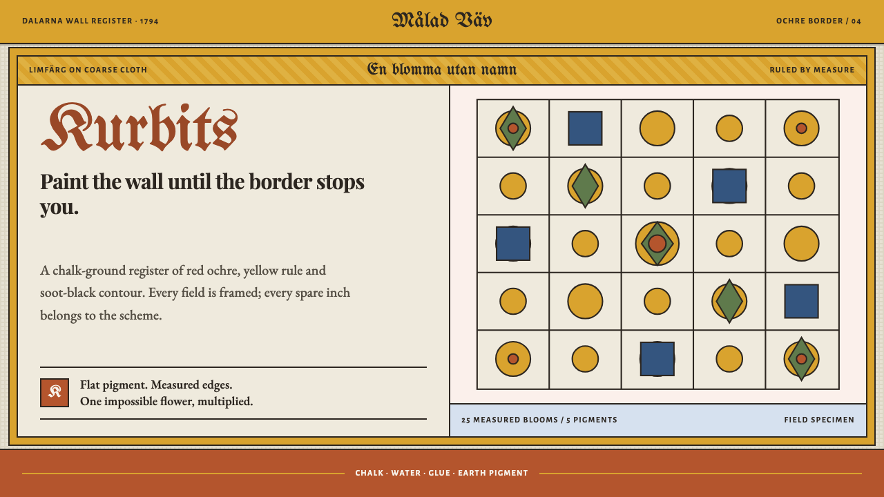 Kurbits Dalarna PaintingNo blank wall survives. Red ochre blooms crowd a chalk ground inside measured…
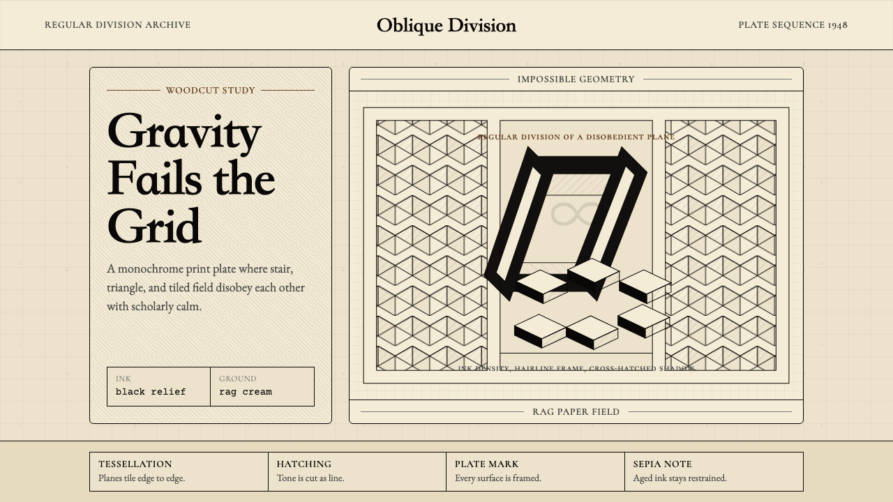 M.C. Escher ImpossibleImpossible calm. Ink-black tessellations and hatching fold cream paper into p…
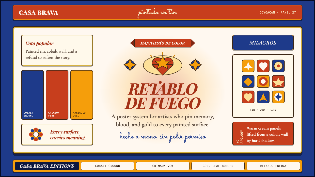 Mexican Folk Art (Frida-era)Defiance painted on tin. Cobalt ground, crimson vows, marigold borders, hard…
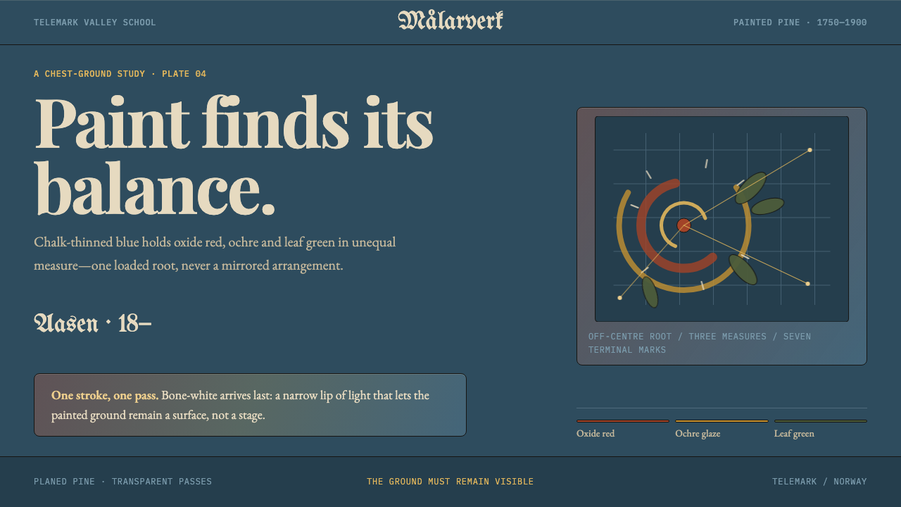 Telemark RosemalingAsymmetry made by hand. Oxide-red scrolls balance on chalky Prussian blue wit…