What is High-Tech Architecture?
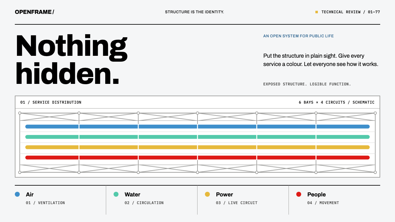
High-Tech architecture turned the building inside out: structure on the outside, services in plain sight, and every colour given a single job.
High-Tech Architecture in brief
High-Tech is an architectural approach that makes a building's structure and services the main visual subject. Steel frames, trusses, ducts, pipes and escalators are not hidden behind walls or ceilings but exposed, ordered and colour-coded. The idea is that a building should show how it works, and that this honesty can itself be a form of beauty.
Its defining monument is the Centre Pompidou in Paris, which opened in January 1977. Designed by Renzo Piano and Richard Rogers, it hangs a white steel skeleton on the outside of its glass walls and paints its services by function: blue for air-conditioning ducts, green for water, yellow for electricity and red for the escalators and lifts. The result looks like a machine for culture, and it changed what many people thought a museum could be.
As a design language, the style carries over directly. Bold, flush-left grotesque type reads like wayfinding. Cards hang in visible trusses, dividers run as pipes, and depth comes from line work rather than shadow. It suits interfaces that want to show how they work, and it gives a product a confident, engineered clarity.

Where does High-Tech Architecture come from?
The origin lies in a competition. In 1971 the design by Renzo Piano and Richard Rogers won the commission for a new cultural centre in the Beaubourg district of Paris. Construction then ran from 1971 to 1977, and the building opened in January 1977. Peter Rice, the engineer, is part of the record of the project, which reflects how closely architecture and structural engineering were bound together in the result.
The design made a deliberate choice that shocked many observers. Rather than conceal the building's mechanical systems, the architects moved them to the outside and gave them colour. The interior floors could then be left open and flexible, free of columns, ducts and stairs. The outside became a kind of diagram of the building's inner workings. It was both a practical decision and a statement of values: services are not shameful, and structure can be expressive.
The style that grew out of this approach is called High-Tech, and it continued through the 1980s. It is sometimes described in terms of structural expressionism, an idea that structure should be visible and should carry the visual character of the building. The movement borrowed from industrial and engineering imagery, such as factories, ships and cranes, and put it into the language of public architecture.
Graphic identity was part of the project. Jean Widmer, a graphic designer whose name appears in the record, worked on the visual identity associated with the centre, helping to give the building a clear, bold, wayfinding-like voice. This is why the style translates so naturally to screens: from the beginning it combined an exposed structure with legible signage, and the two supported each other.
What defines the High-Tech Architecture look?
Exposed Structure
The frame is the facade. Steel members, trusses and connections are visible and ordered, and they set the rhythm of the layout. In interface terms, the grid is not hidden: it can be seen as lines, rails and brackets that organise the content. A layout built this way always shows where each element is held.
Colour as Function
Each colour has one assignment, as in the building's pipes. Duct blue drives primary actions, escalator red moves people, water green signals flow, and electrical yellow warns. Because the codes are consistent, the palette works as a legend, and a user can learn it quickly. Colours are not used for mood; they are used for meaning.
White Frame and Neutral Ground
The structure is predominantly white, and the ground is clean and light, so the coloured services stand out against it. This neutral base gives the colour codes their clarity and keeps the overall effect orderly rather than busy. It also allows content, such as images and data, to sit calmly inside the framework.
Bold Grotesque Type
Type is a bold grotesque, set flush left like signage on the floors of a public building. Archivo stands in for Univers, the typeface associated with this kind of wayfinding. Headings are direct and heavy, labels are short, and information is ordered by level and category. The effect is of a building that tells you where things are.
Line Work Instead of Shadow
Depth comes from drawing, not lighting. Cards are suspended in visible trusses, dividers run as pipes and connectors, and layers are separated by lines and offsets rather than by blurred shadows. This keeps the surface flat and technical, like an architectural drawing, and it reinforces the sense that nothing is being hidden.
Modular, Repeating Parts
High-Tech buildings are assembled from repeating, standardised parts, and the style carries that logic into layout. Cards, rails, brackets and connectors recur in regular intervals. This makes pages predictable, and makes it easy to extend them without redesigning the system.
Honest Labelling
Because the style is about showing how things work, labelling is part of the design. Components can be named, annotated and numbered like parts in a technical drawing. Short captions, arrows and legends are welcome, and they become part of the look rather than an afterthought.

Who shaped High-Tech Architecture?
One of the two architects who won the 1971 competition for the Centre Pompidou. His approach combined engineering curiosity with a sense of lightness, and the building's open, exposed frame is one of the best-known results. In design terms he stands for the idea that clear structure can feel generous rather than severe.
The other architect of the winning design. His name is closely tied to the movement's commitment to showing services on the outside of a building and to flexible, open interiors. Together with Piano he turned a competition entry into the defining monument of High-Tech.
The engineer named in the record of the project. His presence reflects the central role of structural engineering in High-Tech, where the engineer's decisions about members, joints and connections are visible in the finished form and directly shape its appearance.
A graphic designer named among the key figures, associated with the visual identity linked to the centre. His work helped give the building a clear, bold, wayfinding-like graphic voice, and it is the main reason this architectural style translates so well into typography and screen layout.
How do you use High-Tech Architecture today?
High-Tech is a good fit for products that want to explain themselves. Its strengths are legibility, structure and a sense of engineered confidence. Its limits are that it can feel technical and impersonal, so it is best applied where the audience values clarity and process more than warmth.
For presentation slides, a cover can show a light ground, a heavy flush-left title and a row of thin structural lines framing the page. Section slides can use a single colour code, such as blue for the current topic, to orient the audience like a floor sign. Content slides work well as diagrams: boxes hung from lines, connectors as pipes and short labels. Data slides can use the colour-as-function rule, with one colour per category or system, repeated consistently across the deck.
For web interfaces, it suits data platforms, developer tools, engineering documentation and exhibition guides. Primary actions use the duct blue, success and flow states use the water green, warnings use the electrical yellow, and the red is saved for movement or navigation. Cards can hang inside visible truss-like frames, and dividers can be drawn as pipes. Keep surfaces flat and rely on line work for depth. Navigation can read like floor signage: bold, left-aligned and categorised.
For editorial and marketing work, the style works well for process-driven stories, behind-the-scenes explainers and product architecture pages. A long article can be built on an exposed grid with numbered sections, and diagrams can use the colour codes. For exhibition or event guides, the wayfinding voice is a natural fit, with bold headings, colour-coded zones and clear lists.
A common mistake is to treat the colours as decoration. If blue, red, green and yellow appear without a consistent meaning, the style loses its logic and becomes a generic primary-colour scheme. Another is to add soft shadows or glassy effects, which contradict the line-based, exposed logic. A third is to hide the grid entirely; the style depends on structure being visible. Finally, avoid using it where warmth and intimacy are the goal, such as wellness or personal storytelling.

High-Tech Architecture — FAQ
What is High-Tech architecture?
It is an architectural approach that exposes a building's structure and services as its main visual feature. Its defining example is the Centre Pompidou in Paris, designed by Renzo Piano and Richard Rogers, which won the competition in 1971 and opened in January 1977.
What do the colours mean?
Each colour is assigned a single job, following the building's colour-coded services. Blue is for air ducts and, in design, primary actions. Green is for water and flow. Yellow is for electricity and warnings. Red is for escalators and lifts, and in design for movement and navigation.
Which typeface suits the style?
A bold grotesque set flush left, in the manner of wayfinding. Univers is the historical reference, and Archivo is a practical stand-in. Keep headings direct and heavy, labels short, and information organised by level and category.
How do I show depth without shadows?
Use line work. Draw frames, trusses, rails and connectors around cards, offset layers slightly, and separate regions with lines and colour planes. The effect resembles an architectural drawing, where depth is explained by structure rather than lighting.
Is it suitable for consumer products?
Selectively. It suits consumer products that explain how they work, such as tools, platforms and guides. It is less suited to products built on warmth, intimacy or softness. In mixed cases, borrow the colour-as-function discipline and the visible grid, and soften the typography and spacing.
Related design styles
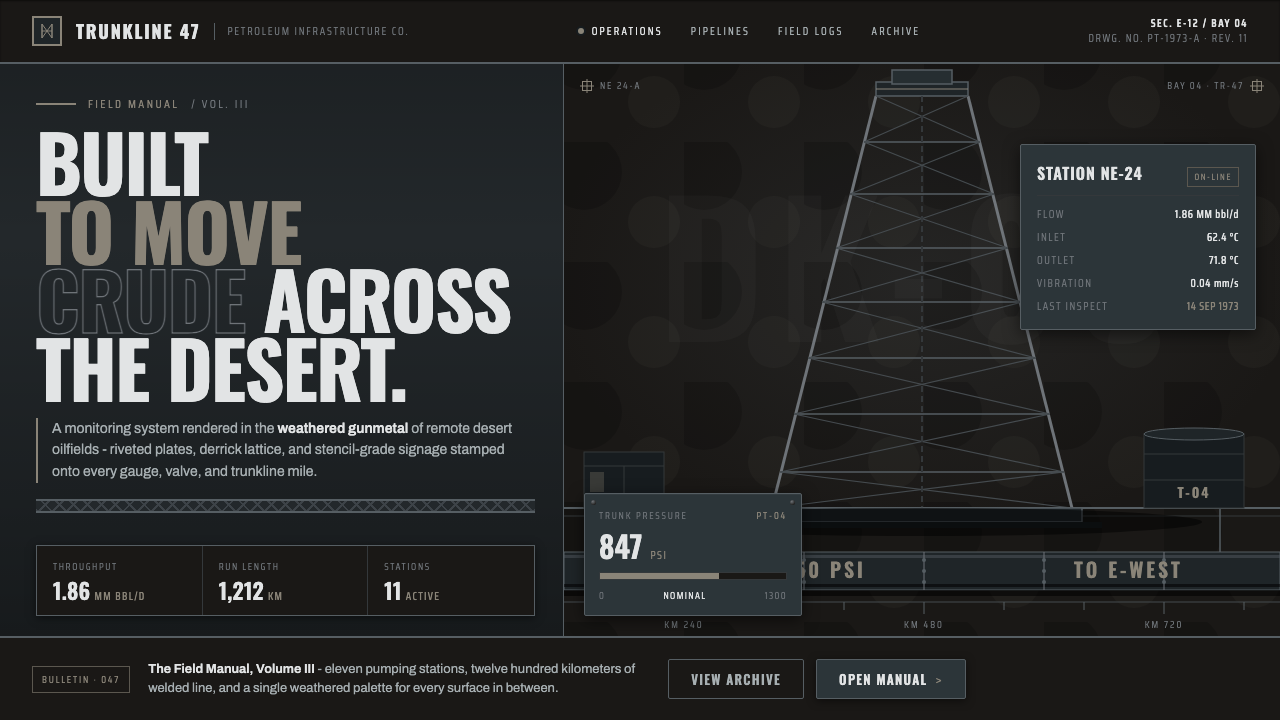 Gulf Oil Derrick IndustrialEngineered, not decorative. Soot-darkened gunmetal, derrick lattice, condense…
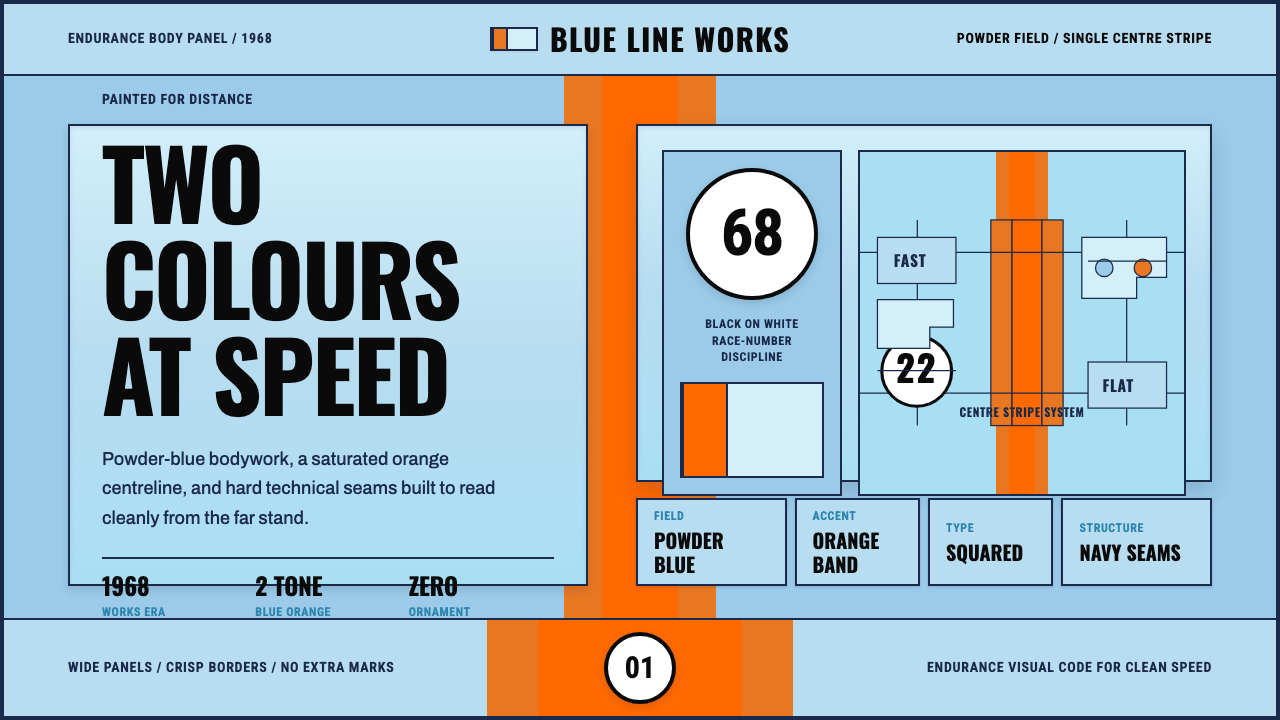 Gulf Racing LiverySpeed made disciplined. Powder blue, orange stripe, black roundel, strict gri…
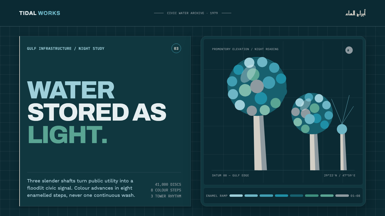 Kuwait Water TowersInfrastructure becomes a night monument. Eight enamel steps spiral across a d…
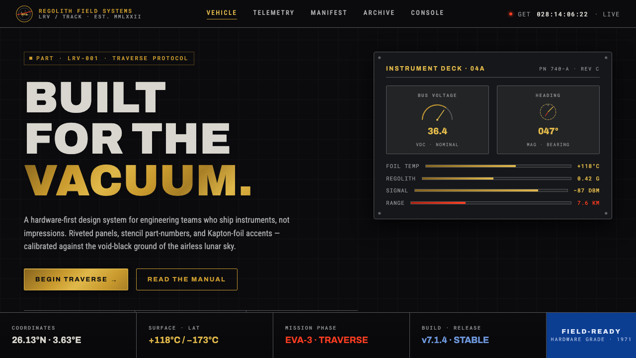 Lunar RoverBuilt for the vacuum. Kapton-gold foil and stencil part-numbers against void-…
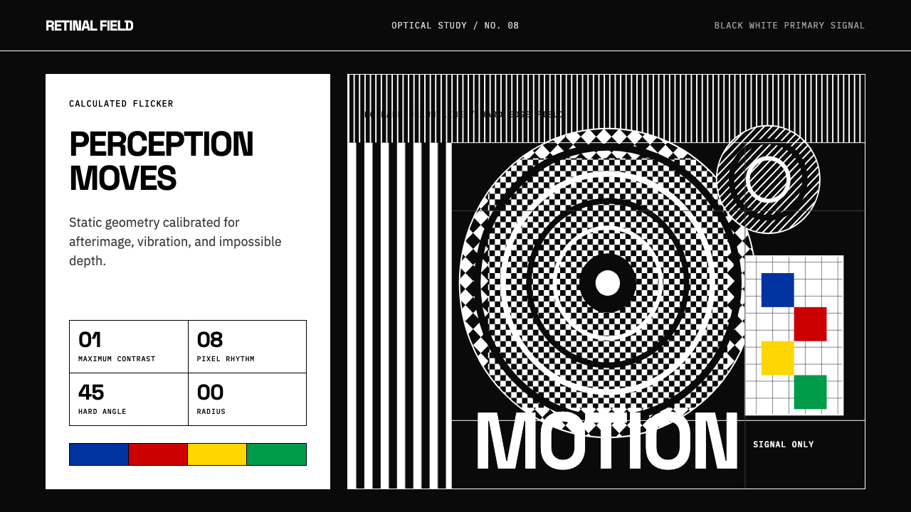 Op Art (Riley / Vasarely)Perception is engineered. Black-white grids and primary signals make static g…
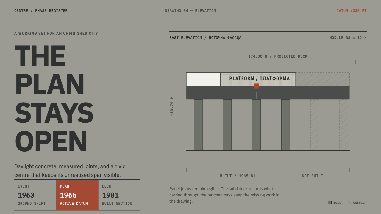 Skopje 1963 ReconstructionCompletion is not the point. Concrete-grey grids keep built bays solid and fu…