What is Hi-Fi Rush?
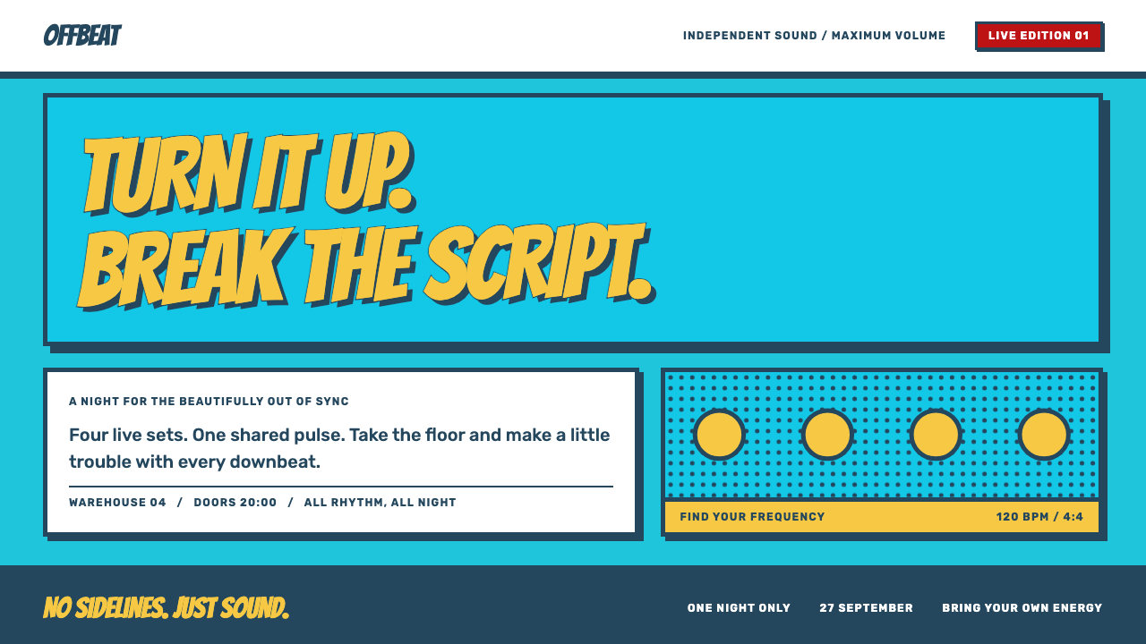
Hi-Fi Rush turns an interface into a comic panel that moves on the beat: turquoise linework, a yellow jacket, denim ink and sound effects with a heavy stroke.
Hi-Fi Rush in brief
Hi-Fi Rush is a design style taken from the 2023 rhythm action game of the same name, made by Tango Gameworks in Tokyo. The game was released on 25 January 2023 for Xbox Series X and S and for PC, and arrived on PS5 in March 2024. Its look is loud by design: cel-shaded characters, comic-book panels and a city drawn in turquoise linework.
The colours are assigned like roles in a cast. Headlines and primary actions wear the yellow of the protagonist Chai's jacket. Outlines and body copy take the denim blue of his jeans. The red of his scarf is kept for hits and alerts. The turquoise city from the cover becomes the page itself, and every section behaves like a comic panel.
What separates this style from a simple comic look is rhythm. Markers pulse, cards squash and spring back, and impacts flash with a small split of colour, all timed to a beat. The interface does not sit still; it moves like music, and that sense of constant, confident pulse is its most distinctive trait.

Where does Hi-Fi Rush come from?
The source is Hi-Fi Rush, an action game by Tango Gameworks, a studio based in Tokyo. The game's key figures include John Johanas and Keita Sakai, whose names are associated with its direction and creation. Released in January 2023, it built its whole identity around a single idea: that every action in the world, from walking to combat to scenery, should be tied to music.
Its art direction draws on three clear traditions. The first is cel-shaded toon rendering, in which 3D models are drawn with flat colour and bold outlines so that they look like animation cels. The second is the language of American comic books, including halftone dot shading, thick ink borders and panel layouts. The third is Japanese anime staging, with its exaggerated poses, dramatic framing and quick cuts. Hi-Fi Rush mixes them confidently, which is why it feels both Western and Japanese at once.
The cover image sets the palette. A city is drawn in turquoise linework, and the characters stand out against it in strongly contrasting colours. The protagonist's yellow jacket, denim jeans and red scarf became the colour roles of the design system. This is an unusually clear case of a design language derived directly from the costume of a single character and the colour of a single background.
The style spread beyond the game because it solved a problem that interface designers often face: how to make a screen feel alive without cluttering it. Hi-Fi Rush answered by letting rhythm do the work. Instead of adding decoration, it added timing. That choice is what makes the style useful as a design reference, and it is the reason it is more than a comic costume.
What defines the Hi-Fi Rush look?
Turquoise Ground
The page background is the turquoise of the game's cover city, a saturated cool tone that is bright without being harsh. It gives the whole interface an energetic, graphic base and makes warm colours such as yellow and red stand out sharply. The turquoise is flat, not gradient-washed, so the page feels like printed ink.
Role-Based Colour
Each colour has a single job. Yellow, taken from the protagonist's jacket, is for headlines and primary actions. Denim blue, from his jeans, is for outlines and body copy. Red, from his scarf, is saved for hits, errors and boss-style labels. This discipline keeps a loud palette readable, because a viewer learns very quickly what each colour means.
Comic Panels
Every surface is treated as a comic panel. Content sits in boxes with thick ink borders, panels butt up against each other, and layouts can be broken diagonally for drama. This replaces the usual card-on-background arrangement with something more graphic, and makes the page read like a spread rather than a web template.
Hard Offset Shadow
Shadows are hard, solid and offset, with no blur. They behave like the second print layer in a comic, giving panels a raised, cut-out look. Because there is no softness, the effect stays crisp at any size and matches the heavy outlines around it.
Ben-Day Dot Shading
Tone is built from patterns of dots, in the manner of old comic printing, instead of gradients. Dots can fill backgrounds, shade the edges of panels or add texture to a large colour field. They add richness while staying flat and printed, and they are the clearest signal of the comic-book side of the style.
Sound-Effect Type
Display text uses Bangers, a comic lettering face, set large with a heavy drop stroke so that it looks like a sound effect bursting out of the panel. Short words such as hit and boss feel natural in this setting. Body text stays in a plain face so that the loud lettering is reserved for moments that deserve it.
On-the-Beat Motion
Nothing sits still. Markers pulse in time, cards squash on press and spring back, and impacts flash with a small chromatic split, a brief offset of red and blue channels. The motion is quick, rhythmic and always tied to an action, so it reads as feedback rather than decoration.

Who shaped Hi-Fi Rush?
Named among the key figures of Hi-Fi Rush and associated with its direction at Tango Gameworks. His involvement links the game's strong, unified visual and musical identity to a clear creative lead, which is part of why the design system derived from it has such a coherent logic.
Another key figure associated with the game's creation. His name sits alongside the Tokyo studio's in the record of the project, representing the Japanese anime-staging side of a work that also borrows heavily from American comics.
The Tokyo studio that made the game. Its work on Hi-Fi Rush shows how a team can use a strong constraint, here the beat, to unify art, animation and interface into a single, readable language. The studio stands for the idea that style can come from rules rather than from ornament.
How do you use Hi-Fi Rush today?
Hi-Fi Rush is a high-energy style, and it works when energy is the point. Its strengths are immediate recognition, strong hierarchy and a sense of motion. Its weaknesses are that it is loud and graphic, so it needs to be used where the audience expects fun and rhythm.
For presentation slides, a cover can show a turquoise ground, a yellow headline in Bangers lettering and a hard offset shadow behind a bordered panel. Content slides work as comic spreads: two or three panels per slide, each with a thick ink border and a short, punchy caption. Data slides can draw bars as outlined blocks with hard shadows, and use red only for the number that is a hit or an alert.
For web interfaces, it suits game sites, music and event pages and any marketing page that needs a strong sense of rhythm. Primary buttons should be yellow with denim outlines and a hard shadow that shifts on press. Section headings can use the sound-effect face, while body text stays in a plain sans-serif. Pulsing markers can show current position or the next step, and hover states can squash slightly and snap back.
For editorial and marketing work, panels offer an easy way to structure a story. A feature page can run as a sequence of panels, each with its own border, a headline in loud lettering and a block of calm text. Halftone dots can add depth to hero areas without using photography. Campaign pages tied to a launch, a tour or a release can borrow the beat-driven motion to add urgency.
A common mistake is to use every effect at once. The style works because each device has a role: yellow for action, blue for text, red for impact, dots for tone, lettering for sound. Putting dots, lettering, chromatic splits and diagonal cuts on every element turns rhythm into noise. Another mistake is to use the style for sober, text-heavy content, where its loudness will fight with reading. Finally, respect people who are sensitive to motion by offering reduced-motion behaviour.

Hi-Fi Rush — FAQ
What is Hi-Fi Rush?
It is a rhythm action game by Tango Gameworks in Tokyo, released on 25 January 2023 for Xbox Series X and S and for PC, and on PS5 in March 2024. Its look combines cel-shaded rendering, American comic-book halftone and panel language, and Japanese anime staging.
What do the colours mean in this style?
Each colour has one job. Yellow, from the protagonist's jacket, is for headlines and primary actions. Denim blue, from his jeans, is for outlines and body copy. Red, from his scarf, is for hits, alerts and boss-style labels. The turquoise of the cover city is the page ground.
Can I use it for a serious product?
Generally not for the whole interface. Its loudness suits games, music, events and playful campaigns. For serious products you could borrow the discipline of role-based colour and clear hierarchy while leaving out comic lettering, halftone dots and chromatic effects.
How does motion work in the style?
Motion follows a beat. Markers pulse in time, cards squash on press and spring back, and impacts flash with a small chromatic split. Animations are quick, tied to actions and meant as feedback. Provide a reduced-motion option for users who prefer it.
What typefaces fit it?
Display text uses Bangers, a comic lettering face with a heavy drop stroke, for sound-effect style headings. Body text should use a plain, readable sans-serif so the loud lettering is reserved for moments that deserve attention.
Related design styles
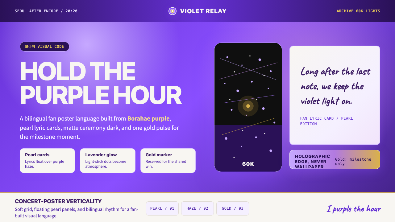 BTS Army Purple 2020Fandom becomes atmosphere. Borahae purple, pearl cards, lavender glow, one go…
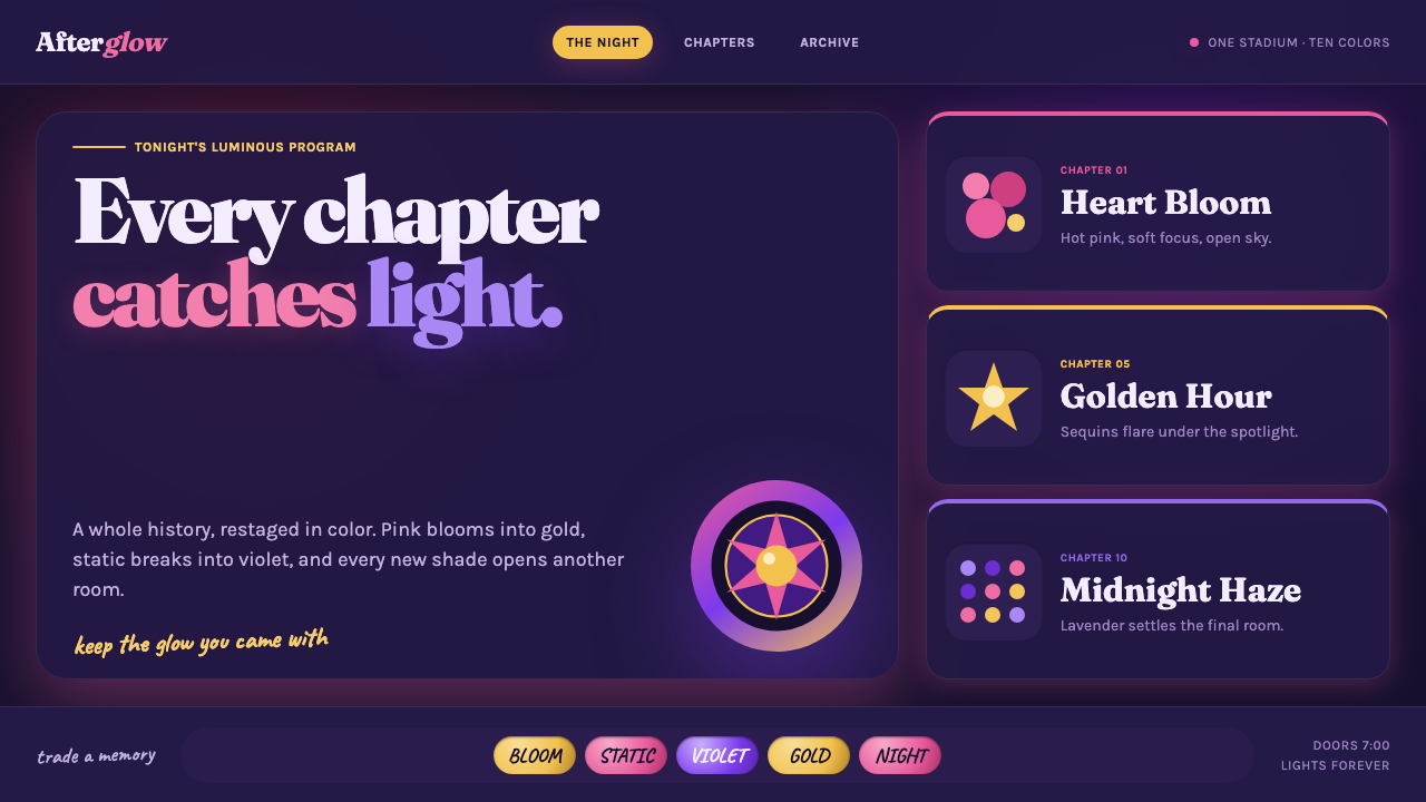 Taylor Swift Eras (2023)Every chapter catches light. Hot pink, lavender, gold and beadwork glow on mi…
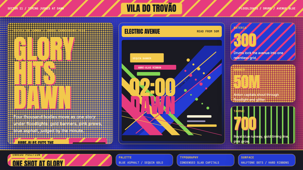 Brazilian Samba School (2000s Carnaval)Parade at floodlight volume. Royal blue asphalt, sequin gold type, pink ribbo…
 Medellín Comuna 13 MuralsRefuses blank walls. Hot pink, neon green, and cobalt blocks pack the grid li…
 One Piece (Grand Line Adventure)Adventure shouts first. Vermilion splash type and cyan charts collide in hard…
 Takashi Murakami SuperflatJoy has no depth. Pastel rainbow, scarlet accents, and black contours flatten…