What is Helsinki Central Station?
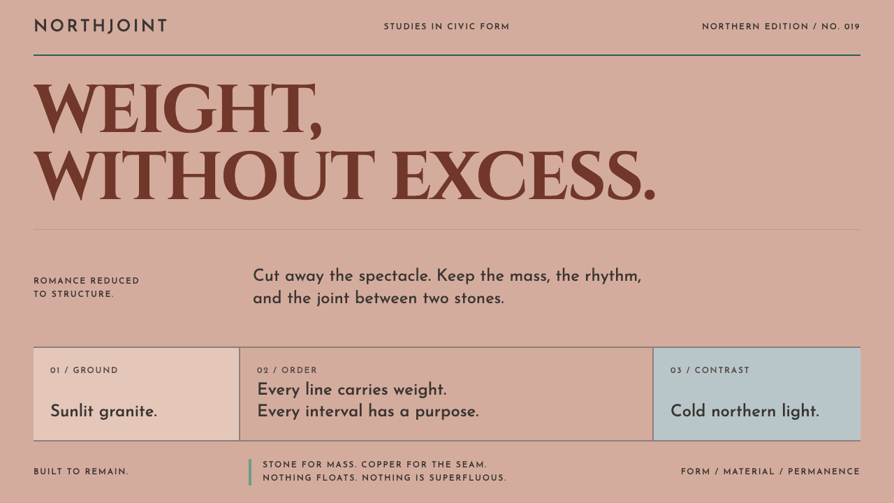
Helsinki Central Station is a romantic castle cut back, course by course, into load-bearing granite: weight without pomp, with ornament reduced to the joint between two stones.
Helsinki Central Station in brief
The Helsinki Central Station style takes its vocabulary from Eliel Saarinen's railway terminus in the Finnish capital, completed in 1919. In architectural terms it is a building of heavy rusticated granite, fronted by one enormous parabolic arch and a clock tower, with four lantern-bearing figures standing at the entrance. As a design language it translates into a pale, sunlit stone ground, a deep red granite for everything that acts, streaks of oxidised copper-green for dividers, and a handful of spherical lamps that supply the only true circles on the page.
The governing idea is weight arranged rationally. Nothing in this style floats; everything is load-bearing, jointed and cut. Where other decorative traditions add ornament to a structure, this one lets ornament emerge from construction itself: the visible seam between two blocks, the shadow of a deep reveal, the rhythm of courses laid one upon another. It sits at the meeting point of Finnish National Romanticism and Nordic Classicism, and it carries the sobriety of the second without losing the mineral warmth of the first.
Visually, the result is monumental but never theatrical. Capital letters are large and look carved, blocks of content stack like masonry, edges are firm, and colour is drawn from the materials themselves rather than from a brand palette. It is a natural fit for transport, civic institutions, heritage, finance, architecture and any organisation that wants to feel permanent without feeling pompous.

Where does Helsinki Central Station come from?
The story begins with a competition. In 1904 Eliel Saarinen won the commission for a new central station in Helsinki with a design that looked more like a romantic castle than a piece of transport infrastructure. Finland at the time was a grand duchy inside the Russian Empire, and the architectural culture around it was dominated by National Romanticism, a movement that searched for a distinctly Finnish language of form in granite bedrock, medieval silhouettes and the craft traditions of the countryside. A castle-like station was an entirely natural expression of that moment.
What makes the building remarkable is what happened next. Saarinen spent roughly the following fifteen years cutting the fantasy out of it. Construction ran from 1909 to 1919, and across that decade the design was progressively disciplined: towers and picturesque incident gave way to a calmer, more classical order, and the architecture drifted from National Romanticism toward the sober geometry of Nordic Classicism, with echoes of the Jugend-era civic architecture that surrounded it. By the time the station opened in 1919, Finland had become an independent state, and the building that welcomed passengers had traded storybook drama for a quieter, more confident monumentality.
Material was central to the transformation. The granite was quarried at Hanko and laid in heavy rusticated courses, a coarse, tooled surface that keeps the rough character of the quarry on the finished face. The granite firm Ab Granit Oy appears among the project's key names, a reminder that this was a building made as much by stonecutters and suppliers as by its architect. The result is a facade in which texture and joint do the work that carved ornament would do elsewhere.
The entrance gives the building its famous silhouette: one enormous parabolic arch, a tall clock tower rising beside it, and four figures of lantern bearers by the sculptor Emil Wikström, each holding a spherical lamp. Those globes are the lone insistent circles in an otherwise orthogonal and cut composition, and the design system inherits that scarcity. Saarinen himself later carried his practice across the Atlantic, but the station remains the clearest statement of his early idea: a national building in which every element has to earn its place.
What defines the Helsinki Central Station look?
Sunlit Ashlar Ground
The page is carried by a pale, warm stone tone, the colour of cut ashlar in low northern daylight, with a faint rosy cast rather than a sterile white. It is a light system, built for day. Large areas are never pure white or flat grey; they read as a mineral surface, which is what allows deep colours and fine lines to sit on top of it without feeling pasted on.
Deep Red Granite for Action
A single deep red, taken from the tower's red granite, carries every action: buttons, links, active states, the one number that matters. Because red is reserved for doing, it doubles as wayfinding. The eye learns that wherever it appears something can be pressed, chosen or confirmed. It is dark and earthy rather than bright, closer to a quarried stone than to a signal flag.
Oxidised Copper Joints
Verdigris streaks of oxidised copper supply the cool counterpoint: dividers, rules and thin accents that look like weathered seams between blocks. Green here is not a status colour but a surface history, the trace of metal that has been left out in the rain. It appears in thin lines, never in large fills, so that the stone and the red remain dominant.
Monumental Capitals
Headlines are set like inscriptions: large capital letters, generously spaced, heavy and upright, as though cut into the facade above a doorway. Body text is calm and highly readable, but the display voice is always monumental. The contrast between carved capitals and quiet running text gives hierarchy without needing extra colour, ornament or decoration.
Coursed Rustication
Layouts are built the way walls are built: horizontal courses of different heights, stacked with visible joints between them. Panels are rectangular, borders are firm, and the gaps between modules read as mortar lines rather than as floating whitespace. Sections feel quarried and fitted, not placed, and nothing in the composition appears to hover above the page.
Arch and Lamp Geometry
The geometry is mostly orthogonal, and that is exactly why the exceptions land. One large parabolic arch can announce an entrance, a hero crop or a section break, and the spherical lamps of the lantern bearers justify the very few true circles that appear on the page. Used rarely, curves become the style's signature; used everywhere, they would dissolve its logic.
Depth Through Recess
There are no glows, blurs or floating cards. Depth is described the way masonry describes it: through reveals, steps, offsets and crisp, heavy shadows that look like the side of a deep window recess. Elevation is something cut into the surface or built up from it, never simulated with soft light. Ornament, where it exists at all, is reduced to the joint between two stones.

Who shaped Helsinki Central Station?
Saarinen won the 1904 competition for the station and then spent the following years refining it, shedding the castle-like romanticism of the winning scheme in favour of a more rational and classical monumentality. The finished building, opened in 1919, is the clearest demonstration of his central idea: that national character can be expressed through disciplined mass and material rather than through applied decoration. He later continued his practice in the United States.
Wikström is the sculptor behind the four lantern bearers that flank the station's main entrance. Each figure holds a spherical lamp, and together they give the building its human scale and its most memorable detail. In design terms, those lamps are the origin of the style's rare circles: sculpture handled as part of the architecture's structure, not as a late decorative add-on.
Ab Granit Oy is the granite company associated with the project, and a reminder that this is a style born of stone supply as much as of drawing-board decisions. The material, quarried at Hanko and laid in rusticated courses, sets the tone, texture and warmth of the whole system. Acknowledging the supplier's place in the story is also a useful design lesson: the palette here was never invented, it was quarried.
How do you use Helsinki Central Station today?
Helsinki Central Station works best wherever an organisation wants institutional gravity without pomp. It suits transport and infrastructure, civic and cultural bodies, heritage and architecture practices, financial and legal services, and any product whose promise is permanence. Because its colour logic is functional (stone for ground, red for action, copper for seams), it also translates cleanly into interfaces, where meaning is encoded by role rather than by decoration.
For presentation slides, covers are strongest when they behave like a facade: a heavy block of display capitals on the pale stone ground, a single deep red band or block as a base course, and perhaps one arched crop of a photograph as the sole curve. Content slides should be built from coursed rows with visible joints between them and no floating decoration. Data slides benefit from this mineral approach: bars read as cut blocks, tables are separated by thin copper-green rules, and the one figure the audience must remember takes the deep red.
For web interfaces, the style fits dashboards, booking and timetable products, and pricing pages where hierarchy and trust matter more than delight. Keep the page on the stone ground, let deep red mark the primary action and nothing else, and use thin copper-green lines for dividers and quiet confirmations. Cards should look like fitted blocks with firm edges; panels should step or recess rather than hover. Navigation works best as sober capitals, with stateful controls clearly distinguished by the red.
For editorial and marketing work, the style supports long, serious reading: institutional histories, annual reports, museum and heritage sites, architecture portfolios. Pull quotes can be set like inscriptions, section openers can use large capitals with generous spacing, and photography of stone, facades and civic spaces fits naturally. Campaign pages can alternate full-width pale stone sections with deep red feature bands, keeping the rhythm of a wall rather than of a collage.
The most common mistake is to read this style as a generic palette of beige and burgundy and then add the usual contemporary polish on top: gradients, soft glows, glassy overlays and floating, rounded cards. Those effects contradict the central premise that everything is load-bearing. The second mistake is spending the red. If it decorates headings, illustrations and backgrounds as well as buttons, it stops meaning ‘act here’. A third is overusing arches and circles, which turns a rare, earned gesture into wallpaper. Keep the ground sunlit, the joints visible and the curves scarce.

Helsinki Central Station — FAQ
Is the Helsinki Central Station style a kind of Art Nouveau?
Not exactly. The station sits in the Jugend-era civic landscape and shares that period's interest in material and craft, but its trajectory runs away from curving, ornamental Art Nouveau toward heavy, disciplined masonry. Its main influences are Finnish National Romanticism and Nordic Classicism, and ornament is reduced to the joints between stones rather than applied as decoration.
What is Finnish National Romanticism?
It was a movement in Finnish architecture and the arts around the turn of the twentieth century that looked for a national visual language in granite bedrock, medieval silhouettes and vernacular craft. Saarinen's 1904 competition scheme, with its castle-like profile, belongs to this world, and the realised station shows the movement being steadily disciplined into something calmer and more classical.
Can this style work in a dark mode?
It is conceived as a daylight system: the pale ashlar ground is what lets deep red and copper-green read as materials. A dark variant is possible, but it should be treated as the same facade at dusk, with heavy joints, small points of light like the lamps, and the single red kept for action, rather than as a simple colour inversion. If most of your use is dark, another style may serve you better.
How is it different from brutalism or other heavy styles?
Brutalism celebrates raw, poured concrete and the unfinished surface. Helsinki Central Station is dressed granite, tooled, jointed and carefully coursed, and its colour is warm and sunlit rather than grey and severe. It is heavy without being hostile, and craft is visible everywhere: the seam is the ornament.
Which kinds of brands should use it?
Brands whose promise is reliability and permanence: railways and logistics, public institutions, museums, banks, law and architecture firms, universities and heritage organisations. It is less suited to playful consumer products, fast-moving fashion, or anything built around glow, motion and softness.
Related design styles
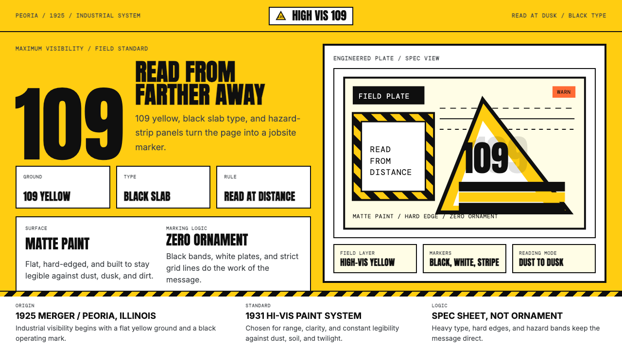 Caterpillar Construction Yellow (1925)Maximum visibility, zero softness. 109 yellow ground and black slab type.
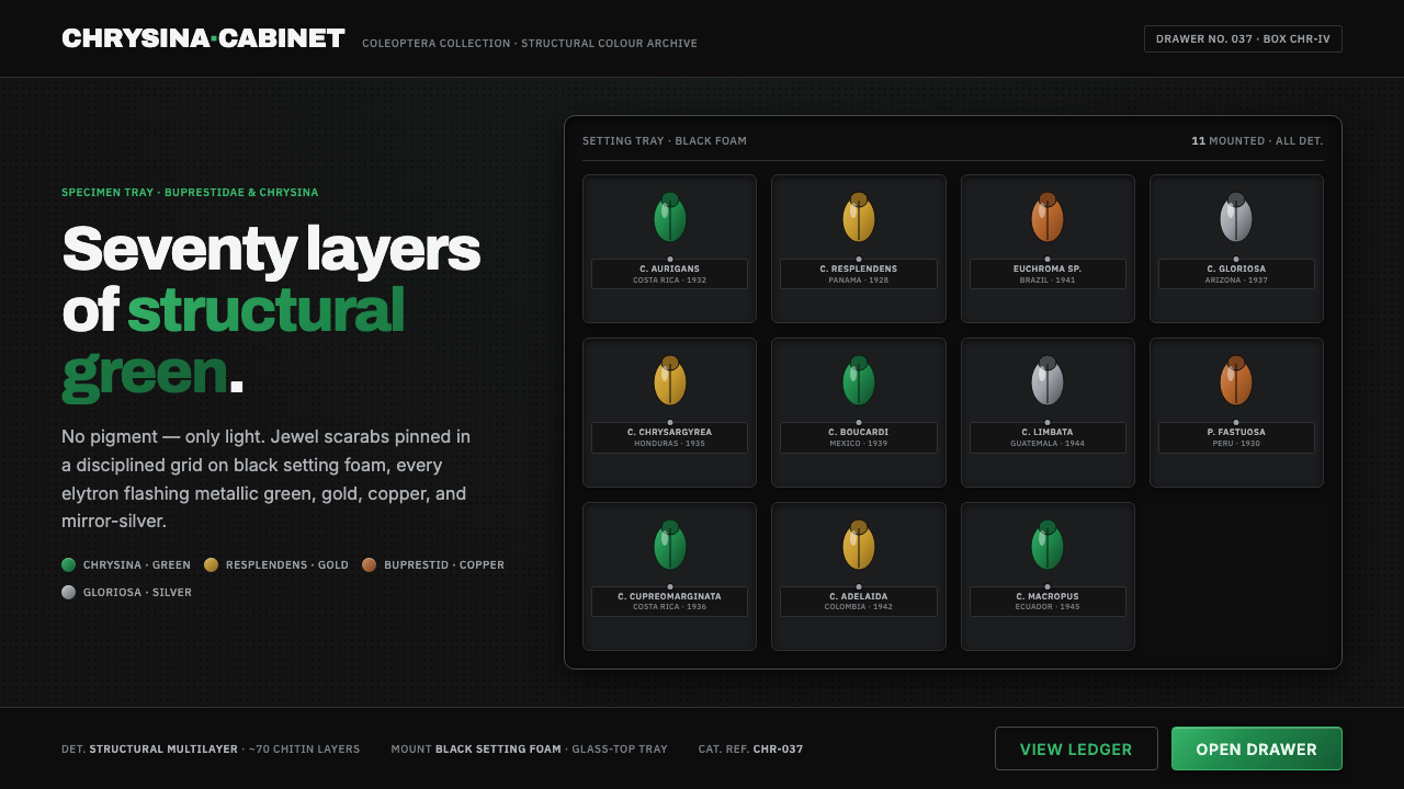 Iridescent Scarab DrawerOrder makes the shimmer read. Jewel scarabs pinned in a grid on black foam, m…
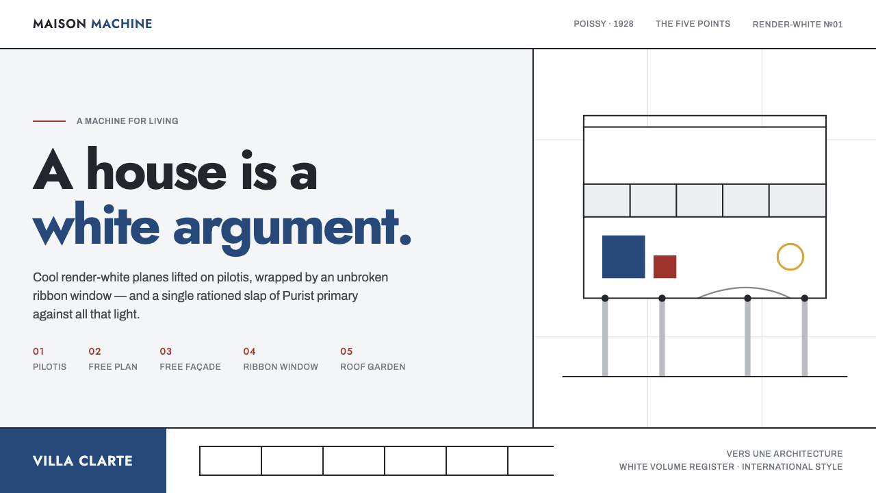 Le Corbusier Purist WhiteA house is a white argument: render-white planes, ribbon windows, one slap of…
 Olympic Poster Berlin (1936)Monumental and legible. Green-gray, cream, and gold turn type into architectu…
 Olympics Five Rings (1912)Ceremony without noise. Saturated five-ring color on pure white, locked to a…
 Bandung Tropical Art DecoClimate writes the geometry. Bottle-green bands on stucco white make hard sha…