What is Hayabusa2?
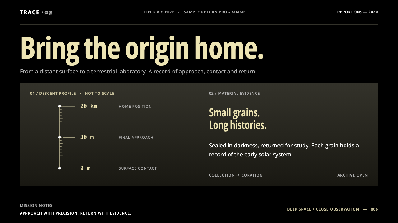
Hayabusa2 turns a plain grey photograph of a spinning-top asteroid into a design rule: pure black, pale-gold headings and fine lines on a strict vertical axis.
Hayabusa2 in brief
Hayabusa2 is the name of JAXA's asteroid sample-return mission, and, as a design style, it is the look of that mission's own imagery and data. The mission launched in 2014, reached the asteroid Ryugu in 2018, touched down twice in 2019 and returned a sample capsule that landed at Woomera, in Australia, on 6 December 2020. The pictures people remember are plain: an even grey asteroid, shaped like a spinning top, floating in pure black.
The visual system takes that plainness as its rule. The ground is black, text is white, headings are a pale gold, and panels are dark olive. Charts are drawn with fine lines against a strict vertical axis, so that orbits and descent paths read as thin, precise traces rather than as filled shapes. Nothing is added for effect.
The mood is quiet and exact. It is a style for work where the subject carries the page, and where the design's job is to stay out of the way. It suits science, engineering and mission-reporting contexts, but it also works for any product that wants to signal seriousness without coldness.

Where does Hayabusa2 come from?
Hayabusa2 was developed by JAXA, Japan's space agency, with the work centred on the Institute of Space and Astronautical Science in Sagamihara. Its goal was to travel to a small near-Earth asteroid, study it, collect material from it and bring that material home. It followed an earlier Japanese sample-return mission, and the second mission carried the aim a step further by collecting samples from the surface and from beneath it.
The mission's timeline is itself part of the story. It launched in 2014, arrived at Ryugu in 2018, and carried out its operations there through 2018 and 2019, including two touchdowns on the asteroid in 2019. It then travelled back and delivered its capsule to Woomera on 6 December 2020. The long, patient sequence of arrival, survey, descent and return gives the style its sense of measured pace.
The look of the mission was shaped by how it communicated. Images from the Optical Navigation Camera, a camera used to guide the spacecraft, were published openly, and operations were covered publicly as they happened. That openness gave the world a steady stream of unretouched, technical images: an asteroid in black space, small bright dots where target markers had been released, and diagrams showing the spacecraft's descent. The aesthetic that follows is not decoration; it is the visual residue of engineering and honest reporting.
Key figures associated with the project include Yuichi Tsuda, Makoto Yoshikawa and Sei-ichiro Watanabe, whose names appear in the record of the mission's leadership and science. Behind them stands a wider body of engineers and researchers. The style borrows not any one person's taste but the collective discipline of a team that had to make every image and every line of data mean something.
What defines the Hayabusa2 look?
Pure Black Ground
The page ground is true black, matching the emptiness of space in the mission photographs. There is no deep navy, no charcoal wash, no starfield texture. The black makes images and light-coloured text carry the entire page, and it gives the layout the stillness of a night observation.
Pale-Gold Headings
Headings take a soft, pale gold, a restrained warmth against the black and white. The gold is used sparingly, for titles and key labels, so that it reads as a quiet marker of importance rather than as decoration. It recalls the tone of spacecraft insulation without trying to imitate it.
Dark Olive Panels
Panels and cards sit on the black as slightly lighter, greenish-dark olive surfaces. They give structure without breaking the night-time mood, grouping content softly rather than boxing it in with bright borders. White text stays comfortably readable on them.
Fine Lines on a Vertical Axis
Charts and diagrams are drawn with thin lines. Orbits, descent paths and timelines hang from a single strict vertical axis, so the eye follows the spacecraft's journey straight down the page. Lines are never thick, filled or glowing, because precision is the point. Labels sit close to the line they describe.
Image as Hero
The photograph does the work. A grey, evenly lit asteroid on black needs no frame or effect, and the layout makes room for it rather than competing with it. Captions are short and factual. This is a style that trusts its subject and treats the image as evidence.
Plain, Even Type
Type is neutral and even, set in a clear sans-serif without display flourishes. Numbers, dates and units are given room and align cleanly, since they are the core content. Hierarchy comes from the pale-gold heading, white body and a smaller, dimmer tone for metadata, not from changes in typeface.
No Special Effects
There are no glows, no blurs, no gradients and no animated flourishes. Motion, where it exists, is slow and linear, like a spacecraft descending at a steady rate. The absence of effects is not a lack of ambition; it is a decision that lets the data and imagery stay credible.

Who shaped Hayabusa2?
A key figure in the Hayabusa2 mission record. His name is associated with the project's leadership, and he stands as a representative of the engineering culture behind the mission: patient, methodical and committed to public reporting of operations.
Another figure associated with the mission's leadership and science. His inclusion in the record reflects how a deep-space project depends on a team that combines orbital mechanics, instrument knowledge and mission planning.
A scientist named among the mission's key figures. His role points to the scientific side of the project: the aim not just to reach Ryugu but to understand what it is and to bring material home for analysis.
How do you use Hayabusa2 today?
Hayabusa2 is a style for content that has to be trusted. Its restraint signals that the numbers are real, the images are unretouched and the project is being reported honestly. It does not suit contexts that depend on playfulness or sentiment, but it is very effective wherever a calm, serious tone is the goal.
For presentation slides, a cover can be pure black with a single large image, a pale-gold title and a short white subtitle. Content slides keep to the same discipline: one heading in pale gold, short white text, and dark olive panels for grouped information. Data slides work especially well, with fine-line charts hung from a vertical axis and a few labelled points. Avoid filling bars with heavy colour; keep the lines thin and the numbers legible.
For web interfaces, it suits research project sites, mission live-coverage pages and data dashboards that need to feel precise. Keep the page background black, set panels in dark olive, and let large images take the top of the page. Navigation should be plain, with small white labels. A timeline running down a vertical axis is a natural way to present events, and works for release notes, case histories and progress logs as well as for space missions.
For editorial and marketing work, the style supports long, careful narratives. A feature article can sit on black with a pale-gold headline, a single strong photograph and generous line spacing, followed by short sections that move down the page in order. A science report or annual review can adopt the same structure. Let the image lead and keep text brief and factual.
A common mistake is to add drama. Neon accents, glowing edges, lens flares and star-field wallpapers turn a sober style into generic space kitsch and contradict the honesty of the source material. Another is to use bright gold in large areas, which stops it reading as a quiet accent. Finally, do not lighten the background; the black is the foundation of the style, and a grey ground would lose the sense of looking out into space.

Hayabusa2 — FAQ
What is Hayabusa2?
It is JAXA's asteroid sample-return mission. It launched in 2014, reached the asteroid Ryugu in 2018, touched down twice in 2019 and returned a sample capsule that landed at Woomera, Australia, on 6 December 2020.
Where does the visual style come from?
From the mission's own imagery, especially pictures from the Optical Navigation Camera, which show an evenly grey, spinning-top asteroid floating in pure black. The style adopts that plainness as a rule: black ground, white text, pale-gold headings, dark olive panels and fine-line charts.
Is it only for space or science topics?
No. It is a natural fit for research and mission pages, but the same qualities, calm tone, strong image focus and precise data presentation, suit technical documentation, annual reports, analytics dashboards and any product that wants to look serious without being cold.
How should charts be drawn in this style?
With thin lines hung from a strict vertical axis. Orbits, descents and timelines are traces, not filled shapes. Keep labels close to what they describe, avoid glow and gradients, and use pale gold only for the one thing you want the reader to notice.
Can it be used on a light background?
It is designed as a dark system, and the black ground is central to its identity. A light variant would need a rethink of the gold and olive tones rather than a simple inversion. If a light version is unavoidable, keep the same restraint, fine lines and image-led layout, but expect a quite different feel.
Related design styles
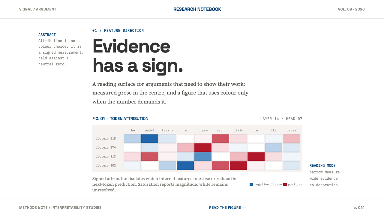 AI Alignment LabEvidence has a sign. Narrow serif prose yields to a red-blue attribution matr…
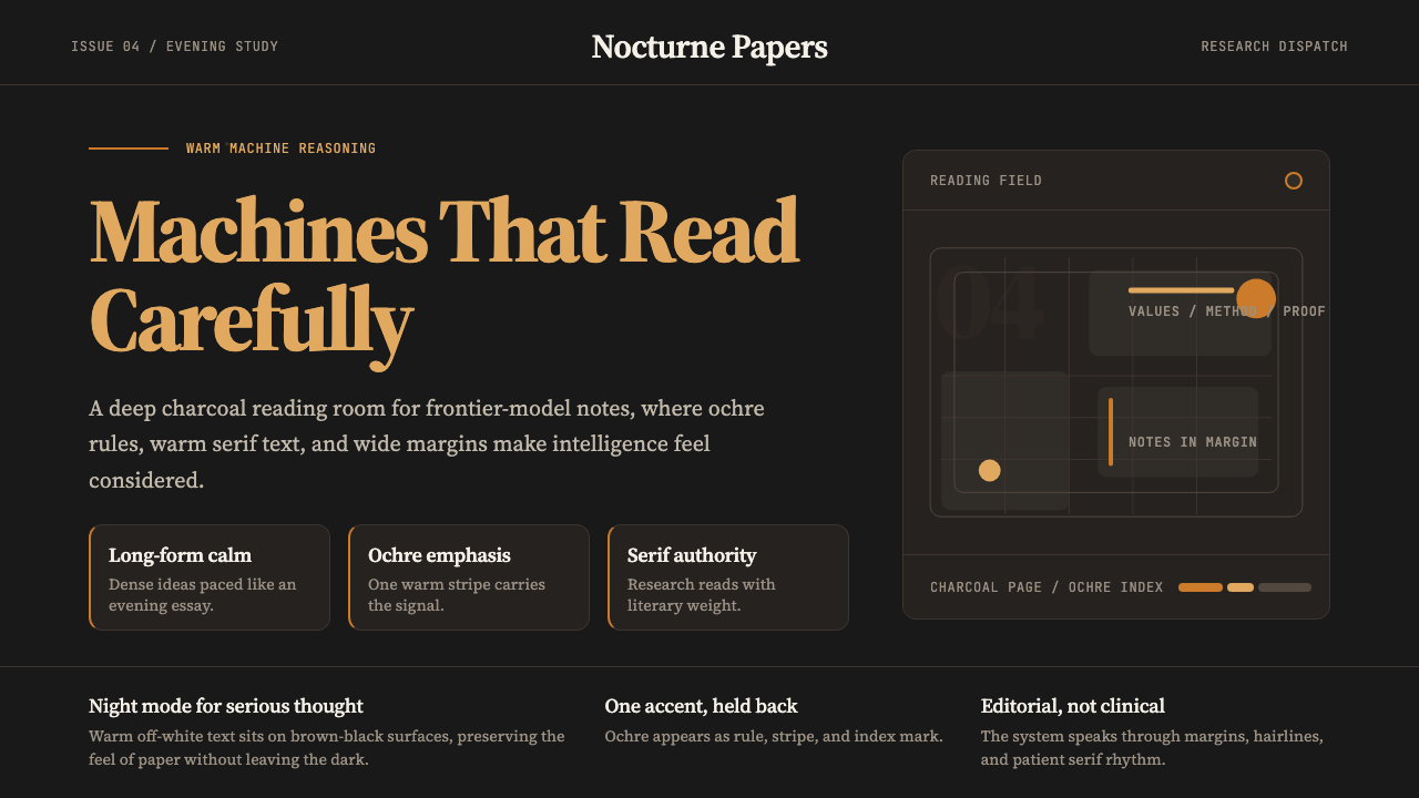 Claude / Anthropic Warm 2024Warm intelligence at night. Ochre rules and Source Serif glow on deep charcoa…
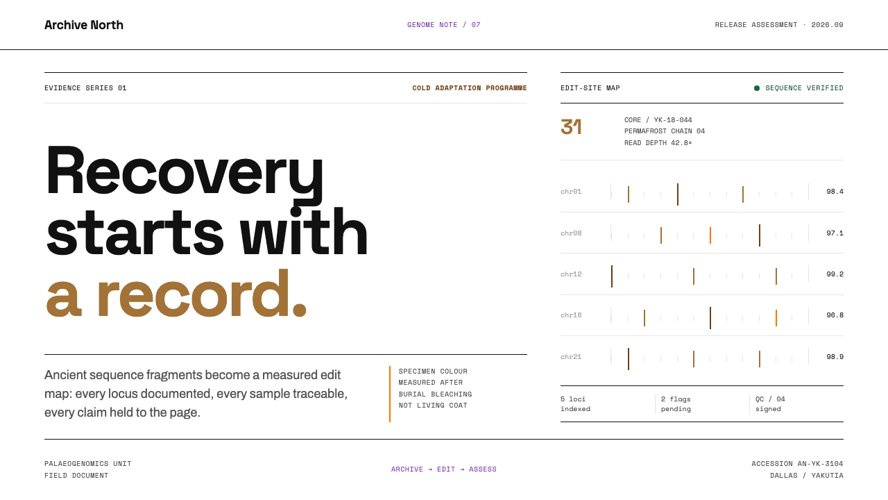 De-extinction LabResurrection reads as evidence. Black rules and specimen brown map every geno…
 Netflix 2024Cinema UI goes dark. Near-black chrome, poster rails, and one surgical red ac…
 Perplexity AISerious search after midnight. Teal citations cut through black panels and de…
 Stratospheric SunshadeUncertainty is the message. Pale sky stock, UN blue corridors, and an IPCC ri…