What is Hatsune Miku?
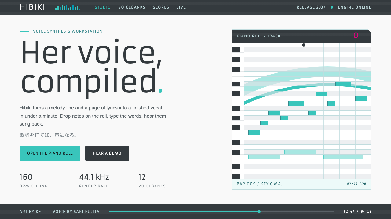
Hatsune Miku's design language reads her costume sheet like hardware: near-white panels, grey readout strips and one long blue-green curve.
Hatsune Miku in brief
Hatsune Miku is a voicebank with a face. Crypton Future Media released her in August 2007 as a VOCALOID2 product, with the voice supplied by Saki Fujita and the character drawn by KEI. As a design style, it translates her official look into an interface: a near-white ground, dark grey control strips, pale grey-teal cards and one long blue-green curve sweeping through crisp rectangular panels.
The style begins from a simple observation about the character. Her outfit is designed like equipment. Grey sleeves carry readouts that resemble the display of a synthesizer panel, and a numbered '01' sits on the shoulder as though she were the first unit in a product line. This system takes that costume sheet literally, so the interface feels like music software made for an idol: clean, electronic and orderly, without stickers or sparkle to hold it up.
Its personality is therefore a balance of two ideas that rarely meet. One is the precision of audio tools, with their meters, strips and labelled controls. The other is the warmth of fandom, represented by a single friendly color that people instantly associate with a person rather than a brand.

Where does Hatsune Miku come from?
Hatsune Miku was released on 31 August 2007 by Crypton Future Media, a company based in Sapporo, Japan. She was a voicebank for VOCALOID2, a singing synthesis engine, which meant that users could type lyrics and a melody and have a synthetic voice sing them. The voice was recorded from Saki Fujita, and the visual character was designed by the illustrator KEI. Her official color, a blue-green, is part of her identity, appearing in her twin tails, her tie and the accents of her costume.
What turned a product into a culture was what happened next. On Niconico, a Japanese video-sharing site, amateur producers began to post songs sung by Miku in 2007 and 2008, and fans began to draw her, remix her and respond to each other's work. This doujin and fan-derivative culture gave the character a life that no manufacturer planned. People associated with that scene, such as the producer ryo of the group supercell, are among those linked to the character's early rise, and Hiroyuki Itoh is among the names connected with her creation. Because the product was designed to be played by its fans, the character's visual identity was shared and extended collectively from the start.
Over the following years Miku moved off the screen and onto the stage. From 2009 onward, hologram concerts, together with the events known as Magical Mirai and Miku Expo, presented her as a virtual idol performing before live audiences. These shows gave her look a second life as a lighting and stage design problem: a figure made of light, framed by panels and displays.
The design system here returns to the earliest source, the official illustration and costume sheet, instead of the later fan cultures that surround it. Its movements are the three that shaped the character: VOCALOID music production, Niconico-era doujin culture, and the idea of virtual idols with hologram live shows. The aim is to capture the clean electronic discipline of the original design, not the busy visual excitement of the fandom around it.
What defines the Hatsune Miku look?
Near-white ground
The base is almost white, with only a faint cool tint, so the page feels like the clean casing of a device or the bright surface of a studio. It leaves room for the single accent color to carry the personality and keeps panels crisp. This is a light interface by design: the character is bright, and her software should feel the same.
The blue-green accent
One blue-green carries the whole identity. It appears on the long sweeping curve, on active controls and on small highlights, and almost never as a large flat fill. Everything else stays neutral, which means the accent works the way a signal light does on a piece of hardware. Because the hue sits between blue and green, it reads as both digital and friendly.
Grey readout strips
Dark grey bands, modelled on the sleeves of the costume, run along headers and control areas and carry small labels and values. They look like the display strip of a synthesizer. The strips provide contrast to the pale ground, anchor the layout and give data a place to sit that feels deliberately instrumental.
Pale grey-teal cards
Content cards use a pale grey tinted slightly toward teal. They sit gently apart from the white ground without needing strong borders or shadows, and they echo the accent color without competing with it. The result is a quiet layered surface where information is grouped by tone, not by decoration.
Crisp rectangular panels
Panels are rectangular with sharp, clean corners, like parts of a control surface. The geometry is orderly and grid-aligned, which suits tools such as editors, mixers and dashboards. This stiffness is the point: the one curve then has something to contrast with, and its sweep feels intentional.
The long sweeping curve
A single flowing line passes through the layout, recalling the twin tails and the waveform of a voice. It is the one organic element in an otherwise rectilinear system. Used once per view, it gives movement and identity; used repeatedly, it would lose its force and turn into decoration.

Who shaped Hatsune Miku?
The illustrator who designed the character's look, including the costume that this style takes as its source. The grey sleeves with readouts and the numbered shoulder mark are central to why the interface feels like equipment.
The voice actress whose recordings provided the sound of the original voicebank. Her voice is the reason the product could carry a personality, and the identity of Miku is inseparable from it.
A name associated with Crypton Future Media and the creation of Hatsune Miku. He represents the company side of the story, the Sapporo-based firm that released the software in 2007.
A producer connected with the Niconico song culture that spread Miku's music. His inclusion among the key figures points to the way fans and producers, not only the company, built the character's public life.
How do you use Hatsune Miku today?
This style is a natural fit for music tools, creative software, fan communities, virtual-idol projects, event pages and any product that wants a clean, electronic, friendly face. It suits interfaces where there are many controls to organize but the mood should still feel bright and approachable.
For presentation slides, start from a white or near-white cover with a single sweeping blue-green curve crossing the slide, and place the title in a dark grey strip or on the ground in dark grey type. Content slides use pale grey-teal cards in a tidy grid, with small dark labels at the top of each. Data slides can borrow the readout language: values in narrow strips, bars in the accent color and neutral greys for comparison.
For web interfaces, build dashboards, editors and player pages from rectangular panels with dark grey header strips. Use the accent for the active state, the progress curve and the primary button; keep everything else neutral. Controls should be clearly labelled and aligned to a grid, so the page feels like a piece of studio equipment. A subtle curve in the hero area or behind a player gives the page identity without adding decoration elsewhere.
For editorial and marketing work, keep layouts airy and rely on the white ground. Section headers can sit in grey strips, with feature cards in the pale teal-grey tone. Photography and illustration should stay clean and bright; the curve can guide the eye from a headline to a call to action. The style handles concert, event and product announcements well because its tone is festive without being noisy.
The most common mistake is to add what the original deliberately omits: sparkles, stickers, gradients, glow effects and a crowd of pastel colors. Those additions turn a clean instrumental system into generic fan decoration. A second mistake is overusing the curve or the accent, which dissolves the contrast that makes them work. Let the panels stay rectangular, the greys stay disciplined, and the blue-green stay rare.

Hatsune Miku — FAQ
Is this style only for fan or anime projects?
No. Although it starts from a character, the system itself is a clean, light, instrument-like interface that happens to carry a friendly accent color. It works for any music or creative tool, and for products that want an electronic yet approachable feel. You do not need to show the character for the style to make sense.
What does the number on the shoulder have to do with the design?
The numbered mark is part of the costume sheet and signals that she is built like a product, the first unit in a series. In the interface, it suggests small labels, indices and readouts as visual elements. It justifies using compact numeric tags and strips as ornament, because they come from the character's design logic rather than being added for decoration.
Can I use a dark background with this style?
The source look is light, and the near-white ground is a large part of its character. A dark variant is possible for a player or an editor, but it changes the feeling from bright studio equipment to nightclub. If you try it, keep the dark grey strips as the base and the blue-green as the only glow, and avoid adding other neon colors.
How many accent colors should a page use?
One. The strength of this style is that the blue-green does all the identity work while the grey and white stay neutral. A second accent invites comparison and weakens the connection to the character. If a state color is needed for errors or warnings, use it sparingly and keep it separate from the main accent.
Related design styles
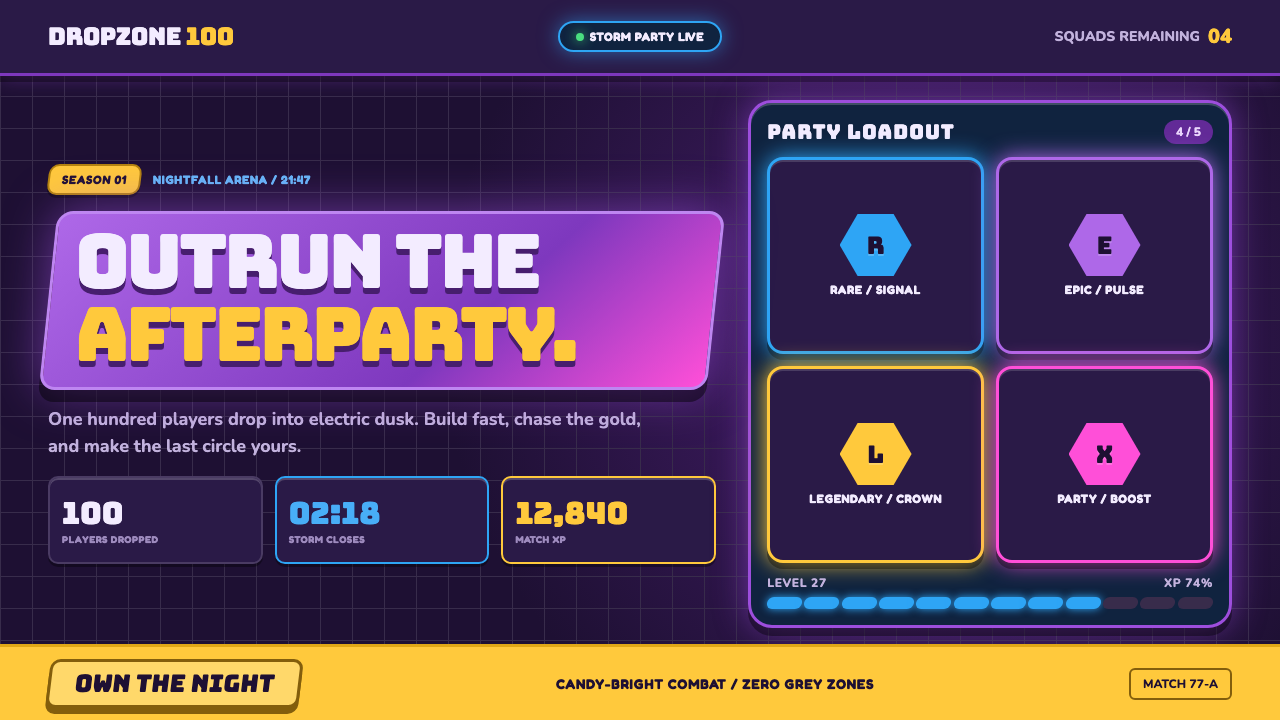 Fortnite (2017 Battle Royale)Battle royale becomes a neon party. Chunky caps and rarity glows electrify st…
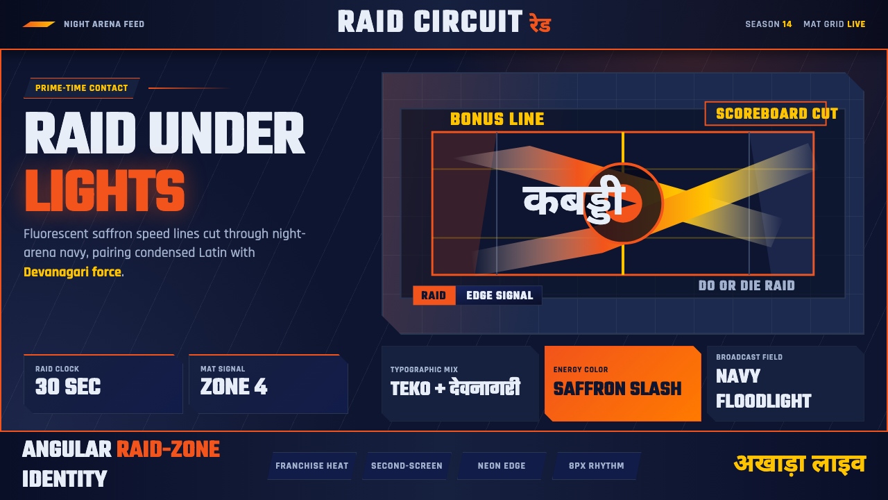 Pro Kabaddi LeagueBroadcast electricity. Saffron slashes, navy court grids, and Devanagari type…
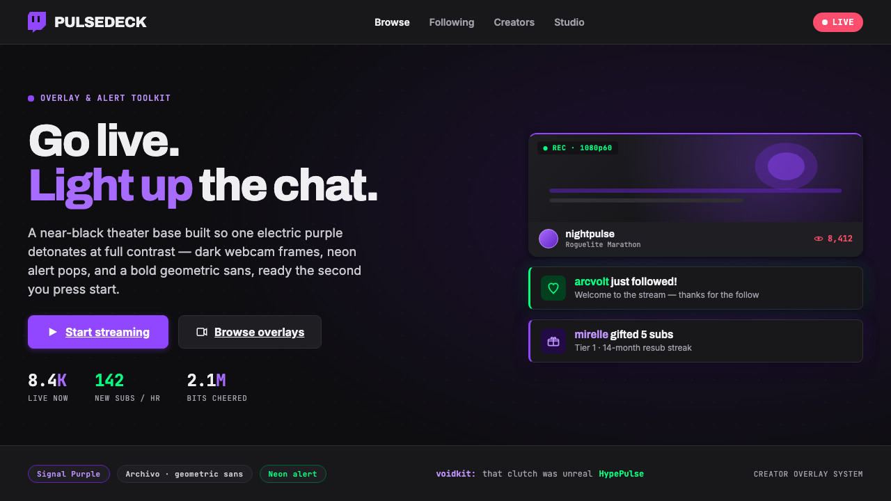 Twitch Streamer OverlayNear-black theater base, one electric purple. Dark webcam frames, neon alert…
 Among Us (crewmate space)Trust is ready to break. Loud capsule colors cut through a navy void with har…
 bilibiliCold grey feed, hot pink actions. White outlined danmaku race left across one…
 CloudpunkNeon-noir goes voxel. Pink-cyan glow cuts deep-indigo grids and blocky tower…