What is Harris Tweed (Herringbone)?
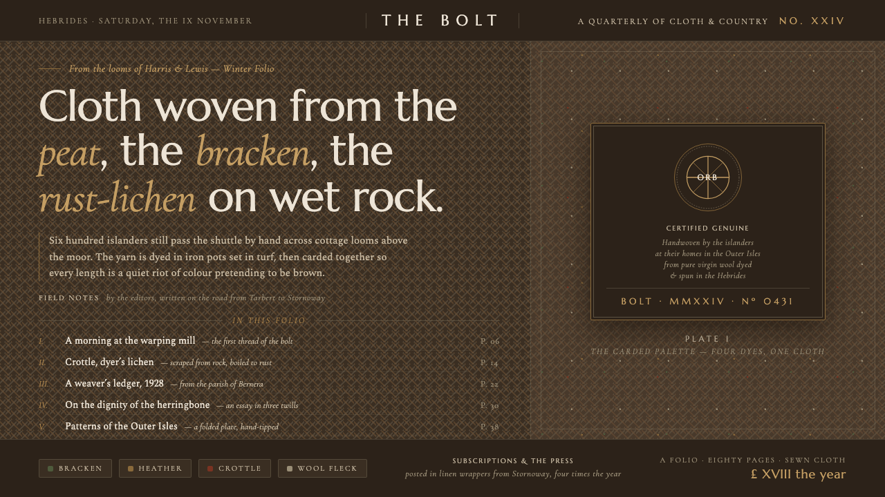
Harris Tweed turns the Outer Hebridean moor into cloth — peat-dark, lichen-flecked, warmly irregular, and ordered by the steady rhythm of herringbone twill.
Harris Tweed (Herringbone) in brief
Harris Tweed is a handwoven wool textile tradition from the Outer Hebrides of Scotland, especially the Isles of Harris and Lewis. It is made by islanders in their homes from pure virgin wool dyed and spun in the Hebrides, and it is the only cloth in the world protected by its own Act of Parliament. The Orb certification mark identifies that protected provenance rather than merely describing a visual pattern.
Its appearance belongs to the landscape that produces it. Peat-brown ground tones recall the moor; subdued greens, purples, ochres, and rust-like notes evoke bracken, heather, plants, and crottle lichen gathered from wet rock. These colors do not behave like clean industrial swatches. They mingle through the yarn as flecks and neighboring fibers, giving the surface depth without relying on shine or dramatic contrast.
Herringbone brings order to that earthy mixture. Alternating diagonal twill directions meet in repeated chevrons, creating movement that remains calm and structural. In digital interpretation, the style combines a dark, weathered ground, restrained plant-dye colors, wool-like speckling, tactile twill rhythm, and refined serif display type. The result should feel cultivated but never polished smooth: heritage is expressed through material character, not ornamental nostalgia.
Where does Harris Tweed (Herringbone) come from?
The style begins in the Outer Hebrides, the Scottish island region that includes Harris and Lewis. Here the cloth is inseparable from place and method: islanders weave it by hand in their homes, while the pure virgin wool is dyed and spun within the Hebrides. Production is therefore understood as a connected regional practice rather than an anonymous fabric process. Landscape, household labor, fiber, and provenance all belong to the same identity.
Its historic palette grew from the visual and material resources of the islands. Peat established the deep brown foundation; bracken and heather supplied a language of subdued vegetation; crottle lichen, scraped from wet rock for dyeing, introduced characteristic rusty earth notes. The significance of these colors lies less in isolated hues than in their mixture. A finished surface can suggest an entire moor because many quiet tones coexist within the wool.
The Harris Tweed heritage associated with the period from 1900 to 1950 joined domestic handweaving to a recognizable public identity. Lady Catherine Murray, Countess of Dunmore, appears among the tradition's key historical figures, while Hebridean handweavers remain its essential makers. The story is therefore neither solely aristocratic nor solely institutional: it is anchored in island households and represented through figures who helped define its wider heritage.
Orb trademark certification was established in 1909, giving the cloth a visible sign of authenticated origin. The Harris Tweed Authority and the Orb mark stand for the protected relationship between material, process, and region. In design terms, this provenance matters as much as herringbone itself. A convincing Harris Tweed-inspired system should communicate traceability, endurance, and local knowledge, not merely place a fashionable chevron over a brown background.
What defines the Harris Tweed (Herringbone) look?
Moorland Color
The palette begins with a deep peat-brown ground and expands through muted earth tones associated with bracken, heather, plants, and rust-colored crottle lichen. Colors feel weathered and naturally related rather than separately saturated. Warm and cool notes may coexist, but neither should become bright enough to detach from the landscape. The overall impression is dark, mineral, and vegetative, with restrained variation rewarding close attention.
Herringbone Rhythm
Alternating diagonal twill directions form a sequence of chevrons. The pattern supplies structure, directional movement, and a quiet sense of continuity, but it should not dominate like a loud graphic motif. Its strength comes from repetition and woven logic. At a distance it reads as an ordered field; nearby, the directional changes reveal the construction and make the surface feel worked by hand.
Wool Flecking
The surface is never perfectly uniform. Small color flecks and fiber-like irregularities suggest blended yarn and give the dark ground a lived-in density. Speckling should remain subtle enough to merge into the field rather than resemble scattered confetti or digital noise. It works as evidence of material variation: numerous subdued threads combine into a richer color than any single flat fill could provide.
Serif Refinement
Refined serif display lettering introduces ceremony and lineage without turning the composition into a historical costume. Its measured strokes contrast with the coarse textile ground, creating a productive tension between cultivated presentation and rural material. Body typography should remain calm and highly readable. The serif voice is most effective when reserved for names, titles, and statements that carry provenance or authority.
Tactile Darkness
Darkness here is not sleek, glossy, or technological. The peat-brown field feels absorbent and soft, holding texture within it rather than reflecting light outward. Lighter content should resemble wool, parchment, weathered plant fiber, or pale natural matter rather than stark synthetic white. Contrast remains sufficient for reading, but the relationship is warm and mellow instead of glaring.
Certified Provenance
The Orb-certified identity makes provenance part of the aesthetic system. Labels, seals, maker information, and origin statements should feel integrated into hierarchy rather than added as decorative badges. The visual language favors authenticity, continuity, and accountable making. Every heritage cue should point back to the Outer Hebrides, handweaving, local wool preparation, or the protected cloth tradition; vague rustic decoration weakens that specificity.
Who shaped Harris Tweed (Herringbone)?
The handweavers of the Outer Hebrides are the central makers of Harris Tweed. Working in their island homes, they embody the connection between domestic labor, regional knowledge, and authenticated cloth. Their role prevents the tradition from being reduced to a pattern or brand surface: herringbone may be reproduced visually, but Harris Tweed heritage begins with people, place, wool, and the act of handweaving.
Lady Catherine Murray, Countess of Dunmore, is identified among the key figures in Harris Tweed heritage. Within the visual history of the cloth, her name represents the public-facing historical dimension that accompanies the work of island handweavers. Referencing her should support an account of provenance and continuity, not substitute aristocratic imagery for the material and domestic foundations of the tradition.
The Harris Tweed Authority and its Orb certification mark represent the protected definition of the cloth. The mark, certified from 1909, makes origin visible and distinguishes Harris Tweed from a generic tweed appearance. For designers, it is a reminder that the style's deepest idea is not herringbone alone but verified belonging: a particular wool practice connected to a particular island region.
How do you use Harris Tweed (Herringbone) today?
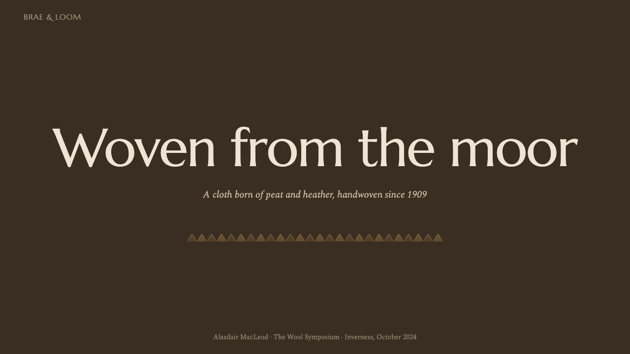
For presentation covers, begin with a peat-dark field and let a broad herringbone passage establish atmosphere without competing with the title. A refined serif title can carry the formality of a cloth label or provenance statement, while small supporting text remains quiet. Content slides should reduce the texture behind dense reading areas and use earthy accents to distinguish sections. The composition should feel tailored and deliberate, with generous pauses rather than decorative abundance.
Data slides benefit from the palette's natural hierarchy. Use the darkest browns for stable baselines, muted plant tones for categories, and a restrained rust or heather note for the most important comparison. Charts should remain clear before they become atmospheric; wool flecks belong in surrounding fields, not inside marks whose values must be compared. Herringbone can organize a margin, header, or summary panel, but should never interfere with labels or obscure differences.
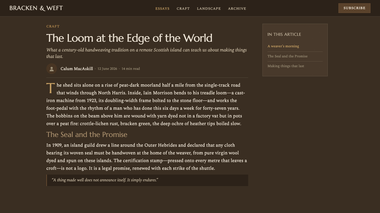
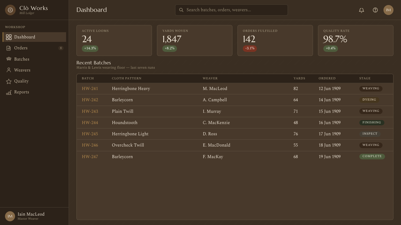
For web dashboards and pricing pages, the style creates a serious, trustworthy environment suited to information about craft, provenance, inventory, membership, or long-lived goods. Dark peat surfaces can frame pale reading panels, while plant-dye accents identify states and tiers without resorting to luminous interface colors. Pricing cards should resemble carefully arranged samples or records rather than floating glass panels. Borders, divisions, and labels can borrow the firmness of woven structure.
Editorial and marketing applications should foreground the relationship between landscape and material. Long-form articles can alternate close, quiet text passages with broad areas of textile rhythm, maker information, and origin notes. Product storytelling works best when herringbone, flecking, and earthy color support concrete claims about the Outer Hebrides, handweaving, wool, or certification. Marketing headlines may be stately, but the voice should remain grounded; the cloth's authority comes from specificity rather than grandeur.
The common mistake is to equate Harris Tweed with any brown herringbone surface. An oversized chevron, generic luxury serif, and artificial vintage distress may produce a rustic fashion mood, but they omit the style's real structure. Avoid making every panel heavily textured, every accent rust-colored, or every label resemble a seal. Preserve calm reading areas, allow several subdued colors to mingle, and ensure that heritage references remain connected to the islands, materials, and protected making tradition.
Harris Tweed (Herringbone) — FAQ
Is Harris Tweed simply a herringbone pattern?
No. Herringbone is a twill arrangement that can appear in many textiles, while Harris Tweed is a protected cloth tradition defined by origin, material, and process. It is handwoven by islanders in their homes in the Outer Hebrides from pure virgin wool dyed and spun there. A design can borrow herringbone visually, but it should not imply Harris Tweed provenance merely because the chevron structure looks similar.
Why is the palette so dark and muted?
The colors are drawn from the Outer Hebridean landscape: peat-brown moor, bracken, heather, plants, and the rusty tones of crottle lichen. Their character comes from coexistence inside the yarn rather than from isolated brilliance. Darkness provides the ground, while small variations create warmth and depth. Making the palette brighter and cleaner would weaken its connection to wool, weather, and moorland.
Can the style be used without visible textile texture?
Yes, provided its other principles remain intact. A design may express Harris Tweed heritage through peat-dark color, restrained plant and lichen tones, serif formality, careful provenance language, and a measured herringbone rhythm used only in selected areas. Texture should support material character, not become mandatory wallpaper. On text-heavy screens, reducing speckle and twill often preserves both readability and the style's quiet confidence.
What does the Orb mark contribute to the design language?
It makes authenticated origin visible. Since its certification in 1909, the Orb has represented the protected relationship between the cloth, Hebridean production, and regional identity. In a broader design system, that idea can guide labels, maker notes, origin statements, and documentary hierarchy. The lesson is not to scatter seal-like graphics everywhere, but to treat provenance as information worthy of clear and dignified presentation.
Where does Harris Tweed-inspired design work best?
It works best where durability, provenance, craft, and understated authority support the message: heritage products, editorial storytelling, cultural presentations, archives, memberships, and interfaces concerned with long-lived goods or regional making. It is less natural for experiences that depend on weightless brightness, synthetic gloss, or rapid novelty. The style succeeds when the subject can genuinely carry its associations with place, labor, material, and continuity.
Related design styles
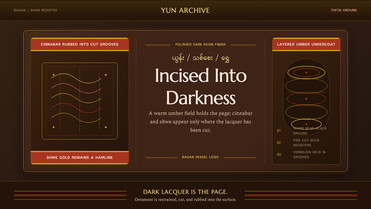 Burmese Shan Lacquer BrownDark lacquer leads. Cinnabar bands and shwe hairlines cut across a warm umber…
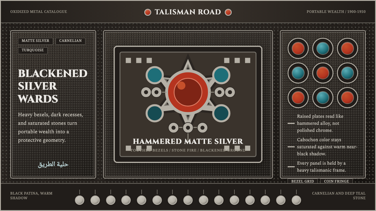 Kuchi Nomad Silver JewelryWeight becomes protection. Matte silver frames carnelian and teal stones on b…
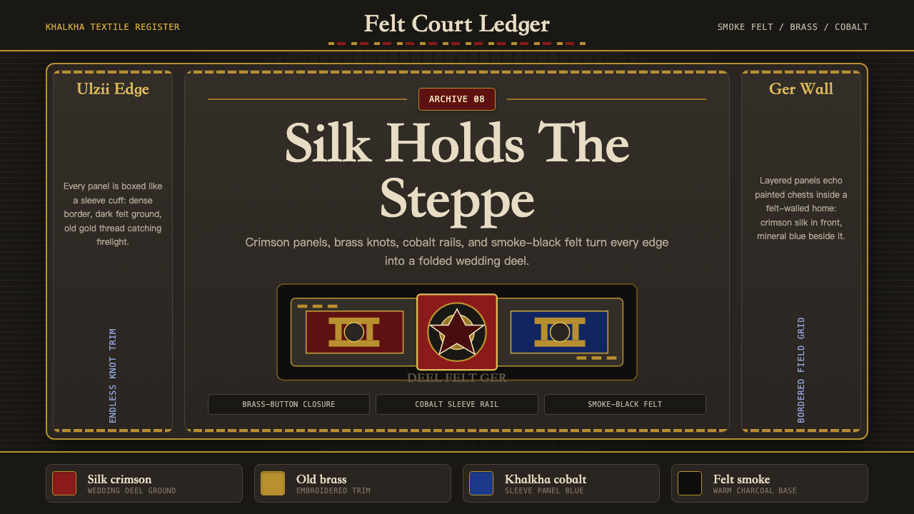 Mongolian Deel & Ger FeltTextile gravity. Smoke-black felt frames crimson silk, brass knot borders, an…
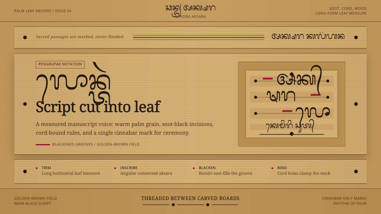 Balinese LontarHandmade memory, incised. Golden leaf strips carry soot script and spare cinn…
 Burmese Cane RattanWoven warmth holds the page. Walnut cane lattice glows with cinnabar rim line…
 Christmas ClassicTradition glows warmly. Evergreen panels, berry-red notes and burnished-gold…