What is Hardingfele Rosing?
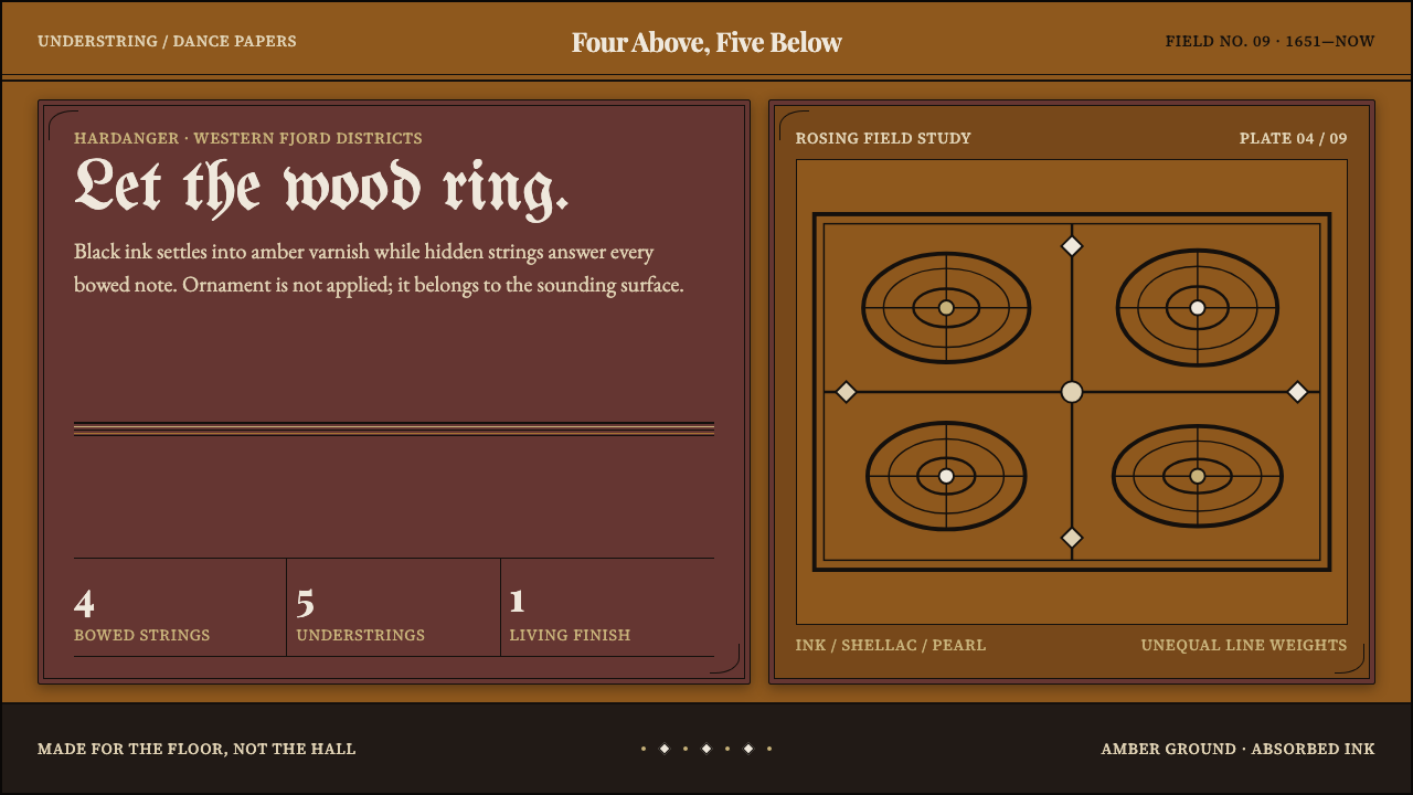
The Hardanger fiddle is a musical instrument whose surface is as much content as its sound — black pen-and-ink rosing sunk into amber varnish, edged with mother-of-pearl and bone.
Hardingfele Rosing in brief
The Hardanger fiddle, called the hardingfele in Norwegian, is a folk instrument from the fjord country of western Norway. It carries four bowed strings above four or five understrings that lie beneath the fingerboard and ring on their own, so the instrument sounds as if it has a second, hidden voice. Its scroll is carved as a dragon head or a Norwegian lion rather than the plain curl of an ordinary violin. The sound, a bright, droning, slightly haunted resonance, is inseparable from the look.
That look is the subject of this design language. The body is spruce and maple finished in shellac varnish, and on that varnished wood a maker draws black decoration called rosing directly in pen and ink. Mother-of-pearl and bone are let into the fingerboard and the tailpiece, so the edges of the instrument catch the light with a pale, cool shine against the warm wood. Rosing is not applied like a sticker. It sits in the finish, and it is drawn by hand, which is why its line has a living variation in weight.
In interface terms, the Hardingfele Rosing system treats an amber-varnished wooden surface as the ground, not as a decorative panel pasted over black. Ink sits in the surface as rules, tendrils and paired curls that fill a frame and stop at its border. Pearl and bone appear only at the edges. Nothing is vector-clean. The result is a dark, dense, tactile style that feels made and played, in contrast to the airy, pale and spacious look people often associate with Scandinavian design.

Where does Hardingfele Rosing come from?
The tradition reaches back to 1651, the date associated with the earliest surviving instrument, credited to the maker Ole Jonsen Jaastad. The fiddle belongs to Hardanger and the western Norwegian fjord districts, where farms and villages were separated by water and mountain and a local instrument could develop its own character. Its extra understrings, its carved head and its decorated body mark it as a distinct object, not simply a variant of the violin. The tradition continues to the present day, which is why the style reads as living craft rather than historical pastiche.
The classic decorated form matured across the eighteenth and nineteenth centuries. In this period the pattern of the instrument settled: shellac-varnished spruce and maple, black rosing in pen and ink, mother-of-pearl and bone inlays at the fingerboard and tailpiece, and a carved scroll. Families of builders carried the knowledge from one generation to the next, and the Helland family is among those whose workshop tradition shaped how a fine Hardanger fiddle should look. The point to take from this lineage is that the decoration was part of the making, not an afterthought, so ornament and instrument share a single logic.
The fiddle's music is the slått repertoire, Norwegian tunes for dancing and for listening, played on an instrument whose resonance fills a room. Torgeir Augundsson, known as Myllarguten, the miller's boy, became one of the best-known players of the nineteenth century. Ole Bull, a concert violinist, helped carry this music out of farm and village into a wider public. The fiddle was therefore not a museum exhibit. It was a dance instrument, played in kitchens and at gatherings, and that function explains the dense, tactile, hand-made quality of its surface.
The final strand is the national-romantic folk revival, in which Norwegians looked at their rural crafts as expressions of a national character. Within that movement sits rosemåling, the Norwegian tradition of decorative drawing and painting in scrolls and flowers, and rosing on a fiddle belongs to the same family of hand-drawn decoration. The revival gave the Hardanger fiddle its place as a cultural symbol, and it also fixed a picture of the instrument as a handsome, ornamented object. This system uses that picture as the starting point of a visual language.
What defines the Hardingfele Rosing look?
Amber Varnished Wood Ground
The ground is warm amber wood under translucent shellac, deep and slightly glowing, the colour of an old instrument. It is a material, not a flat fill: it has depth, and it reads as dark even though it is brown rather than black. Text and ornament sit on this wood as if they were drawn on the instrument itself.
Ink Sunk into the Finish
Black ink is the line colour, and it behaves as if it were drawn into the varnish: crisp, dark and slightly soft where it meets the glaze. It carries rules, ornament and often the type itself. Because the ink is part of the surface and not floating above it, shadows and glows are kept to a minimum.
Rules, Tendrils and Paired Curls
The motif vocabulary is small: double-line frames, flowing tendrils and paired curls that mirror each other. Each ornament fills a defined frame and stops at its border, never spilling past it. The drawing is dense inside the frame and quiet outside it, which gives the page a clear sense of compartments.
Pearl and Bone at the Edges
Mother-of-pearl and bone are the light colours of the system, pale and cool against the warm wood. They appear only at edges, as inlay does on a fingerboard or a tailpiece: outlines, borders, small highlights and focus marks. They catch the light rather than fill space, so they stay precious by staying rare.
The Hand-Drawn Line
Nothing here is vector-clean. A pen line swells and thins, curves are slightly uneven, and paired motifs are alike rather than identical. This variation is what makes the surface read as made by a person. Where a design system would normally standardise a stroke, this one lets it breathe, as long as the overall rhythm holds.
Dense, Hand-Set Typography
This is a dance fiddle, not a concert-hall exhibit, so the type is dense and has the feel of something set by hand. Text blocks are compact, headings are compact too, and the page keeps its density rather than opening into the generous white expanse of Nordic minimalism. Reading rhythm comes from framing and rules, not from emptiness.
Resonance and Echo
The understrings of the fiddle sound without being touched, answering the played strings. As a design reading, that suggests a quiet secondary line that echoes a primary one: a thin rule running beside a heavier border, a repeated curl at a smaller scale. Echo gives the surface richness without adding new elements.

Who shaped Hardingfele Rosing?
Jaastad is the maker credited with the earliest surviving Hardanger fiddle, dated 1651. The date is why the tradition can be traced to the middle of the seventeenth century and why the instrument is treated as having a continuous history. For design, he stands for the origin of the form: the extra strings, the carved head and the decorated body as parts of one idea.
Torgeir Augundsson, known as Myllarguten, was one of the most celebrated fiddle players of the nineteenth century. His playing represents the living side of the tradition, the tunes and the dances for which the ornament exists. He is a reminder that the decoration serves an instrument made to be played hard, which supports a design that is dense and tactile rather than precious.
Ole Bull was a concert violinist whose interest in Norwegian folk music helped bring the Hardanger fiddle and its repertoire to a wider public. His role ties the instrument to the national-romantic revival, in which rural craft was recognised as a national inheritance. The visual language borrows that attitude of respect for folk making without turning it into a souvenir.
The Helland family stands for the builders' workshops that passed techniques from one generation to the next. Their tradition shows that the look of a Hardanger fiddle is not an individual flourish but an inherited standard: the same varnished wood, rosing and inlays, handled with practised skill. A style that comes from a workshop line is consistent without being mechanical.
How do you use Hardingfele Rosing today?
Hardingfele Rosing is a tactile, ornamental and distinctly dark style, and it works best when it is treated as a material rather than a pattern. The aim is a surface that feels varnished and drawn on: warm wood as the ground, ink as the line, pearl and bone as sparing light. Everything else follows from keeping those three roles distinct.
For presentation slides, a cover can be a single amber field with a double-line frame drawn in ink, a title set compactly inside it, and a narrow pale edge line standing for the inlay. Content slides can use framed compartments, each with its own ink border and a small paired curl in the corner as a section mark. Data slides suit this style when the charts are drawn with ink lines and the highlight colour is the pearl tone, used only for the one figure that matters.
For web interfaces, the style fits cultural, musical, craft and storytelling products: instrument makers, folk-music archives, museum collections, event pages and artisan shops. Use the amber wood as the page ground, ink for borders and type, and pearl for focus rings, selected states and thin dividers. Cards become framed compartments with a drawn border, and hover states can brighten the pearl edge instead of adding shadow. Keep body text dense and well set so that the page still reads as a working surface.
For editorial and marketing work, the style gives long-form features and campaign pages a handmade, regional character. A feature can open with a framed headline, run text in compact columns, and mark sections with a short run of ink curls. Marketing pages can use inlay-style borders around product or gallery images. Photography of real wood, varnish and hand-drawn detail will support the look better than illustration in a different style.
The most common mistake is to flatten the style into clean Nordic minimalism with a few leaves added, which removes the density and the varnished depth that define it. A second is to use pearl and bone as large fills; they are edge colours, and they lose their gleam when they take over. A third is to make the ornament vector-perfect or to let it spill beyond its frame. Finally, avoid treating the culture as a theme-park decoration; credit the tradition and keep the ornament tied to its function.

Hardingfele Rosing — FAQ
What is a Hardanger fiddle?
It is a Norwegian folk instrument, the hardingfele, with four bowed strings above four or five understrings that resonate on their own, a carved scroll in the form of a dragon head or lion, and a body decorated with ink and inlay. The earliest surviving dated example is from 1651, and the tradition has continued to the present day in Hardanger and the western Norwegian fjord districts.
What is rosing, and how is it different from rosemåling?
Rosing is the black pen-and-ink decoration drawn directly on the varnished body of a Hardanger fiddle: frames, tendrils and paired curls. Rosemåling is the wider Norwegian tradition of decorative painting in scrolls and flowers, usually on furniture and household objects. They belong to the same family of hand-drawn ornament, but rosing is specific to the fiddle and is done in ink rather than colour.
Why is the line not perfectly clean and uniform?
Because the original is drawn by hand with a pen. A pen line naturally varies in weight, and paired motifs are similar but not identical. That variation is the evidence of making, and it is central to the style's character. In a digital version the line should keep a gentle variation of weight, with perfect, mechanical regularity treated as a departure from the source.
Is this a dark theme, and does it work in light mode?
It is a dark system: the amber varnished wood is deep and the ink is black. A light version is possible by using the pale pearl and bone tones as the ground and keeping the ink for lines, but it loses the varnished depth that makes the style distinct. If you need a light variant, keep a trace of the amber at the edges so the wood remains present.
How can I use the style without making a page look like a folk-craft pastiche?
Use its rules rather than its icons. Keep the three roles distinct, with warm wood as the ground, ink as the line and pearl as sparing edge light, and make ornament fill a frame and stop at its border. Keep the type dense and well set. A few disciplined elements will read as authentic far more than a page crowded with every motif at once.
Related design styles
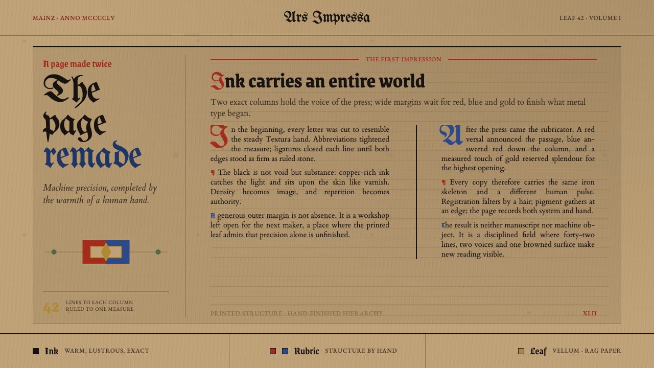 Gutenberg 42-Line BiblePrecision awaits the hand. Dense black columns open into red, blue and gold o…
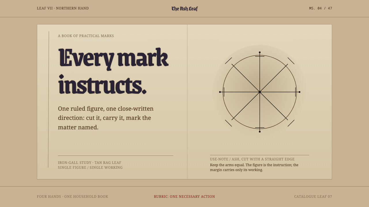 Icelandic GaldrabókEvery mark instructs. Iron-gall geometry stands alone on a smoke-darkened tan…
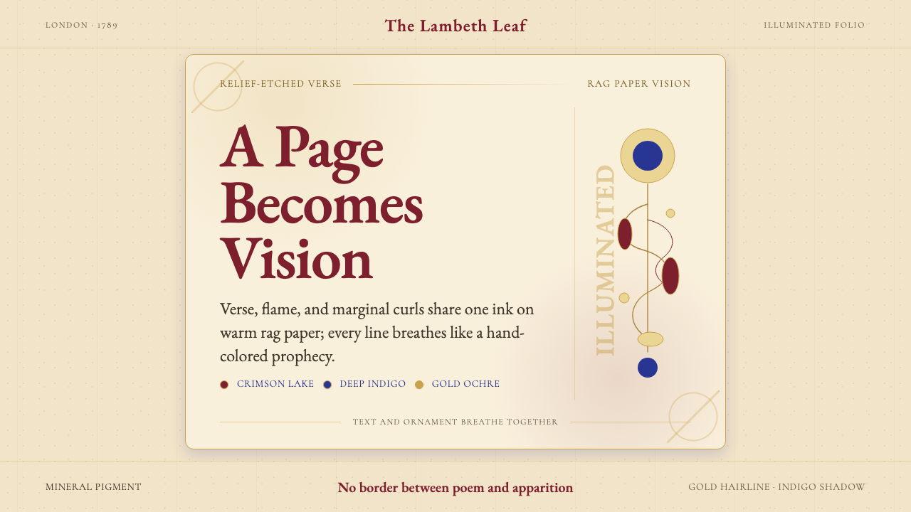 William Blake IlluminatedThe page becomes a vision. Crimson, indigo, and gold ornament breathe on rag…
 Belarusian Slutsk SashCourtly silk, vitrined. Taupe ground, crimson panels, Cinzel type, antique go…
 Bhutanese KushutharaPatience made visible. Lac pink and indigo bands shift across a warm silk gro…
 Central African Azande ThroneDense court gravity. Dark wood grids, brass dots, and court red cover every s…